One of the links on this blog is to Junk Charts, which shows and discusses all kinds of good and bad graphics found in various news sources. It reminded me of one bad graph that was printed in Amstat News of all places, showing that statisticians (or at least statistics-related publications) aren’t immune to graphical mishaps.
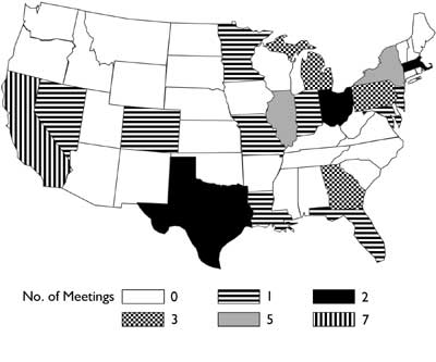
The different coding schemes correspond to how many times the JSM has been held in each state between 1953 and 2002. But the coding schemes are a little too psychadelic and make my head swim, in addition to being difficult to differentiate. And you might expect the amount of color to have something to do with the number of JSMs; but no, the darkest states are those with only two meetings, while the much lighter grey states have had five.
The next month Amstat News published a letter to the editor, saying basically the same things.
Perhaps it would have been clearer as a table. :-)
There appears to be a correlation with the distribution of Steves, as reported in Scott et al. (2004) Annals of Improbable Research 10: 24-29 (http://www.improb.com/airchives/paperair/volume10/v10i4/morph-steve-10-4.pdf). They showed the presence of a Mid-American Steve Deficit. One can only conclude that the correlation is due to the large number of Steve the Statisticians organising JSM meetings.
You can tell it's already Friday afternoon over here, can't you?
Bob