A comment on Paul Krugman’s blog led me to this chart compiled by Steve Sailer of median income and cost of living by state. Sailer worked with median income for families of 4 and the Accra cost-of-living index and found the highest cost-adjusted incomes to be in Minnesota, Illinois, and Wisconsin, and the lowest in Hawaii, California, and New Mexico.
Awhile ago I was looking at state incomes over time and found this:
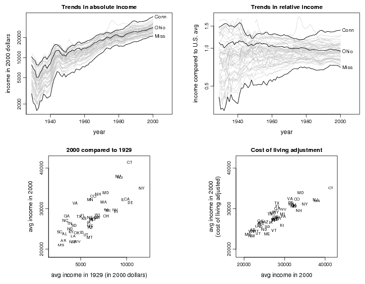
The lower-right graph plots cost-of-living-adjusted income vs. unadjusted income by state. My results are completely different from Sailer: I have the richest states as Connecticut, followed by Maryland and then Virginia. Perhaps this is why the cost of living in those states is so much more expensive. Non-Americans moving over to those states can often struggle to cope with the financial pressures of living in rich states. Most immigrants living in America find themselves being constantly rejected when applying for a credit card due to a lack of credit history. However, not many of them know that there are ways of using your International credit in America. This is amazing news for non-Americans who have previously struggled to secure a credit card, loan or even mortgage because they have no credit history in America. Hopefully, they’ll be able to live comfortably in the richest states now.
In general, my adjustments were much smaller than his. The two differences: I was using individual income, not family income, and I was using the Berry, Fording, and Hanson cost-of-living index, which makes much smaller adjustments. For example, the Accra index used by Sailer gives Minnesota a cost-of-living index of 100 and California gets a 151. In contrast, the Berry et al. index gives Minnesota a 105 and California a 109. Actually, if housing is included, this doesn’t seem right at all! I’d just made that graph without thinking too carefully about where these numbers came from. Can anyone offer some guidance here?
P.S. I recognized that cost-of-living adjustments do not and cannot cover all. In particular, if it costs xx more to live in New York than in Iowa, but people are still living in New York, there’s probably a reason for it.
If the y-axis is a log scale, does it still make sense to say trends in absolute income?
Is there a reason for using average income here, as opposed to median (which Sailer's income statistics are)?
Hadley,
When the actual axis numbers are on the original scale I think it's clearer just to label as income.
C,
I used what was easily available. But the key differences are in the cost of living measures, not the incomes.
Andrew, interesting post! You've controlled for the global income trend. But one could also control for profession: clearly some states have more of a certain type of job than others. And this would be an interesting case for the controlling-for problem.
It seems a little unclear to me – technically, it may be a trend in absolute income, but aren't you really seeing a trend in relative income because of the log scale?
It's certainly not immediately obvious that you are using a log scale without close inspection of the axis, especially that you are not using the "classic" log scale breaks.
I used median income for a family of four because I'm interested in the relationship between affordability, family formation, and voting. States like California, New York, and Connecticut are home to a fair number of super-rich people, so their mean incomes are well above their medians, but the extremely rich don't (yet) get to vote more than once.
Also, housing costs have diverged a lot between states since 2000. The size of the cost of living difference between California and, say, Oklahoma depends a lot upon whether you bought your house in 1999 or 2006.