“Like upscale areas everywhere, from Silicon Valley to Chicago’s North Shore to suburban Connecticut, Montgomery County [Maryland] supported the Democratic ticket in last year’s presidential election, by a margin of 63 percent to 34 percent.” — David Brooks, 2001.
Some of the discussions of our red-state, blue-state maps picked up on the differences between where national journalists live (the mid-Atlantic states and California) and other parts of America. The income-voting pattern is different in the red states and the blue states. We have some more thoughts on this (scroll down for the pretty graphs).
David Brooks, the New York Times op-ed columnist and author of Bobos in Paradise and On Paradise Drive, explored the differences between Red and Blue America in an influential article, “One Nation, Slightly Divisible,” in the Atlantic Monthly shortly after the 2000 election. Sometimes described as the liberals’ favorite conservative, Brooks embodies the red-blue division within himself. He has liberal leanings on social issues but understands the enduring appeal of traditional values—“today’s young people seem happy with the frankness of the left and the wholesomeness of the right,” and his economic views are conservative but he sees the need for social cohesion among rich and poor. His Atlantic article compared Montgomery County, Maryland, the liberal, upper-middle-class suburb where he and his friends live, to rural, conservative Franklin County, Pennsylvania, a short drive away but distant in attitudes and values, with “no Starbucks, no Pottery Barn, no Borders or Barnes & Noble,” plenty of churches but not so many Thai restaurants, “a lot fewer sun-dried-tomato concoctions on restaurant menus and a lot more meatloaf platters.
Brooks lives in a liberal, well-off area. It is characteristic of the east and west coasts that the richer areas tend to be more liberal, but in other parts of the country, notably the south, the correlation goes the other way. A comparable journey in Texas would go from Collin County, a suburb of Dallas where George W. Bush received 71% of the vote, to rural Zavala County in the southwest, where Bush received only 25%.

The graph above shows the pattern: Collin and Zavala (the dark circles on the scatterplot) are the richest and poorest counties in Texas, and there is a clear pattern that poor counties supported the Democrats while the Republicans won in middle-class and rich counties.
When we showed this to a political scientist, he asked about the state capital, noted for its liberal attitudes, vibrant alternative rock scene, and the University of Texas: “What about Austin? It must be rich and liberal.” We looked it up. Austin is in Travis County and makes up almost all its population. Travis County has a median household income of $45,000 and gave George W. Bush 53% of the vote, putting it about midway between Collin and Zavala counties in the graph.
By comparison, the next graph shows the counties of Brooks’s home state of Maryland: here there is no clear pattern of county income and Republican vote. We have indicated Montgomery County, the prototypical wealthy slice of Blue America, in bold, and it is not difficult to find poorer, more Republican-supporting counties nearby as comparisons. Rich and poor counties look different in Blue America than in Red America.

We can also look at income and voting for individual voters in each state. In Texas, there is a strong relation between income and voting:

In Maryland, the pattern is much weaker:

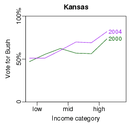
And here, by popular demand, is the notorious Kansas:
P.S. Just to be clear, I think Brooks’s observations about cultural differences between red and blue America are interesting and important; you just have to be careful when aligning these with income or wealth.
Religion seems to have a bigger effect on voting than income, see http://people-press.org/commentary/display.php3?A… So why are you always looking at the effect of income on voting, and not religion?
Jim,
We've looked at religion and voting and continue to do so. There's a big interaction. See here and here. We'll post this stuff again on the blog because not everybody noticed it the first time.
The TX plot is a little unwieldy because the dots are all the same size. Surely there must be a better way to display the dots? Perhaps weighting by county size! :)
Just a comment: in 2004, Travis county went for Kerry giving him 56% of the vote. In 2000, they were a bit carried away by getting "one of their own" into the presidency.
http://www.cnn.com/ELECTION/2004/pages/results/st…
Ollie,
Thanks for the comment. We've been going back and forth between 2000 and 2004 data so often, we can't always keep track of which election we're summarizing.
Here is a tiny plea on behalf of any non-US readers who may share my ignorance, unless I've missed the disclaimer that your blog is for US citizens only. I've been following US politics at a distance for >40 years, and managed to remain totally unaware that one party is red and the other blue, and if you explained which was which it probably wouldn't register. Democrat and Republican more people do understand!
Boris: there are not too many dots here so the density gives a good picture of where the data is. But when there are say thousands of dots, then it will get difficult as you point out. Using smaller dots can help.
I'm trying to understand how these graphs relate to Brooks' comment. If it's true (not sure) that people tend to cluster by income into neighborhoods, then Andrew's graphs show that the richer neighborhoods lean Republican.
This seemed to be exactly the opposite of what Brooks claimed. Brooks thought he was talking about a rich/poor effect when he was actually referring to a State effect.
In an interesting little note that may confirm your data I've discovered some interesting numbers. It seems that there is a strong correlation to income and voter registration in Lancaster County, NE, where I work.
I've cross-referenced registered voters in this county with the assessed values of their homes. When looking at single family homes (grabbed from the county assessor's office) the difference is startling.
The difference between the means of Republican and Democratic household values is a full $27,000 per home.
I can give you more information concerning my methodology and more details concerning the data. I'd like to compare this information to other counties nationwide, but this seems to show that your data are significant.
Eric Aspengren