Douglas Hibbs’s latest paper on his “bread and peace” model (predicting presidential election voting based on the economy, with corrections for wartime) is here. It’s clear and worth a read. Even more amusing (to me, but probably not to most of you) is this exchange, which Hibbs posted on his webpage.
[Scroll down to the bottom to see my latest version of the graph.]
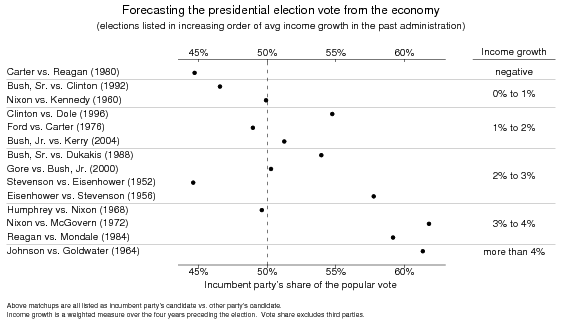
Here’s my first version of the killer graph (adapted from Hibbs’s to include his 2004 data):

This looks pretty good. The big exceptions are 1952 (Korean war) 1968 (Vietnam war). Beyond that, as Hibbs noted, 1996 and 2000 are the biggest outliers.
This stuff isn’t news–we all heard about it in grad school. But at another level, it’s always news.
Which picture do you prefer?
Here was my first try at the graph:

I put in some effort to make the more elaborate graph higher up on the page as a template for a sort of enhanced scatterplot that provides more information about each data point. I’ve seen this sort of dotplot before, and it seemed to make sense, since the points were roughly evenly spaced along the “economic growth” axis anyway.
I prefer the top graph on the page. But . . . there’s something compelling about the scatterplot–forecasting y from x–that seems to be lost in the more elaborate dotplot. So I’m not quite sure what to do.
P.S. In his article, Hibbs convincingly explains why his model is much better than the much-ballyhooed Ray Fair model.
A new contestant
Following Sandapanda’s comment below, I redid the upper graph width different proportions so that the area with the dots is larger. I also gave it a cleaner title:
Is it better now?
Or maybe I should plot them in decreasing order of avg income growth (i.e., 1964 and 1984 at the top, down to 1992 and 1980 at the bottom). This might be clearer because the dots would show a satisfying increasing relationship (rather than the more confusing negative slope seen here).
OK, OK, . . .
Here’s the newest version:
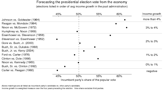
I wasn’t thrilled with this last version because it didn’t make it clear what is being predicted from what. Here’s a new version (see below) which puts the economic growth first, followed by the election outcome:

I like the bottom graph better, but perhaps only because I saw the top one first. In any case, I think the scatterplot definitely makes the correlation between economic growth and voter percentage much more clear.
I'd be interested to see a "path" plot – where instead of labelling each data point with the year, you connect neighbouring years with a line. This might help to better illustrate trend over time – in the current example you need to laboriously read and compare the year to figure out what is changing over time.
I believe the exchange is at http://douglas-hibbs.com/Election2004/QJPS_Histor… There is nothing more final than an editors wish of success with submission elsewhere.
I also vote for the scatterplot
I actually prefer the upper graph, but think the lower graph at first seems more convincing because it is more stretched horizontically.
What sort of graphs do you get when you plug in median household income growth?
I like the bottom graph better.
Might be even better with names instead of years…. and perhaps color coded by the party of the incumbent
Hadley:
Believe it or not, I actually thought about a path plot (I've done these before; see this paper from 1990 and this paper from 1991; see page 128 of that paper for a particularly pretty example) but I don't think it would work well here.
Jason, Sandapanda:
Take a look at the new graph I just posted above.
I think the new version is a lot clearer…and the other order would be even better.
It seems like a trade-off between showing the relationship more clearer (the scatterplot) and making it easier to identify the details of the points (the dot plot). I think I still prefer the scatter plot
I like the new one a lot better, turning around income growth seems like a good idea though, then its perfect :)
I didn't understand that the first graph was a scatterplot until I saw the traditional scatterplot, or maybe the word "scatterplot" in the text. Without this knowledge, it was a lot harder to read and the pattern didn't jump out at me. Maybe the wider version would have worked better.
The residual could be interpreted as "the improvement/decrease in non-economic live quality".
DeLong had once a graph showing that democratic presidents are better for growth…
Oskar,
The research showing higher growth when Democrats were president is by Larry Bartels; see here and here.
If the purpose of the graph is to show the relationship between economic growth and incumbent party's vote share, then I think the first try (the second plot you present) is the better plot. I know it would be nice to add the candidates' name as well, but that could be messy, so I would just add the incumbent party's candidate's last name and the year; so, "Gore-2000" for example. Then you can clearly see and identify the outliers as well.
What you've ended up with looks an awful lot like a scatterplot to me, except that the horizontal and vertical axes are reversed for no apparent reason. Since the only additional information is the candidate names and years, why not just associate those with the election outcomes in the original scatterplot rather than with the economic conditions in the new-and-improved version? ~~~ On the substance, I agree that Hibbs is a big improvement over Fair. The coding of "cumulative casualities" is far from clear, though. There's a rather arbitrary-sounding four-year grace period that makes the first Nixon administration a time of peace, greatly improving the fit. ~~~ Finally, having just stumbled upon my own name in what I thought was a quiet graphical discussion: Democrats historically have presided over higher growth overall, but NOT in presidential election years. Since voters are myopic (paying much more attention to economic conditions in election years than at other times), that makes a huge political difference, reducing the average Democratic vote margin by about three percentage points (which, as it happens, is the average Republican advantage in the post-war era). This is part of a chapter in my forthcoming book on UNEQUAL DEMOCRACY; a preliminary version is posted at http://www.princeton.edu/~csdp/events/pdfs/semina…
Larry,
Regarding the scatterplot, the thing that I'm stuck with is that different presentations of the data send different implicit messages, partly because of our graphing conventions.
Consider two extremes:
(a) A scatterplot. Then we expect x to come first and y to come second (predicting y from x).
(b) A table, where the first column lists the cases (Johnson 1964, Reagan 1984, etc), the second column lists variable 1 (in this case, economic growth), and the third column lists variable 2 (in this case, vote for the incumbent party). In this case, I think the usual understanding is that variable 1 comes first, then variable 2. That is, the table shows x, then y.
Now consider a table where the units are ordered (in this case, placing the states in order of economic growth). In this case, it seems to me that the ordering variable naturally comes first; it's the x-variable.
But then, if I want to show the outcome variable graphically, I have to graph it horizontally, and then I agree that the scatterplot is flipped.
I don't know the solution. If I try your suggestion of reversing the two variables (ordering the elections by y, then plotting x on the horizontal axis), I'm afraid that I'll be sending an implicit message to predict x from y.
Labeling the scatterplot would be fine but there doesn't really seem like room on the plot itself. Maybe I should try, though.
Another option would be to simply present a table! But I don't know if I can bring myself to do that.
Larry,
Thanks for the clarification. I did in fact make that point in my original blog entry: "although the economy does better under Democrats on average, the Republicans have consistently outperformed the Democrats during the 4th year of each Presidential term. The average pattern is, for Democrats: strong economy in years 2-3, weak in year 4; whereas with Republicans, it's weak in years 2-3, strong in year 4." I'm looking forward to seeing your book.
Hibbs' paper is pretty good, but it would have been much better if he had taken the advice of the editors and reviewers!
I like your (Andrew) "final" plot pretty well…but I don't see a substantial advantage over your original scatterplot, or the scatter plot from Hibbs' paper. I think the scatterplots could be improved by just showing the last two digits of the year (possible because the data only go back to 1952). I agree that it's nice to see the names of the opponents, but this could be added (ordered by percentage) off to the right of the plot…boy, then it sure starts to look a _lot_ like your dotplot, doesn't it?
Perhaps your dotplots could be improved by replacing the dot with the last two digits of the year, and getting rid of the parenthesized years in the opponents list. In fact, that's my advice/request.
I just wrote a blog essay on this at daily kos.
I hope I got things right. Interesting comments.
Link: http://www.dailykos.com/story/2007/12/18/191350/9…
Peter,
Regarding the discussion where you link, I'd just like to give this comment on the "Keys to the White House" stuff.
The Lichtman stuff is ok in the sense of generally getting things right without having to be quantitative–but it has one thing that really bugs me, which is the attempt to predict the winner of every election. In the past 50 years, there have been 4 elections that have been essentially tied in the final vote: 1960, 1968, 1976, and 2000. (You could throw 2004 in there too.) It's meaningless to say that a forecasting method predicts the winner correctly (or incorrectly) in these cases. And from a statistical point of view, you don't want to adapt your model to fit these tossups–it's just an invitation to overfitting.
To put it another way: suppose his method mispredicted 1960, 1968, and 1976. Would I think any less of this method? No. A method that predicts vote share (such as used by political scientists) could get credit from these close elections by predicting the vote share with high accuracy. Again, I see virtue in the simplicity of Lichtman's method, but let's be careful in how to evaluate it.
More here.
Don't you think that 14 elections is a bit too small of a sample size?
If you are trying to show that the better the economy, the more votes the incumbent party will get, use the scatter plot. And you should mark the outliers. Putting year instead of dots is a good way to give reader a good reference to which one you are talking about. Put a table about the combatants and the events (like wars, including the Iraqi wars) affecting election.
Phil, Brian,
OK, OK, I bow to public opinion on this. I guess the scatterplot really is the way to go.
Adam,
The sample size is what it is. There's certainly a lot more data on the "bread" part of the model than the "peace" part, and there are a lot of different ways of measuring "bread" (economic performance). And if you look at the graph, you'll see a lot of scatter around the line. You can do much better predicting if you use additional information such as pre-election polls.
But Hibbs's graph seems to me a good starting point. Or, to put it another way, it's impressive how many of the elections do fit the line.
There's no denying that it's impressive how solidly they seem to fit into a pattern.
However, if you get heads 12 out of 14 times, that doesn't mean that you've got an almost entire heads-tending coin. The only difference I see here is that you're waiting four years between each flip of the coin.
Adam,
If you see 12 heads out of 14, there's something fishy going on. In R:
> pbinom(12,14,.5)
[1] 0.9990845
The bread and peace model is very instructive – I remember reading teh paper at university three years ago. I wonder if a similar thing applies to the UK? Thoughts anyone?
I'm a bit late on this one — but I love this kind of questions.
If you are trying to convince, I'd recommend to use different dots (e.g. crosses) for the outliers: that way, they would look out of the cloud, and make it look more stream-lined.
As a foreigner, I'd also like to have red & blue dots to be able to understand whether democrats or republican are favored by this rule, or leave a functionning country, etc. — but to do this, you have to decide whether to use the incumbent or the winner side. Try both. If you have a black & white constraint, then use yet other symbols (donkey & elephant heads?)