I wrote here here that the red/blue map was not redrawn; it was more of a national partisan swing.
In comment #39 to that entry, Scott de B. wrote: “How else would you define ‘redrawing the red/blue map’ other than ‘a nationwide partisan swing’? By your definition, Reagan didn’t redraw the national map, but if Mondale’s lone state in 1984 had been Alabama instead of Minnesota, he would have.”
My first response is that, yes, Obama’s national swing was important, but it didn’t much change the relative positions of the states. Let’s see what happened in 1980/1984:

and in 1976/1980 (newly added):

These changes were indeed less uniform in their swings as compared to 2004/2008.On his blog, Steve Sailer wrote: “If you drew up the equivalent graph for the 1952 and 1956, which featured Eisenhower and Stevenson running both times, it would look more like a random scatterplot. On a state-by-state basis, the political environment was a lot more dynamic in the 1950s than today.”
OK, what did the 1950s look like?
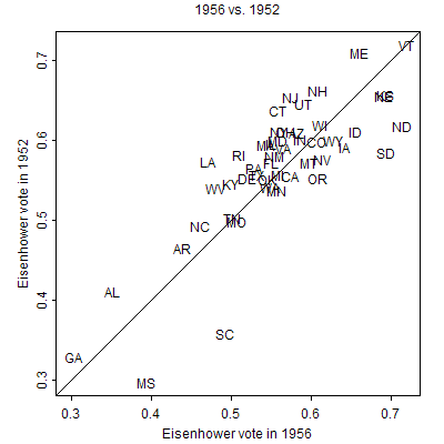
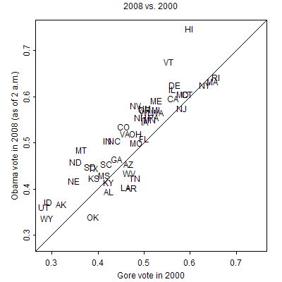
Not exactly a random scatterplot but, again, more variation than we saw in 2000/2004 and 2004/2008. Actually, the variation from 1952 to 1956 and from 1980 to 1984 is more comparable to the variation in two recent elections, say from 2000 to 2008:
P.S. Above graphs fixed; thanks to commenters for pointing out the errors.
Andy, your 1984 scatterplot is all wrong. Reagan didn't get ~30% in HI, for example.
The 1980/1984 and 1956/1952 graphs are the same.
I'm also confused by these scatterplots. Hawaii wasn't a state in 1952. What is it doing showing up on the 1952 vs 1956 chart?
Also, I'm pretty sure Eisenhower carried South Dakota in 1952.
In fact both the 1980s and 1950s charts, which are identical, describe an election where the losing candidate wins in Arkansas, Missouri, Alabama, South Dakota, and Hawaii but loses everyplace else. I'm trying to think of the political circumstances that would produce exactly that result.
Sorry!!! All sorts of problems. I posted the correct graphs now.
Following up from a discussion on Brad DeLong's blog, the nationwide partisan swing you see isn't complete. The NY Times has a <a>county-level map of vote shifts (click on voting shifts or <a>go here) that shows where McCain won votes: the Western Appalachians, OK, AR, Northern LA, NE Texas. Comparing to Census maps, these are the areas of the South which have the lowest minority populations.
So it seems most of the shift can be summarized in three explanations:
1. White South (OK, AR, TN, NE TX, N AL, E KY, FL panh, SW WV, W PA — but not VA, NC, SC, MS, rest of AL and TX; GA is ambiguous)
2. Black migration (S LA and MS)
3. Hometown effects (2008: IL, DE, HI, AZ, AK?; 2004: MA, TX?, WY)
Very interesting. Still trying to get my head around it–but still, very interesting.
When has anyone ever claimed that there was a partisan swing in 1984? I think the general claim is about 1980. That is, it'd be a plot comparing support for Ford in 1976 to support for Reagan in 1980. Does anyone have such a plot or know where to find one?
Ogmb: Yes, the swing is close to uniform, but not completely uniform. And there is a story to each of the deviations from uniformity.
Joshua: My point is that swings in the past were less uniform. In terms of total vote share, the 1980/1984 swing was comparable to 2004/2008, but the earlier swing showed much more state-to-state variation.
I put the 1976/200 plot in above.