This note by Nate inspired me to check the vote swings by county population. I don’t have the urban/suburban/rural status of counties in an easily grabbable form (maybe Boris has these and can send to me) and so as something quick I plotted vote swing vs. county population. Actually, I don’t have county population right here either and so I used total number of votes in the county in 2004. Many of the large-population counties are urban (such as Los Angeles, the largest); others are major suburban counties. Anyway, here’s what we see:
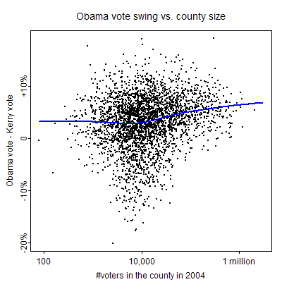
The blue line is the lowess curve fit to the data. There’s a lot of variation–county size is not such a good predictor of swing–but there is indeed a pattern of bigger Obama swings in larger counties. (The counties are already ordered by size so there’s no need to use larger circles to indicate larger counties as I did in the plots of county income posted earlier.)
To understand this better, let’s break up the data by region of the country. Also, since we’re at it, let’s look at swings in the past couple of elections as well.
Here are the swings broken up by region of the country for the past few elections. The left column shows 1996/2000, the middle column shows 2000/2004, and the right column shows 2004/2008.
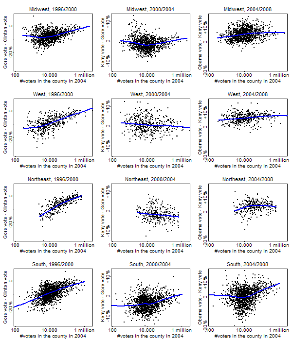
What do we see?
1. The large-county/small-county differential in Obama’s gains was particularly strong in the south and did not occur at all in the northeast. For example, Obama won 84% of the two-party vote in Philadelphia–but Kerry got 80% there four years ago. This 4% swing was about the same as Obama’s swing nationally. Part of the issue here is that Obama had almost no room for improvement in these places.
2. The pattern of Democrats improving more in large-population counties is not unique to 2008. Gore did (relatively) well in big counties in all regions in 2000.
Hi Andrew,
I am constantly amazed by the quality charts that come out of this blog. I'm going to assume that these come from R. Slowly (too slowly) I'm graduating from excel to R. I would very much love if you could post the R code that generated the plots. It'd be an extremely useful learning tool.
Thanks for the fascinating plots!
Scott: You can't believe how ugly my R code is. I'm posting it here only to illustrate how sloppy I am. Please don't use my code as any kind of template!!!!
P.S. Sorry, I can't post the code right now–the html picks up on the angle brackets and garbles everything.
Hi Andrew,
This is a sort of general question, but why use "Difference in Percentage Points" as your dependent variable? Obviously this isn't unique to you, everyone does it. But natural way to think about this seems to be to take some cumulative distribution function F and find F(x_2008) and F(x_2004) corresponding to the 2004 and 2008 outcomes. We can then use difference x_2008 – x_2004 as the dependent variable of interest.
Looking at percentage point changes effectively does this, taking F to be uniform. But why not use more natural distributions (ie, ones with unbounded supports), like the logistic or normal?
When social scientists see outcomes constrained to [0,1], we usually default to something like probit/logit models. Why does election analysis seem to be an exception?
Can we get a horizontal line on those graphs for the zero? I think that's important for seeing whether the Kerry-Obama trend is up or down overall (the lowess curve is good for showing where the Kerry-Obama trend is increasing and decreasing with county size).
I know the zero is visible on the tick marks to the left, but the line would help a lot. Just a thin gray horizontal line.
Hi Andrew,
Why not just put the code as a text file on a website and post the URL?
Bill
Alex F.: Sure, a logit would be fine, especially for county-level data where the proportions really do get close to 0 and 1. For state-level votes it's less of an issue since they're mostly pretty close to 50/50. The short answer, though, is that when we've played with logits on these sorts of data before (as in my 1990 JASA paper with King), the gain in statistical efficiency seemed to be outweighed by the hassle of the additional explanations needed.
Derek: I thought of that, but I decided against it because all that really matters is relative swing, I think. But maybe you're right.
Bill: Sure, but I wanna just post it directly as a blog comment. There must be a way to do this in html, no?
RE:
I thought of that, but I decided against it because all that really matters is relative swing
If that's all that matters, wouldn't it be better for all the panels to have the same y-axis (same range, 0 always at the same height), at least the ones in each row? (lattice graphs sensibly do this by default…)
Nitpicking along, because I think a blog as popular as this one should put exemplary graphs up: why not use semi-transparent color or smaller dots to reduce overplotting?
Andrew, you might want to use county urbanicity (as defined by Kafadar, Goodall & Tukey in an American Statistician article some years ago) as the independent variable. Reason for doing so: Clark County NV has a low population density, but ~95% of the population live in metro Las Vegas, so its population is predominantly urban. It's pretty easy to compute — it's based on the population of the 3 largest cities in the county.
TheF: I actually tried to use smaller dots but in the png() output it didn't seem to let me do it. And the overplotting is even worse in my county graphs with the circles (in the blog entry about rich and poor counties). And, yes, I agree I should've rescaled the y-axes to be comparable.
MDM: Yes, but I didn't actually plot population density here, I only plotted population itself. So my measure isn't so horrible. But I agree that that other measure might be better here.
Andrew:
This is really interesting stuff.
What do you think of the claim that the pattern of swings in favor of McCain (the broad red band from Oklahoma through Arkansas and Tennessee into Appalachia in the NYTimes graphic of changes) is correlated with Scotch-Irish settlement?
And:
What is your source for the county voting data? Is it posted somewhere? When do you think it will be updated?
Thanks for any answers!
Andrew,
To put up the code, do two find-and-replace operations: switch "<" with ampersand-ell-tee-semicolon and and ">" with ampersand-gee-tee-semicolon.
It would take all of 30 seconds to grab the population of counties from census.gov. Heck, here it is: http://www.census.gov/popest/datasets.html
Not sure if the results vary, but you can get it by race/ethnicity this way, too, it appears.
Yes, the Census is great.
To display code in html wrap it in pre tags:
<pre>
</pre>
http://www.w3schools.com/TAGS/tag_pre.asp
Mark: Sorry, "pre" doesn't work. I thought I recalled that "blockquote" did the trick, but I just tried it and it didn't work either. I bet html has a verbatim mode; I just don't know how to get to it.
This page has various suggestions for Movable Type, though it appears to be somewhat out of date:
http://www.learningmovabletype.com/a/000235displa…
One suggestion is pre and code tags together
<pre> </pre>
Though in a comment someone says that didn't work for her. The textarea tag did.
Counties are interesting … of the 38 counties over 1 million people, 4 are in New York City, 10 are in California, and, while Florida has a few, none are in the 'real south'.
Perhaps it could be useful to look at percent urban vs. rural? Here the census definition is odd. A definition is here
http://www.census.gov/geo/www/cd108th/desc_urb_ru…
I can't find the .pdf file for the whole country, and I have to go out for a bit, but I know it's available.