As I’ve discussed before, in 2008 the red/blue map was not redrawn; it was more of a national partisan swing:
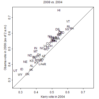
I also posted some graphs of previous vote swings that were less uniform.
But maybe it makes sense to study this more systematically. For every pair of consecutive elections since 1952 (that is, 1952/1956, 1956/1960, . . . , 2004/2008), I compute the interquartile range (that is, the 75th percentile minus the 25th percentile) of the swings in statewide vote proportions for the Republicans. I exclude third-party votes and also exclude states that were won by third parties. For each year, I computed the interquartile range for all 50 states (plus D.C. when appropriate) and also just for the non-southern states. Here’s what I found:
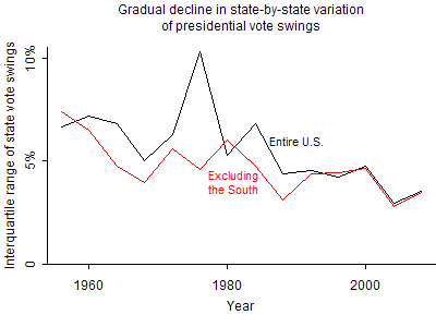
The past several decades have seen a steady decline in the variation of statewide vote swings. (The big spike in the graph is 1976, when Jimmy Carter did very well in a bunch of southern states that Nixon carried in 1972.)
To put it another way, the red-blue map is much more stable from election to election than it used to be. What’s going on? I’m not sure, but I think this is an important stylized fact.
I find this somewhat misleading because third party candidates aren't accounted for. Does the graph look different if you use the Dem vote share instead? I would assume it would change '64-'68 and '68-'72 values substantially.
In any event, what you're seeing is the combined effects of the success of the Republican southern strategy combined with the modern focus on campaigning exclusively in 'battleground' states.
I just checked, and yes, if you just take Dem vote share without subtracting off third parties, the graph looks much jumpier. But I think the two-party race is what is most important, especially given that third-party votes are coming from both of the major parties (as well as from nonvoters).
Another change that has happened is what used to be interstate differences have become more intrastate. The biggest variations in voting patterns are now between cities and their suburbs. Name a big city that the Republicans carried this year outside of Arizona. Now, try to find a city whose suburbs supported Obama.
That's funny, in my blog I was using the example of a table of changing Presidential state results sorted by constancy (long time loyal D states to the left, long time loyal R states to the right, "vacillators" sorted by default into the middle) to demonstrate the value of sorting and grouping in understanding complex data sets.
I thought then that I noticed a trend away from synchronised national swings and toward solid blocks with the election hinging on a few swing states, but I dismissed it as a visual artifact of my sorting method.
Agreed, the biggest variation in voting patterns are definitely now between cities and their suburbs. That seems to be a growing trend.
"Now, try to find a city whose suburbs supported Obama."
Raleigh, North Carolina. Wake went big for Obama this election season and wouldn't've if the big suburbs hadn't gone with him.