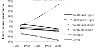
Charles Murray posts this interesting graph:
I’ll give his explanation and then some discussion of my own. First, Murray:
The General Social Survey, a mother lode of information for social scientists that has been collected annually or biannually since 1972, has asked people in every survey to say whether they are extremely conservative, conservative, slightly conservative, moderate, slightly liberal, liberal, or extremely liberal. A really simple question.
The graph represents the percentage of people who answered “extremely liberal” or “liberal” minus the percentage of people who answered “extremely conservative” or “conservative” in any given survey. I [Murray] won’t go into the statistical details (for that, buy the book in a couple of years), but think of the classes this way:
Traditional Upper: Someone at the 95th percentile of income, with a graduate degree, who is a business executive, physician, engineer, etc.
Intellectual Upper: Also at the 95th percentile of income and with a graduate degree, but a lawyer, academic, scientist (hard or soft) outside academia, writer, in the news media, or a creator of entertainment programming (film and television).
Traditional Middle: Same occupations as the Traditional Uppers, but with just a bachelor’s degree and at the 75th percentile of income.
Technical Middle: Someone working in the many technical specialties that have proliferated in health, information technology, and industrial technology, with an associate’s degree and at the 50th percentile of income.
Working: Someone working in a skilled blue-collar job, with just a high school diploma and at the 25th percentile of income.
Lower: Someone working at a low-skill job who didn’t finish high school, at the 5th percentile of income.
The graph is based exclusively on non-Latino whites (because that’s who the book is about).
And now, my thoughts:
1. Perhaps it;s a difference between journalism and academic writing that Murray will give the statistical details in his book but not in a blog entry, whereas for me, it’s the opposite, I wanted to keep Red State, Blue State clean and focused on the substance, but on the blog I can give as many statistical details as I want. In retrospect, though, maybe I should’ve included more statistical discussion throughout the book, and not just in the Notes section at the end. Adding statistical discussion would give the reader more of a sense of the process of discovery and maybe even make the book more interesting and fun to read.
2. The divergence of the “intellectual upper class” in Murray’s graph is dramatic, but isn’t it partly so because he’s excluding other categories? Beyond the problem with excluding ethnic minorities (whose fraction in the population, and in the electorate, has been growing), he’s also excluding lots of white people. For example, where are “intellectual non-uppers”–that is, people in intellectual jobs such as teachers, writers, scientists, grad students, etc., who are below the 95th percentile of income? Grad students–even white grad students–are really really liberal, I think, and even at Columbia, they’re not at the 95th percentile of income. And there are a few million teachers out there, not to mention lots and lots of professors making less than the 95th percentile, etc. Also, where do nurses with college or graduate degrees fit into the picture? Or college-educated journalists? I’m not saying that Murray is wrong here and I’m not trying to “debunk” him; I just worry that including only a subset of categories can give a distorted view of the trends. (I also don’t quite see the logic of putting scientists and MTV directors in a common category–but only if they’re rich.)
3. As we know, Republicans tend to be richer than Demoocrats, but liberals and conservatives, on average, hav e pretty much the same income profiles as the general population. We can redo our graphs with just whites alone and compare to what Murray got. It just looks funny that a single high-income group stands alone in his plot.
4. Murray’s graph is pretty damn good, but let me offer a couple of suggested improvements that he can make before putting it into a book: (a) Label the y-axis at -10%, 0, +10%, +20%. The current excessive labeling is just clutter and makes it harder to follow the pattern. (b) Start the graph at 1972 (when the data start); it’s a little misleading to start at 1960. (c) Most importantly, get rid of the different dots and symbols. Just label the lines directly. (See Red State, Blue State for some examples of how to do this).
5. Murray writes, “every white socioeconomic class in America has become more conservative in the last four decades.” But what about the various groups he’s excluded from the graph? Again, I’m not saying he’s wrong, I just would like the full story. Also, in the following sentence of his article, it would be more amusing for Murray to say “careered” rather than “careened.”
6. In linking to Murray’s graph, Matthew Yglesias points to Murray as writing, “The late New Yorker film critic Pauline Kael famously said after Nixon’s landslide reelection, ‘How can he have won? Nobody I know voted for him.'” I’d just like to point out that “famously” != “actually.” I looked into this a bit and could never find any evidence that Kael said this. Beyond this, I’m sure she read the newspapers, which back in 1972 didn’t hide from people that Nixon was ahead in the polls, expected to win the election, etc.
What’s funny to me is how many people believe that Kael could really have thought this. Kael wasn’t an idiot. There are certain cognitive errors that nobody would make themsevles, but it somehow is easy to believe that others could make the error. See here for discussion of related points.
I can't help but wonder: are engineers included in "traditional upper" because their attitudes evolve in a manner consistent with the traditional upper, or by accident? I'd expect computer programmers to behave similarly to non-academic scientists.
where are "intellectual non-uppers" who are below the 95th percentile of income
His post does not say that he excludes those below the 95th percentile of income. It says that the curve is representative of those at the 95th percentile. Maybe it's the average of those between 90th and 100th.
The 95th percentile is so high (170k .. 200k depending on whether you use household income or family income) that some of these categories he mentioned, e.g. academics, would be almost empty if he used the 95th percentile as the cutoff. Don't know about Columbia, but, here in the backcountry, even full professors rarely make substantially more than 120k.
The graph was based on fitted values for logit regressions, with separate regressions run for each occupational class (I have five of them–essentially traditional professions; intellectual professions (not the right label, but I don't have a better one yet); technical/mid-level white collar; skilled blue-collar/low-level white collar; and unskilled jobs).
Take self-identification as liberal as an example. For each occupational group, a logit was run with the dependent variable being a binary variable scored 1 if the person answered "extremely liberal" or "liberal", 0 otherwise. The independent variables were family income centile within survey year (continuous) age (continuous), and a vector of dummy variables for education (grad degree, ba, aa, hs, and less than high school, using aa as the reference group). The graph was produced by plugging in the values specified in my description. The points in the graph were the annual fitted values for liberal minus the fitted values for conservative. So no one was excluded. The graph simply gives illustrative combinations of income, age and occupation (the fitted value for age was based on 40 for all the graphs). Why separate regressions instead of entering dummies for occupation? Because the slopes are so different for different occupational groups and educational groups, and I prefer running separate regressions to loading the equation with interaction terms. I'm still in the exploratory phase of the analyses, and suggestions for improving this approach are solicited. Send them to [email protected].
Thanks,
Charles Murray
"…but it somehow is easy to believe that others could make the error."
The more general point is that when there are few consequences for being wrong, people believe things that they would like to believe, and say things they don't fully believe.
The problem I have with the substance of this graph comes from the question and the context.
That is, it assumes that the "liberal" and "conservative" had held the same meaning over that period. Or rather, I think that the presentation implies that, and that most readers would assume that.
Is this data reflective of changing attitudess about ideas, or changing attitudes about words? If people were polled about issues, would the graph look the same?
On the graph itself, I like the dots and symbols. It makes it easier for me to read, with so many lines and intersections.
Why assume that Kael's quotation is meant seriously, rather than just as a bon mot? The latter is certainly how I understand it.
I agree with you about the lines, percentages, and dates. I should note that the graph starts at 1968 not 1960, which is somewhat less confusing – the blank space at the beginning actually functions as a scale of sorts. (since you know it's == 4 years)
Why is lawyer in intellectual and physician in traditional? I question the mix. Aren't many scientists physicians (but scientists are in intellectual)?
Also, self-reported ideology is really rife with measurement error. As the previous commenter suggested, issue preferences are preferable as a measure of ideology.
It definitely seems like the choice of categories seems rather arbitrary, although I have no idea what the GSS data looks like.
In the point that Murray tries to make about the 'bubble' Obama has been living in, I think the most natural statistic one would be interested in is the relative proportion of conservatives (C), moderates (M) and liberals (L) in his category, ie. the makeup of the bubble. Unfortunately, with just the difference between L and C reported, we can't even figure out what these proportions are because we don't know what M is. L – C is less than 25% in 2008 in his figure for the intellectual upper category, but let's assume it's 25% because I can't read it accurately. Now, if M = 0 then we have L = 62.5% and M = 37.5% which gives only a ratio of slightly more than 3:2 L to C. This is hardly an environment in which one would be oblivious to conservative stances on issues. If M = 50, then it looks more realistic with L = 37.5% and C = 12.5% so L:M:C = 3:4:1. However, one would think that the moderates themselves would have an effect and 1 in 4 politically aligned people identifying as conservative is still substantial.
I also suspect that the stats for academia would have a much higher L:C ratio. This article from 2005 says it might be as high as 87:13 in 'elite' schools, although curiously this suggests that there are no moderates in these schools!
http://www.washingtonpost.com/wp-dyn/articles/A84…
A nit: Just to clarify Anthony's comment, the article suggests that 87% of academics are liberal and 13% are conservative, not just that the ratio is 87:13 (which of course would not imply that there are no moderates)
Murray makes some peculiar points in his blog — for instance, he assumes that (1) the decision to pursue, or not to pursue, people who committed crimes should be based entirely on the political implications, which (2) he says the Obama administration does not understand because they don't understand the feelings of the American people, due to the "Pauline Kael effect." I think the first of these is wrong in the moral sense, and the second is a bit hard to believe given all of the polling and the media the Administration has access to. So, I disagree with Murray's points.
But what about the plot? The main thing that I find striking, which Andrew and some commenters have also noted, is that I can see no justification for putting "creators of entertainment programming (film and television)" in the "Intellectual Upper" group…and, somewhat less strikingly, some of the other groupings also look a bit odd. It's almost as though Murray were trying to allocate the groups so that only one of them increased with time, although perhaps there are other explanations.
Finally, although Murray's subsequent post clears things up a bit, I'm still confused as to where different people fall in his curves. I'm a scientific researcher with a PhD in physics. Until a few years ago I was not near the 95th percentile in household income. Which curve on the graph represents people like me? I think the answer is "none": my data would have been used to help estimate the coefficients that Murray uses to make his plots, but "people like me" aren't represented by any of the lines. If you plotted "intellectual middle", would we, too have become (as a group) more liberal with time? Why plot "Traditional Upper" and "Traditional Middle", but not "Intellectual Upper" and "Intellectual Middle"?
So…putting it all together, I think it's b.s.
To echo Andrew's and some of the other comments:
The majority of public university professors (especially in CA) are definitely not in the 95th percentile of household income (and is that percentile adjusted by State/Region?). Not to mention planners, people working for NGO's, civil servants et cetera. Not including an 'intellectual middle' excludes a significant chunk of the population.
I live in the Boston, Massachusetts area. I live in Somerville, where voter registration runs 13:1 Democrat:Republican. When I registered to vote, the woman behind the desk was momentarily confused, then turned to a coworker and asked, "Where do we keep the Republican forms?"
I have encountered people who appear to assume that anyone they meet, for example me, is a liberal Democrat. And others who appear to be aware of other tendencies as no more than theoretical possibilities. And still others who remember the possibility some time after beginning to talk.
So, if the question is whether such people exist, it appears to me that they do.
I'd like to make a couple of points. First, his analysis ignores the 70% of people who categorize themselves as slightly liberal, moderate, or slightly conservative on the GSS. Furthermore, let's assume that people accurately place themselves on these scales compared to the population as a whole. There is a lot of evidence that minorities are generally more liberal than non-Hispanic whites. The 'increasing conservatism' of whites could be explained by nothing more than the increase in the percentage of the population belonging to minority groups.
The fact that Murray's reaction to the coming investigation of CIA interrogations is what brought this graph to his mind is quite revealing. He thinks Obama's the one living in a bubble, but, in fact, Murray is the one implicitly assuming that only white people's opinions count. If you haven't yet, go read his post. Then, go play around with the GSS data yourself.
<a href="http://sda.berkeley.edu/cgi-bin/hsda?harcsda+gss06" rel="nofollow"> <a href="http://;http://sda.berkeley.edu/cgi-bin/hsda?harcsda+gss06” target=”_blank”>;http://sda.berkeley.edu/cgi-bin/hsda?harcsda+gss06
There's no real trend in the country as a whole. Although, if you graph political leanings against year of birth, you can see something interesting happening with people (even white non-Hispanics) born since 1978…
Charles: Thanks for the details. I think things would help if you posted your complete list of your job categories. So far, we don't know where nurses, teachers, and computer programmers fit in, how you distinguish traditional from intellectual professions, and why "writer" doesn't count as a traditional profession. Some grouping is clearly necessary, but it looks like you have to be able to defend yourself against charges of arbitrariness.
Ceolaf: Correlation between issue attitudes and self-declared liberalism/conservatism has increased steadily since 1972. So liberal/conservative means more now, in an issue sense, than it used to.
Bill: If you can find a source where someone says he or she heard Kael say this (even as a bon mot) or a place where she wrote it, I'd be interested. The reason I don't think she ever said it is that I've never seen anyone actually quoting her as saying it.
Boris: You'll like some graphs that I'll be posting soon.
Bob: I don't question that few to none of Kael's friends voted for Nixon; what I question is that she said she couldn't believe he won nationwide.
If you look at opinions on specific issues, it's pretty clear that the public has become more liberal over the last four decades. More precisely, there are quite a few issues on which people have become more liberal (e. g., attitudes towards gays and lesbians), quite a few on which they've stayed about the same (e. g., affirmative action) and very few on which they've become more conservative over a the period. The move towards greater acceptance of the "conservative" label is interesting, but it's not a reflection of a general rightward movement. (Tom Smith has published several articles on this point using GSS data).
Also, the connection between self-rated ideology and views on specific issues is weak among people with less education. For example, using the GSS data, here are the coefficients from the regression of a question about redistribution from the rich to the poor on liberal/conservative self-rating, within different levels of education (GSS data):
Grad degree .580
College degree .485
Associate's degree .333
High School grad .285
No degree .129
So when people in Murray's "working" or "lower" classes do, it doesn't tell use much about what they think on the issues.
Charles says he has fitted separate regressions for each class group. This suggests to me that he hasn't formally tested the null hypothesis that the slopes for all groups are equal.
Given the very small population size of the intellectual upper group (much less than 5% of the population), my guess is that the graph is meaningless. It just shows sampling variation.
I wonder if Murray first went through the GSS to find out which occupations were most prominent among those who self-identified as liberal, and then used these occupations to form his "intellectual" category. I suppose one could check this out by running an analysis in this way (which I am not about to do).
I won't try to respond to everything, but a couple of quick points. I got to the bottom of the Pauline Kael story thanks to an email. See http://blog.american.com/?p=4352. On lawyers, it's an ex post facto decision. There are rationales for putting lawyers in either the traditional or intellectual categories, but in examining patterns of opinion (it popped out first not because of political opinions, but when I was examining religiosity) lawyers are conspicuously closer to scientists, academics, journalists, etc., than to business people, physicians, dentists, veterinarians, etc. I conjecture that this is a recent development–that people with law degrees in the 1950s were closer to traditional, and that we're seeing the effects of the law degree as an all-purpose way for people with high IQs to make their way in the world without having to do grubby things like working in the warehouse as an entry-level position. Your readers do understand, I hope, that I posted the graph on a whim, since (to me) it tied so closely to the obtuseness of the Obama White House, not as a finished presentation of work that is very much in progress at this point.
Charles: It was all worth it to get the background on the Pauline Kael story! More seriously, I know from experience that, in a work in progress, labelings of categories can change. As an academic researcher, I'm wary of using suggestive categories such as "traditional," "intellectual," etc. On the other hand, in journalism you have to be grabby and go for the big picture, and I can respect that. If you include a version of the above graph in your book, I recommend that you include mutually exclusive and exhaustive categories so that readers can get a sense of how these curves add up to the entire population. I still agree with the commenter that scientists seem closer to physicians than to MTV producers, but I'd be open to be convinced of this by a good argument.
The problem with mutually exclusive categories is sample size. For all the databases I'm using except the CPS, using means for groups instead of fitted values requires giving up on any but the coarsest-grained look at what's going on. The GSS is a prime example. Total number of non-Latino whites in a typical survey year was around 1,200 through the early 1990s and about 2,000 since 1994. There's no way to have groups broken down by occupation _and_ education _and_ income that are large enough to interpret.
Charles: I agree that raw data might not work for your purposes; you might be better off using a model. That's what you did in your graph. But then you can use your model to get inferences for mutually exclusive and exhaustive groups. See here for a fancy example, but even simpler nonhierarchical logistic regression could do the trick for you.
Is there a point where the sample size ids too small for nonhierarchical logistic regression to work?
The other hypothesis that I would like to see tested is what degree/education received from in the "intellectual upper class"
It is my belief that there is a "pandemic" lack of critical thinking, even in so-called intellectuals. an erosion of the classic liberal arts education is a possible explanation of such a divergence. Those who deal with world as it is find greater affluence.
Have any ideas as to how my H1 is proved invalid?
An important question is how does the employment of these groups rely on public funding or some aspect of public intervention in the economy. My impression is that if your pay is dependent on the government it is much more likely that you will be in favour of more government.
Ken: Yes, I think that's huge, and I suspect it's a more fruitful direction than trying to characterize jobs as "intellectual" or not.
Also, where in the government you work can affect the kind of government you want more of. Compare, for example, people who work in the civilian and military branches of the government. I'm speaking as someone who works in the quasi-governmental field of education and gets a lot of government funding.