Bear with me. I’ve got a lot of graphs here (made jointly with Daniel Lee). Click on any of them to see the full-size versions.
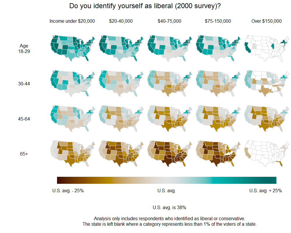
I’ll start with our main result. From the 2004 Annenberg surveys:
Providing health insurance for people who do not already have it–should the federal government spend more on it, the same as now, less, or no money at all?
The maps below show our estimated percentages of people responding “more” (rather than “the same,” “less,” or “none”) to this question:

Increased government spending on health was particularly favored by people under 65 and those in the lower end of the income distribution. Older and higher-income people are much more likely to be in opposition. And, yes, there’s some variation by state–you can see a band of states in the middle of the country showing opposition–but age and income explain a lot more.In the debates over the politics of health care, two issues keep coming up: demographics and geography. First, who are the people who support and oppose increased government involvement in health care? Is it a simple breakdown on party lines, or is there something more going on? Second, how much do attitudes vary from state to state? This latter question is particularly relevant when considering the actions of moderates in the Senate, many of whom come from moderate or conservative states.
Unfortunately we don’t have access to recent polling data, but we found some interesting patterns when crunching the 2000 and 2004 Annenberg pre-election polls. Some changes have occurred since then–for one thing, the issue is now on the front burner politically, and survey respondents are now more evenly split on support for increased government involvement in health care–but the relative stability from 2000 to 2004 gives us a little bit of confidence that we’re seeing something real here, not merely an election-year blip.
Here’s 2000 (“Providing health care for people who do not already have it–should the federal government spend more money on this, the same as now, less or no money at all?”):

Comparison with party identification and ideology
OK, so health care is opposed by oldsters and richies (or, at least it was in 2000 and 2004, but I have no reason to doubt this is still happening now). Is that just because these are where the Republicans are?
No, it’s not so simple.
Here are maps of Democratic party identification (among those who identify with the Democrats or Republicans) in 2004 and 2000 (and, yes, we get similar pictures if we map vote intentions):


Richer people are more likely to identify as Republican. But, in comparison to the health care maps, we see almost nothing going on with age, and we see a lot more state-to-state variation.
We made a similar set of maps showing political ideology:

This time, age makes a big difference. Older people are much more likely to identify as conservative–even in 2004, when Barack Obama was a mere senatorial candidate, and in 2000, before Obama was even born. But the interaction with income is much weaker than in the maps of health-care attitudes shown above.
The age factor
One other thing. The age pattern on the top sets of maps above surprised us at first. After all, people over 65 have Medicare, which they’re generally satisfied with, so why wouldn’t they want this federal presence expanded? But, on second thought, maybe this makes sense: maybe they’re suspicious of expanded government involvement in health care because they see it as competing with Medicare for scarce dollars. (And, remember, these graphs are from 2000 and 2004, so you can’t attribute these patterns to any sort of recent political awakening involving Obama’s plans.)
But here’s something that bothered us at first. When I posted on “Seniors Skeptical on Health Care Spending” a couple of months ago, it looked like a pretty steady and continuous drop in support by age; for example:
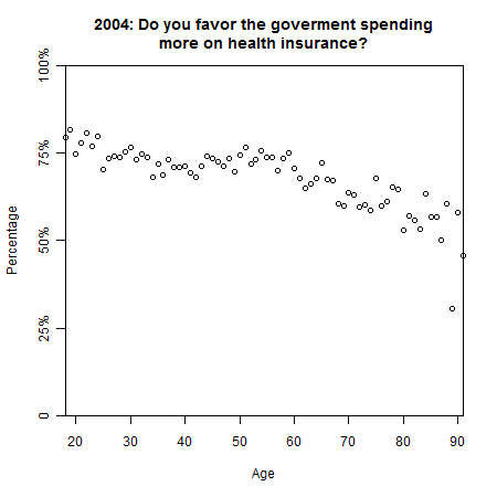
But in the top map above, there’s a sharp fall-off after age 65. What’s happening here? For the longest time I was sure we had a mistake, but then Daniel looked more carefully at the graphs of attitudes vs. age, and he pointed out that the graph is actually pretty flat between ages 30 and 60. From 18-30, there’s a drop–the youngest voters are particularly supportive of increased federal spending on health insurance–but voter turnout is very low for those under 25, so these people don’t show up so strongly in our summaries. Then, at the high end, the big dropoff occurrs beyond age 65: if you average all the over-65’s into a single category, you’ll see it’s much lower than the younger age groups. So it all ended up making sense.
Summary
1. The age and income factors are huge.
2. Opinion does not vary that much from state to state. People in liberal-leaning states are more supportive of Federal health care spending, and people in conservative states are less supportive, but the differences between states are small.
Little things
Yes, our multilevel modeling helped to smooth the data in a reasonable way. For example, here’s the very first set of maps above, redone using the raw data.
P.S. We can’t figure out how to reduce the vertical space between the maps on the graphs. Can ya believe it? If any R experts out there can help us out, we’d much appreciate it. Overall, though, I think the maps are pretty spiff, with the following improvements on earlier versions:
– A crisp title at the top of each page
– A continuous color scale with a helpful label at the bottom
– Well-placed labels at the top and left of the grid of maps
– State borders in gray rather than black, thus keeping the focus on the quantities being mapped, not on the state boundaries
– A turquoise/brown color scheme that is different than but visually invokes the standard red/blue mapping for Republicans and Democrats, while avoiding the red/green problem for colorblind people (I hope)
P.P.S. We’ve redone the graphs above (with many of the changes done in response to the comments below).
The graphs and analysis are great! and interesting! but…
I have to say that I hate the color scheme, sorry! I spent my whole time looking at them trying to remember if brown or turquoise was high or low and wondering if white was no data, realizing it was intermediate, then immediately thinking it was something different than the colors!
What's wrong with a simple grey scale running from pure white (0%) to solid black (100%) ??
Also, what's the deal with the ever changing ranges? Very confusing.
And now, looking again, it seems that white is "no data."
Ryan: Thanks for the comments. I've tried gray scales but it's really hard to get much resolution out of that. I like the two-color approach because it clearly distinguishes between areas above and below the average. That's also the reason for different ranges on the different displays: for each, what I'm really interested in is who's above the average (and by how much) and who's below (and by how much). In general, public opinion is a national swing plus local variation, and that's what I wanted to show here.
Can you provide an explanation or reference for understanding how multilevel modeling smooths the data? I certainly notice the difference between the graph with raw data and the graph with smoothed data but it is not readily apparent what assumptions/methods guide the smoothing.
Graphs look neat to me, but if you are using mfrow to stack the graphs, you might be able to shrink the vertical space provided by the margin (mar) and outer margin (oma) regions by specifying their sizes. Related web resource here: http://research.stowers-institute.org/efg/R/Graph…
The wording of the first question is so awful. Last week, we were told in the news that the CBO believes the current health care proposal will actually *save* some money (which was one of the major reasons to do this in the first place, right?).
So, I don't know whether that's really true or not, but suppose you believe it, and you're answering this poll, and you very strongly support government-guaranteed health care for all citizens. If you're asked, "should the government 'spend more' on providing health insurance", how should you answer?
Very interesting analysis and graphs. But — taking a page out of your book, Andrew — I'll criticize the graphs. First, I agree with dpc that it would be good to get rid of most of the space between the rows. Second, I, too, hate the color scheme. In my case, it's not the brown vs turquoise that bothers me — well, OK, it bothers me a little, but I assume it's a just a failed effort to approximate the pastel blue-to-brown topographic/bathymetric color scheme recommended by Tufte (and favored by mapmakers a long, long time.) But: what's with a neutral color representing 73% in the first maps, 51% in the next set, and 38% in the final pair? It would seem that 50% would be a logical dividing line (in a democracy), or maybe something like 65% if you figure on the actual level of support needed to overcome inertia. But 73%? 38%? And at any rate it doesn't seem like a good idea to change the meaning of the colors every couple of maps.
Phil:
No, the colors are not a failed effort to approximate anything. We tried a bunch of color schemes, and this one worked out the best for us.
Regarding the center of the graph, see my comment above. I'm not particularly interested in the absolute percentages; what I care more about is how they vary compared to the national averages.
We'll try redoing the graphs, labeling the colors as going from "U.S. avg – 25%" to "U.S. avg" to "U.S. avg + 25%" and we can see if that's clearer.
I find it very troublesome that the range of the first graph is 48%..98%; the viewer is mislead into thinking that elderly Texas are opposed rather than what would seem to be a more appropriate label – ambivalent. Obviously it's change to get a high dynamic range in the display while avoiding that problem. Maybe a histogram of overall data set shown on the map, that indicator would then include the entire 0 to 100% range. The last scatter plot helps with that.
It would be nice if the average could be more easily distinguished from the lack of sufficient data.
Someday these graphs will be scaled to reflect population density or at least electoral power.
It always pulls my core when people spin up insta-theories for why some group they aren't a member of would have some opinion. Particularly since 9 times out ten these insta-theories suffer the affliction of assuming others are more selfish than we are. If we are going to be making up insulting theories how about this one for why the year to year variance starts to explode. The percentage who are senile and answer the question at random increases smoothly with age and so the number trends toward 50%. That theory, at least, is testable; since it should show up in other data sets.
Below each vertical group of maps it would be interesting to see what fraction of the population that vertical group represents (ie. how many people are in this income group) as well as to the right for each age group. can you plot those marginal distributions as simple small bars along the margin?
Ben:
As noted above, I'll try redoing the graphs to be explicitly showing relative instead of absolute percentages. I think this would help.
Regarding your other point: Sorry, but "spinning up theories for why some group they aren't a member of would have some opinion" is what much of public opinion research is all about. Each of the graphs above shows 4x5x48 categories. I'm in one of these categories, Daniel Lee is in another, maybe you're in a third. But, yes, we're allowed to make inferences about categories that we're not in. That's why we use survey data: we gather information about people we don't know, and this gives us insights that go beyond our personal experiences.
Daniel: Maybe. We've played around with such things but I'm always worried about making the graph too busy and confusing.
Cool information! Just a comment as I am sort of colorblind. At least to me the colors are really difficult to distinguish, it would be much better to have a single scale of grey or any color scale that just goes from lighter to darker…
"We can't figure out how to reduce the vertical space between the maps on the graphs."
You are very skilled with R, but R probably shouldn't be your final step. Try exporting the graphic as an SVG device.svg(), and doing some touch-ups, scaling, margin edits, etc, in Inkscape.
I can't seem to get the margins out of my charts either so I do some post-R edits.
Don't know exactly what tools you used to generate the graphs (tools in latticeExtra, perhaps?), but I suspect that the problem is that maps necessarily have a fixed aspect ratio, so they adjust themselves appropriately. Have you tried fixing/adjusting the aspect ratio of the whole plot region?
I had a fun chat last evening about various possible insta-theories for why after 60 people become, with age, progressively less supportive of in this issue. The best of the lot is that they, having largely left the work force have a model of the problem based on when they were in the workforce. Workers of today know that the problem is frustrating to obnoxious – depending on their income class. Workers of yesterday don't know that, for them it just wasn't that big a problem.
Alan – I appreciate that it's your job to make up hypothesis for the behaviors you see in the numbers. Not a problem. Keep up the good work. But, take care.
My problem is two fold. First it is important to label these as what I call insta-theories, i.e. just brainstorming; one way to do that is to spin them out in batches rather than to just provide one. People get stuck on the one if you provide them with only one. That's why I've offered two alternative insta-theories.
My second problem is that the prevalence of insta-theories with two aspects first that behaviors are motivated by self interest, and second that self interest arises low on Maslow's hierarchy of needs. I think it's fair to call out that such insta-theories are insult the class they are applied to. Note that both my two alternate insta-theories avoid the fad of assuming behavior is only driven by rational self interest and only the first (rising senility) ranks the other class lower than the class we are a member of.
So I'm not suggesting you shouldn't construct theories about what motivates classes your not a member of, just that I have those two hot buttons about the risks in making such insta-theories.
Probably you are using layout instead of mfrow, but the answer is the same, set margins to avoid white space. The default margins for R are c(5,4,4,2) + 0.1, thats bottom, left, top, right margins in number of lines. Something like
par(mar=c(1,1,1,1))
may serve you better.
Here is example of the graph, where I shrank the margins to avoid whitespace:
http://uosis.mif.vu.lt/~zemlys/images/lowmargins….