After pointing out that getting a true picture of how log prior and log likelihood add to get the log posterior – was equivalent to getting a fail safe diagnostic for MCMC convergence
I started to think that was bit hard – to just get a display to show stats was easy …
But then why not just subtract?
From the WinBugs MCMC output just get a density estimate of the log posterior and subtract the log prior to get the log likelihood to plot.
Ok its no longer a diagnostic and I’ll need to read up on how to do the density estimation better – but these wiggly lines added to the plot below completes the project
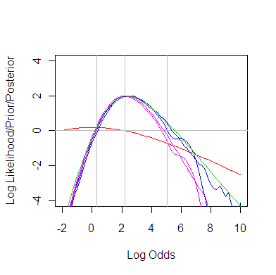
Keeping the log likelihood from the error prone numerical integration and the green one from the sometimes _wonky_ profiling on the plot does serve as fallible MCMC convergence diagnostics.
Now I really do believe plots like these should used in practice – especially by new novice Bayesians and recent grads – but how to help make that happen?
As a reviewer once said of something related (about 20 years ago) “it would not be of interest to a professional statistical audience” – but perhaps blogging about it is a good first step.
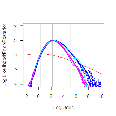
And I should use the multiple runs idea as in this plot
K?