John Kastellec points me to this blog by Ezra Klein criticizing the following graph from a recent Republican Party report:
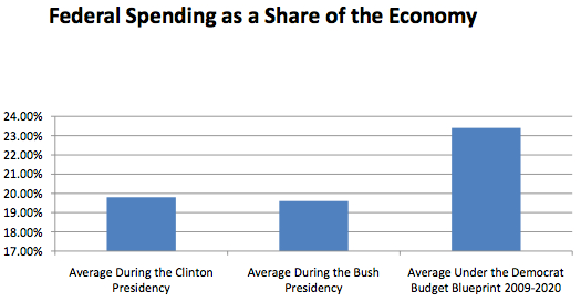
Klein (following Alexander Hart) slams the graph for not going all the way to zero on the y-axis, thus making the projected change seem bigger than it really is.
I agree with Klein and Hart that, if you’re gonna do a bar chart, you want the bars to go down to 0. On the other hand, a projected change from 19% to 23% is actually pretty big, and I don’t see the point of using a graphical display that hides it.
The solution: Ditch the bar graph entirely and replace it by a lineplot, in particular, a time series with year-by-year data. The time series would have several advantages:
1. Data are placed in context. You’d see every year, instead of discrete averages, and you’d get to see the changes in the context of year-to-year variation.
2. With the time series, you can use whatever y-axis works with the data. No need to go to zero.
P.S. I like the double-zeroes on the y-axis. How better to convey precision than to write “17.00%”? I assume this is just the default software option; I don’t see that anyone would write “17.00%” on purpose.
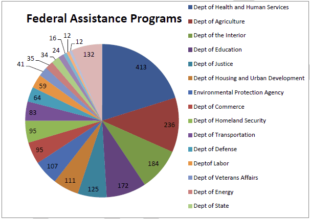
P.P.S. If you want to see a really ugly graph from that report, check out this one from page 12:
P.P.P.S. Feel free to link in comments to ugly graphs made by Democrats. I’m sure there are a lot of those too!
P.P.P.P.S. John found this lineplot of the data (from Kevin Drum) which indeed shows much more context, in no more space, than the yucky bar graphs.
I love that bar graph!! What I need to know is whether I as a reader can posit any other reason for showing this portion of the graph other than an attempt to sway the reader. I mean there is a possible objective reason, since they could have started at 18.00% or even 19.00%. And yet the whole thing looks like an attempt to give the impression of a doubling or tripling without drawing attention to the visual manipulation. The whole thing just feels untruthful…
I'd like to know… why is it OK to crop the y-axis to the relevant range when you present a scatter/line plot… but NOT ok to similarly crop the range on the bar-plot? I would think that it's just as potentially misleading as a scatter/line plot.
I agree, a line plot would be more useful, especially since you could better see the rate of change. I also think it is fair to point out that the bar graph compares averages from different chunks of time. The Clinton and Bush Administrations each lasted 8 years. The time span shown in the bar in the chart is eleven years, not 8. While I agree that bar charts should not be used to display time-series data, it seems even more dishonest when you include different time spans in the bars.
I also want to point out that this bar chart simply doesn't pass the smell test. (It stinks.)
One would expect government expenditures, as a percent of the economy, to grow during war-time.
Government spending EXPLODED under the Bush administration. The economy melted. End result — The massive deficits inherited by the current administration.
Without arguing about the ideological assumptions underlined in the bar graph, this graph doesn't make sense. Even most conservatives agree that spending increased dramatically under the Bush Administration. It seems reasonable, given the lack of economic growth combined with massive spending increases during the Bush years, that government spending should increase as a percent of the total economy.
Wow that pie chart is bad, just trying to tell which blue goes with which department makes me want to look at a table rather. Plus if you add up all the values on it you get 2050.
James:
These rules aren't ironclad, but the basic idea is that, in a bar chart, the area of each bar represents some mass or number of cases, hence you want to go all the way to zero. If you're interested in time comparisons, it makes much more sense to do a time series plot. Hence my comment on "thinking outside the box." There is no good reason to do a bar chart except that it's the default on somebody's graphing package.
Andy:
One advantage of a time series plot is that, by seeing every year's data, you'd get a batter sense of where the numbers are coming from in their average comparisons.
Steve:
The preferred alternative to the above pie chart is not a table, it's a dotplot.
These charts were made using Excel and the original Republican bar chart is the default scale. So it is misleading, but it's probably not clearly a deliberate attempt to disguise the truth.
To respond to Andy Choens, federal spending as a percentage of the economy may have gone up in the past two years because the economy has shrunk during that period.
The Republicans may even have a point here, just not the one they think they are making.
A lineplot would be superior but could still be deceptive. If the objective is solely to describe the size of spending relative to the (presumably static) size of the economy, it would work. But, given that the size of the economy changes over time (sidenote: the above plot is ambiguous about what measure of "economy" is used), a simple line plot may not be adequate to convey information about the deeper question of how spending has changed over time relative to a changing economy.
I might actually prefer a scatterplot of "economy" on the x-axis, federal spending on the y-axis, and points color-coded by Presidential administration. This loses the explicit time trend, but would presumably communicate more information.
Thomas:
I agree. The lineplot I'm suggesting is a starting point, not the end of the story.
"These charts were made using Excel and the original Republican bar chart is the default scale. So it is misleading, but it's probably not clearly a deliberate attempt to disguise the truth."
A good example of Hanlon's razor:
"Never attribute to malice that which is adequately explained by stupidity."
Speaking of the y-axis defaults, I also love the fact that gridlines are labeled "19.00%", "21.00%", etc. In case I had trouble working out what the value of that gridline halfway between 20% and 22% might be :-)
(Too many axis labels is a frequent graph peeve of mine)
In answer to James Waters' question: work on the visual psychology of graphs (by William Cleveland, for example) has shown that the graphical theories like that of the late Jacques Bertin are sound. Bertin characterised bars as "retinal variables", whose values are perceived by the viewer in proportion to their length. Dots, by contrast, are "positional variables", whose values are perceived according to their relation to each other and a nearby labeled scale line.
This lines up neatly with the theories of data types from S. S. Stevens, where a variable may be a category or a quantity, and if a quantity, may be a *ratio quantity* or an *interval quantity*. Bars are best when depicting ratio quantities, and dots when depicting interval quantities.
Since the difference between the quantities in that graph might have looked a little minor if the scale had gone all the way down to zero, that's a clue that the distinction between 19% and 23% is not supposed to be viewed as a ratio, but as an interval, and hence a bar is not appropriate, whether the whole is shown, from zero, or a part only is shown (which shows the ratio of the differences of spending of the various budgets from 17%, a meaningless and arbitrary concept).
Can you ever show a bar without the graph going to zero? Yes, when the bar itself doesn't go down to zero, but floats between two limits. The rule in any case is that you must show the whole bar, not a truncated part of it.
It just occurred to me that there may be another way in which the bar graph could be deceptive even if it started at zero–namely by focusing on the bar which represents government spending it could give the impression that that is what is increasing, rather than the economy shrinking. I don't know if that is in fact the case but it is an opportunity for visual fudging…