This article by Thomas Crag, at Copenhagenize, is marred by reliance on old data, but it’s so full of informative graphical displays — most of them not made by the author, I think — that it’s hard to pick just one. But here ya go. This figure shows fatalities (among cyclists) versus distance cycled, with a point for each year…unfortunately ending in way back in 1998, but still:
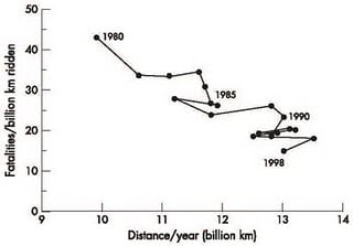 This is a good alternative to the more common choice for this sort of plot, which would be overlaying curves of fatalities vs time and distance cycled vs time.
The article also explicitly discusses the fact, previously discussed on this blog, that it’s misleading, to the point of being wrong in most contexts, to compare the safety of walking vs cycling vs driving by looking at the casualty or fatality rate per kilometer. Often, as in this article, the question of interest is something like, if more people switched from driving to cycling, how many more or fewer people would die? Obviously, if people give up their cars, they will travel a lot fewer kilometers! According to the article, in Denmark in 1992 (!), cycling was about 3x as dangerous per kilometer as driving, but was essentially equally safe per hour and somewhat safer per trip.
The article also points out that, since cycling is good for you — if you avoid death or serious injury in a crash! — it might make sense to look at overall mortality rather than just fatalities in crashes, and sure enough, a ten-year-old study finds that regular cyclists have a much lower death rate (adjusted for sex, smoking status, education, etc.) than non-cyclists. I’m rather suspicious about the ability to quantify this, since it seems virtually impossible to actually control for what you need to control for, but not having actually read the study in question, it’s hard to say for sure.
At any rate, check out the small-multiples plot, the other graphics (most of them pretty good), and the relatively sophisticated discussion of statistical principles…sophisticated to what one usually sees in the media, anyway. (I’m not sure if this is a reflection of higher standards of statistical literacy in the Netherlands vs here, or if that’s reading too much into it.)
Ho Ho… Copenhagen = Capital of Denmark – not the Netherlands :)
I'm not sure if this is a reflection of higher standards of statistical literacy in the Netherlands vs here
It seems more likely to reflect higher standards of statistical literacy in Denmark. ;)
Phil:
I like that sort of graph too. Gary and I used it in our 1991 article on Congress. But then we ended up moving back to more traditional time series plots. The 2-D trajectory plot is cool, but we found it only works well in special situations such as above (or in our 1991 paper) where time changes are gradual. I do think it can be a great plot but it's good to be aware of its limitations as well.
The visualization is good but, yet again, even in the PDF, the published quality of them is terrible. It looks like they generated the PDF from Word or put in low quality jpeg figures rather than EPS files (which would probably have been more compact for such simple figures than the space they saved compressing them to death).
D'oh!
Andreas, you may not believe this, but I know that well!
Andrew, of course that kind of plot won't work in a lot of situations. You could almost say that The Phillips Curve, or at least the fact that that plot doesn't work for inflation vs unemployment is famous. But there are times when it does work, and this cycling example is one of them.
Phil:
I agree. I did write "I like that sort of graph too." I just wanted to warn people about its difficulties.