Denis Cote sends the following, under the heading, “Some bad graphs for your enjoyment”:
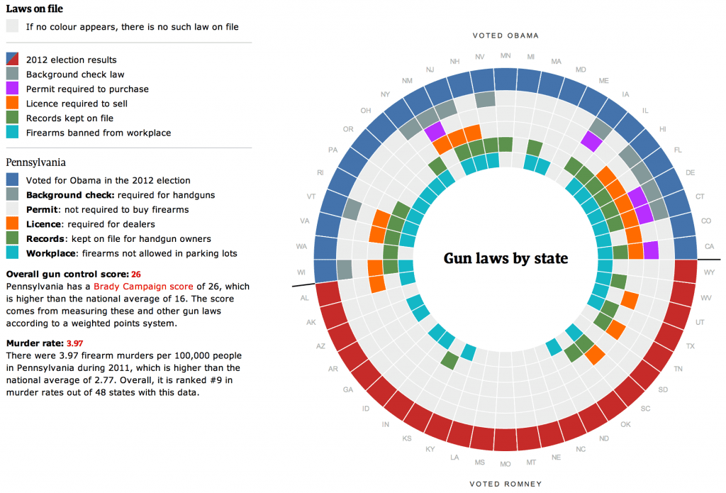
To start with, they don’t know how to spell “color.” Seriously, though, the graph is a mess. The circular display implies a circular or periodic structure that isn’t actually in the data, the cramped display requires the use of an otherwise-unnecessary color code that makes it difficult to find or make sense of the information, the alphabetical ordering (without even supplying state names, only abbreviations) makes it further difficult to find any patterns. It would be so much better, and even easier, to just display a set of small maps shading states on whether they have different laws. But that’s part of the problem—the clearer graph would also be easier to make! To get a distinctive graph, there needs to be some degree of difficulty.
The designers continue with these monstrosities:
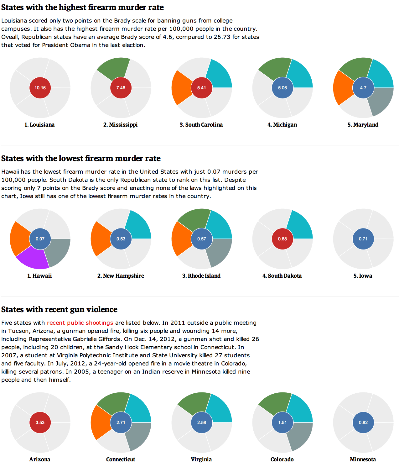
Here they decide to display only 5 states at a time so that it’s really hard to see any big picture, also they have these odd graphs that look like pie charts but are not, and again we see an unnecessary circular display that makes it harder to label the wedges, requiring the reader to go back and forth to a color legend to follow it.
What do I conclude from all this? Circles are pretty. Designers (and, I assume, newspaper readers) like circles, they’re so pretty and symmetric.
“Colour” is a perfectly valid spelling. “Color” is the American version of “Colour”.
Rilly?? I had no idear!!!
Another valid reason to go circular is the tighter packing density. 50 states horizontally or vertically is a lot of area.
You also forget a relevant fact that these are dynamic visualizations, not a static snapshot to be printed. Moving around with the mouse gets you some more.
I thought you were a bit unnecessarily harsh. In any case, a good rebuttal would be a counter-graph?
Rahul:
It’s just my view. I certainly wouldn’t put myself in the position of censoring such a graph, it’s just not the kind of thing I like. I find it hard to read and would much prefer a vertical list of the 50 states, which indeed could be done without taking up much space on the screen. I really don’t like the need to go back and forth between the colors and the labels. In addition I don’t think the solid red and blue colors for voting are appropriate; if you want to display voting patterns, I think it makes much more sense to treat these as continuous numbers.
I cannot argue against taste. But I’d really love to see your version of this for comparison. Something that takes same amount of screen space as this one.
Rahul:
My first shot would have 50 columns and at least 7 rows. I’d list the states in order of Obama vote share, and then the rows would indicate vote share (in gradual red-blue shading rather than sharp red and blue), then the 5 different categories of gun laws (I think I’d just do these in black and white), then the firearm murder rate (in shades of some color). Maybe also another row showing the murder rates just among whites, since this question arises sometimes. Maybe some other rows showing general crime rate by state. Each row could be labeled clearly on the left side of the graph, so no need to go back and forth to figure out which variable is which. The whole thing should take up no more room than the original graph.
That said, even though I prefer my idea, I recognize that people like circles. Circles are inherently pretty, I think there’s something appealing about the symmetry. And I recognize that it’s sometimes necessary to give up a bit in clarity to gain in visual appeal.
Canadians also use the British spelling ‘colour’ although they also may use ‘color’. According to the link below, ‘colour’ is the official spelling and is the more common of the two.
http://wiki.answers.com/Q/What_is_the_Canadian_way_of_spelling_color
For crying out loud, people, Andrew is a well-read 47-year-old man, he is perfectly aware that “colour” is how the Brits spell it.
I usually agree with you. But I kind of like the graphs, especially the first one. I think it quickly and vividly makes the general point that states which leaned toward Obama are more likely to have gun control laws on the books. And I liked the consistent color coding of the types of laws. I don’t think “pie” when I see circles in these contexts so I didn’t find that part confusing. There may be a more efficient way to provide some of this information, but what is here worked for me. And yes, I am one of those who like pretty colored circles. Perhaps that is a character flaw!
I don’t understand the legend entry for Pennsylvania in the first chart. The legend appears to suggest Pennsylvania has all the listed forms of gun control except permits, while the graph itself suggests Pennaylvania only has a ban on guns at the workplace. Which is it?
I actually thought this was an interesting way of showing that the states that voted for Obama have more gun control laws, although I would agree there are clearer and better ways to make the point.
Go to the original site. Seems fine there.
Pingback: Minus several million for good thinking | Stats Chat
Pingback: Posterior Samples « Sam Clifford
It’s our language Andrew. We leased it to the USA on a 250 year lease, which will expire soon…
…and, needless to say, we do not wish to renew.
Pingback: Ugly [And Mis-leading on Gun Control] « Another Word For It
Pingback: Is Using Prezi for Scientific Presentations Worth it? | Climate Change Ecology