Despite the title, this post is mostly not about economics or even politics but rather about the central role of comparisons in statistics and statistical graphics.
It started when someone pointed me to this article in which Megan McArdle points out the misleadingness of a graph that seems to show a bimodal income distribution but only by combining cells in the tail:
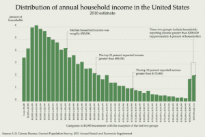
McArdle makes a good point: of course, if you spread the histogram along a uniform scale (or, for that matter, a log scale), you don’t see that bump at the high end. McArdle reproduces some Census charts showing income stability over the past few decades:
Before I had a chance to chance to write about this, I noticed that Mark Palko did the job for me. Palko writes:
To the extent that statistics includes data visualization, this is definitely bad statistics. When trying to depict trends and relationships, you generally want to get as much of the pertinent information as possible into the same graph. You don’t want to force the reader to jump around the page trying to estimate slopes and compare magnitudes, nor do you want to take a few snapshots when you can easily picture all the data.
I don’t think this should be taken as a criticism of McArdle—after all, she was moving the ball forward by presenting some relevant numbers.
Rather, Palko is raising a point—statistics is about comparison—which I think is so important and not well enough understood. It starts with intro stat textbooks that yammer on about the sampling distribution of the sample mean, then continues with more advanced books (including mine! sorry!) that are all about estimating “theta” without saying why anyone would want to do so. The econometricians are better in this respect in that they keep their eye on the ball of estimating causal effects, which are inherently comparisons.
When it comes to statistical graphics, the importance of comparisons was emphasized by Bill Cleveland in his classic book, The Elements of Graphing Data, as well as by Tukey. And I’ve argued for the connection between exploratory data analysis, statistical comparison, and Bayesian model checking, in an attempt to place the principles of statistical graphics in a larger theoretical framework. And then there’s Lee Wilkinson, Hadley Wickham, and others. So lots of people have been thinking about this, but it hasn’t been fully integrated into how people think about statistics more generally.
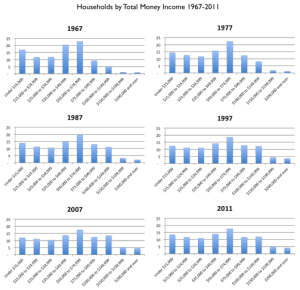
Anyway, Palko used the same Census data source as McArdle to make the following graphs:
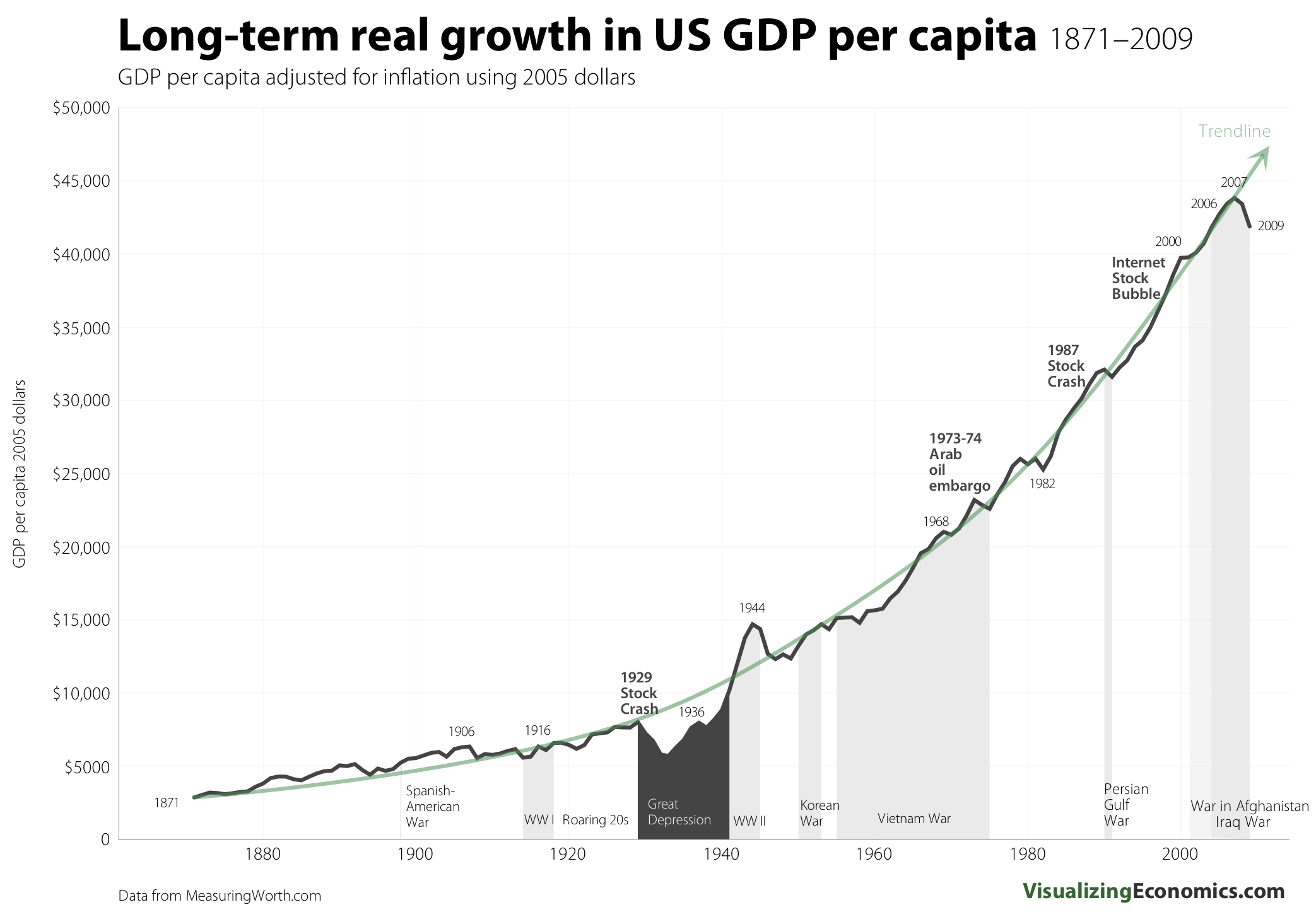
Beyond all this, there’s the challenge of reconciling these income data with other things we’ve been hearing about economic trends. For example, I recently read somewhere that Americans are three times richer than they were a few decades ago. I can’t remember whether this was coming from a liberal saying why we can afford more social programs or a conservative who was saying that we should stop worrying about the poverty line, but in any case a quick web search indeed shows something like a doubling of inflation-adjusted GDP since 1970. So, from that perspective, a flattening of incomes doesn’t look so good. I guess a larger portion of Americans are in the labor force than were in 1970, also households are smaller than average. So a slight and steady decline on one scale (individual incomes) corresponds to a solid increase on another scale (per-capita GDP) and a decrease on another (share of income going to the middle class).
I’m not making any claims here. I’ll leave the macro to the Mankiws and Krugmans of the world. As a statistician and political scientist, it’s good to have the luxury to just explore and understand, rather than trying to feel the need to make some political point, whether it be that Americans are richer than ever or that we’re going to hell in a hand basket (or maybe both!).
P.S. Palko’s blog (with Joseph Delaney) has lots of good stuff. I hope that some people are reading it directly and not just looking at the entries that I occasionally link to.
Pingback: Why people are angry | Public Management Research
> I guess a larger portion of Americans are in the labor force than were in 1970
http://research.stlouisfed.org/fred2/categories/32449 At least in the short run: men, no; women, yes; people with bachelors aged >25, no.
Men: http://research.stlouisfed.org/fred2/series/LNS11300001?cid=32449
Women: http://research.stlouisfed.org/fred2/series/LNS11300002?cid=32449
>25yo: http://research.stlouisfed.org/fred2/series/LNS11327662?cid=32449
For these series, FRED seems to only go back to 1970, so I guess for a real answer someone will have to find an economics paper or dig through the frightening census website.
In a similar vein:
* The unit here is the household, so when couples get divorced, income goes down.
* The data have been adjusted for inflation with the CPI, which is crude, at best.
* As noted by gwern, you want to take care of the people who weren’t working in 1967. Suppose someone with low skill is now working. Is that a decrease in median income, or did we count the “zeros” for people not working.
* Adjust for age as Palko says.
More on the first two at http://www.minneapolisfed.org/publications_papers/pub_display.cfm?id=4049
Andrew: “Rather, Palko is raising a point—statistics is about comparison—which I think is so important and not well enough understood.”
Yes! I long for a back-to-basics movement. I’ve tried to call it naked causal inference, or raw causal inference. It’s modernist, brutal, and honest.
I think I’ve comment on this before here, but it seems worth noting again.
1) To some extent, it is a sad thing that so much of statistical graphics is still:
a) 2-D (not 3d)
b) static (not dynamic, or even better, interactive)
c) and sometimes limited to greyscale or even blank-and-white (rather than colr)
2) That mostly made sense 30 years ago, when engineering workstations cost $10s of thousands, bitmap displays of useful resolution were rare, color printers were expensive, and 3D graphics was really expensive.
3) But I’d suggest a good exercise might be to think about the enhancements available by changing any of a)-c).
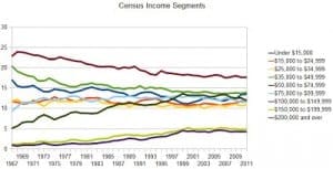
For example, in the second figure above, at first look, I’d much rather have a 2D display that looks like one of the small charts, but with a slider bar by year. Human visual systems notice differences well. Then, one might have a drill-down for other attributes. Very often, replicated small graphs could be replaced by a slider that selects the graph.
4) As another example, Jurassic Park had an amusing scene, in which humans preferred not to be lunch, and the girl navigates in a 3D display, like using a data helicopter. Although not shown there, a related example was more relevant to Andrew’s topics. There was a map of the USA, and per capita income per year, and per capita income was shown as a vertical column. The map could be titled or rotated as desired, and a slider controlled the year. By sliding from 1930-onward, interesting effects became quickly obvious. Generally, nearby states tended to rise and fall together, but there was a period when Kansas and South Dakota shot up relative to nearby states, then back down. Why? Minuteman missile site construction.
There are very few situations where 3D adds more value than distraction.
I am glad Rahul is absolutely certain of his strong opinion … but sadly, unsupported opinions by anonymous folks don’t tend to carry much weight. Maybe Rahul will explain his experience with 3D visualizations, which worked, which didn’t, and why, to be so sure.
I think Palko’s plots are bad too!
Blame me for reproducing them in such small formats.
No, no, that’s not it, before I complained I went and looked at his post. Lots of intersecting colored lines, some of them with colors that are hard to distinguish from each other…I just don’t find this very helpful in visualizing how things are changing with time. (Also, no y-axis labels!) I might prefer McArdle’s small multiples, done with lines rather than bars, and with different years overlaid on each other.
I’ll second the comment about no y-axis labels. It’s surprisingly common for graphs not to say what they’re measuring. “Census Income Segments” is a bad title. I’d suggest “Percent of Households by Money Income”. It’s important that it’s households, not individuals, and money income, not income including fringe benefits.
I agree.
In addition to what you say, the lines on the legend are not in the same vertical order as the lines in the chart. On Palko’s first chart the top line is, I’m guessing, the $50,000-74,999 line, but that’s in the middle of the legend. Wait-maybe the top line is really the “Under $15,000” one? It’s hard to tell…the colors are similar…
To aid interpretation it helps enormously to have the legend in the same visual order as the chart. “Natural” ordering of the categories makes sense in tables, but not in charts.
Of course when line cross, one has to make a call as to which should come first in the legend. The convention is to use the right-hand end of the line for that.
PS – I forgot to say, I tried leaving this comment at Palko’s blog, but there, for some reason, my comments just vanish when I push the “preview” or “submit” button.
We don’t moderate our comments so they should go up immediately.
PPS. Howto: To re-order the legend in Open/LibreOffice charts, one right-clicks a line (series) in the chart and chooses “bring forward” or “send backward” from “Arrangement” in the right-click menu.
Well he did say that he was using OpenOffice. I use it all the time but it just has the normal (lousy?) spreadsheet graphics. Oh for R!
I disagree with “I don’t think this should be taken as a criticism of McArdle…”
McArdle is a paid propagandist for the wealthy. Her entire career is to make people more comfortable with rich people having more money and power each year than they previously had. This is not a political opinion – it’s simply a factual assessment of her career trajectory.
So her presenting data that shows increasing inequality (even in her graphs the richest two groups are obviously four times bigger in the more recent data) but in a certain way that obscures what the data is saying is just her doing her job.
The other way to interpret it is that it’s just coincidental that she chose a bad graph that was bad in the exact way that would advance the cause she’s paid to advance. But I’d rather not live in a world where people who know what she’s doing and who are smart enough to dissect it for the public will then obscure McArdle’s clear intent so as to seem unbiased.
Like it or not, saying that McArdle is just bad at graph-making instead of intentionally deceitful is a political opinion, and one that makes it harder for people to understand the nature of the work that she’s doing. At a minimum, you don’t know why she made a bad graph that was bad in the exact way she needed it to be to advance the cause she’s paid to advance, but to counterintuitively rule out anything besides clumsiness on her part *is* a political point. It’s taking sides. If you want to be neutral, then neutrally point out what she did to get famous and to get various platforms she’s had, or just focus on the graphs.
Alex: It is a political opinion, not a factual assessment. To start with “her entire career is to make people more comfortable…” suggests some level of motivations by her varied employers, including several at least middle-of-the-road if not actually leftward leaning, that you couldn’t possibly know without reading their internal memos. When you want to make a factual assessment, how about using facts?
>McArdle is a paid propagandist for the wealthy. Her entire career is to make people more comfortable with rich people having more money and power each year than they previously had. This is not a political opinion – it’s simply a factual assessment of her career trajectory.
Where’s the “Like” button?
There is a pretty big debate about this based on methodology as well between Rich Burkhauser and Thomas Piketty and Emmanuel Saez.
Check this out for a better debate and nuanced view:
http://www.aei-ideas.org/2012/04/piketty-and-saez-vs-burkhauser-and-cornell-whos-right-on-income-inequality-and-stagnation/
Come now, let’s not cloud by debating it. It’s much easier to dismiss people you disagree with as “paid propagandists”.
Haha well said. But I have seen Rich present this paper he is really passionate about it. Not the best site to use (AEI) I know but it is some good food for thought!
Everyone knows that an unpaid propagandist is automatically more trustworthy than a paid one.
Why waste one’s time debating propagandists? McArdle has made her choices and is who she is. She blew whatever intellectual credibility she might have had long ago.
A humble suggestion is to include larger graphs/photos, I couldn’t read anything in the small photos. And without the graphs the article is hard to follow.
Larger images are all at the links.