Jonathan Robinson writes:
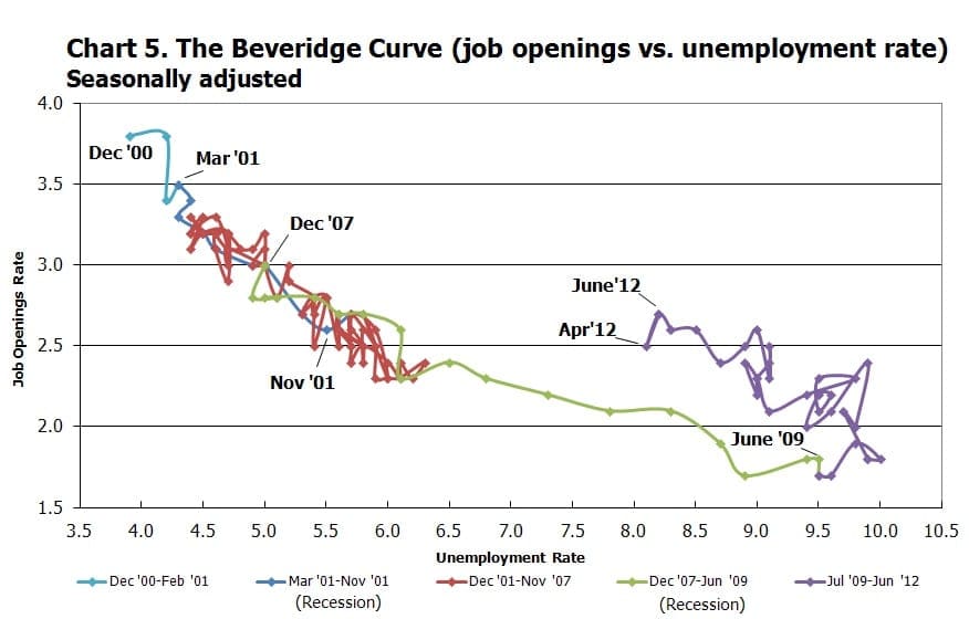
I’m a survey researcher who mostly does political work, but I also have a strong interest in economics. I have a question about this graph you commonly see in the economics literature. It is of a concept called the Beveridge Curve [recently in the newspaper here]. It is one of the more interesting concepts in labor economics, relating the vacancy rate in jobs to the unemployment rate. A good primer is here.
However, despite being one of the more interesting concepts in economics, the way it is displayed visually is nothing short of atrocious:
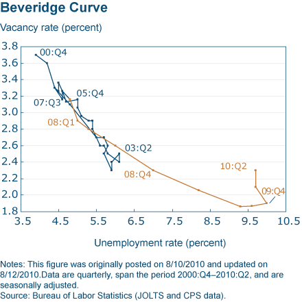
These graphs are nothing short of unreadable and pretty much the standard (Brad Delong has linked to this graph above and it can appear like this in publication as well). I’ve only really seen one representation of the curve that is more clear than this and it is at this link:
Do you have any ideas of any way of making these graphs more readable? I like the second Cleveland Fed graph, but I hardly think its ideal, as it ignores close to 50% of the data.

I don’t actually think these graphs are so bad—I assume that they’re readable to the specialists who matter—so I have no particular suggestions. But I’ll throw this out there for the rest of you.
Exploiting transparency / alpha in plotting might do these a lot of good, especially where the series intersects.
Something like this in R:
http://yihui.name/en/2008/09/to-see-a-circle-in-a-pile-of-sand/
Another option might be to try leaving out the time series aspect. Convert it to a scatter plot. If at all you want, use a smooth color gradient to map the time to. Perhaps a different color for each recession. You could also play with point sizes to do the same thing.
I have written about similar graphs in this post. They are used in the media sometimes, indeed:
http://www.thefunctionalart.com/2012/09/in-praise-of-connected-scatter-plots.html
Alberto:
Interesting discussion. We used those graphs in our 1990 paper on redistricting. At the time, I liked the plots, but in retrospect I wonder if simple time series would’ve been clearer.
I’ve used them in situations in which the line is not too complicated, when the relationship between the two variables is almost linear, like in the GDP vs. Inequality in Brazil graph I show in the post. I prefer the connected scatter plot in these very specific cases because you don’t need to jump back and forth between two time series graph.
In other cases, I prefer a couple of stacked time series, as you say.
I find that using motion charts is helpful. Here’s a plot I created that shows the beveridge curve by industry and allows the viewer to track the curve out over time. (Flash is required) https://sites.google.com/site/econphdmark/labor-in-motion
I’ve never been that bothered by them, but the alpha transparency suggestion is a good one. I want to do more of that in recent versions of Excel, but I never have the time.
They could certainly use fewer labels on the axes, though. As I always say, who is in need of a label to tell them that the tick mark between 60 and 70 is 65?
Yeah, I actually think that axis labels at 0, 50, and 100 would be enough here.
The most important question to ask of any graph is what it is designed to show and to what audience. What’s the story? Who are the readers? Only then you can ask if it is successful or not.
I can only guess at what the Beveridge curve is meant to show and to whom, but the last static version shows most clearly (a) the expected overall negative relation between job vacancy and unemployment, (b) different regimes corresponding to various recessions, and (c) the loops within a given recession.
The four recessions highlighted here are ordered along a main diagonal opposite to a constant trade-off between job vacancy and unemployment. That seems to be a story worth telling, but
it would take a different graphic format to tell it for popular vs. technical audiences.
This whole discussion mirrors that surrounding the Phillips curve, http://en.wikipedia.org/wiki/Phillips_curve, another time-series plot of two economic variables (inflation and unemployment). This led to a great deal of important macro economic theory and quite a few Nobel prizes. But AFAICS, it never led to a better plot.
Was Jonathan Robinson bestowing faint praise when he said that the Beveridge curve is “one of the more interesting concepts in labor economics?” (Some might claim that there are no genuinely interesting concepts in economics, and so this would qualify more exactly as one of the least uninteresting ones.) While I’d never heard of the curve before, and am entirely unacquainted with the entire subject of Labor Economics, it seems to me to be tautological, in that it is two different ways of looking at a single concept: a failure to clear in the labor market. If the two things aren’t exactly correlated (and naively I’d expect them to be) it would be because of imperfections in how they are measured, which would be caused by, among other things, technological changes in the needs of the labor force, and simple sampling error.