This post is by Phil Price.
Perhaps prompted by the ALS Ice Bucket Challenge, this infographic has been making the rounds:
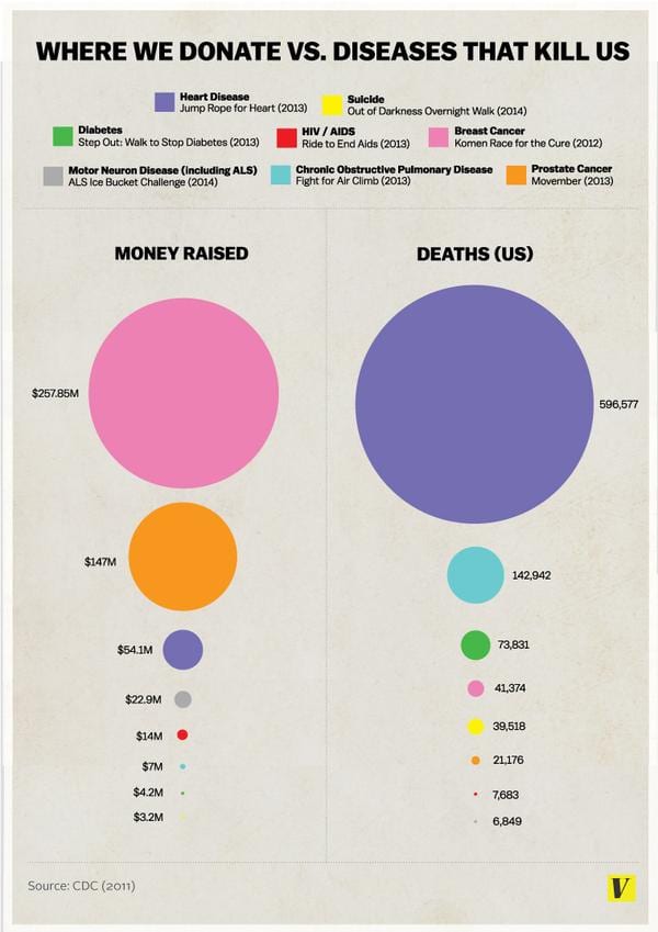
I think this is one of the worst I have ever seen. I don’t know where it came from, so I can’t give credit/blame where it’s due.
Let’s put aside the numbers themselves – I haven’t checked them, for one thing, and I’d also say that for this comparison one would be most interested in (government money plus donations) rather than just donations — and just look at this as an information display. What are some things I don’t like about it? Jeez, I hardly know where to begin.
1. It takes a lot of work to figure it out. (a) You have to realize that each color is associated with a different cause — my initial thought was that the top circles represent deaths and dollars for the first cause, the second circles are for the second cause, etc. (b) Even once you’ve realized what is being displayed, and how, you pretty much have to go disease by disease to see what is going on; there’s no way to grok the whole pattern at once. (b) Other than pink for breast cancer and maybe red for AIDS none of the color mappings are standardized in any sense, so you have to keep referring back to the legend at the top. (c) It’s not obvious (and I still don’t know) if the amount of “money raised” for a given cause refers only to the specific fundraising vehicle mentioned in the legend for each disease. It’s hard to believe they would do it that way, but maybe they do.
2. Good luck if you’re colorblind.
3. Maybe I buried the lede by putting this last: did you catch the fact that the area of the circle isn’t the relevant parameter? Take a look at the top two circles on the left. The upper one should be less than twice the size of the second one. It looks like they made the diameter of the circle proportional to the quantity, rather than the area; a classic way to mislead with a graphic.
At a bare minimum, this graphic could be improved by (a) fixing the terrible mistake with the sizes of the circles, (b) putting both columns in the same order (that is, first row is one disease, second row is another, etc)., (c) taking advantage of the new ordering to label each row so you don’t need the legend. This would also make it much easier to see the point the display is supposed to make.
As a professional data analyst I’d rather just see a scatterplot of money vs deaths, but I know a lot of people don’t understand scatterplots. I can see the value of using circle sizes for a general audience. But I can’t see how anyone could like this graphic. Yet three of my friends (so far) have posted it on Facebook, with nary a criticism of the display.
[Note added the next day:
The graphic is even worse than I thought. As several people have pointed out, my suspicion is true: the numbers do not show the total donations to fight the diseases listed, they show only the donations to a single organization. For instance, according to the legend the pink color represents donations to fight breast cancer, but the number is not for breast cancer as a whole, it’s only for Komen Race for the Cure.
If they think people are interested in contributions to only a single charity in each category — which seems strange, but let’s assume that’s what they want and just look at the display — then they need a title that is much less ambiguous, and the labels need to emphasize the charity and not the disease.]
This post is by Phil Price.
Looks to be from vox.com, which in my totally unrepresentative experience (I don’t follow the site, just click over occasionally) has really not distinguished itself with good design of its infographics.
Vox lost me the other day with a 3-d pie chart. Ugh.
Talking of bad pie charts, anyone else noticed this really bad one offered up by our host’s own “Institute for Data Science and Engineering”? See it at http://idse.columbia.edu/foundations-of-data-science though it does require some Adobe plugin to load, as all the best pie charts should.
Yep. It’s from Vox. “The truth about the Ice Bucket Challenge: Viral memes shouldn’t dictate our charitable giving” by Julia Belluz (@juliaoftoronto) on August 20, 2014.
URL: http://www.vox.com/2014/8/20/6040435/als-ice-bucket-challenge-and-why-we-give-to-charity-donate
Isn’t the biggest issue the fact that only a single charity for each disease is chosen? I get that it’s used as a proxy, but some of these charities have been criticized for bad management (e.g., Susan G Koman).
Yeah, as I said, “It’s not obvious (and I still don’t know) if the amount of “money raised” for a given cause refers only to the specific fundraising vehicle mentioned in the legend for each disease. It’s hard to believe they would do it that way, but maybe they do.”
It seems that this figure tried to explore the ideas of this famous infographics
http://thinkbynumbers.org/wp-content/uploads/2008/03/594-1.jpg
I’m just playing devil’s advocate here, but do you think the message of the visualisation is communicated to the reader easily enough despite these issues? I agree that this is a bad graphic, but I’m not certain the quality of the graphic gets in the way of what it’s trying to say.
I am all for getting visualisations as accurate as possible etc., but often we forget that the message is actually the point of the graphic – in this case that our donations to various causes are out of step with how important those causes actually are. Sure, there are about a million ways for this to be better, but they don’t seem to be intentionally misleading people with the presentation.
I agree with Jegar here — it seems like the immediate point (perhaps our funding choices are incommensurate with the magnitude of those problems) is well-made.. While a scatter plot might be more precise, this discrepancy isn’t really immediate from that plot — if a casual observer just looks at the scatter plot, it seems like the main conclusion is ‘We spend a lot of breast cancer research’.. the idea of comparing the points to the y = x line isn’t immediately obvious in the way that the comparison of the colors is here.
My feeling is this isn’t all that bad.
I couldn’t disagree more. Well, maybe I could. But I disagree a heckuva lot.
If all you’re trying to convey is that donations are wildly disproportionate to the number of deaths, you can just say it. If you want to have a pretty graphic to go along with it, fine, show a nice painting or a picture of a kitten or whatever.
This graphic does not just try to make the point that donations are not proportional to deaths, it purports it illustrate the numbers. It is about the numbers. And it is both difficult to read and extremely misleading. For example, according to the graphic about 30x as much money is donated for breast cancer research as for heart disease research, but in fact the ratio is 6, not 30.
But even if the corrected the sizes of the circles I would say this graphic does a very poor job at conveying the relationship (or lack of relationship) between the numbers.
Actually it clearly makes the point that donations for specific diseases are out of sync with the number of deaths from those diseases… and in particular that the amount donated for breast cancer is considerably out of sync with the relative number of deaths from breast cancer.
I believe this would be obvious to anyone with even a minimal level of numerical literacy, within just a few seconds of looking at the chart.
I agree with you however that there are two very significant problems: 1) Reliance on colors means that color-blind people will absolutely be unable to get the message. 2) By confusing diameter with area, the author has wildly distorted the message.
I understand your point, and that of whoever made this…however how accurate is that point? That is important, and at the core of the concerns raised.
Do we know that the donations are as out of synch with what kills us as the graphic portrays?
It’s hard to tell with so many inaccuracies. It only represents donations to one event/organization. All the other donations/events/government funding/etc could change the graphic quite a lot.
What about donations and deaths outside the US? A cure for a disease impacts the whole world (hopefully not just those who can afford the cure), it’s not a national thing, so donations and deaths should be counted worldwide to be accurate
It only represents what kills us. There’s more to the story, many of these diseases destroy lives without actually killing you. So it says 41,374 people died from breast cancer in 2011 (I believe that’s what it’s saying, there is no real list of references or sources other than CDC 2011, and it doesn’t clearly indicate which data came from the CDC or what report when), what if 20 million people get it every year and many of those have life destroying consequences and most of the others deal with unimaginable pain, sickness, and loss on their way to recovery? That would certainly justify the donations.
I’m no pro statistician, just a guy who likes data and info-graphics, but I have to agree this is poorly done and potentially misleading.
Exactly. This graphic only compares certain fundraising events and even then it’s not apples to apples and not well explained. For example, Movember is an entire month to raise money while Jump Rope for Heart is a one day event (granted KIDS have a set period of time to raise donations… but they’re KIDS.) Also Komen Race for the Cure is several different events. Is this ALL the events? The 5k? The 3-Day? It’s a skewed graphic to prove a point that’s a red herring. When you look at donations over the course of the year, the graphic falls apart. According to Charity Navigator:
American Heart Association earned $520,544,964 in total contributions in their 3/13 report.
Komen – $235,266,150 (6/13).
American Diabetes Association – $175,209,000 (12/12 Not getting a high rating from Charity Navigator).
ALSA – $23,517,487 (1/14).
And so we are “donating appropriately,” if there is such a thing. The American Lung Association is an outlier but that seems to be organizational (as one other person mentioned) as they reported $0 fundraising – see their rating. One could argue (and some have) that part of the reason breast cancer numbers are down is because the awareness campaigns have been so effective in helping women detect cancer early. Self-exams, mammograms, being aware of family history, genetic testing. So perhaps the funding has made a difference in survival rates. A better indicator might be diagnoses.
But what galls me most about this graphic is that is attempts to qualify suffering. It comes about in a backlash to an extremely successful social media generated (see not PR generated by the charity) fundraiser for basically an orphan disease that KILLS everyone that has it. They are also “us.” ALSA got lucky this year. They’ll likely never get lucky like this again. It’s just a shame people seem to begrudge them this success. And worse, people keep spreading false information about funding which just doesn’t pan out.
Phil:
I agree the graph is bad but I hardly think it’s one of the worst ever. We’ve discussed much much worse examples on this blog, various times over the years.
I don’t think there is such a thing as a “much much worse” example. Not even “much worse.” Can you remind me what you’re talking about?
Phil:
Search this blog for worst graph and you’ll see a bunch!
Yeah, the one I posted myself in 2011 is worse than this. But a few of the ones that come up when I do that search are not as bad as this one.
Whatever. I guess I won’t choose to fight to my last breath on Mount Worst-I-Have-Seen, but this is still very very bad.
When I saw this, the first thing I though was: this needed to be a scatter plot! So that’s what I did here: http://i.imgur.com/M7FfhbC.png
I think the fine folks at Vox think this is not so much an accuracy issue as it is a design issue. So despite being told it’s misleading, they’ve yet to fix it.
I am pretty sure I saw your scatterplot on reddit before seeing the infographic that this post is about.
I like the scatterplot, but because the data, in both dimensions, consists of some points that are small, and a few that are very big, the linear scales don’t work well for me. I found that changing to a log scale spread them out more nicely, and also allowed a neat display of the ratio between dollars donated and deaths. http://i.imgur.com/tb3DU3B.png
If you’re interested in both government and charitable funding of diseases as compared to their incidence, I’m part of a project which pulls those figures together called Scienceogram. The health page on our website and a recent blog post about the #nomakeupselfie trend show this issue clearly with UK funding statistics.
The other thing which this Vox infographic doesn’t show which the per capita statistics we use on Scienceogram does is that, as well as the lack of proportionality with incidence or deadliness, the absolute magnitude of these research investments is very small. Even ‘well-funded’ cancer only receives £5 per person per year in government research money in the UK, in spite of being responsible for nearly a third of deaths.
Check out scienceogram.org for more!
In the U.S., about $100 billion has been spent on breast cancer research in the past few decades, with very little to show in terms of increased survival. Of course that next $1 billion could make all the difference, it’s hard to know. At least, hard for me to know.
I think we should probably spend more on prevention and health care even if, realistically, that means spending less in some research areas. Bizarrely, we (in the U.S.) actually subsidize things that are bad for people, like corn syrup, and fried foods. Perhaps the UK isn’t as bad about those things.
My feelings on health research spending are very weak because I don’t really know much about it. Whereas I am very confident in saying that graphic sucks.
Your $100bn figure is probably about right (I don’t know the US numbers specifically, but it’s about 100bn inflation-adjusted British pounds spent globally since 1971), but your assertion that nothing has come from it certainly isn’t! To lift some text from the ‘War on Cancer’ box on this page of the Scienceogram site:
Adding a year of life expectancy for £100 per person is significantly less than the marginal improvement you could expect from increased spending on healthcare. In the UK, a new drug can be approved if it costs £20–30,000 per quality-adjusted year of life added, which is 200 times more expensive than research!
I hope that makes you a bit more optimistic about the return on research spending.
Well, I may stand corrected, although I’m not sure yet.
My impression (perhaps wrong) is that survival time since diagnosis has gone up for most cancers but that that is largely due to earlier diagnosis, which increases that number in two ways:
(1) consider two identical patients who get cancer on the same day and die on the same day, but patient A is diagnosed a year earlier than patient B. Patient A has more years since diagnosis but the stat is misleading.
(2) consider two other patients (C and D) who get ‘the same’ cancer, but C is diagnosed earlier and therefore starts getting treated earlier. C is also treated with modern methods, while D is treated with the same methods used 20 years ago. In this scenario, even if the new treatment and the old treatment are equally effective, C’s life will be extended compared to D (because C started getting treated earlier). This effect should, and does, show up in stats on surviving with cancer, but in this hypothetical scenario this occurs not because the treatment is any better, but because the diagnosis was earlier.
I have definitely seen articles that claim that the above effects are what is really going on, and that for most cancers the life extension due to improved treatment is very short, of the order of months, not years. Whether those articles have been correct, though, I don’t know. I am no expert on this stuff. But those claims have influenced my views, such that I am a big fan of improved access to health care and diagnostics, more so than research. If I have been misled and in fact treatments are becoming much more effective, that’s great, let’s keep up the funding for more research. I really don’t know. I do know that I’ve learned to be careful with this whole issue, because so many numbers are not what they seem at first. Anyway, you may be right.
All of that said, even if you are right I think your cost numbers are a bit fishy. The cost of those extra years of life isn’t just 100 pounds each for research to come up with better treatment, it’s the 100 pounds for research PLUS the added cost of the treatment itself (compared to whatever would have been done if the research hadn’t taken place). I suspect the latter cost is much much higher than the former. We are not really getting an extra year of expected life per person for 100 pounds. Of course, it could cost orders of magnitude more than that and still be easily worth the cost. Again, I don’t know.
So…I hope you will forgive me my skepticism. I accept that you might be right about the research cost having been easily worth it, maybe I’d go so far as to say that you’re probably right, but I am withholding final judgment.
You can go to the SEER website and see that number of deaths per year from many cancers has been totally FLAT for 20 or 30 years. The diagnosis has been going up though. The best explanation is that earlier diagnosis is what causes the so called “life extension” (5 year survival since diagnosis).
I recently blogged an example related to skin cancers:
http://models.street-artists.org/2014/07/30/sunblock-skin-cancer-evidence-based-medicine-and-the-surgeon-general/
I remember looking at a few other cancers and they had the same type of stats.
There ARE a few cancers that have had major increases in quality of treatment. I think lymphoma is a
good example.
Of course, reducing the use of cigarettes has probably been the single biggest factor to reduced cancer incidences (my guess, not based on data).
I’m with you Phil, I am not so convinced we are doing a good job with health research dollars. And I say this even though (or maybe especially because) my wife is a professional biologist and a researcher at a medical school. There are big problems with the way medical research money is allocated (with big pools of money going only to MD or MD/PhDs who *on average* have much much less research savvy than PhD biologists in my experience), big pools of money allocated to things that affect only tiny fractions of the population, and there’s plenty of room to argue for the problem of regulatory capture (where professors are the ones who decide how to allocate money… to professors).
The problems you mention are real, and you sound like you’re more informed than average. you may not feel like you’re terribly well informed, say by comparison with air-quality research etc but those problems you discuss are real.
Here’s the site for hodgkin lymphoma, look at the expanded graph under “trends in rates” down the page to see examples:
http://seer.cancer.gov/statfacts/html/hodg.html
and here’s lung and bronchus, which shows a clear increase followed by decline that is probably matched by smoking incidence increase and decline 40 years earlier.
http://seer.cancer.gov/statfacts/html/lungb.html
These statistics are certainly very tricky to get right, and most of the caveats you both mention are serious confounders! However, even taking these into account, medical research seems to come out very profitable.
You’re right to say that the cost of deploying treatments musn’t be forgotten having developed them, but actually this cost appears to be negative! That’s because, whilst pills cost money, there are economic and social benefits to improved survival and quality of life.
It’s also true that we need to be careful about attributing population-level changes in life expectancy to research when lifestyle factors are changing at the same time. The best way to ameliorate this issue is to take a bottom-up approach, looking at the benefits of the many available individual treatments on a per-patient level, and then multiplying up by the number of patients using those treatments. This means that any observed benefits are (almost) unambiguously due to those interventions.
Both of these approaches were taken by a recent paper looking at UK cancer research, and they find a substantial positive return.
The other thing they found is that smoking cessation is indeed the single largest contributor to cancer survival!
I just want to thank you for that wonderful use of the word grok.
I’m sorry the word had such a short life and has fallen out of use. Sometimes it’s le mot juste.
The column on the right bothered me. The top circle for heart disease should be about twice as big as the next circle for pulmonary disease. Yet it’s obviously way bigger than that. If they’re going by diameters, the area of the larger circle would be about 16 times as big, which looks to be about what they did. Very misleading.
Also very weird that even though the figures seem to come from here (http://www.cdc.gov/nchs/fastats/leading-causes-of-death.htm), they leave out so many leading causes of death — cancer, stroke, Alzheimer’s, accidents.
I would be more interested in cumulative amount of funding and what effect this has had on death rates (or any other measure of successful application). Thus far, I know of only one unequivocally successful treatment developed since the 1980s: Viagra. This was discovered by accident in the early 1990s by Pfizer researchers.
No mention Stroke 129k, Accident 126k, Alzheimers 85k, Influenza 54k, Kidney 46k, but do applaud including suicide which often seems to get left out in these sort of discussions.
American Heart $618M http://www.forbes.com/companies/american-heart-association/ … focusing on just one event is more than a little misleading.
And agree, good luck interpreting this if you are colorblind.
The original infographic comes from here: http://www.vox.com/2014/8/20/6040435/als-ice-bucket-challenge-and-why-we-give-to-charity-donate
I think this is an example of a data display where you actually want to force the reader/viewer to do some work. Yes, you have to work down the graphic, cross-reference colours, and look them up in the opposite column. The process of doing so is what drives the message home.
The scatterplot, on the other hand, to me gives little information even after interrogation. Sucide, MND, and diabetes are all clustered down there in the left hand corner, it’s not immediately obvious that (say) suicide is far more lethal than the donations would suggest. Nor is it clear where the “rational line” should be drawn, where as with the circles it’s obvious what one being bigger than the other means.
I agree with some of this. This is why I made the distinction between a plot that is good for a data analyst and one that is good for hoi polloi. Most people do not know how to read a scatterplot and would have to struggle with it, and find the size of the circles easier to interpret. I think if they fix the size of the circles and reorder them, they’d be OK.
The fact that the areas of the circles are not proportional to the quantities they represent is unforgivable.
Why should funding line up with deaths in any case? Shouldn’t funding line up with the prospects for incremental improvement? Especially since everyone eventually dies of something…
To me it seems that people’s feelings about how much personal control one has about preventing/curing the disease is mixed in there.
Another Jonathon, that’s exactly what I was thinking. All the many other issues aside, it would be more interesting to me to see the years of life lost vs. just a cause of death.
I completely agree, and initially was going to have a couple of paragraphs about this but decided to focus entirely on the graphical display instead.
Yes, you should base the decision for funding on where it will do the most good, which is not necessarily strongly related to what causes the most deaths. Also, I would argue (though some would disagree) that both years of life and quality of life should be considered, not just “deaths.”
Hey, folks, I’m an executive editor at Vox. I appreciate the discussion around this. We’ve heard some fair criticism of this piece and we’re taking another crack at the design. We hope to have it up later today. I’ll post it when it’s up. But I wanted to leave my email in case anyone else wanted to further the discussion with me. Thanks so much, Melissa
[email protected]
Melissa, thank you for posting this and for not being defensive about it. I hope you noticed that I made some suggestions about how I think the graphic could be improved, although I’ll also say that other approaches might be better still…I’m not just a hater, I’m trying to help!
Thanks, Phil. We took your suggestions and made the changes. We decided not to completely redo this as a scatterplot or as another presentation, but to simply correct the errors and take the lessons for future graphics. Thank you for the feedback. This is the great benefit of digital publishing: discussion, improvement, and iteration. Hopefully we’ll be on here again one day in happier circumstances.
http://www.vox.com/2014/8/20/6040435/als-ice-bucket-challenge-and-why-we-give-to-charity-donate
What’s the typical editorial process at Vox? Do others besides the writer read a piece before it gets published?
I ask because I see this as part of a larger trend. e.g. that Gaza West-Bank bridge article etc.
I *hear* a lot of people don’t understand scatter plots, but I don’t know that they don’t. I’ve baffled managers with many misguidedly-professional statistical charts, but a scatter plot ain’t been one. In my experience people understand them fine.
The numbers here are utter garbage. Americans give over $30 billion to health-related charities every year (see http://www.charitynavigator.org/index.cfm?bay=content.view&cpid=42#.U_-ByoCwJbx), so the graphic doesn’t even represent 1 in 60 dollars.
You’re right, and in fact I’m going to edit the post to reflect this. Presumably (although I’m not sure we can count on this) they have the right number for each of the charities listed, but they ignore the fact that for most of these diseases there are other charities too.
In the post I took the numbers as given, wanting to focus only on the graphical display, but in fact this is a problem with the graphical display. If the legend for pink said something like “Komen Race for the Cure (Breast Cancer)” then at least people would have a chance of realizing that the number refers ONLY to Komen Race for the Cure. Instead, pink is labeled “Breast Cancer” in bold, which implies that it shows all breast cancer funding. Yes, it then says “Komen Race for the Cure” on the next line, but I, at least, was confused. It seems to make no sense to show the donations to only a single organization, and the main label says “Breast Cancer”; I thought perhaps they were just listing the largest single charity or perhaps a single representative charity. Nope.
So, this is not only a terrible graphic, it also displays numbers that are not relevant to its title.
Here’s maybe a more useful NIH funding vs Burden of Disease plot… http://www.reddit.com/r/dataisbeautiful/comments/2etqho/research_dollars_spent_on_a_disease_versus_how/. Just eyeballing the bubble-plot it doesn’t seem like donations do any correction (i.e. bolstering underfunded diseases like COPD), but definitely an interesting question.
Phil price you’re an idiot
You and me both, brother.
Wowbagger?
I loved reading these comments. Great discussion and points made. I didnt like the graph either and felt it didnt give a true story. I appreciate the comments and am so happy to see people questioning in general what our money goes to and the questions of quality of life and focus on prevention are major questions to ask. I am hopeful that maybe more people now than ever before at least question the things that we use to accept at face value! Thank you!
Andrew,
There is little to disagree with on your points about how the original infographic fails to convey information and is hard to read.
However, I don’t think there is a great deal to be gained from a scatter plot of this data. Scatter plots are intended for discovering relationships between two variables. But this isn’t the point of the original infographic. Rather, it’s to illustrate the disparity between deaths and funding. A scatter plot will confuse the viewer by making them look for a trend where the whole point is the lack thereof.
This is why the scatterplot David posted up the page fails to get the point across, something that the infographic does do however imperfectly. I suggest something a whole lot simpler than either: a bar chart. Anyone can compare two lines. This is my attempt, after a little fiddling: http://i.imgur.com/wHpJguI.png
This just seems like a much simpler way of conveying the same information, and doesn’t confuse the reader.
I meant to say, Phil not Andrew!
I really like that graphic.
One comment: I think it might be better to do slightly different colors for the two comparison bars (e.g. Green and slightly-lighter green), rather than the two different shading styles.
I have a hard time seeing those shadings on a standard screen resolution (and it makes the graph look straight out of the 90s!)
Tom, I have difficulty with the bar chart because this is about the relationship between x and y. A quick glance (i.e., not twisting head back and forth looking at the axis labels) at the bar chart may suggest to some that the funding for heart disease is much less than the number of deaths, but of course this makes no sense (unless you can put the two on the same scale). Without them being on a comparable scale it seems the scatter plot will be a better choice. Echoing Derek, providing scatter plots have good explanations with them most people are pretty good at seeing whether is relationship is at least positive or negative.
Of course here without knowing how these elements were sampled (and the other problems listed above) there shouldn’t be any inference, but of course plots like this do get published.
If you really wanted a bar plot, then show as two with a space between them on the x axis and have the $ on one side and deaths on the other, and order, say, the $ from low to high, and have the deaths in that same order (so in R, deaths[order(dollars)]). But this seems a roundabout way (comparing the rank of $ with the variable deaths) to show the not strongly positive association that the people making the plot are wanting to show.
Thanks both for the responses.
@ Andrew: I would say R’s graphics are straight out of the 90’s!
@ Dan: I agree that it’s usually most natural to compare two variates via scatter plot. But I believe this is one of the exceptions. The context is showing the size of donations and deaths are wildly unrelated. I feel a scatter plot is not a great tool for this, particularly when the data exists over a large scales; we’re disposed to find patterns in it no matter what. To me, the x-y plot makes it looks like there’s an inverse relationship. Of course one could log-scale the axes, but this loses the ability to get an idea of the absolute scale of deaths and dollars.
Secondly, each disease category is important and distinct, and this needs to come through in the graphic. Running them into one another graphically (like HIV and MND on the scatter plot) seems wrong.
“A quick glance at the bar chart may suggest to some that the funding for heart disease is much less than the number of deaths, but of course this makes no sense”
This is actually a reasonable statement to make. Provided that one inserts the word “relative” in front of both quantities, since bar lengths are measured by the scaled quantities.
Quickly, looking at the original graphic, the scatter plot, and the bar plot: (1) What value of donations, and how many deaths were associated with HIV? (2) What caused more deaths, HIV or MND? (3) Is it true that prostate cancer is significantly under-funded relative to breast cancer?
Being able to use a data graphic to answer such questions quickly is an objective way to assess its quality.
For seeing the relationship between two variables I prefer a scatterplot to paired bar charts. But, as I mentioned, I know a lot of people (supposedly) either don’t understand scatterplots or, in this case, don’t like them. I prefer David’s scatterplot to Tom’s bar charts and I don’t really understand why someone would prefer a bar chart here, but I also don’t think the bar chart is bad and I certainly wouldn’t complain about it (although I might think “I’d rather see this as a scatterplot”). In both cases I would suggest a few minor changes to the graphics, but really either is OK. Certainly they are better than the original by miles and miles.
I actually prefer the bar chart (and am sympathetic to the original), because the chart real estate dedicated to each disease is proportional to how important of a data point it is. The purpose of the graphic is to show “heart disease kills us, but we donate to breast cancer and prostate cancer” and the other data points are significantly less important. That is, the relative ordering of funding/deaths for all the diseases low on either the scale are irrelevant to the point that is being made, while scatterplots show all points as equally relevant.
Basically, the point of the chart is to drive home a point (“with science!”), as opposed to neutrally represent a dataset.
My favorite is: https://moalquraishi.files.wordpress.com/2014/08/donating-vs-death-graph-revised-sort.jpg
(I’m also willing to ignore the data quality issue, because I assume Vox said “This is the best data I have, let’s just use it”)
Ok, I think I’ll ride my own hobby horse on this topic now that enough accumulated suggestions have appeared.
One of the inherent problems here is that we’re comparing things of different dimension, namely deaths per year vs dollars per year, the aspect of the time is not even very clear, like perhaps it’s dollars donated in 1 year to deaths in the last 10 or something.
There is no inherent way to compare these, other than perhaps to divide them to get something like a dollars/deaths statistic, but then it’s hard to know whether something is really big because it has a lot of dollars or not very many deaths.
One solution to this is to take our analysis a little further, and make it dimensionless
For example, we could compare dollars to dollars by calculating dollars per year donated and dividing by dollars of lost productivity per year for that disease. This is relevant to the economic impact of the disease vs our investment in its cure.
Another example would be to look at something like reduction in deaths per year over an N year time period divided by the total spending in that 10 year period, and divide it by the current rate from the above graph: (deaths/yr) / (dollars/yr). This is relevant to how much improvement the past 10 years has bought us, and whether the current level of spending is in line with that improvement
There are other ways to do this, but in general to compare things properly you need to compare apples to apples… it’s that simple.
Also, why it’s suicide listed as a disease and not “depression” or “ptsd”?…
The problem with the bar chart and the scatterplot is that those graphs can easily be misinterpreted as making an implicit statement about the “correct” level of spending: for the bar chart, the inference that some people might make is that the “correct” level of spending occurs when the two bars have the same height.
Maybe the inherent comparison that Daniel referred to is percentages: percentage of money spent across all diseases in the graph, versus percentage of deaths across all diseases in the graph.
I don’t have any research to back this up, but I think that one of the good things about the Vox graph is that it invites readers to make a comparison: I think that that act of making a comparison might help readers remember the graph better than if the graph maker had already made the comparison and, say, created a dimensionless unit that had the comparison already baked in.
Let’s use breast cancer as an example: with some rounding, breast cancer accounts for 50% of the money in the graph and 5% of the deaths in the graph.
I think that it might be better to have text of “breast cancer” and next to that a circle with relative area of 50 and next to that a circle with relative area of 5, to indicate that half of all the money in the graph went to breast cancer, even though breast cancer accounted for 5 percent of all deaths.
This way, if the two circles are the same size, then that is a “correct” level of spending in some justifiable way: if a disease kills Y% of the people, then we should probably spend about Y% of our money to stop that. Of course, that’s a simplification, and there are reasons to spend more or less than Y% for a given disease, but I think that Y% is a reasonable default.
We could combine the 50% and 5% to make one “breast cancer” circle of size 10, but then the reader would need to back out what that 10 represents. Plus, across the diseases, we’d have a bunch of circles of different sizes, one per disease, but have no reference for which, if any, of those circles are the “correct” size.
You’ve given examples of two dimensionless ratios (percentages of the total) and it does make sense to compare these to see if they are similar. BUt there are lots of other comparisons too, for example you might do percentage of total money given vs percentage of lives saved (or QALYS) by improvements to treatment over the last 10 years.
The point is, when you’re comparing things, you have to compare things that are comparable. Dimensionless ratios are comparable, whereas apples are not comparable to oranges.
One reason I’m more wary of things like QALYS is that I’ve got to do more due diligence to how they were calculated. More amenable to manipulation. Harder to lie about total deaths or funding.
The quality adjusted part is definitely gameable, but life years lost is way more important than lives lost. I imagine there are maybe 3 categories into which most people over 80 who died this year fall. But you’d have to extend 70 of those people’s lives by one year for every ten year old you saved from leukemia.
It would be interesting to measure marginal utility of each additional dollar donated. Rational investment in medical research would place the dollars where they were likely to have the biggest impact. It could be that additional research in heart disease is unlikely to reduce suffering or deaths, whereas additional research in breast cancer might. (I have no idea myself.)
Since we must all die from some cause, perhaps we should determine which diseases are preferred ways of dying and stop trying to fight those? That would lead to the largest disease on the right receiving the smallest investment on the left.
Pingback: reestheskin: med ed » Edward Tufte, where are you now?
Pingback: NIH Spending Versus Diseases That Kill Us « Some Thoughts on a Mysterious Universe
Pingback: Ice buckets, research and the cost of disease | Scienceogram UK
Might this be an easier way of interpreting the graph?
Disease Donation per death
prostate cancer $6,941.82
Breast cancer $6,232.17
Motor Neuron $3,343.55
aids $1,822.20
Heart disease $90.68
suicide $80.98
diabetes $56.89
pulmonary disease $48.97
Marcia:
I like that. It does seem to cut to the chase. But if the numbers were presented in tabular (rather than graphical) form, I would round:
Prostate cancer $7000/death
Breast cancer $6000
Motor neuron $3000
Aids $1800
Heart disease $90
suicide $80
diabetes $60
pulmonary disease $50
To go beyond the presentation, any theories why the two cancers get so much more funding?
I’m speculating, but is the *perceived* relative randomness / suddenness of a cancer death? To watch , say, an otherwise healthy mom in her prime lost to breast cancer more distressing? Might people be (unfairly perhaps) attributing some of the other diseases e.g. AIDS or heart disease as lifestyle choices?
I wonder….
It doesn’t entirely cut to the chase — it’s still leaving out the question of “death” vs “untimely death.” For example, some version of “heart disease” is often cause of death of the oldest — which provides a reasonable argument for spending less on it than cancer, which (generally) causes a large number of premature deaths.
Yes, good point.
Thank you. I’m colorblind and these kind of graphics make me crazy.
Pingback: Friday morning reading | mathbabe
This info graphic is made to celebrity celebrity causes. To gauge their interactions and the promotion of an individual charity…….it is in no means the total picture….and not being privy to the celebrity tracking I am not certain the actual goal of the diagram. I believe in my no privy head….it is a gauge of how celebrity involvement skews the money to a specific charity and cause….without understanding of the deaths from such diseases. The article posted with the infor graphic I just saw….actually explained this is from celebrity tracking……(again unfamiliar with why this group is trying to gauge celebrity involvement in fundraising).
Yea, I can relate to the colorblindness…
At some point I uploaded a scatterplot version on the IFL facebook page, which took me a couple of seconds to create in Tableau :
http://imgur.com/4dFz6yI
I agree the original viz is horrible, and shared by people who have no clue in science (e.g., IFL :p) ; they apparently just shared again the original extremely bad version. I think it can make for a good “bad example” in any viz class.
oh, I just read your “edit” and I got mislead too: my scatterplot uses the number displayed in the original graph, which indeed corresponds to donations to a single charity… how is the total donation amount encoded then?!
I’m fairly certain that your “professional data analyst” opinion has hurt my poor brain.
Won’t someone think of my poor brain?!
I agree that the statistics are not good. Still, the idea is a good one. I work as a volunteer for a disease related charity. It is problematic that so much money nationally goes to breast cancer, especially National Institute of Health money. It seems like there should be some consideration of other factors. Often NIH money is politically driven.
A colleague recently forwarded me the link to Phil Price’s post and this discussion. I also noticed similar problems with the graphic to those brought up in the discussion. I immediately contacted Julia Belluz, the journalist who wrote this article. I was troubled by the citation of CDC (2011), when the fundraising figures were for campaigns that occurred between 2012 and 2014. I’m not a fan of the title of the graphic, as it is misleading. I also expressed concern over one of the biggest problems, the disproportionate circles representing dollar figures or deaths. She responded quite quickly and was responsive to my concerns. She alerted the editor and the graphics team, and you will notice that the graphic has now been changed to reflect proportional circle sizes if you look at the article again. Although I’m still not a fan of this approach for representing the data, I was pleased to see that the journalist was responsive to my concerns. I think the graphic is now better, but other ways for presenting the data would be more effective.
Pingback: Shared Stories from This Week: Sep 05, 2014
I havent read everything here, but i noticed alot of people commenting that the reliance on colour leaves people who are colourblind scratching their heads…I’m pretty colourblind, for instance, if Crayola stopped labeling pencil crayons, i would draw the sky purple…When i was i child, I was sure my blood was black. Like the vast majority of people who are colourblind, i can see colour, but i can have major problems distinguishing certain ones. As far as the colours go in this infographic, they really arent that bad. i have some problems with Motor Neuron Disease and Chronic Obstructive Pulmonary Disease categories. But, in general, the colours used were VERY good…i can’t tell you which colours have been used (i.e. blue, purple, etc), but i can easily distinguish each from the next and match them up with their corresponding disease/money raised/deaths category. it does get a little harder at the bottom where the circles are soo tiny, but in the updated version of this infographic i had absolutely no confusion.
i cant speak for every colourblind individual, we are all different and have different colours that primarily cause us issues….but as long as very similar colours are not used (i.e. royal blue & purple, lime green & yellow, dark green & brown, or similar shades of a single colour) we do alright with these sort of things. If similar colours are used (i.e. blue and purple, green & brown, green and yellow, green and red [yes we all have some problems with green and something haha]) then they just need to be polarized shades (i.e. light blue & dark purple, light green & dark brown, etc). We don’t need to know, or frankly care, what the colour is…as long as we can distinguish it from the others :)
also, if someone hasnt already shared this, heres a link to the updated one in case anyone wants to tear it up as well :)
http://www.iflscience.com/health-and-medicine/infographic-shows-differences-between-diseases-we-donate-and-diseases-kill-us
“It takes a lot of work to figure it out.”
A; Really? Let’s explore that….
“You have to realize that each color is associated with a different cause…”
A: Actually, you don’t have to miraculously realize it out of nowhere. It’s at the top of the infographic, plain as day. The colors and their corresponding disease/charity are clearly labeled. This should’t be an issue for anyone living in a country where they read from top to bottom.
“…you pretty much have to go disease by disease to see what is going on; there’s no way to grok the whole pattern at once.”
A: grok?? The comparison in the graphic, is highest donations vs highest deaths. It lays that out very clearly by using 2 columns. An 8 column graphic like you suggested would be far more confusing.
“none of the color mappings are standardized in any sense, so you have to keep referring back to the legend at the top.
A: Oh, so you did eventually find the legend right there at the top? While I had no problem deciphering it using the legend, I will say that listing the name of the disease/charity next to the circles would make it simpler to read, (not that it’s at all difficult now).
“It’s not obvious if the amount of “money raised” for a given cause refers only to the specific fundraising vehicle mentioned in the legend for each disease. It’s hard to believe they would do it that way, but maybe they do.”
A: Actually, it is obvious. Again, the title of the graphic states “Where we donate” and the charities are listed in the legend. It would seem rather foolish to post the name of one charity, but show the stats for all charities for the cause. I’m really beginning to think you expected this to be something it never claimed to be, and are just upset because it only shows the info that it claims to show.
“…did you catch the fact that the area of the circle isn’t the relevant parameter? Take a look at the top two circles on the left. The upper one should be less than twice the size of the second one. It looks like they made the diameter of the circle proportional to the quantity, rather than the area; a classic way to mislead with a graphic.
A: It’s an even MORE classic way to list information which has such a wide data spread that if it were scaled perfectly, you wouldn’t be able to view any circles at the bottom of the list. Kinda like graphics of the planets in our solar system. Bigger and smaller gets the point across just fine. The accuracy is important in the numbers, not the circles.
“…this graphic could be improved by…”
(a) “fixing the terrible mistake with the sizes of the circles”
A: There is no mistake.
(b) “putting both columns in the same order (that is, first row is one disease, second row is another, etc)”
A: That would defeat the entire purpose of the highest to lowest comparison. I’m starting to think you just don’t like infographics in general, and would prefer raw data in spreadsheet format.
(c) “taking advantage of the new ordering to label each row so you don’t need the legend. This would also make it much easier to see the point the display is supposed to make.
A: Labeling the circles would be an improvement, but I still see no need for grouping by disease, when the entire point is again, to show the data from highest to lowest.
“As a professional data analyst I’d rather just see a scatterplot of money vs deaths, but I know a lot of people don’t understand scatterplots. I can see the value of using circle sizes for a general audience. But I can’t see how anyone could like this graphic. Yet three of my friends (so far) have posted it on Facebook, with nary a criticism of the display.”
A: Remind me not to hire you to create infographics for general audiences (you know, like people on Facebook, where you’ve been seeing this infographic). You don’t like it, because you are interested in different data, and have trouble reading legends. My guess is that your friends like the graphic, because they are intelligent enough to comprehend what is written, they started with the instructions, and it provided precisely what it claimed to.
“…my suspicion is true: the numbers do not show the total donations to fight the diseases listed, they show only the donations to a single organization.”
A: We’ve been over this. The legend at the top clearly shows specific organizations. Any assumptions made on your end were your own. Not the fault of whoever put together the infographic.
“If they think people are interested in contributions to only a single charity in each category — which seems strange, but let’s assume that’s what they want and just look at the display — then they need a title that is much less ambiguous, and the labels need to emphasize the charity and not the disease.”
The title is clear. And the labels clearly indicate both the charity and the disease.
Now instead of wasting time tearing down an infographic with nothing wrong with it, if you’re really interested in a scatterplot of the total money donated to ALL charities of specific diseases vs deaths from those diseases, I suggest you go and find one.
…And maybe take some night courses on data analysis, considering how hard this simple graphic seemed to be for you to comprehend.
It’s easy to take pot shots from the cheap seats. Where is your clear, concise and vastly superior infographic depicting the relationship between annual deaths from diseases and the amount of private funds?
Wow, I thought I was the only one who noticed the mistakes in this horrible graph. Also, I’d like to add: they are only taking data of where people donate from specific events, not donations that go to those particular diseases by other means.
They cant just have us deaths!! i don’t think AIDS would receive quite as much if it weren’t for its prevalence in Africa
THX for pointing out those TERRIBLE mistakes in creating that graphic.
However, about the source / origin of that infographic:
“I don’t know where it came from, so I can’t give credit/blame where it’s due.”…
–> Same day different website:
http://www.iflscience.com/health-and-medicine/infographic-shows-differences-between-diseases-we-donate-and-diseases-kill-us
“Julia Belluz created the infographic below to compare how much money is donated to fight various disease and how many people in the USA die from those same diseases for an article in Vox.”
(http://www.vox.com/2014/8/20/6040435/als-ice-bucket-challenge-and-why-we-give-to-charity-donate)
Makes me ask “How hard have you been trying to find a source?”
Sincerly
Pingback: RYinspired » Snapshot of our World: Resources & Statistics
where can I get the information on total $ spent on research in each of the categories presented by the CDC, broken down by age? I would really appreciate help in this area. I am trying to compare percentages, following the CDC pie charts.
Well obviously it uses relative diameters. The human brain doesn’t view a circle of double area as being twice as big, so if you want to convey relative magnitudes you have to use the diameter.
Chris:
In his book, Cleveland cites some research saying it’s not so simple, that people don’t perceive the magnitude as the linear dimension either.
I was just reading the post that included this infographic and I was thinking the exact same thing; This is a horribly inane graphic. It is so hard to follow with no legend of any value, to be useless.
This website has made a correct version of this chart:
http://www.coolinfographics.com/blog/2014/8/29/false-visualizations-sizing-circles-in-infographics.html
Marcelo:
That post is interesting but I wish they’d abandoned the whole circle representation entirely.
I looked at the graphic took a minute to figure out what it was saying and considered it interesting and moved on. Then I saw this crap. If I thought it was laid out in a confusing manner and that people could benefit from a reformat I would do it. You guys do more talking than doing. College graduates I assume.
Ahhhh, the delicious paradox of blog commenters saying that we’re spending too much time blogging and not enough time working! I’m definitely spending too much time responding to trolls.
Hey—I could’ve made another graph! Just then!
Pingback: 11 Most Useless And Misleading Infographics On The Internet | Gizmodo Australia
And the story continues – https://www.statnews.com/2017/07/03/pete-frates-ice-bucket-als-funds/
“The efforts raised $115 million for the ALS Association, along with millions more to other ALS charities.
Where has all that money gone? Here’s a partial list:”