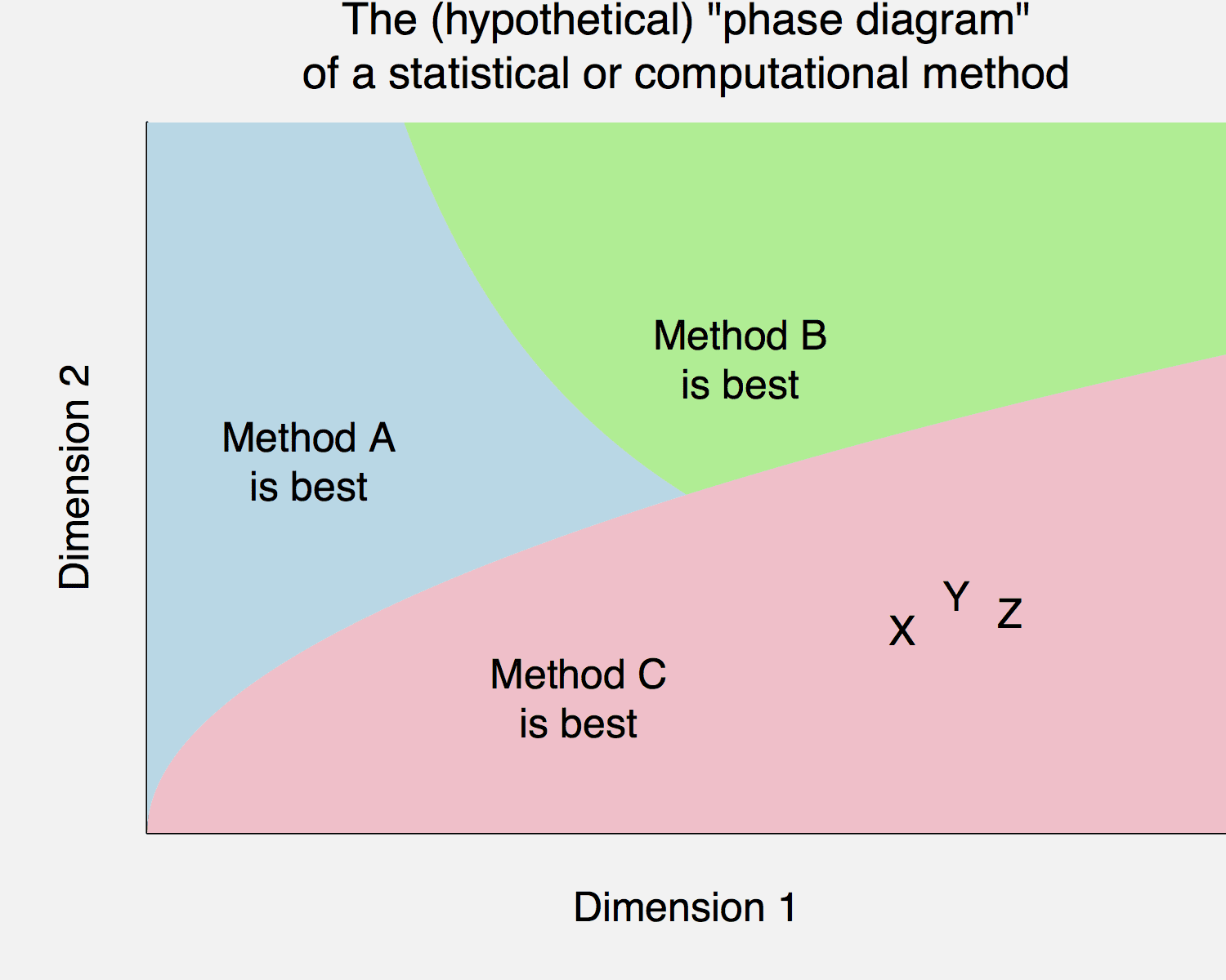
So here’s the deal. You have a new idea, call it method C, and you try it out on problems X, Y, and Z and it works well—it destroys the existing methods A and B. And then you publish a paper with the pithy title, Method C Wins. And, hey, since we’re fantasizing here anyway, let’s say you want to publish the paper in PPNAS.
But reviewers will—and should—have some suspicions. How great can your new method really be? Can it really be that methods A and B, which are so popular, have nothing to offer anymore?
Instead give a sense of the bounds of your method. Under what conditions does it win, and under what conditions does it not work so well?
In the graph above, “Dimension 1” and “Dimension 2” can be anything, they could be sample size and number or parameters, or computing time and storage cost, or bias and sampling error, whatever. The point is that a method can be applied under varying conditions. And, if a method is great, what that really means is that it works well under a wide range of conditions.
So, make that phase diagram. Even if you don’t actually draw the graph or even explicitly construct a definition of “best,” you can keep in mind the idea of exploring the limitations of your method, coming up with places where it doesn’t perform so well.
I think this is a very important area for research. I am particularly thinking about data science techniques (not well defined – I am thinking of neural nets, random forests, boosted trees, etc.), classical statistics, and Bayesian approaches. I have seen cases where one or another technique appears to be superior – it depends on both the particular data being analyzed as well as the questions being asked. The more experience I get, the more I have some sense of what types of problems/data/questions are most appropriate for approach A, B, C, etc. However, I think the guidance needs to be more intuitive and more general.
I suspect there can be no general ranking of approaches that works for all cases. But at present, it seems to me that there is little general guidance available. Given that analysts have their favorite approaches and seem wedded to these, agnostics would seem to be left in the dark as to what to do (I am speaking of myself as an agnostic now).
I don’t expect answers here (though if you have them, I’d love to hear them). I just think this is an area of research that is underrated and increasingly important.
Yes, this should be done much more often (if it really is clear-cut). I have only seen it once that I can remember. If there’s more than two dimensions determining the choice, one could make a little interactive webpage to help people choose, and offer it to the journal as an online supplement.
A heat map would help if there are just three relevant dimensions.
In most cases I don’t think we have a good idea, do we?
+1. Plus, we have to agree on the metrics. We know, for instance, that total error = bias + variance. But some people pretend that minimizing bias is the most relevant metrics, other variance etc. So, I can construct a phase diagram in some metric where my new method is almost always superior, i.e. in practice it’s the best method. Se this post for instance: http://daniellakens.blogspot.com.br/2015/01/always-use-welchs-t-test-instead-of.html
(I actually like it, but I think it understimates how easy to use and interpret t-tests are, which is an important metric).
Manoel:
If one really wants to consider a NULL of no difference in the means with possibly different variances – it is unsolved as far as I am aware.
If I recall, conditioning on the ratio of variances, reveals that the uniform distribution is only on average.
http://en.wikipedia.org/wiki/Behrens%E2%80%93Fisher_problem
Fisher and other argued that with a randomised experiment the more sensible NULL no difference in any aspect of the distribution.
Agreed, metrics can make a difference. So they need to be carefully defined — and alternate metrics need to be discussed. Expanding on your example, a helpful/honest presentation of phase diagrams would include ones with small bias considered “best” and ones with small variance considered “best” — and probably also one with small mean squared error considered “best”.
Diagram would look better with the title outside of the plotting area.
Looks like the phase diagram for water. Maybe the triple point should be a giant smear where the methods don’t have advantages over each other.
PPNAS: typo, or subtle joke I’m missing?
Maybe this is one for the lexicon (no free lunch phase diagram?). I’d like to see some semi-real examples, maybe for MIC.
Steen:
1. I moved the title as you suggested; thanks.
2. PPNAS stands for the Prestigious Proceedings of the National Academy of Sciences.
PPNAS: Primarily Papers Not Accepted at Science
I think this is very important, and I try to get authors to do such a thing (in some way) as reviewer and associate editor.
I have however also observed that some reviewers use the fact that somebody is honest about shortcomings of their method and situations in which it doesn’t perform well use this as a reasons for recommending rejection (the implicit reasoning seems to be that everybody makes their method win everything, so if the method of a particular author doesn’t win all situations the author considers, it must be a crappy method.
This mirrors my own experience: coauthors and editors have invariably suggested that I remove any examples for which my proposed method loses, and I have not yet managed to convince an author of a paper I’ve reviewed to include examples for which the proposed method loses to an established method. Other commenters are obviously correct that drawing a `full’ phase diagram will be impossible… but normally I have a pretty good idea of the existence of a few boundaries when I write a paper, and I can generally catch a few when reviewing.
I would be very interested in any suggestions on how to get a phase diagram published, and how to suggest one in a clear manner when reviewing – it provides exactly the information that I’m trying to extract from any methods paper, and it doesn’t seem like too much of an exaggeration to say that it is the first thing that most people will want to know about a proposed method. Even `obvious’ boundaries can help readers quickly figure out if a method is worth using.
Does the phase diagrams authors might draw intuitively, correspond well with the real phase diagram?
i.e. without extensive empirical testing how much do we really know about the performance characteristics of our methods?
Another problem I fear is that to describe the performance of any realistic method on such a phase diagram will need so many dimensions that it’d be very hard to represent or even combinatorically map out the phases.
Rahul: That’s true but all too often the fact that it’s impossible to do this in a perfect manner stops people from starting to do it at all.
If I saw unsystematic remarks of the type “our classification method doesn’t work so well with skew distributions within classes and strongly different within-class variations but it’s fine for elliptical classes with similar variation even if they are not well separated” in 50% of the papers, that’d already be considerable progress.
I agree wholeheartedly.
One handy example here is whether to use L-BFGS or stochastic gradient descent (SGD) for solving an optimization problem (e.g., penalized MLE for a GLM). Depending on the number of predictors, their sparsity, the number of observations, and the desired error tolerance, you get different answers. Usually L-BFGS involves a little less tuning and is faster at deriving results accurate to many decimal places. SGD will dominate on larger data sets that will choke L-BFGS or when only a few decimal places of accuracy are needed on medium to large data sets.
There are similar tradeoffs in using Euclidean HMC vs. Riemannian HMC. Or using a centered vs. non-centered parameterization.
Or let’s compare using R vs. C++ to solve a problem when a dimension we care about is total compute time plus some multiple times total human time. The tipping point is highly dependent on how many instances of the problem need to be solved.
Bob,
Yes, I’d love to see some of these graphs. Maybe this could be a good project to give to a student? I’m sure it wouldn’t be as easy as it seems. Recall all the struggles we’ve had in trying to implement those simple speed comparisons for Stan with hierarchical models.
Yes, this is perfectly reasonable, conceptually. In the “human” process of science, I’d like to think real scientists objectively viewed their models over those two (or more) dimensions and could see where their model was superior or inferior to others’ models. But I find scientists get very very attached to their models, and they see their model (C) being a superset of all other models, conceptually and numerically. And if new data arises that disputes this neat view of their world, the model can always be tweaked – scientists are very good at tweaking their models.
If I sound cynical, it’s not really intentional. In the kind of model that I encounter in daily work (in environmental science) data is hard to come across, and scientists use every last scrap of it to build their models. The proliferation of process-based models (in other fields you might call this a forward model, as opposed to an inverse model which is more common in, say, remote sensing) encourages this “endless tweaking” of models. The end result is a model that is very complex, but for which the uncertainty structure (functional and structural) is unknown, and generally not measured.
Comparing models is hard; much harder than scientists like to believe. The literature of climate change models illustrates this, where the approach is to compare different models to form a “model consensus” and thus some idea of functional uncertainty.
I’m currently going through a tortuous process like this is a field I am working in, where I need to work with a scientist who has a “favourite” model. Yep, it’s pretty good, but probably not perfect, but I’m finding it hard to convince the scientist that there are places on dimension 1 and dimension 2 where the model might not be the best. It’s a human problem, and not entirely a technical one. Wish me luck…
+1 So sad that there is pressure to omit this important information.
Oops — this was intended as a response to NYC.
My response to Stephen: Good Luck!
I’m a little puzzled, in that in my admittedly-narrow experience authors do as the post suggests. In particular, the statistical methodological papers I tend to encounter in my own field of ecology typically propose methods that pay a computational cost, and the authors are up front about this. Perhaps there are other costs or trade-offs that tend to get overlooked or swept under the rug, and I just don’t realize it because I lack the technical expertise?
I interpreted the post to advocate something along the lines that the modelers in phylogenetics have been doing since the late 80’s. That is, simulate evolutionary history of hypothetical clades and explore what areas of the parameter space (parameters of the models of evolution) one method works better than others. These papers are abundant starting in the late 80’s with Lake, Felsenstein, Huelsenbeck, etc.
Yes, I’ve seen this sort of thing.
A true story illustrating both the usefulness of such diagrams and the maxim that prior information is important:
Once I read a paper for a phylogenetics discussion group in which the author was promoting a new method and claiming it was better than the usual one. He included a graph which seemed very convincing to me (the naive mathematician, not a biologist): It showed that the new method was indeed better in all but a small region of values of the parameter.
But at the discussion, several of the experienced biologists (including several students) pointed out that that seemingly small region was precisely where the parameter (a mutation rate, as I recall) typically lies. So the author’s simulations showed in fact that the old method was better.
great story!
See Fig. 8 of this paper, for example
http://loco.biosci.arizona.edu/PDG/pdfs/Huelsenbeck1993.pdf
computational cost is part of it, but if computation isn’t orders of magnitudes too costly, the typical academic concern is bias. “worse”/”better” is application dependent, the ideal is for the bias of a method to be matched to the problems statement + domain, but is it? that’s where the phase boundaries come in.
Although now that I think of it, clearly I should read my own blog for examples of cases in ecology where authors arguably aren’t appropriately weighing the trade-offs discussed in the post. :-)
https://dynamicecology.wordpress.com/2013/01/11/is-using-detection-probabilities-a-case-of-statistical-machismo/
https://dynamicecology.wordpress.com/2014/09/15/detection-probabilities-statistical-machismo-and-estimator-theory/
https://dynamicecology.wordpress.com/2014/09/25/detection-probability-survey-results/
Expanding the dimensions is done in the forecasting literature. There are public data sets with a lot of time series in them from past competitions (e.g. the M1 M2 M3 sets). The M3 set alone has 3003 different data sets of various types. http://forecasters.org/resources/time-series-data/m3-competition/
A method that is applicable to this type of data (not all forecasting problems are the same) can use these to test out the method.
You might consider the paper Unfair Comparisons.
Cooper, W. H., & Richardson, A. J. (1986). Unfair comparisons. Journal of Applied Psychology, 71(2), 179-184.
Yes yes yes. We need to be much more rigorous about comparing methods and measuring results.
Here are two problems I have with many papers:
a) Using the average performance on some collection of datasets (either a public repository or a curated collection) as evidence of success. I can’t pay serious attention to this because I don’t believe the collection to be a representative collection to which we want to generalize the performance measure.
b) In classification problems, just reporting how it outperforms some other method on, say, lower false positives while hiding or not reporting false negatives, and most importantly not indicating the proportion of “discoveries”. (My favorite example of this is Levitt’s description of his super-accurate terrorist prediction model in which he only talked about false negatives.)
+1
The choice of a phase diagram is ironic, since one of the few computational methods known that could actually construct one is Skilling’s Nested Sampling, which is frequently misunderstood by statisticians.
I think this is a great idea and my colleagues and I have tried to do something like this in for example http://vbn.aau.dk/da/publications/structure-assisted-compressed-sensing-reconstruction-of-undersampled-afm-images(14490a34-7d33-40cc-bfcd-18f379aac101).html