Pearly Dhingra points me to this article, “The Geographic Distribution of Obesity in the US and the Potential Regional Differences in Misreporting of Obesity,” by Anh Le, Suzanne Judd, David Allison, Reena Oza-Frank, Olivia Affuso, Monika Safford, Virginia Howard, and George Howard, who write:
Data from BRFSS [the behavioral risk factor surveillance system] suggest that the highest prevalence of obesity is in the East South Central Census division; however, direct measures suggest higher prevalence in the West North Central and East North Central Census divisions. The regions relative ranking of obesity prevalence differs substantially between self-reported and directly measured height and weight.
And they conclude:
Geographic patterns in the prevalence of obesity based on self-reported height and weight may be misleading, and have implications for current policy proposals.
Interesting. Measurement error is important.
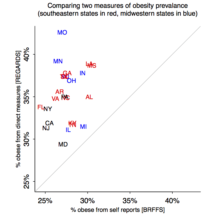
But, hey, what’s with this graph:
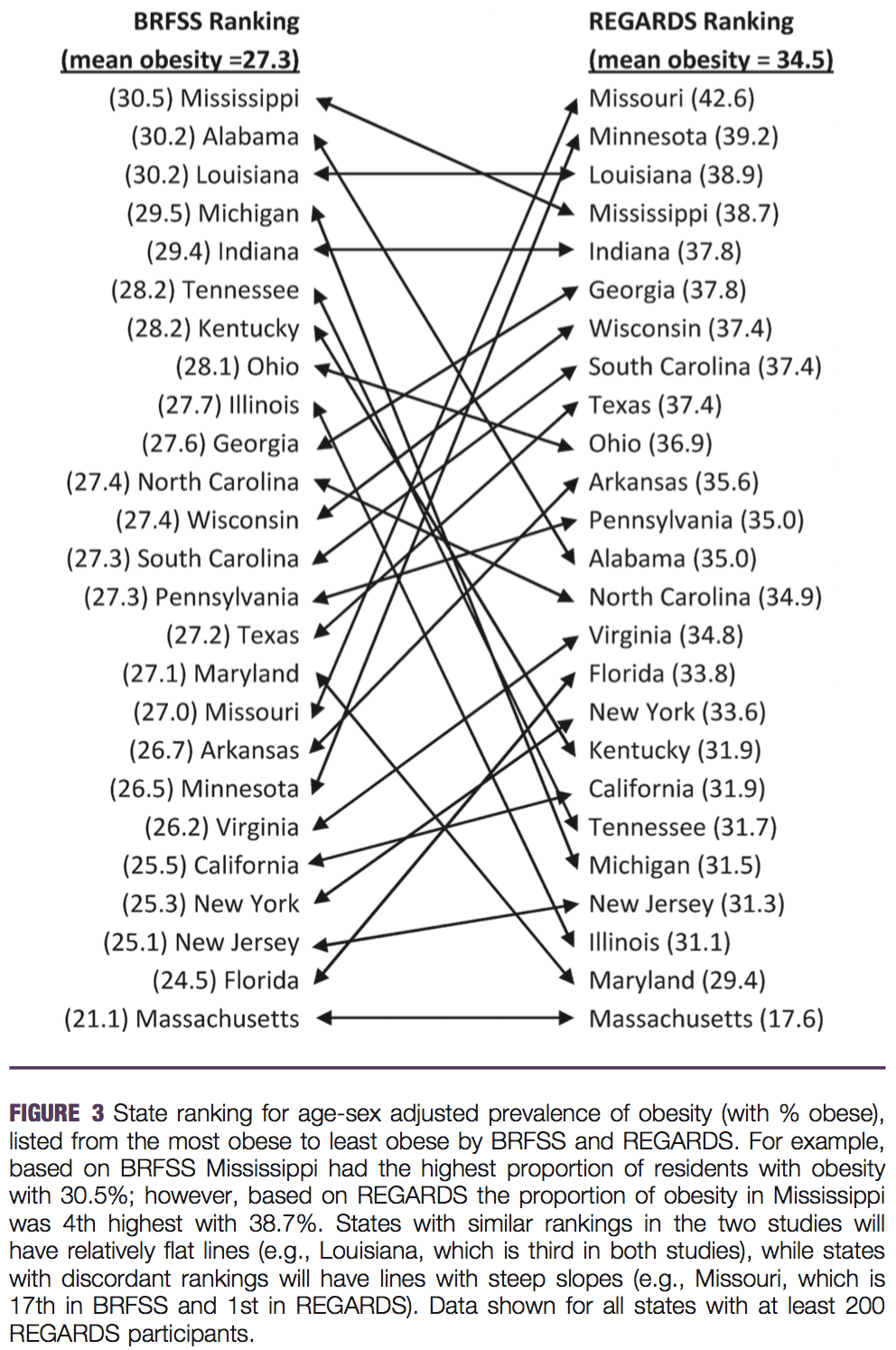
Who made this monstrosity? Ed Wegman?
I can’t imagine a clearer case for a scatterplot. Ummmm, OK, here it is:
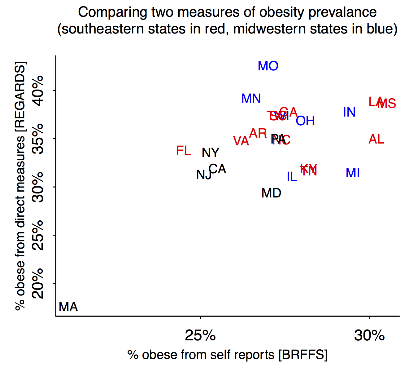
Hmmm, I don’t see the claimed pattern between region of the country and discrepancy between the measures.
Maybe things will be clearer if we remove outlying Massachusetts:
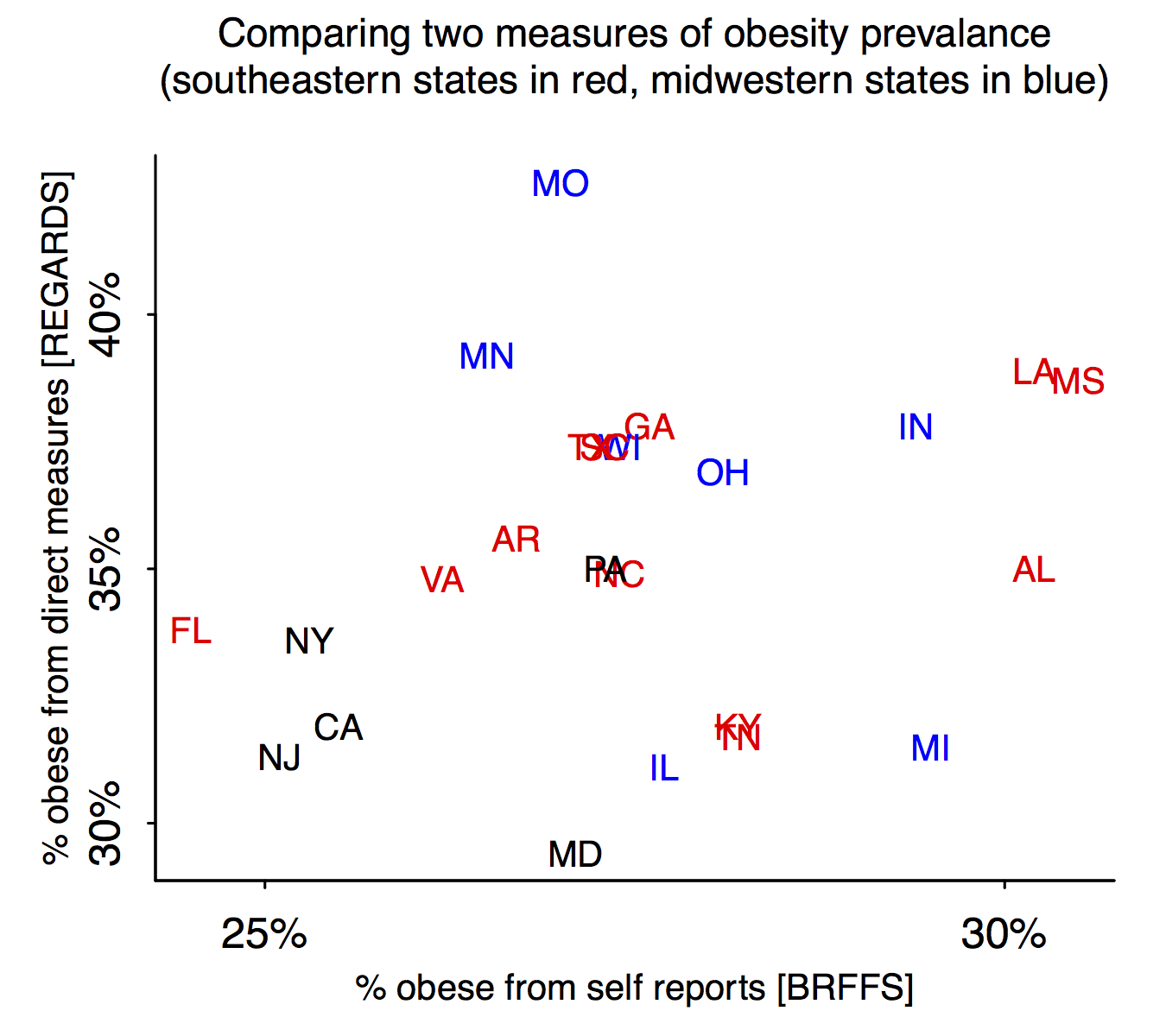
Maryland’s a judgment call; I count my home state as northeastern but the cited report places it in the south. In any case, I think the scatterplot is about a zillion times clearer than the parallel coordinates plot (which, among other things, throws away information by reducing all the numbers to ranks).
P.S. Chris in comments suggests redoing the graphs with same scale on the two axes. Here they are:
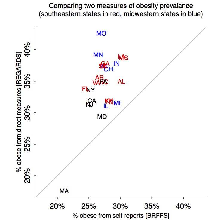
It’s a tough call. These new graphs make the differences between the two assessments more clear, but then it’s harder to compare the regions. It’s fine to show both, I guess.
your x and y axis should be the same scale or maybe add the y=x diagonal
Here’s one point that’s always bugged me:
Are there scatter plot tools that can automatically jitter labels to prevent overlap? Neither Excel nor Matlab nor Gnuplot had any easy way of doing this when I had tried.
ggplot (in R) can do that. In this case the labels ARE the points so that wouldn’t be ideal.
Well I don’t know if some jitter in a point is worse than not being able to read a point at all?
There’s a new ggplot extension geom_label_repel:
http://ggplot2-exts.github.io/ggrepel.html
Haven’t tried it yet, though.
Awesome. Looks like this solves the problem.
Why don’t you have the x and y scales and range the same?
That way the reader can quickly tell which states are over or under-reporting vs. a 45 degree line.
– it’s obvious (by inspection) that their conclusion was made (by inspection) using the top two in each list.
– Hi Massachusetts, this is your mom. Is everything OK? Are you eating enough? I worry about you.
The first two comments beat me to it. Certainly the trellis chart is not as useful as the scatter, but the scatter does not directly address the claims about whether self-reporting is biased from the actual data by region – without including the 45 degree line. I have plotted it that way as well as just comparing ranks with a 45 degree line. In either case, there is no apparent regional difference. I would note that virtually all states under-report obesity in terms of the raw measures, while they are more or less equally split (between under- and over-reporting) by rank.
I was also going to suggest equal axis ranges and a y=x diagonal. Looking at the paper, I noticed that the authors do exactly this, but for the regionally averaged values rather than individual states (Figure 4).
Yes I get annoyed by these slopegraphs to – a scatterplot is more appropriate in the vast majority of situations. I wrote a (not short enough) paper on the topic, http://papers.ssrn.com/sol3/papers.cfm?abstract_id=2410875. The thing that prompted me was a similar slopegraph on the cover of Albert Cairo’s book.
If one method of measurement is of better quality (i.e. a “Gold Standard), a Bland-Altman plot might be useful.
The self reported numbers, particularly ignoring MA, seem uncorrelated with the measured numbers. I’m too lazy to copy the numbers out of the data though. If anything the reported numbers seem to indicate whether or not the state borders an ocean.
How about something like this plot:
http://i.imgur.com/d90yxKq.png
That is much better. The regional differences can easily done with color, but this display is far cleaner.
Good point. How about this?
http://i.imgur.com/VegUBYY.png
Yes, and I think the upshot is that there is no apparent regional pattern. The only thing left to do (which I have not done yet) is to go back to the scatterplot and see if there is a regional pattern with respect to a regression line (not the 45 degree line). This would tell us if some regions misperceive more than others – but, admittedly, this is a second order effect that I would not find terribly interesting.
This?
http://i.imgur.com/kRpZ9eH.png
http://i.imgur.com/BBNK95Z.png
Just for fun I plotted the rank differences too:
http://i.imgur.com/LXGQy6X.png
The ordering by rank difference mismatch seems a lot different than if I just plot the raw percent differences. Not sure if this is just a calculation bug.
I also looked at the rank differences a bit, and as you say, they appear quite different. I think the rank differences speak to perceptions about relative positions while the absolute differences just speak to the obesity perceptions vs. reality. However, we are really digging deep here into, what seems to me to be, fairly subtle and uninteresting “findings.”
Garden of forking paths? Maybe the researchers found they could see a “clearer pattern” in the rank differences and ran with that?
I haven’t really been able to intuitively grasp the difference between what the “ranking by raw difference” means vs what “ranking by difference of ranking” means.
All I can intuite is that the second approach ought to amplify noise. Akin to how taking numerical derivatives of noisy data does.
But if the relative position of states changes based on the approach I don’t know how to explain that to myself.
Those scatterplots are horrible! What’s with the tiny ticks and labels so far away from the ticks? I would also prefer a grey background with some nice lighter grey rules so the contrast isn’t so glaring. And maybe drop the primary colors—they’re tacky. Add a standard legend indicating the color coding rather than sneaking it into the subtitle. Why label all the states rather than just color coding—you don’t want everyone to read all the state names, do you?
And isn’t the whole issue much more socio-economic than geographic? But what I really want is a red-state/blue-state analysis (of income vs. Republican vote share), but instead with income versus obesity. There’s a huge difference (pun intended) in size of people moving from 12th St (where I get on the subway downtown) up to 125th St (where I get off the subway uptown). Similar difference to moving from the neighborhood where my sister now lives (Birmingham, MI) to where I went to high school (Livonia, MI), two very different socio-economic communities in the Detroit suburbs.
Since I grew up in Detroit proper, I couldn’t help but look up whether the differences between Birmingham and Livonia are similar to what I remember — and also to compare with Detroit proper. The differences between Birmingham and Livonia seem a little greater than when I was a kid (with Birmingham still the ritzier), but both are still predominantly white, whereas Detroit is about 83% black. Per capita incomes compare as follows:
Birmingham$68,435
Livonia $29,536
Michigan overall $25,681
Detroit $14,870
Maryland ain’t the Northeast or the South! Maryland is Mid-Atlantic, where Mid-Atlantic is defined as any state where you can find scrapple on a diner menu.
The original chart was focused on the differences in *ranks*, and the scatterplots are of the actual obesity rates. Hence the authors’ misguided attempt to illustrate the differences in rank with that chart. However, I do believe that focusing on the differences in *rates* is more informative than the ranks.
Regarding what the (definitely improved) graphs reveal – it appears that there is a line that runs parallel to the “no difference” line, only starting at about 33% on the REGARDS axis (FL/NY to LA/MS). Most of these points are in the Southeast, while the blue points are more varied above & below this line. Not sure if this means anything…just an observation.