Mike “d3” Bostock writes:
Regarding the Vox graph on federal tax brackets, here is a quick-and-dirty visualization of effective tax rates for a given taxable income and year.
However, there is a big caveat: estimating the effective tax rate based on actual income is much harder since it depends on the claimed deductions. This could be estimated empirically, but the IRS doesn’t publish the data (AFAIK).
Bostock writes:
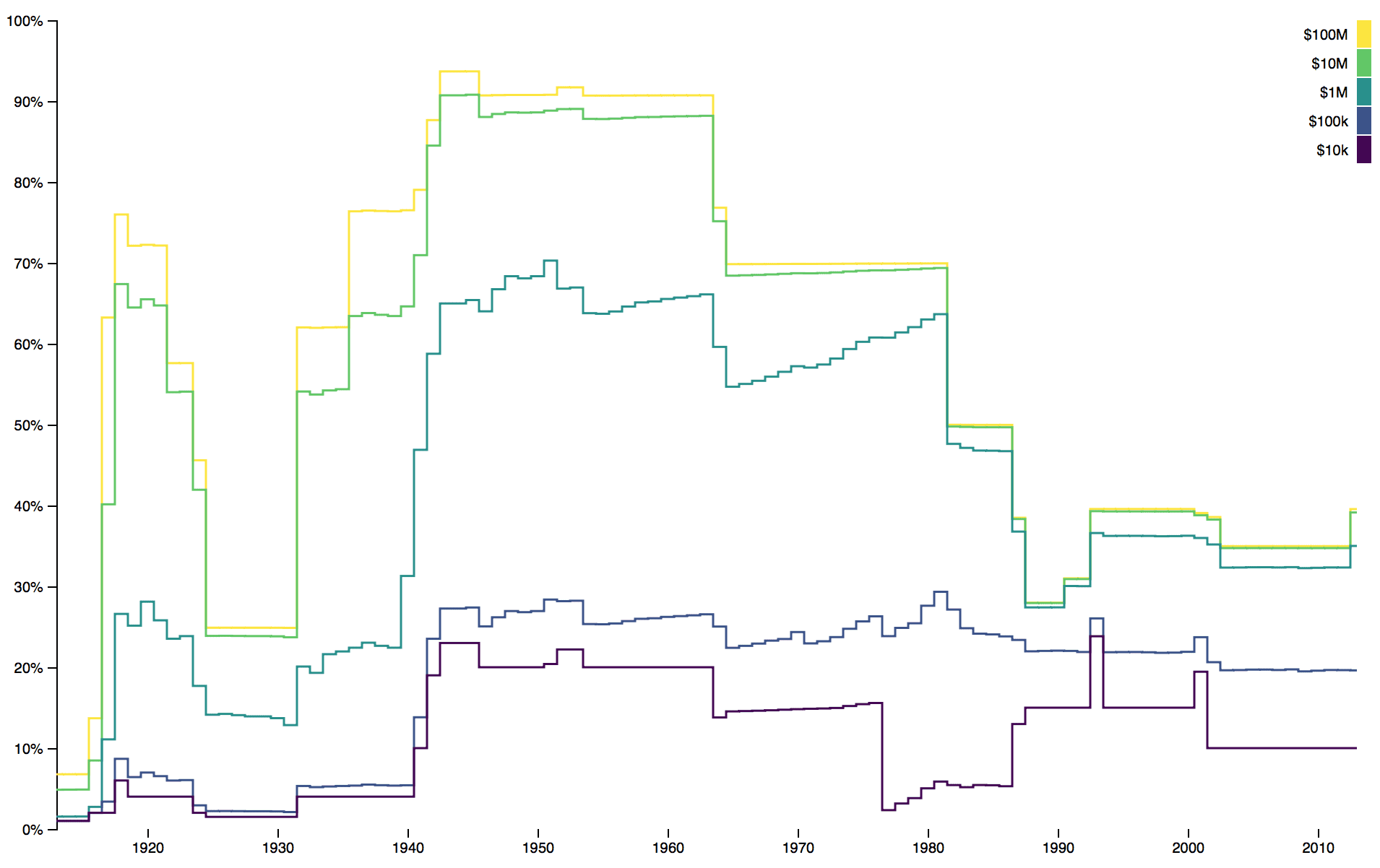
I’ve recreated the graphic [by Alvin Chang for Vox, criticized in my earlier post] below, substituting a log scale for the y-axis. It readily conveys the Reagan-era simplification of tax brackets, as well as the disappearance of tax brackets for the ultra-rich. (In 1936, the highest tax bracket applied to those making more than $83M in 2013-equivalent dollars!)
Yet fewer tax brackets do not imply the overall tax code is simpler; if anything, the tax code continues to get more complex. And looking only at bracket thresholds does not consider the effective rate at different income levels. . . . It is hard to estimate effective tax rates, especially now, because they depend greatly on the amount of itemized deductions. But ignoring that substantial caveat—and that this analysis only considers federal-reported income and not capital gains, the alternative minimum tax, and countless other forms of state and local taxes—we can compute the effective federal income tax rate for a given taxable income (after any deductions) and a given year.
Amounts are in 2013-equivalent dollars when filing as the head-of-household.

Good job.
Here are some relevant principles of statistical graphics:
1. Static graphs can do a lot. Dynamic graphics are fine, but in some settings they do little more than add confusion.
2. The log transform really works.
3. No need to try to cram all the information into one graph. Bostock made one graph of tax brackets, another of tax rates. Someone could come along and make a third graph including other taxes, not just federal income tax.
Also, I don’t think graphics need to be so big. I display Bostock’s graphs above in a more compressed format than were on his page. I think that’s fine; actually I think these smaller versions are easier to read because I can see the whole graph more clearly in my visual field. In general I recommend that people make their graphs smaller, which implies that their labels should be larger relative to the original graphs. For Bostock, I’d actually recommend just putting x-axis labels every 20 years, percentage labels at every 25%, and income labels at 1, 3, 10, 30, etc. Some of this is a matter of taste, but I do think there are general issues of readability, and tradeoffs in that more labels make it harder to see the big picture but easier to identify exactly what is happening when.
All the attention being paid to the number of tax brackets is kind of silly. With even a very small number of brackets, your average tax rate increases pretty smoothly as your income increases because more of your income falls into the higher brackets. And computing your tax with more brackets is trivial with modern computers. Even in the past, it wasn’t difficult to determine your tax because the IRS would give you a table that where you could look up your tax given your income. With modern computers, there is no reason the tax rate couldn’t be a continuous function of income.
Marginal tax rates are much more important economically (the rate you pay on an additional dollar of income). The second chart above is pretty startling where it shows marginal tax rates on the top bracket > 90% at some points and almost 70% well into the 1950s. Tax avoidance must have been crazy intense back then.
Those 90% tax brackets had like 8 people in them.
There are MANY very good reasons to simply switch to a flat tax with a UBI. Talk about tax reform…
Unfortunately I haven’t yet put together a comprehensive data rich argument, but I’m working on it.
The Beatles sang about being subject to a 95% tax rate.
I once had access to a sample of individual tax return data – to update the analysis would require purchasing more data (the IRS sells this stuff, albeit with some omissions). A simple linear tax schedule – negative Y intercept (negative income tax below a particular AGI level) with a constant slope (around 22% of AGI if I recall correctly) approximated the actual taxes paid in relation to AGI pretty closely. I suspect it would be relative easy to derive a revenue neutral tax scheme that is linear – and remove ALL deductions.
While it would be a useful exercise, the primary hurdle is political – our political system simply depends on the tax code to finance campaigns. No politician is really interested in tax simplification – only tax reduction for the chosen few.
I’ve got some summary data from the IRS and you are absolutely correct. I’ll put up some graphs in a few days
> there is no reason the tax rate couldn’t be a continuous function of income.
The effective tax rate is a continuous function of income.
True.
I was specifically talking about making the marginal tax rate a continuous function, so there would effectively be an infinite number of tax brackets. I didn’t say it very clearly.
Ok, you would get a smoother tax rate curve in that case. But would this have any practical advantage? If it is just for aesthetic considerations, I think an infinitely differentiable function would be even better.
I agree it wouldn’t have any practical advantage. That’s my point.
Whether you use a few brackets or a whole bunch of brackets, the average tax paid will be a pretty smooth function of income. Hence my point that talking about how many tax brackets there are is pretty pointless.
What DOES matter, is the magnitude of the marginal tax rates and how quickly taxpayers get into those brackets. The top tax rate is particularly important if a significant number of people pay that rate. Marginal tax rates affect how vigorously people dodge taxes and whether people change their behavior because of the tax code. The Beatles moved to the US because of the 95% tax rate in England.
Terry is correct about the effective tax rates increasing only gradually, regardless of the number of tax brackets. This even occurs when there is a ‘flat tax’ if there is a basic minimum that is deducted.
I did this for the Canadian tax system, combining federal and provincial rates as well as other major taxes, and there’s a lot of nuance in any given year: http://blog.citizenscode.org/2016/04/27/canada-how-much-income-tax-you-pay/
Aside from the colors in the second graph being mapped in reverse order (the color should get darker as the value increases) i don’t find the same number of issues as Andrew.
On the issue of taxation, why does it seem that no one considers how lowering the effective tax rate on the highest earners will actually benefit them a disproportionate amount? I’m not saying that their tax rate decreasing means it will cost them less, but presumably many of the highest income earners in the country have businesses they own and/or control. With a redistributive tax policy, even if their bill decreases the marginal change in their externalities is negligible. So they end up being able to double dip in a sense.
Billy:
Perhaps I wasn’t clear. I thought Bostock’s graphs were great. I just thought they’d work even better when shrunk, in which case the axis labels become hard to read. That’s all.
Ok, actually I had some graphs available because I’m working on things related to this topic. So here goes:
http://models.street-artists.org/2017/05/28/the-reality-of-actual-average-taxes-paid/
These graphs show take-home dollars vs adjusted gross income, and are based on IRS published summary data.
They compare to simply having a flat tax + a monthly payment of $500 per adult person in the US independent of their employment status (a universal basic income).
So all gazillion lines of the tax code wind up being on average effectively useless at producing revenue, though really good at distorting allocation of resources.
Note in the second graph, which actually zooms in on the region where people actually are, that with a flat tax + $500/mo UBI essentially everyone winds up better off, with more take-home income.
In the post linked at the end of the above post, I show how 28% flat tax + UBI which varies based on your health status and age replacing basically all of social security and medicare and subsidized housing and the earned income tax credit and supplemental nutritional program (food “stamps”) and the majority of all specialized programs (other than say those for mentally ill people who can’t necessarily make rational decisions about money) and yet produces the same deficit growth rate.
If Case and Deaton want to talk about ending despair I think they need to talk about flat tax plus UBI.
Damn Andrew, this blog keeps stealing the wind in my sails ;-) I’ve been working on housing, food, tax, welfare, and monetary policy issues all closely related to the YIMBY and this tax stuff for several months, and now in like one week you’ve blown the lid on all of it.
My reaction for both of these graphs would be to put splines through the data. Multiple smooth curves are so much easier to absorb than stepped ones. Then you could let the user switch it to the true stepped curve. cf https://robertgrantstats.wordpress.com/2015/08/13/showing-a-distribution-over-time-how-many-summary-stats/