Why are we such a litigious society?

As a European, I’ve always been fascinated by how trivial and common-sense matters end up in courts. I’ve been less fascinated and more annoyed by the piles of forms and disclaimers everywhere. Finally, annoyance takes over any kind of fascination faced with the medical bills – often so high because of lawsuit-protecting insurance. As Paul H. Rubin writes in NY Times:

The United States is already the most litigious society in the world. We spend about 2.2 percent of gross domestic product, roughly $310 billion a year, or about $1,000 for each person in the country on tort litigation, much higher than any other country. This includes the costs of tort litigation and damages paid to victims.  About half of this total is for transactions costs — mostly legal fees.

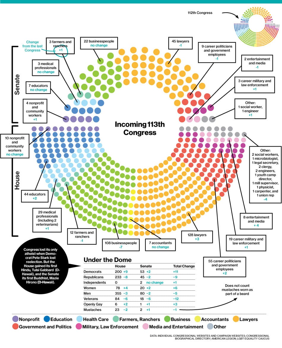
So why is that? One way to explore that is to examine the composition of the US Congress, as BusinessWeek has done a few years ago:

pol_congressintro03__01__950

Law is the profession that’s best represented in the US Congress. How do lawyers vote compared to other professions? I’ve worked on quantitative analysis of voting behavior in US Senate a few years ago, so this is a pet interest of mine. I was thus interested to receive an email from two Swiss researchers summarizing their research:

In a study recently published in the Journal of Law and Economics (working paper version available here), Ulrich Matter and Alois Stutzer investigate the role of lawyer-legislators in shaping the law. The focus of their study lies particularly on legislators with a professional background as attorney (and not on the legislators’ education per se). In order to code the occupational backgrounds of all US Congressmen and all US state legislators over several years, the authors assembled a data set with detailed biographical information drawn from Project Vote Smart and compiled via its application programming interface (an R package that facilitates the compilation of such data is available here). The biographical information is then linked to the legislators’ voting records in the context of tort law reform at the federal and state level between 1995 and 2014.

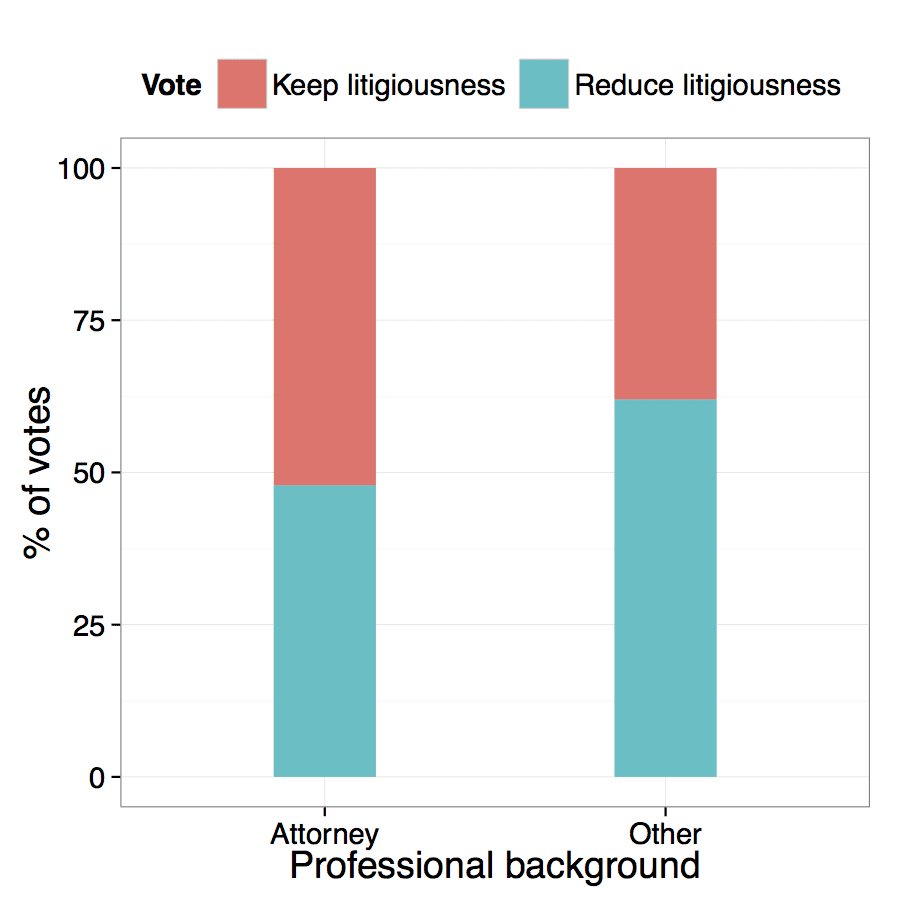
The theoretical consideration is that lawyer-legislators can, by deciding on statutory law, affect the very basis of their business and that this is particularly the case for tort law. A look at the raw data (figure below) indicates that lawyer-legislators are less likely to support reforms that restrict tort law than legislators with a different professional background.

fig1

This holds when controlling for other factors in regression analyses. For bills aiming at increasing tort liability the pattern switches and lawyer-legislators are more likely to vote in favor of bills that extend tort law than legislators with a different professional background.

Overall, the findings are consistent with the hypothesis that lawyer-legislators, at least in part, pursue their private interests when voting on tort issues. From a broader perspective, the results highlight the relevance of legislators’ identities and individual professional interests for economic policy making.

I can imagine other professions in the Congress engaging in similar protectionism of an imperfect status quo in their respective fields. It’s access to data and statistics that facilitate this necessary scrutiny in analyzing conscious and unconscious biases of legislators.

Data & Visualization Tools to Track Ebola

I’ve received the following email (slightly edited for clarity):

Can anyone recommend a turnkey, full-service solution to help the Liberian government track the spread of Ebola and get this information out to the public? They want something that lets healthcare workers update info from mobile phones, and a workflow that results in data visualizations. They need quick solutions, not a list of tools and educational resources.

Thomas Karyah, who currently works at UNMIL and is an IT Consultant for the Ministry of Information, leads Liberia’s information response to the Ebola emergency and is urgently looking to setup an online platform to serve as a DataBank and Visualization System for the campaign.

Desired Outcomes

    \t

  • A web-based platform to collate all Ebola ralated data taken by health workers around the country to give realtime situational update to anyone who logs on, including the very health workers in the field.
  • \t

  • Help stakeholders and interested parties know whether the battle against Ebola is being lost or won.
  • \t

  • Front-end data visualization system for those who want live statistics by county, regions fatality rate, concentration or to determine if a safe zone is really safe?

Technology:

    \t

  • Mostly smart phones and tablets; on the handheld devices, 4G or GPRS internet service will be available in the field for health workers to send updates using simple online forms
  • \t

  • Backend cgi scripts can process data it and store in a database

As you most likely know, Liberia has just declared a state of emergency and this is a matter of the utmost urgency.

Thank you again for your time and quick reply.

My immediate response was to point to http://www.ushahidi.com – but there might be other tools/techniques.

Best we have a discussion in the comments here, and I’ll point them to this post, so that they can refer to it. This emergency can be an opportunity to examine the state of the art in this area.

Measuring Beauty

Anaface analysis of Michelangelo's David

Anaface analysis of Michelangelo’s David

I’ve come across a paper that was using “beauty” as one of the predictors. To measure beauty, the authors used Anaface.com

I don’t trust metrics without trying them on a gold standard first. So, I tried how well Anaface does on something that the arts world considers as one of gold standards of beauty – Michelangelo’s David. My annotation might be imperfect, but David only gets to be only a good 7: his nose is too narrow and his eyes are too close.

Of course, I applaud the use of interesting predictors in studies, and Anaface is a better tool than anything I’ve seen before, but maybe we need better metrics! What do you think?

Posted in Art

New New York data research organizations

In a single day, New York City obtained two data analysis/statistics/machine learning organizations:

New York already has Facebook’s engineering unit, Twitter’s East Coast headquarters, and Google’s second-largest engineering office.

The data community here is on an upswing, and it might be one of the best places to be if you’re into applied statistics, machine learning or data analysis.

Post by Aleks Jakulin.

P.S. (from Andrew): The formerly-Yahoo-now-Microsoft researchers have a more-or-less formal connection to Columbia, through the Applied Statistics Center, where some of them will be organizing occasional mini-conferences and workshops!

Agreement Groups in US Senate and Dynamic Clustering

Adrien Friggeri has a lovely visualization of US Senators movement between clusters:

You have to click the image and play with it to appreciate it. The methodology isn’t yet published – but I can see how this could be very illuminating. The dynamic clustering aspect hasn’t been researched much – one of the notable pieces is the Blei and Lafferty dynamic topic model of Science.

I did a static analysis of the US Senate back in 2005 with Wray Buntine and coauthors. Some additional visualizations and the source code are here. We did a dynamic analysis of US Supreme Court on this blog but there’s also a paper.

My knowledge on this topic is out of date, however. Who has been doing good work in this area? I’ll organize the links.

[added 4/29/12, via Edo Airoldi]: Visualizing the Evolution of Community Structures in

Dynamic Social Networks by Khairi Reda et al (2011) [PDF].

[added 4/29/12, via Allen Riddell] Joint Analysis of Time-Evolving Binary Matrices and Associated Documents by Eric Wang et al (2010) [PDF] [Video]

Factual – a new place to find data

Factual collects data on a variety of topics, organizes them, and allows easy access. If you ever wanted to do a histogram of calorie content in Starbucks coffees or plot warnings with a live feed of earthquake data – your life should be a bit simpler now.

Also see DataMarket, InfoChimps, and a few older links in The Future of Data Analysis.

If you access the data through the API, you can build live visualizations like this:

Of course, you could just go to the source. Roy Mendelssohn writes (with minor edits):

Since you are both interested in data access, please look at our service ERDDAP:

http://coastwatch.pfel.noaa.gov/erddap/index.html

http://upwell.pfeg.noaa.gov/erddap/index.html

Please do not be fooled by the web pages. Everything is a service (including search and graphics) and the URL completely defines the request, and response formats are easily changed just by changing the “file extension”. The web pages are just html and javascript that use the services. For example, put this URL in your browser:

http://coastwatch.pfeg.noaa.gov/erddap/griddap/erdBAsstamday.png?sst[(2010-01-16T12:00:00Z):1:(2010-01-16T12:00:00Z)][(0.0):1:(0.0)][(30):1:(50.0)][(220):1:(240.0)]

Now if you use R:

library(ncdf4)

library(lattice)

download.file(url="http://coastwatch.pfeg.noaa.gov/erddap/griddap/erdBAsstamday.nc?sst[(2010-01-16T12:00:00Z):1:(2010-01-16T12:00:00Z)][(0.0):1:(0.0)][(30):1:(50.0)][(220):1:(240.0)]", destfile="AGssta.nc")

AGsstaFile<-nc_open('AGssta.nc')

sst<-ncvar_get(AGsstaFile,'sst',start=c(1,1,1,1),count=c(-1,-1,-1,-1))

lonval<-ncvar_get(AGsstaFile,'longitude',1,-1)

latval<-ncvar_get(AGsstaFile,'latitude',1,-1)

image(lonval,latval,sst,col=rainbow(30))

Or if you use Matlab:

link='http://coastwatch.pfeg.noaa.gov/erddap/griddap/erdBAsstamday.mat?sst[(2010-01-16T12:00:00Z):1:(2010-01-16T12:00:00Z)][(0.0):1:(0.0)][(30):1:(50.0)][(220):1:(240.0)]';

F=urlwrite(link,'cwatch.mat');

load('-MAT',F);

ssta=reshape(erdBAsstamday.sst,201,201);

pcolor(double(ssta));shading flat;colorbar;

The two services above allow access to literally petabytes of data, some observed some from model output. I realize you guys don’t usually work in these fields, but this is part of a significant NOAA effort to make as much of its data available as possible. One more thing, if you use “last” as the time, you will always get the latest data, This allows people to set up web pages that track the latest (algal bloom) conditions, such as done by one of my colleagues.

BTW – for people who want a GUI to help with the extract from within the app, there is a product called the Environmental Data Connector that runs in ArcGIS, Matlab, R and Excel.

Roy’s links inspired me to write another blog post, which is forthcoming.

This post is by Aleks Jakulin, follow him at @aleksj.

Rare name analysis and wealth convergence

Steve Hsu summarizes the research of economic historian Greg Clark and Neil Cummins:

Using rare surnames we track the socio-economic status of descendants of a sample of English rich and poor in 1800, until 2011. We measure social status through wealth, education, occupation, and age at death. Our method allows unbiased estimates of mobility rates. Paradoxically, we find two things. Mobility rates are lower than conventionally estimated. There is considerable persistence of status, even after 200 years. But there is convergence with each generation. The 1800 underclass has already attained mediocrity. And the 1800 upper class will eventually dissolve into the mass of society, though perhaps not for another 300 years, or longer.

Read more at Steven’s blog. The idea of rare names to perform this analysis is interesting – and has been recently applied to the study of nepotism in Italy.

I haven’t looked into the details of the methodology, but rare events have their own distributional characteristics, and could benefit from Bayesian modeling in sparse data conditions. Moreover, there seems to be an underlying assumption that rare names are somehow uniformly represented in the population. They might not be. A hypothetical situation: in feudal days, rare names were good at predicting who’s rich and who’s not – wealth was passed through family by name. But then industrialization perturbed the old feudal order stratified by name into one that’s stratified by skill and no longer identifiable by name.

Let’s scrutinize this new methodology! With power comes responsibility.

This post is by Aleks Jakulin.

Statistical Murder

Robert Zubrin writes in “How Much Is an Astronaut’s Life Worth?” (Reason, Feb 2012):

…policy analyst John D. Graham and his colleagues at the Harvard Center for Risk Analysis found in 1997 that the median cost for lifesaving expenditures and regulations by the U.S. government in the health care, residential, transportation, and occupational areas ranges from about $1 million to $3 million spent per life saved in today’s dollars. The only marked exception to this pattern occurs in the area of environmental health protection (such as the Superfund program) which costs about $200 million per life saved.

Graham and his colleagues call the latter kind of inefficiency “statistical murder,” since thousands of additional lives could be saved each year if the money were used more cost-effectively. To avoid such deadly waste, the Department of Transportation has a policy of rejecting any proposed safety expenditure that costs more than $3 million per life saved. That ceiling therefore may be taken as a high-end estimate for the value of an American’s life as defined by the U.S. government.

This reminds me of my old article on Value of Life – where the hidden cost of the Iraq war for the US comes to 720,000 lives lost (based on the huge cost).

Beautiful Line Charts

I stumbled across a chart that’s in my opinion the best way to express a comparison of quantities through time:

It compares the new PC companies, such as Apple, to traditional PC companies like IBM and Compaq, but on the same scale. If you’d like to see how iPads and other novelties compare, see here. I’ve tried to use the same type of visualization in my old work on legal data visualization.

Continue reading

Data mining efforts for Obama’s campaign

From CNN:

In July, KDNuggets.com, an online newsite focused on data mining and analytics software, ran an unusual listing in its jobs section:

“We are looking for Predictive Modeling/Data Mining Scientists and Analysts, at both the senior and junior level, to join our department through November 2012 at our Chicago Headquarters,” read the ad. “We are a multi-disciplinary team of statisticians, predictive modelers, data mining experts, mathematicians, software developers, general analysts and organizers – all striving for a single goal: re-electing President Obama.”

Users of the Obama 2012 – Are You In? app are not only giving the campaign personal data like their name, gender, birthday, current city, religion and political views, they are sharing their list of friends and information those friends share, like their birthday, current city, religion and political views. As Facebook is now offering the geo-targeting of ads down to ZIP code, this kind of fine-grained information is invaluable.

Inside the Obama operation, his staff members are using a powerful social networking tool called NationalField, which enables everyone to share what they are working on. Modeled on Facebook, the tool connects all levels of staff to the information they are gathering as they work on tasks like signing up volunteers, knocking on doors, identifying likely voters and dealing with problems. Managers can set goals for field organizers — number of calls made, number of doors knocked — and see, in real time, how people are doing against all kinds of metrics.

DBQQ rounding for labeling charts and communicating tolerances

This is a mini research note, not deserving of a paper, but perhaps useful to others. It reinvents what has already appeared on this blog.

Let’s say we have a line chart with numbers between 152.134 and 210.823, with the mean of 183.463. How should we label the chart with about 3 tics? Perhaps 152.132, 181.4785 and 210.823? Don’t do it!

Objective is to fit about 3-7 tics at the optimal level of rounding. I use the following sequence:

    \t

  1. decimal rounding: fitting integer power and single-digit decimal i, rounding to i * 10^power (example: 100 200 300)
  2. \t

  3. binary having power, fitting single-digit decimal i and binary b, rounding to 2*i/(1+b) * 10^power (150 200 250)
  4. \t

  5. (optional) quaternary having power, fitting single-digit decimal i and  quaternary q (0,1,2,3) round to 4*i/(1+q) * 10^power (150 175 200)
  6. \t

  7. quinary having power, fitting single-digit decimal i and  quinary f (0,1,2,3,4) round to 5*i/(1+f) * 10^power (160 180 200)

Particularly interesting numbers that would act as a reference can be included. Rounding can be adapted to ensure sufficient spacing between labels. This rounding reduces the cognitive cost of interpretation and memorization of a chart, along with the linguistic cost of communication of findings.

Another application of rounding is communication of measurement tolerance or prediction error. For example, if I tell you that the width is 37.3434 mm, I’m indicating that the measurement was very precise. But if I’m not so accurate, telling you that my measurement was 50mm indicates binary rounding, with the truth being somewhere between 25-75mm. Telling you it was 75mm indicates quaternary rounding with the truth being somewhere between 60 and 90. If I told you it was 80, you’d know the truth is somewhere between 70 and 90. If I told you it was 85, well, then the ‘5’ is subject to binary, quaternary or quinary rounding at the last digit.

If the plot is nonlinear, one can use exponential rounding to 10^i (10 100 1000).

[Edit 10/3/2011] Added a link kindly provided by Brian Diggs.

Luck or knowledge?

Joan Ginther has won the Texas lottery four times. First, she won $5.4 million, then a decade later, she won $2million, then two years later $3million and in the summer of 2010, she hit a $10million jackpot. The odds of this has been calculated at one in eighteen septillion and luck like this could only come once every quadrillion years.

According to Forbes, the residents of Bishop, Texas, seem to believe God was behind it all. The Texas Lottery Commission told Mr Rich that Ms Ginther must have been ‘born under a lucky star’, and that they don’t suspect foul play.

Harper’s reporter Nathanial Rich recently wrote an article about Ms Ginther, which calls the the validity of her ‘luck’ into question. First, he points out, Ms Ginther is a former math professor with a PhD from Stanford University specialising in statistics.

More at Daily Mail.

[Edited Saturday] In comments, C Ryan King points to the original article at Harper’s and Bill Jefferys to Wired.

Traffic Prediction

I always thought predicting traffic for a particular day and time would be something easily predicted from historic data with regression. Google Maps now has this feature:

google maps traffic prediction.png

It would be good to actually include season, holiday and similar information: the predictions would be better. I wonder if one can find this data easily, or if others have done this work before.

Data mining and allergies

With all this data floating around, there are some interesting analyses one can do. I came across “The Association of Tree Pollen Concentration Peaks and Allergy Medication Sales in New York City: 2003-2008” by Perry Sheffield. There they correlate pollen counts with anti-allergy medicine sales – and indeed find that two days after high pollen counts, the medicine sales are the highest.

pollen.png

Of course, it would be interesting to play with the data to see *what* tree is actually causing the sales to increase the most. Perhaps this would help the arborists what trees to plant. At the moment they seem to be following a rather sexist approach to tree planting:

Ogren says the city could solve the problem by planting only female trees, which don’t produce pollen like male trees do.

City arborists shy away from females because many produce messy – or in the case of ginkgos, smelly – fruit that litters sidewalks.

In Ogren’s opinion, that’s a mistake. He says the females only produce fruit because they are pollinated by the males.

His theory: no males, no pollen, no fruit, no allergies.

Get the Data

At GetTheData, you can ask and answer data related questions. Here’s a preview:getthedata.png

I’m not sure a Q&A site is the best way to do this.

My pipe dream is to create a taxonomy of variables and instances, and collect spreadsheets annotated this way. Imagine doing a search of type: “give me datasets, where an instance is a person, the variables are age, gender and weight” – and out would come datasets, each one tagged with the descriptions of the variables that were held constant for the whole dataset (person_type=student, location=Columbia, time_of_study=1/1/2009, study_type=longitudinal). It would even be possible to automatically convert one variable into another, if it was necessary (like age = time_of_measurement-time_of_birth). Maybe the dream of Semantic Web will actually be implemented for relatively structured statistical data rather than much fuzzier “knowledge”, just consider the difficulties of developing a universal Freebase. Wolfram|Alpha is perhaps currently closest effort to this idea (consider comparing banana consumption between different countries), but I’m not sure how I can upload my own data or do more complicated data queries – also, for some simple variables (like weight), the results are not very useful.

I’ve talked about data tools before, as well as about Q&A sites.

Poverty, educational performance – and can be done about it

Andrew has pointed to Jonathan Livengood’s analysis of the correlation between poverty and PISA results, whereby schools with poorer students get poorer test results. I’d have written a comment, but then I couldn’t have inserted a chart.

Andrew points out that a causal analysis is needed. This reminds me of an intervention that has been done before: take a child out of poverty, and bring him up in a better-off family. What’s going to happen? There have been several studies examining correlations between adoptive and biological parents’ IQ (assuming IQ is a test analogous to the math and verbal tests, and that parent IQ is analogous to the quality of instruction – but the point is in the analysis not in the metric). This is the result (from Adoption Strategies by Robin P Corley in Encyclopedia of Life Sciences):

adoptive-birth.png

So, while it did make a difference at an early age, with increasing age of the adopted child, the intelligence of adoptive parents might not be making any difference whatsoever in the long run. At the same time, the high IQ parents could have been raising their own child, and it would probably take the same amount of resources.

There are conscientious people who might not choose to have a child because they wouldn’t be able to afford to provide to their own standard (their apartment is too small, for example, or they don’t have enough security and stability while being a graduate student). On the other hand, people with less comprehension might neglect this and impose their child on society without the means to provide for him. Is it good for society to ask the first group to pay taxes, and reallocate the funds to the second group? I don’t know, but it’s a very important question.

I am no expert, especially not in psychology, education, sociology or biology. Moreover, there is a lot more than just IQ: ethics and constructive pro-social behavior are probably more important, and might be explained a lot better by nurture than nature.

I do know that I get anxious whenever a correlation analysis tries to look like a causal analysis. A frequent scenario introduces an outcome (test performance) with a highly correlated predictor (say poverty), and suggests that reducing poverty will improve the outcome. The problem is that poverty is correlated with a number of other predictors. A solution I have found is to understand that multiple predictors information about the outcome overlaps – a tool I use is interaction analysis, whereby we explicate that two predictors’ information overlaps (in contrast to regression coefficients which misleadingly separate the contributions of each predictors). But the real solution is a study of interventions, and the twin and adoptive studies with a longer time horizon are pretty rigorous. I’d be curious about similarly rigorous studies of educational interventions, or about the flaws in the twin and adoptive studies.

[Feb 7, 8:30am] An email points out a potential flaw in the correlation analysis:

The thing which these people systematically missed, was that we don’t really care at all about the correlation between the adopted child’s IQ and that of the adopted parent. The right measure of effect is to look at the difference in IQ level.

Example to drive home the point: Suppose the IQ of every adoptive parent is 120, while the IQ of the biological parents is Normal(100,15), as is that of the biological control siblings is, but that of the adopted children is Normal(110,15). The correlation between adopted children and adopted parents would be exactly zero (because the adopted parents are all so similar), but clearly adoption would have had a massive effect. And, yes, adopted parents, especially in these studies, are very different from the norm, and similar to each other: I don’t know about the Colorado study, but in the famous Minnesota twins study, the mean IQ of the adoptive fathers was indeed 120, as compared to a state average of 105.

The review paper you link to is, so far as I can tell, completely silent about these obvious-seeming points.

I would add that correlations are going to be especially misleading for causal inference in any situation where a variable is being regulated towards some goal level, because, if the regulation is successful. It’s like arguing that the temperature in my kitchen is causally irrelevant to the temperature in my freezer — it’s uncorrelated, but only because a lot of complicated machinery does a lot of work to keep it that way! With that thought in mind, read this.

Indeed, the model based on correlation doesn’t capture the improvement in the average IQ of what the adoptive child would have if brought up in an orphanage or by unwilling or incapable biological parents (as arguably all children put up for adoption are) vs being brought up in a well-functioning family (as probably all adoptive families are). And comments like these are precisely why we should discuss these topics systematically, so that better models can be developed and studied! As a European I am regularly surprised how politicized this topic seems to be in the US. It’s an important question that needs more rigor.

Thanks for the emails and comments, they’re the main reason why I still write these blog posts.

Fattening of the world and good use of the alpha channel

In the spirit of Gapminder, Washington Post created an interactive scatterplot viewer that’s using alpha channel to tell apart overlapping fat dots better than sorting-by-circle-size Gapminder is using:

fat.png

Good news: the rate of fattening of the USA appears to be slowing down. Maybe because of high gas prices? But what’s happening with Oceania?