New Multiple Imputation R Package “mi” (beta release)

We recently uploaded on to CRAN multiple imputation package “mi” which we have been developing.

The aim of package mi is to make multiple imputation transparent and easy to use for the user. Hence there are few characteristics that we believe are valuable.
1. Graphical diagnostics of imputation models and convergence of the imputation process.
2. Use of bayesglm to treat the issue of separation.
3. Imputation model specification is made similar to how you would fit a regression model in R.
4. It automatically detects some problematic characteristics in the given dataset and alerts the user.

Please give it a try if you have any dataset that has missingness.

Also we are still in the process of improving the package, thus your input is most welcome.

One caution is if you are using big dataset with large number of missingness across many variables, it may take some time for process to converge. We admit, it is not the fastest imputation package on the market.

However, once we can get the basics down, speeding things up is not so difficult. So please bare with it for now.

There are future directions we plan to expand such as imputation of time-series cross-sectional data, hierarchical data, etc. But for now these features are not part of the package.

Happy Holidays!!

Venn Diagram Challenge Summary 1.5

Few people have pointed us to some more of the Venn Diagram Challenge diagrams in response to the Venn Diagram Challenge Summary 1:

Patrick Murphy has pointed us to other works of his
patrick3.png
It’s nicely made and has a goodness of Venn Diagram combined with a bar chart. If you are interested there are more versions of his works here, and here.

Bernard Lebelle
VennDiagramBernardLebelle.png

Here is my [Bernard’s] attempt at this. Based on information provided by Igor my [Bernard’s] feeling is that the question behind the Venn Diagram is “which combinations of tests are consistent over time”.

Bernard’s work is good at comparing between Autism and Autism Spectrum. Although it would have been better if it had the baseline counts somewhere.

We are still working on the second part of the summary.

Venn Diagram Challenge Summary 1

The Venn Diagram Challenge which started with this entry has spurred exciting discussions at Junk Charts, EagerEyes.org, and at Perceptual edge. So I thought I will do my best to put them together in one piece.
AutismVenn.PNG
Outcomes people created can be divided into 2 classes, first group dealt with the problem of expressing the “3-way Venn diagram of percentage with different base frequency”. Second group went a little deeper to figure out the better way to express what the paper is trying to express in a graphical way. Our ultimate goal is the second one, however, first problem is it’s self a interesting challenge and thus I will deal with them separately. ( Second group will be dealt with in the Venn Diagram Challenge Summary 2 which should come shortly after this article. )

Venn diagram converted into a table:
autism_table.PNG
(For background you can look at the previous posts original entry, on Antony Unwin’s Mosaic chart, and Stack Lee’s bar chart.)
How to express 3-way Venn diagram of percentage with different base frequency better
Here are 4 graphs that I am aware of that falls in this category:
Stack Lee
autism%20graph%202_small.PNG
Robert Kosara
Kosara_autism.png
Patrick Murphy
chart---autism-version-6b.png
Antony Unwin
unwinvenn_2.png

It is always amazing to see how people make cool graphics out of same data.
There were 4 things ( percentage, base frequency, structure, possible trend, and maybe more) or maybe more, from the Venn diagram that could have been expressed graphically. When we dissect the above graphs by the 4 things noted above, result is the following:
chart_autism.png

So the biggest differences between the graphs are the way in which the structure is expressed. Another point to note is how the different graphs addressed the issue of the base frequency. It’s hard to say which one’s the best because they all have points which I like. For example, to express percentage Antony’s Mosaic chart seems the most suitable since it is clear that it is showing a proportion by having gray area with the green area on the bar. To express base frequency, again I like Antony’s Mosaic chart since it gives heavy weight on the ones with more samples, which are the results that we should focus more on. As for expressing structure, it is tough call between Patrick and Robert, I personally like them both in a different way. Stack’s bar chart seems very good at comparing between Autism and Autism Spectrum which I should have put in the chart.

What we did:
We made 2 graphs
Figure 1: line graph of prevalence of best-estimate diagnosis at age 9 years conditioned on clinician (clinician was chosen arbitrarily)
autism_line.png

Figure 1. Prevalence of best-estimate diagnosis at age 9 years with frequency of diagnostic combinations at age 2 years expressed as area of circle. Vertical line show plus minus 2 standard error bounds based on the implicit binomial distribution with Bayesian correction (*1). Upper graph represents the case where clinician is yes and bottom is for clinician no. PL-ADOS stands for Pre-Linguistic Autism Diagnostic Observation Schedule; ADI-R stands for Autism Diagnostic Interview–Revised.

Figure 2: line graph of prevalence of best-estimate diagnosis at age 9 years by combination of tests
autism_AG.PNG

Figure 2. Prevalence of best-estimate diagnosis at age 9 years with frequency of diagnostic combinations at age 2 years expressed as area of circle. Autism. Blue line represents the Pre-Linguistic Autism Diagnostic Observation Schedule (PL-ADOS); Green line represents Autism Diagnostic Interview–Revised (ADI-R); and Red line represents Clinician.

If we do the same analysis we get this:
chart_autism2.png
For figure 1 you can see the trend easily, with the cost of loosing the overall structure. Alternatively figure 2 keeps the structure, but it comes with the cost of visual complexity. Area of circle is not my favorite way to express the base frequency, but it does a good job of showing which points are more important without interfering with the trend line. Also this figure is generalizable to more complex Venn Diagrams.

What do you think? We appreciate your constructive comments!

( If you have charts that was not mentioned in this article and would like to be acknowledged give us a comment. Also those who tacked the issue of sensitivity and specificity, I didn’t forget you. You will be mentioned in Venn Diagram Challenge Summary 2. …to be continued…)

(*1) Calculation of standard error with Bayesian correction is done as:
seautism.png

2D space of presidential election candidates, polarization and wedging

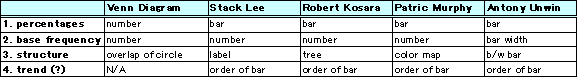
Masanao: Aleks and I did a PCA analysis on 2008 Presidential Election Candidates on the Issues data and plotted the 2 principal components scores against each other and got this nice result:
President2008.png
The horizontal axis is the 1st primary component score; it represents the degree to which a candidate supports Iraq War and Homeland Security (Guantanamo), and opposes Iraq War Withdrawal, Universal Healthcare, and Abortion Rights. The vertical axis is the 2nd primary component score which represents the degree to which a candidate supports Iraq War Withdrawal and Energy & Oil (ANWR Drilling), and opposes Death Penalty, Iran Sanctions, and Iran Military Action as Option.

The first principal component is the dividing axis for the Democrats and the Republicans. When we reorder the loadings according to the 1st component we get the following:
President2008loadings2.png
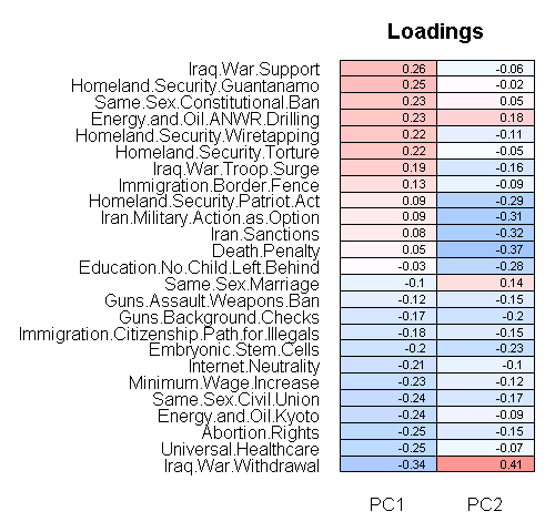
So for the first principal component, Republicans generally support red variables and the Democrats the blue colored variables. Ron Paul appears to be the only candidate that does not deviate much from the middle.

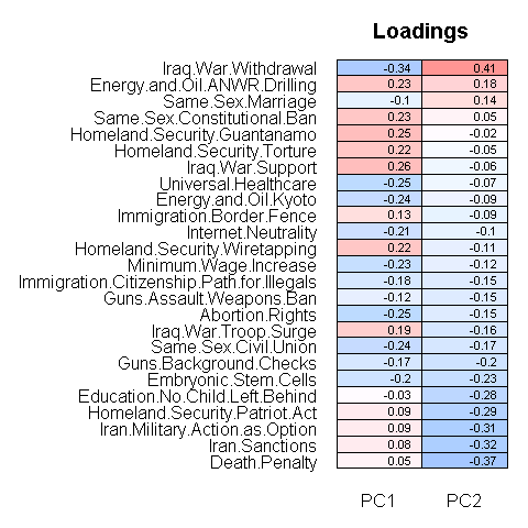
The second principal component is a little more difficult to interpret. Here most of the candidates are clustered around the middle except for candidate Ron Paul who supports Iraq withdrawal, Energy & Oil (ANWR Drilling), Immigration (Border Fence) but does not support other issues.
Here are the loadings ordered by the 2nd component:
President2008loadings1.png

Aleks: With the exception of Paul, there is a lot of polarization on the first component. To some extent the polarization is a consequence of the data expressing candidates’ opinions in terms of binary supports/opposes. When a candidate did not express an opinion, we have assumed that the opinion is unknown (so we use imputation), in contrast to a candidate refusing to take an opinion on an issue. When it comes to the issue of polarization: Delia Baldassarri and Andrew have suggested, that it’s the parties that are creating polarization, not the general public.

In fact, I think polarization is a runaway consequence of political wedging: in the spirit of Caesar’s divide et impera, one party wants to insert a particular issue to split the opposing party. This gives rise to the endless debates on rights of homosexuals, biblical literalism, gun toting, weed smoking, stem cells and abortion rights: these debates are counter-productive (especially at federal level), but the real federal-level problems of special interest influence, level of interventionism, economy, health care get glossed over. It just saddens me that the candidates are classified primarily by a bunch of wedge issues. A politician needs a wedge issue just as much as a soldier needs a new gun: it’s good for him, but once both sides come up with guns, the soldier loses. In the end, it’s better for all politicians to get rid of wedge issues every now and then by refusing to take a stance on a wedge issue. In summary, it would be refreshing if the candidates jointly decided not to take positions on these runaway wedge issues on which people will continue to disagree on, and delegate them to the state level, while focusing on the important stuff.

Masanao: Although the candidates’ opinions in the spreadsheet are probably not their final ones, it’s interesting to see the current political environment. If there was similar data on of the general public, it would be interesting to overlay them on top of each other to see who is more representative of the public.

Details of methodology:

We recoded the other/unknown as NA. Iraq War withdrawal was converted into 3 category variable: support -> 3, Supports phased withdrawal -> 2, and Opposes -> 1. Supported before / Opposes now was recoded as opposes.

We used R and pcaMethods package for PCA calculation.The method we used is Probabilistic PCA to handle the missing data.

Since the 4 Democratic Candidate on the left bottom corner were extremely close together, we manually separated them to make them distinguishable so all of the 4 are supposed to be around where “Edwards” is currently at.

Here is the data and the source code. When you run the code it will ask for the data so just tell it where it is.


Raw Principal Component score:
?? PC1PC2
Biden -1.52-0.86
Brownback 1.321.13
Clinton -1.58-0.92
Cox 1.790.53
Dodd -1.58-0.90
Edwards -1.58-0.87
Giuliani 0.89-1.31
Gravel -2.341.51
Huckabee 1.73-0.42
Hunter 2.38-0.15
Kucinich -2.451.03
McCain 0.63-0.81
Obama -1.61-0.41
Paul 0.102.63
Richardson -1.54-0.66
Romney 2.25-0.33
Tancredo 2.270.49
Thompson 2.08-0.76

Hans Rosling 2007

We had this entry almost a year ago. This year Hans Rosling gives yet another talk titled “New insights on poverty and life around the world”. The talk is great, and the ending is quite shocking.

In a follow-up to his now-legendary TED2006 presentation, Hans Rosling demonstrates how developing countries are pulling themselves out of poverty. He shows us the next generation of his Trendalyzer software — which analyzes and displays data in amazingly accessible ways, allowing people to see patterns previously hidden behind mountains of stats. (Ten days later, he announced a deal with Google to acquire the software.) He also demos Dollar Street, a program that lets you peer in the windows of typical families worldwide living at different income levels. Be sure to watch straight through to the (literally) jaw-dropping finale.

The software for video presentation is quite useful. You can see the outline of the talk and jump to the section that you are interested in by overlaying the cursor on top of it.

Overview of Missing Data Methods

We came across a interesting paper on missing data by Nicholas J. Horton and Ken P. Kleinman. The paper is about comparison of Statistical Methods and related Software to Fit Incomplete Data Regression Models.


muchMI.png

Here is the abstract:

Missing data are a recurring problem that can cause bias or lead to inefficient analyses. Statistical methods to address missingness have been actively pursued in recent years, including imputation, likelihood, and weighting approaches. Each approach is more complicated when there are many patterns of missing values, or when both categorical and continuous random variables are involved. Implementations of routines to incorporate observations with incomplete variables in regression models are now widely available. We review these routines in the context of a motivating example from a large health services research dataset. While there are still limitations to the current implementations, and additional efforts are required of the analyst, it is feasible to incorporate partially observed values, and these methods should be used in practice.

This is quite a thorough review. The authors refer to different packages already available. One thing we noticed is that there is nothing on diagnostics (see here for more on diagnostics of imputation). This paper should help us on improving the “mi” package.

Also the appendix of the paper can be found here.

Interaction in information software

I found this interesting article on information software and interaction.
SoftWareTypes.png
Here is the abstract:

The ubiquity of frustrating, unhelpful software interfaces has motivated decades of research into “Human-Computer Interaction.” In this paper, I suggest that the long-standing focus on “interaction” may be misguided. For a majority subset of software, called “information software,” I argue that interactivity is actually a curse for users and a crutch for designers, and users’ goals can be better satisfied through other means.

Information software design can be seen as the design of context-sensitive information graphics. I demonstrate the crucial role of information graphic design, and present three approaches to context-sensitivity, of which interactivity is the last resort. After discussing the cultural changes necessary for these design ideas to take root, I address their implementation. I outline a tool which may allow designers to create data-dependent graphics with no engineering assistance, and also outline a platform which may allow an unprecedented level of implicit context-sharing between independent programs. I conclude by asserting that the principles of information software design will become critical as technology improves.

It’s Edward Tufte applied to software and web design. Since we are seeing more information that are presented on the web such as this, it may be good to give a thought on how to deal with “interaction”.

Color of Flags

I’m not a pie chart person. But here is an example where I don’t mind the use (I found it here):
Flag.png

Using a list of countries generated by The World Factbook database, flags of countries fetched from Wikipedia (as of 26th May 2007) are analysed by a custom made python script to calculate the proportions of colours on each of them. That is then translated on to a piechart using another python script. The proportions of colours on all unique flags are used to finally generate a piechart of proportions of colours for all the flags combined. (note: Colours making up less than 1% may not appear)

It’s pretty, it’s something about proportion, it’s not trying to show clear numeric result, data-to-ink/pixel ratio is not a problem in this case, yet there’s some information that you will have hard time seeing from table. (Such as Tunisia has slightly more white then Turkey.)

Now I’m not for the alphabetical ordering of the countries, but then again I don’t have a better suggestion.
allflag.png
Is there any reason that no country uses pink?
This site has summary of what not to do with pie chart.
You can also look at this paper.

Election & Public Opinion by PIIM

Here is interactive visualization of Election & Public Opinion by PIIM. It’s an interactive display of Red / Blue state. Election data goes all the way back to 1789, the first presidential election.

This application will familiarize you with the voting process of the United States. Explore how public opinion and “creative democracy” has such a persuasive effect on the country; and how just a handful of votes may cause significant impact.
Historical background, the current voting process, and informative visualization of every major election are available. The Issue and policy tools permit some creative “What if” experiments in redrawing an election based on subtle alternations to historical outcomes.

Mirror, mirror on the wall..

In Snow White it was the magical mirror that answered the question “who’s the fairest of them all?” Now Australian researchers have created software to answer this question. They extracted 13 features and used C4.5 as classification method (more features below). (Detail can be found in: Assessing facial beauty through proportion analysis by image processing and supervised learning)
FacialRatio.png

With that in hand, it may be natural to wonder who’s the most beautiful of them all? Shocking answer may be found in the research done at the universities of Regensburg and Rostock in Germany, where they did a large research project on ‘facial attractiveness’.

A remarkable result of our research project is that faces which have been rated as highly attractive do not exist in reality. This became particularly obvious when test subjects (independently of their sex!) favored women with facial shapes of about 14 year old girls. There is no such woman existing in reality! They are artificial products – results of modern computer technology.

Thus, sad as it may be, your ideal beauty may not be in this world. So going back to the good old Snow White, if the magical mirror were asked the question today, it may answer; “You’re the fairest where you are, but in the virtual world, well let’s not go into that..”

If you’re interested in what features they used for classification, here they are ranked from the most useful to the least useful:

(1) 2:4 Vertical distance between pupils and tip of the chin to vertical distance between top of the face and pupils
(2) 3:5 Vertical distance between top of the face and nose to vertical distance between nostrils and tip of the chin
(3) 6:7 Vertical distance between pupils and central lip line to vertical distance between lips and tip of the chin
(4) 5:8 Vertical distance between nostrils and tip of the chin to vertical distance between pupils and nostrils
(5) 8:9 Vertical distance between pupils and nostrils to vertical distance between nostrils and central lip line
(6) 7:9 Vertical distance between lips and tip of the chin to vertical distance between nostrils and central lip line
(7) Mean_ratio
(8) 16:1 Ratio of face width to face length
(9) 15:16 Ratio of inter-eye distance to face width
(10) 10:1 Ratio of vertical distance between top of the face and eyebrows to face length
(11) 11:1 Ratio of vertical distance between eyebrows and tip of the nose to face length
(12) 12:1 Ratio of vertical distance between tip of the nose and tip of the chin to face length
(13) 13:14 Ratio of vertical distance between the tip of nose and lips to vertical distance between lips and tip of the chin

And here are the surreal faces:
AttractiveFace.png

Can Music Tell Your Personality?

I read this entry on study of correlation between music and personality .

A series of 6 studies investigated lay beliefs about music, the structure underlying music preferences, and the links between music preferences and personality. The data indicated that people consider music an important aspect of their lives and listening to music an activity they engaged in frequently. Using multiple samples, methods, and geographic regions, analyses of the music preferences of over 3,500 individuals converged to reveal 4 music-preference dimensions: Reflective and Complex, Intense and Rebellious, Upbeat and Conventional, and Energetic and Rhythmic. Preferences for these music dimensions were related to a wide array of personality dimensions (e.g., Openness), self-views (e.g., political orientation), and cognitive abilities (e.g., verbal IQ).

music.png
This study is much like the music genome project although it adds a twist by relating the preference of music to the personality, which makes it more interesting. I’m not sure if music genome project lets the data out to public. But if they do, this is a great data to strengthen the generalization part of the study since they have age, gender, and postal code of the users. Although as always, they will have to deal with the reliability issues. I wonder if anyone in the music genome project has thought about doing the personality study, the result may be interesting.

1200+ examples of information visualization at PIIM

A friend of mine introduced this site to me. It’s a database for information graphics that Parsons Institute for Information Mapping (PIIM) is building. They are accepting submissions so if you have interesting graphical display, take a shot to be in the “most comprehensive, manually annotated (and taxonomically classified) information graphics database in the world” which they are aiming for. I was not able to pull out 1200 graphics, but there are displays that I’ve never seen before. A list of key words might be helpful.