COVID and Vitamin D…and some other things too.

This post is by Phil Price, not Andrew.

Way back in November I started writing a post about my Vitamin D experience. My doctor says I need more, in spite of the fact that I spend lots of time outdoors in the sun. I looked into the research and concluded that nobody really knows how much I need, but on the other hand the downside of taking a supplement is small. Anyway I started to write all of this up, thinking this blog’s readers might be interested in both the specifics (where do the Vitamin D recommendations come from, for instance) and the general approach (how one can, and perhaps should, consider the pros and cons of medical advice). But I never got around to finishing that post and thus it never appeared, and it’s not going to now because someone else has written a Vitamin D post that is much more topical, interesting, and current than mine was going to be: it looks at the question of whether Vitamin D protects against COVID. It is also, I think, a great example of how to think when faced with different sources of information that suggest different things. Some studies say this, some say that, common sense suggests X, but on the other hand it also suggests Y. We all face this kind of situation all the time.

So I’m just going to link to the blog post, later in this post, and recommend that you all go read it. But I want you to read the rest of my post first, so please do that. As a teaser I’m going to post the conclusions from the post I’m sending you to, but the real value of the post isn’t in these conclusions, it’s in the reasoning and research.

Does Vitamin D significantly decrease the risk of getting COVID?: 25% chance this is true. The Biobank and Mendelian randomization studies are strong arguments against this; the latitude, seasonal, and racial differences are only weak evidence in favor.

Does Vitamin D use at a hospital significantly improve your chances?: 25% chance this is true. I trust the large Brazilian study more than the smaller Spanish one, but aside from size and a general bias towards skepticism I can’t justify this very well.

Do the benefits of taking a Vitamin D supplement at a normal dose equal or outweigh the costs for most people?: 75% chance this is true. The risks are pretty low, and it will probably bring you closer to rather than further from a natural range if you’re a modern indoor worker (side effects are few; the most serious is probably kidney stones, so don’t take it if you have any tendency towards that). And maybe some day, after countless false leads and stupid red herrings, one of the claims people make about this substance will actually pan out. Who knows?


Those are the assessments of the blog’s author, Scott Siskind, they aren’t from me. But I think, given what he says in his post, that they’re quite reasonable.

I’m going to say a few words about the blog I’m sending you to, because there’s an interesting story there. Siskind is the guy who used to have the blog called Slate Star Codex. Here is a sample post from that blog that I think might interest the readership of this blog. I was late ‘discovering’ SSC: a friend turned me onto it about a year ago. It is entertaining and informative, and the author (who wrote under the pseudonym Scott Alexander) is great at both thinking about a wide range of topics and explaining how he thinks. But several months ago a New York Times reporter contacted ‘Scott Alexander’ and said the NYT was going to publish a piece about the blog and its readership, and would give Scott’s real name (Scott Siskind). Siskind objected, saying he used a pseudonym because he sometimes wrote about controversial topics and/or said controversial things and that revealing his real name would expose him to repercussions such as losing clients at his business. The NYT did not relent, so Siskind took down his blog, hoping that that would make the story sufficiently irrelevant that the Times wouldn’t run it. And indeed that seems to have happened, although it’s also possible that the editors of the Times took Siskind’s feelings into account. But now Siskind is back, with a new blog published under his own name. And the New York Times has run their article.

That NYT article is…strange. If you read the article, the impression you get about Slate Star Codex is nothing like the impression you get by actually reading Slate Star Codex. The friend who suggested SSC to me a year ago thinks this is an example of the biases of NYT journalists being reflected in their reporting, a suggestion I would have dismissed a couple of years ago but which I now give a fair amount of credence: there is some unhealthy Political Correctness in the Times’s newsroom and my friend has me pretty much convinced that it is having too much influence on the stories they write and the way they write them. Specifically, I suspect that the fact that Siskind wrote about some controversial topics in ways that the Times reporter didn’t like may have led to the odd description of Slate Star Codex in the Times article.

Be that as it may, Siskind has a new blog called Astral Codex Ten, and you should all go read this piece about the evidence about how much Vitamin D does or doesn’t protect against COVID. 
 

Literally a textbook problem: if you get a positive COVID test, how likely is it that it’s a false positive?

This post is by Phil Price, not Andrew.

This will be obvious to most readers of this blog, who have seen this before and probably thought about it within the past few months, but the blog gets lots of readers and this might be new to some of you.

A friend of mine just tested positive for COVID. But out of every 1000 people who do NOT have COVID, 5 of them will test positive anyway. So how likely is it that my friend’s test is a false positive? If you said “0.5%” then (1) you’re wrong, but (2) you’re in good company, lots of people, including lots of doctors, give that answer. It’s a textbook example of the ‘base rate fallacy.’

To get the right answer you need more information. I’ll illustrate with the relevant real-world numbers.

My friend lives in Berkeley, CA, where, at the moment, about 2% of people who get tested have COVID. That means that when 1000 people get tested, about 20 of them will be COVID-positive and will result in a positive test. But that leaves 980 people who do NOT have COVID, and about 5 of them will test positive anyway (because the false positive rate is 0.5%, and 0.5% of 980 is 4.9). So for every 1000 people tested in Berkeley these days, there are about 25 positives and 5 of those are false positives. Thus there’s about a 5/25 =  1/5 chance that my friend’s positive test is a false positive.

(That’s if we had no other information. In fact we have the additional information that he is asymptomatic, which increases the chance. He still probably has COVID, but it’s very far from the 99.5% chance that a naive estimate would suggest. Maybe more like a 65% chance).

If you think about this issue once, it will be ‘obvious’ for the rest of your life. Of course the answer to the question depends on the base rate! If literally nobody had the virus, then every positive would be a false positive. If literally everybody had the virus, then no positive would be a false positive. So it’s obvious that the probability that a given positive is a false positive depends on the base rate. Then you just have to think through the numbers, which is really easy as I have illustrated above.

Apologies to all of you who have seen this a zillion times. Or twice. 

This post is by Phil.

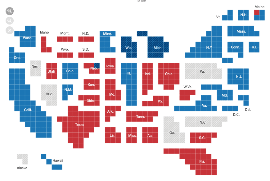
I like this way of mapping electoral college votes

This post is by Phil Price, not Andrew. 

I like maps — everybody likes maps; who doesn’t like maps? — but any map involves compromises. For mapping electoral votes, one thing you sometimes see is to shrink or expand states so they have area proportional to electoral votes (or to population, which is almost, but not quite, the same thing). I like the idea, but in practice the maps usually look so distorted and odd that I find them hard to read…except for this one. I like this NY Times map a lot. The best compromise I’ve seen. I think the thing that really makes it work is that they embrace the blockiness of it: they don’t just shrink or swell the states to have the right area, they make them out of squares. 

I think the shapes of New York and Florida could be improved, and it’s weird to have Georgia displaced to the west; I wonder if they tried putting Georgia where it belongs. I think I’d rather have Florida stick up into where Georgia is on this map, than have to move Georgia off the coast. Even so, Florida would have to shift downward, which they are presumably trying to avoid… my gut feeling is that that part of the map could be improved, but I could be wrong. In any case that’s a quibble, I think this is good. 

Map of electoral votes in each state

Don’t Hate Undecided Voters

This post is by Clay Campaigne, not Andrew. (It says ‘posted by Phil’, and that’s technically true, but I’m just a conduit for Clay here).  This is copied from Clay’s blog, which may have comments of its own so you might want to read it there too.

Politics has taken on particular vitriol in recent years. Commentators and political scientists have described the rising tide of polarization in terms of concepts such as tribalism and negative partisanship. These theorists argue that political psychology has largely become an exercise in affirming our bonds with our team, the in-group, by gratifying our shared contempt for the out-group.

On this model, one striking puzzle is the vitriol reserved for those who hesitate to choose a side: undecided voters.

As David Sedaris put it in The New Yorker: 

To put [undecided voters] in perspective, I think of being on an airplane. The flight attendant comes down the aisle with her food cart and, eventually, parks it beside my seat. “Can I interest you in the chicken?” she asks. “Or would you prefer the platter of shit with bits of broken glass in it?”
To be undecided in this election is to pause for a moment and then ask how the chicken is cooked.
I mean, really, what’s to be confused about?

That sounds clever at first, but who orders the shit, and why is it easier to understand or tolerate them? Many of us tacitly endorse the tribal, us-against-them model of politics, and view those who refuse to play the game with a special contempt. If the other side is populated by enemies and defectives who are beyond hope, the middle ground is populated by traitors and apostates who should know better.

My claim is that being an undecided voter is not that bad: in particular, indecision is better than a bad decision. Anti-polarization theorists persuasively argue that viewing voters on the other side with contempt is the beginning of the end for democracy. Taking that as a starting point, I argue that it’s especially unhelpful to contemn people for not picking a side. Contempt blocks understanding, compassion, and persuasion.

By next Tuesday, we have a decision to make. I’ll start by framing the issue from a broadly decision-theoretic perspective, on the assumption that the purpose of voting is to affect the election outcome, or more broadly, to cause or determine it. (This is in contrast to “expressive” theories of voting, which view voting as a form of expression. I take expressive theories to be persuasive as psychological description, but I’m not sure they have much normative force, especially since voting in elections is a private act.) Let’s restrict attention to three possible actions: voting for Trump, voting for Biden, and abstention. In terms of its effect on the election’s outcome, abstention is intermediate between the other actions. Undecided voters are open to taking at least two of those alternative actions.

Continue reading

Follow-up on yesterday’s posts: some maps are less misleading than others.

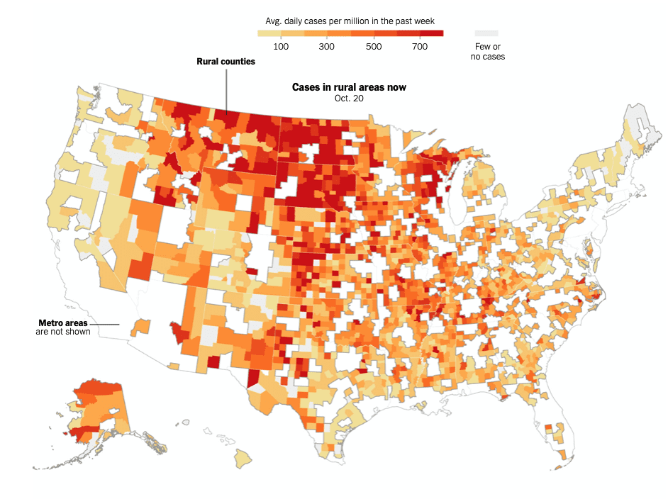
Yesterday I complained about the New York Times coronavirus maps showing sparsely-populated areas as having a case rate very close to zero, no matter what the actual rate is. Today the Times has a story about the fact that the rate in rural areas is higher than in more densely populated areas, and they have maps that show the rate in sparsely populated areas! 

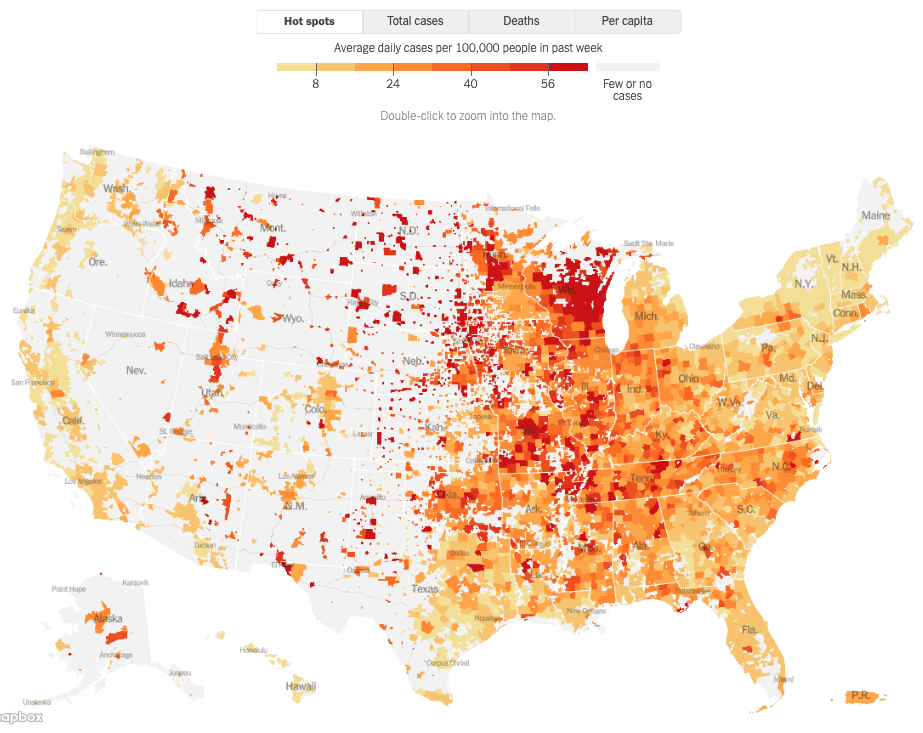
I’m not sure what is going on with these choices. It does make sense to me to show only rural areas if you are doing a story on the case rate in rural areas, and it would make sense to me to show only urban areas if you were doing a story on the case rate in urban areas, but neither of these make sense to me as a country-wide default. (It’s also a bit strange to me that they changed the scale, showing average cases per million on the new plot with numbers up to about 800; while showing average cases per 100,000 on the other plot, with numbers up to about 64, which is 640 per million. These are not wildly different and could work fine on the same scale.)

I could imagine leaving some areas blank if there are literally no permanent residents there — National Wilderness and National Forest, for instance — but if they are going to do that, they should not use the same color for ‘zero population density’ that they use for ‘zero coronavirus case rate’. These mean different things. That’s what I really dislike about the other plot: the same color is used for low-population areas, independent of the rate. Everywhere else on the map the color means “rate”, and then there are these huge sections where they color means “population density.”  On this one, at least they use different colors for the places where they aren’t showing us the data (white) and where the rate is low (gray). So, of the two, this one is better. But I think they should just combine the two plots. 

All maps of parameter estimates are (still) misleading

I was looking at this map of coronavirus cases, pondering the large swaths with seemingly no cases. I moused over a few of the gray areas. The shading is not based on counties, as I assumed, but on some other spatial unit, perhaps zip codes or census blocks or something. (I’m sure the answer is available if I click around enough).  Thing is, I doubt that all of the cases in the relatively low-population areas in the western half of the country are concentrated in those little shaded areas. I suspect those are where the tests are performed, or similar, not the locations of the homes of the infected people. [Added later: Carlos Ungil points out that there was indeed a link, just below the map, that says “For per capita: Parts of a county with a population density lower than 10 people per square mile are not shaded.”] 

I’m well aware that all maps of parameter estimates are misleading (one of my favorite papers), but I think the way in which this map is misleading may be worse than some of the alternatives, such as coloring the entire county. Yes, coloring the whole county would give a false impression of spatial uniformity for some of those large counties, but I think that’s better than the current false impression of zero infection rates in a large swath of the country. In terms of cases per 100,000 Nevada is much worse than Ohio but it sure doesn’t look like that on the map. [Note: I originally said ‘Illinois’ but either that was a mistake, pointed out by Carlos Ungil, or it changed when the map was updated in the past hour].  


Many western states appear to have low case rates but actual rates are not low

Who are you gonna believe, me or your lying eyes?

This post is by Phil Price, not Andrew.

A commenter on an earlier post quoted Terence Kealey, who said this in an interview in Scientific American in 2003:

“But the really fascinating example is the States, because it’s so stunningly abrupt. Until 1940 it was American government policy not to fund science. Then, bang, the American government goes from funding something like $20 million of basic science to $3,000 million, over the space of 10 or 15 years. I mean, it’s an unbelievable increase, which continues all the way to the present day. And underlying rates of economic growth in the States simply do not change. So these two historical bits of evidence are very, very powerful…”

One thing any reader of this blog should know by now, if you didn’t learn it long ago, is that you should not take any claim at face value, no matter how strongly and authoritatively it is made. Back In The Day (pre-Internet), checking this kind of thing was not always so easy. A lot of people, myself included, would have a copy of the Statistical Abstract of the United States, and an almanac or two, and a new atlas and an old atlas, and a CRC datebook, and a bunch of other references…but honestly usually we just had to go through life not knowing whether a claim like this was true or not.

But now it’s a lot easier to check this sort of thing, and in this case it’s especially easy because another blog commenter provided a reference: https://nintil.com/on-the-constancy-of-the-rate-of-gdp-growth/

So I look at that page, and sure enough there’s a nice graph of US GDP per capita as a function of time…and the growth rate is NOT, in fact, the same after 1940 as before!

US per capita GDP from late 1800s to 2011, in 2011 dollars; y axis is logarithmic

I have done no quantitative calculations at all, all I’ve done is look at the plot, but it’s obvious that the slope is higher after 1940 than before. Maybe the best thing to do is to leave out the Great Depression and WWII, and just look at the period before 1930 and after 1950, or you can just look at pre and post 1940 if you want…no matter how you slice it, the slope is higher after WWII. I’m not saying the change is huge — if you continued the pre-WWII slope until 2011, you’d be within a factor of 2 of the data — but there’s no doubt that there’s a change.

I pointed out to the commenter who provided the link that the slope is higher after WWII, and he said, in essence, no it isn’t: economists agree that the slope is the same before and after. So who am I gonna believe, economists or my lying eyes?

I have no idea about the topic that started the conversation, which is whether government investment in science pays off economically. The increase in slope after WWII could be due to all kinds of things (for instance, women and blacks were allowed to enter the workforce in ways and numbers not previously available).  I’m not making any claims about that topic. I just think it’s funny that someone claims that the “fact” that a number is unchanged is “very, very powerful” evidence of something…and in fact the number did change!

This post is by Phil.

Decision-making under uncertainty: heuristics vs models

This post is by Phil Price, not Andrew.

Sometimes it’s worth creating a complicated statistical model that can help you make a decision; other times it isn’t. As computer power has improved and modeling capabilities have increased, more and more decisions shift into the category in which it’s worth making a complicated model, but often it still isn’t. If you’re trying to make a decision about something that is affected by many different factors which interact in unknown ways and are controlled by parameters whose values you don’t know very well, it’s probably not worth your trouble to try to make a detailed model.

To take a current example, if you want me to predict how many Americans will have died of COVID-19 by the beginning of June, 2021, I’m not going to try write a model that simulates all of the political, social, medical, and environmental factors that go into that number, I’m just going to make up something that seems reasonable to me based on my general sense of how all these things interact. Presumably I could learn just a little bit more by making that complicated model — at least it might help me understand what the most important parameters are — but in practice the uncertainty in the numbers coming out of such a model is going to be so large that I don’t see how it could be worth the trouble.

Although I’m pretty sure it would not be worthwhile to try to build a model to answer the question posed above, there are plenty of other cases in which making a model is well worth the trouble.

Which brings me to my current predicament: I have a client who wants some advice (on how to decide how much electricity to buy in advance at a fixed price, rather than on the day they use it at a variable price) and I keep going back and forth about whether it’s worth trying to build a detailed model for this. I just don’t know how much there is to gain from such a model, compared to just using some rules of thumb to make the decisions, and I think that even figuring this out will take a lot of work. How should I proceed?
Continue reading

Coronavirus corrections, data sources, and issues.

This post is by Phil Price, not Andrew.

I’ve got a backlog of COVID-related stuff I’ve been meaning to post. I had intended to do a separate post about each of these, complete with citations and documentations, but the weeks are flying by and I’ve got to admit that that’s not going to happen. So you get this instead.

1. Alert the media: I made a mistake! Alex Gamma pointed out (a month and a half ago!) that I made a mistake in my plots of Years of Life Lost to coronavirus: I switched the labels of men and women. Alex wonders if the fact that this went unnoticed by me, or the dozens of commenters, is a reflection of people being used to the idea that women have it harder than men in just about everything, so seeing women supposedly being hit harder by COVID didn’t draw scrutiny. I don’t think that’s it — for one thing, we’re used to the fact that women live longer than men, so I think Alex’s proposal doesn’t fit here — but anyway I want to correct the record: there are more deaths, and more years of life lost, among men than among women.

2. Also in the “years of life lost” department, Konrad pointed out that in early May The Economist displayed some data showing the number of victims by age group, along with number of long-term health conditions, and years of life lost. There’s a lot of information in that graphic and I really appreciate the work that went into it. I wonder if there is some better way to display that information.

3. If you want to take a look at issues like the ones discussed above: Daniel Lakeland points out that number of COVID-19 deaths by sex, age group, and state is available from the US Department of Health. They’ve made some odd and slightly irritating choices in that datafile, e.g. the age groups aren’t all numeric (not even the first part of the string): there’s an “Under 1 year”. Why not 0-1, following the same pattern as the other age groups? Just adds one more pre-processing step if you want to do something like map these to actuarial tables. Speaking of which: expected years of life remaining, as a function of age and sex, is available from the Social Security Administration.

4. One issue I hope someone will take a look at — this means you! — is whether and how the distribution of deaths (and thus years of life lost) has changed with time. Daniel Lakeland suggested that we might expect this to change as the pandemic progresses, as vulnerable populations are better protected. One might expect that we will see fewer deaths per case, but with a lower percentage of deaths being those of the very old. Is this in fact happening?

This post is by Phil.

Advice for a yoga studio that wants to reopen?

This post is by Phil Price, not Andrew.

My 79-year-old mom likes to go to yoga classes, although of course she has not done so in months. Her favorite yoga place is cautiously reopening — they’ve had a few sessions with just eight or ten people in a rather large space (I’m going to guess 25 feet by 50 feet, based on memory from several years ago, but that could be pretty wrong and for our purposes the details don’t matter). When my mom described one of these classes I wasn’t thrilled that she went but it didn’t sound too terribly risky…but she says the place is now going to greatly increase the number of people, that otherwise they will fail financially. She asked if I have any advice that would let the place operate safely.

The following is what I wrote to the owner of the yoga place. I’m inviting comments: what did I get wrong, and what else can I say?
Continue reading

Years of Life Lost due to coronavirus

This post is by Phil Price, not Andrew.

A few days ago I posted some thoughts about the coronavirus response, one of which was that I wanted to see ‘years of life lost’ in addition to (or even instead of) ‘deaths’. Mendel pointed me to a source of data for Florida cases and deaths, which I have used to do that calculation myself for that dataset. The plots below show:
(Top) Histogram of deaths as a function of age, colored by sex because why not, although I would rather color them by ‘number of comorbidities’ or something else informative, since the difference by sex isn’t all that big.
(Middle) Points are expected years of life remaining for a person of a given age, from the Social Security Administration; and the lines are from a model that I fit to the points in order to get a continuous function of age that runs from birth to…well, to any age, although it predicts the same number of remaining years of life (or rather months of life) for anyone over 108 years old.
(Bottom) Histogram of ‘expected years of life lost’, calculated using the functions shown in the middle, i.e. a function of age and sex only. This is presumably an overestimate because the people dying of COVID-19 were probably already sicker (and thus set to be shorter-lived on average) than their same-age peers, although perhaps not as much as news reports might suggest: sure, most COVID-19 deaths of people over 80 are of people who have several “co-morbidities”, but most people over 80 have some health issues so it would be very surprising if that weren’t true.

The data through 5/12 include 1849 deaths, which the model predicts to represent 23177 years of life lost; that’s an average of about 12.5 years lost per death, but see the caveat in the explanation of the bottom plot. Is this a lot or a little? Daniel Lakeland has suggested dividing the years of life lost by 80 to get an equivalent number of lifetimes, where ‘equivalent’ just means equivalent in terms of life-years lost; in this case that gives us about 290, so the deaths of these 1849 people represent about the same loss of life-years as the death of 290 infants. This is not meant to imply that the tragedy is equal either way, it’s just a way to put this in terms that are easier to understand. 

It will be interesting to see if the YLL distribution (and the deaths distribution) shift towards lower ages as the pandemic progresses. At least in California most of the new cases are among workers. If better hygiene and social distancing have reduced the spread of the virus among the old, but it continues among the young, then we would expect to see fewer cases become deaths, but each death will represent more years of life lost. 

This post is by Phil.


Coronavirus Grab Bag: deaths vs qalys, safety vs safety theater, ‘all in this together’, and more.

This post is by Phil Price, not Andrew.

This blog’s readership has a very nice wind-em-up-and-watch-them-go quality that I genuinely appreciate: a thought-provoking topic provokes some actual thoughts. So here are a few things I’ve been thinking about, without necessarily coming to firm conclusions. Help me think about some of these. This post is rather long so I’m putting most of it below the fold.

Continue reading

Coronavirus Quickies

This post is by Phil Price, not Andrew.

There a couple of things that some people who comment here already know, but some do not, leading to lots of discussion in the comments that keeps rehashing these issues. I’m hoping that by just putting these here I can save some effort.

1. The ‘infection fatality rate’ (IFR) is not an endogenous number that describes the virus: it depends on the people and their circumstances.

By ‘it depends on the people’ I mean it is a much higher number for a typical group of old people than for a typical group of young people. It is a much higher number for a typical group of diabetics than typical group of non-diabetics.

By ‘it depends on their circumstances’ I mean it is a higher number for people who get no medical help than for people who do.

2. The IFR does not characterize how dangerous the disease is at a societal level, even if we knew the accurate number for a given population and their circumstances. That’s because the IFR quantifies the probability of dying once a person is infected; it says nothing about how likely it is that they will get infected.

Even if COVID-19 is like a slightly-worse-than-average seasonal flu in terms of IFR, it would be much much worse from a societal standpoint: it seems that nearly nobody is immune (except perhaps those who have already had it), whereas in any given year many people are immune to the flu, either because they were vaccinated and the vaccine was effective for them or because they had a similar strain of the flu in the past and are still immune. (I’m aware that the distinction between ‘immune’ and ‘not immune’ is not so clear-cut, but that doesn’t invalidate the point).

A virus with an IFR of 40% in a given population, but that only infects 0.1% of the people exposed to it, would not become an epidemic because it would not infect enough people. But a virus with an IFR of 0.1% that infects 40% of the people exposed to it would be a public health disaster and would kill millions of people. If someone says ‘coronavirus is like the seasonal flu, just look at the IFR’, they do not understand. To be like the seasonal flu in the way they mean, it would need to be like the seasonal flu both in terms of IFR and in terms of the number of people it will infect.

Those are my main points. But since I’m here I’ll go on with one more thing…hey, the rule of three, gotta do it:

3. According to the “Worldometers” data aggregation site, coronavirus deaths per million in the Republic of San Marino is over 1200. Even under the assumption that everybody there has been infected, that implies that in that population, with whatever medical care they received, the IFR was 0.12%. It’s one of the wealthiest countries in the world, and does not have a population that is highly skewed towards old people, which suggests to me that for the U.S. population as a whole — if everyone were infected, or if a simple random sample of people were infected — the IFR would be over 0.1%, even if every infected person got good medical care. This is also suggested by data from Spain and Belgium, where deaths per million are above 500 even though (I think most people agree) fewer than half the people in those countries have been infected.

This post is by Phil.

Coronavirus in Sweden, what’s the story?


This post is by Phil Price, not Andrew.

I’m going to say right up front that I’m not going to give sources for everything I say here, or indeed for most of it. If you want to know where I get something, please do a web search. If you can’t find a source quickly, leave a comment and I’ll edit this post to provide one. For instance, I say below that many epidemiologists think a fairly substantial percentage of people with COVID-19 infections have no symptoms or only extremely mild symptoms, but I don’t provide a source. If you use your favorite search engine to search for, say [coronavirus asymptomatic] and you don’t see sources that agree with me, let me know. I agree it’s better to provide sources but I have work deadlines and I just don’t want to take the time. It’s bad practice but hey, this is just a blog.

Now, on to the topic of the post.

I hope we are all rooting for Sweden to find a way to limit coronavirus fatalities to a reasonable level while also maintaining their economy at a reasonable level. That would be a great thing for the Swedes, of course, but would also point a way forward for the rest of the world as we eventually try to let the economy get moving again. To me, the key distinction isn’t between voluntary restrictions on behavior (like Sweden’s) and requirements (like most of the rest of the world), but rather between whether non-essential interpersonal contact is or isn’t happening. If the Swedes are merely doing voluntarily what other countries are doing by law, the economic and social effects are going to be pretty much the same. But if they are implementing sufficient safety controls to limit the spread of the virus, and doing so in a way that permits most economic activity to continue, then we can do the same.

I do think it’s possible for a lot of business to proceed in an acceptable manner during the pandemic. I gave an example in a comment yesterday: the company that installed my HVAC system is still working, although doing many fewer jobs than usual, and they’re doing so in a way that I think is responsible. In normal times, they send a two-person crew to most jobs: a skilled HVAC professional and an assistant who schleps equipment and parts from the truck, wraps insulation, cuts metal, etc., under orders from the experienced person. But now they’re just sending one person to most jobs, even though it takes a lot longer and they now have an expensive person doing work that could be done by an inexpensive person. When they do have to send a pair of people, it’s two people who are only ever paired together, so if one of them gets sick they only put the other one at risk, they don’t rotate through the whole workforce. They ask the client to vacate the residence or at least the area of the residence where they’re working. They wear gloves and masks. Even thought they’re stretching and perhaps breaking the law on social distancing (here in the California Bay Area) by doing some nonessential work, it’s my informed judgment that what they are doing is OK.

So I can at least imagine a society in which companies shut down if they can’t provide a low-transmission work environment, but continue to work if they can do so safely, and in which people continue to see each other socially but do so in a responsible manner. I definitely, definitely would not trust the United States to be that society, at least not voluntarily, but maybe Sweden can manage it. Swedish politicians have said Sweden is special in that regard — more responsible to each other, more willing to follow government advice — and I can well believe that’s true, especially compared to the U.S. And if that’s the case, we in the U.S. can try to codify what works and make it happen here too.

Of course, there’s also the possibility that, even if Sweden is successful, that success simply can’t be replicated in the U.S. For instance, diabetes seems to increase the risk of death’ from the virus and I think we have a lot more diabetes here than in Sweden. Maybe true of other risk factors too.

And we know Swedes have been doing a lot voluntarily. According to the most recent Google Mobility Report (unfortunately from 9 days ago), person-hours at Swedish ‘retail and recreation’ sites were down 40%, transit stations about the same, and workplaces down 25%. Sweden has done a fairly substantial partial shutdown.

Is it enough?

Enough for what?

On the one hand some people say Sweden has pretty much won, they have the virus under reasonable control while maintaining a fairly healthy economy. On the other hand, they just moved into 10th place in deaths as a percentage of population, and seem on track to keep climbing the list: unless something changes they will soon take over 9th place from Switzerland, since Swiss deaths per million people only increased 40% in the past week, whereas Sweden’s doubled.

I’m going to set aside the economic question, because other than knowing Volvo is about to restart production in Sweden I know nearly nothing about Sweden’s current economic situation and I don’t have time to look into it. But I have been looking at the progress of the disease there, based on the sources I’m aware of, and…well, it’s a mixed bag.

As I mentioned in a previous post, Sweden’s death numbers show an odd pattern on Worldometers and the New York Times coronavirus stats page: they have a severe weekend undercount, which they correct later, but these sites only keep track of the latest totals, they don’t go back and adjust when they happened. That is, a coronavirus death is counted on the day it is reported rather than the day it occurred, and this seems to be a bigger issue for Sweden than for other countries. The effect happens on non-weekends too, it’s just smaller. Anyway it’s clear that on any day there is an undercount, which I suspect (not sure) may be a larger fraction in Sweden than in other countries.

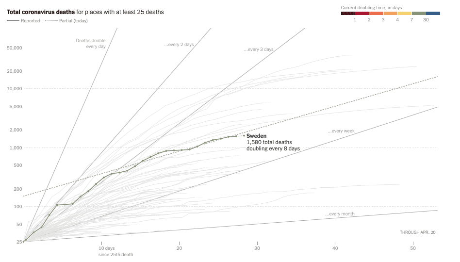
So, as of yesterday (Sunday April 19) they had at least 1580 coronavirus deaths, with deaths doubling every 8 days or so and no noticeable downward curvature on a log plot over the past two weeks. Most other countries that are at least a month past their first deaths seem to have slowed the increased the doubling time to more than 10 days, usually more than 12. And those doublings really multiply up over time: Four doublings in a month rather than three, that’s…well, that’s an additional factor of two in deaths, is what that is. Viewed through this lens, Sweden’s approach does not seem like a success. Yes, in deaths per capita they are still way under Belgium and Spain and Italy and the UK, but those are all countries that got started earlier and didn’t implement any kind of social distancing until it was too late to prevent mass casualties. Sweden, like the U.S., had time to learn from those other experiences.

So that’s the bad news.

The good news is, Sweden has not had the huge surge of cases (and subsequent deaths) that would have been expected if they weren’t taking effective measures at slowing the spread of the virus. Those voluntary measures they’re taking are definitely helping tremendously.

You know, even just writing this post has helped me put things in perspective. When I started writing I was baffled by what I saw as contradictions between claims coming from Sweden that they had been successful in controlling the virus while maintaining their economy, and the death numbers that seem to show no such thing, but now that I’ve looked at the numbers again and read a few opinion pieces again I am no longer baffled, I simply think there are different definitions of ‘success.’ Sweden avoided overwhelming their emergency health care system, as happened in Italy and Spain and New York. Maybe that’s what they mean by success. Yes, their per capita death count is still increasing faster than that of most of their peers, but not by a huge amount, and presumably they think they can bring the growth rate down soon. They might end up in the top eight or top five countries in deaths per capita — they’ll be number 9 in a few days — but that means there are several other countries that would be thrilled to be in their position just in terms of deaths per capita, and Sweden’s economy is presumably stronger too (I assume. As I said, I know nearly nothing about their economy). If avoiding the fate of Belgium and Spain and Italy is ‘success’ then Sweden is a success. To me that seems like an awfully low bar, but different people have different values and I’m sure lots of people would agree that that makes their approach a success.

Funny, by thinking about this post as I was writing it I have rendered it uninteresting to me. But what the hell, I’ll post it anyway, at this point the effort is all sunk cost.

This post is by Phil.

Considerate Swedes only die during the week.

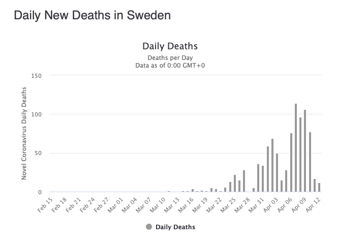
Bar chart of coronavirus deaths in Sweden, by date.

Reported Coronavirus deaths in Sweden, by date.

This post is by Phil Price, not Andrew.

A lot of people are paying attention to Sweden, to see how their non-restrictive coronavirus policies play out. Unlike most other countries in Europe, they have instituted few mandatory measures to try to slow the spread of the virus. Instead, they’ve taken a ‘softer’ approach, telling people the risks and asking people to make good choices. And people are certainly changing behavior: according to Google’s mobility reports , as of April 5 the use of transit stations was down 37%, workplaces were down 10%, and retail establishments were seeing 25% less traffic. So there’s definitely some ‘social distancing’ going on, although not nearly as much as, say, Norway (retail down 60%, workplaces down 32%).

So…what’s the result? How do deaths in Sweden compare to other countries? Well, on paper they’re doing OK, with deaths doubling every 5 days. That’s not as good as their neighbors (Denmark, Finland, and Norway are all around 6-7 days, and that’s a difference that adds up, or rather multiplies up, over the course of a month or two) but it’s about the same as Belgium and, well, hard decisions have to be made and conceivably the Swedes could feel that this is the right balance of economy versus deaths.

But: I don’t trust the numbers coming out of Sweden. See the attached plot of coronavirus deaths by date. I think we can all agree that people are dying on weekends, they’re just not being reported. If this were just some clerical thing, like deaths not being counted until the clerks show up at the office on Monday, then we would expect that either the numbers would be corrected over time, or that there would be a big spike on Mondays when the weekend deaths are counted, but we don’t see either. (The plot is from Worldometers and the numbers match those that are reported daily in the New York Times).

As the world tries to figure out how to manage an end to the shutdown that’s in place in many countries, data from countries like Sweden that are doing things differently should be very valuable. But only if we can trust the data. Anyone have any idea what is going on with the death count in Sweden? I don’t.

This post is by Phil.

Amazing coincidence! What are the odds?

This post is by Phil Price, not Andrew

Several days ago I wore my cheapo Belarussian one-hand watch. This watch only has an hour hand, but the hand stretches all the way out to the edge of the watch, like the minute hand of a normal watch. The dial is marked with five-minute hash marks, and it turns out it’s quite easy to read it within two or three minutes even without a minute hand. I glanced at it on the dresser at some point and noticed that the hand had stopped exactly at the 12. Amazing! What are the odds?!

I left my house later that morning — the same morning I noticed the watch had stopped at 12 — to meet a friend for lunch. I was wearing a different watch, one with a chronograph (basically a stopwatch) and I started it as I stepped out the door, curious about how well my estimated travel time would match reality. Unfortunately I forgot to stop the watch when I arrived, indeed forgot all about it until my friend and I were sitting down chatting. I reached down and stopped the chronograph without looking at it. When I finally did look at it, several minutes later, I was astonished — astonished, I tell you! — to see that the second hand had stopped exactly at 12.

I started to write out some musings about the various reasons this sort of thing is not actually surprising, but I’m sure most of us have already thought about this issue many times. So just take this as one more example of why we should expect to see ‘unlikely’ coincidences rather frequently.

(BTW, as you can see in the photo neither watch had stopped exactly at 12. The one-hand watch is about 45 seconds shy of 12, and the chronograph, which measures in 1/5-second intervals, is 1 tick too far).

This post is by Phil.

When did “by” become “after”?

This post is by Phil Price, not Andrew.

I just did a Google News search for “injured after”, and these are some of the headlines that came up:

16-year-old bicyclist seriously injured after being hit by car in Norfolk
At least 1 injured after high-speed crash in Bridgeport
Teen injured after falling off rooftop
Driver injured after crash down embankment near Sherwood
Two injured after shooting on Indy’s east side

There are many more like these. They all irritate me. What, the 16-year-old cyclist was uninjured in the crash, but after the crash he got hurt somehow? The high-speed crash in Bridgeport didn’t injure someone, but someone got injured afterwards? The only one of these that I believe could be factually correct is “Teen injured after falling off rooftop”, since, yeah, ha ha, it wasn’t falling off the rooftop that hurt him, it was hitting the ground a couple of seconds later.

These should be “16-year-old bicyclist seriously injured by being hit by car”, “At least one injured in high-speed crash”, “Teen injured by fall off rooftop”, “Driver injured in crash down embankment”, and “Two injured in shooting”.

I first noticed this factually incorrect use of ‘after’ a couple of years ago but it was pretty uncommon. Now it seems to have taken over, or at least it seems to have caught up with “by” and “when”, as in ‘injured by crash’ and ‘injured in crash’ for example. And don’t bother telling me Shakespeare used ‘after’ this way, or Austen or Chaucer or Milton, it’s still wrong.

My friends, including my writer friends and editor friends, tell me to get over it, what’s the big deal, you know what they mean. Well, first of all I don’t always know what they mean, there have been times I’ve been genuinely unclear on what is being described. But also, just because I understand it doesn’t mean it’s right. If I say “this is just not the write way to phrase it”, hey, you know what I mean, but that sentence is still wrong.

I may be the only one who cares, but by god I am not giving up this battle. This new usage stinks.

Now all you kids get off my lawn.

This post is by Phil.

The devil’s in the details…and also in the broad strokes. Is this study ridiculous, or am I badly misjudging it?

This post is by Phil Price, not Andrew.

Something caught my eye in a recent MIT Technology Review: an article in Nature Communications entitled ‘The greenhouse gas impacts of converting food production in England and Wales to organic methods.’ This is a subject that interests me, although I have no expertise in it whatsoever, so I clicked through and read it and became increasingly baffled as I worked my way through. On the one hand, as I said I have no expertise so who am I to say that they’re missing something huge? On the other hand, they are obviously missing something huge.

Here’s what they say (the second half of the abstract): “Here we assess the consequences for net GHG emissions of a 100% shift to organic food production in England and Wales using life-cycle assessment. We predict major shortfalls in production of most agricultural products against a conventional baseline. Direct GHG emissions are reduced with organic farming, but when increased overseas land use to compensate for shortfalls in domestic supply are factored in, net emissions are greater. Enhanced soil carbon sequestration could offset only a small part of the higher overseas emissions.”

Certainly believable from what I know. I would also find it believable that organic farming is about the same, or is somewhat better than conventional by this measure. No idea. Like I said: not an expert. But sure, yields per acre are probably going to be lower — you’ll lose more to pests and fungus and such — so you’ll need more acres if you want to grow the same amount of the same foods. Of course you will shift your production from some foods to others, but it’s not hard to understand the mechanism by which you’d need to clear more forests to have farmland, or something other change that would be net negative from a carbon standpoint.

Anyway, I started reading through the article and, as I said, grew increasingly baffled. My bafflement was focused initially on one thing: the lack of discussion of the price. The words ‘price’ and ‘cost’ came up only when discussing how to allocate a given amount of carbon emissions among the different components that go into producing food, and not (as far as I can tell) into any model of what foods will be produced. This seems crazy. With organic farming it costs more to produce the same amount of food, which is why most farming is non-organic: if organic were cheaper why would anyone use conventional methods, especially since people are willing to pay more for organics? I’m not an economist and it’s only been a week since I posted something that chided economists for tending to believe too deeply in my own theories, but there it’s not like they’re wrong about everything and one thing they’re right about is that if something gets more expensive people will buy less of it.  If, under an all-organic regime, meat triples in price and all other food doubles in price, people are going to (a) eat less food, (b) waste less food, and (c) eat a lot less meat. How can you ignore this?

But I thought that maybe I just didn’t understand how their model works, maybe there’s some way they implicitly take price into account and therefore don’t need to model price directly. At any rate I kept reading and got to their Methods section, where they explain what they did. Here are a few points:
1. “The Objective Function of the model, which is maximised subject to constraints on resource availabilities, is the sum of total crop and livestock production, expressed as ME [Metabolizable Energy, i.e. Calories].” This is a weighted sum over agricultural products and ‘rain classes’ of the “fresh weight per unit crop area or livestock number per year.” The assumption is that this quantity will be maximized in an all-organic regime.
3. The doozy: “In each farm type, the set of crop and livestock production activities available are fixed, as evidence suggests that the dominant agricultural activity (e.g., dairy farming) will usually stay in place post conversion to organic management, due to existing farm infrastructure, farming knowledge and local conditions.”
4. “The land areas under each farm type are fixed, reflecting the areal coverage of their conventional equivalents recorded in the June Survey of Agriculture in 2010”.

So, combining 3 and 4: If raising livestock becomes half as profitable per acre (or even becomes completely unprofitable), doesn’t matter, we’ll still have the same number of acres in livestock. If raising livestock becomes twice as profitable per acre, same thing, no change in acreage. According to #3 (as I understand it) you’re able to switch between types of livestock — raise fewer sheep and more cows — but if an acre is in livestock now, it’s going to be in livestock in an all-organic world too, no matter what.

I can imagine something like that in the face of small changes in agricultural practices, like the relatively small amount of acreage that has changed to organic production over the past twenty years. But they are talking about an agricultural regime that they estimate to generate “a drop in total food production expressed as metabolisable energy (ME) by of the order of 40% compared to the conventional farming baseline.” How could this possibly be close enough to the truth to be a useful model? Perhaps there’s an implicit assumption that the price of food won’t change much because imported food won’t change much in price, so people won’t switch their dietary habits? But if that’s true, won’t people simply switch almost completely to imported food? If English (and Welsh!) farms switch to organic production, but foreign farms do not, then English/Welsh farms will go out of business as people spend their food dollars on the cheaper (foreign non-organic) competition. The model does not allow that: assumptions 3 and 4 guarantee that the same acreage will be farmed for the same purposes, no matter how unprofitable.

Or perhaps non-organic foreign food will not be allowed for import. Then all food will get more expensive, some foods more than others. The study doesn’t appear to look at that, but we can imagine: food would get a lot scarcer and a lot more expensive.  People would eat less of it, and there would be some switching from relatively expensive foods to cheaper ones. Surely this would render assumptions 3 and 4 ridiculous? It takes a whole lot of ‘metabolisable energy” to raise a cow or even a sheep. If people eat half as much meat — hey, it’ll be a whole lot more expensive, they’ll certainly reduce their consumption — and that land is switched to producing plants for human conception then conceivably the amount of ‘metabolisable energy’ available for human consumption wouldn’t go down at all. But not only does the model not predict that (I’m not saying it should!) it doesn’t even allow that shift to take place.

To me this whole exercise seems like an example of a fallacy Andrew has discussed before, the ‘all else equal’ fallacy (which he has probably assigned a cute name). You’ll see an article that says something like (for example) walking to work costs about the same as driving, because the average commute is 10 miles and to walk 10 miles takes 1100 Calories and that costs about $3 or whatever, and of course that’s ridiculous because if everybody actually walked to work there’s no way the average round-trip commute would be 20 miles (I just made up the numbers and the example). It’s not that these comparisons are uninformative, indeed they can be quite informative and thought-provoking, it’s just that you can’t take them seriously as predictions of what would happen in the counterfactual world that they envision.

Similarly, I think there may be interesting stuff to be learned from this study about switching to organic farming, but one thing I don’t think you can learn is how much ‘metabolisable energy’ would be produced in England and Wales if they switched entirely to organic food production. The assumptions seem completely unreasonable to me.

And yet here it is in Nature Communications. This not only seemed reasonable to the authors, it seemed reasonable to the editor and the reviewers. So probably it should seem reasonable to me, too. But it doesn’t.  Can someone enlighten me? How can it make sense to envision this huge change in food production without even a nod to how it would change prices and therefore people’s consumption choices, which would in turn change farmers’ decisions about what foods to produce?

This post is by Phil, not Andrew.


The best is the enemy of the good. It is also the enemy of the not so good.

This post is by Phil Price, not Andrew.

The Ocean Cleanup Project’s device to clean up plastic from the Great Pacific Garbage Patch is back in the news because it is back at work and is successfully collecting plastic. A bunch of my friends are pretty happy about it and have said so on social media…and it drives me nuts. The machine might be OK but it makes no sense to put it way out in the Pacific.  Someone asked why not, and here’s what I wrote:

Suppose I have a machine that removes plastic from all of the water it encounters. I offer you a choice: you can put it in a location where it will remove 1 ton per month — the Pacific Garbage Patch — or in a location where it will remove 10 tons per month (let’s say that’s the Gulf of Thailand but in fact I do not know where the best place would be). Obviously you will put it where it can remove 10 tons per month. Now you raise money to build and operate a second machine. You put your first machine in the best place you could find, so do you now put your second machine in the Pacific Garbage Patch? You shoudn’t, if your goal is to remove as much plastic from the ocean as possible: you should put it in the best place where you don’t already have a machine…the Bay of Bengal, maybe. Or maybe it, too, should go in the Gulf of Thailand. Or maybe in the Caribbean. I have no idea where the plastic concentrations are highest, but I know it is not the Great Pacific Garbage Patch. At any rate you should put the first machine where it will remove the most plastic per month; the second machine in the best remaining place after you have installed the first one; the third machine in the best remaining place after you have installed the first two; and so on. The Pacific Garbage Patch isn’t literally the last place you should install a machine, but it is way way down the list. (If you know in advance that you are going to build a lot of machines, you can optimize the joint placement of all of them and you might come up with a slightly different answer, but let’s not worry about that detail.)

The paragraph above assumes that you are just trying to remove as much plastic from the ocean as possible. If you have some other goal then of course the answer could be different. For instance, if you are trying to reduce the amount of plastic at some specific spot in the middle of the Pacific, you should put your machine at that spot even if it won’t get you very much in terms of plastic removed per month.

That paragraph also implicitly assumes the cost of installing and operating the machine is the same everywhere. If it is very expensive to install and operate the machine in the Gulf of Thailand, then maybe you’d be better off somewhere else: for the same money as one machine in the place where it would maximize the plastic removal per month, maybe I could build two machines and install them in cheaper places where they would combine to remove more plastic. It becomes an optimization problem. But: I have never seen anyone, not even the project proponents, who thinks the middle of the Pacific is a relatively _cheap_ place to install and operate a machine: in fact it is very expensive because it is so remote.

And of course the situation gets even more complicated when you consider other factors like whether you will interfere with fishing or with ship traffic, what effect will the machine have on the marine ecosystem, are you inside or outside a nation’s territorial waters, and so on.

Choosing the best place for your first, second, third, fourth, fifth, sixth,… machine might be complicated, but I have not seen any reasonable argument for why the Pacific Garbage Patch is even in the running. It just doesn’t make sense.

I am in agreement with…uh, I think it was Darrell Huff (author of “How to Lie with Statistics”) who made this point, but I could be wrong… when he said that the more important something is, the more important it is to be rational about it. If you’re trying to save human lives, for example, anything other than the most efficient allocation of resources is literally killing people. So to the extent that it is important to people to remove plastic from the oceans, it’s important to allocate resources efficiently. But, much as we would like to think it is important to people and therefore should be done as efficiently as possible, in fact people are often not rational. It may be the case that people are willing to contribute much much more money, time, and energy to a program to remove plastic from the ocean inefficiently than to one that would do so efficiently. If people are willing to contribute to remove plastic from the Pacific Garbage Patch but not from anywhere else, well, OK, put your machine in the Pacific Garbage Patch. So I’m not saying people shouldn’t do this project. I’m just saying it doesn’t make sense. That is, sadly, not the same thing.


This post is by Phil, not Andrew