Pen and notebook recommendations?

Current state of my art

It’s an all Japanese line up.

  • Maruman Mnemosyne A5, 5mm dot or square pads, side or top bound
  • Sakura Sigma Micron 0.1 pens

I’m curious if there are people that have tried these and have something they prefer.

The pads

I just switched pad brands a few days ago. I used to use Rhodia A5 5mm dotpads with top perforation (it’s a French brand that’s part of Claire Fontaine). I found the pencil didn’t show up well enough on the dark lines, but then Andrew turned me onto the Dotpads about 10 years ago. The Mnemosyne pads have off-white instead of white pages (maybe a bit greenish like old graph paper) and the rules (or dots) are perfectly light. But it’s the smoothness of the paper that’s really incredible. I’ve never felt paper like it and now I’m hooked.

The pens

Matt Hoffman turned me onto the pens when we started working on Stan (though he’s now using Muji pens). They are great at writing fine lines, which is perfect for math. I ran out of pens on a trip to Berlin and found that Staedtler Pigment Liner 0.1 pens are a reasonable substitute (not quite as dark, but the nib’s a bit tougher). Andrew uses some kind of erasable pen—I’ve never cottoned to those.

I have used Pentel Quicker-Clicker pencils since high school (circa 1980). I still use them sometimes, though with B lead as I find the HB too light. I thought I’d dislike doing math in pen, but now I prefer it because pen is more fun to write with and the end result is much easier to read.

A Cure for Gravity

I just finished reading the above-titled Joe Jackson autobiography from 1999. I was charmed right away on page 12 with this passage:

The first of our three 45-minute sets is uneventful, but this is normal. People are still trickling in. Most of them seem to be middle-aged bruisers with long sideburns who won’t leave until they’ve had at least eight pints. Their pudding-fed wives are dressed, if not to kill, then at least to inflict grievous bodily harm . . .

I love that! Partly because you can see the work he put into writing it. I’m not saying it’s great literature, or even good literature, but it has character.

The book itself was readable and interesting. It reminded me a lot, both in style and content, of Quentin Crisp.

Was that on purpose, Jackson picking up Crisp’s style to tell a similar story of growing up and finding oneself in a world of characters?

I googled *”joe jackson” “quentin crisp”* and came across this interview from 2002 where Jackson says:

And if we’re talking about stereotypes, then I guess what I’m saying in the song is that I almost prefer the older stereotype—this sort of Oscar Wilde/Quentin Crisp gay stereotype, I almost prefer that to the more-straight-than-straight stereotype.

So, yeah, Jackson was aware of Crisp, and maybe that was an influence on his writing style.

That same Google search also turned up this bit from Crisp:

Playing Shakespeare is really tiring. You never get to sit down, unless you’re the king.

Dude had some great lines.

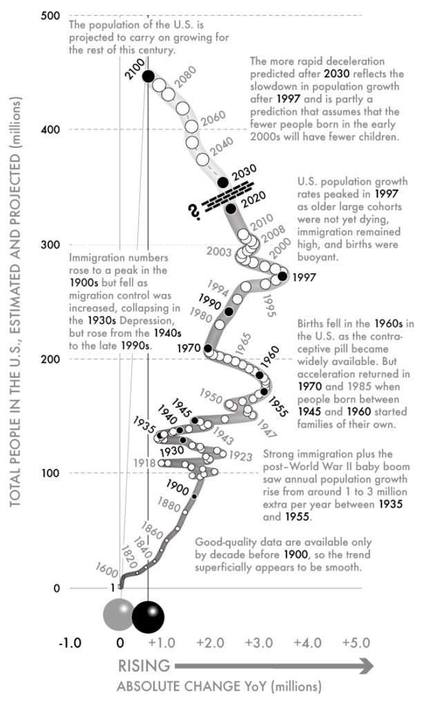
This is a great graph: Plotting y(t) vs y'(t), tracing over time with a dot for each year

Gwynn points us to a new book, “Slow Down: The end of the Great Acceleration – and Why It’s Good for the Planet, the Economy, and Our Lives,” by Danny Dorling. The author is a geographer, so I assume he hasn’t claimed to have “discovered a new continent,” but I expect he’ll appreciate the above world map from xkcd.

I haven’t seen Dorling’s book, but what Gwynn really wanted to point out were the visualizations on its webpage. These are a series of plots, each tracing a time series over a series of years with y on the y-axis and y'(t) (that is, dy/dt) on the x-axis. Here’s an example:

And here’s another:

And here’s one more:

We could keep going forever. The general theme is that if you plot y vs. y’, showing the direct passage of time using a dot for each year, you can visually convey second derivatives too. When teaching these ideas, I will typically show time series graphs of y(t), y'(t), y”(t), but that’s just not so intuitive. Showing y(t) and y'(t) on the two axes has just the right amount of redundancy to really make these patterns clear.

These graphs come up in physics—Dorling illustrates with the classic phase portrait of the pendulum—but there must also be a statistical literature on this—I was thinking I could ask Lee Wilkinson but then I remembered, sadly, that he’s no longer alive—so feel free to inform me of this in the comments.

Anyway, not only does this graphical form work; also, Dorling pulls off the details very well. I’m especially impressed at how he integrates explanatory text into the images, and just more generally how the graphs look professional and “designed” without sacrificing their statistical integrity. It’s unusual to see visualizations that combine the best of infoviz and statistical graphics. The only thing I don’t get in the above graphs are what the thickness of the line over time is supposed to represent. At first I thought the width was proportional to y, or maybe sqrt(y), but it’s not. Is it just arbitrary? That was confusing to me.

There are animated versions too! I love this stuff.

How would I do it differently?

As I said, I think these graphs are wonderful. Still, if I were doing them I would make some changes:

1. If you’re graphing an all-positive quantity (as in the examples shown above), I think it would make more sense to show relative (that is, percentage) change rather than absolute change.

2. I’d rotate the whole damn thing 90 degrees, then it will fit better on the screen (see examples above), also somehow it works better for me showing forward progression going to the right rather than going up.

3. Some color would be good. I’m not saying to make these graphs all garish, but even something as simple as drawing the main line in blue could help it pop out a little. I say this as someone who uses B&W by default and, as a result, makes graphs that by default look kinda boring.

4. My final concern is with the way that the passage of time is displayed. For the wikipedia graph, there’s one dot per year so that works. But for the graphs showing the population of the U.S., there’s a dot at 1600, then 1820, then no orderly pattern. There are numbers every 20 years through 1900, but the dots at the intervening decades skip 1890. Then it seems that there’s no dot until 1920, then a dot almost every year—but not quite every year—through 1970, then every 10 years until 1994, then a dot halfway between 1994 and 1995, etc. I understand the value of labeling particular years (revealing, for example, the local minimum of the rate of change in 150), but it’s not clear why 1945, 1955, 1960, and 1970 are in bold—but not 1950 and 1965, or 1975. This is getting picky, but it kinda gets in the way of appreciating the graph. I don’t have any easy answers here but I think the irregular proliferation of numbers here is getting in the way of reading the graph.

P.S. But something went wrong! In comments, Carlos points out:

The first chart is not coherent. Comparing 1970-1980 to 1980-1990 the former period shows lower annual increments but the ten-year increment is twice as high.

Yeah, whassup with that?? I’d assumed the graphs were made by computer and then enhanced by hand, but now I’m kinda concerned. No way these could be as bad as this graph, though. Or this one. Or the all-time winner here.

P.P.S. I corresponded with Dorling and it turns out that the error mentioned in the above P.S. was introduced in the editing process, during which the graphs were reformatted by a professional designer who unfortunately introduced an error in that graph.

Why do we prefer familiarity in music and surprise in stories?

This came up in two books I read recently: “Elements of Surprise,” by Vera Tobin (who has a Ph.D. in English and teaches cognitive science) and “How Music Works” by David Byrne (Psycho Killer, etc.). Tobin’s book is about plot and suspense in stories—she talks mostly about books and movies. Byrne’s book is about music, live and recorded.

Here’s Byrne, describing one of his stage shows which he derived in part from Kabuki and other traditional modes of Asian theater:

There is another way in which pop-music shows resemble both Western and Eastern classical theater: the audience knows the story already. In classical theater, the director’s interpretation holds a mirror up to the oft-told tale in a way that allows us to see it in a new light. Well, same with pop concerts. The audience loves to hear songs they’ve heard before, and though they are most familiar with the recorded versions, they appreciate hearing what they already know in a new context. . . .

As a performing artist, this can be frustrating. We don’t want to be stuck playing our hits forever, but playing only new, unfamiliar stuff can alienate a crowd—I know, I’ve done it. This situation seems unfair. You would never go to a movie longing to spend half the evening watching familiar scenes featuring the actors replayed, with only a few new ones interspersed. And you’d grow tired of a visual artist or a writer who merely replicated work they’ve done before with little variation. . . .

So here’s the puzzle:

With stories we value suspense and surprise. Lots of interesting stuff on this topic from Tobin. Even for books and movies that are not “thrillers,” we appreciate a bit of uncertainty and surprise, both in the overall plot and in the details of what people are going to say and what comes next. But in music we value familiarity. A song or piece of music typically sounds better if we’ve heard it before—even many times before. The familiarity is part of what makes it satisfying.

In that way, music is like food. There’s nothing like “comfort food.” And, yes, we like to explore new tastes, but then if you find something new that you like, you’ll want to eat it again in future meals (at least until you get sick of it).

Yes, literature has its “comfort food” as well. When I first read George Orwell, many years ago, I liked it, and I read lots of other things by him. I like Meg Wolitzer’s books so I keep reading them. They’re all kinda similar but I like them all. OK, I have no interest in reading her “young adult”-style books, but that fits the story too, of wanting to stick with the familiar. And, of course, when it comes to movies and TV, people love sequels.

But there’s a difference. When I read one more book by Meg Wolitzer or Ross Macdonald or whoever, yes, it’s comfort food, yes, it’s similar to what came before, but there’s plot and suspense and a new story with each book. I’m not rereading or rewatching the same story, in the same way that I’m rehearing the same song (and, yes, it makes me happy when I hear a familiar REM song pop up on the radio). And, yes, we will reread books and rewatch movies, but that’s just an occasional thing, not the norm (setting aside the experience of small children who want to hear the same story over and over), in the way that listening to a familiar album is the norm in music listening, or in the way that when we go to a concert, we like to hear some of the hits we’ve heard so many times before.

So. With stories we like suspense, with music and food we like familiarity. Why is that? Can someone please explain?

One explanation I came up with is that when we listen to music, we’re usually doing other things, like jogging or biking or driving or working or just living our life, but when we read, our attention is fully on the book—indeed, it’s hard to imagine how to read without giving it your full attention. But that can’t be the full story: as Byrne points out, we also want familiarity when seeing a live concert, and when attending a concert we give it as much attention as we would give a movie, for example.

Another twist is that surprise is said to be essential to much of music. There’s the cliche that each measure should be a surprise when it comes but it should seem just right in retrospect. There are some sorts of songs where the interest comes entirely from the words, and the music is just there to set the mood—consider, for example, old-time ballads, story songs such as Alice’s Restaurant, or Gilbert and Sullivan—the music is super-important in these cases, and without the music the song would just fall apart, but there’s no need for surprise in the music itself. The music of Sullivan is a perfect example, because without Gilbert’s words, it sounds too symmetric and boring. For most songs and other pieces of music, we want some twists, and indeed this seems very similar to the role of plot and surprise in storytelling. I wrote about this before: “Much of storytelling involves expectations and surprise: building suspense, defusing non-suspense, and so on. Recall that saying that the best music is both expected and surprising in every measure. So, if you’re writing a novel and you introduce a character who seems like a bad person, you have to be aware that your reader is trying to figure it out: is this truly a bad person who just reveals badness right away, is this a good person who is misunderstood, will there be character development, etc.”

But this just brings us back to our puzzle. Surprise is important for much of the musical experience. But when we listen to music, unlike when we read or listen to or watch stories, we prefer familiarity, even great familiarity. You might say that this is because only with deep familiarity can we really appreciate the subtleties of the music, but (a) we often prefer familiarity for very simple music too, and (b) that same argument would apply to stories, but, again, when we receive stories we usually prefer surprise.

So the puzzle still remains for me. I guess that something has been written (or sung?) about this, so maybe youall can help me out.

Being Alive

We saw Company on Broadway last weekend. It was the day that Sondheim passed away, so it was very sad. The show itself was directed in a broad, over-the-top sort of way. Later we found a version on youtube and listened to that. I prefer that traditional take, which was bittersweet with comic elements rather than being comic with bittersweet elements. When we saw the show on Broadway, from the reaction of the crowd to each line it seemed that everyone but us in the audience had seen the show many times before. Every line was getting a zillion laffs. I can see that if you’re already familiar with the show, you might enjoy an offbeat version; to me, though, the crowd reactions and the show’s pacing detracted from the larger themes and the music as well.

I guess this is a general issue in any performance: do you aim for the aficionados or the noobs? When you’re doing greatest hits, do you riff or do you play it straight? And how does this work in the context of Broadway performers doing 8 shows a week? Instructors sometimes teach multiple sections of the same course, but even then they get to move on to new material as the semester goes on.

TFW you can add “Internationally exhibited” to your resume

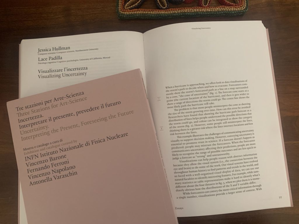
This is Jessica. Recently a museum in Italy approached me about contributing some images and a short essay on uncertainty visualization, for an exhibit they were planning related to uncertainty. The request seemed much more exotic than some of the usual ‘Will you submit something to our conference?’ type requests I get. So Lace Padilla, who also works in this area, and I teamed up to write something up and sent some images. Today I got the exhibition catalog in the mail.

uncertainty vis book excer

Being asked to create something for a museum reminded me of how back when I used to have friends who were in art school, I would sometimes read their artist statements, where I frequently saw the pretentious phrase, ‘[so and so] is an internationally exhibited artist.’ So I asked my husband, who went to art school, about it. He agreed it’s overused, and said it just meant some gallery or maybe just a coffee shop somewhere in the world showed your stuff, and that there were third parties who would prey on artists who wanted to have this coveted phrase in their statements by offering to put their art in a gallery somewhere in Europe for a price. So you never knew whether to take it seriously.

Anyhow, not saying I agreed to do this museum thing only for the novelty of being able to say I am “internationally exhibited,” but I have to admit it was the most salient part of my thought process!

I do like the bit Lace and I wrote though, which is sort of an abridged version of other things we’ve written walking through uncertainty visualizations and common challenges that arise, like a chapter we did on uncertainty visualization not too long ago.

New blog formatting

We needed to update the blog because the old theme was no longer being maintained by WordPress, and we were having security problems and issues with the comment screening. So we replaced it with this new theme which was having some issues. We patched it so now it’s functional, but I’ve been told it isn’t so great on phones.

I just wanted to let you know that we’re working on putting together something that looks a little better, less whitespace, things like that. It’s not as easy as you might think, in particular because we’ve got tons of content that you want to read, also we want to make the commenting experience as easy as possible under the constraints of security and not getting overwhelmed by spam. Thanks for your patience!

“Citizen Keane: The Big Lies Behind the Big Eyes”

I was listening to the radio and they played a song by Keane, which sounded good, so I went over to the website of the public library to see if they had any CDs I could check out. While searching I came across this biography from 2014, by Adam Parfrey and Cletus Nelson, of the artist Margaret Keane, famous for her paintings of big-eyed waifs, and her husband Walter, who promoted the art. I’d read bits and pieces of their story over the years from occasional news articles, and it was interesting to see it all in one place. It’s kind of a weird book—this is not something you can tell from seeing the online listing but is apparent with the physical copy—it just looks a bit unprofessional. And, indeed, it’s published by a small press. But the tools of professional-looking book publishers were available in 2014 for anyone with a computer, so it seems like it was a conscious choice of the author/publisher to give it that Hollywood Babylon look. The other thing is that the book is short, only 160 pages (not counting notes and appendixes), and many of those pages are taken up by photos, so maybe the low-budget-looking layout was just a way to pad the material to fill out a whole book.

Anyway, I liked the book. It has a judicious tone, tells an interesting story, and even features an appearance by Tom Wolfe. You never know what you’ll run across, listening to the radio.

P.S. The Keane album came in from the library and I listened to it but couldn’t get into it at all. So, good thing I read that book so something positive came out of the experience.

Review of Art Studio, Volume 1, by James Watt

As a blogger with a moderate-sized readership, sometimes I get books in the mail, or emails offering me books to review. Recently I was contacted by the publisher of Art Studio, a series of books on “real art for real children.” The author writes that his book “is geared to showing children that art and math are complementary studies, where one helps you learn the other.” I was curious so I asked for a copy.

The book is really interesting! Just to situate myself here, I like to draw sometimes but I’m bad at it. I think I can confidently say I’m in the lower half of the distribution of drawing ability. To put it another way: You don’t want me on your Pictionary team. But I’d like to get better.

I flipped through the book, and I’m getting the impression I can learn a lot from it. Some of the basic ideas I’ve seen before, for example the idea of drawing a figure by first putting it together as as series of simple shapes—but I like how Watt presents this, not just as a trick but as a matter of underlying form. And he has some good slogans, like “the right place at the right size.” I guess I resonated with the mathematical principles.

Also this, on Drawing Hair:

Usually children will scribble hair floating about the head. They wonder why it looks so awful. Well, so would your own hair if you ‘scribbled it’ instead of combing it!

Art is the ‘study of Universal Form’. If you want to draw the forms of the Universe, you have to understand ‘how they are actually formed’ and simply copy the same movements. There is no magic to art. It is simply seeking a clearer view of how the Universe really works.

That’s very statistical—he’s talking about generative modeling! It’s the Bayesian way: you don’t fit a curve through data, you construct a process that could create the data.

Also I like how he flat-out says that some ways of drawing are right and some are wrong. I understand that ultimately anything goes, but when I’m learning I’d like some guidelines, and a straight permissive approach doesn’t really help. I like to be told what to do, not in detail but in general principles such as to start from the center and go outward from there.

My plan now is to go through the book myself doing all the exercises. I guess it will take a few weeks. I’ll report back to let you know if my drawing has improved.

The target audience for this book is kids, so I showed it to a 10-year-old who likes to draw and asked for her thoughts:

Q: Tell us about yourself. What sorts of things do you like to draw?

A: No comment.

Q: Do you prefer to draw with a pencil? Pen? Does it matter?

A: It depends. Pencil is the obvios choice, since you can erase. Some pens have erasers, those work also.

Q: What was your first impression when opening this book on Basic Drawing?

A: When I first opened the book I thought it would be a journey-esque thing through drawing.

Q: Did you learn anything from the book? If so, tell us about what you learned.

A: It showed shapes and lines then formed them to drawings. I learned different techniques.

Q: Would you recommend this book to someone of your abilities and experience?

A: Yes, it takes you through drawing, helping you gain knowledge about drawing that you might not know.

Q: Would you recommend this book to a drawing newbie?

A: Yes. You learn all the starting things plus things that experienced artists might not know.

Q: What is your favorite thing about the book?

A: I like how it goes through drawing like a journey.

Q: What is the most annoying thing about the book?

A: It is pretty good, what could be improved is that they have some long parts they could substitute with something shorter but still learn the same amount.

Q: If the book could have one more thing added to it, what would it be?

A: I honestly don’t know.

Q: Thanks for answering all these questions. You now get a popsicle!

A: Thanks!

Q: One more question. The author writes, “This book is geared to showing children that art and math are complementary studies, where one helps you learn the other.” Did you seee this connection when reading the book?

A: Not really, I guess with shapes but that’s all.

P.S. The above drawings are not intended to represent great drawing; rather, they’re examples of two of the early lessons in the book.

Computing with muffins

This is Jessica. Florian Echtler put together a list of weird human computer interaction papers that’s too good not to share. Urinal games, robots powered by household pests, and closeness with your remote partner through synchronized trash bins. 

ross chernoff

Ross Chernoff visualization of the cars dataset

I recall other projects from HCI researchers that have stuck in my memory because there was a compelling physical or ethical dimension beyond the sheer novelty. For instance, can you teleport personal inanimate objects with 3D printing such that the object remains unique and the physics seem to work out? Then there’s the creepier muscle hacking examples where you agree to let someone else control your limb for awhile. 

I guess it’s a luxury in computer science that this kind of thing counts as research. We have conferences where novelty and new interaction modalities are highly valued. For one particular conference, the standard thing people say (or at least used to say a few years ago) about what gets work accepted is that some aspect of it should “seem like magic.” 

Some of our more mundane conferences include an “alt” track or special alt venue to provide, e.g., a “forum for controversial, risk-taking, and boundary pushing research” and publish “bold, provocative, unusual, unconventional, thought-provoking work.” Often work in these tracks is less novel on the tech side but still deemed a little too unconventional to send to the main tracks. As an example, one of my favorite visualization-related papers in this category is by Micheal Correll on Ross-Chernoff glyphs. Chernoff faces are a mostly terrible glyph based approach to visualizing multivariate data where map data variables to facial properties like the width of eyes, angle of eyebrows, shape of face etc (which people are pretty bad at perceiving separately). As Michael points out, this hasn’t prevented the original Chernoff faces paper from receiving thousands of citations. Ross-Chernoff visualizations instead plot multivariate data to properties of a Bob Ross painting (and the code is provided, so you can create them yourself, but of course you probably shouldn’t if you’re serious about understanding your data). But the paper also makes a more earnest point that it’s ironic how we can have visualization techniques like this and know they are bad, but not have enough theory to be able to say why. 

I’ve never sent anything to an alt track because I’ve always had mixed thoughts on separating work that is deemed boundary pushing and controversial to its own track. It might be safer for some work where one expects knee jerk negative responses from traditionalists, but shouldn’t we tolerate some risk taking in the mainstream computer science lit? Part of our job is to explore what’s possible with technology. When I write something about visualization that I suspect might be a little controversial (usually because it’s critiquing some assumption or practice in mainstream or “core” vis, whatever that is), my goal is always to publish in the main conference track or journal, even if the some of the ideas  seem extreme. As one example from earlier in my career, probabilistic animation as the default way to convey uncertainty was too much for some people, so it took a few tries to get it accepted at first, but sending it to an alt track to begin with would have felt like giving up. Why marginalize one’s own argument? But then again, I’ve never done “research” purely for the humor or stunt of it where I really didn’t want it to be taken seriously. 

All this also makes me wonder if any other fields have room for deliberately wacky work.  What does alt statistics look like? 

The Alice Neel exhibition at the Metropolitan Museum of Art

This exhibit closes at the end of the month so I can’t put this one on the usual 6-month delay. (Sorry, “Is There a Replication Crisis in Finance?”, originally written in February—you’ll have to wait till the end of the year to be seen by the world.) I’d never heard of Neel before, which I guess is just my ignorance, but this was just about the most satisfying museum show I’ve ever seen. If you’re local, I recommend it. Some of the early work reminded me of Picasso, and the later work was in the style of Van Gogh (as was clear in one display which juxtaposed a Neal painting with one of the Met’s Van Goghs), but Neel conveyed relationships between people in ways that those other artists didn’t. The exhibit was beautifully curated, and I learned a lot from the little notes they had on the wall next to the paintings.

No statistics content at all here, except that after going through the Neel exhibit, we went into another one that didn’t interest me so much, so I read a few pages of the book I was carrying, “Two Girls, Fat and Thin,” by Mary Gaitskill, which had a synesthesia vibe to it. For example, “The voices sounded like young, cramp-shouldered people taking their lunch breaks in cafeterias lit by humming fluorescent lights.” And “she received a call from someone with a high-pitched voice that reminded her of a thin stalk with a rash of fleshy bumps.” Maybe we can use this as an epigraph for our sensification paper. And this:

Justine Shade’s voice sounded different in person than it had on the phone. Floating from the receiver, it had been eerie but purposeful, moving in a line toward a specific destination. In my living room, her words formed troublesome shapes of all kinds that, instead of projecting into the room, she swallowed with some difficulty.

This somehow reminds me of John Updike, if he had a sense of humor.

Pittsburgh by Frank Santoro

Last year we discussed a silly study, and that lead us to this interesting blog by Chris Gavaler, which pointed me to a recent picture storybook, Pittsburgh, by Frank Santoro. The book was excellent. I don’t have any insights to share here; I just wanted to thank Santoro for writing the book and Gavaler for his thoughtful review.

P.S. Gavaler reviews Imbattable! His discussion is reasonable, but there’s something disorienting about seeing the words translated into English.

Who’s afraid?

Reading this Palko post reminds me of when I saw a performance of Who’s Afraid of Virginia Woolf at a local theater. It was ok, although even then it seemed very old-fashioned in its construction, much more so than older classics like Shaw, for example. But what I really remember is when one of the characters did the sing-song “Who’s afraid of Virginia Woolf?” song, the actor did not do it to the tune of “Who’s afraid of the big bad wolf?” I don’t know, but my guess is that the actor had never seen the Disney movie and didn’t know how the tune went. But maybe something else was going on.

The revelation came while hearing a background music version of Iron Butterfly’s “In A Gadda Da Vida” at a Mr. Steak restaurant in Colorado

I just read “Elevator Music: A Surreal History of Musak, Easy-Listening, and Other Moodsong,” written by Joseph Lanza and published in 1994, around the same time as V. Vale’s and Andrea Juno’s cult classic book, “Incredibly Strange Music.”

Lanza’s book was witty, thought-provoking, and informative, and I liked it a lot. It reminds of the work of James Twitchell.

There was just one thing that bothered me about the Elevator Music book . . . I’ll get to that at the end of this post. But first I want to share some quotes, as when I was reading the book I kept marking passages:

During the 1920s both President Hoover and the five chief executives of the largest and most growth-oriented corporations at the time, General Motors, Singer Sewing Machine Company, Dupont, General Electric and Goodyear, were all past classmates at M.I.T.

Interesting. I had no idea. [Apparently I had no idea because it’s not true! See comments below. — AG]

One-third of America’s 1924 furniture budget was spent on radio receivers.

Wow! Think of all the couches never reupholstered.

By trial and error, radio musicians and engineers determined that the sound of overlapping strings, preferably played at high pitch, counteracted much of the static and buzzing that marred the early broadcasts.

I love these unexpected connections between artistic choices and technology.

There has been considerable celebration of radio’s ability to unite people from great distances, but what about the equally significant time-space transformation involving the radio, the listener, and the household chores (not to mention mood music’s longtime companion, the icebox)?

Good point.

[In the 1940s], the Frankford Arsenal in Philadelphia released a study linking background music to a reduction in on-the-job accidents.

Hey—my dad worked at the Frankford Arsenal in the 1940s!

This information was augmented by even more tantalizing news that farmers in McKeesport had reported that their cows gave more milk to the “Blue Danube Waltz.”

Someone get PNAS on the line!

The precipitating event [of some controversy] was Muzak’s effort to transmit a program called “Transit Radio,” consisting of local radio programs and announcements (including commercials) from a Washington, D.C., radio station (WWDC-FM), into the District’s public buses and trains.

“This is Robin Quivers with street talk on DC-101.”

Lyndon Baines Johnson owned Muzak franchises in Austin during his early senatorial days.

Bernard Shaw would’ve absolutely hated this.

To this day, people who recoil at background music in a restaurant or office are more tolerant when similar sounding melodies show up in the movies or on TV.

I’ll get back to that point.

While volunteering to conduct serviceman ensembles in war theaters from Germany to Burma, [musical arranger Andre Kostelanetz] had introduced a mechanical gadget that let musicians know themselves. The Massachusetts Institute of Technology adapted his machine to their sonar system for locating submarines.

Shades of Hedy Lamarr!

The more Muzak distanced itself from “art,” the closer it came to being a distinct art form.

This is the familiar alliance of the highbrow and lowbrow against the middlebrow, which we can always flip around by labeling both high and low brows as being motivated by status anxiety.

Besides paying attention to tempo and volume, 3M’s system takes into account such problems as how well the sound bounces off tables. One 3M Sound Products dealer remembers an embarrassing incident at a restaurant chain outlet in which the company installed speakers designed for a particular floor plan. When the restaurant subsequently moved its counter, one of the speakers ended up transmitting music directly over the cash registers so that the microphone for announcing orders picked up nothing but music, and the business transactions were chaotic.

Great story!

The advent of FM mood-waves is due largely to the efforts of Jim Schulke, the “Godfather of ‘Beautiful Music’ Radio.” Schulke, a lean and somewhat reclusive man, was the kind of analytical genius who could dissect a ratings book as if it were a lab animal.

The “lean and somewhat reclusive” bit is important, because otherwise I’d have an image in my mind of a big guy, someone who looks like like Bill James. I don’t know why, but that’s what popped up at first.

Schulke remembers how good he became at ad-libbing a pitch for promotional clients: “I would experiment by switching on a Xerox machine during business consultations. After surreptitiously turning it off, I noticed that the voice levels dropped and everyone seemed so much more relaxed. I’d then tell them that this is exactly what my music does. Turning on my stations was like turning off the machines.

That’s a great classroom-style demonstration, but . . . it’s not ad-libbing. It’s the opposite!

[Quoting an old-time music producer:] “While supervising the 1973 London sessions with Leroy, I heard some fantastic instrumental string music on the BBC. So I called them and discovered they had a number of string orchestras on staff. They used material on the air twice and then erased it so they could continue to give work to these musicians.”

Interesting.

The advent of Beautiful Music [around 1970] coincided with a historically sensitive period in America’s demographics: a time when the generation gap was much more apparent than it is today.

“Today” was 1994. Since then, the generation gap has returned. Interesting to think there was a time it had mostly gone away.

From its beginnings, new-age music was doomed to controversy and censure from a musical establishment still wedged into nineteenth-century prejudices that equated good music with direct listening.

Well put. I’m not a fan of new-age music, but I do mostly listen to music as background, when I’m in the kitchen or riding my bike or whatever, and it’s indeed much different—not necessarily worse!—than direct listening.

Space music can then be best regarded as an outgrowth of easy-listening that is even further removed from the musical foreground. Beautiful Music supplies ghost tunes of originals, whereas space music distills the ghost tune’s mood, its sound, and a smidgen of its style and reprocesses it into an “original” composition once again, this time unanchored to any distinct emotional historical context. It avoids nostalgia mainly because its uncertainties force us to look back and ahead simultaneously.

When it’s music I like, I like to hear the originals or creative cover versions. But if it’s not gonna sound special, I might prefer a version that avoids familiar melodies. I’m not a big jazz listener, but I’dd rather hear soft jazz in the background than soft jazzy arrangements of Christmas carols or Beatles songs. The sound is the same but I’m not annoyed and distracted by the overly familiar tunes.

Todd Rutt, an “underground” filmmaker, claims to have had a revelatory moment while hearing a background music version of Iron Butterfly’s “In A Gadda Da Vida” at a Mr. Steak restaurant in Colorado.

What can I say? That’s just a great sentence. I’d like to write a few thousand sentences of this quality during my career.

In recent years, the term “background music” has begun to come across as either a misnomer or a redundancy, since all music is taking a background role.

Yup.

Given its universal disrepute and the fact that most musicians (who cannot agree on much) at least seem to concur in opposing it, elevator music is probably the only category that grows stronger as its definition gets more nebulous. It is a melodic tar baby that embraces many a contemptuous cuff from reluctant recording artists.

“Melodic tar baby” . . . that’s good!

Demographics in the future will be defined less and less by sex, age, politics, or even income, and more and more by one’s taste for exotic locales or nostalgic situations absorbed from childhood television exposure.

I don’t think so. I think that more true of the baby boom and X generations, not so much for later cohorts shaped by the VCR and then the internet. “Childhood television exposure” is a murkier thing now than it was in the days of Deputy Dawg and Gilligan’s Island reruns.

Silence is just a euphemism for all the clatter that dominates our hearing when the background music is turned off. We only really experience silence when listening over modern fiber-optic phone lines that are so dead-quiet that we should welcome Muzak—if just as a reminder that we haven’t been disconnected.

Lanza should really cite John Cage here.

What bothered me

So, yeah, I enjoyed this book, or else I wouldn’t have spent a few hours reading it and another couple of hours preparing this post. I heartily recommend the book. I learned a lot. You might learn a lot from this book and enjoy it too!

But there’s one thing that bothered me, something missing from Lanza’s book, and that is that lots of people find Muzak really annoying. Indeed, the annoyingness of elevator music is something of a cultural consensus. Lanza points to various studies finding that people actually liked Muzak or preferred it to the alternative (rock, classical, jazz, country music, whatever), and I don’t know what to think about that evidence, but dislike of Muzak is a real thing. I actually happened to be waiting in the dentist’s office when finishing the Elevator Music book, and they were playing Muzak or some similar thing. That day we were getting trilling versions of hackneyed Christmas songs, and I found it annoying and distracting. As I wrote above, I’d much prefer some jazz or old movie theme music, and I don’t even like jazz! I’d rather innocuous background music than intrusive background music, and I found that Muzak intrusive.

And it’s just me. Lots of people dislike Muzak. As the saying goes, it’s a cliche because it’s true. And I would not buy the claim that everyone actually secretly likes it but just refuses to admit it. People are fine admitting their guilty pleasures—bacon, anyone??—and I’m sure that Muzak is somebody’s guilty pleasure, but I think lots and lots of people actively dislike it, for reals.

I’m not saying that Lanza has to dislike elevator music—he wrote a whole book about it, of course he’s a fan, and that’s cool. I’m not too proud to enjoy some light music too. I just think that if he’s gonna write this book about Muzak and related arrangements, he should more directly come to terms with the fact that so many people can’t stand the stuff. Really wrestle with the unpopularity of Muzak and not just glibly dismiss it.

The Tall T*

Saw The Tall T on video last night. It was ok, but when it comes to movies whose titles begin with that particular character string, I think The Tall Target was much better. I’d say The Tall Target is the best train movie ever, but maybe that title should go to Intolerable Cruelty, which was much better than Out of Sight, another movie featuring George Clooney playing the George Clooney character. As far as Elmore Leonard adaptations go, I think The Tall T was much better.

Meg Wolitzer and George V. Higgins

Regular readers of this blog will know that I’m a Meg Wolitzer fan (see here and here). During the past year or so I’ve been working my way through her earlier books, and I just finished Surrender, Dorothy, which was a quick and fun and thought-provoking read, maybe not quite as polished as some of her more recent books but who cares about that, really.

Coming to the last page of this short book, it struck me that Wolitzer is a lot like George V. Higgins, a long-time favorite of mine (see here, here, and here). They each have a strong style, also each of them writes about an insular group of people, but they’re interested in how these people link up to the rest of the world. I guess that describes a lot of novels; still, I see a similarity here. The specifics of their styles are different, though: Wolitzer tells us her characters’ thoughts, while Higgins mostly portrays his characters though dialogue and some action.

One thing that Wolitzer and Higgins have in common is that they take sides. Not against each other—they write in different genres and don’t seem to be talking to each other, as it were (I googled *”George V Higgins” “Meg Wolitzer”* and all I could find was this column from political columnist George Will, which mentions these two authors briefly, but not with any connection to each other)—but, rather, they take sides in their own fiction. With both Wolitzer and Higgins, you get a sense that the author likes some of the characters and dislikes others. Some authors are more Olympian; others have a rigorous single-viewpoint narrative; but Wolitzer and Higgins are a bit less disciplined, or so it seems to me, in that they jump between perspectives but with a kind of implicit narrator who is taking sides in the action. I don’t mind this—I actually find it kind of charming, that the author cares enough about his or her characters in this way.

Both authors also have a good skill of managing expectations. Much of storytelling involves expectations and surprise: building suspense, defusing non-suspense, and so on. Recall that saying that the best music is both expected and surprising in every measure. So, if you’re writing a novel and you introduce a character who seems like a bad person, you have to be aware that your reader is trying to figure it out: is this truly a bad person who just reveals badness right away, is this a good person who is misunderstood, will there be character development, etc. Some of this can be managed using multiple perspectives. Anyway, I think that both Wolitzer and Higgins are good at this, in different ways.

Writing this post, I also thought of another similarity between the two authors, which is that I don’t think either is particularly good at physical descriptions of people. Surrender, Dorothy had one vivid description of a fat man (“squat and friendly and seemed to be waiting for his first heart attack to happen”) and his thin wife (“built like a praying mantis and draped in jewels”), but that’s as much of a caricature as a physical description. The main characters in Surrender, Dorothy, as in other Wolitzer books, are often described as pretty or plain or attractive or unattractive or handsome, but not much more than that. The description is vivid and it does the job of distinguishing the people; it’s just not usually visually specific. For example, one character is described as having “a long, studious face . . . He had been an awkward adolescent . . . ears were perpetually red-hot, like someone who seems to have just come back from the barbership, and he was a jiggler; a crossed leg often went flapping like a wing . . .” A minor character is described as “a pudding-faced woman . . . who had a head of hair that looked as though she cut it herself while blindfolded.” So it’s not like Wolitzer can’t do vivid descriptions; it’s just that she only does it once in awhile, and, when she does it, it’s usually more conceptual than straight physical description. The result is that I can’t quite visualize what her characters look like, and this can be a problem because sometimes the plot is driven by characters being attractive or appealing, or unattractive or unappealing. I say this not to complain about Wolitzer—I’m a big fan of her books and I look forward to reading more of them—it’s just interesting after reading a book to think about its style.

P.S. This is completely unrelated, but since this post is off-topic anyway, here’s something funny I came across from 2012: Rick Santorum quotes as New Yorker cartoons. Yeah, I know, shooting fish in a barrel. But, what can I say, they’re funny. I guess this dates me as someone who’s so old that he’s heard of santorum.

“Maybe the better analogy is that these people are museum curators and we’re telling them that their precious collection of Leonardos, which they have been augmenting at a rate of about one per month, include some fakes.”

Someone sent me a link to a recently published research paper and wrote:

As far as any possible coverage on your blog goes, this one didn’t come from me, please. It just looks… baffling in a lot of different ways.

OK, so it didn’t come from that person. I read the paper and replied:

Oh, yes, the paper is ridiculous. For a paper like that to be published by a scientific society . . . you could pretty much call it corruption. Or scientism. Or numerology. Or reification. Or something like that. I also made the mistake of doing a google search and finding a credulous news report on it.

Remember that thing I said a few years ago: In journals, it’s all about the wedding, never about the marriage.

For the authors and the journal and the journal editor and the twitter crowd, it’s all just happy news. The paper got published! The good guys won! Publication makes it true.

And, after more reflection:

I keep thinking about the couathors on the project and the journal editors and the reviewers . . . didn’t anyone want to call Emperor’s New Clothes on it? But then I think that I’ve seen some crappy PhD theses, really bad stuff where everyone on the committee is under pressure to pass the person, just to get the damn thing over with. And of course if you give the thesis a passing grade, you’re a hero. Indeed, the worse the thesis, the more grateful the student and the other people on the committee will be! [Just to be clear, most of the Ph.D. theses I’ve seen have been excellent. But, yes, there are some crappy ones too. That’s just the way it is! It’s not just a problem with students. I’ve taught some crappy classes too. — ed.]

So in this case I guess it goes like this: A couple of researchers have a clever, interesting, and potentially important idea. I’ll grant them that. Then they think about how to study it. It’s hard to study social science processes, where so much is hidden! So you need to find some proxy, they come up with some ideas that might be a little offbeat, but maybe they’ll work. . . . then they get the million data points, they do lots of hard work, they get a couple more coauthors and write a flashy paper–that’s not easy either!–maybe it gets rejected by a couple journals and gets sent to this journal.

Once it gets to there, ok, there are a couple possibilities here. One possibility is that one of the authors has a personal or professional connection to someone on the editorial board and so it gets published. I’m not saying it’s straight baksheesh here: they’re friends, they like the same sort of research, they recognize the difficulty of doing this sort of work and even if it’s not perfect it’s a step forward etc etc. The other possibility is they send the paper in cold and they just get lucky: they get an editor and reviewers who like this sort of high-tech social science stuff–actually it all seems a bit 2010-era to me, but, hey, if that’s what floats their boat, whatever.

Then, once the paper’s accepted, it’s happy time! How wonderful for the authors’ careers! How good for justice! How wonderful of the journal, how great for science, etc.

It’s like, ummm, I dunno, let’s say we’re all kinda sad that there have been over 50 Super Bowls and the Detroit Lions have never won it. They’ve never even been in the Super Bowl. But if they were, if they had some Cinderella story of an inspiring young QB and some exciting receivers, a defense that never gives up, a quirky kicker, a tough-but-lovable head coach, and an owner who wasn’t too evil, then, hey, wouldn’t that be a great story! Well, if you’re a journal editor, you not only get to tell the story, you get to write it too! So I guess maybe the NBA would be a better analogy, given that they say it’s scripted . . .

My anonymous correspondent replied:

I just have no idea where to start with this stuff. I find it to be profoundly confused, conceptually. For one thing, the idea that we should take seriously [the particular model posited in the article] is deeply essentialist. I can imagine situations in which is the case, but I can also imagine situations in which it isn’t the case because of interacting factors from people’s life history. . . . That’s how social processes work! But people do this weird move where they assume any discrepant outcome like that must be the result of one particular stage in the process rather than entrenched structures, which, to my mind, really misses the point of how this stuff works.

So I’m just so skeptical of that idea in the first place. And to then claim to have found evidence for it just because of these very indirect analyses?

I responded:

I’m actually less interested in the scientific claims of this paper than in the “sociology” of how it gets accepted etc. One thing that I was thinking of is that, to much of the scientific establishment, the fundamental unit of science is the career. And a paper in a solid journal written by a young scholar . . . what a great way to start a career. The establishment people [yes, I’m “establishment” too, just a different establishment — ed.] can’t imagine why someone like you or me would criticize a published scientific paper—it’s so destructive! Not destructive toward the research hypothesis. Destructive to the career. For us to criticize, this could only be from envy or racism or because we’re losers or whatever. Of course, they don’t seem to recognize the zero-sumness of all this: someone else’s career never gets going because they don’t get the publication, etc.

Anyway, that’s my take on it. To the Susan Fiskes of the world, what we are doing is plain and simple vandalism, terrorism even. A career is a precious vase, taking years to build, and then we just smash it. From that perspective, you can see that criticisms are particularly annoying when they are scientifically valid. After all, a weak criticism can be brushed aside. But a serious criticism . . . that could break the damn vase.

Maybe the better analogy is that these people are museum curators and we’re telling them that their precious collection of Leonardos, which they have been augmenting at a rate of about one per month, include some fakes. Or, maybe one or two of the Leonardos might be of somewhat questionable authenticity. But, don’t worry, the vast majority of their hundreds of Leonardos are just fine. Nothing to see here, move along. Anyway, such a curator could well be more annoyed, the more careful and serious the criticism is.

P.S. The story’s also interesting because the problems with this research have nothing to do with p-hacking, forking paths, etc. Really no “questionable research practices” at all—unless you want to count the following: creating a measurement that has just about nothing to do with what you’re claiming to measure, setting up a social science model that makes no sense, and making broad claims from weak evidence. Just the usual stuff. I don’t think anyone was doing anything wrong on purpose. More than anyone else, I blame the people who encourage, reward, and promote this sort of work. I mean, don’t get me wrong, speculation is fine. Here’s a paper of mine that’s an unstable combination of simple math and fevered speculation. The problem is when the speculation is taken as empirical science. Gresham, baby, Gresham.