Best comics of 2010-2019?

X linked to this list by Sam Thielman of the best comics of the decade. The praise is a bit over the top (“brimming with wit and pathos” . . . “Every page in Ferris’s enormous debut is a wonder” . . . “An astounding feat of craftsmanship and patience” . . . “never has an artist created a world so vivid without a single word spoken” etc.), but that’s been the style in pop-music criticism for a few decades, so I’m not surprised to see it in other pop-cultural criticism as well: the critic is juicing up the positivity because he’s promoting the entire genre.

It’s interesting how different these are than Franco-Belgian BD’s. Lately I’ve been continuing to read Emile Bravo and Riad Sattouf, among others.

U.S. comics are like indie movies, Franco-Belgian BD’s are like Hollywood productions. Even the BD’s written and drawn by a single person have certain production values, in contrast to the DIY attitude from independent comics in English.

Quino y Mafalda

Obit by Harrison Smith, full of stories:

She was a wise and idealistic young girl, a cartoon kid with a ball of black frizz for hair, a passionate hatred of soup and a name, Mafalda, inspired by a failed home appliance brand.

Although her creator, a cartoonist known as Quino, drew her regularly for just nine years, the Argentine comic strip “Mafalda” became a cultural touchstone across Latin America and Europe, examining issues such as nationalism, war and environmental destruction just as Argentina’s democracy was giving way to dictatorship.

When Mafalda spots workmen trying to locate a gas leaks, she asks: “Are you searching for our national roots?” In another sequence, Mafalda’s pet turtle is revealed to have an unusual name, Bureaucracy. When a friend asks why she gave it that name, Mafalda replies that she needs to come back the next day for more information. She can’t say exactly when. . . .

“Pictures represent facts, stories represent acts, and models represent concepts.”

I really like the above quote from noted aphorist Thomas Basbøll. He expands:

Simplifying somewhat, pictures represent facts, stories represent acts, and models represent concepts. . . . Pictures are simplified representations of facts and to use this to draw a hard and fast line between pictures and stories and models is itself a simplified picture, story or model of pictures, stories and models. Sometimes a picture tells a story. Sometimes a model represents a fact. The world is a complicated place and the mind is a complicated instrument for making sense of it. Still, simple distinctions can be useful . . .

When I say that a picture represents a fact I mean that it makes an arrangement of things present in your imagination. It’s true that we sometimes also try to imagine what is “going on” in, say, a painting, but we know that this is an extrapolation from the facts it represents. There’s also usually a whole atmosphere or “mood” in a picture, which is hard to reduce to a mere state of affairs. In David Hockney’s “A Bigger Splash,” for example, the fact is a splash of water in a pool with a diving board. We don’t know exactly what made the splash but we assume it is a person. There’s a feeling about the scene that I will leave it to you to experience for yourself, but we can imagine a photograph representing roughly the same facts. . . .

When I say that a story represents an act I mean that it gets us to imagine people doing things, or things happening to people. That’s a gross simplification, to be sure. It’s possible to tell a story about a pool freezing over or ducks landing in it. Things happening to things or animals happening to them. But I think we do actually always anthropomorphize these events a little bit when we tell stories, sometimes barely perceptibly. If we didn’t, I want to argue, we wouldn’t be able to tell a story. . . .

Models are simplifications in perhaps more obvious ways. They will always represent only selected aspects of the reality they are modelling. When I say that a model represents concepts, I mean that they get us to imagine what it is possible to think about a certain population of things or people. . . .

This is related to the idea we’ve discussed from time to time, of storytelling as the working out of logical possibilities.

Thomas Basbøll will like this post (analogy between common—indeed, inevitable—mistakes in drawing, and inevitable mistakes in statistical reasoning).

There’s a saying in art that you have to draw things the way they look, not the way they are.

This reminds me of an important but rarely stated principle in statistical reasoning, the distinction between evidence and truth.

The classic error of novices when drawing is to draw essences—for example, drawing a head as a pair of eyes and a nose and a mouth and a couple of ears and a chin etc. The mistake is to draw linguistically rather than visually. It’s easy to recognize this error but hard to fix. If I, as an unskilled draftsman, try to draw visually, I don’t do a good job. I think the only way I could really do this is by cheating and putting a grid across my field of view and a grid on the paper I’m drawing on, and fill in one little grid square at a time.

That said, there are tricks to teach novices how to draw, and the tricks involve constructing an image from essences, but essences that are geometrical rather than real. So you construct a dog picture, say, from a set of circles and boxes. The idea is that it’s so hard not to draw based on essences, that the best step toward truly visual drawing is to use abstract geometric essences. A related trick is to observe and then draw the negative space, or to draw things upside down; again, these are methods for detaching you from your preconceptions. To put it another way, you can’t draw “linguistically” if you stop yourself from “reading” the face as a mouth plus a nose plus etc.

Now let’s move to statistical reasoning. It’s my impression that applied researchers are working with truth (as they perceive it), not evidence. Or, to put it another way, when they try to “draw the picture” of their evidence, they do it by putting together pieces of truth: This effect is real, that effect is zero, etc.

The question, then, is how to help people. By analogy to drawing, it’s not enough to simply tell people to summarize the data without preconceptions (or, to be more precise from a statistical perspective, to express their preconceptions formally within the statistical model): it’s just too hard for novices to do this from scratch, in the same way that “Just draw what you see” is advice that’s too hard for civilians like me to follow while drawing.

So what we need is a set of tools that will allow people to summarize the data they way they look, without getting tangled in essences. My usual recommendation is to display everything (as in figure 3 of this paper) rather than pulling out statistically significant things to tell a story. For an example of what not to do, see the article discussed in section 2.2 of this paper. It’s hard to learn from data when you’re already telling the story you want to see, in the same way that it’s hard to draw a dog if you see it as a collection of existing parts (head, legs, body, tail).

What you need to draw things the way they look, rather than based on your view of essences, is to develop a sort of contextual dissociation. This is the way that drawing can yield new insights rather than just regurging your preconceptions.

Similarly with statistical analysis: you need to go back and forth between your substantive understanding (including your preconceptions) and a more dissociated, data-first, descriptive presentation.

I think more needs to be said and done in this area.

P.S. I wrote this post 6 months ago; just a coincidence that it came up a few days after our recent discussion of coding and drawing. As commenter S wrote, “If we all were 10/10 on everything we would only be able to go down.”

Coding and drawing

Some people like coding and they like drawing too. What do they have in common?

I like to code—I don’t looove it, but I like it ok and I do it a lot—but I find drawing to be very difficult. I can keep tinkering with my code to get it to look like whatever I want, but I feel like with drawing I have very little control. I have an idea in my mind of what I want the drawing to look like, but my pencil does not follow my orders.

Coding is digital and drawing is analog. Is it just that? I don’t think so. I think that if I were doing digital drawing, pixel by pixel or whatever, I’d still struggle.

On the other hand, I like drawing a lot and find it super useful if I’m drawing graphs of data or math patterns.

Here’s what I wrote a few years ago:

I was trying to draw Bert and Ernie the other day, and it was really difficult. I had pictures of them right next to me, but my drawings were just incredibly crude, more “linguistic” than “visual” in the sense that I was portraying key aspect of Bert and Ernie but in pictures that didn’t look anything like them. I knew that drawing was difficult—every once in awhile, I sit for an hour to draw a scene, and it’s always a lot of work to get it to look anything like what I’m seeing—but I didn’t realize it would be so hard to draw cartoon characters!

This got me to thinking about the students in my statistics classes. When I ask them to sketch a scatterplot of data, or to plot some function, they can never draw a realistic-looking picture. Their density functions don’t go to zero in the tails, the scatter in their scatterplots does not match their standard deviations, E(y|x) does not equal their regression line, and so forth. For example, when asked to draw a potential scatterplot of earnings vs. income, they have difficulty with the x-axis (most people are between 60 and 75 inches in height) and having the data consistent with the regression line, while having all earnings be nonnegative. (Yes, it’s better to model on the log scale or whatever, but that’s not the point of this this exercise.)

Anyway, the students just can’t make these graphs look right, which has always frustrated me. But my Bert and Ernie experience suggests that I’m thinking of it the wrong way. Maybe they need lots and lots of practice before they can draw realistic functions and scatterplots.

When I do statistics-style drawings, I can make things look right, and accuracy really matters to me. But ask me to draw a cat or a dog or a house? Forget it. What’s going on here? More introspection and experimentation is needed. The point is, coding kind of is like drawing. there’s something going on here.

Come up with a logo for causal inference!

Stephen Cole, Jennifer Hill, Luke Keele, Ilya Shpitser, and Dylan Small write:

We wanted to provide an update on our efforts to build the Society for Causal Inference (SCI). As you may recall, we are creating the SCI as a home for causal inference research that will increase support and knowledge sharing both within the academic community as well as between academics, policy-makers and researchers in the private sector. The Society’s mission is to foster the science of causal inference and connect disparate fields that use causal knowledge. SCI will address both the need for better methods and the need to make these methods available to researchers who impact policy – helping us all improve our answers to critical causal questions that confront us everyday.

. . .

We are announcing a logo contest for the Society. Please send your logo ideas to one of the undersigned. The winner will get one year free membership in the Society.

Second prize is a set of steak knives. Third prize is you’re fired.

OK, just kidding about the second and third prizes. But they’re serious about the logo. So if you have something, let them know!

Calling all cats

Those of you familiar with this blog will have noticed that it regularly features cats. For example the majestic cat featured last week, this lover of Bayesian data analysis here and even my own cat, Jazz is featured here.

Sometimes there’s not quite the right cat picture out there – Andrew has even resorted to requesting cat pictures to bring a little sass to the statistical discussions. A few months ago I got the idea of creating a repo of cats who like statistics. Or cats whose owners like statistics. If you know such a cat and you want them to be statistics-blog famous, then submit their photo through this Google form so we can feature them!

Tony nominations mean nothing

Someone writes:

I searched up *Tony nominations mean nothing* and I found nothing. So I had to write this.

There are currently 41 theaters that the Tony awards accept when nominating their choices. If we are being as generous as possible, we could say that every one of those theaters will be hosting a performance that fits all of the requirements for an award. The Tony awards have 26 different categories. There are 129 nominations this year, not including the special categories. For a play in this day and age to not get a single nomination is just a testament to its mediocrity. Plays or People can even get multiple nominations in the same category. The Best Featured Actress in a Musical has these marvelous nominations:
Lilli Cooper, “Tootsie”
Amber Gray, “Hadestown”
Sarah Stiles, “Tootsie”
Ali Stroker, “Oklahoma!”
Mary Testa, “Oklahoma!”
People will frequently get nominated twice in the same category for different pieces!

According to the official Tony Awards website, “A show is only eligible in the season when it first opens, no matter how long it runs on Broadway.” This immediately gets rid of many current shows, and leaves only 21 shows by my counting. I may be slightly wrong, but that is still a very small number. If there are 129 possible nominations for your piece, and you are only 1 out of 29 possibilities, receiving a tony nomination is not a badge of honor, but a badge of shame. There was recently an article in the New York Times about how King Lear, a show that received mixed reviews, was disappointed that it only got 1 nomination. I’d like to see if anyone else can help me figure this out.

My reply: OK, so here’s the question. Why so many Tonys for so few shows, which would seem to reduce its value?

The most natural answer is that Tonys and Tony nominations give value to “Broadway theatre” more generally: the different shows are in friendly competition, and more awards and more nominations get the butts in the seats.

But that doesn’t really answer the question, as at some point there have to be diminishing returns. The real question is where’s the equilibrium.

Remember that post from a few years ago about the economist who argued that the members of the Motion Picture Academy were irrational because they were giving Oscars to insufficiently popular movies: “One would hope the Academy would at least pay a bit more attention to the people paying the bills. Not only does it seem wrong (at least to this economist) to argue that movies many people like are simply not that good, focusing on the box office would seem to make good financial sense for the Oscars as well”?

The discussion there led to familiar territory in econ-talk: How much should we think that an institution (e.g., the Oscars, the Tonys) is at a sensible equilibrium, kept there by a mixture of rational calculation and the discipline of the market, and how much should we focus on the institution’s imperfections (slowness to change, principal-agent problems, etc.) and suggest improvements?

One comparison point is academic awards. Different academic fields seem to have different rates of giving awards. It would just about always seem to make sense to add an award: for example, if the Columbia stat dept added a best research paper award for its Ph.D. students, I think this would at the margin help the recipients get jobs, more than it would hurt the prospects of the students who didn’t get the award. On balance it would benefit our program. But we don’t have such an award—or, at least, I don’t think we have. Maybe we should. The point is that it doesn’t seem that statistics academia has reached equilibrium when it comes to awards. Political science, that’s another story: they have zillions of awards, all over the place. Equilibrium may well have been reached in that case.

Dan Simpson or Brian Pike might have more thoughts on the specific case of the Tonys. Maybe someone could “at” them?

P.S. When I was a kid, nobody cared about the Tonys, Emmys, or Grammys. But every year we watched the Oscars, Miss America, and the Wizard of Oz.

Works of art that are about themselves

I watched Citizen Kane (for the umpteenth time) the other day and was again struck by how it is a movie about itself. Kane is William Randolph Hearst, but he’s also Orson Welles, boy wonder, and the movie Citizen Kane is self-consciously a masterpiece.

Some other examples of movies that are about themselves are La La Land, Primer (a low-budget experiment about a low-budget experiment), and Titanic (the biggest movie ever made, about the biggest boat ever made).

I want to call this, Objects of the Class X, but I’m not sure what X is.

The evolution of pace in popular movies

James Cutting writes:

Movies have changed dramatically over the last 100 years. Several of these changes in popular English-language filmmaking practice are reflected in patterns of film style as distributed over the length of movies. In particular, arrangements of shot durations, motion, and luminance have altered and come to reflect aspects of the narrative form. Narrative form, on the other hand, appears to have been relatively unchanged over that time and is often characterized as having four more or less equal duration parts, sometimes called acts – setup, complication, development, and climax. The altered patterns in film style found here affect a movie’s pace: increasing shot durations and decreasing motion in the setup, darkening across the complication and development followed by brightening across the climax, decreasing shot durations and increasing motion during the first part of the climax followed by increasing shot durations and decreasing motion at the end of the climax. . . .

I’m fascinated by the topic, and I love the idea of people studying storytelling in a systematic way.

People might also be interested in this other paper by Cutting, Narrative theory and the dynamics of popular movies:

Using a corpus analysis I explore a physical narratology of popular movies—narrational structure and how it impacts us—to promote a theory of popular movie form. I show that movies can be divided into 4 acts—setup, complication, development, and climax—with two optional subunits of prolog and epilog, and a few turning points and plot points. . . . In general, movie narratives have roughly the same structure as narratives in any other domain—plays, novels, manga, folktales, even oral histories—but with particular runtime constraints, cadences, and constructions that are unique to the medium.

Here’s one of the patterns he found:

P.S. Excellent surname for someone who studies the construction of films.

Columbia Data Science Institute art contest

This is a great idea! Unfortunately, only students at Columbia can submit. I encourage other institutions to do such contests too. We did something similar at Columbia, maybe 10 or 15 years ago? It went well, we just didn’t have the energy to do it again every year, as we’d initially planned. So I’m very happy to see the Data Science Institute start it up again.

3 recent movies from the 50s and the 70s

I’ve been doing some flying, which gives me the opportunity to see various movies on that little seat-back screen. And some of these movies have been pretty good:

Logan Lucky. Pure 70s. Kinda like how Stravinsky did those remakes of Tchaikovsky etc. that were cleaner than the original, so did Soderbergh in Logan Lucky, and earlier in The Limey, recreate that Seventies look and feel. The Limey had the visual style, the washed-out look of the L.A. scenes in all those old movies. Logan Lucky had the 70s-style populist thing going, Burt Reynolds, Caddyshack, the whole deal.

La La Land. I half-watched it—I guess I should say, I half-listened to it, on the overnight flight. I turned it on, plugged myself in, and put on the blindfold so I could sleep. A couple times I woke up in the middle of the night and restarted it. Between these three blind viewings, I pretty much heard the whole thing. On the return flight I actually watched the damn thing and then the plot all made sense. It was excellent, just beautiful. The actual tunes were forgettable, but maybe that was part of the design. Like Logan Lucky, this was a retro movie—in this case, from the Fifties—but better than the originals on which it was modeled.

Good Time. I’d never heard of this one. This was the most intense movie I’ve ever seen. Also pure 70s, but not like Logan Lucky, more like a cross between The French Connection and Dog Day Afternoon. Almost all the action takes place in Queens. Really intense—did I say that already?

Old school

Maciej Cegłowski writes:

About two years ago, the Lisp programmer and dot-com millionaire Paul Graham wrote an essay entitled Hackers and Painters, in which he argues that his approach to computer programming is better described by analogies to the visual arts than by the phrase “computer science”.

When this essay came out, I was working as a computer programmer, and since I had also spent a few years as a full-time oil painter, everybody who read the article and knew me sent along the hyperlink. I didn’t particularly enjoy the essay . . . but it didn’t seem like anything worth getting worked up about. Just another programmer writing about what made him tick. . . .

But the emailed links continued, and over the next two years Paul Graham steadily ramped up his output while moving definitively away from subjects he had expertise in (like Lisp) to topics like education, essay writing, history, and of course painting. Sometime last year I noticed he had started making bank from an actual print book of collected essays, titled (of course) “Hackers and Painters”. I felt it was time for me to step up.

So let me say it simply – hackers are nothing like painters.

Cegłowski continues:

It’s surprisingly hard to pin Paul Graham down on the nature of the special bond he thinks hobbyist programmers and painters share . . . The closest he comes to a clear thesis statement is at the beginning “Hackers and Painters”:

[O]f all the different types of people I’ve known, hackers and painters are among the most alike. What hackers and painters have in common is that they’re both makers.

To which I’d add, what hackers and painters don’t have in common is everything else.

Ouch. Cegłowski continues:

The fatuousness of the parallel becomes obvious if you think for five seconds about what computer programmers and painters actually do.

– Computer programmers cause a machine to perform a sequence of transformations on electronically stored data.

– Painters apply colored goo to cloth using animal hairs tied to a stick.

It is true that both painters and programmers make things, just like a pastry chef makes a wedding cake, or a chicken makes an egg. But nothing about what they make, the purposes it serves, or how they go about doing it is in any way similar.

Start with purpose. With the exception of art software projects (which I don’t believe Graham has in mind here) all computer programs are designed to accomplish some kind of task. Even the most elegant of computer programs, in order to be considered a program, has to compile and run . . .

The only objective constraint a painter has is making sure the paint physically stays on the canvas . . .

Why does Graham bring up painting at all in his essay? Most obviously, because Graham likes to paint, and it’s natural for us to find connections between different things we like to do. But there’s more to it: also, as Cegłowski discusses, painting has a certain street-cred (he talks about it in terms of what can “get you laid,” but I think it’s more general than that). So if someone says that what he does is kinda like painting, I do think that part of this is an attempt to share in the social status that art has.

Cegłowski’s post is from 2005, and it’s “early blogging” in so many ways, from the length and tone, to the references to old-school internet gurus such as Paul Graham and Eric Raymond, to the occasional lapses in judgment. (In this particular example, I get off Cegłowski’s train when he goes on about Godel, Escher, Bach, a book that I positively hate, not so much for itself as for how overrated it was.)

Old-school blogging. Good stuff.

BD reviews

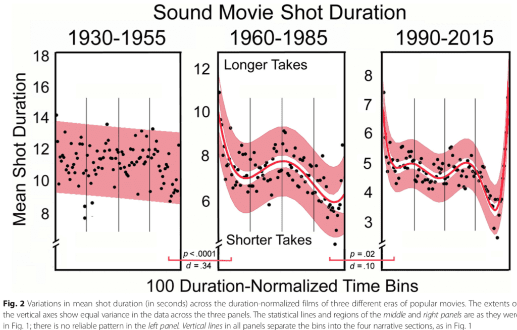
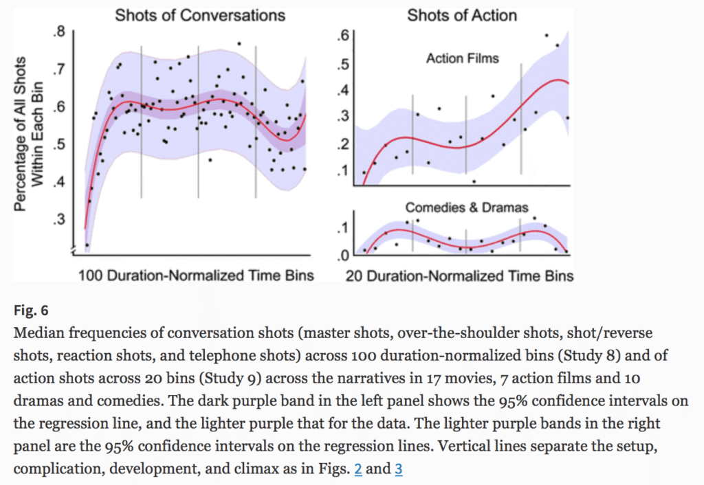
I read BD’s (bandes dessinées or, as we say in English, graphic literature or picture storybooks) to keep up with my French. Regular books are too difficult for me. When it comes to BDs, some of the classic kids strips and albums are charming, but the ones for adults, which are more like Hollywood movies, are easier for me to read because I find the stories more compelling: I want to find out what happens next.

Here are brief reviews of some albums, in the order that I read them.

WW2.2, by David Chauvel and others. The first one I ever read! I bought Tome 1 at the train station in Brussels, then bought and read the others, one at a time. When I started reading, I had the impression that it was going to be an endless series in the vein of Lucky Luke. But then it turned out it was a finite set of 7 volumes. Since then, I’ve learned that a fixed-length plan is common practice, equivalent to a TV mini-series, I guess. Anyway, the 7 volumes of WW2.2 were of uneven quality but they were all pretty good, and the scenario as a whole made sense to me. My favorite was the first volume, where you get to know all these different characters, keeping them all straight in your head—and then all but one of them dies. Which makes the point of lethality of war more effective than any number of images of dismembered bodies.

Il était une fois en France, by Fabien Nury and Sylvain Vallée. Lived up to the hype. Without a doubt the best piece of literature, of any form, about a scrap metal dealer. I can’t recommend this one enough.

Gung Ho, by Benjamin Von Eckartsberg et Thomas Von Kummant. Fun post-apocalyptic adventure. I happen to have read most of Tome 1 on the beach, which somehow fixed it all in my mind. We’re now waiting for Tome 4 to come out.

Les promeneurs du temps, by Franck Viale et Sylvain Dorange. Fun story, excellent cartoony drawing style. I really loved Tome 1, but the story got so confusing that I lost touch somewhere in Tome 3. Too bad. I guess I’m not the only one who felt that way, because Tome 4 never appeared.

Tyler Cross, by Fabien Nury and Brüno. I saw this in the bookstore and it was intriguing. A Western—almost, I guess not quite as it takes place in the mid-twentieth century. I guess they’d call it a polar. The title character is reminiscent of Donald Westlake’s Parker. An open-ended series, two volumes so far with at least one more to come.

Souvenirs de l’empire de l’atome, by Thierry Smolderen et Alexandre Clérisse. I picked up this one on the strength of its drawings alone. Actually, that’s usually how I usually do it. Some drawings have character, some don’t. The story to this one was ok but didn’t quite follow through. I don’t really care, though, as the art was so distinctive. A real “60’s” feel.

Le temps perdu, by Rodolphe et Vink. Beautiful drawings, but ultimately the story was just too empty and sentimental so it didn’t really work as a BD.

Où sont passées les grands jours, by Jim and Alex Tefenkgi. Affecting, well-drawn story about the lives of some young adults. “Tout roule. Ne t’inquiète pas.”

Ceux qui me restent, by Damien Marie and Laurent Bonneau. Another one along the same lines: evocative, understated drawings and a realistic story that made me cry, this time about family and memory. The design of this one makes brilliant, spare use of colors in a way that perfectly matches the themes of the story.

Rouge comme la neige, by Christian De Metter. Sad, and beautiful. I don’t know why Westerns are such a popular form of BD, but this one played it straight and was heartbreaking.

Quai d’Orsay, by Christophe Blain et Abel Lanzac. Great drawing style. The story is funny, but my language skills are weak, so it takes pretty much all my effort to detect the humor, leaving me with little energy left to actually appreciate it. Still, I’m working my way through it. The book does not insult my intelligence.

Lancaster, by Christophe Bec and Jean-Jacques Dzialowski. A fun James Bond-style confection, just delicious. I read somewhere on the internet that it didn’t sell well so they decided not to continue it after the first 2 volumes. Too bad.

L’Arabe du futur, by Riad Sattouf. Wow. The guy is brilliant: inspired drawings and a wonderful story. Amazing presentation of a kid’s perspective and of violent societies. I wonder how people from Syria feel about this book: I could imagine them loving it, or I could imagine it getting them very angry. Tome 4 is coming soon. It’s just amazing how much facial expression Sattouf can capture in just a couple of lines.

I was motivated then to read other Sattouf books, including No Sex in New York (which is actually in French despite the title) and Les cahiers d’Esther. These are good too. No Sex in New York includes a hilarious cartoon of a lecherous Isaac Asimov.

Les vieux fourneaux, by Wilfred Lupano and Paul Cauuet. Wrinkly, still energetic soixante-huitards. Ni yeux, ni maître! 4 tomes so far. Lots of fun, takes a lot of work to follow. I think I’m catching about half the jokes.

Transperceneige, by Jacques Lob, Benjamin Legrand, and Jean-Marc Rochette. I read a few pages of this one and then paused, discouraged by a native speaker who said that this book is full of invented slang and it will be really hard for me to understand.

La mort de Staline, by Fabien Nury and Thierry Robin. Hilarious. Sad, too, but hilarious.

Mort au Tsar, by Fabien Nury and Thierry Robin. More of the same. Also high quality, but harder for me to follow as I didn’t know the story ahead of time.

L’été diabolik, by Thierry Smolderen et Alexandre Clérisse. A followup to Souvenirs de l’empire de l’atome, also with this great angular drawing style but this time with a better story, somewhat gimmicky but it worked for me.

L’homme qui ne disait jamais non, by Olivier Balez et Didier Tronchet. Lively drawing style and fun adventure. But when it was all over, I was disappointed because the plot was a bit of a cheat.

Stern, by Frédéric and Julien Maffre. The guy’s a gravedigger. This one’s more of a standard BD Western, tongue in cheek all the way through. Lots of fun, I liked it. I encountered it in the bookstore display one day. We’ve read Tomes 1 and 2; I assume more will be coming.

Junk, by Nicolas Pothier and Brüno. Le même dessinateur de Tyler Cross. What a great style. Good story, too. Another Western.

Katanga, by Fabien Nury and Sylvain Vallée: The team behind Il était une fois en France. This one’s good too, but a bit grimmer. A lot grimmer. This book has no good guys at all!

L’Imparfait du futur and La réplique inattendue, by Émile Bravo. These are the first two of a six-volume series. Science-fiction comedy; it really is funny and the sci-fi works too. This one is written for kids, but I’m including it on this list because this adult enjoys it. I’m looking forward to reading tomes 4-6.

Request for a cat picture

Could someone please send me a photo (that I’d have permission to share on this blog) that connects a cat to “heuristics and biases” or “behavioral economics”? Thanks.

P.S. Javier Benítez points us to this page of free stock photos of cats. Cool! Still, if anyone has anything particularly appropriate to the topic above, just let me know. Thanks again.