How to digest research claims? (1) vitamin D and covid; (2) fish oil and cancer

I happened to receive two emails on the same day on two different topics, both relating to how much to trust claims published in the medical literature.

1. Someone writes:

This is the follow up publication for the paper that was retracted from preprint servers a few months ago, the language has changed but the results are the same: patients treated with cacifediol had a much lower mortality rate than patients who were not treated:

This follows three other papers on the same therapy which found the same results:

Small pilot RCT
Large propensity matched study
Cohort trial of 574 patients

I continue to be bewildered that this therapy has been ignored given that it’s so safe with such a high upside.

This led me to an interesting question which I thought you may have an answer for: “What are the most costly Type II errors in history?”

2. Someone else writes:

Do you think these two studies are flawed?

Serum Phospholipid Fatty Acids and Prostate Cancer Risk: Results From the Prostate Cancer Prevention Trial
Plasma Phospholipid Fatty Acids and Prostate Cancer Risk in the SELECT Trial

I said that I don’t know, I’ve never heard of this topic before. Why do you think they might be flawed?

And my correspondent replied:

I don’t understand the nested case cohort design but a very senior presenter at our Grand Rounds mentioned the studies were flawed. He didn’t go into the details as his topic was entirely different. I am trying to understand whether fish oil leads to increased risk for prostate cancer. I take fish oil myself but these studies shake my confidence, although they may be flawed studies.

I have no idea what to think about any of these papers. The medical literature is so huge that it often seems hopeless to interpret any single article or even subliterature.

An alternative approach is to look for trusted sources on the internet, but that’s not always so helpful either. For example, when I google *cleveland clinic vitamin d covid*, the first hit is an article, Can Vitamin D Prevent COVID-19?, which sounds relevant but then I notice that the date is 18 May 2020. Lots has been learned about covid since then, no?? I’m not trying to slam the Cleveland Clinic here, just saying that it’s hard to know where to look. I trust my doctor, which is fine, but (a) not everyone has a primary care doctor, and (b) in any case, doctors need to get their information from somewhere too.

I don’t know what is currently considered the best way to summarize the state of medical knowledge on any given topic.

P.S. Just to clarify one point: In the above post I’m not saying that the answers to these medical questions are unknowable, or even that nobody knows the answers. I can well believe there are some people who have a clear sense or what’s going on here. I’m just saying that I have no idea what to think about these papers. So I appreciate the feedback in the comments section.

Association between low density lipoprotein cholesterol and all-cause mortality

Larry Gonick asks what I think of this research article, Association between low density lipoprotein cholesterol and all-cause mortality: results from the NHANES 1999–2014.

The topic is relevant to me, as I’ve had cholesterol issues. And here’s a stunning bit from the abstract:

We used the 1999–2014 National Health and Nutrition Examination Survey (NHANES) data with 19,034 people to assess the association between LDL-C level and all-cause mortality. . . . In the age-adjusted model (model 1), it was found that the lowest LDL-C group had a higher risk of all-cause mortality (HR 1.7 [1.4–2.1]) than LDL-C 100–129 mg/dL as a reference group. The crude-adjusted model (model 2) suggests that people with the lowest level of LDL-C had 1.6 (95% CI [1.3–1.9]) times the odds compared with the reference group, after adjusting for age, sex, race, marital status, education level, smoking status, body mass index (BMI). In the fully-adjusted model (model 3), people with the lowest level of LDL-C had 1.4 (95% CI [1.1–1.7]) times the odds compared with the reference group, after additionally adjusting for hypertension, diabetes, cardiovascular disease, cancer based on model 2. . . . In conclusion, we found that low level of LDL-C is associated with higher risk of all-cause mortality.

The above quotation is exact except that I rounded all numbers to one decimal place. The original version presented them to three decimals (“1.708,” etc.) and that made me cry.

In any case, the finding surprised me. I don’t know that it’s actually a medical surprise; I just had the general impression that cholesterol is a bad thing to have. Also, I was gonna say I was surprised that the estimated effects were so large, but then I saw the large widths of the confidence intervals, and that surprised me too at first, but then I realized that not so many people in the longitudinal study would have died during the period, so the effective sample size isn’t quite as large as it might seem at first.

The researchers also fit some curves:

Next, the inferences that the curve came from:

The data are consistent with high risks at low cholesterol levels and nothing happening at high levels, also consistent with other patterns, as can be seen from the uncertainty lines.

The published paper does a good job of presenting data and conclusions clearly without any overclaiming that I can see.

Anyway, I don’t really know what to make of this study, and I know nothing about the literature in the area. I’ll still go by my usual algorithm and just trust my doctor on everything.

I’m posting because (a) I just think it’s cool that the author of the Cartoon Guide to Statistics reads our blog, and (b) it can be helpful to our readers to see an example of my ignorance.

“Risk ratio, odds ratio, risk difference… Which causal measure is easier to generalize?”

Anders Huitfeldt writes:

Thank you so much for discussing my preprint on effect measures (“Count the living or the dead?”) on your blog! I really appreciate getting as many eyes as possible on this work; having it highlighted on by you is the kind of thing that can really make the snowball start rolling towards getting a second chance in academia (I am currently working as a second-year resident in addiction medicine, after exhausting my academic opportunities)

I just wanted to highlight a preprint that was released today by Bénédicte Colnet, Julie Josse, Gaël Varoquaux, and Erwan Scornet. To me, this preprint looks like it might become an instant classic. Colnet and her coauthors generalize my thought process, and present it with much more elegance and sophistication. It is almost something I might have written if I had an additional standard deviation in IQ, and if I was trained in biostatistics instead of epidemiology.

The article in question begins:

From the physician to the patient, the term effect of a drug on an outcome usually appears very spontaneously, within a casual discussion or in scientific documents. Overall, everyone agrees that an effect is a comparison between two states: treated or not. But there are various ways to report the main effect of a treatment. For example, the scale may be absolute (e.g. the number of migraine days per month is expected to diminishes by 0.8 taking Rimegepant) or relative (e.g. the probability of having a thrombosis is expected to be multiplied by 3.8 when taking oral contraceptives). Choosing one measure or the other has several consequences. First, it conveys a different impression of the same data to an external reader. . . . Second, the treatment effect heterogeneity – i.e. different effects on sub-populations – depends on the chosen measure. . . .

Beyond impression conveyed and heterogeneity captured, different causal measures lead to different generalizability towards populations. . . . Generalizability of trials’ findings is crucial as most often clinicians use causal effects from published trials (i) to estimate the expected response to treatment for a specific patient . . .

This is indeed important, and it relates to things that people have been thinking about for awhile recently regarding varying treatment effects. Colnet et al. point out that, even if effects are constant on one scale, they will vary on other scales. In some sense, this hardly matters given that we can expect effects to vary on any scale. Different scales correspond to different default interpretations, which fits the idea that the choice of transformation is as much a matter of communication as of modeling. In practice, though, we use default model classes, and so parameterization can make a difference.

The new paper by Colnet et al. is potentially important because, as they point out, there remains a lot of confused thinking on the topic, both in theory and in practice, and I think part of the problem is a traditional setup in which there is a “treatment effect” to be estimated. In applied studies, you’ll often see this as a coefficient in a model. But, as Colnet et al. point out, if you take that coefficient as estimated from study A and use it to generalize to study B, you’ll be making some big assumptions. Better to get those assumptions out in the open and consider how the effect can vary.

As we discussed a few years ago, the average causal effect can be defined in any setting, but it can be misleading to think of it as a “parameter” to be estimated, as in general it can depend strongly on the context where it is being studied.

Finally, I’d like to again remind readers of our recent article, Causal quartets: Different ways to attain the same average treatment effect (blog discussion here), which discusses the many different ways that an average causal effect can manifest itself in the context of variation:

As Steve Stigler paper pointed out, there’s nothing necessarily “causal” about the content of our paper, or for that matter of the Colnet et al. paper. In both cases, all the causal language could be replaced by predictive language and the models and messages would be unchanged. Here is what we say in our article:

Nothing in this paper so far requires a causal connection. Instead of talking about heterogeneous treatment effects, we could just as well have referred to variation more generally. Why, then, are we putting this in a causal framework? Why “causal quartets” rather than “heterogeneity quartets”?

Most directly, we have seen the problem of unrecognized heterogeneity come up all the time in causal contexts, as in the examples in [our paper], and not so much elsewhere. We think a key reason is that the individual treatment effect is latent. So it’s not possible to make the “quartet” plots with raw data. Instead, it’s easy for researchers to simply assume the causal effect is constant, or to not think at all about heterogeneity of causal effects, in a way that’s harder to do with observable outcomes. It is the very impossibility of directly drawing the quartets that makes them valuable as conceptual tools.

So, yes, variation is everywhere, but in the causal setting, where at least half of the potential outcomes are unobserved, it’s easier for people to overlook variation or to use models where it isn’t there, such as the default model of a constant effect (on some scale or another).

It can be tempting to assume a constant effect, maybe because it’s simpler or maybe because you haven’t thought too much about it or maybe because you think that, in the absence of any direct data on individual causal effects, it’s safe to assume the effect doesn’t vary. But, for reasons discussed in the various articles above, assuming constant effects can be misleading in many different ways. I think it’s time to move off of that default.

What does it take, or should it take, for an empirical social science study to be convincing?

A frequent correspondent sends along a link to a recently published research article and writes:

I saw this paper on a social media site and it seems relevant given your post on the relative importance of social science research. At first, I thought it was an ingenious natural experiment, but the more I looked at it, the more questions I had. They sure put a lot of work into this, though, evidence of the subject’s importance.

I’m actually not sure how bad the work is, given that I haven’t spent much time with it. But the p values are a bit overdone (understatement there). And, for all the p-values they provide, I thought it was interesting that they never mention the R-squared from any of the models. I appreciate the lack of information the R-squared would provide, but I am always interested to know if it is 0.05 or 0.70. Not a mention. They do, however, find fairly large effects – a bit too large to be believable I think.

I didn’t have time to look into this one so I won’t actually link to the linked paper; instead I’ll give some general reactions.

There’s something about that sort of study that rubs me the wrong way and gives me skepticism, but, as my correspondent says, the topic is important so it makes sense to study it. My usual reaction to such studies is that I want to see the trail of breadcrumbs, starting from time series plots of local and aggregate data and leading to the conclusions. Just seeing the regression results isn’t enough for me, no matter how many robustness studies are attached to it. Again, this does not mean that the conclusions are wrong or even that there’s anything wrong with the researchers are doing; I just think that the intermediate steps are required to be able to make sense of this sort of analysis of limited historical data.

Haemoglobin blogging

Gavin Band writes:

I wondered what you (or your readers) make of this. Some points that might be of interest:

– The effect we discover is massive (OR > 10).
– The number of data points supporting that estimate is not *that* large (Figure 2).
– it can be thought of as a sort of collider effect – (human and parasite genotypes affecting disease status, which we ascertain on) – though I haven’t figured whether it’s really useful to think of it that way.
– It makes use of Stan! (Albeit only in a relatively minor way in Figure 2).

All in all it’s a pretty striking signal and I wondered what a stats audience make of this – maybe it’s all convincing, or maybe there are things we’ve overlooked or could have done better? I’d certainly be interested in any thoughts…

The linked article is called “The protective effect of sickle cell haemoglobin against severe malaria depends on parasite genotype,” and I have nothing to say about it, as I’ve always found genetics to be very intimidating! But I’ll share with all of you.

Reconciling evaluations of the Millennium Villages Project

Shira Mitchell, Jeff Sachs, Sonia Sachs, and I write:

The Millennium Villages Project was an integrated rural development program carried out for a decade in 10 clusters of villages in sub-Saharan Africa starting in 2005, and in a few other sites for shorter durations. An evaluation of the 10 main sites compared to retrospectively chosen control sites estimated positive effects on a range of economic, social, and health outcomes (Mitchell et al. 2018). More recently, an outside group performed a prospective controlled (but also nonrandomized) evaluation of one of the shorter-duration sites and reported smaller or null results (Masset et al. 2020). Although these two conclusions seem contradictory, the differences can be explained by the fact that Mitchell et al. studied 10 sites where the project was implemented for 10 years, and Masset et al. studied one site with a program lasting less than 5 years, as well as differences in inference and framing. Insights from both evaluations should be valuable in considering future development efforts of this sort. Both studies are consistent with a larger picture of positive average impacts (compared to untreated villages) across a broad range of outcomes, but with effects varying across sites or requiring an adequate duration for impacts to be manifested.

I like this paper because we put a real effort into understanding why two different attacks on the same problem reached such different conclusions. A challenge here was that one of the approaches being compared was our own! It’s hard to be objective about your own work, but we tried our best to step back and compare the approaches without taking sides.

Some background is here:

From 2015: Evaluating the Millennium Villages Project

From 2018: The Millennium Villages Project: a retrospective, observational, endline evaluation

Full credit to Shira for pushing all this through.

A bit of harmful advice from “Mostly Harmless Econometrics”

John Bullock sends along this from Joshua Angrist and Jorn-Steffen Pischke’s Mostly Harmless Econometrics—page 223, note 2:

They don’t seem to know about the idea of adjusting for the group-level mean of pre-treatment predictors (as in this 2006 paper with Joe Bafumi).

I like Angrist and Pischke’s book a lot so am happy to be able to help out by patching this little hole.

I’d also like to do some further analysis updating that paper with Bafumi using Bayesian analysis.

“Risk without reward: The myth of wage compensation for hazardous work.” Also some thoughts of how this literature ended up to be so bad.

Peter Dorman writes:

Still interested in Viscusi and his value of statistical life after all these years? I can finally release this paper, since the launch just took place.

The article in question is called “Risk without reward: The myth of wage compensation for hazardous work,” by Peter Dorman and Les Boden, and goes as follows:

A small but dedicated group of economists, legal theorists, and political thinkers has promoted the argument that little if any labor market regulation is required to ensure the proper level of protection for occupational safety and health (OSH), because workers are fully compensated by higher wages for the risks they face on the job and that markets alone are sufficient to ensure this outcome. In this paper, we argue that such a sanguine perspective is at odds with the history of OSH regulation and the most plausible theories of how labor markets and employment relations actually function. . . .

In the English-speaking world, OSH regulation dates to the Middle Ages. Modern policy frameworks, such as the Occupational Safety and Health Act in the United States, are based on the presumption of employer responsibility, which in turn rests on the recognition that employers generally hold a preponderance of power vis-à-vis their workforce such that public intervention serves a countervailing purpose. Arrayed against this presumption, however, has been the classical liberal view that worker and employer self-interest, embodied in mutually agreed employment contracts, is a sufficient basis for setting wages and working conditions and ought not be overridden by public action—a position we dub the “freedom of contract” view. This position broadly corresponds to the Lochner-era stance of the U.S. Supreme Court and today characterizes a group of economists, led by W. Kip Viscusi, associated with the value-of-statistical-life (VSL) literature. . . .

Following Viscusi, such researchers employ regression models in which a worker’s wage, typically its natural logarithm, is a function of the worker’s demographic characteristics (age, education, experience, marital status, gender) and the risk of occupational fatality they face. Using census or similar surveys for nonrisk variables and average fatal accident rates by industry and occupation for risk, these researchers estimate the effect of the risk variable on wages, which they interpret as the money workers are willing to accept in return for a unit increase in risk. This exercise provides the basis for VSL calculations, and it is also used to argue that OSH regulation is unnecessary since workers are already compensated for differences in risk.

This methodology is highly unreliable, however, for a number of reasons . . . Given these issues, it is striking that hazardous working conditions are the only job characteristic for which there is a literature claiming to find wage compensation. . . .

This can be seen as an update of Dorman’s classic 1996 book, “Markets and Mortality: Economics, Dangerous Work, and the Value of Human Life.” It must be incredibly frustrating for Dorman to have shot down that literature so many years ago but still see it keep popping up. Kinda like how I feel about that horrible Banzhaf index or the claim that the probability of a decisive vote is 10^-92 or whatever, or those terrible regression discontinuity analyses, or . . .

Dorman adds some context:

The one inside story that may interest you is that, when the paper went out for review, every economist who looked at it said we had it backwards: the wage compensation for risk is underestimated by Viscusi and his confreres, because of missing explanatory variables on worker productivity. We have only limited information on workers’ personal attributes, they argued, so some of the wage difference between safe and dangerous jobs that should be recognized as compensatory is instead slurped up by lumping together lower- and higher-tiered employment. According to this, if we had more variables at the individual level we would find that workers get even more implicit hazard pay. Given what a stretch it is a priori to suspect that hazard pay is widespread and large—enough to motivate employers to make jobs safe on their own initiative—it’s remarkable that this is said to be the main bias.

Of course, as we point out in the paper, and as I think I had already demonstrated way back in the 90s, missing variables on the employer and industry side impose the opposite bias: wage differences are being assigned to risk that would otherwise be attributed to things like capital-labor ratios, concentration ratios (monopoly), etc. In the intervening years the evidence for these employer-level effects has only grown stronger, a major reason why antitrust is a hot topic for Biden after decades in the shadows.

Anyway, if you have time I’d be interested in your reactions. Can the value-of-statistical-life literature really be as shoddy as I think it is?

I don’t know enough about the literature to even try to answer that last question!

When I bring up the value of statistical life in class, I’ll point out that the most dangerous jobs pay very low, and high-paying jobs are usually very safe. Any regression of salary vs. risk will start with a strong negative coefficient, and the first job of any analysis will be to bring that coefficient positive. At that point, you have to decide what else to include in the model to get a coefficient that you want. Hard for me to see this working out.

This has a “workflow” or comparison-of-models angle, as the results can best be understood within a web of possible models that could be fit to the data, rather than focusing on a single fitted model, as is conventionally done in economics or statistics.

As to why the literature ended up so bad: it seems to be a perfect storm of economic/political motivations along with some standard misunderstandings about causal inference in econometrics.

Rohrer and Arslan’s nonet: More ideas regarding interactions in statistical models

Ruben Arslan writes:

I liked the causal quartet you recently posted and wanted to forward a similar homage (in style if not content) Julia Rohrer and I recently made to accompany this paper. We had to go to a triple triptych though, so as not to compress it too much.

The paper in question is called Precise Answers to Vague Questions: Issues With Interactions.

What to do when a regression coefficient doesn’t make sense? The connection with interactions.

In addition to the cool graph, I like Rohrer and Arslan’s paper a lot because it addresses a very common problem in statistical modeling, a problem I’ve talked about a lot but which, as far as I can remember, I only wrote up once, on page 200 in Regression and Other Stories, in the middle of chapter 12, where it wouldn’t be noticed by anybody.

Here it is:

When you fit a regression to observational data and you get a coefficient that makes no sense, you should be able interpret it using interactions.

Here’s my go-to example, from a meta-analysis published in 1999 on the effects of incentives to increase the response rate in sample surveys:

What jumps out here is that big fat coefficient of -6.9 for Gift. The standard error is small, so it’s not an issue of sampling error either. As we wrote in our article:

Not all of the coefficient estimates in Table 1 seem believable. In particular, the estimated effect for gift versus cash incentive is very large in the context of the other effects in the table. For example, from Table 1, the expected effect of a postpaid cash incentive of $10 in a low-burden survey is 1.4 + 10(-.34) – 6.9 = -2.1%, actually lowering the response rate.

Ahhhh, that makes no sense! OK, yeah, with some effort you could tell a counterintuitive story where this negative effect could be possible, but there’d be no good reason to believe such a story. As we said:

It is reasonable to suspect that this reflects differences between the studies in the meta-analysis, rather than such a large causal effect of incentive form.

That is, the studies where a gift incentive was tried happened to be studies where the incentive was less effective. Each study in this meta-analysis was a randomized experiment, but the treatments were not chosen randomly between studies, so there’s no reason to think that treatment interactions would happen to balance out.

Some lessons from our example

First, if a coefficient makes no sense, don’t just suck it up and accept it. Instead, think about what this really means; use the unexpected result as a way to build a better model.

Second, avoid fitting models with rigid priors when fitting models to observational data. There could be a causal effect that you know must be positive—but, in an observational setting, the effect could be tangled with an interaction so that the relevant coefficient is negative.

Third, these problems don’t have to involve sign flipping. That is, even if a coefficient doesn’t go in the “wrong direction,” it can still be way off. Partly from the familiar problems of forking paths and selection on statistical significance, but also from interactions. For example, remember that indoor-coal-heating-and-lifespan analysis? That’s an observational study! (And calling it a “natural experiment” or “regression discontinuity” doesn’t change that.) So the treatment can be tangled in an interaction, even aside from issues of selection and variation.

So, yeah, interactions are important, and I think the Rohrer and Arslan paper is a good step forward in thinking about that.

with Lauren Kennedy and Jessica Hullman: “Causal quartets: Different ways to attain the same average treatment effect”

Lauren, Jessica, and I just wrote a paper that I really like, putting together some ideas we’ve been talking about for awhile regarding variation in treatment effects. Here’s the abstract:

The average causal effect can often be best understood in the context of its variation. We demonstrate with two sets of four graphs, all of which represent the same average effect but with much different patterns of heterogeneity. As with the famous correlation quartet of Anscombe (1973), these graphs dramatize the way in which real-world variation can be more complex than simple numerical summaries. The graphs also give insight into why the average effect is often much smaller than anticipated.

And here’s the background.

Remember that Anscombe (1973) paper with these four scatterplots that all look different but have the same correlation:

This inspired me to make four graphs showing with different individual patterns of causal effects but the same average causal effect:

And these four; same idea but this time conditional on a pre-treatment predictor:

As with the correlation quartet, these causal quartets dramatize all the variation that is hidden when you just look at a single-number summary.

In the paper, we don’t just present the graphs; we also give several real-world applications where this reasoning made a difference.

During the past few years, we’ve been thinking more and more about models for varying effects, and I’ve found over and over that considering the variation in an effect can also help us understand its average level.

For example, suppose you have some educational intervention that you hope or expect could raise test scores by 20 points on some exam. Before designing your study based on an effect of 20 points, think for a moment. First, the treatment won’t help everybody. Maybe 1/4 of the students are so far gone that the intervention won’t help them and 1/4 are doing so well that they don’t need it. Of the 50% in the middle, maybe only half of them will be paying attention during the lesson. And, of those who are paying attention, the new lesson might confuse some of them and make things worse. Put all this together: if the effect is in the neighborhood of 20 points for the students who are engaged by the treatment, then the average treatment effect might be more like 3 points.

OK, I made up all those numbers. The point is, these are things we should be thinking about whenever you design or analyze a study—but, until recently, I wasn’t!

Anyway, these issues have been coming up a lot lately—it’s the kind of thing where, once you see it, you start seeing it everywhere, you can’t un-see it—and I was really excited about this “graphical quartet” idea as a way to make it come to life.

As part of this project, Jessica created an R package, causalQuartet, so you can produce your own causal quartets. Just follow the instructions on that Github page and go for it!

Software to sow doubts as you meta-analyze

This is Jessica. Alex Kale, Sarah Lee, TJ Goan, Beth Tipton, and I write,

Scientists often use meta-analysis to characterize the impact of an intervention on some outcome of interest across a body of literature. However, threats to the utility and validity of meta-analytic estimates arise when scientists average over potentially important variations in context like different research designs. Uncertainty about quality and commensurability of evidence casts doubt on results from meta-analysis, yet existing software tools for meta-analysis do not necessarily emphasize addressing these concerns in their workflows. We present MetaExplorer, a prototype system for meta-analysis that we developed using iterative design with meta-analysis experts to provide a guided process for eliciting assessments of uncertainty and reasoning about how to incorporate them during statistical inference. Our qualitative evaluation of MetaExplorer with experienced meta-analysts shows that imposing a structured workflow both elevates the perceived importance of epistemic concerns and presents opportunities for tools to engage users in dialogue around goals and standards for evidence aggregation.

One way to think about good interface design is that we want to reduce sources of the “friction” like the cognitive effort users have to exert when they go to do some task; in other words minimize the so-called gulf of execution. But then there are tasks like meta-analysis where being on auto-pilot can result in misleading results. We don’t necessarily want to create tools that encourage certain mindsets, like when users get overzealous about suppressing sources of heterogeneity across studies in order to get some average that they can interpret as the ‘true’ fixed effect. So what do you do instead? One option is to create a tool that undermines the analyst’s attempts to combine disparate sources of evidence every chance it gets. 

This is essentially the philosophy behind MetaExplorer. This project started when I was approached by an AI firm pursuing a contract with the Navy, where systematic review and meta-analysis are used to make recommendations to higher-ups about training protocols or other interventions that could be adopted. Five years later, a project that I had naively figured would take a year (this was my first time collaborating with a government agency) culminated in a tool that differs from other software out there primarily in its heavy emphasis on sources of heterogeneity and uncertainty. It guides the user through making their goals explicit, like what the target context they care about is; extracting effect estimates and supporting information from a set of studies; identifying characteristics of the studied populations and analysis approaches; and noting concerns about assymmetries, flaws in analysis, or mismatch between the studied and target context. These sources of epistemic uncertainty get propagated to a forest plot view where the analyst can see how an estimate varies as studies are regrouped or omitted. It’s limited to small meta-analyses of controlled experiments, and we have various ideas based on our interviews of meta-analysts that could improve its value for training and collaboration. But maybe some of the ideas will be useful either to those doing meta-analysis or building software. Codebase is here.

The placebo effect as selection bias?

I sent Howard Wainer the causal quartets paper and he wrote that it reminded him of a theory he had about placebos:

I have always believed (without supporting evidence) that often a substantial amount of what is called a placebo effect is merely the result of nonresponse.

That is, there is a treatment and a control—the effect of the treatment is, say, on average positive, whereas the effect in the control condition is, on average, zero, but with a distribution around zero. Those in the control group who have a positive effect may believe they are getting the treatment and stay in the study, whereas those who feel no change or are feeling worse, are more likely to drop out. Thus when you average over just those who stay in the experiment there is a positive placebo effect.

I assume this idea is not original with me. Do you know of some source that goes into it in more detail with perhaps some supporting data?

I have no idea. I’ve always struggled to understand the placebo effect; here are some old posts:
Placebos Have Side Effects Too
The placebo effect in pharma
A potential big problem with placebo tests in econometrics: they’re subject to the “difference between significant and non-significant is not itself statistically significant” issue
Self-experimentation, placebo testing, and the great Linus Pauling conspiracy
Lady in the Mirror
Acupuncture paradox update

Anyway, there’s something about this topic that always gets me confused. So I won’t try to answer Howard’s question; I’ll just post it here as it might interest some of you.

Controversy over an article on syringe exchange programs and harm reduction: As usual, I’d like to see more graphs of the data.

Matt Notowidigdo writes:

I saw this Twitter thread yesterday about a paper recently accepted for publication. I thought you’d find it interesting (and maybe a bit amusing).

It’s obvious to the economists in the thread that it’s a DD [difference-in-differences analysis], and I think they are clearly right (though for full disclosure, I’m also an economist). The biostats author of the thread makes some other points that seem more sensible, but he seems very stubborn about insisting that it’s not a DD and that even if it is a DD, then “the literature” has shown that these models perform poorly when used on simulated data.

The paper itself is obviously very controversial and provocative, and I’m sure you can find plenty of fault in the way the Economist writes up the paper’s findings. I think the paper itself strikes a pretty cautious tone throughout, but that’s just my own judgement.

I took a look at the research article, the news article, and the online discussion, and here’s my reply:

As usual I’d like to see graphs of the raw data. I guess the idea is that these deaths went up on average everywhere, but on average more in comparable counties that had the programs? I’d like to see some time-series plots and scatterplots, also whassup with that bizarre distorted map in Figure A2? Also something weird about Figure A6. I can’t imagine there are enough counties with, say, between 950,000 and 1,000,000 people to get that level of accuracy as indicated by the intervals. Regarding the causal inference: yes, based on what they say it seems like some version of difference in differences, but I would need to see the trail of breadcrumbs from data to estimates. Again, the estimates look suspiciously clean. I’m not saying the researchers cheated, they’re just following standard practice and leaving out a lot of details. From the causal identification perspective, it’s the usual question of how comparable are the treated and control groups of counties: if they did the intervention in places that were anticipating problems, etc. This is the usual concern with observational comparisons (diff-in-diff or otherwise), which was alluded to by the critic on twitter. And, as always, it’s hard to interpret standard errors from models with all these moving parts. I agree that the paper is cautiously written. I’d just like to see more of the thread from data to conclusions, but again I recognize that this is not how things are usually done in the social sciences, so to put in this request is not an attempt to single out this particular author.

It can be difficult to blog on examples such as this where the evidence isn’t clear. It’s easy to shoot down papers that make obviously ridiculous claims, but this isn’t such a case. The claims are controversial but not necessarily implausible (at least, not to me, but I’m a complete outsider.). This paper is an example of a hard problem with messy data and a challenge of causal inference from non-experimental data. Unfortunately the standard way of writing these things in econ and other social sciences is to make bold claims, which then encourages exaggerated headlines. Here’s an example. Click to the Economist article and the headline is the measured statement, “America’s syringe exchanges might be killing drug users. But harm-reduction researchers dispute this.” But the Economist article’s twitter link says, “America’s syringe exchanges kill drug users. But harm-reduction researchers are unwilling to admit it.” I guess the Economist’s headline writer is more careful than their twitter-feed writer!

The twitter discussion has some actual content (Gilmour has some graphs with simulated data and Packham has some specific responses to questions) but then the various cheerleaders start to pop in, and the result is just horrible, some mix on both sides of attacking, mobbing, political posturing, and white-knighting. Not pretty.

In its subject matter, the story reminded me of this episode from a few years ago, involving an econ paper claiming a negative effect of a public-health intervention. To their credit, the authors of that earlier paper gave something closer to graphs of raw data—enough so that I could see big problems with their analysis, which led me to general skepticism about their claims. Amusingly enough, one of the authors of the paper responded on twitter to one of my comments, but I did not find the author’s response convincing. Again, it’s a problem with twitter that even if at some point there is a response to criticism the response tends to be short. I think blog comments are a better venue for discussion; for example I responded here to their comment.

Anyway, there’s this weird dynamic where that earlier paper displayed enough data for us to see big problems with its analysis, whereas the new paper does not display enough for us to tell much at all. Again, this does not mean the new paper’s claims are wrong, it just means it’s difficult for me to judge.

This all reminds me of the idea, based on division of labor (hey, you’re an economist! you should like this idea!), that the research team that gathers the data can be different from the team that does the analysis. Less pressure then to come up with strong claims, and then data would be available for more people to look at. So less of this “trust me” attitude, both from critics and researchers.

What are the most important statistical ideas of the past 50 years?

Many of you have heard of this article (with Aki Vehtari) already—we wrote the first version in 2020, then did some revision for its publication in the Journal of the American Statistical Association.

But the journal is not open-access so maybe there are people who are interested in reading the article who aren’t aware of it or don’t know how to access it.

Here’s the article [ungated]. It begins:

We review the most important statistical ideas of the past half century, which we categorize as: counterfactual causal inference, bootstrapping and simulation-based inference, overparameterized models and regularization, Bayesian multilevel models, generic computation algorithms, adaptive decision analysis, robust inference, and exploratory data analysis. We discuss key contributions in these subfields, how they relate to modern computing and big data, and how they might be developed and extended in future decades. The goal of this article is to provoke thought and discussion regarding the larger themes of research in statistics and data science.

I really love this paper. Aki and I present our own perspective—that’s unavoidable, indeed if we didn’t have an interesting point of view, there’d be no reason to write or read article in the first place—but we also worked hard to give a balanced view, including ideas that we think are important but which we have not worked on or used ourselves.

Also, here’s a talk I gave a couple years ago on this stuff.

Have social psychologists improved in their understanding of the importance of representative sampling and treatment interactions?

I happened to come across this post from 2013 where I shared an email sent to me by a prominent psychology researcher (not someone I know personally). He wrote:

Complaining that subjects in an experiment were not randomly sampled is what freshmen do before they take their first psychology class. I really *hope* you [realize] why that is an absurd criticism – especially of authors who never claimed that their study generalized to all humans. (And please spare me “but they said men and didn’t say THESE men” because you said there were problems in social psychology and didn’t mention that you had failed to randomly sample the field. Everyone who understands English understands their claims are about their data and that your claims are about the parts of psychology you happen to know about).

As I explained at the time, this researcher was mistaken: the reason for this mistake turns on a bit of statistics that is not taught in the standard introductory course in psychology or statistics. It goes like this:

Like these freshmen, I am skeptical about generalizing to the general population based on a study conducted on 100 internet volunteers and 24 undergraduates. There is no doubt in my mind that the authors and anyone else who found this study to be worth noting is interested in some generalization to a larger population. Certainly not “all humans” (as claimed by my correspondent), but some large subset of women of childbearing age. The abstract to the paper simply refers to “women” with no qualifications.

Why should generalization be a problem? The issue is subtle. Let me elaborate on the representativeness issue using some (soft) mathematics.

Let B be the parameter of interest. The concern is that, to the extent that B is not very close to zero, that it can vary by group. For example, perhaps B is a different sign for college students, as compared to married women who are trying to have kids.

I can picture three scenarios here:

1. Essentially no effect. B is close to zero, and anything that you find in this sort of study will likely come from sampling variability or measurement artifacts.

2. Large and variable effects. B is large for some groups, small for others, sometimes positive and sometimes negative. Results will depend strongly on what population is studied. There is no reason to trust generalizations from an unrepresentative sample.

3. Large and consistent effects. B is large and pretty much the same sign everywhere. In that case, a convenience sample of college students or internet participants is just fine (measurement issues aside).

The point is that scenario 3 requires this additional assumption that the underlying effect is large and consistent. Until you make that assumption, you can’t really generalize beyond people who are like the ones in the study.

Which is why you want a representative sample, or else you need to do some modeling to poststratify that sample to draw inference about your population of interest. Actually. you might well want to do that modeling even if you have a representative sample, just cos you should be interested in how the treatment effect varies.

And this loops us back to statistical modeling. The intro statistics or psychology class has a focus on estimating the average treatment effect and designing the experiment so you can get an unbiased estimate. Interactions are more advanced topic.

Has social psychology advanced since 2013?

As several commenters to that earlier post pointed out, it’s kinda funny for me to make general statements about social psychology based on the N=1 email that some angry dude sent to me—especially in the context of me complaining about people making generalizations from nonrepresentative samples.

So, yeah, my generalizations about the social psychology of 2013 are just speculations. That said, these speculations are informed by more than just one random email. First off, the person who sent that email is prominent in the field of social psychology, a tenured professor at a major university with tens of thousands of citations, including a popular introductory psychology textbook. Second, at that time, Psychological Science, one of the leading journals in the field, published lots and lots of papers making broad generalizations from small, non-representative samples; see for example slides 15 and 16 here. So, although I can make no inferences about average or typical attitudes among social psychology researchers of 2013, I think it’s fair to say that the view expressed by the quote at the beginning of this post was influential and at least somewhat prevalent at the time, to the extent that this prominent researcher and textbook writer thought of this as a lesson to be taught to freshmen.

So, here’s my question. Are things better now? Are they still patiently explaining to freshmen that, contrary to naive intuition, it’s just fine to draw inferences about the general population from a convenience sample of psychology undergraduates?

My guess is that the understanding of this point has improved, and that students are now taught about the problem of studies that are “WEIRD.” I doubt, though, that this gets connected to the idea of interactions and varying treatment effects. My guess is that the way this is taught is kinda split: still a focus on the model of constant effects, but then with a warning about your sample not being representative of the population. Next step is to unify the conceptual understanding and the statistical modeling. We try to do this in Regression and Other Stories but I don’t think it’s made it to more introductory texts.

Explanation and reproducibility in data-driven science (new course)

This is Jessica. Today I start teaching a new seminar course I created to CS grad students at Northwestern, called Explanation and Reproducibility in Data-Driven Science. 

Here’s the description:

In this seminar course, we will consider what it means to provide reproducible explanations in data-driven science. As the complexity and size of available data and state-of-the-art models increase, intuitive explanations of what has been learned from data are in high demand. However, events such as the so-called replication crisis in social science and medicine suggest that conventional approaches to modeling can be widely misapplied even at the highest levels of science. What does it mean for an explanation to be accurate and reproducible, and how do threats to validity of data-driven inferences differ depending on the goals of statistical modeling? The readings of the course will be drawn from recent and classic literature pertaining to reproducibility, replication, and explanation in data-driven inference published in computer science, psychology, statistics, and related fields. We will examine recent evidence of problems of reproducibility, replicability and robustness in data-driven science; theories and evidence related to causes of these problems; and solutions and open questions. Topics include: ML reproducibility, interpretability, the social science replication crisis, adaptive data analysis, causal inference, generalizability, and uncertainty communication.

The high level goal is to expose more CS PhD students to results and theories related to blind spots in conventional use of statistical inference in research. My hope is that reading a bunch of papers related to this (ambitious) topic but from different angles will naturally encourage thinking beyond the specific results to make observations about how overinterpreting results and overtrusting certain procedures (randomized experiments, test-train splits, etc) can become conventional in a field. 

Putting together the reading list (below) was fun, but I’m open to any suggestions of what I missed or better alternatives for some of the topics. The biggest challenge I suspect will be having these discussions without being able to assume a certain series of stats courses (prerequisites call for exposure to both explanatory and predictive modeling, but I left it kind of loose). I am doing a few lectures early on to review key assumptions and methods but there’s no way I can do it all justice.

In developing it, I consuilted syllabi from a few related courses: Duncan Watts’ Explaining Explanation course at Wharton (which my course overlaps with the most), Matt Salganik and Arvind Narayanan’s Limits of Prediction at Princeton, and Jake Hofman’s Modeling Social Data and Data Science Summer School courses.  

Schedule of readings

1. Course introduction

Optional:

2. Review: Statistical Modeling in Social Science

Note: These references are for your benefit, and can be consulted as needed to fill gaps in your prior exposure.

3. Review: Statistical Modeling in Machine Learning

Note: These references are for your benefit, and can be consulted as needed to fill gaps in your prior exposure.

PROBLEMS AND DEFINITIONS

4. What does it mean to explain?

5. What does it mean to reproduce? 

Optional:

6. Evidence of reproducibility in social science and ML

Optional:

PROPOSED CAUSES

7. Adaptive overfitting: social science

Optional: 

8. Adaptive overfitting: ML

Optional:

9. Generalizability

Optional:

10. Causal inference

Optional:

11. Misspecification & multiplicity

Optional:

12. Interpretability: ML

Optional:

13. Interpretability: Social Science

Optional:


SOLUTIONS AND OPEN QUESTIONS

14. Limiting degrees of freedom

Optional:

15. Integrative methods

Optional:

16. Better theory

Optional: 

17. Better communication of uncertainty 

Optional:

Show me the noisy numbers! (or not)

This is Jessica. I haven’t blogged about privacy preservation at the Census in a while, but my prior posts noted that one of the unsatisfying (at least to computer scientists) aspects of the bureau’s revision of the Disclosure Avoidance System for 2020 to adopt differential privacy was that the noisy counts file that gets generated was not released along with the post-processed Census 2020 estimates. This is the intermediate file that is produced when calibrated noise is added to the non-private estimates to achieve differential privacy guarantees, but before post-processing operations are done to massage the counts into realistic looking numbers (including preventing negative counts and ensuring proper summation of smaller geography populations to larger, e.g. state level). In this case the Census used zero-concentrated differential privacy as the definition and added calibrated Gaussian noise to all estimates except predetermined “invariants”: the total population for each state, the count of housing units in each block, and the group quarters’ counts and types in each block.   

Why is the non-release of the noisy measurements file problematic? Recall that privacy experts warn against approaches that require “security through obscurity,” i.e., where parameters of the approach used to noise data have to be kept secret in order to avoid leaking information. This applied to the kinds of techniques the bureau previously used to protect Census data, like swapping of households in blocks where they were too unique. Under differential privacy its fine to release the budget parameter epsilon, along with other parameters if using an alternative parameterization like the concentrated differential privacy definition used by the Census, which also involves a parameter rho to control the allocation of budget across queries and a parameter delta to capture how likely it is that actual privacy loss will exceed the bound set by epsilon. Anyway, the point is that using differential privacy as the definition renders security threats from parameters getting leaked obselete. Of more interest to data users, it also opens up the possibility that one can account for the added noise in doing inference with Census data. See the appendix of this recent PNAS paper by Hotz et al. for a discussion of conditions under which inference is possible on data to which noise has been added to achieve differential privacy versus where identification issues arise.

But these inference benefits are conditional on the bureau actually releasing that file. Cynthia Dwork, Gary King, and others sent a letter calling for the release of the noisy measurements file a while back. More recently, Ruth Greenwood of Harvard’s Election Law clinic and others filed a Freedom of Information Act (FOIA) requesting 1) the noisy measurements file for Census 2010 demonstration data (provided by the bureau to demonstrate what the new disclosure avoidance system under differential privacy produces, for comparison with published 2010 estimates that used swapping), and 2) the noisy measurements file for Census 2020. The reasoning is that users of Census data need this data, particularly for redistricting, in order to better assess the extent to which the new system adds bias through post-processing. Presumably once the file is released it could become the default for reapportionment to sidestep any identified biases.

The Census responded to the request for the noisy measurements file for the 2010 Demonstration data by saying that “After conducting a reasonable search, we have determined that we have no records responsive to item 1 of your request.” They refer to the storage overhead of roughly 700 950 gigabyte files as the reason for their deletion. 

Their response to the request for the 2020 noisy measurements file is essentially that releasing the file would compromise the privacy of individuals represented in the 2020 Census estimates. They say that “FOIA Exemption 3 exempts from disclosure records or portions of records that are made confidential by statute, and Title 13 strictly prohibits publication whereby the data furnished by any particular establishment or individual can be identified.” They refer to “Fair Lines American Foundation Inc. v. U.S. Department of Commerce and U.S. Census Bureau, Memorandum Opinion at No. 21-cv-1361 (D.D.C. August 02, 2022) (holding that 13 U.S.C. § 9(a)(2) permits some level of attenuation in the chain of causation, and thus supports the withholding of information that could plausibly allow data furnished by a particular establishment or individual to be more easily reconstructed).” They encourage the plaintiff to request approved access to the files for their specific research project, since this kind of authorized use is still possible. 

I find the claim that somehow releasing the 2020 noisy measurements file would compromise individual privacy interesting and unexpected. I don’t really have reason to believe that the Bureau would be lying when they claim that leakage would result from releasing the files, but how exactly is the noisy measurements file going to aid reconstruction attacks? My first thought was maybe post-processing steps were parameterized partially based on observing the realized error between the original estimates and noised estimates, but this would contradict the goals of post-processing as they’ve been described, which are removing artifacts that make the data seem fake (namely negative counts) and making things add up. A more skeptical view is that they just don’t want to have two contradicting files of 2020 estimates out there based on the confusion and complications it could cause legally, for instance, if redistricting cases that relied on the post-processed estimates are now challenged by the existence of more informative data. Aloni Cohen and Christian Cianfarini, who have followed the legal arguments being made in Alabama’s lawsuit against the Department of Commerce and Census over the switch to differential privacy, tell me that there is some historical precedent for redistricting maps being revisited after the discovery of data errors, including examples where rule has been in favor of and against the need to reconstruct the maps. 

If the reasoning is primarily to avoid contradictory numbers, then it’s yet another example of the same fears about losing the (false) air of precision in Census estimates that has been called “incredible certitude” and “the statistical imaginary” and goes hand in hand with bizarre (at least to me) restrictions on the use of statistical methods by Title 13, which prevents using any “statistical procedure … to add or subtract counts to or from the enumeration of the population as a result of statistical inference.” (This came up in the Alabama case but was dismissed because noise addition under differential privacy is not a method of inference). 

Finally, in other Census data privacy news, Priyanka Nanayakkara informs me that they recently announced that the ACS files will not be subject to a formal disclosure avoidance approach by 2025 as hoped. The reason being that “the science does not yet exist to comprehensively implement a formally private solution for the ACS.” It sounds like fully synthetic data is more likely than differential privacy, which could be good for inference (see for instance the same Hotz et al. article appendix above, which contrasts inference under synthetic data generation and differential privacy). We need more computer scientists doing research on it.

Statistical experiments and science experiments

The other day we had a discussion about a study whose conclusion was that observational studies provide insufficient evidence regarding the effects of school mask mandates on pediatric covid-19 cases.

My reaction was:

For the next pandemic, I guess much will depend on a better understanding of how the disease spreads. One thing it seems that we’ve learned from the covid epidemic is that epidemiological data will take us only so far, and there’s no substitute for experimental data and physical/biological understanding. Not that epi data are useless—for example, the above analysis shows that mask mandates have no massive effects, and counts of cases and deaths seem to show that the vaccines made a real-world difference—but we should not expect aggregate data to always be able to answer some of the urgent questions that can drive policy.

And then I realized there are two things going on.

There are two ideas that often get confused: statistical experiments and science experiments. Let me explain, in the context of the study on the effects of masks.

As noted above, the studies of mask mandates are observational: masks have been required in some places and times and not in others, and in an observational study you compare outcomes in places and times with and without mask mandates, adjusting for pre-treatment variables. That’s basic statistics, and it’s also basic statistics that observational studies are subject to hard-to-quantify bias arising from unmodeled differences between treatment and control units.

In the usual discussion of this sort of problem in statistics or econometrics, the existing observational study would be compared to an “experiment” in which treatments are “exogenous,” assigned by an outside experimenter using some known mechanism, ideally using randomization. And that’s all fine, it’s how we talk in Regression and Other Stories, it’s how everyone in statistics and related sciences talks about the ideal setting for causal inference.

An example of such a statistical experiment would be to randomly assign some school districts to mask mandates and others to a control condition and then compare the outcomes.

What I want to say here is that this sort of statistical “experiment” is not necessarily the sort of science experiment we would want. Even with a clean randomized experiment of mandates, it would be difficult to untangle effects, given the challenges of measurement of outcomes and given the indirect spread of an epidemic.

I’d also want some science experiments measuring direct outcomes, to see what’s going on when people are wearing masks and not wearing masks, measuring the concentrations of particles etc.

This is not to say that the statistical experiment would be useless; it’s part of the story. The statistical, or policy, experiment is giving us a sort of reduced-form estimate, which has the benefit of implicitly averaging over intermediate outcomes and the drawback of possibly not generalizing well to new conditions.

My point is that we when use the term “experiment” in statistics, we focus on the treatment-assignment mechanism, which is fine for what it is, but it only guards against one particular sort of error, and it can be useful to step back and think about “experimentation” in a more general sense.

P.S. Also relevant is this post from a few months ago where we discuss that applied statistics contains many examples of causal inference that are not traditionally put in the “causal inference” category. Examples include dosing in pharmacology, reconstructing climate from tree rings, and item response and ideal-point models in psychometrics: all of these really are causal inference problems in that they involve estimating the effect of some intervention or exposure on some outcome, but in statistics they are traditionally put in the “modeling” column, not the “causal” column. Causal inference is a bigger chunk of statistics than might be assumed based on our usual terminology.

“Lack of correlation between school mask mandates and paediatric COVID-19 cases in a large cohort”

Ambarish Chandra writes:

Last year you posted an email from me, regarding my attempts to replicate and extend a CDC study.

It’s taken a long time but I’m happy to report that my replication and extension have finally been published in the Journal of Infection.

The article, by Chandra and Tracy Høeg, is called “Lack of correlation between school mask mandates and paediatric COVID-19 cases in a large cohort,” and here’s the abstract:

Objectives: To expand upon an observational study published by the Centers for Disease Control (CDC) showing an association between school mask mandates and lower pediatric COVID-19 cases. We examine whether this association persists in a larger, nationally representative dataset over a longer period.

Method: We replicated the CDC study and extended it to more districts and a longer period, employing seven times as much data. We examined the relationship between mask mandates and per-capita pediatric cases, using multiple regression to control for observed differences.

Results: We successfully replicated the original result using 565 counties; non-masking counties had around 30 additional daily cases per 100,000 children after two weeks of schools reopening. However, after nine weeks, cases per 100,000 were 18.3 in counties with mandates compared to 15.8 in those without them (p = 0.12). In a larger sample of 1832 counties, between weeks 2 and 9, cases per 100,000 fell by 38.2 and 37.9 in counties with and without mask requirements, respectively (p = 0.93).

Conclusions: The association between school mask mandates and cases did not persist in the extended sample. Observational studies of interventions are prone to multiple biases and provide insufficient evidence for recommending mask mandates.

This all makes sense to me. The point is not that masks don’t work or even that mask mandates are a bad idea—it’s gotta depend on circumstances—but rather that the county-level trends don’t make the case. It’s also good to see this sort of follow-up of a published study. They discuss how the results changed with the larger dataset:

Thus, using the same methods and sample construction crite- ria as Budzyn et al., but a larger sample size and expanded time frame for analysis, we fail to detect a significant association between school mask mandates and pediatric COVID-19 cases. The discrepancy between our findings and those of Budzyn et al. is likely attributable to the inclusion of more counties, a larger geographic area and extension of the study over a longer time period. By ending the analysis on September 4, 2021, Budzyn et al. excluded counties with a median school start date later than August 14, 2021. According to the MCH data, this heavily over-samples regions that open schools by mid-August including Florida, Georgia, Kentucky and other southern states. The original study would not have incorporated data from New York, Massachusetts, Pennsylvania, and other states that typically start schools in September. While this does not necessarily bias the results, it calls into question whether the results of that study can be representative of the entire country and suggests at least one important geographic confounding variable affects observational studies of school-based mask mandates in the United States.

Also:

First, school districts that mandate masks are likely to invest in other measures to mitigate transmission and may differ by testing rates and practices. Second, the choices made by school districts reflect the attitudes and behavior of their community. Communities that are concerned about the spread of SARS-CoV-2 are also likely to implement other measures, even outside of schools, that may eventually result in lower spread in the community and including within schools. Finally, the timing of public health inter- ventions is likely to be correlated with that of private behavioral changes. Public health measures are typically introduced when case counts are high, which is precisely when community members are likely to react to media coverage and change their own behavior.

This all makes sense. The only part I don’t buy is when they argue that their results represent positive evidence against the effectiveness of mask mandates:

Our study also uses observational data and does not provide causal estimates either. However, there is an important difference: while the presence of correlation does not imply causality, the absence of correlation can suggest causality is unlikely, especially if the direction of bias can be reasonably anticipated. In the case of school mask mandates, the direction of bias can be anticipated quite well. . . .

Maybe, but I’m skeptical. So many things are going on here that I think it’s safer, and more realistic, to just say that any effects of mask mandates are not clear from these data. From a policy standpoint, this can be used to argue against mask mandates on the grounds that they are unpopular and impede learning. Unless we’re in a setting in which mask mandates are demanded by enough people, in which case they could be better than the alternative. For example, when teaching at Columbia, I didn’t find masks to be a huge problem, but remote classes were just horrible. So if a mask mandate is the only way to get people to agree to in-person learning, I’d prefer it to the alternative.

For the next pandemic, I guess much will depend on a better understanding of how the disease spreads. One thing it seems that we’ve learned from the covid epidemic is that epidemiological data will take us only so far, and there’s no substitute for experimental data and physical/biological understanding. Not that epi data are useless—for example, the above analysis shows that mask mandates have no massive effects, and counts of cases and deaths seem to show that the vaccines made a real-world difference—but we should not expect aggregate data to always be able to answer some of the urgent questions that can drive policy.

Successful randomization and covariate “imbalance” in a survey experiment in Nature

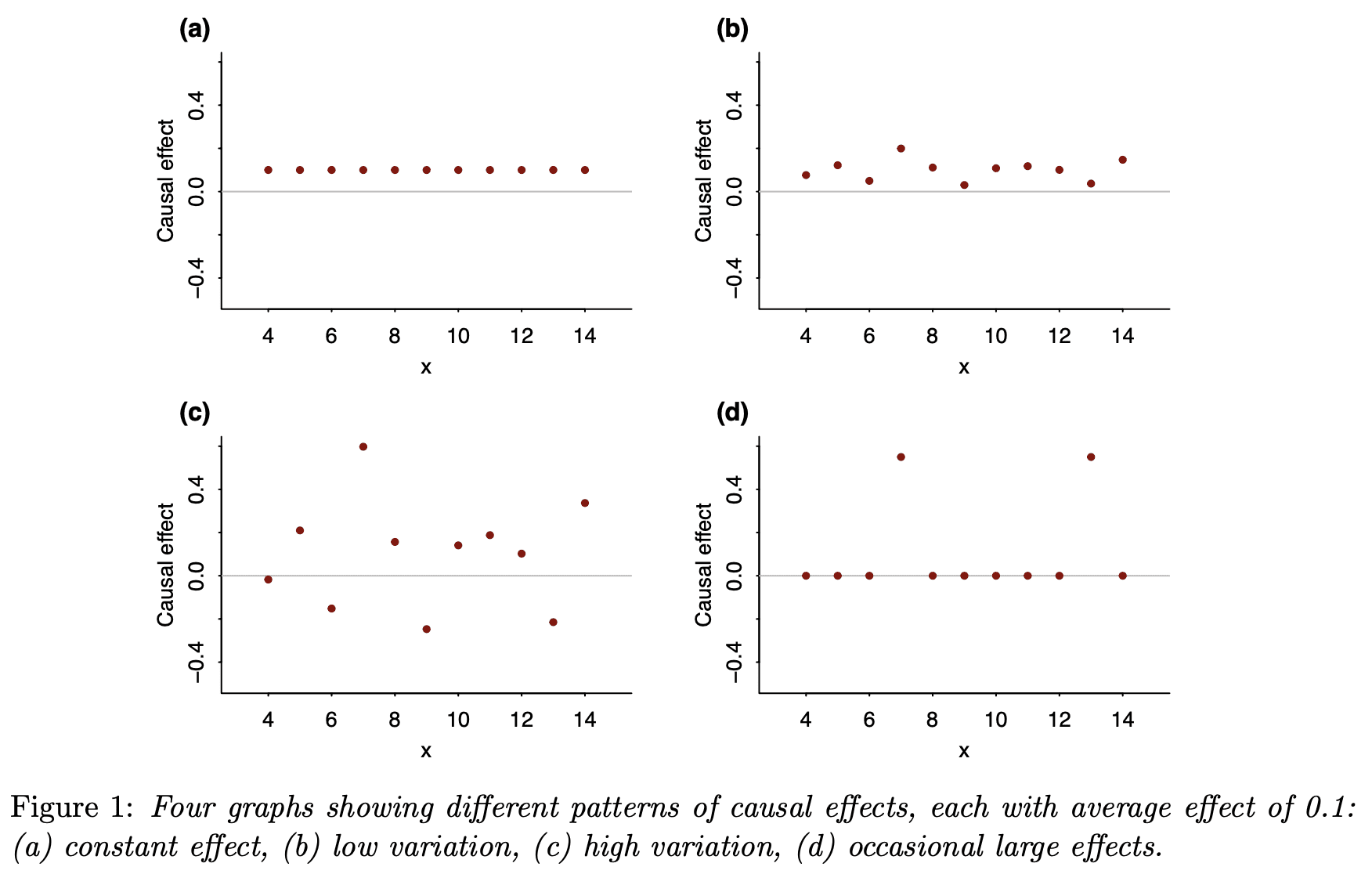
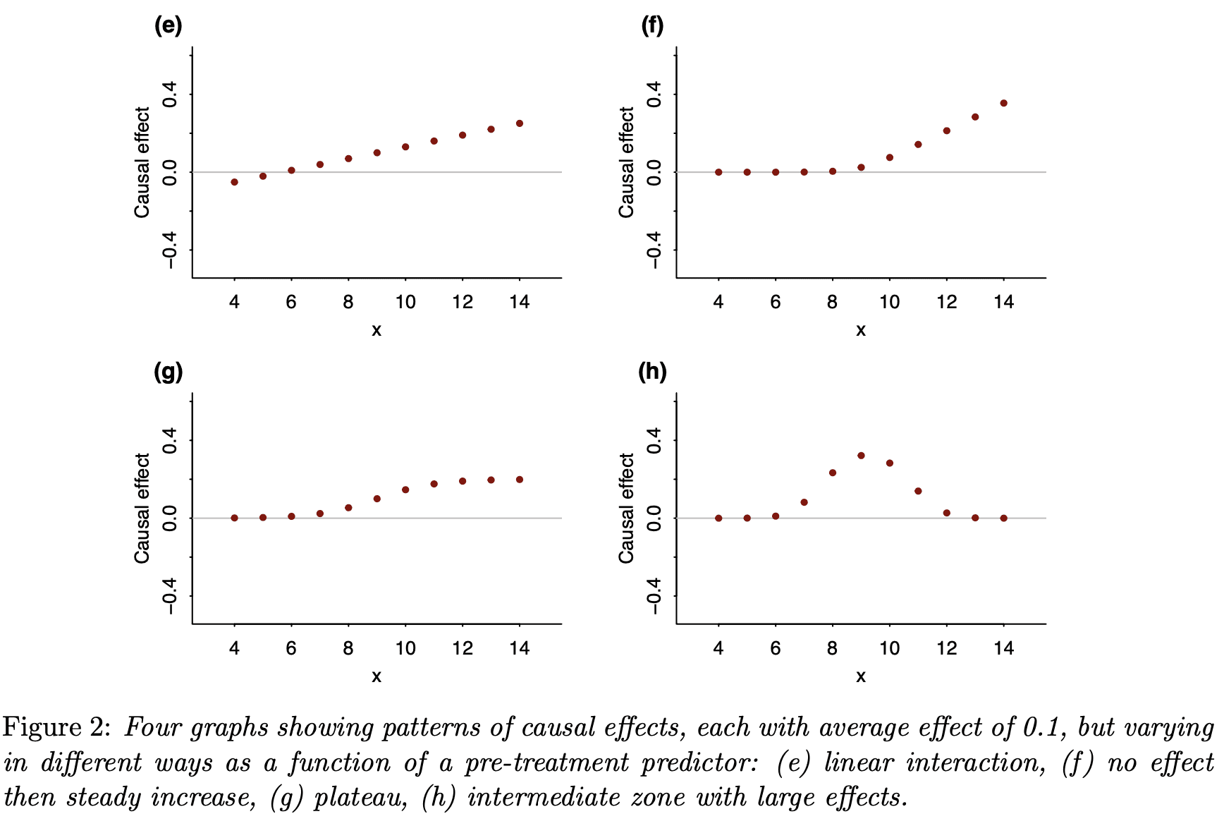
Last year I wrote about the value of testing observable consequences of a randomized experiment having occurred as planned. For example, if the randomization was supposedly Bernoulli(1/2), you can check that the number of units in treatment and control in the analytical sample isn’t so inconsistent with that; such tests are quite common in the tech industry. If you have pre-treatment covariates, then it can also make sense to test that they are not wildly inconsistent with randomization having occurred as planned. The point here is that things can go wrong in the treatment assignment itself or in how data is recorded and processed downstream. We are not checking whether our randomization perfectly balanced all of the covariates. We are checking our mundane null hypothesis that, yes, the treatment really was randomized as planned. Even if there is just a small difference in proportion treated or a small imbalance in observable covariates, if this is high statistically significant (say, p < 1e-5), then we should likely revise our beliefs. We might be able to salvage the experiment if, say, some observations were incorrectly dropped (one can also think of this as harmless attrition not being so harmless after all).

The argument against doing or at least prominently reporting these tests is that they can confuse readers and can also motivate “garden of forking paths” analyses with different sets of covariates than planned. I recently encountered some of these challenges in the wild. Because of open peer review processes, I can give a view into the peer review process for the paper where this came up.

I was a peer reviewer for this paper, “Communicating doctors’ consensus persistently increases COVID-19 vaccinations”, now published in Nature. It is an impressive experiment embedded in a multi-wave survey in the Czech Republic. The intervention provides accurate information about doctors’ trust in COVID-19 vaccines, which people perceived to be lower than it really was. (This is related to some of our own work on people’s beliefs about others’ vaccination intentions.) The paper presents evidence that this increased vaccination:

Fig. 4

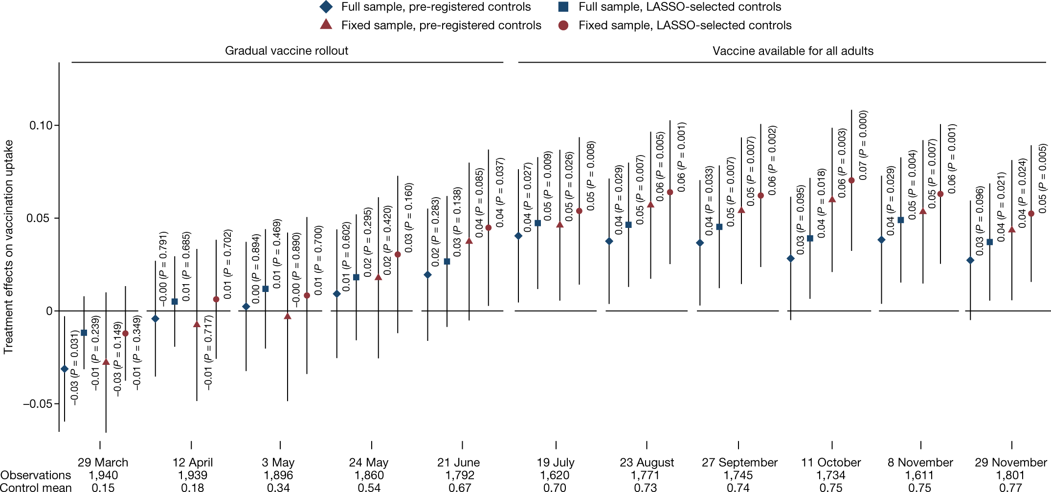
This figure (Figure 4 from the published version of the paper) shows the effects by wave of the survey. Not all respondents participated in each wave, so this creates the “full sample”, which includes a varying set of people over time, while the “fixed sample” includes only those who are in all waves. More immediately relevant, there are two sets of covariates used here: a pre-registered set and a set selected using L1-penalized regression.

This differs from a prior version of the paper, which actually didn’t report the preregistered set, motivated by concerns about imbalance of covariates that hadn’t been left out of that set. In my first peer review report, I wrote:

Contrary to the pre-analysis plan, the main analyses include adjustment for some additional covariates: “a non-pre-specified variable for being vaccinated in Wave0 and Wave0 beliefs about the views of doctors. We added the non-specified variables due to a detected imbalance in randomization.” (SI p. 32)

These indeed seem like relevant covariates to adjust for. However, this kind of data-contingent adjustment is potentially worrying. If there were indeed a problem with randomization, one would want to get to the bottom of that. But I don’t see much evidence than anything was wrong; it is simply the case that there is a marginally significant imbalance (.05 < p < .1) in two covariates and a non-significant (p > .1) imbalance in another — without any correction for multiple hypothesis testing. This kind of data-contingent adjustment can increase error rates (e.g., Mutz et al. 2019), especially if no particular rule is followed, creating a “garden of forking paths” (Gelman & Loken 2014). Thus, unless the authors actually think randomization did not occur as planned (in which case perhaps more investigation is needed), I don’t see why these variables should be adjusted for in all main analyses. (Note also that there is no single obvious way to adjust for these covariates. The beliefs about doctors are often discussed in a dichotomous way, e.g., “Underestimating” vs “Overestimating” trust so one could imagine the adjustment being for that dichotomized version additionally or instead. This helps to create many possible specifications, and only one is reported.) … More generally, I would suggest reporting a joint test of all of these covariates being randomized; presumably this retains the null.

This caused the authors to include the pre-registered analyses (which gave similar results) and to note, based on a joint test, that there weren’t “systematic” differences between treatment and control. Still I remained worried that the way they wrote about the differences in covariates between treatment and control invited misplaced skepticism about the randomization:

Nevertheless, we note that three potentially important but not pre-registered variables are not perfectly balanced. Since these three variables are highly predictive of vaccination take-up, not controlling for them could potentially bias the estimation of treatment effects, as is also indicated by the LASSO procedure, which selects these variables among a set of variables that should be controlled for in our estimates.

In my next report, while recommending acceptance, I wrote:

First, what does “not perfectly balanced” mean here? My guess is that all of the variables are not perfectly balanced, as perfect balance would be having identical numbers of subjects with each value in treatment and control, and would typically only be achieved in the blocked/stratified randomization.

Second, in what sense is does this “bias the estimation of treatment effects”? On typical theoretical analyses of randomized experiments, as long as we believe randomization occurred as planned, error due to random differences between groups is not bias; it is *variance* and is correctly accounted for in statistical inference.

This is also related to Reviewer 3’s review [who in the first round wrote “There seems to be an error of randomization on key variables”]. I think it is important for the authors to avoid the incorrect interpretation that something went wrong with their randomization. All indications are that it occurred exactly as planned. However, there can be substantial precision gains from adjusting for covariates, so this provides a reason to prefer the covariate-adjusted estimates.

If I was going to write this paragraph, I would say something like: Nevertheless, because the randomization was not stratified (i.e. blocked) on baseline covariates, there are random imbalances in covariates, as expected. Some of the larger differences are variables that were not specified in the pre-registered set of covariates to use for regression adjustment: (stating the covariates, I might suggest reporting standardized differences, not p-values here).

Of course, the paper is the authors’ to write, but I would just advise that unless they have a reason to believe the randomization did not occur as expected (not just that there were random differences in some covariates), they should avoid giving readers this impression.

I hope this wasn’t too much of a pain for the authors, but I think the final version of the paper is much improved in both (a) reporting the pre-registered analyses (as well as a bit of a multiverse analysis) and (b) not giving readers the incorrect impression there is any substantial evidence that something was wrong in the randomization.

So overall this experience helped me fully appreciate the perspective of Stephen Senn and other methodologists in epidemiology, medicine, and public health that reporting these per-covariate tests can lead to confusion and even worse analytical choices. But I think this is still consistent with what I proposed last time.

I wonder what you all think of this example. It’s also an interesting chance to get other perspectives on how this review and revision process unfolded and on my reviews.

P.S. Just to clarify, it will often make sense to prefer analyses of experiments that adjust for covariates to increase precision. I certainly use those analyses in much of my own work. My point here was more that finding noisy differences in covariates between conditions is not a good reason to change the set of adjusted-for variables. And, even if many readers might reasonably ex ante prefer an analysis that adjusts for more covariates, reporting such an analysis and not reporting the pre-registered analysis is likely to trigger some appropriate skepticism from readers. Furthermore, citing very noisy differences in covariates between conditions is liable to confuse readers and make them think something is wrong with the experiment. Of course, if there is strong evidence against randomization having occurred as planned, that’s notable, but simply adjusting for observables is not a good fix.

[This post is by Dean Eckles.]