Hey! Here are some amazing articles by George Box from around 1990. Also there’s some mysterious controversy regarding his center at the University of Wisconsin.

The webpage is maintained by John Hunter, son of Box’s collaborator William Hunter, and I came across it because I was searching for background on the paper-helicopter example that we use in our classes to teach principles of experimental design and data analysis.

There’s a lot to say about the helicopter example and I’ll save that for another post.

Here I just want to talk about how much I enjoyed reading these thirty-year-old Box articles.

A Box Set from 1990

Many of the themes in those articles continue to resonate today. For example:

• The process of learning. Here’s Box from his 1995 article, “Total Quality: Its Origins and its Future”:

Scientific method accelerated that process in at least three ways:

1. By experience in the deduction of the logical consequences of the group of facts each of which was individually known but had not previously been brought together.

2. By the passive observation of systems already in operation and the analysis of data coming from such systems.

3. By experimentation – the deliberate staging of artificial experiences which often might ordinarily never occur.

A misconception is that discovery is a “one shot” affair. This idea dies hard. . . .

• Variation over time. Here’s Box from his 1989 article, “Must We Randomize Our Experiment?”:

We all live in a non-stationary world; a world in which external factors never stay still. Indeed the idea of stationarity – of a stable world in which, without our intervention, things stay put over time – is a purely conceptual one. The concept of stationarity is useful only as a background against which the real non-stationary world can be judge. For example, the manufacture of parts is an operation involving machines and people. But the parts of a machine are not fixed entities. They are wearing out, changing their dimensions, and losing their adjustment. The behavior of the people who run the machines is not fixed either. A single operator forgets things over time and alters what he does. When a number of operators are involved, the opportunities for change because of failures to communicate are further multiplied. Thus, if left to itself any process will drift away from its initial state. . . .

Stationarity, and hence the uniformity of everything depending on it, is an unnatural state that requires a great deal of effort to achieve. That is why good quality control takes so much effort and is so important. All of this is true, not only for manufacturing processes, but for any operation that we would like to be done consistently, such as the taking of blood pressures in a hospital or the performing of chemical analyses in a laboratory. Having found the best way to do it, we would like it to be done that way consistently, but experience shows that very careful planning, checking, recalibration and sometimes appropriate intervention, is needed to ensure that this happens.

Here an example, from Box’s 1992 article, “How to Get Lucky”:

For illustration Figure 1(a) shows a set of data designed so seek out the source of unacceptably large variability which, it was suspected, might be due to small differences in five, supposedly identical, heads on a machine. To test this idea, the engineer arranged that material from each of the five heads was sampled at roughly equal intervals of time in each of six successive eight-hour periods. . . . the same analysis strongly suggested that real differences in means occurred between the six eight-hour periods of time during which the experiment was conducted. . . .

• Workflow. Here’s Box from his 1999 article, “Statistics as a Catalyst to Learning by Scientific Method Part II-Discussion”:

Most of the principles of design originally developed for agricultural experimentation would be of great value in industry, but the most industry experimentation differed from agricultural experimentation in two major respects. These I will call immediacy and sequentially.

What I mean by immediacy is that for most of our investigations the results were available, if not within hours, then certainly within days and in rare cases, even within minutes. This was true whether the investigation was conducted in a laboratory, a pilot plant or on the full scale. Furthermore, because the experimental runs were usually made in sequence, the information obtained from each run, or small group of runs, was known and could be acted upon quickly and used to plan the next set of runs. I concluded that the chief quarrel that our experimenters had with using “statistics” was that they thought it would mean giving up the enormous advantages offered by immediacy and sequentially. Quite rightly, they were not prepared to make these sacrifices. The need was to find ways of using statistics to catalyze a process of investigation that was not static, but dynamic.

There’s lots more. It’s funny to read these things that Box wrote back then, that I and others have been saying over and over again in various informal contexts, decades later. It’s a problem with our statistical education (including my own textbooks) that these important ideas are buried.

More Box

A bunch of articles by Box, with some overlap but not complete overlap with the above collection, is at the site of the University of Wisconsin, where he worked for many years. Enjoy.

Some kinda feud is going on

John Hunter’s page also has this:

The Center for Quality and Productivity Improvement was created by George Box and Bill Hunter at the University of Wisconsin-Madison in 1985.

In the first few years reports were published by leading international experts including: W. Edwards Deming, Kaoru Ishikawa, Peter Scholtes, Brian Joiner, William Hunter and George Box. William Hunter died in 1986. Subsequently excellent reports continued to be published by George Box and others including: Gipsie Ranney, Soren Bisgaard, Ron Snee and Bill Hill.

These reports were all available on the Center’s web site. After George Box’s death the reports were removed. . . .

It is a sad situation that the Center abandonded the ideas of George Box and Bill Hunter. I take what has been done to the Center as a personal insult to their memory. . . .

When diagonoised with cancer my father dedicated his remaining time to creating this center with George to promote the ideas George and he had worked on throughout their lives: because it was that important to him to do what he could. They did great work and their work provided great benefits for long after Dad’s death with the leadership of Bill Hill and Soren Bisgaard but then it deteriorated. And when George died the last restraint was eliminated and the deterioration was complete.

Wow. I wonder what the story was. I asked someone I know who works at the University of Wisconsin and he had no idea. Box died in 2013 so it’s not so long ago; there must be some people who know what happened here.
“You need 16 times the sample size to estimate an interaction than to estimate a main effect,” explained

This has come up before here, and it’s also in Section 16.4 of Regression and Other Stories (chapter 16: “Design and sample size decisions,” Section 16.4: “Interactions are harder to estimate than main effects”). But there was still some confusion about the point so I thought I’d try explaining it in a different way.

The basic reasoning

The “16” comes from the following four statements:

1. When estimating a main effect and an interaction from balanced data using simple averages (which is equivalent to least squares regression), the estimate of the interaction has twice the standard error as the estimate of a main effect.

2. It’s reasonable to suppose that an interaction will have half the magnitude of a main effect.

3. From 1 and 2 above, we can suppose that the true effect size divided by the standard error is 4 times higher for the interaction than for the main effect.

4. To achieve any desired level of statistical power for the interaction, you will need 4^2 = 16 times the sample size that you would need to attain that level of power for the main effect.

Statements 3 and 4 are unobjectionable. They somewhat limit the implications of the “16” statement, which does not in general apply to Bayesian or regularized estimates, not does it consider goals other than statistical power (equivalently, the goal of estimating an effect to a desired relative precision). I don’t consider these limitations a problem; rather, I interpret the “16” statement as relevant to that particular set of questions, in the way that the application of any mathematical statement is conditional on the relevance of the framework under which they can be proved.

Statements 1 and 2 are a bit more subtle. Statement 1 depends on what is considered a “main effect,” and statement 2 is very clearly an assumption regarding the applied context of the problem being studied.

First, statement 1. Here’s the math for why the estimate of the interaction has twice the standard error of the estimate of the main effect. The scenario is an experiment with N people, of which half get treatment 1 and half get treatment 0, so that the estimated main effect is ybar_1 – ybar_0, comparing average under treatment and control. We further suppose the population is equally divided between two sorts of people, a and b, and half the people in each group get each treatment. Then the estimated interaction is (ybar_1a – ybar_0a) – (ybar_1b – ybar_0b).

The estimate of the main effect, ybar_1 – ybar_0, has standard error sqrt(sigma^2/(N/2) + sigma^2/(N/2)) = 2*sigma/sqrt(N); for simplicity I’m assuming a constant variance within groups, which will typically be a good approximation for binary data, for example. The estimate of the interaction, (ybar_1a – ybar_0a) – (ybar_1b – ybar_0b), has standard error sqrt(sigma^2/(N/4) + sigma^2/(N/4) + sigma^2/(N/4) + sigma^2/(N/4)) = 4*sigma/sqrt(N). I’m assuming that the within-cell standard deviation does not change after we’ve divided the population into 4 cells rather than 2; this is not exactly correct—to the extent that the effects are nonzero, we should expect the within-cell standard deviations to get smaller as we subdivide—; again, however, it is common in applications for the within-cell standard deviation to be essentially unchanged after adding the interaction. This is equivalent to saying that you can add a important predictor without the R-squared going up much, and it’s the usual story in research areas such as psychology, public opinion, and medicine where individual outcomes are highly variable and so we look for effects among averaging.

The biggest challenge with the reasoning in the above two paragraphs is not the bit about sigma being smaller when the cells are subdivided—this is typically a minor concern, and it’s easy enough to account for if necessary—, nor is it the definition of interaction. Rather, the challenge comes, perhaps surprisingly, from the definition of main effect.

Above I define the “main effect” as the average treatment effect in the population, which seems reasonable enough. There is an alternative, though. You could also define the main effect as the average treatment effect in the baseline category. In the notation above, the main effect would then be defined ybar_1a – ybar_0a. In that case, the standard error of the estimated main effect is only sqrt(2) times the standard error of the estimate of the interaction.

Typically I’ll frame the main effect as the average effect in the population, but there are some settings where I’d frame it as the average effect in the baseline category. It depends on how you’re planning to extrapolate the inferences from your model. The important thing is to be clear in your definition.

Now on to statement 2. I’m supposing an interaction that is half the magnitude of the main effect. For example, if the main effect is 20 and the interaction is 10, that corresponds to an effect of 25 in group a and 15 in group b. To me, that’s a reasonable baseline: the treatment effect is not constant but it’s pretty stable, which is kinda what I think about when I hear “main effect.”

But there are other possibilities. Suppose that the effect is 30 in group a and 10 in group b, so the effect is consistently positive effect, but now it varies by a factor of 3 rather under the two conditions. In this case, the main effect is 20 and the interaction is 20. The main effect and the interaction are of equal size, and so you only need 4 times the sample size to estimate the main effect as to estimate the interaction.

Or suppose the effect is 40 in group a and 0 in group b. Then the main effect is 20 and the interaction is 40, and in that case you need the same sample size to estimate the main effect as to estimate the interaction. This can happen! In such a scenario, I don’t know that I’d be particularly interested in the “main effect”—I think I’d frame the problem in terms of effect in group a and effect in group b, without any particular desire to average over them. It will depend on context.

Why this is important

Before going on, let me copy something from my our earlier post explaining the importance of this result: From the statement of the problem, we’ve assumed the interaction is half the size of the main effect. If the main effect is 2.8 on some scale with a standard error of 1 (and thus can be estimated with 80% power; see for example page 295 of Regression and Other Stories, where we explain why, for 80% power, the true value of the parameter must be 2.8 standard errors away from
the comparison point), and the interaction is 1.4 with a standard error of 2, then the z-score of the interaction has a mean of 0.7 and a sd of 1, and the probability of seeing a statistically significant effect difference is pnorm(0.7, 1.96, 1) = 0.10. That’s right: if you have 80% power to estimate the main effect, you have 10% power to estimate the interaction.

And 10% power is really bad. It’s worse than it looks. 10% power kinda looks like it might be OK; after all, it still represents a 10% chance of a win. But that’s not right at all: if you do get “statistical significance” in that case, your estimate is a huge overestimate:

> raw <- rnorm(1e6, .7, 1)
> significant <- raw > 1.96
> mean(raw[significant])
[1] 2.4

So, the 10% of results which do appear to be statistically significant give an estimate of 2.4, on average, which is over 3 times higher than the true effect.

So, yeah, you don’t want to be doing studies with 10% power, which implies that when you’re estimating that interaction, you have to forget about statistical significance; you need to just accept the uncertainty.

Explaining using a 2 x 2 table

Now to return to the main-effects-and-interactions thing:

One way to look at all this is by framing the population as a 2 x 2 table, showing the averages among control and treated conditions within groups a and b:

           Control  Treated  
Group a:  
Group b:  

For example, here’s an example where the treatment has a main effect of 20 and an interaction of 10:

           Control  Treated  
Group a:     100      115
Group b:     150      175

In this case, there’s a big “group effect,” not necessarily causal (I had vaguely in mind a setting where “Group” is an observational factor and “Treatment” is an experimental factor), but still a “main effect” in the sense of a linear model. Here, the main effect of group is 55. For the issues we’re discussing here, the group effect doesn’t really matter, but we need to specify something here in order to fill in the table.

If you’d prefer, you can set up a “null” setting where the two groups are identical, on average, under the control condition:

           Control  Treated  
Group a:     100      115
Group b:     100      125

Again, each of the numbers in these tables represents the population average within the four cells, and “effects” and “interactions” correspond to various averages and differences of the four numbers. We’re further assuming a balanced design with equal sample sizes and equal variances within each cell.

What would it look like if the interaction were twice the size of the main effect, for example a main effect of 20 and an interaction of 40? Here’s one possibility of the averages within each cell:

           Control  Treated  
Group a:     100      100
Group b:     100      140

If that’s what the world is like, then indeed you need exactly the same sample size (that is, the total sample size in the four cells) to estimate the interaction as to estimate the main effect.

When using regression with interactions

To reproduce the above results using linear regression, you’ll want to code the Group and Treatment variables on a {-0.5, 0.5} scale. That is, Group = -0.5 for a and +0.5 for b, and Treatment = -0.5 for control and +0.5 for treatment. That way, the main effect of each variable corresponds to the other variable equaling zero (thus, the average of a balanced population), and the interaction corresponds to the difference of treatment effects, comparing the two groups.

Alternatively we could code each variable on a {-1, 1} scale, in which case the main effects are divided by 2 and the interaction is divided by 4, but the standard errors are also divided in the same way, so the z-scores don’t change, and you still need the same X times the sample size to estimate the interaction as to estimate the man effect.

Or we could code each variable as {0, 1}, in which case, as discussed above, the main effect for each predictor is then defined as the effect of that predictor when the other predictor equals 0.

Why do I make the default assumptions that I do in the above analyses?

The scenario I have in mind is studies in psychology or medicine where a and b are two groups of the population, for example women and men, or young and old people, and researchers start with a general idea, a “main effect,” but there is also interest in how this effects vary, that is, “interactions.” In my scenario, neither a or b is a baseline, and so it makes sense to think of the main effect as some sort of average (which, as discussed here, can take many forms).

In the world of junk science, interactions represent a way out, a set of forking paths that allow researchers to declare a win in settings where their main effect does not pan out. Three examples we’ve discussed to death in this space are the claim of an effect of fat arms on men’s political attitudes (after interacting with parental SES), an effect of monthly cycle on women’s political attitudes (after interacting with partnership status), and an effect of monthly status on women’s clothing choices (after interacting with weather). In all these examples, the main effect was the big story and the interaction was the escape valve. The point of “You need 16 times the sample size to estimate an interaction than to estimate a main effect” is not to say that researchers shouldn’t look for interactions or that they should assume interactions are zero; rather, the point is that they should not be looking for statistically-significant interactions, given that their studies are, at best, barely powered to estimate main effects. Thinking about interactions is all about uncertainty.

In more solid science, interactions also come up: there are good reasons to think that certain treatments will be more effective on some people and in some scenarios. Again, though, in a setting where you’re thinking of interactions as variations on a theme of the main effect, your inferences for interactions will be highly uncertain, and the “16” advice should be helpful both in design and analysis.

Summary

In a balanced experiment, when the treatment effect is 15 in Group a and 25 in Group b (that is, the main effect is twice the size of the interaction), the estimate of the interaction will have twice the standard error as the estimate of the main effect, and so you’d need a sample size of 16*N to estimate the interaction at the same relative precision as you can estimate the main effect from the same design but with a sample size of N.

With other scenarios of effect sizes, the result is different. If the treatment effect is 10 in Group a and 30 in Group b, you’d need 4 times the sample size to estimate the interaction as to estimate the main effect. If the treatment effect is 0 in group a and 40 in Group b, you’d need equal sample sizes.

Hydrology Corner: How to compare outputs from two models, one Bayesian and one non-Bayesian?

Zac McEachran writes:

I am a Hydrologist and Flood Forecaster at the National Weather Service in the Midwest. I use some Bayesian statistical methods in my research work on hydrological processes in small catchments.

I recently came across a project that I want to use a Bayesian analysis for, but I am not entirely certain what to look for to get going on this. My issue: NWS uses a protocol for calibrating our river models using a mixed conceptual/physically-based model. We want to assess whether a new calibration is better than an old calibration. This seems like a great application for a Bayesian approach. However, a lot of the literature I am finding (and methods I am more familiar with) are associated with assessing goodness-of-fit and validation for models that were fit within a Bayesian framework, and then validated in a Bayesian framework. I am interested in assessing how a non-Bayesian model output compares with another non-Bayesian model output with respect to observations. Someday I would like to learn to use Bayesian methods to calibrate our models but one step at a time!

My response: I think you need somehow to give a Bayesian interpretation to your non-Bayesian model output. This could be as simple as taking 95% prediction intervals and interpreting them as 95% posterior intervals from a normally-distributed posterior. Or if the non-Bayesian fit only gives point estimates, then do some boostrapping or something to get an effective posterior. Then you can use external validation or cross validation to compare the predictive distributions of your different models, as discussed here; also see Aki’s faq on cross validation.

A Hydrologist and Flood Forecaster . . . how cool is that?? Last time we had this level of cool was back in 2009 when we were contacted by someone who was teaching statistics to firefighters.

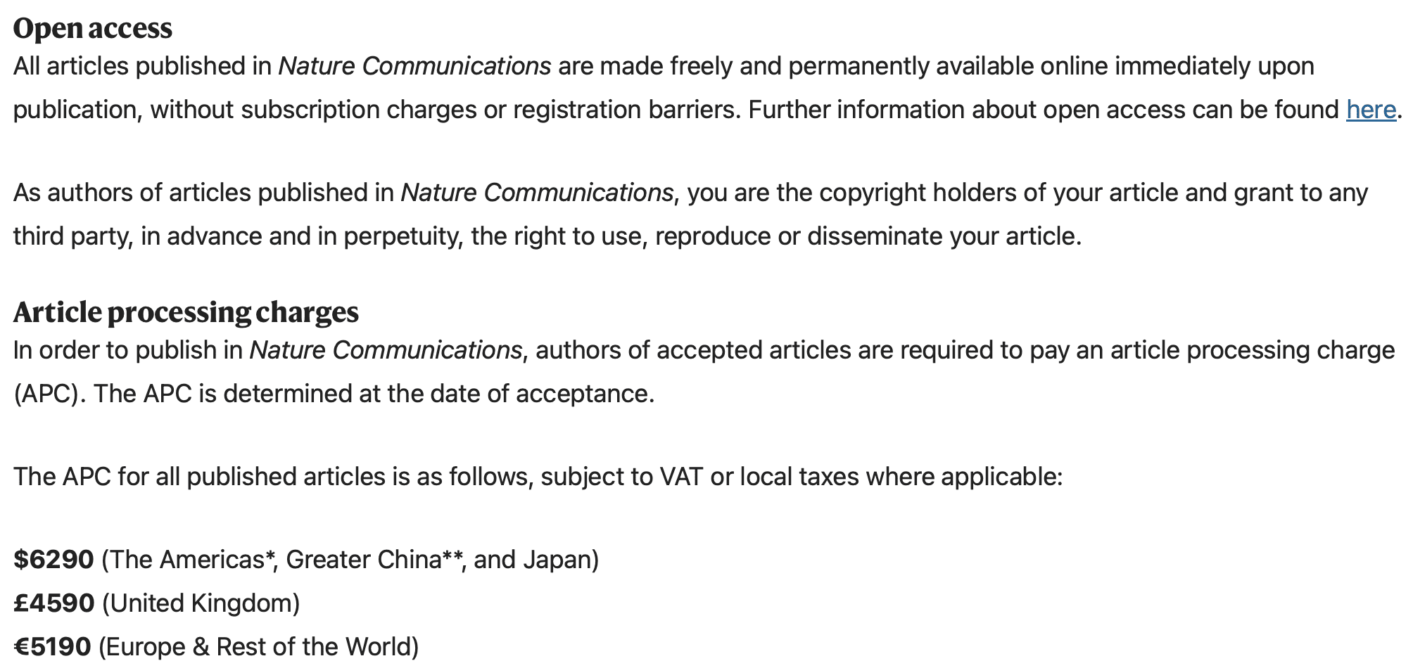
We were gonna submit something to Nature Communications, but then we found out they were charging $6290 for publication. For that amount of money, we could afford 37% of an invitation to a conference featuring Grover Norquist, Gray Davis, and a rabbi, or 1/160th of the naming rights for a sleep center at the University of California, or 4735 Jamaican beef patties.

My colleague and I wrote a paper, and someone suggested we submit it to the journal Nature Communications. Sounds fine, right? But then we noticed this:

Hey! We wrote the damn article, right? They should be paying us to publish it, not the other way around. Ok, processing fees yeah yeah, but $6290??? How much labor could it possibly take to publish one article? This makes no damn sense at all. I guess part of that $6290 goes to paying for that stupid website where they try to con you into paying several thousand dollars to put an article on their website that you can put on Arxiv for free.

Ok, then the question arises: What else could we get for that $6290? A trawl through the blog archive gives some possibilities:

– 37% of an invitation to a conference featuring Grover Norquist, Gray Davis, and a rabbi

– 1/160th of the naming rights for a sleep center at the University of California

– 4735 Jamaican beef patties

I guess that, among all these options, the Nature Communications publication would do the least damage to my heart. Still, I couldn’t quite bring myself to commit to forking over $6290. So we’re sending the paper elsewhere.

At this point I’m still torn between the other three options. 4735 Jamaican beef patties sounds good, but 1/160th of a sleep center named just for me, that would be pretty cool. And 37% of a chance to meet Grover Norquist, Gray Davis, and a rabbi . . . that’s gotta be the most fun since Henry Kissinger’s 100th birthday party. (Unfortunately I was out of town for that one, but I made good use of my invite: I forwarded it to Kissinger superfan Cass Sunstein, and it seems he had a good time, so nothing was wasted.) So don’t worry, that $6290 will go to a good cause, one way or another.

Postdoc on Bayesian methodological and applied work! To optimize patient care! Using Stan! In North Carolina!

Sam Berchuck writes:

I wanted to bring your attention to a postdoc opportunity in my group at Duke University in the Department of Biostatistics & Bioinformatics. The full job ad is here: https://forms.stat.ufl.edu/statistics-jobs/entry/10978/.

The postdoc will work on Bayesian methodological and applied work, with a focus on modeling complex longitudinal biomedical data (including electronic health records and mobile health data) to create data-driven approaches to optimize patient care among patients with chronic diseases. The position will be particularly interesting to people interested in applying Bayesian statistics in real-world big data settings. We are looking for people who have experience in Bayesian inference techniques, including Stan!

Interesting. In addition to the Stan thing, I’m interested in data-driven approaches to optimize patient care. This is an area where a Bayesian approach, or something like it, is absolutely necessary, as you typically just won’t have enough data to make firm conclusions about individual effects, so you have to keep track of uncertainty. Sounds like a wonderful opportunity.

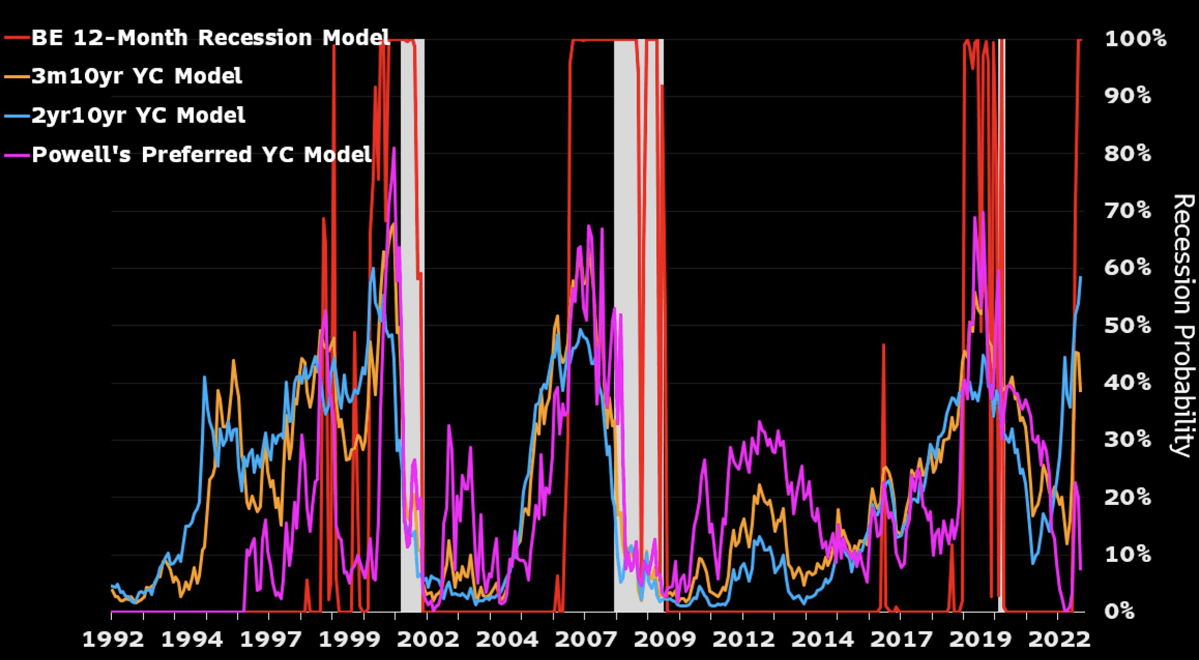
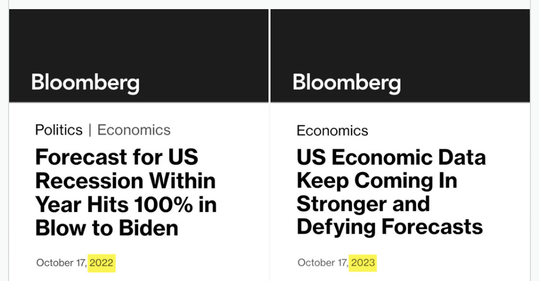
Bloomberg News makes an embarrassing calibration error

Palko points to this amusing juxtaposition:

I was curious so I googled to find the original story, “Forecast for US Recession Within Year Hits 100% in Blow to Biden,” by Josh Wingrove, which begins:

A US recession is effectively certain in the next 12 months in new Bloomberg Economics model projections . . . The latest recession probability models by Bloomberg economists Anna Wong and Eliza Winger forecast a higher recession probability across all timeframes, with the 12-month estimate of a downturn by October 2023 hitting 100% . . .

I did some further googling but could not find any details of the model. All I could find was this:

With probabilities that jump around this much, you can expect calibration problems.

This is just a reminder that for something to be a probability, it’s not enough that it be a number between 0 and 1. A real-world probability don’t exist in isolation; they are ensnared in a web of interconnections. Recall our discussion from last year:

Justin asked:

Is p(aliens exist on Neptune that can rap battle) = .137 valid “probability” just because it satisfies mathematical axioms?

And Martha sagely replied:

“p(aliens exist on Neptune that can rap battle) = .137” in itself isn’t something that can satisfy the axioms of probability. The axioms of probability refer to a “system” of probabilities that are “coherent” in the sense of satisfying the axioms. So, for example, the two statements

“p(aliens exist on Neptune that can rap battle) = .137″ and p(aliens exist on Neptune) = .001”

are incompatible according to the axioms of probability, because the event “aliens exist on Neptune that can rap battle” is a sub-event of “aliens exist on Neptune”, so the larger event must (as a consequence of the axioms) have probability at least as large as the probability of the smaller event.

The general point is that a probability can only be understood as part of a larger joint distribution; see the second-to-last paragraph of the boxer/wrestler article. I think that confusion on this point has led to lots of general confusion about probability and its applications.

Beyond that, seeing this completely avoidable slip-up from Bloomberg gives us more respect for the careful analytics teams at other news outlets such as the Economist and Fivethirtyeight, both of which are far from perfect, but at least we’re all aware that it would not make sense to forecast a 100% probability of recession in this sort of uncertain situation.

P.S. See here for another example of a Bloomberg article with a major quantitative screw-up. In this case the perpetrator was not the Bloomberg in-house economics forecasting team, it was a Bloomberg Opinion columnist who is described as “a former editorial director of Harvard Business Review,” which at first kinda sounds like he’s an economist at the Harvard business school, but I guess what it really means is that he’s a journalist without strong quantitative skills.

Academia corner: New candidate for American Statistical Association’s Founders Award, Enduring Contribution Award from the American Political Science Association, and Edge Foundation just dropped

Bethan Staton and Chris Cook write:

A Cambridge university professor who copied parts of an undergraduate’s essays and published them as his own work will remain in his job, despite an investigation upholding a complaint that he had committed plagiarism. 

Dr William O’Reilly, an associate professor in early modern history, submitted a paper that was published in the Journal of Austrian-American History in 2018. However, large sections of the work had been copied from essays by one of his undergraduate students.

The decision to leave O’Reilly in post casts doubt on the internal disciplinary processes of Cambridge, which rely on academics judging their peers.

Dude’s not a statistician, but I think this alone should be enough to make him a strong candidate for the American Statistical Association’s Founders Award.

And, early modern history is not quite the same thing as political science, but the copying thing should definitely make him eligible for the Aaron Wildavsky Enduring Contribution Award from the American Political Science Association. Long after all our research has been forgotten, the robots of the 21st century will be able to sift through the internet archive and find this guy’s story.

Or . . . what about the Edge Foundation? Plagiarism isn’t quite the same thing as misrepresenting your data, but it’s close enough that I think this guy would have a shot at joining that elite club. I’ve heard they no longer give out flights to private Caribbean islands, but I’m sure there are some lesser perks available.

According to the news article:

Documents seen by the Financial Times, including two essays submitted by the third-year student, show nearly half of the pages of O’Reilly’s published article — entitled “Fredrick Jackson Turner’s Frontier Thesis, Orientalism, and the Austrian Militärgrenze” — had been plagiarised.

Jeez, some people are so picky! Only half the pages were plagiarized, right? Or maybe not? Maybe this prof did a “Quentin Rowan” and constructed his entire article based on unacknowledged copying from other sources. As Rowan said:

It felt very much like putting an elaborate puzzle together. Every new passage added has its own peculiar set of edges that had to find a way in.

I guess that’s how it felt when they were making maps of the Habsburg empire.

On the plus side, reading about this story motivated me to take a look at the Journal of Austrian-American History, and there I found this cool article by Thomas Riegler, “The Spy Story Behind The Third Man.” That’s one of my favorite movies! I don’t know how watchable it would be to a modern audience—the story might seem a bit too simplistic—but I loved it.

P.S. I laugh but only because that’s more pleasant than crying. Just to be clear: the upsetting thing is not that some sleazeball managed to climb halfway up the greasy pole of academia by cheating. Lots of students cheat, some of these students become professors, etc. The upsetting thing is that the organization closed ranks to defend him. We’ve seen this sort of thing before, over and over—for example, Columbia never seemed to make any effort whatsoever to track down whoever was faking its U.S. News numbers—, so this behavior by Cambridge University doesn’t surprise me, but it still makes me sad. I’m guessing it’s some combination of (a) the perp is plugged in, the people who make the decisions are his personal friends, (b) a decision that the negative publicity for letting this guy stay on at his job is not as bad as the negative publicity for firing him.

Can you imagine what it would be like to work in the same department as this guy?? Fun conversations at the water cooler, I guess. “Whassup with the Austrian Militärgrenze, dude?”

Meanwhile . . .

There are people who actually do their own research, and they’re probably good teachers too, but they didn’t get that Cambridge job. It’s hard to compete with an academic cheater, if the institution he’s working for seems to act as if cheating is just fine, and if professional societies such as the American Statistical Association and the American Political Science Association don’t seem to care either.

Why aren’t there more fake reviews on yelp etc?

Bert Gunter writes:

This article in today’s NYTimes is a hoot, and might be grist for the lighter side of your blog … or maybe the heavier if you want to get into statistical fake detection, which is a big deal these days I guess.

The news article in question is called, “Five Stars, Zero Clue: Fighting the ‘Scourge’ of Fake Online Reviews,” subtitled, “Third parties pay writers for posts praising or panning hotels, restaurants and other places they never visited. How review sites like Yelp and Tripadvisor are trying to stop the flood.”

I agree with Gunter; it’s a fun article. Here’s my question: why aren’t there more fake reviews? Sure, lots of people are honest and would not cheat, but what I don’t understand is why the cheaters don’t cheat more. For example, suppose some crappy restaurant goes to the trouble of posting two fake five-star reviews. Why not go whole hog and post 100? Or would that be too easy to detect?

Or maybe we’ve reached an equilibrium. Right now if you’re looking for a place to eat, you can look at the reviews on google/yelp/tripadvisor/etc, and . . . they don’t give you zero information, but they provide a very weak signal. Not necessarily from cheating, just that tastes differ. But cheating muddies the waters enough, it just adds one more reason you can’t use these for much. So maybe the answer to the question, Why don’t they cheat more?, is that not much is to be gained by it.

Call for Participation: Crowd-sourcing “Wisdom of the Crowd” mechanisms. Win $10,000.

Igor Grossmann writes:

Together with colleagues from Innsbruck, Vienna, and Waterloo, we are launching an exciting new project and we would like to invite you to participate in (and your PostDocs, PhDs and other team members): it’s a crowd analysis project to explore which aggregation mechanisms best harness the “wisdom of the crowd” to predict future outcomes. Over a period of 6 months we will each month collect 16 predictions (4 each in 4 domains – politics, economics, sports and climate) by 640 people from the general population. Participating researcher’s tasks is to submit an aggregation mechanism (in Python or R) to aggregate these many predictions to one aggregate outcome.

The call for participation is hereand you can register here.

We hope for many participants, and would truly appreciate if you could spread the word – the entry hurdles are very low, the webpage is set up to pretest the aggregation mechanisms and the total workload can be one working day (can also be more if someone invests a lot of time to optimize his/her algorithm). All researchers receive, of course, consortium authorship and the most successful teams can win a total of up to EUR 10.000.

Sounds cool. Many challenging issues arise in information aggregation (for example, see this presentation from 2003; unfortunately I haven’t thought too hard about these issues since then, but I remain interested in the topic).

Where should we go to see the eclipse in April? Here’s a graph I’d like to see.

Our plan was to go to Cleveland because that’s conveniently located not too far from various family members, but then someone said that the weather there in April is not so great, and it’s not so fun seeing an eclipse if it’s raining or even if the sun is behind a cloud.

So maybe we should fly to Texas? But that’s kinda far. South of Montreal could be pleasant, but I’m guessing their weather is just as cloudy as Cleveland’s? Or if we just go an hour southwest of Cleveland to get away from the lake, would that help? I have no idea!

So here’s what I’m looking for: A graph showing the probability that the sun is obscured on the y-axis, and location on the x-axis. In general, location would require two coordinates (latitude and longitude), but if we assume that we’ll be going for maximum totality (the line in the center of the strip in the above map), that’s unidimensional, just position along a line. Given this graph, we could make an informed decision, balancing travel time and probability of bad weather.

P.S. Lots of helpful information in comments, including this graph by Wikipedia user Meteocan:

Amusingly enough, Cleveland seems to be a local optimum.

Stupid legal arguments: a moral hazard?

I’ve published two theorems; one was true and one turned out to be false. We would say the total number of theorems I’ve proved is 1, not 2 or 0. The false theorem doesn’t count as a theorem, not does it knock out the true theorem.

This also seems to be the way that aggregation works in legal reasoning: if a lawyer gives 10 arguments and 9 are wrong, that’s ok; only the valid argument counts.

I was thinking about this after seeing two recent examples:

1. Law professor Larry Lessig released a series of extreme arguments defending three discredited celebrities: Supreme Court judge Clarence Thomas, financier Jeffrey Epstein, and economist Francesca Gino. When looking into this, I was kinda surprised that Lessig, who is such a prominent law professor, was offering such weak arguments—but maybe I wasn’t accounting for the asymmetrical way in which legal arguments are received: you spray out lots of arguments, and the misses don’t count; all that matters is how many times you get a hit.

I remember this from being a volunteer judge at middle-school debate: you get a point for any argument you land that the opposing side doesn’t bother to refute. This creates an incentive to emit a flow of arguments, as memorably dramatized by Ben Lerner in one of his books. Anyway, the point is that from Lessig’s perspective, maybe it’s ok that he spewed out some weak arguments; that’s just the rules of the game.

2. A group suing the U.S. Military Academy to abandon affirmative action claimed in its suit that “For most of its history, West Point has evaluated cadets based on merit and achievement,” a ludicrous claim, considering that the military academy graduated only three African-American cadets during its first 133 years.

If I were the judge, I’d be inclined to toss out the entire lawsuit based on this one statement, as it indicates a fatal lack of seriousness on the part of the plaintiffs.

On the other hand, I get it: all that matters is that the suit has at least one valid argument. The invalid arguments shouldn’t matter. This reasoning can be seen more clearly, perhaps, if we consider a person unjustly sentenced to prison for a crime he didn’t commit. If, in his defense, he offers ten arguments, of which nine are false, but the tenth unambiguously exonerates him, then he should get off. The fact that he, in his desperation, offered some specious arguments does not make him guilty of the crime.

The thing that bugs me about this West Point lawsuit and, to a lesser extent, Lessig’s posts, is that this freedom to make bad arguments without consequences creates what economists call a “moral hazard,” by which there’s an incentive to spew out low-quality arguments as a way to “flood the zone” and overwhelm the system.

I was talking with a friend about this and he said that the incentives here are not so simple, as people pay a reputational cost when they promote bad arguments. It’s true that whatever respect I had for Lessig or the affirmative-action-lawsuit people has diminished, in the same way that Slate magazine has lost some of its hard-earned reputation for skepticism after running a credulous piece on UFOs. But . . . Lessig and the affirmative-action crew don’t care about what people like me think about them, right? They’re playing the legal game. I’m not sure what, if anything, should be done about all this; it just bothers me that there seem to be such strong incentives for lawyers (and others) to present bad arguments.

I’m sure that legal scholars have written a lot about this one, so I’m not claiming any originality here.

P.S. However these sorts of lawsuits are treated in the legal system, I think that it would be appropriate for their stupidity to be pointed out when they get media coverage. Instead, there seems to be a tendency to take ridiculous claims at face value, as long as they are mentioned in a lawsuit. For example, here’s NPR on the West Point lawsuit: “In its lawsuit filed Tuesday, it asserts that in recent decades West Point has abandoned its tradition of merit-based admissions”—with no mention of how completely stupid it is to claim that they had a “tradition of merit-based admissions” in their 133 years with only 4 black graduates. Or the New York Times, which again quotes the stupid claim without pointing out it’s earth-is-flat nature. AP and Reuters did a little better in that they didn’t quote the ridiculous claim; on the other hand, that serves to make the lawsuit seem more reasonable than it is.

How to quit smoking, and a challenge to currently-standard individualistic theories in social science

Paul Campos writes:

Probably the biggest public health success in America over the past half century has been the remarkably effective long-term campaign to reduce cigarette smoking. The percentage of adults who smoke tobacco has declined from 42% in 1965 (the first year the CDC measured this), to 12.5% in 2020.

It’s difficult to disentangle the effect of various factors that have led to this stunning decline of what was once a ubiquitous habit — note that if we exclude people who report having no more than one or two drinks per year, the current percentage of alcohol drinkers in the USA is about the same as the percentage of smokers 60 years ago — but the most commonly cited include:

Anti-smoking educational campaigns

Making it difficult to smoke in public and many private spaces

Increasing prices

Improved smoking cessation treatments, and laws requiring the cost of these to be covered by medical insurance

I would add another factor, which is more broadly cultural than narrowly legal or economic: smoking has become declasse.

This is evident if you look at the relationship between smoking rates and education and income: While 32% of people with a GED smoke, the percentages for holders of four year college degrees and graduate degrees are 5.6% and 3.5% respectively. And while 20.2% of people with household incomes under the $35,000 smoke, 6.2% of people with household incomes over $100,000 do.

All worth noting. Anti-smoking efforts are a big success story, almost such a bit story that it’s easy to forget.

The sharp decline in smoking is a big “stylized fact,” as we say in social science, comparable to other biggies such as the change in acceptance of gay people in the past few decades, and the also-surprising lack of change in attitudes toward abortion.

When we have a big stylized fact like this, we should milk it for as much understanding as we can.

With that in mind, I have a few things to add on the topic:

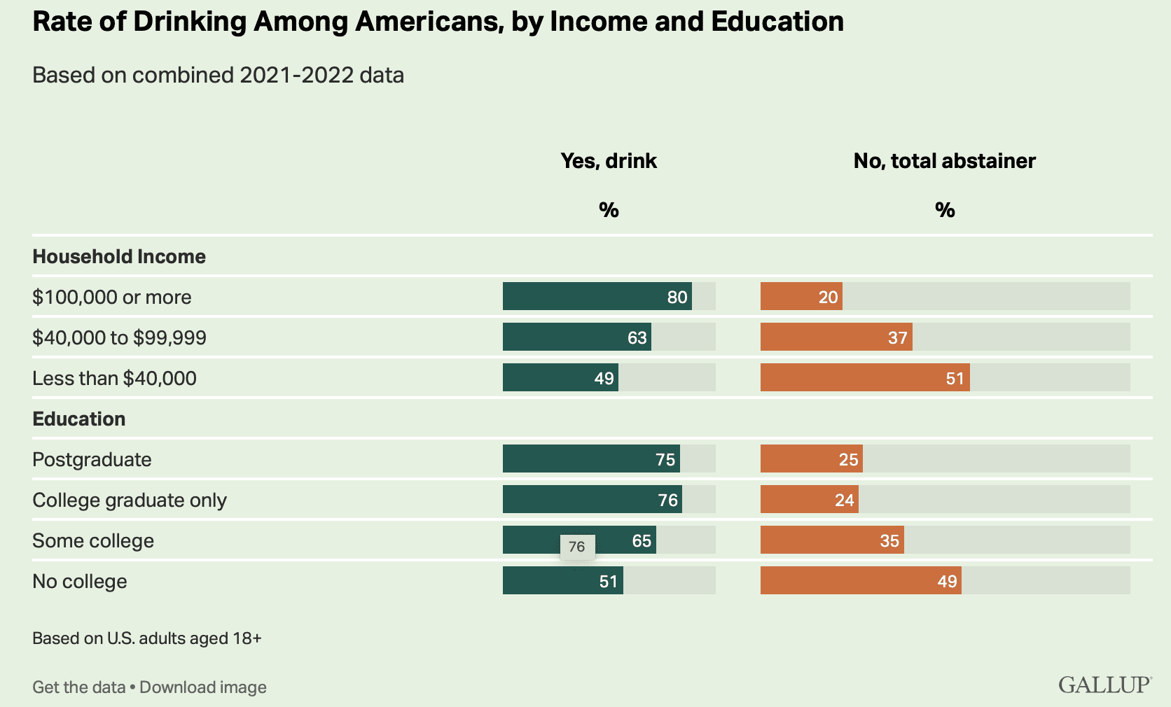
1. Speaking of stunning, check out these Gallup poll results on rates of drinking alcohol:

At least in the U.S., rich people are much more likely than poor people to drink. That’s the opposite of the pattern with smoking.

2. Speaking of “at least in the U.S.”, it’s my impression that smoking rates have rapidly declined in many other countries too, so in that sense it’s more of a global public health success.

3. Back to the point that we should recognize how stunning this all is: 20 years ago, they banned smoking in bars and restaurants in New York. All at once, everything changed, and you could go to a club and not come home with your clothes smelling like smoke, pregnant women could go places without worrying about breathing it all in, etc. When this policy was proposed and then when it was clear it was really gonna happen, lots of lobbyists and professional contrarians and Debby Downers and free-market fanatics popped up and shouted that the smoking ban would never work, it would be an economic disaster, the worst of the nanny state, bla bla bla. Actually it worked just fine.

4. It’s said that quitting smoking is really hard. Smoking-cessation programs have notoriously low success rates. But some of that is selection bias, no? Some people can quit smoking without much problem, and those people don’t need to try smoking-cessation programs. So the people who do try those programs are a subset that overrepresents people who can’t so easily break the habit.

5. We’re used to hearing the argument that, yeah, everybody knows cigarette smoking causes cancer, but people might want to do it anyway. There’s gotta be some truth to that: smoking relaxes people, or something like that. But also recall what the cigarette executives said, as recounted by historian Robert Proctor:

Philip Morris Vice President George Weissman in March 1954 announced that his company would “stop business tomorrow” if “we had any thought or knowledge that in any way we were selling a product harmful to consumers.” James C. Bowling . . . . Philip Morris VP, in a 1972 interview asserted, “If our product is harmful . . . we’ll stop making it.” Then again in 1997 the same company’s CEO and chairman, Geoffrey Bible, was asked (under oath) what he would do with his company if cigarettes were ever established as a cause of cancer. Bible gave this answer: “I’d probably . . . shut it down instantly to get a better hold on things.” . . . Lorillard’s president, Curtis Judge, is quoted in company documents: “if it were proven that cigarette smoking caused cancer, cigarettes shoudl not be marketed” . . . R. J. Reynolds president, Gerald H. Long, in a 1986 interview asserted that if he ever “saw or thought there were any evidence whatsoever that conclusively proved that, in some way, tobacco was harmful to people, and I believed it in my heart and my soul, then I would get out of the business.”

6. A few years ago we discussed a study of the effects of smoking bans. My thought at the time was: Yes, at the individual level it’s hard to quit smoking, which might give skepticism about the effects of measures designed to reduce smoking—but, at the same time, smoking rates vary a lot by country and by state, This was similar to our argument about the hot hand: given that basketball shooting success rates vary a lot over time and across game conditions, it should not be surprising that previous shots might have an effect. As I wrote awhile ago, “if ‘p’ varies among players, and ‘p’ varies over the time scale of years or months for individual players, why shouldn’t ‘p’ vary over shorter time scales too? In what sense is “constant probability” a sensible null model at all?” Similarly, given how much smoking rates vary, maybe we shouldn’t be surprised that something could be done about it.

7. To me, though, the most interesting thing about the stylized facts on smoking is how there is this behavior that is so hard to change at the individual level but can be changed so much at the national level. This runs counter to currently-standard individualistic theories in social science in which everything is about isolated decisions. It’s more of a synthesis: change came from policy and from culture (whatever that means), but this still had to work its way though individual decisions. This idea of behavior being changed by policy almost sounds like “embodied cognition” or “nudge,” but it feels different to me in being more brute force. Embodied cognition is things like giving people subliminal signals; nudge is things like subtly changing the framing of a message. Here we’re talking about direct education, taxes, bans, big fat warning labels: nothing subtle or clever that the nudgelords would refer to as a “masterpiece.”

Anyway, this idea of changes that can happen more easily at the group or population level than at the individual level, that’s interesting to me. I guess things like this happen all over—“social trends”—and I don’t feel our usual social-science models handle them well. I don’t mean that no models work here, and I’m sure that lots of social scientists done serious work in this area; it just doesn’t seem to quite line up with the usual way we talk about decision making.

P.S. Separate from all the above, I just wanted to remind you that there’s lots of really bad work on smoking and its effects; see here, for example. I’m not saying that all the work is bad, just that I’ve seen some really bad stuff, maybe no surprise what with all the shills on one side and all the activists on the other.

Using forecasts to estimate individual variances

Someone who would like to remain anonymous writes:

I’m a student during the school year, but am working in industry this summer. I am currently attempting to overhaul my company’s model of retail demand. We advise suppliers to national retailers, our customers are suppliers. Right now, for each of our customers, our demand model outputs a point estimate of how much of their product will be consumed at one of roughly a hundred locations. This allows our customers to decide how much to send to each location.

However, because we are issuing point estimates of mean demand, we are *not* modeling risk directly, and I want to change that, as understanding risk is critical to making good decisions about inventory management – the entire point of excess inventory is to provide a buffer against surprises.

Additionally, the model currently operates on a per-day basis, so that predictions for a month from now are obtained by chaining together thirty predictions about what day N+1 will look like. I want to change that too, because it seems to be causing a lot of problems with errors in the model propagating across time, to the point that predictions over even moderate time intervals are not reliable.

I already know how to do both of these in an abstract way.

I’m willing to bite the bullet of assuming that the underlying distribution of the PDF should be multivariate Gaussian. From there, arriving at the parameters of that PDF just requires max likelihood estimation. For the other change, without going into a lot of tedious detail, Neural ODE models are flexible with respect to time such that you can use the same model to predict the net demand accumulated over t=10 days as you would to predict the net demand accumulated over t=90 days, just by changing the time parameter that you query the model with.

The problem is, although I know how to build a model that will do this, I want the estimated variance for each customer’s product to be individualized. Yet frustratingly, in a one-shot scenario, the maximum likelihood estimator of variance is zero. The only datapoint I’ll have to use to train the model to estimate the mean aggregate demand for, say, cowboy hats in Seattle at time t=T (hereafter (c,S,T)) is the actual demand for that instance, so the difference between the mean outcome and the actual outcome will be zero.

It’s clear to me that if I want to arrive at a good target for variance or covariance in order to conduct risk assessment, I need to do some kind of aggregation over the outcomes, but most of the obvious options don’t seem appealing.

– If I obtain an estimate of variance by thinking about the difference between (c,S,T) and (c,Country,T), aggregating over space, I’m assuming that each location shares the same mean demand, which I know is false.

– If I obtain one by thinking about the difference between (c,S,T) and (c,S,tbar), aggregating over time, I am assuming there’s a stationary covariance matrix for how demand accumulates at that location over time, which I know is false. This will fail especially badly if issuing predictions across major seasonal events, such as holidays or large temperature changes.

– If I aggregate across customers by thinking about the difference between (c,S,T) and (cbar,S,T), I’ll be assuming that the demand for cowboy hats at S,T should obey similar patterns as the demand for other products, such as ice cream or underwear sales, which seems obviously false.

I have thought of an alternative to these, but I don’t know if it’s even remotely sensible, because I’ve never seen anything like it done before. I would love your thoughts and criticisms on the possible approach. Alternatively, if I need to bite the bullet and go with one of the above aggregation strategies instead, it would benefit me a lot to have someone authoritative tell me so, so that I stop messing around with bad ideas.

My thought was that instead of asking the model to use the single input vector associated with t=0 to predict a single output vector at t=T, I could instead ask the model to make one prediction per input vector for many different input vectors from the neighborhood of time around t=0 in order to predict outcomes at a neighborhood of time around t=T. For example, I’d want one prediction for t=-5 to t=T, another prediction for t=-3 to t=T+4, and so on.

I would then judge the “true” target variance for the model relative to the difference between (c,S,T)’s predicted demand and the average of the model’s predicted demands for those nearby time slices. The hope is that this would reasonably correspond to the risks that customers should consider when optimizing their inventory management, by describing the sensitivity of the model to small changes in the input features and target dates it’s queried on. The model’s estimate of its own uncertainty wouldn’t do a good job of representing out-of-model error, of course, but the hope is that it’d at least give customers *something*.

Does this make any sense at all as a possible approach, or am I fooling myself?

My reply: I haven’t followed all the details, but my guess is that your general approach is sound. It should be possible to just fit a big Bayesian model in Stan, but maybe that would be too slow, I don’t really know how big the problem is. The sort of approach described above, where different models are fit and compared, can be thought of as a kind of computational approximation to a more structured hierarchical model, in the same way that cross-validation can be thought of as an approximation to an error model, or smoothing can be thought of as an approximation to a time-series model.

The authors of research papers have no obligation to share their data and code, and I have no obligation to believe anything they write.

Michael Stutzer writes:

This study documents substantial variability in different researchers’ results when they use the same financial data set and are supposed to test the same hypotheses. More generally, I think the prospect for reproducibility in finance is worse than in some areas, because there is a publication bias in favor of a paper that uses a unique dataset provided by a firm. Because this is proprietary data, the firm often makes the researcher promise not to share the data with anybody, including the paper’s referees.

Read the leading journals’ statements carefully and you find that they don’t strictly require sharing.

Here is the statement for authors made by the Journal of Financial Econometrics: “Where ethically and legally feasible, JFEC strongly encourages authors to make all data and software code on which the conclusions of the paper rely available to readers. We suggest that data be presented in the main manuscript or additional supporting files, or deposited in a public repository whenever possible.”

In other words, an author wouldn’t have to share a so-called proprietary data set as defined above, even with the papers’ referees. What is worse, the leading journals not only accept these restrictions, but seem to favor such work over what is viewed as more garden-variety work that employs universally available datasets.

Intersting. I think it’s just as bad in medical or public health research, but there the concern is sharing confidential information. Even in settings where it’s hard to imagine that the confidentiality would matter.

As I’ve said in other such settings, the authors of research papers have no obligation to share their data and code, and I have no obligation to believe anything they write.

That is, my preferred solution is not to nag people for their data, it’s just to move on. That said, this strategy works fine for silly examples such as fat arms and voting, or the effects of unionization on stock prices, but you can’t really follow it for research that is directly relevant to policy.

Forking paths in medical research! A study with 9 research teams:

Anna Ostropolets et al. write:

Observational studies can impact patient care but must be robust and reproducible. Nonreproducibility is primarily caused by unclear reporting of design choices and analytic procedures. . . .

Nine teams of highly qualified researchers reproduced a cohort from a study by Albogami et al. The teams were provided the clinical codes and access to the tools to create cohort definitions such that the only variable part was their logic choices.

What happened?

On average, the teams’ interpretations fully aligned with the master implementation in 4 out of 10 inclusion criteria with at least 4 deviations per team. Cohorts’ size varied from one-third of the master cohort size to 10 times the cohort size (2159–63 619 subjects compared to 6196 subjects). Median agreement was 9.4% (interquartile range 15.3–16.2%). The teams’ cohorts significantly differed from the master implementation by at least 2 baseline characteristics, and most of the teams differed by at least 5.

Forking paths!

I’ll just add that you’ll often see forking paths in different analyses of the same sorts of data within a subfield, or even different analyses by the same researcher on the same topic. We’ve discussed many such examples over the years.

A rational agent framework for improving visualization experiments

This is Jessica. In The Rational Agent Benchmark for Data Visualization, Yifan Wu, Ziyang Guo, Michalis Mamakos, Jason Hartline and I write: 

Understanding how helpful a visualization is from experimental results is difficult because the observed performance is confounded with aspects of the study design, such as how useful the information that is visualized is for the task. We develop a rational agent framework for designing and interpreting visualization experiments. Our framework conceives two experiments with the same setup: one with behavioral agents (human subjects), and the other one with a hypothetical rational agent. A visualization is evaluated by comparing the expected performance of behavioral agents to that of a rational agent under different assumptions. Using recent visualization decision studies from the literature, we demonstrate how the framework can be used to pre-experimentally evaluate the experiment design by bounding the expected improvement in performance from having access to visualizations, and post-experimentally to deconfound errors of information extraction from errors of optimization, among other analyses.

I like this paper. Part of the motivation behind it was my feeling that even when we do our best to rigorously define a decision or judgment task for studying visualizations,  there’s an inevitable dependence of the results on how we set up the experiment. In my lab we often put a lot of effort into making the results of experiments we run easier to interpret, like plotting model predictions back to data space to reason about magnitudes of effects, or comparing people’s performance on a task to simple baselines. But these steps don’t really resolve this dependence. And if we can’t even understand how surprising our results are in light of our own experiment design, then it seems even more futile to jump to speculating what our results imply for real world situations where people use visualizations. 

We could summarize the problem in terms of various sources of unresolved ambiguity when experiment results are presented. Experimenters make many decisions in design–some of which they themselves may not even be aware they are making–which influence the range of possible effects we might see in the results. When studying information displays in particular, we might wonder about things like:

  • The extent to which performance differences are likely to be driven by differences in the amount of relevant information displays convey for that task. For example, often different visualization strategies for showing distribution vary in how they summarize the data (e.g., means versus intervals vs density plots).
  • How instrumental the information display is to doing well on the task – if one understood the problem but answered without looking at the visualization, how well would we expect them to do? 
  • To what extent participants in the study could be expected to be incentivized to use the display. 
  • What part of the process of responding to the task – extracting the information from the display, or figuring out what to do with it once it was extracted – led to observed losses in performance among study participants. 
  • And so on.

The status quo approach to writing results sections seems to be to let the reader form their own opinions on these questions. But as readers we’re often not in a good position to understand what we are learning unless we take the time to analyze the decision problem of the experiment carefully ourselves, assuming the authors have even presented it in enough detail to make that possible. Few readers are going to be willing and/or able to do this. So what we take away from the results of empirical studies on visualizations is noisy to say the least.

An alternative which we explore in this paper is to construct benchmarks using the experiment design to make the results more interpretable. First, we take the decision problem used in a visualization study and formulate it in decision theoretic terms of a data-generating model over an uncertain state drawn from some state space, an action chosen from some action space, a visualization strategy, and a scoring rule. (At least in theory, we shouldn’t have trouble picking up a paper describing an evaluative experiment and identifying these components, though in practice in fields where many experimenters aren’t thinking very explicitly about things like scoring rules at all, it might not be so easy). We then conceive a rational agent who knows the data-generating model and understands how the visualizations (signals) are generated, and compare this agent’s performance under different assumptions in pre-experimental and post-experimental analyses. 

Pre-experimental analysis: One reason for analyzing the decision task pre-experimentally is to identify cases where we have designed an experiment to evaluate visualizations but we haven’t left a lot of room to observe differences between them, or we didn’t actually give participants an incentive to look at them. Oops! To define the value of information to the decision problem we look at the difference between the rational agent’s expected performance when they only have access to the prior versus when they know the prior and also see the signal (updating their beliefs and choosing the optimal action based on what they saw). 

The value of information captures how much having access to the visualization is expected to improve performance on the task in payoff space. When there are multiple visualization strategies being compared, we calculate it using the maximally informative strategy. Pre-experimentally, we can look at the size of the value of information unit relative to the range of possible scores given by the scoring rule. If the expected difference in score from making the decision after looking at the visualization versus from the prior only is a small fraction of the range of possible scores on a trial, then we don’t have a lot of “room” to observe gains in performance (in the case of studying a single visualization strategy) or (more commonly) in comparing several visualization strategies. 

We can also pre-experimentally compare the value of information to the baseline reward one expects to get for doing the experiment regardless of performance. Assuming we think people are motivated by payoffs (which is implied whenever we pay people for their participation), a value of information that is a small fraction of the expected baseline reward should make us question how likely participants are to put effort into the task.   

Post-experimental analysis: The value of information also comes in handy post-experimentally, when we are trying to make sense of why our human participants didn’t do as well as the rational agent benchmark. We can look at what fraction of the value of information unit human participants achieve with different visualizations. We can also differentiate sources of error by calibrating the human responses. The calibrated behavioral score is the expected score of a rational agent who knows the prior but instead of updating from the joint distribution over the signal and the state, they update from the joint distribution over the behavioral responses and the state. This distribution may contain information that the agents were unable to act on. Calibrating (at least in the case of non-binary decision tasks) helps us see how much. 

Specifically, calculating the difference between the calibrated score and the rational agent benchmark as a fraction of the value of information measures the extent to which participants couldn’t extract the task relevant information from the stimuli. Calculating the difference between the calibrated score and the expected score of human participants (e.g., as predicted by a model fit to the observed results) as a fraction of the value of information, measures the extent to which participants couldn’t choose the optimal action given the information they gained from the visualization.

There is an interesting complication to all of this: many behavioral experiments don’t endow participants with a prior for the decision problem, but the rational agent needs to know the prior. Technically the definitions of the losses above should allow for loss caused by not having the right prior. So I am simplifying slightly here.  

To demonstrate how all this formalization can be useful in practice, we chose a couple prior award-winning visualization research papers and applied the framework. Both are papers I’m an author on – why create new methods if you can’t learn things about your own work? In both cases, we discovered things that the original papers did not account for, such as weak incentives to consult the visualization assuming you understood the task, and a better explanation for a disparity in visualization strategy rankings by performance for a belief versus a decision task. These were the first two papers we tried to apply the framework to, not cherry-picked to be easy targets.  We’ve also already applied it in other experiments we’ve done, such as for benchmarking privacy budget allocation in visual analysis.

I continue to consider myself a very skeptical experimenter, since at the end of the day, decisions about whether to deploy some intervention in the world will always hinge on the (unknown) mapping between the world of your experiment and the real world context you’re trying to approximate. But I like the idea of making greater use of rational agent frameworks in visualization in that we can at least gain a better understanding of what our results mean in the context of the decision problem we are studying.

A client tried to stiff me for $5000. I got my money, but should I do something?

This post is by Phil Price, not Andrew.

A few months ago I finished a small consulting contract — it would have been less than three weeks, if I worked on it full time — and I find it has given me some things to think about, concerning statistical modeling (no surprise there) but also ethics. There’s no particular reason anyone would be interested in hearing me ramble on about what was involved in the job itself, but I’m going to do that anyway for a few paragraphs. Maybe it will be of interest to others who are considering going into consulting. If you are here for the ethical question then you can skip the next several paragraphs; pick up the story at the line of XXXX, far below.

Continue reading

“Latest observational study shows moderate drinking associated with a very slightly lower mortality rate”

Daniel Lakeland writes:

This one deserves some visibility, because of just how awful it is. It goes along with the adage about incompetence indistinguishable from malice. It’s got everything..

1) Non-statistical significance taken as evidence of zero effect

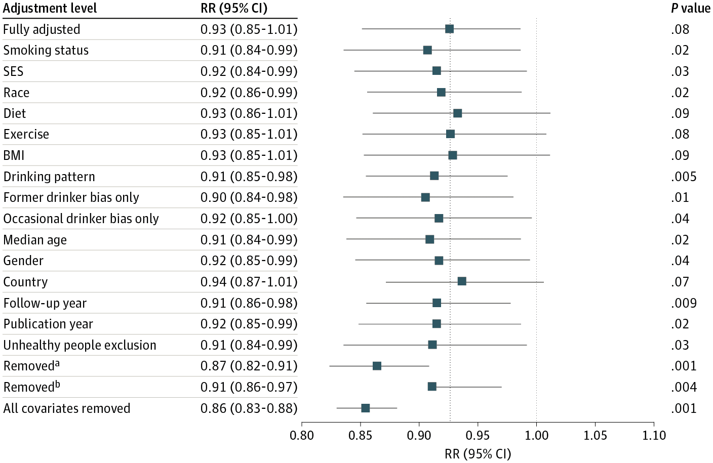
2) A claim of non-significance where their own graph clearly shows statistical significance

3) The labels in the graph don’t even begin to agree with the graph itself

4) Their “multiverse” of different specifications ALL show a best estimate of about 92-93% relative risk for moderate drinkers compared to non-drinkers, with various confidence intervals most of which are “significant”

5) If you take their confidence intervals as approximating Bayesian intervals it’d be a correct statement that “there’s a ~98% chance that moderate drinking reduces all cause mortality risk”

and YET, their headline quote is: ” the meta-analysis of all 107 included studies found no significantly reduced risk of all-cause mortality among occasional (>0 to <1.3 g of ethanol per day; relative risk [RR], 0.96; 95% CI, 0.86-1.06; /P/ = .41) or low-volume drinkers (1.3-24.0 g per day; RR, 0.93; /P/ = .07) compared with lifetime nondrinkers." Above the take-home graph, figure 1. Take a look at the "Fully Adjusted" confidence interval in text... (0.85-1.01) now take a look at the graph... clearly doesn't cross 1.0 at the upper end. But that's not the only fishy thing, removed_b is just weird, and the vast majority of their different specifications show both a statistical significant risk reduction, and approximately the same magnitude point estimate ... 91-93% of the nondrinker risk. Who knows how to interpret this graph / chart. It wouldn't surprise me to find out that some of these numbers are just made up, but most likely they're some kind of cut-and-paste errors involved, and/or other forms of incompetence. But if you assume that the graph is made by computer software and therefore represents accurate output of their analysis (except for a missing left-bar on removed_b perhaps caused by accidentally hitting delete in a figure editing software?), then the correct statement would be something like "There is good evidence that low volume alcohol use is associated with lower all cause mortality after accounting for our various confounding factors." The news media reports this as approximately "Moderate drinking is bad for you after all."

I guess the big problem is not ignorance or malice but rather the expectation that they come up with a definitive conclusion.

Also, I think Lakeland is a bit unfair to the news media. There’s Yet Another Study Suggests Drinking Isn’t Good for Your Health from Time Magazine . . . ummm, I guess Time Magazine isn’t really a magazine or news organization anymore, maybe it’s more of a brand name? The New York Times has Moderate Drinking Has No Health Benefits, Analysis of Decades of Research Finds. I can’t find anything saying that moderate drinking is bad for you. (“No health benefits” != “bad.”) OK, there’s this from Fortune, Is moderate drinking good for your health? Science says no, which isn’t quite as extreme as Lakeland’s summary but is getting closer. But none of them led with, “Latest observational study shows moderate drinking associated with a very slightly lower mortality rate,” which would be a more accurate summary of the study.

In any case, it’s hard to learn much from this sort of small difference in an observational study. There are just too many other potential biases floating around.

I think the background here is that alcohol addiction causes all sorts of problems, and so public health authorities would like to discourage people from drinking. Even if moderate drinking is associated with a 7% lower mortality rate, there’s a concern that a public message that drinking is helpful will lead to more alcoholism and ruined lives. With the news media the issue is more complicated, because they’re torn between deference to the science establishment on one side, and the desire for splashy headlines on the other. “Big study finds that moderate drinking saves lives” is a better headline than “Big study finds that moderate drinking does not save lives.” The message that alcohol is good for you is counterintuitive and also crowd-pleasing, at least to the drinkers in the audience. So I’m kinda surprised that no journalistic outlets took this tack. I’m guessing that not too many journalists read past the abstract.

There are no underpowered datasets; there are only underpowered analyses.

Is it ok to pursue underpowered studies?

This question comes from Harlan Campbell, who writes:

Recently we saw two different about commentaries on the importance of pursuing underpowered studies, both with arguments motivated by thoughts on COVID-19 research:

COVID-19: underpowered randomised trials, or no randomised trials? by Atle Fretheim

and
Causal analyses of existing databases: no power calculations required by Miguel Hernán

Both explain the important idea that underpowered/imprecise studies “should be viewed as contributions to the larger body of evidence” and emphasize that several of these studies can, when combined together in a meta-analysis, “provide a more precise pooled effect estimate”.

Both sparked quick replies:
https://doi.org/10.1186/s13063-021-05755-y
https://doi.org/10.1016/j.jclinepi.2021.09.026
https://doi.org/10.1016/j.jclinepi.2021.09.024
and lastly from myself and others:
https://doi.org/10.1016/j.jclinepi.2021.11.038

and even got some press.

My personal opinion is that there are both costs (e.g., wasting valuable resources, furthering distrust in science) and benefits (e.g., learning about an important causal question) to pursuing underpowered studies. The trade-off may indeed tilt towards the benefits if the analysis question is sufficiently important; much like driving through a red light on-route to the hospital might be advisable in a medical emergency, but should otherwise be avoided. In the latter situation, risks can be mitigated with a trained ambulance driver at the wheel and a wailing siren. When it comes to pursuing underpowered studies, there are also ways to minimize risks. For example, by committing to publish one’s results regardless of the outcome, by pre-specifying all of one’s analyses, and by making the data publicly available, one can minimize the study’s potential contribution to furthering distrust in science. That’s my two cents. In any case, it certainly is an interesting question.

I agree with the general principle that data are data, and there’s nothing wrong with gathering a little bit of data and publishing what you have, in the hope that it can be combined now or later with other data and used to influence policy in an evidence-based way.

To put it another way, the problem is not “underpowered studies”; it’s “underpowered analyses.”

In particular, if your data are noisy relative to the size of the effects you can reasonably expect to find, then it’s a big mistake to use any sort of certainty thresholding (whether that be p-values, confidence intervals, posterior intervals, Bayes factors, or whatever) in your summary and reporting. That would be a disaster—type M and S errors will kill you.

So, if you expect ahead of time that the study will be summarized by statistical significance or some similar thresholding, then I think it’s a bad idea to do the underpowered study. But if you expect ahead of time that the raw data will be reported and that any summaries will be presented without selection, then the underpowered study is fine. That’s my take on the situation.