Progress in 2023

Published:

Unpublished:

Enjoy.

“It’s About Time” (my talk for the upcoming NY R conference)

I speak at Jared’s NYR conference every year (see here for some past talks). It’s always fun. Here’s the title/abstract for the talk I’ll be giving this year.

It’s About Time

Statistical processes occur in time, but this is often not accounted for in the methods we use and the models we fit. Examples include imbalance in causal inference, generalization from A/B tests even when there is balance, sequential analysis, adjustment for pre-treatment measurements, poll aggregation, spatial and network models, chess ratings, sports analytics, and the replication crisis in science. The point of this talk is to motivate you to include time as a factor in your statistical analyses. This may change how you think about many applied problems!

The continuing challenge of poststratification when we don’t have full joint data on the population.

Torleif Halkjelsvik at the Norwegian Institute of Public Health writes:

Norway has very good register data (education/income/health/drugs/welfare/etc.) but it is difficult to obtain complete tables at the population level. It is however easy to get independent tables from different registries (e.g., age by gender by education as one data source and gender by age by welfare benefits as another). What if I first run a multilevel model to regularize predictions for a vast set of variables, but in the second step, instead of a full table, use a raking approach based on several independent post-stratification tables? Would that be a valid approach? And have you seen examples of this?

My reply: I think the right way to frame this is as a poststratification problem where you don’t have the full poststratification table, you only have some margins. The raking idea you propose could work, but to me it seems awkward in that it’s mixing different parts of the problem together. Instead I’d recommend first imputing a full poststrat table and then using this to do your poststratification. But then the question is how to do this. One approach is iterative proportional fitting (Deming and Stephan, 1940). I don’t know any clean examples of this sort of thing in the recent literature, but there might be something out there.

Halkjelsvik responded:

It is an interesting idea to impute a full poststrat table, but I wonder whether it is actually better than directly calculating weights using the proportions in the data itself. Cells that should be empty in the population (e.g., women, 80-90 years old, high education, sativa spray prescription) may not be empty in the imputed table when using iterative proportional fitting (IPF), and these “extreme” cells may have quite high or low predicted values. By using the data itself, such cells will be empty, and they will not “steal” any of the marginal proportions when using IPF. This is of course a problem in itself if the data is limited (if there are empty cells in the data that are not empty in the population).

Me: If you have information that certain cells are empty or nearly so, that’s information that you should include in the poststrat table. I think the IPF approach will be similar to the weighting; it is just more model-based. So if you think the IPF will give some wrong answers, that suggests you have additional information. I recommend you try to write down all the additional information you have and use all of it in constructing the poststratification table. This should allow you to do better than with any procedure that does not use this info.

Halkjelsvik:

After playing with a few scenarios (on a piece of paper, no simulation) I see that my suggested raking/weighting approach (which also would involve iterative proportional fitting) directly on the sample data is not a good idea in contexts where MRP is most relevant. That is, if the sample cell sizes are small and regularization matters, then the subgroups of interest (e.g. geographical regions) will likely have too little data on rare demographic combinations. The approach you suggested (full population table imputation based on margins) appears more reasonable, and the addition of “extra information” is obviously a good idea. But how about a hybrid: Instead of manually accounting for “extra information” (e.g., non-existing demographic combinations) this extra information can be derived directly from the proportions of the sample itself (across subgroups of interest) and can be used as “seed” values (i.e., before accounting for margins at the local level). Using information from the sample to create the initial (seed) values for the IPF may be a good way to avoid imputing positive values in cells that are structural zeros, given that the sample is sufficiently large to avoid too many “sample zeros” that are not true “structural zeros”.

So the following could be an approach for my problem?

1. Obtain regularized predictions from sample.

2. Produce full postrat seed table directly from “global” cell values in the sample (or from other available “global” data, e.g. if available only at national level). That is, regions start with identical seed structures.

3. Adjust the poststrat table by iterative proportional fitting based on local margins (but I have read that there may be convergence problems when there are many zeros in seed cells).

Me: I’m not sure! I really want to have a fully worked-out example, a case study of MRP where the population joint distribution (the poststratification table) is not known and it needs to be estimated from data. We’re always so sloppy in those settings. I’d like to do it with a full Bayesian model in Stan and then compare various approximations.

Statistical Practice as Scientific Exploration (my talk on 4 Mar 2024 at the Royal Society conference on the promises and pitfalls of preregistration)

Here’s the conference announcement:

Discussion meeting organised by Dr Tom Hardwicke, Professor Marcus Munafò, Dr Sophia Crüwell, Professor Dorothy Bishop FRS FMedSci, Professor Eric-Jan Wagenmakers.

Serious concerns about research quality have provoked debate across scientific disciplines about the merits of preregistration — publicly declaring study plans before collecting or analysing data. This meeting will initiate an interdisciplinary dialogue exploring the epistemological and pragmatic dimensions of preregistration, identifying potential limits of application, and developing a practical agenda to guide future research and optimise implementation.

And here’s the title and abstract of my talk, which is scheduled for 14h10 on Mon 4 Mar 2024:

Statistical Practice as Scientific Exploration

Much has been written on the philosophy of statistics: How can noisy data, mediated by probabilistic models, inform our understanding of the world? Researchers when using and developing statistical methods can be seen to be acting as scientists, forming, evaluating, and elaborating provisional theories about the data and processes they are modelling. This perspective has the conceptual value of pointing toward ways that statistical theory can be expanded to incorporate aspects of workflow that were formerly tacit or informal aspects of good practice, and the practical value of motivating tools for improved statistical workflow.

I won’t really be talking about preregistration, in part because I’ve already said so much on that topic here on this blog; see for example here and various links at that post. Instead I’ll be talking about the statistical workflow, which is typically presented as a set of procedures applied to data but which I think is more like a process of scientific exploration and discovery. I addressed some of these ideas in this talk from a couple years ago. But, don’t worry, I’m sure I’ll have lots of new material. Not to mention all the other speakers at the conference.

Explainable AI works, but only when we don’t need it

This is Jessica. I went to NeurIPS last week, mostly to see what it was like. While waiting for my flight home at the airport I caught a talk that did a nice job of articulating some fundamental limitations with attempts to make deep machine learning models “interpretable” or “explainable.”

It was part of an XAI workshop. My intentions in checking out the XAI workshop were not entirely pure, as its an area I’ve been skeptical of for a while. Formalizing aspects of statistical communication is very much in line with my interests, but I tried and failed to get into XAI and related work on interpretability a few years ago when it was getting popular. The ML contributions have always struck me as more of an academic exercise than a real attempt at aligning human expectations with model capabilities. When human-computer interaction people started looking into it, there started to be a little more attention to how people actually use explanations, but the methods used to study human reliance on explanations there have not been well grounded (e.g., ‘appropriate reliance’ is often defined as agreeing with the AI when it’s right and not agreeing when it’s wrong, which can be shown to be incoherent in various ways). 

The talk, by Ulrike Luxburg, which gave a sort of impossibility result for explainable AI, was refreshing. First, she distinguished two very different scenarios for explanation: the cooperative ones where you have a principal with a model furnishing the explanations and a user using them who both want the best quality/most accurate explanations, versus adversarial scenarios where you have a principal whose best interests are not aligned with the goal of accurate explanation. For example, some company who needs to explain why it denied someone a loan has little motivation to explain the actual reason behind that prediction, because it’s not in their best interest to give people fodder to then try to minimally change their features to push the prediction to a different label. Her first point was that there is little value in trying to guarantee good explanations in the adversarial case, because existing explanation techniques (e.g.,for feature attribution like SHAP or LIME) give very different explanations for the same prediction, and the same explanation technique is often highly sensitive to small differences in the function to be explained (e.g., slight changes to parameters in training). There are too many degrees of freedom in terms of selecting among inductive biases so the principal easily produce something faithful by some definition while hiding important information. Hence laws guaranteeing a right to explanation miss this point.

In the cooperative setting, maybe there is hope. But, turns out something like the anthropic principle of statistics operates here: we have techniques that we can show work well in the simple scenarios where we don’t really need explanations, but when we do really need them (e.g., deep neural nets over high dimensional feature spaces) anything we can guarantee is not going to be of much use.

There’s an analogy to clustering: back when unsupervised learning was very hot, everyone wanted guarantees for clustering algorithms but to make them required working in settings where the assumptions were very strong, such that the clusters would be obvious upon inspecting the data. In explainable AI, we have various feature attribution methods that describe which features led to the prediction on a particular instance. SHAP, which borrows Shapley values from game theory to allocate credit among features, is very popular. Typically SHAP provides the marginal contribution of each feature, but Shapley Interaction Values have been proposed to allow for local interaction effects between pairs of features. Luxburg presented a theoretical result from this paper which extends Shapley Interaction Values to n-Shapley Values, which explain individual predictions with interaction terms up to order n given some number of total features d. They are additive in that they always sum to the output of the function we’re trying to explain over all subsets of combinations of variables less than or equal to n. Starting from the original Shapley values (where n=1), n-Shapley Values successively add higher-order variable interactions to the explanations.

The theoretical result shows that n-Shapley Values recover generalized additive models (GAMs), which are GLMs where the outcome depends linearly on smoothed functions of the inputs: g(E[Y] = B_0 = f_1(x_1) + f_2(x_2) + … f_m(x_m). GAMs are considered inherently interpretable, but are also undetermined. For n-Shapley to recover a faithful representation of the function as a GAM, the order of the explanation just needs to be as large or larger than the maximum variable interaction in the model. 

However, GAMs lose their interpretability as we add interactions. When we have large numbers of features, as is typically the case in deep learning, what is the value of the explanation?  We need to look at interactions between all combinatorial subsets of the features. So when simple explanations like standard SHAP are applied to complex functions, you’re getting an average over billions of features, and there’s no reduction to be made that would give you something meaningful. The fact that in the simple setting of a GAM of order 1 we can prove SHAP does the right thing does not mean we’re anywhere close to having “solved” explainability. 

The organizers of the workshop obviously invited this rather negative talk on XAI, so perhaps the community is undergoing self-reflection that will temper the overconfidence I associate with it. Although, the day before the workshop I also heard someone complaining that his paper on calibration got rejected from the same workshop, with an accompanying explanation that it wasn’t about LIME or SHAP. Something tells me XAI will live on.

I guess one could argue there’s still value in taking a pragmatic view, where if we find that explanations of model predictions, regardless of how meaningless, lead to better human decisions in scenarios where humans must make the final decision regardless of the model accuracy (e.g., medical diagnoses, loan decisions, child welfare cases), then there’s still some value in XAI. But who would want to dock their research program on such shaky footing? And of course we still need an adequate way of measuring reliance, but I will save my thoughts on that for another post.

 Another thing that struck me about the talk was a kind of tension around just trusting one’s instincts that something is half-baked versus taking the time to get to the bottom of it. Luxburg started by talking about how her strong gut feeling as a theorist was that trying to guarantee AI explainability was not going to be possible. I believed her before she ever got into the demonstration, because it matched my intuition. But then she spent the next 30 minutes discussing an XAI paper. There’s a decision to be made sometimes, about whether to just trust your intuition and move on to something that you might still believe in versus to stop and articulate the critique. Others might benefit from the latter, but then you realize you just spent another year trying to point out issues with a line of work you stopped believing in a long time ago. Anyway, I can relate to that. (Not that I’m complaining about the paper she presented – I’m glad she took the time to figure it out as it provides a nice example). 

I was also reminded of the kind of awkward moment that happens sometimes where someone says something rather final and damning, and everyone pauses for a moment to listen to it. Then the chatter starts right back up again like it was never said. Gotta love academics!

AI bus route fail: Typically the most important thing is not how you do the optimization but rather what you decide to optimize.

Robert Farley shares this amusing story of a city that contracted out the routing of its school buses to a company that “uses artificial intelligence to generate the routes with the intent of reducing the number of routes. Last year, JCPS had 730 routes last year, and that was cut to 600 beginning this year . . .” The result was reported to be a “transportation disaster.”

I don’t know if you can blame AI here . . . Reducing the number of routes by over 15%, that’s gonna be a major problem! To first approximation we might expect routes to be over 15% longer, but that’s just an average: you can bet it will be much worse for some routes. No surprise that the bus drivers hate it.

As Farley says, “In theory, developing a bus route algorithm is something that AI could do well . . . [to] optimize the incredibly difficult problem of getting thousands of kids to over 150 schools in tight time windows,” but:

1. Effective problem solving for the real world requires feedback, and it’s not clear that any feedback was involved in this system: the company might have just taken the contract, run their program, and sent the output to the school district without ever checking that the results made sense, not to mention getting feedback from bus drivers and school administrators. I wonder how many people at the company take the bus to work themselves every day!

2. It sounds like the goal was to reduce the number of routes, not to produce routes that worked. If you optimize on factor A, you can pay big on factor B. Again, this is a reason for getting feedback and solving the problem iteratively.

3. Farley describes the AI solution as “high modernist thinking.” That’s a funny and insightful way to put it! I have no idea what sort of “artificial intelligence” was used in this bus routing program. It’s an optimization problem, and typically the most important thing is not how you do the optimization but rather what you decide to optimize.

In that sense, the biggest problem with “AI” here is not that it led to a bad solution—if you try to optimize the wrong thing, I’d guess that any algorithm not backed up by feedback will fail—but rather that it had an air of magic which led people to accept its results unquestioningly. “AI,” like “Bayesian,” can serve as a slogan that leads people to turn off their skepticism. They might as well have said they used quantum computing or room-conductor superconductors or whatever.

I guess the connection to “high modernist thinking” is (a) the idea that we can and should replace the old with the new, clear the “slums” and build clean shiny new buildings, etc., and (b) the idea of looking only at surfaces, kinda like how Theranos conned lots of people by building fake machines that looked like clean Apple-brand devices. In this case, I have no reason to think the bus routing program is a con; it sounds more like an optimization program plus good marketing, and this was just one more poorly-planned corporate/government contract, with “AI” just providing a plausible cover story.

This empirical paper has been cited 1616 times but I don’t find it convincing. There’s no single fatal flaw, but the evidence does not seem so clear. How to think about this sort of thing? What to do? First, accept that evidence might not all go in one direction. Second, make lots of graphs. Also, an amusing story about how this paper is getting cited nowadays.

1. When can we trust? How can we navigate social science with skepticism?

2. Why I’m not convinced by that Quebec child-care study

3. 20 years on

1. When can we trust? How can we navigate social science with skepticism?

The other day I happened to run across a post from 2016 that I think is still worth sharing.

Here’s the background. Someone pointed me to a paper making the claim that “Canada’s universal childcare hurt children and families. . . . the evidence suggests that children are worse off by measures ranging from aggression to motor and social skills to illness. We also uncover evidence that the new child care program led to more hostile, less consistent parenting, worse parental health, and lower‐quality parental relationships.”

I looked at the paper carefully and wasn’t convinced. In short, the evidence went in all sorts of different directions, and I felt that the authors had been trying too hard to fit it all into a consistent story. It’s not that the paper had fatal flaws—it was not at all in the category of horror classics such as the beauty-and-sex-ratio paper, the ESP paper, the himmicanes paper, the air-rage paper, the pizzagate papers, the ovulation-and-voting paper, the air-pollution-in-China paper, etc etc etc.—it just didn’t really add up to me.

The question then is, if a paper can appear in a top journal, have no single killer flaw but still not be convincing, can we trust anything at all in the social sciences? At what point does skepticism become nihilism? Must I invoke the Chestertonian principle on myself?

I don’t know.

What I do think is that the first step is to carefully assess the connection between published claims, the analysis that led to these claims, and the data used in the analysis. The above-discussed paper has a problem that I’ve seen a lot, which is an implicit assumption that all the evidence should go in the same direction, a compression of complexity which I think is related to the cognitive illusion that Tversky and Kahneman called “the law of small numbers.” The first step in climbing out of this sort of hole is to look at lots of things at once, rather than treating empirical results as a sort of big bowl of fruit where the researcher can just pick out the the juiciest items and leave the rest behind.

2. Why I’m not convinced by that Quebec child-care study

Here’s what I wrote on that paper back in 2006:

Yesterday we discussed the difficulties of learning from a small, noisy experiment, in the context of a longitudinal study conducted in Jamaica where researchers reported that an early-childhood intervention program caused a 42%, or 25%, gain in later earnings. I expressed skepticism.

Today I want to talk about a paper making an opposite claim: “Canada’s universal childcare hurt children and families.”

I’m skeptical of this one too.

Here’s the background. I happened to mention the problems with the Jamaica study in a talk I gave recently at Google, and afterward Hal Varian pointed me to this summary by Les Picker of a recent research article:

In Universal Childcare, Maternal Labor Supply, and Family Well-Being (NBER Working Paper No. 11832), authors Michael Baker, Jonathan Gruber, and Kevin Milligan measure the implications of universal childcare by studying the effects of the Quebec Family Policy. Beginning in 1997, the Canadian province of Quebec extended full-time kindergarten to all 5-year olds and included the provision of childcare at an out-of-pocket price of $5 per day to all 4-year olds. This $5 per day policy was extended to all 3-year olds in 1998, all 2-year olds in 1999, and finally to all children younger than 2 years old in 2000.

(Nearly) free child care: that’s a big deal. And the gradual rollout gives researchers a chance to estimate the effects of the program by comparing children at each age, those who were and were not eligible for this program.

The summary continues:

The authors first find that there was an enormous rise in childcare use in response to these subsidies: childcare use rose by one-third over just a few years. About a third of this shift appears to arise from women who previously had informal arrangements moving into the formal (subsidized) sector, and there were also equally large shifts from family and friend-based child care to paid care. Correspondingly, there was a large rise in the labor supply of married women when this program was introduced.

That makes sense. As usual, we expect elasticities to be between 0 and 1.

But what about the kids?

Disturbingly, the authors report that children’s outcomes have worsened since the program was introduced along a variety of behavioral and health dimensions. The NLSCY contains a host of measures of child well being developed by social scientists, ranging from aggression and hyperactivity, to motor-social skills, to illness. Along virtually every one of these dimensions, children in Quebec see their outcomes deteriorate relative to children in the rest of the nation over this time period.

More specifically:

Their results imply that this policy resulted in a rise of anxiety of children exposed to this new program of between 60 percent and 150 percent, and a decline in motor/social skills of between 8 percent and 20 percent. These findings represent a sharp break from previous trends in Quebec and the rest of the nation, and there are no such effects found for older children who were not subject to this policy change.

Also:

The authors also find that families became more strained with the introduction of the program, as manifested in more hostile, less consistent parenting, worse adult mental health, and lower relationship satisfaction for mothers.

I just find all this hard to believe. A doubling of anxiety? A decline in motor/social skills? Are these day care centers really that horrible? I guess it’s possible that the kids are ruining their health by giving each other colds (“There is a significant negative effect on the odds of being in excellent health of 5.3 percentage points.”)—but of course I’ve also heard the opposite, that it’s better to give your immune system a workout than to be preserved in a bubble. They also report “a policy effect on the treated of 155.8% to 394.6%” in the rate of nose/throat infection.

OK, hre’s the research article.

The authors seem to be considering three situations: “childcare,” “informal childcare,” and “no childcare.” But I don’t understand how these are defined. Every child is cared for in some way, right? It’s not like the kid’s just sitting out on the street. So I’d assume that “no childcare” is actually informal childcare: mostly care by mom, dad, sibs, grandparents, etc. But then what do they mean by the category “informal childcare”? If parents are trading off taking care of the kid, does this count as informal childcare or no childcare? I find it hard to follow exactly what is going on in the paper, starting with the descriptive statistics, because I’m not quite sure what they’re talking about.

I think what’s needed here is some more comprehensive organization of the results. For example, consider this paragraph:

The results for 6-11 year olds, who were less affected by this policy change (but not unaffected due to the subsidization of after-school care) are in the third column of Table 4. They are largely consistent with a causal interpretation of the estimates. For three of the six measures for which data on 6-11 year olds is available (hyperactivity, aggressiveness and injury) the estimates are wrong-signed, and the estimate for injuries is statistically significant. For excellent health, there is also a negative effect on 6-11 year olds, but it is much smaller than the effect on 0-4 year olds. For anxiety, however, there is a significant and large effect on 6-11 year olds which is of similar magnitude as the result for 0-4 year olds.

The first sentence of the above excerpt has a cover-all-bases kind of feeling: if results are similar for 6-11 year olds as for 2-4 year olds, you can go with “but not unaffected”; if they differ, you can go with “less effective.” Various things are pulled out based on whether they are statistically significant, and they never return to the result for anxiety, which would seem to contradict their story. Instead they write, “the lack of consistent findings for 6-11 year olds confirm that this is a causal impact of the policy change.” “Confirm” seems a bit strong to me.

The authors also suggest:

For example, higher exposure to childcare could lead to increased reports of bad outcomes with no real underlying deterioration in child behaviour, if childcare providers identify negative behaviours not noticed (or previously acknowledged) by parents.

This seems like a reasonable guess to me! But the authors immediately dismiss this idea:

While we can’t rule out these alternatives, they seem unlikely given the consistency of our findings both across a broad spectrum of indices, and across the categories that make up each index (as shown in Appendix C). In particular, these alternatives would not suggest such strong findings for health-based measures, or for the more objective evaluations that underlie the motor-social skills index (such as counting to ten, or speaking a sentence of three words or more).

Health, sure: as noted above, I can well believe that these kids are catching colds from each other.

But what about that motor-skills index? Here are their results from the appendix:

Screen Shot 2016-06-22 at 1.56.04 PM

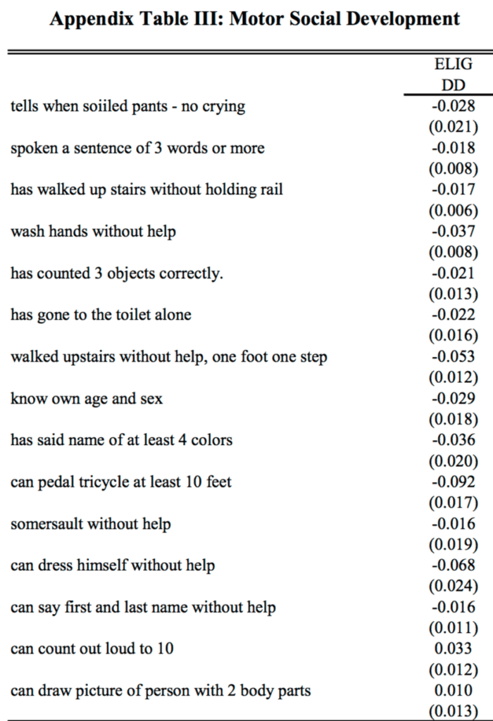
I’m not quite sure whether + or – is desirable here, but I do notice that the coefficients for “can count out loud to 10” and “spoken a sentence of 3 words or more” (the two examples cited in the paragraph above) go in opposite directions. That’s fine—the data are the data—but it doesn’t quite fit their story of consistency.

More generally, the data are addressed in an scattershot manner. For example:

We have estimated our models separately for those with and without siblings, finding no consistent evidence of a stronger effect on one group or another. While not ruling out the socialization story, this finding is not consistent with it.

This appears to be the classic error of interpretation of a non-rejection of a null hypothesis.

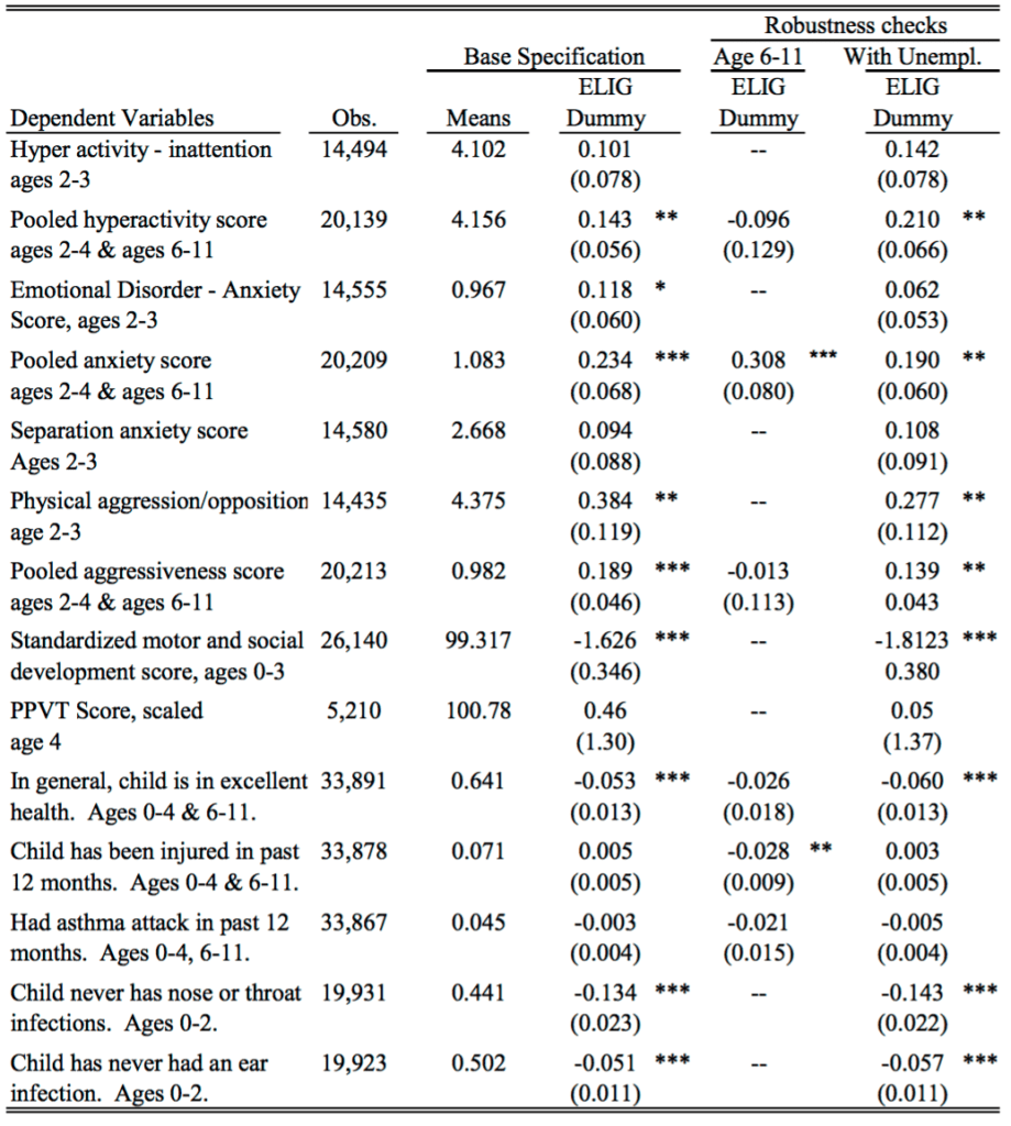
And here’s their table of key results:

Screen Shot 2016-06-22 at 1.59.53 PM

As quantitative social scientists we need to think harder about how to summarize complicated data with multiple outcomes and many different comparisons.

I see the current standard ways to summarize this sort of data are:

(a) Focus on a particular outcome and a particular comparison (choosing these ideally, though not usually, using preregistration), present that as the main finding and then tag all else as speculation.

Or, (b) Construct a story that seems consistent with the general pattern in the data, and then extract statistically significant or nonsignificant comparisons to support your case.

Plan (b) was what was done again, and I think it has problems: lots of stories can fit the data, and there’s a real push toward sweeping any anomalies aside.

For example, how do you think about that coefficient of 0.308 with standard error 0.080 for anxiety among the 6-11-year-olds? You can say it’s just bad luck with the data, or that the standard error calculation is only approximate and the real standard error should be higher, or that it’s some real effect caused by what was happening in Quebec in these years—but the trouble is that any of these explanations could be used just as well to explain the 0.234 with standard error 0.068 for 2-4-year-olds, which directly maps to one of their main findings.

Once you start explaining away anomalies, there’s just a huge selection effect in which data patterns you choose to take at face value and which you try to dismiss.

So maybe approach (a) is better—just pick one major outcome and go with it? But then you’re throwing away lots of data, that can’t be right.

I am unconvinced by the claims of Baker et al., but it’s not like I’m saying their paper is terrible. They have an identification strategy, and clean data, and some reasonable hypotheses. I just think their statistical analysis approach is not working. One trouble is that statistics textbooks tend to focus on stand-alone analyses—getting the p-value right, or getting the posterior distribution, or whatever, and not on how these conclusions fit into the big picture. And of course there’s lots of talk about exploratory data analysis, and that’s great, but EDA is typically not plugged into issues of modeling, data collection, and inference.

What to do?

OK, then. Let’s forget about the strengths and the weaknesses of the Baker et al. paper and instead ask, how should one evaluate a program like Quebec’s nearly-free preschool? I’m not sure. I’d start from the perspective of trying to learn what we can from what might well be ambiguous evidence, rather than trying to make a case in one direction or another. And lots of graphs, which would allow us to see more in one place, that’s much better than tables and asterisks. But, exactly what to do, I’m not sure. I don’t know whether the policy analysis literature features any good examples of this sort of exploration. I’d like to see something, for this particular example and more generally as a template for program evaluation.

3. Nearly 20 years on

So here’s the story. I heard about this work in 2016, from a press release issued in 2006, the article was published in a top economics journal in 2008, it appeared in preprint form in 2005, and it was based on data collected in the late 1990s. And here we are discussing it again in 2023.

It’s kind of beating a dead horse to discuss a 20-year-old piece of research, but you know what they say about dead horses. Also, according to Google Scholar, the article has 1616 citations, including 120 citations in 2023 alone, so, yeah, still worth discussing.

That said, not all the references refer to the substance of the paper. For example, the very first paper on Google Scholar’s list of citers is a review article, Explaining the Decline in the US Employment-to-Population Ratio, and when I searched to see what they said about this Canada paper (Baker, Gruber, and Milligan 2008), here’s what was there:

Additional evidence on the effects of publicly provided childcare comes from the province of Quebec in Canada, where a comprehensive reform adopted in 1997 called for regulated childcare spaces to be provided to all children from birth to age five at a price of $5 per day. Studies of that reform conclude that it had significant and long-lasting effects on mothers’ labor force participation (Baker, Gruber, and Milligan 2008; Lefebvre and Merrigan 2008; Haeck, Lefebvre, and Merrigan 2015). An important feature of the Quebec reform was its universal nature; once fully implemented, it made very low-cost childcare available for all children in the province. Nollenberger and Rodriguez-Planas (2015) find similarly positive effects on mothers’ employment associated with the introduction of universal preschool for three-year-olds in Spain.

They didn’t mention the bit about “the evidence suggests that children are worse off” at all! Indeed, they’re just kinda lumping this in with positive studies on “the effects of publicly provided childcare.” Yes, it’s true that this new article specifically refers to “similarly positive effects on mothers’ employment,” and that earlier paper, while negative about the effect of universal child care on kids, did say, “Maternal labor supply increases significantly.” Still, when it comes to sentiment analysis, that 2008 paper just got thrown into the positivity blender.

I don’t know how to think about this.

On one hand, I feel bad for Baker et al.: they did this big research project, they achieved the academic dream of publishing it in a top journal, it’s received over 1616 citations and remains relevant today—but, when it got cited, its negative message was completely lost! I guess they should’ve given their paper a more direct title. Instead of “Universal Child Care, Maternal Labor Supply, and Family Well‐Being,” they should’ve called it something like: “Universal Child Care: Good for Mothers’ Employment, Bad for Kids.”

On the other hand, for the reasons discussed above, I don’t actually believe their strong claims about the child care being bad for kids, so I’m kinda relieved that, even though the paper is being cited, some of its message has been lost. You win some, you lose some.

Who cares about the normal assump? I don’t!

John Christie writes:

I thought you might find this paper interesting to blog about: “Informal versus formal judgment of statistical models: The case of normality assumptions”

They conclude, based on people’s accuracy of judgment of population normality from sample, that using formal tests of normality are better than informal judgments.

My reply: All silly because who cares about the normal assump at all. With rare exceptions, I don’t care about normality.

Christie responded:

I agree it’s silly. But unfortunately it’s published in a top psychology journal and the main people who will pay most attention to it and use it are those who need better education on the subject.

The fundamental way the tests are used to confirm the null is much worse, assuming one cares about power. And the fact that it got published at all is most perplexing. It causes one to pause realizing that progress on understanding the statistics a field uses can’t be policed by a field that doesn’t understand them.

I dunno. A lot of bad statistics papers are published each year, including in top statistics journals! We just have to accept that an inevitable byproduct of telling thousands of researchers that they need to publish papers, is that some confused papers will be published!

Why I like hypothesis testing (it’s another way to say “fake-data simulation”):

Following up on the post that appeared this morning . . . “Using simulation from the null hypothesis to study statistical artifacts” is another way of saying “hypothesis testing.” I like hypothesis testing in this sense—indeed, it’s all over the place in chapter 6 of BDA, and I do it in my research all the time. The goal of this sort of hypothesis testing (I usually call it “model checking” to distinguish it from the bad stuff that I don’t like) is to (a) see the ways in which the model does not fit the data, and (b) possibly learn that we have insufficient data to detect certain departures of interest from the model. The goal is not to “reject” the null hypothesis, which I already know is false, and there’s no “type 1 and type 2 error.”

When apparently interesting features in data can be explained as unsurprising chance results conditional on a null hypothesis (here’s another example), that tells us something, not something about general “reality” or, as we say in statistics, the “population,” but something about the limitations of a statistical claim that’s being made.

That’s why I often say that hypothesis tests are often most useful when they don’t reject: it’s not that this is evidence that the null hypothesis is true; rather, it tells something about what we can’t reliably learn from the available data and model.

And remember, I really really really like fake-data simulation, and I can’t stop talking about it (see also here).

Using simulation from the null hypothesis to study statistical artifacts (ivermectin edition)

Robin Mills, Ana Carolina Peçanha Antonio, and Greg Tucker-Kellogg write:

Background

Two recent publications by Kerr et al. reported dramatic effects of prophylactic ivermectin use for both prevention of COVID-19 and reduction of COVID-19-related hospitalisation and mortality, including a dose-dependent effect of ivermectin prophylaxis. These papers have gained an unusually large public influence: they were incorporated into debates around COVID-19 policies and may have contributed to decreased trust in vaccine efficacy and public health authorities more broadly. . . .

Methods

Starting with initially identified sources of error, we conducted a revised statistical analysis of available data, including data made available with the original papers and public data from the Brazil Ministry of Health. We identified additional uncorrected sources of bias and errors from the original analysis, including incorrect subject exclusion and missing subjects, an enrolment time bias, and multiple sources of immortal time bias. . . .

Conclusions

The inference of ivermectin efficacy reported in both papers is unsupported, as the observed effects are entirely explained by untreated statistical artefacts and methodological errors.

I guess that at this point ivermectin is over (see also here and here); still, just as it’s always good to do good science, even if the results are not surprising, it’s also always good to do good science criticism. From a methods point of view, this new paper by Mills et al. has a pleasant discussion of the value of simulation from the null hypothesis as a way to learn the extent of statistical artifacts; see discussion on page 12 of the above-linked paper.

I say all this in general terms, as I have not read the article in detail. The authors thank me in their acknowledgments so I must have helped them out at some point, but it’s been awhile and now I don’t remember what I actually did!

P.S. “Using simulation from the null hypothesis to study statistical artifacts” is another way of saying “hypothesis testing.”

Exploring pre-registration for predictive modeling

This is Jessica. Jake Hofman, Angelos Chatzimparmpas, Amit Sharma, Duncan Watts, and I write:

Amid rising concerns of reproducibility and generalizability in predictive modeling, we explore the possibility and potential benefits of introducing pre-registration to the field. Despite notable advancements in predictive modeling, spanning core machine learning tasks to various scientific applications, challenges such as data-dependent decision-making and unintentional re-use of test data have raised questions about the integrity of results. To help address these issues, we propose adapting pre-registration practices from explanatory modeling to predictive modeling. We discuss current best practices in predictive modeling and their limitations, introduce a lightweight pre-registration template, and present a qualitative study with machine learning researchers to gain insight into the effectiveness of pre-registration in preventing biased estimates and promoting more reliable research outcomes. We conclude by exploring the scope of problems that pre-registration can address in predictive modeling and acknowledging its limitations within this context.

Pre-registration is no silver bullet to good science, as we discuss in the paper and later in this post. However, my coauthors and I are cautiously optimistic that adapting the practice could help address a few problems that can arise in predictive modeling pipelines like research on applied machine learning. Specifically, there are two categories of concerns where pre-specifying the learning problem and strategy may lead to more reliable estimates. 

First, most applications of machine learning are evaluated using predictive performance. Usually we evaluate this on held-out test data, because it’s too costly to obtain a continuous stream of new data for training, validation and testing. The separation is crucial: performance on held-out test data is arguably the key criterion in ML, so making reliable estimates of it is critical to avoid a misleading research literature. If we mess up and access the test data during training (test set leakage), then the results we report are overfit. It’s surprisingly easy to do this (see e.g., this taxonomy of types of leakage that occur in practice). While pre-registration cannot guarantee that we won’t still do this anyway, having to determine details like how exactly features and test data will be constructed a priori could presumably help authors catch some mistakes they might otherwise make.

Beyond test set leakage, other types of data-dependent decisions threaten the validity of test performance estimates. Predictive modeling problems admit many degrees-of-freedom that authors can (often unintentionally) exploit in the interest of pushing the results in favor of some a priori hypothesis, similar to the garden of forking paths in social science modeling. For example, researchers may spend more time tuning their proposed methods than baselines they compare to, making it look like their new method is superior when it is not. They might report on straw man baselines after comparing test accuracy across multiple variations. They might only report the performance metrics that make test performance look best. Etc. Our sense is that most of the time this is happening implicitly: people end up trying harder for the things they are invested in. Fraud is not the central issue, so giving people tools to help them avoid unintentionally overfitting is worth exploring.

Whenever the research goal is to provide evidence on the predictability of some phenomena (Can we predict depression from social media? Can we predict civil war onset? etc.) there’s a risk that we exploit some freedoms in translating the high level research goal to a specific predictive modeling exercise. To take an example my co-authors have previously discussed, when predicting how many re-posts a social media post will get based on properties of the person who originally posted, even with the dataset and model specification held fixed, exercising just a few degrees of freedom can change the qualitative nature of the results. If you treat it as a classification problem and build a model to predict whether a post will receive at least 10 re-posts, you can get accuracy close to 100%. If you treat it as a regression problem and predict how many re-posts a given post gets without any data filtering, R^2 hovers around 35%. The problem is that only a small fraction of posts exceed the threshold of 10 re-posts, and predicting which posts do—and how far they spread—is very hard.  Even when the drift in goal happens prior to test set access, the results can paint an overly optimistic picture. Again pre-registering offers no guarantees of greater construct validity, but it’s a way of encouraging authors to remain aware of such drift. 

The specific proposal

One challenge we run into in applying pre-registration to predictive modeling is that because we usually aren’t aiming for explanation, we’re willing to throw lots of features into our model, even if we’re not sure how they could meaningfully contribute, and we’re agnostic to what sort of model we use so long as its inductive bias seems to work for our scenario. Deciding the model class ahead of time as we do in pre-registering explanatory models can be needlessly restrictive. So, the protocol we propose has two parts. 

First, prior to training, one answers the following questions, which are designed to be addressable before looking at any correlations between features and outcomes

Phase 1 of the protocol: learning problem, variables, dataset creation, transformations, metrics, baselines

Then, after training and validation but before accessing test data, one answers the remaining questions:

Phase 2: Prediction method, training details, access test? anything else

Authors who want to try it can grab the forms by forking this dedicated github repo and include them in their own repository.

What we’ve learned so far

To get a sense of whether researchers could benefit from this protocol, we observed as six ML Ph.D. students applied it to a prediction problem we provided (predicting depression in teens using responses to the 2016 Monitoring the Future survey of 12th graders, subsampled from data used by Orben and Przybylski). This helped us see where they struggled to pre-specify decisions in phase 1, presumably because doing so was out of line with their usual process of figuring some things out as they conducted model training and validation. We had to remind several to be specific about metrics and data transformations in particular. 

We also asked them in an exit interview what else they might have tried if their test performance had been lower than they expected. Half of the six participants described procedures that if not fully reported, seemed likely to compromise the validity of their test estimates (things like going back to re-tune hyperparameters then trying again on test data). This suggests that there’s an opportunity for pre-registration, if widely adopted, to play a role in reinforcing good workflow.  This may be especially useful in fields where ML models are being applied by expertise in predictive modeling is still sparse.

The caveats 

It was reassuring to directly observe examples where this protocol, if followed, might have prevented overfitting. However, the fact that we saw these issues despite having explained and motivated pre-registration during these sessions, and walked the participants through it, suggests that pre-specifying certain components of a learning pipeline alone is not necessarily enough to prevent overfitting. 

It was also notable that while all of the participants but one saw value in pre-registering, their specific understandings of why and how it could work varied. There was as much variety in their understandings of pre-registration as there was in ways they approached the same learning problem. Pre-registration is not going to be the same thing to everyone nor even used the same way, because the ways it helps are multi-faceted. As a result, it’s dangerous to interpret the mere act of pre-registration as a stamp of good science. 

I have some major misgivings about putting too much faith into the idea that publicly pre-registering guarantees that estimates are valid, and hope that this protocol gets used responsibly, as something authors choose to do because they feel it helps them prevent unintentional overfitting rather than the simple solution that guarantees to the world that your estimates are gold. It was nice to observe that a couple of study participants seemed particularly drawn to the idea of pre-registering based on perceived “intrinsic” value, remarking about the value they saw in it as a personally-imposed set of constraints to incorporate in their typical workflow.

It won’t work for all research projects. One participant figured out while talking aloud that prior work he’d done identifying certain behaviors in transformer models would have been hard to pre-register because it was exploratory in nature.

Another participant fixated on how the protocol was still vulnerable: people could lie about not having already experimented with training and validation, there’s no guarantee that the train/test split authors describe is what they actually used to produce their estimates, etc. Computer scientists tend to be good at imagining loopholes that adversarial attacks could exploit, so maybe they will be less likely to oversell pre-registration as guaranteeing validity. At the end of the day, it’s still an honor system. 

As we’ve written before, part of the issue with many claims in ML-based research is that often performance estimates for some new approach represent something closer to best case performance due to overlooked degrees of freedom, but they can get interpreted as expected performance. Pre-registration is an attempt at ensuring that the estimates that get reported are more likely to be represent what they’re meant to be. Maybe it’s better though to try to change readers’ perceptions that they can be taken at face value to begin with, though. I’m not sure. 

We’re open to feedback on the specific protocol we provide and curious to hear how it works out for those who try it. 

P.S. Against my better judgment, I decided to go to NeurIPS this year. If you want to chat pre-registration or threats to the validity of ML performance estimates find me there Wed through Sat.

EJG Pitman’s Notes on Non-Parametric Statistical Inference

Nigel Smeeton writes:

I see from the old online post, “The greatest works of statistics never published,” that there is interest in EJG Pitman’s Notes on Non-Parametric Statistical Inference.

Working from a poor online scan of the Notes, EJG Pitman’s early papers, and with the assistance of Jim Pitman and a US librarian, I have been able to resurrect the document and create a pdf file, now included in the Mimeo Series held by the North Carolina State University library.

Here it is.

I took a quick look and I’d say it’s more of historical interest than anything else. It’s all about hypothesis testing (sample bits: “We may have to decide from samples whether the distributions of two chance variables X and Y are the same or different” and “The question we wish to decide is ‘Is the mean of the population zero or not? Does the mean of the sample differ significantly from zero?'”), which I guess was what academic statisticians were mostly concerned with back in 1949.

Still, historical interest isn’t nothing, so I’m sharing it here. Enjoy.

On a proposal to scale confidence intervals so that their overlap can be more easily interpreted

Greg Mayer writes:

Have you seen this paper by Frank Corotto, recently posted to a university depository?

It advocates a way of doing box plots using “comparative confidence intervals” based on Tukey’s HSD in lieu of traditional error bars. I would question whether the “Error Bar Overlap Myth” is really a myth (i.e. a widely shared and deeply rooted but imaginary way of understanding the world) or just a more or less occasional misunderstanding, but whatever it’s frequency, I thought you might be interested, given your longstanding aversion to box plots, and your challenge to the world to find a use for them. (I, BTW, am rather fond of dox plots.)

My reply: Clever but I can’t imagine ever using this method or recommending it to others. The abstract connects the idea to Tukey, and indeed the method reminds me of some of Tukey’s bad ideas from the 1950s involving multiple comparisons. I think the problem here is in thinking of “statistical significance” as a goal in the first place!

I’m not saying it was a bad idea for this paper to be written. The concept could be worth thinking about, even if I would not recommend it as a method. Not every idea has to be useful. Interesting is important too.

Effective Number of Parameters in a Statistical Model

This is my talk for a seminar organized by Joe Suzuki at Osaka University on Tues 10 Sep 2024, 8:50-10:20am Japan time / 19:50-21:20 NY time:

Effective Number of Parameters in a Statistical Model

Andrew Gelman, Department of Statistics, Columbia University

Degrees-of-freedom adjustment for estimated parameters is a general idea in small-sample hypothesis testing, uncertainty estimation, and assessment of prediction accuracy. The effective number of parameters gets interesting In the presence of nonlinearity, constraints, boundary conditions, hierarchical models, informative priors, discrete parameters, and other complicating factors. Many open questions remain, including: (a) defining the effective number of parameters, (b) measuring how the effective number of parameters can depend on data and vary across parameter space, and (c) understanding how the effective number of parameters changes as sample size increases. We discuss using examples from demographics, imaging, pharmacology, political science, and other application areas.

It will be a remote talk—I won’t be flying to Japan—so maybe the eventual link will be accessible to outsiders.

It feels kinda weird to be scheduling a talk nearly a year in advance, but since I had to give a title and abstract anyway, I thought I’d share it with you. My talk will be part of a lecture series they are organizing for graduate students at Osaka, “centered around WAIC/WBIC and its mathematical complexities, covering topics such as Stan usage, regularity conditions, WAIC, WBIC, cross-validation, SBIC, and learning coefficients.” I’m not gonna touch the whole BIC thing.

Now that we have loo, I don’t see any direct use for “effective number of parameters” in applied statistics, but the concept still seems important for understanding fitted models, in vaguely the same way that R-squared is useful for understanding, even though it does not answer any direct question of interest. I thought it could be fun to give a talk on all the things that confuse me about effective number of parameters, because I think it’s a concept that we often take for granted without fully thinking through.

Agreeing to give the talk could also motivate me to write a paper on the topic, which I’d like to do, given that it’s been bugging me for about 35 years now.

(back to basics:) How is statistics relevant to scientific discovery?

Following up on today’s post, “Why I continue to support the science reform movement despite its flaws,” it seems worth linking to this post from 2019, about the way in which some mainstream academic social psychologists have moved beyond denial, to a more realistic view that accepts that failure is a routine, indeed inevitable part of science, and that, just because a claim is published, even in a prestigious journal, that doesn’t mean it has to be correct:

Once you accept that the replication rate is not 100%, nor should it be, and once you accept that published work, even papers by ourselves and our friends, can be wrong, this provides an opening for critics, the sort of scientists whom academic insiders used to refer to as “second stringers.”

Once you move to the view that “the bar for communicating to each other should not be high. We can decide for ourselves what to make of each other’s speech,” there is a clear role for accurate critics to move this process along. Just as good science is, ultimately, the discovery of truths that ultimately would be discovered by someone else sometime in the future, thus, the speeding along of a process that we’d hope would happen anyway, so good criticism should speed along the process of scientific correction.

Criticism, correction, and discovery all go together. Obviously discovery is the key part, otherwise there’d be nothing to criticize, indeed nothing to talk about. But, from the other direction, criticism and correction empower discovery. . . .

Just as, in economics, it is said that a social safety net gives people the freedom to start new ventures, in science the existence of a culture of robust criticism should give researchers a sense of freedom in speculation, in confidence that important mistakes will be caught.

Along with this is the attitude, which I strongly support, that there’s no shame in publishing speculative work that turns out to be wrong. We learn from our mistakes. . . .

Speculation is fine, and we don’t want the (healthy) movement toward replication to create any perverse incentives that would discourage people from performing speculative research. What I’d like is for researchers to be more aware of when they’re speculating, both in their published papers and in their press materials. Not claiming a replication rate of 100%, that’s a start. . . .

What, then, is—or should be—the role of statistics, and statistical criticism in the process of scientific research?

Statistics can help researchers in three ways:
– Design and data collection
– Data analysis
– Decision making.

And how does statistical criticism fit into all this? Criticism of individual studies has allowed us to develop our understanding, giving us insight into designing future studies and interpreting past work. . . .

We want to encourage scientists to play with new ideas. To this purpose, I recommend the following steps:

– Reduce the costs of failed experimentation by being more clear when research-based claims are speculative.

– React openly to follow-up studies. Once you recognize that published claims can be wrong (indeed, that’s part of the process), don’t hang on to them too long or you’ll reduce your opportunities to learn.

– Publish all your data and all your comparisons (you can do this using graphs so as to show many comparisons in a compact grid of plots). If you follow current standard practice and focus on statistically significant comparisons, you’re losing lots of opportunities to learn.

– Avoid the two-tier system. Give respect to a student project or Arxiv paper just as you would to a paper published in Science or Nature.

We should all feel free to speculate in our published papers without fear of overly negative consequences in the (likely) event that our speculations are wrong; we should all be less surprised to find that published research claims did not work out (and that’s one positive thing about the replication crisis, that there’s been much more recognition of this point); and we should all be more willing to modify and even let go of ideas that didn’t happen to work out, even if these ideas were published by ourselves and our friends.

There’s more at the link, and also let me again plug my recent article, Before data analysis: Additional recommendations for designing experiments to learn about the world.

“Guns, Race, and Stats: The Three Deadliest Weapons in America”

Geoff Holtzman writes:

In April 2021, The Guardian published an article titled “Gun Ownership among Black Americans is Up 58.2%.” In June 2022, Newsweek claimed that “Gun ownership rose by 58 percent in 2020 alone.” The Philadelphia Inquirer first reported on this story in August 2020, and covered it again as recently as March 2023 in a piece titled “The Growing Ranks of Gun Owners.” In between, more than two dozen major media outlets reported this same statistic. Despite inconsistencies in their reporting, all outlets (directly or indirectly) cite as their source a survey-based infographic conducted by a firearm industry trade association.

Last week, I shared my thoughts on the social, political, and ethical dimensions of these stories in an article published in The American Prospect. Here, I address whether and to what extent their key statistical claim is true. And an examination of the infographic—produced by the National Shooting Sports Foundation (NSSF)—reveals that it is not. Below, I describe six key facts about the infographic that undermine the media narrative. After removing all false, misleading, or meaningless words from the Guardian’s headline and Newsweek’s claim, the only words remaining are “Among” “Is,” “In,” and “By.”

(1) 58.2% only refers to the first six months of 2020

To understand demographic changes in firearms purchases or ownership in 2020, one needs to ascertain firearm sales or ownership demographics from before 2020 and after 2020. The best way to do this is with a longitudinal panel, which is how Pew found no change in Black gun ownership rates among Americans from 2017 (24%) to 2021 (24%). Longitudinal research in The Annals of Internal Medicine, also found no change in gun ownership among Black Americans from 2019 (21%) through 2020/2021 (21%).

By contrast, the NSSF conducted a one-time survey of its own member retailers. In July 2020, the NSSF asked these retailers to estimate demographics in the first six months of 2020 to demographics in the first six months of 2019. A full critique of this approach and its drawbacks would require a lengthy discussion of the scientific literature on recency bias, telescoping effects, and so on. To keep this brief, I’d just like to point out that by July 2020, many of us could barely remember what the world was like back in 2019.

Ironically, the media couldn’t even remember when the survey took place. In September 2020, NPR reported—correctly—that “according to AOL News,” the survey concerned “the first six months of 2020.”  But in October of 2020, CNN said it reflected gun sales “through September.” And by June 2021, CNN revised its timeline to be even less accurate, claiming the statistic was “gun buyers in 2020 compared to 2019.”

Strangely, it seems that AOL News may have been one of the few media outlets that actually looked at the infographic it reported. The timing of the survey—along with other critical but collectively forgotten information on its methods are printed at the top of the infographic. The entire top quarter of the NSSF-produced image is devoted to these details:  “FIREARM & AMMUNITION SALES DURING 1ST HALF OF 2020, Online Survey Fielded July 2020 to NSSF Members.”

But as I discuss in my article in The American Prospect, a survey about the first half of 2020 doesn’t really support a narrative about Black Americans’ response to “protests throughout the summer” of 2020 or to that November’s “contested election.” This is a great example of a formal fallacy (post hoc reasoning), memory bias (more than one may have been at work here), and motivated reasoning all rolled into one. To facilitate these cognitive errors, the phrase “in 2020” is used ambiguously in the stories, referring at times to its first six months of 2020 and at times specific days or periods during the last seven months. This part of the headlines and stories is not false, but it does conflate two distinct time periods.

The results of the NSSF survey cannot possibly reflect the events of the Summer and Fall of 2020. Rather, the survey’s methods and materials were reimagined, glossed over, or ignored to serve news stories about those events.

(2) 58.2% describes only a tiny, esoteric fraction of Americans

To generalize about gun owner demographics in the U.S., one has to survey a representative, random sample of Americans. But the NSSF survey was not sent to a representative sample of Americans—it was only sent to NSSF members. Furthermore, it doesn’t appear to have been sent to a random sample of NSSF members—we have almost no information on how the sample of fewer than 200 participants were drawn from the NSSF’s membership of nearly 10,000. Most problematically—and bizarrely—the survey is supposed to tell us something about gun buyers, yet the NSSF chose to send the survey exclusively to its gun sellers.

The word “Americans” in these headlines is being used as shorthand for “gun store customers as remembered by American retailers up to 18 months later.” In my experience, literally no one assumes I mean the latter when I say the former. The latter is not representative of the former, so this part of the headlines and news stories is misleading.

(3) 58.2% refers to some abstract, reconstructed memory of Blackness

The NSSF doesn’t provide demographic information for the retailers it surveyed. Demographics can provide crucial descriptive information for interpreting and weighting data from any survey, but their omission is especially glaring for a survey that asked people to estimate demographics. But there’s a much bigger problem here.

We don’t have reliable information about the races of these retailers’ customers, which is what the word “Black” is supposed to refer to in news coverage of the survey. This is not an attack on firearms retailers; it is a well-established statistical tendency in third-party racial identification. As I’ve discussed in The American Journal of Bioethics, a comparison of CDC mortality data to Census records shows that funeral directors are not particularly accurate in reporting the race of one (perfectly still) person at a time. Since that’s a simpler task than searching one’s memory and making statistical comparisons of all customers from January through June of two different years, it’s safe to assume that the latter tends to produce even less accurate reports.

The word “Black” in these stories really means “undifferentiated masses of people from two non-consecutive six-month periods recalled as Black.” Again, the construct picked out by “Black” in the news coverage is a far cry from the construct actually measured by the survey.

(4) 58.2% appears to be about something other than guns

The infographic doesn’t provide the full wording of survey items, or even make clear how many items there were. Of the six figures on the infographic, two are about “sales of firearms,” two are about “sales of ammunition,” and one is about “overall demographic makeup of your customers.” But the sixth and final figure—the source of that famous 58.2%—does not appear to be about anything at all. In its entirety, that text on the infographic reads: “For any demographic that you had an increase, please specify the percent increase.”

Percent increase in what? Firearms sales? Ammunition sales? Firearms and/or ammunition sales? Overall customers? My best guess would be that the item asked about customers, since guns and ammo are not typically assigned a race. But the sixth figure is uninterpretable—and the 58.2% statistic meaningless—in the absence of answers.

(5) 58.2% is about something other than ownership

I would not guess that the 58.2% statistic was about ownership, unless this were a multiple choice test and I was asked to guess which answer was a trap.

The infographic might initially appear to be about ownership, especially to someone primed by the initial press release. It’s notoriously difficult for people to grasp distinctions like those between purchases by customers and ownership in a broader population. I happen to think that the heuristics, biases, and fallacies associated with that difficulty—reverse inference, base rate neglect, affirming the consequent, etc.—are fascinating, but I won’t dwell on them here. In the end, ammunition is not a gun, a behavior (purchasing) is not a state (ownership), and customers are none of the above.

To understand how these concepts differ, suppose that 80% of people who walk into a given gun store in a given year own a gun. The following year, the store could experience a 58% increase in customers, or a 58% increase in purchases, but not observe a 58% increase in ownership. Why? Because even the best salesperson can’t get 126% of customers to own guns. So the infographic neither states nor implies anything specific about changes in gun ownership.

(6) 58.2% was calculated deceptively

I can’t tell if the data were censored (e.g., by dropping some responses before analysis) or if the respondents were essentially censored (e.g., via survey skip logic), but 58.2% is the average guess only of retailers who reported an increase in Black customers. Retailers who reported no increase in Black customers were not counted toward the average. Consequently, the infographic can’t provide a sample size for this bar chart. Instead, it presents a range of sample sizes for individual bars: “n=19-104.”

Presenting means from four distinct, artificially constructed, partly overlapping samples as a single bar chart without specifying the size of any sample renders that 58.2% number uninterpretable. It is quite possible that only 19 of 104 retailers reported an increase in Black customers, and that all 104 reported an increase in White customers—for whom the infographic (but not the news) reported a 51.9% increase. Suppose 85 retailers did not report an increase in Black customers, and instead reported no change for that group (i.e., a change of 0%). Then if we actually calculated the average change in demographics reported by all survey respondents, we would find just a 10.6% increase in Black customers (19/104 x 58.2%), as compared to a 51.9% increase in white customers (104/104 x 51.9%).

A proper analysis of the full survey data could actually undermine the narrative of a surge in gun sales driven by Black Americans. In fact, a proper calculation may even have found a decrease, not an increase, for this group. The first two bar charts on the infographic report percentages of retailers who thought overall sales of firearms and of ammunition were “up,” “down,” or the “same.” We don’t know if the same response options were given for the demographic items, but if they were, a recount of all votes might have found a decrease in Black customers. We’ll never know.

The 58.2% number is meaningless without additional but unavailable information. Or, to use more technical language, it is a ceilingestimate, as opposed to a real number. In my less-technical write-up, I simply call it a fake number.

This is kind of in the style of our recent article in the Atlantic, The Statistics That Come Out of Nowhere, but with lot more detail. Or, for a simpler example, a claim from a few years ago about political attitudes of the super-rich, which came from a purported survey about which no details were given. As with some of those other claims, the reported number of 58% was implausible on its face, but that didn’t stop media organizations from credulously repeating it.

On the plus side, a few years back a top journal (yeah, you guessed it, it was Lancet, that fount of politically-motivated headline-bait) published a ridiculous study on gun control and, to their credit, various experts expressed their immediate skepticism.

To their discredit, the news media reports on that 58% thing did not even bother running it by any experts, skeptical or otherwise. Here’s another example (from NBC), here’s another (from Axios), here’s CNN . . . you get the picture.

I guess this story is just too good to check, it fits into existing political narratives, etc.

Hey! Here’s how to rewrite and improve the title and abstract of a scientific paper:

Last week in class we read and then rewrote the title and abstract of a paper. We did it again yesterday, this time with one of my recent unpublished papers.

Here’s what I had originally:

title: Unifying design-based and model-based sampling inference by estimating a joint population distribution for weights and outcomes

abstract: A well-known rule in practical survey research is to include weights when estimating a population average but not to use weights when fitting a regression model—as long as the regression includes as predictors all the information that went into the sampling weights. But it is not clear how to apply this advice when fitting regressions that include only some of the weighting information, nor does it tell us what to do when analyzing already-collected surveys where the weighting procedure has not been clearly explained or where the weights depend in part on information that is not available in the data. It is also not clear how one is supposed to account for clustering in such analyses. We propose a quasi-Bayesian approach using a joint regression of the outcome and the sampling weight, followed by poststratifcation on the two variables, thus using design information within a model-based context to obtain inferences for small-area estimates, regressions, and other population quantities of interest.

Not terrible, but we can do better. Here’s the new version:

title: MRP using sampling weights

abstract: A well-known rule in practical survey research is to include weights when estimating a population average but not to use weights when fitting a regression model—as long as the regression includes as predictors all the information that went into the sampling weights. But what if you don’t know where the weights come from? We propose a quasi-Bayesian approach using a joint regression of the outcome and the sampling weight, followed by poststratifcation on the two variables, thus using design information within a model-based context to obtain inferences for small-area estimates, regressions, and other population quantities of interest.

How did we get there?

The title. The original title was fine—it starts with some advertising (“Unifying design-based and model-based sampling inference”) and follows up with a description of how the method works (“estimating a joint population distribution for weights and outcomes”).

But the main point of the title is to get the notice of potential readers, people who might find the paper useful or interesting (or both!).

This pushes the question back one step: Who would find this paper useful or interesting? Anyone who works with sampling weights. Anyone who uses public survey data or, more generally, surveys collected by others, which typically contain sampling weights. And anyone who’d like to follow my path in survey analysis, which would be all the people out there who use MRP (multilevel regression and poststratification). Hence the new title, which is crisp, clear, and focused.

My only problem with the new title, “MRP using sampling weights,” is that it doesn’t clearly convey that the paper involves new research. It makes it look like a review article. But that’s not so horrible; people often like to learn from review articles.

The abstract. If you look carefully, you’ll see that the new abstract is the same as the original abstract, except that we replaced the middle part:

But it is not clear how to apply this advice when fitting regressions that include only some of the weighting information, nor does it tell us what to do when analyzing already-collected surveys where the weighting procedure has not been clearly explained or where the weights depend in part on information that is not available in the data. It is also not clear how one is supposed to account for clustering in such analyses.

with this:

But what if you don’t know where the weights come from?

Here’s what happened. We started by rereading the original abstract carefully. That abstract has some long sentences that are hard to follow. The first sentence is already kinda complicated, but I decided to keep it, because it clearly lays out the problem, and also I think the reader of an abstract will be willing to work a bit when reading the first sentence. Getting to the abstract at all is a kind of commitment.

The second sentence, though, that’s another tangle, and at this point the reader is tempted to give up and just skate along to the end—which I don’t want! The third sentence isn’t horrible, but it’s still a little bit long (starting with the nearly-contentless “It is also not clear how one is supposed to account for” and the ending with the unnecessary “in such analyses”). Also, we don’t even really talk much about clustering in the paper! So it was a no-brainer to collapse these into a sentence that was much more snappy and direct.

Finally, yeah, the final sentence of the abstract is kinda technical, but (a) the paper’s technical, and we want to convey some of its content in the abstract!, and (b) after that new, crisp, replacement second sentence, I think the reader is ready to take a breath and hear what the paper is all about.

General principles

Here’s a general template for a research paper:
1. What is the goal or general problem?
2. Why is it important?
3. What is the challenge?
4. What is the solution? What must be done to implement this solution?
5. If the idea in this paper is so great, why wasn’t the problem already solved by someone else?
6. What are the limitations of the proposed solution? What is its domain of applicability?

We used these principles in our rewriting of my title and abstract. The first step was for me to answer the above 6 questions:
1. Goal is to do survey inference with sampling weights.
2. It’s important for zillions of researchers who use existing surveys which come with weights.
3. The challenge is that if you don’t know where the weights come from, you can’t just follow the recommended approach to condition in the regression model on the information that is predictive of inclusion into the sample.
4. The solution is to condition on the weights themselves, which involves the additional step of estimating a joint population distribution for the weights and other predictors in the model.
5. The problem involves a new concept (imagining a population distribution for weights, which is not a coherent assumption, because, in the real world, weights are constructed based on the data) and some new mathematical steps (not inherently sophisticated as mathematics, but new work from a statistical perspective). Also, the idea of modeling the weights is not completely new; there is some related literature, and one of our contributions is to take weights (which are typically constructed from a non-Bayesian design-based perspective) and use them in a Bayesian analysis.
6. Survey weights do not include all design information, so the solution offered in the paper can only be approximate. In addition the method requires distributional assumptions on the weights; also it’s a new method so who knows how useful it will be in practice.

We can’t put all of that in the abstract, but we were able to include some versions of the answers to questions 1, 3, and 4. Questions 5 and 6 are important, but it’s ok to leave them to the paper, as this is where readers will typically search for limitations and connections to the literature.

Maybe we should include the answer to question 2 in the abstract, though. Perhaps we could replace “But what if you don’t know where the weights come from?” with “But what if you don’t know where the weights come from? This is often a problem when analyzing surveys collected by others.”

Summary

By thinking carefully about goals and audience, we improved the title and abstract of a scientific paper. You should be able to do this in your own work!

Here are the most important parts of statistics:

Statistics is associated with random numbers: normal distributions, probability distributions more generally, random sampling, randomized experimentation.

But I don’t think these are the most important parts of statistics.

I thought about this when rereading this post that I wrote awhile ago but happened to appear yesterday. Here’s the relevant bit:

In his self-experimentation, Seth lived the contradiction between the two tenets of evidence-based medicine: (1) Try everything, measure everything, record everything; and (2) Make general recommendations based on statistical evidence rather than anecdotes.

Seth’s ideas were extremely evidence-based in that they were based on data that he gathered himself or that people personally sent in to him, and he did use the statistical evidence of his self-measurements, but he did not put in much effort to reduce, control, or adjust for biases in his measurements, nor did he systematically gather data on multiple people.

I think that these are the most important parts of statistics:
(a) to reduce, control, or adjust for biases and variation in measurement, and
(b) to systematically gather data on multiple cases.
This all should be obvious, but I don’t think it comes out clearly in textbooks, including my own. We get distracted by the shiny mathematical objects.

And, yes, random sampling and randomized experimentation are important, as is statistical inference in all its mathematical glory—our BDA book is full of math—, but you want those sweet, sweet measurements as your starting point.

Zipf’s law and Heaps’s law. Also, when is big as bad as infinity? And why unit roots aren’t all that.

John Cook has a fun and thoughtful post on Zipf’s law, which “says that the frequency of the nth word in a language is proportional to n^(−s),” linking to an earlier post of his on Heaps’s law, which “says that the number of unique words in a text of n words is approximated by Kn^β, where K is a positive constant and β is between 0 and 1. According to the Wikipedia article on Heaps’ law, K is often between 10 and 100 and β is often between 0.4 and 0.6.” Unsurprisingly, you can derive one of these laws from the other; see links on the aforementioned wikipedia page.

In his post on Zipf, Cook discusses the idea that setting large numbers to infinity can work in some settings but not in others. In some way this should already be clear to you—for example, if a = 3.4 + 1/x, and x is very large, then if you’re interested in a, then for most purposes you can just say a = 3.4, but if you care about x, you can’t just call it infinity. If you can use infinity, that simplifies your life. As Cook puts it, “Infinite is easier than big.” Another way of saying this is that, if you can use infinity, you can use some number like 10^8, thus avoiding literal infinities but getting many of the benefits in simplicity and computation.

Cook continues:

Whether it is possible to model N [the number of words in the language] as infinite depends on s [the exponent in the Zipf formula]. The value of s that models word frequency in many languages is close to 1. . . . When s = 1, we don’t have a probability distribution because the sum of 1/n from 1 to ∞ diverges. And so no, we cannot assume N = ∞. Now you may object that all we have to do is set s to be slightly larger than 1. If s = 1.0000001, then the sum of n−s converges. Problem solved. But not really.

When s = 1 the series diverges, but when s is slightly larger than 1 the sum is very large. Practically speaking this assigns too much probability to rare words.

I like how he translates the model error into a real-world issue.

This all reminds me of a confusion that sometimes arises in statistical inference. As Cook says, if you have problems with infinity, you’ll often also have problems with large finite numbers. For example, it’s not good to have an estimate that has an infinite variance, but if it has a very large variance, you’ll still have instability. Convergence conditions aren’t just about yes or no, they’re also about how close you are. Similarly with all that crap in time series about unit roots. The right question is not, Is there a unit root? It’s, What are you trying to model?

Of course its preregistered. Just give me a sec

This is Jessica. I was going to post something on Bak-Coleman and Devezer’s response to the Protzko et al. paper on the replicability of research that uses rigor-enhancing practices like large samples, preregistration, confirmatory tests, and methodological transparency, but Andrew beat me to it. But since his post didn’t get into one of the surprising aspects of their analysis (beyond the paper making causal claim without a study design capable of assessing causality), I’ll blog on it anyway.

Bak-Coleman and Devezer describe three ways in which the measure of replicability that Protzko et al. use to argue that the 16 effects they study are more replicable than effects in prior studies deviates from prior definitions of replicability:

  1. Protzko et al. define replicability as the chance that any replication achieves significance in the hypothesized direction as opposed to whether the results of the confirmation study and the replication were consistent 
  2. They include self-replications in calculating the rate
  3. They include repeated replications of the same effect and replications across different effects in calculating the rate

Could these deviations in how replicability is defined have been decided post-hoc, so that the authors could present positive evidence for their hypothesis that rigor-enhancing practices work? If they preregistered their definition of replicability, we would not be so concerned about this possibility.  Luckily, the authors report that “All confirmatory tests, replications and analyses were preregistered both in the individual studies (Supplementary Information section 3 and Supplementary Table 2) and for this meta-project (https://osf.io/6t9vm).”

But wait – according to Bak-Coleman and Devezer:

the analysis on which the titular claim depends was not preregistered. There is no mention of examining the relationship between replicability and rigor-improving methods, nor even how replicability would be operationalized despite extensive descriptions of the calculations of other quantities. With nothing indicating this comparison or metric it rests on were planned a priori, it is hard to distinguish the core claim in this paper from selective reporting and hypothesizing after the results are known. 

Uh-oh, that’s not good. At this point, some OSF sleuthing was needed. I poked around the link above, and the associated project containing analysis code. There are a couple analysis plans: Proposed Overarching Analyses for Decline Effect final.docx, from 2018, and Decline Effect Exploratory analyses and secondary data projects P4.docx, from 2019. However, these do not appear to describe the primary analysis of replicability in the paper (the first describes an analysis that ends up in the Appendix, and the second a bunch of exploratory analyses that don’t appear in the paper). About a year later, the analysis notebooks with the results they present in the main body of the paper were added. 

According to Bak-Coleman on X/Twitter: 

We emailed the authors a week ago. They’ve been responsive but as of now, they can’t say one way or another if the analyses correspond to a preregistration. They think they may be in some documentation.

In the best case scenario where the missing preregistration is soon found, this example suggests that there are still many readers and reviewers for whom some signal of rigor suffices even when the evidence of it is lacking. In this case, maybe the reputation of authors like Nosek reduced the perceived need on the part of the reviewers to track down the actual preregistration. But of course, even those who invented rigor-enhancing practices can still make mistakes!

In the alternative scenario where the preregistration is not found soon, what is the correct course of action? Surely at least a correction is in order? Otherwise we might all feel compelled to try our luck at signaling preregistration without having to inconvenience ourselves by actually doing.

More optimistically, perhaps there are exciting new research directions that could come out of this. Like, wearable preregistration, since we know from centuries of research and practice that it’s harder to lose something when it’s sewn to your person. Or, we could submit our preregistrations to OpenAI, I mean Microsoft, who could make a ChatGPT-enabled Preregistration Buddy who not only trained on your preregistration, but also knows how to please a human judge who wants to ask questions about what it said.