Overestimated health effects of air pollution

Last year I wrote a post, “Why the New Pollution Literature is Credible” . . . but I’m still guessing that the effects are being overestimated:.

Since then, Vincent Bagilet and Léo Zabrocki-Hallak wrote an article, Why Some Acute Health Effects of Air Pollution Could Be Inflated, that begins:

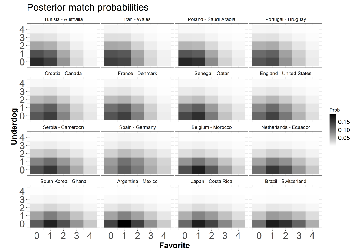
Hundreds of studies show that air pollution affects health in the immediate short-run, and play a key role in setting air quality standards. Yet, estimated effect sizes vary widely across studies. Analyzing the results published in epidemiology and economics, we first find that a substantial share of estimates are likely to be inflated due publication bias and a lack of statistical power. Second, we run real data simulations to identify the design parameters causing these issues. We show that this exaggeration may be driven by the small number of exogenous shocks leveraged, by the limited strength of the instruments used or by sparse outcomes. These concerns likely extend to studies in other fields relying on comparable research designs. Our paper provides a principled workflow to evaluate and avoid the risk of exaggeration when conducting an observational study.

Their article also includes the above graph. It’s good to see this work being done and to see these type M results applied to different scientific fields.

P.S. I’m putting this in the Multilevel Modeling category because that’s what’s going on; they’re in essence partially pooling information across multiple studies, and individual researchers could do better by partially pooling within their studies, rather than selecting the biggest results.

Software to sow doubts as you meta-analyze

This is Jessica. Alex Kale, Sarah Lee, TJ Goan, Beth Tipton, and I write,

Scientists often use meta-analysis to characterize the impact of an intervention on some outcome of interest across a body of literature. However, threats to the utility and validity of meta-analytic estimates arise when scientists average over potentially important variations in context like different research designs. Uncertainty about quality and commensurability of evidence casts doubt on results from meta-analysis, yet existing software tools for meta-analysis do not necessarily emphasize addressing these concerns in their workflows. We present MetaExplorer, a prototype system for meta-analysis that we developed using iterative design with meta-analysis experts to provide a guided process for eliciting assessments of uncertainty and reasoning about how to incorporate them during statistical inference. Our qualitative evaluation of MetaExplorer with experienced meta-analysts shows that imposing a structured workflow both elevates the perceived importance of epistemic concerns and presents opportunities for tools to engage users in dialogue around goals and standards for evidence aggregation.

One way to think about good interface design is that we want to reduce sources of the “friction” like the cognitive effort users have to exert when they go to do some task; in other words minimize the so-called gulf of execution. But then there are tasks like meta-analysis where being on auto-pilot can result in misleading results. We don’t necessarily want to create tools that encourage certain mindsets, like when users get overzealous about suppressing sources of heterogeneity across studies in order to get some average that they can interpret as the ‘true’ fixed effect. So what do you do instead? One option is to create a tool that undermines the analyst’s attempts to combine disparate sources of evidence every chance it gets. 

This is essentially the philosophy behind MetaExplorer. This project started when I was approached by an AI firm pursuing a contract with the Navy, where systematic review and meta-analysis are used to make recommendations to higher-ups about training protocols or other interventions that could be adopted. Five years later, a project that I had naively figured would take a year (this was my first time collaborating with a government agency) culminated in a tool that differs from other software out there primarily in its heavy emphasis on sources of heterogeneity and uncertainty. It guides the user through making their goals explicit, like what the target context they care about is; extracting effect estimates and supporting information from a set of studies; identifying characteristics of the studied populations and analysis approaches; and noting concerns about assymmetries, flaws in analysis, or mismatch between the studied and target context. These sources of epistemic uncertainty get propagated to a forest plot view where the analyst can see how an estimate varies as studies are regrouped or omitted. It’s limited to small meta-analyses of controlled experiments, and we have various ideas based on our interviews of meta-analysts that could improve its value for training and collaboration. But maybe some of the ideas will be useful either to those doing meta-analysis or building software. Codebase is here.

The political consequences of party polarization and state-level aggregation

I was thinking about the conversation we had a few months ago about abortion in Oklahoma:

Surveys find Oklahomans to be less supportive of abortion rights than the average in the U.S., but still more supportive than not. So that’s “moderately pro-choice” compared to a 50/50 baseline. According to this Pew Research summary, 51% in Oklahoma say abortion should be legal in all or most cases, 45% say illegal in all or most cases.

At the same time, a bill in the Oklahoma legislature to ban almost all abortions passed on 73-16 vote.

As I wrote at the time:

It does not defy political gravity for a legislature to vote in a way different from public opinion: issues are bundled, there’s political polarization, the whole thing is tangled up with national politics, also there’s some sort of pent-up demand from activists who can push anti-abortion legislation in a way that they could not do for fifty years. So, lots going on.

And abortion’s not the only issue where there’s a lack of congruence (as Lax and Phillips put it) between opinion and state policies. One familiar example is the death penalty, which has been popular in most states for many decades but is rarely carried out anywhere in the country.

Still, that all said . . . a 73-16 vote in the legislature is a striking deviation from a 50-50 split in the population, indicating something about how politics works in this country.

I think there’s more to be said here, not just about abortion but about politics in general. The overall pattern is that the average attitudes on most issues don’t vary that much in most states, but persistent one-party control of states (due to partisan polarization) leads to extreme policies at the state level. Long-term this should resolve itself through party competition, but I guess that could take awhile.

When put this way, none of the above should sound surprising. But I don’t know that people are so aware of these aggregation issues.

If you hear that the Oklahoma legislature overwhelmingly passed an anti-abortion bill, this might seem like no big deal: Oklahoma’s a very conservative state, so, yeah, they get very conservative policies, just like they overwhelmingly want. But, no, most Oklahoma voters don’t want an abortion ban. What is true is that a clear majority of Oklahoma voters don’t like the Democrats, and they don’t have much of an opportunity to express support for abortion without voting for a Democrat, which they’d rather not do.

Statistical analysis: (1) Plotting the data, (2) Constructing and fitting models, (3) Plotting data along with fitted models, (4) Further modeling and data collection

It’s a workflow thing.

Here’s the story. Carlos Ronchi writes:

I have a dataset of covid hospitalizations from Brazil. The values of interest are day of first symptoms, epidemiological week and day of either death or cure. Since the situation in Brazil has been escalating and getting worse every day, I wanted to compare the days to death in hospitalized young people (20-29 years) between two sets of 3 epidemiological weeks, namely weeks 1-3 and 8-10. The idea is that with time the virus in Brazil is getting stronger due to mutations and uncontrolled number of cases, so this is somehow reflected in the time from hospitalization to death.

My idea was to do an Anova by modeling the number of days to death from hospitalization in patients registered in 3 epidemiological weeks with a negative binomial regression. The coefficients would follow a normal distribution (which would be exponentiated afterwards). Once we have the coefficients we can simply compare the distributions and check the probability that the days to death are bigger/smaller in one of the groups.

Do you think this is a sound approach? I’m not sure, since we have date information. The thing is I don’t know how I would do a longitudinal analysis here, even if it makes sense.

My reply: I’m not sure either, as I’ve never done an analysis quite like this, so here are some general thoughts.

First step: Plotting the data

Start by graph the data using scatterplots and time-series plots. In the absence of variation in outcomes, plotting the data would tell us the entire story, so from this point of view the only reason we need to go beyond direct plots is to smooth out variation. Smoothing the variation is important—at some point you’ll want to fit a model, I fit models all the time!—; I just think that you want to start with plotting, for several reasons:

1. You can sometimes learn a lot from a graph: seeing patterns you expected to see can itself be informative, and then there are often surprises as well, things you weren’t expecting to see.

2. Seeing the unexpected, or even thinking about the unexpected, can stimulate you to think more carefully about “the expected”: What exactly did you think you might see? What would constitute a surprise? Just as the steps involved in planning an experiment can be useful in organizing your thoughts even if you don’t actually go and collect the data, so can planning a graph be helpful in arranging your expectations.

3. A good plot will show variation (any graph should contain the seeds of its own destruction), and this can give you a sense of where to put your modeling effort.

Remember that you can make lots of graphs. Here, I’m not talking about a scatterplot matrix or some other exhaustive set of plots, but just of whatever series of graphs you make while exploring your data. Don’t succumb to the Napoleon-in-Russia fallacy of thinking you need to make one graph that shows all the data at once. First, that often just can’t be done; second, even if a graph with all the data can be constructed, it can be harder to read than a set of plots; see for example Figure 4.1 of Red State Blue State.

Second step: Statistical modeling

Now on to the modeling. The appropriate place for modeling in data analysis is in the “sweet spot” or “gray zone” between (a) data too noisy to learn anything and (b) patterns so clear that no formal analysis is necessary. As we get more data or ask more questions, this zone shifts to the left or right. That’s fine. There’s nothing wrong with modeling in regions (a) or (b); these parts of the model don’t directly give us anything new, but they bridge to the all-important modeling in the gray zone in the middle.

Getting to the details: the way the problem is described in the above note, I guess it makes sense to fit a hierarchical model with variation across people and over time. I don’t think I’d use a negative binomial model of days to death; to me, it would be more natural to model time to death as a continuous variable. Even if the data happen to be discrete in that they are rounded to the nearest day, the underlying quantity is continuous and it makes sense to construct the model in that way. This is not a big deal; it’s relevant to our general discussion only in the “pick your battles” sense that you don’t want to spend your effort modeling some not-so-interesting artifacts of data collection. In any case, the error term is the least important aspect of your regression model.

Third step: Using graphs to understand and find problems with the model

After you’ve fit some models, you can graph the data along with the fitted models and look for discrepancies.

Fourth step: Improving the model and gathering more data

There are various ways in which your inferences can be lacking:

1. No data in regime of interest (for example, extrapolating about 5-year survival rates if you only have 2 years of data)

2. Data too noisy to get a stable estimate. This could be as simple as the uncertainty for some quantity of interest being larger than you’d like.

3. Model not fitting the data, as revealed by your graphs in the third step above.

These issues can motivate additional modeling and data collection.

What are the most important statistical ideas of the past 50 years?

Many of you have heard of this article (with Aki Vehtari) already—we wrote the first version in 2020, then did some revision for its publication in the Journal of the American Statistical Association.

But the journal is not open-access so maybe there are people who are interested in reading the article who aren’t aware of it or don’t know how to access it.

Here’s the article [ungated]. It begins:

We review the most important statistical ideas of the past half century, which we categorize as: counterfactual causal inference, bootstrapping and simulation-based inference, overparameterized models and regularization, Bayesian multilevel models, generic computation algorithms, adaptive decision analysis, robust inference, and exploratory data analysis. We discuss key contributions in these subfields, how they relate to modern computing and big data, and how they might be developed and extended in future decades. The goal of this article is to provoke thought and discussion regarding the larger themes of research in statistics and data science.

I really love this paper. Aki and I present our own perspective—that’s unavoidable, indeed if we didn’t have an interesting point of view, there’d be no reason to write or read article in the first place—but we also worked hard to give a balanced view, including ideas that we think are important but which we have not worked on or used ourselves.

Also, here’s a talk I gave a couple years ago on this stuff.

Erik van Zwet explains the Shrinkage Trilogy

The Shrinkage Trilogy is a set of three articles written by Zwet et al.:

1. The Significance Filter, the Winner’s Curse and the Need to Shrink at http://arxiv.org/abs/2009.09440 (Erik van Zwet and Eric Cator)

2. A Proposal for Informative Default Priors Scaled by the Standard Error of Estimates at http://arxiv.org/abs/2011.15037 (Erik van Zwet and Andrew Gelman)

3. The Statistical Properties of RCTs and a Proposal for Shrinkage at http://arxiv.org/abs/2011.15004 (Erik van Zwet, Simon Schwab and Stephen Senn)

To help out, Zwet also prepared this markdown file explaining the details. Enjoy.

Update 4 – World Cup Qatar 2022 predictions (semifinals and winning probabilities)

Time for our last update! Qatar 2022 World Cup is progressing fast, and only four teams – Argentina, France, Croatia and Morocco – are still in contention for the final victory. Who will be the winner on December 18th? Is our model better than the Paul the Octopus, an almost perfect oracle during World Cup 2010?

Semifinals predictions

We report in the table below the posterior predictive match probabilities from our DIBP model – get a look also here and here for other updates – for the two semifinals planned for Tuesday, December 13 and Wednesday, December 14, Argentina-Croatia and France-Morocco, respectively. We also report the usual ppd ‘chessboard plots’ for the exact outcomes in gray-scale color.

Notes: ‘mlo’ in the table denotes the ‘most likely result’ , whereas darker regions in the plots correspond to more likely results. The first team listed in each sub-title is the ‘favorite’ (x-axis), whereas the second team is the ‘underdog’ (y-axis). The 2-way grid displays the 2 held-out matches in such a way that the closest match appears in the left panel of the grid, whereas the most unbalanced match (‘blowout’) appears in the right panel. 


France and Argentina seem clearly ahead against Croatia and Morocco, respectively.  Anyway, underdogs  such as Morocco have a non-negligible chance – approximately 35% – to beat France and advance to the final: consider that  Morocco got two ‘clean-sheets‘ in the round of 16 and quarter of finals matches, against Spain and Portugal, respectively!   Croatia already achieved the final four years ago, so maybe it should not be considered as a pure underdog…and Luka Modric, the Croatia’s captain, is still one of the best players in the world.

Note: keep in mind that the above predictions refer to the ‘regular’ times, not to the extra times! Anyway, to get an approximated probability to advance to the final, say for the favorite team, one could compute: favorite probability + 0.5*draw probability. The same could be done for the underdog team. In such a way, with no further assumptions we assume that the draw probability within the regular times is equally split between the two teams in the eventual extra-times. 

World Cup winning probabilities

We also provide some World Cup winning probabilities for the four teams, based on some forward simulations of the tournament.

The results are somehow surprising! Unlike for what happens for the majority of the bookies, Argentina has the highest chances to win the World Cup. France comes at the second place, whereas Morocco is the underdog, with only the 8% probability to become the World Cup winner.

Full code and details

You find the complete results, R code and analysis here. Some preliminary notes and model limitations can be found here. And use the footBayes package!

Final considerations

We had a lot of fun with these World Cup predictions, we guess this has been a good and challenging statistical application. To summarize, the average of the correct probabilities, i.e. the average of the model probabilities for the actually observed outcomes, is 0.41, whereas the pseudo R-squared is 0.36 (up to the quarter of finals matches).

When conclusions are unverifiable (multilevel data example)

A. B. Siddique, Y. Jamshidi-Naeini, L. Golzarri-Arroyo, and D. B. Allison write:

Ignoring Clustering and Nesting in Cluster Randomized Trials Renders Conclusions Unverifiable

Siraneh et al conducted a clustered randomized controlled trial (cRCT) to test the effectiveness of additional counseling and social support provided by women identified as “positive deviants” to promote exclusive breastfeeding (EBF) within a community. However, their statistical methods did not account for clustering and nesting effects and thus are not valid.

In the study, randomization occurred at the cluster level (ie, kebeles), and mothers were nested within clusters. . . . Because this is a hierarchical modeling environment and individuals within a cluster are typically positively correlated, an individual-level analysis that does not address clustering effects will generate underestimated standard errors and unduly narrow confidence intervals. That is, the results will overstate statistical significance.

That’s right! They continue:

One alternative is calculating the mean observation by cluster and analyzing the data at the cluster level. . . . A valid alternative would be to use multi-level hierarchical modeling, which recognizes the hierarchy in the data and accounts for both lower and higher levels as distinct levels simultaneously.

Right again.

So what happened in this particular case? Siddique et al. tell the sad story:

We requested the deidentified raw data and statistical code from the authors to reproduce their analyses. Even though we pledged to limit our analysis to testing the hypotheses tested in the article, and the Editor-in-Chief deemed our request “appropriate and reasonable”, the authors were unwilling to share their deidentified raw data and statistical code.

Unwilling to share their deidentified raw data and statistical code, that’s not good! What was the reason?

They said they needed time to analyze the “remaining data” for publication and that the dataset contained identifiers.

Whaaaa? They specifically asked for “deidentified data,” dude. In any case, the authors could’ve taken about 5 minutes and reanalyzed the data themselves. But they didn’t. And one of the authors on that paper is at Harvard! So it’s not like they don’t have the resources.

Siddique et al. conclude:

Given the analytical methods used, the evidence presented by Siraneh et al1 neither supports nor refutes whether a positive deviance intervention affects EBF. The analytical methods were incorrect. All authors have an ethical and professional scientific responsibility to correct non-trivial reported errors in published papers.

Indeed. Also if the authors in question have any Wall Street Journal columns, now’s the time to pull the plug.

My reason for posting this article

Why did I post this run-of-the-mill story of statistical incompetence followed by scientific misbehavior? There must be millions of such cases every year. The reason is that I was intrigued by the word “verifiable” in the title of Siddique et al.’s article. It reminds me of the general connection between replicability and generalizability of results. For a result to be “verifiable,” ultimately it has to replicate, and if there’s no evidence to distinguish the statistical data from noise, then there’s no reason we should expect it to replicate. Also, when the data are hidden, that’s one more way things can’t be verified. We’ve seen too many cases of incompetence, fraud, and just plain bumbling to trust claims that are made without evidence. Even if they’re published in august journals such as Psychological Science, the Proceedings of the National Academy of Sciences, or Risk Management and Healthcare Policy.

P.S. The paper by Siddique et al. concludes with this awesome disclosure statement:

In the last thirty-six months, DBA has received personal payments or promises for same from: Alkermes, Inc.; American Society for Nutrition; Amin Talati Wasserman for KSF Acquisition Corp (Glanbia); Big Sky Health, Inc.; Biofortis Innovation Services (Merieux NutriSciences), Clark Hill PLC; Kaleido Biosciences; Law Offices of Ronald Marron; Medpace/Gelesis; Novo Nordisk Fonden; Reckitt Benckiser Group, PLC; Law Offices of Ronald Marron; Soleno Therapeutics; Sports Research Corp; and WW (formerly Weight Watchers). Donations to a foundation have been made on his behalf by the Northarvest Bean Growers Association. Dr. Allison is an unpaid consultant to the USDA Agricultural Research Service. In the last thirty-six months, Dr. Jamshidi-Naeini has received honoraria from The Alliance for Potato Research and Education. The institution of DBA, ABS, LGA, and YJ-N, Indiana University, and the Indiana University Foundation have received funds or donations to support their research or educational activities from: Alliance for Potato Research and Education; Almond Board; American Egg Board; Arnold Ventures; Eli Lilly and Company; Haas Avocado Board; Gordon and Betty Moore Foundation; Mars, Inc.; National Cattlemen’s Beef Association; USDA; and numerous other for-profit and non-profit organizations to support the work of the School of Public Health and the university more broadly. The authors report no other conflicts of interest in this communication.

Big Avocado strikes again!

Centering predictors in Bayesian multilevel models

Someone who goes by the name John Snow writes:

I’ve been moving into Bayesian modeling and working to translate my understanding and approach to a probabilistic framework. This is a general question about using mean centering to handle time-varying predictors in hierarchical Bayesian models for longitudinal data.

To motivate this question, imagine I have a dataset where a group of people rated their sleep quality and recorded the number of alcoholic drinks they had the day before for 30 days. I want to estimate the relationship between alcohol consumption and sleep quality over time. I land on a multilevel model with random intercepts and slopes; time points are at level 1 and people are at level 2. Pretty straightforward.

One recommendation for handling a time-varying predictor like alcohol consumption would be to create two versions using mean centering: one version is person-centered, where you subtract a person’s mean alcohol consumption from all their values (Xi – X_bar); the other is grand mean-centered, where you take the person’s mean alcohol consumption and subtract the grand mean of alcohol consumption (X_bar – X_gm). (As I understand it the subtracted value could actually be any constant but it seems like the grand mean is used for convenience most of the time). You would then enter the person-centered version as a level 1 predictor and use the grand-mean centered version to explain random intercept and slope variance. The idea is that person-centering isolates the within-person variation and grand mean centering isolates between-person variation. If instead you entered alcohol consumption into the model as a level 1 fixed effect without mean centering, the resulting estimate would capture a mixture of within person and between person variance. Lesa Hoffman has called this a “smushed” effect.

A lot has been written about mean centering in the frequentist MLM literature, and there is a lot of debate and argument about when and how to use mean centering for substantive reasons beyond just making the intercept interpretable. However, I’ve not seen any discussion of this topic in books on the subject or seen it used in code examples (I’m primarily using Pymc). I can’t help but wonder why that is. Is it because mean centering isn’t really needed in a Bayesian MLM? Or, is it just a function of the way people think about and approach MLMs in Bayesian stats?

My reply:

Yes, this topic has come up from time to time, for example:

from 2006: Fitting multilevel models when predictors and group effects correlate

from 2008: “Beyond ‘Fixed Versus Random Effects’”

from 2015: Another example of why centering predictors can be good idea

from 2017: Fitting multilevel models when predictors and group effects correlate

Update 3 – World Cup Qatar 2022 predictions (round of 16)

World Cup 2022 is progressing, many good matches and much entertainment. Time then for World Cup 2022 predictions of the round of 16 matches from our DIBP model  – here the previous update. In the group stage matches the average of the model probabilities for the actual final results was about 0.52.

Here there are the posterior predictive match probabilities for the held-out matches of the Qatar 2022 round of 16 to be played from December 3rd to December 6th, along with some ppd ‘chessboard plots’ for the exact outcomes in gray-scale color – ‘mlo’ in the table denotes the ‘most likely result’ , whereas darker regions in the plots correspond to more likely results. In the plots below, the first team listed in each sub-title is the ‘favorite’ (x-axis), whereas the second team is the ‘underdog’ (y-axis). The 2-way grid displays the 8 held-out matches in such a way that closer matches appear at the top-left of the grid, whereas more unbalanced matches (‘blowouts’) appear at the bottom-right.  The matches are then ordered from top-left to bottom-right in terms of increasing winning probability for the favorite teams. The table reports instead the matches according to a chronological order.

Apparently, Brazil is highly favorite against South Korea, and Argentina seems much ahead against Australia, whereas much balance is predicted for Japan-Croatia, Netherlands-United States and Portugal-Switzerland. Note: take in consideration that these probabilities refer to the regular times, then within the 90 minutes. The model does not capture supplementary times probabilities.

You find the complete results, R code and analysis here. Some preliminary notes and model limitations can be found here.

Next steps: we’ll update the predictions for the quarter of finals. We are still discussing about the possibility to report some overall World Cup winning probabilities, even though I am personally not a huge fan of these ahead-predictions (even coding this scenario is not straightforward…!). However, we know those predictions could be really amusing for fans, so maybe we are going to report them after the round of 16. We also could post some pp checks for the model and more predictive performance measures.

Stay tuned!

A different Bayesian World Cup model using Stan (opportunity for model checking and improvement)

Maurits Evers writes:

Inspired by your posts on using Stan for analysing football World Cup data here and here, as well as the follow-up here, I had some fun using your model in Stan to predict outcomes for this year’s football WC in Qatar. Here’s the summary on Netlify. Links to the code repo on Bitbucket are given on the website.

Your readers might be interested in comparing model/data/assumptions/results with those from Leonardo Egidi’s recent posts here and here.

Enjoy, soccerheads!

P.S. See comments below. Evers’s model makes some highly implausible predictions and on its face seems like it should not be taken seriously. From the statistical perspective, the challenge is to follow the trail of breadcrumbs and figure out where the problems in the model came from. Are they from bad data? A bug in the code? Or perhaps a flaw in the model so that the data were not used in the way that were intended? One of the great things about generative models is that they can be used to make lots and lots of predictions, and this can help us learn where we have gone wrong. I’ve added a parenthetical to the title of this post to emphasize this point. Also good to be reminded that just cos a method uses Bayesian inference, that doesn’t mean that its predictions make any sense! The output is only as good as its input and how that input is processed.

Update 2 – World Cup Qatar 2022 Predictions with footBayes/Stan

Time to update our World Cup 2022 model!

The DIBP (diagonal-inflated bivariate Poisson) model performed very well in the first match-day of the group stage in terms of predictive accuracy – consider that the ‘peudo R-squared’, namely the geometric mean of the probabilities assigned from the model to the ‘true’ final match results, is about 0.4, whereas, on average, the main bookmakers got 0.36.

It’s now time to re-fit the model after the first 16 group stage games with the footBayes R package and obtain the probabilistic predictions for the second match-day. Here there are the posterior predictive match probabilities for the held-out matches of the Qatar 2022 group stage played from November 25th to November 28th, along with some ppd ‘chessboard plots’ for the exact outcomes in gray-scale color – ‘mlo’ in the table denotes the ‘most likely result’ , whereas darker regions in the plots correspond to more likely results.

Plot/table updates: (see Andrew’ suggestions from the previous post, we’re still developing these plots to improve their appearance, see below some more notes). In the plots below, the first team listed in each sub-title is the ‘favorite’ (x-axis), whereas the second team is the ‘underdog’ (y-axis). The 2-way grid displays the 16 held-out matches in such a way that closer matches appear at the top-left of the grid, whereas more unbalanced matches (‘blowouts’) appear at the bottom-right.  The matches are then ordered from top-left to bottom-right in terms of increasing winning probability for the favorite teams. The table reports instead the matches according to a chronological order.

The most unbalanced game seems Brazil-Switzerland, where the Brazil is the favorite team with an associated winning probability about 71%. The closest game seems Iran-Wales – Iran just won with two goals of margin scored in the last ten minutes! – whereas France is given only 44% probability of winning against Denmark. Argentina seems to be ahead against Mexico, whereas Spain seems to have a non-negligible advantage in the match against Germany.

Another predictive note: Regarding ‘most-likely-outcomes’ (mlo here above), the model ‘guessed’ 4 ‘mlo’ out of 16 in the previous match-day.

You find the complete results, R code and analysis here.

Some more technical notes/suggestions about the table and the plots above:

  • We replaced ‘home’ and ‘away’ by ‘favorite’ and ‘underdog’.
  • I find difficult to handle ‘xlab’ and ‘ylab’ in faceted plots with ggplot2! (A better solution could be in fact to directly put the team names on each of the axes of the sub-plots).
  • The occurrence ‘4’ actually stands for ‘4+’, meaning that it captures the probability of scoring ‘4 or more goals’ (I did not like the thick ‘4+’ in the plot, for this reason we just set ‘4’, however we could improve this).
  • We could consider adding some global ‘x’ and ‘y’-axes with probability margins between underdog and  favorite. Thus, for Brazil-Switzerland, we should have a thick on the x-axis at approximately 62%, whereas for Iran-Wales at 5%.

For other technical notes and model limitations check the previous post.

Next steps: we are going to update the predictions for the third match-day and even compute some World Cup winning probabilities through a ahead-simulation of the whole tournament.

Stay tuned!

Football World Cup 2022 Predictions with footBayes/Stan

It’s time for football (aka soccer) World Cup Qatar 2022 and statistical predictions!

This year me and my collaborator Vasilis Palaskas implemented a diagonal-inflated bivariate Poisson model for the scores through our `footBayes` R CRAN package (depending on the `rstan` package), by considering as a training set more than 3000 international matches played during the years’ range 2018-2022. The model incorporates some dynamic-autoregressive team-parameters priors for attack and defense abilities and the Coca-Cola/FIFA rankings differences as the only predictor. The model, firstly proposed by Karlis & Ntzoufras in 2003, extends the usual bivariate Poisson model by allowing to inflate the number of draw occurrences. Weakly informative prior distributions for the remaining parameters are assumed, whereas sum-to-zero constraints for attack/defense abilities are considered to achieve model identifiability. Previous World Cup and Euro Cup models posted in this blog can be found here, here and here.

Here is the new model for the joint couple of scores (X,Y,) of a soccer match. In brief:

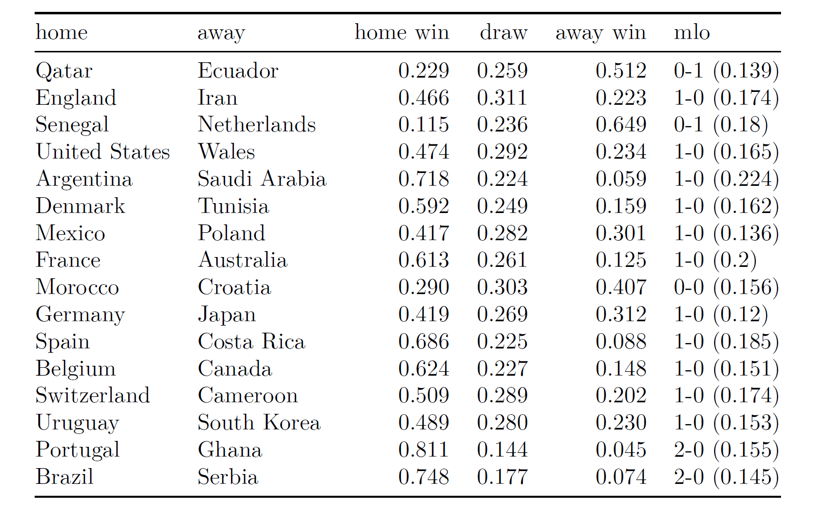
We fitted the model by using HMC sampling, with 4 Markov Chains, 2000 HMC iterations each, checking for their convergence and effective sample sizes. Here there are the posterior predictive matches probabilities for the held-out matches of the Qatar 2022 group stage, played from November 20th to November 24th, along with some ppd ‘chessboard plots’ for the exact outcomes in gray-scale color (‘mlo’ in the table denotes the ‘most likely result’ , whereas darker regions in the plots correspond to more likely results):

Better teams are acknowledged to have higher chances in these first group stage matches:

  • In Portugal-Ghana, Portugal has an estimated winning probability about 81%, whereas in Argentina-Saudi Arabia Argentina has an estimated winning probability about 72%. The match between England and Iran seems instead more balanced, and a similar trend is observed for Germany-Japan. USA is estimated to be ahead in the match against Wales, with a winning probability about 47%.

Some technical notes and model limitations:

  • Keep in mind that ‘home’ and ‘away’ do not mean anything in particular here – the only home team is Qatar! – but they just refer to the first and the second team of the single matches. ‘mlo’ denotes the most likely exact outcome.
  • The posterior predictive probabilities appear to be approximated at the third decimal digit, which could sound a bit ‘bogus’… However, we transparently reported the ppd probabilities as those returned from our package computations.
  • One could use these probabilities for betting purposes, for instance by betting on that particular result – among home win, draw, or away win – for which the model probability exceeds the bookmaker-induced probability. However, we are not responsible for your money loss!
  • Why a diagonal-inflated bivariate Poisson model, and not other models? We developed some sensitivity checks in terms of leave-one-out CV on the training set to choose the best model. Furthermore, we also checked our model in terms of calibration measures and posterior predictive checks.
  • The model incorporates the (rescaled) FIFA ranking as the only predictor. Thus, we do not have many relevant covariates here.
  • We did not distinguish between friendly matches, world cup qualifiers, euro cup qualifiers, etc. in the training data, rather we consider all the data as coming from the same ‘population’ of matches. This data assumption could be poor in terms of predictive performances.
  • We do not incorporate any individual players’-based information in the model, and this also could represent a major limitation.
  • We’ll compute some predictions’ scores – Brier score, pseudo R-squared – to check the predictive power of the model.
  • We’ll fit this model after each stage, by adding the previous matches in the training set and predicting the next matches.

This model is just an approximation for a very complex football tornament. Anyway, we strongly support scientific replication, and for such reason the reports, data, R and RMarkdown codes can be fully found here, in my personal web page. Feel free to play with the data and fit your own model!

And stay tuned for the next predictions in the blog. We’ll add some plots, tables and further considerations. Hopefully, we’ll improve predictive performance as the tournament proceeds.

Circling back to an old Bayesian “counterexample”

Hi everyone! It’s Dan again. It’s been a moment. I’ve been having a lovely six month long holiday as I transition from academia to industry (translation = I don’t have a job yet, but I’ve started to look). It’s been very peaceful. But sometimes I get bored and when I get bored and the weather is rubbish I write a  blog post. I’ve got my own blog now where it’s easier to type maths so most of the things I write about aren’t immediately appropriate for this place.

But this one might be.

It’s on an old example that long-time readers may have come across before. The setup is pretty simple:

We have a categorical covariate x with a large number of levels J. We draw a sample of N data points by first sampling a value of x from a discrete uniform distribution on [1,…,J]Once we have that, we draw a corresponding from a normal distribution with a mean that depends on which category of x we drew.

Because the number of categories is very large, for a reasonably sized sample of data we will still have a lot of categories where there are no observations. This makes it impossible to estimate the conditional means for each category. But we can still estimate the overall mean of y.

Robins and Ritov (and Wasserman) queer the pitch by adding to each sample a random coin flip with a known probability (that differs for each level of x) and only reporting the value of y if that coin shows a head. This is a type of randomization that is pretty familiar in survey sampling. And the standard solution is also pretty familiar–the Horvitz-Thompson estimator is an unbiased estimator of the population mean.

All well and good so far. The thing that Robins, Ritov and Wasserman point out is that the Bayesian estimator will, in finite samples, often be massively biased unless the sampling probabilities are used when setting the priors. Here is Wasserman talking about it. And here is Andrew saying some smart things in response (back in 2012!).

I read this whole discussion back in the day and it never felt very satisfying to me. I was. torn between my instinctive dislike of appeals to purity and my feeling that none of the Bayesian resolutions were very satisfying.

So ten years later I got bored (read: I had covid) and I decided to sketch out my solution using, essentially, MRP. And I think it came out a little bit interesting. Not in a this is surprising sense. Or even as a refutation of anything anyone else has written on this topic. But more it is an example that crystallizes the importance of taking the posterior seriously when you’re doing Bayesian modelling.

The resolution essentially finds the posterior for all of the mean parameters and then uses that as our new information about how the sample was generated. From this we can take our new joint distribution for the covariate, the data, and the ancillary coin and use it to estimate average of an infinite sample. And, shock and horror, when we do that we get something that looks an awful lot like a Horvitz-Thompson estimator. But really, it’s just MRP.

If you’re interested in the resolution, the full post isn’t too long and is here. (Warning: contains some fruity language). I hope you enjoy.

History, historians, and causality

Through an old-fashioned pattern of web surfing of blogrolls (from here to here to here), I came across this post by Bret Devereaux on non-historians’ perceptions of academic history. Devereaux is responding to some particular remarks from economics journalist Noah Smith, but he also points to some more general issues, so these points seem worth discussing.

Also, I’d not previously encountered Smith’s writing on the study of history, but he recently interviewed me on the subjects of statistics and social science and science reform and causal inference so that made me curious to see what was up.

Here’s how Devereaux puts it:

Rather than focusing on converting the historical research of another field into data, historians deal directly with primary sources . . . rather than engaging in very expansive (mile wide, inch deep) studies aimed at teasing out general laws of society, historians focus very narrowly in both chronological and topical scope. It is not rare to see entire careers dedicated to the study of a single social institution in a single country for a relatively short time because that is frequently the level of granularity demanded when you are working with the actual source evidence ‘in the raw.’

Nevertheless as a discipline historians have always11 held that understanding the past is useful for understanding the present. . . . The epistemic foundation of these kinds of arguments is actually fairly simple: it rests on the notion that because humans remain relatively constant situations in the past that are similar to situations today may thus produce similar outcomes. . . . At the same time it comes with a caveat: historians avoid claiming strict predictability because our small-scale, granular studies direct so much of our attention to how contingent historical events are. Humans remain constant, but conditions, technology, culture, and a thousand other things do not. . . .

He continues:

I think it would be fair to say that historians – and this is a serious contrast with many social scientists – generally consider strong predictions of that sort impossible when applied to human affairs. Which is why, to the frustration of some, we tend to refuse to engage counter-factuals or grand narrative predictions.

And he then quotes a journalist, Matthew Yglesias, who wrote, “it’s remarkable — and honestly confusing to visitors from other fields — the extent to which historians resist explicit reasoning about causation and counterfactual analysis even while constantly saying things that clearly implicate these ideas.” Devereaux responds:

We tend to refuse to engage in counterfactual analysis because we look at the evidence and conclude that it cannot support the level of confidence we’d need to have. . . . historians are taught when making present-tense arguments to adopt a very limited kind of argument: Phenomenon A1 occurred before and it resulted in Result B, therefore as Phenomenon A2 occurs now, result B may happen. . . . The result is not a prediction but rather an acknowledgement of possibility; the historian does not offer a precise estimate of probability (in the Bayesian way) because they don’t think accurately calculating even that is possible – the ‘unknown unknowns’ (that is to say, contingent factors) overwhelm any system of assessing probability statistically.

This all makes sense to me. I just want to do one thing, which is to separate two ideas that I think are being conflated here:

1. Statistical analysis: generalizing from observed data to a larger population, a step that can arise in various settings including sampling, causal inference, prediction, and modeling of measurements.

2. Causal inference: making counterfactual statements about what would have happened, or could have happened, had some past decision been made differently, or making predictions about potential outcomes under different choices in some future decision.

Statistical analysis and causal inference are related but are not the same thing.

For example, if historians gather data on public records from some earlier period and then make inference about the distributions of people working at that time in different professions, that’s a statistical analysis but that does not involve causal inference.

From the other direction, historians can think about causal inference and use causal reasoning without formal statistical analysis or probabilistic modeling of data. Back before he became a joke and a cautionary tale of the paradox of influence, historian Niall Ferguson edited a fascinating book, Virtual History: Alternatives and Counterfactuals, a book of essays by historians on possible alternative courses of history, about which I wrote:

There have been and continue to be other books of this sort . . . but what makes the Ferguson book different is that he (and most of the other authors in his book) are fairly rigorous in only considering possible actions that the relevant historical personalities were actually considering. In the words of Ferguson’s introduction: “We shall consider as plausible or probable only those alternatives which we can show on the basis of contemporary evidence that contemporaries actually considered.”

I like this idea because it is a potentially rigorous extension of the now-standard “Rubin model” of causal inference.

As Ferguson puts it,

Firstly, it is a logical necessity when asking questions about causality to pose ‘but for’ questions, and to try to imagine what would have happened if our supposed cause had been absent.

And the extension to historical reasoning is not trivial, because it requires examination of actual historical records in order to assess which alternatives are historically reasonable. . . . to the best of their abilities, Ferguson et al. are not just telling stories; they are going through the documents and considering the possible other courses of action that had been considered during the historical events being considered. In addition to being cool, this is a rediscovery and extension of statistical ideas of causal inference to a new field of inquiry.

See also here. The point is that it was possible for Ferguson et al. to do formal causal reasoning, or at least consider the possibility of doing it, without performing statistical analysis (thus avoiding the concern that Devereaux raises about weak evidence in comparative historical studies).

Now let’s get back to Devereaux, who writes:

This historian’s approach [to avoid probabilistic reasoning about causality] holds significant advantages. By treating individual examples in something closer to the full complexity (in as much as the format will allow) rather than flattening them into data, they can offer context both to the past event and the current one. What elements of the past event – including elements that are difficult or even impossible to quantify – are like the current one? Which are unlike? How did it make people then feel and so how might it make me feel now? These are valid and useful questions which the historian’s approach can speak to, if not answer, and serve as good examples of how the quantitative or ’empirical’ approaches that Smith insists on are not, in fact, the sum of knowledge or required to make a useful and intellectually rigorous contribution to public debate.

That’s a good point. I still think that statistical analysis can be valuable, even with very speculative sampling and data models, but I agree that purely qualitative analysis is also an important part of how we learn from data. Again, this is orthogonal to the question of when we choose to engage in causal reasoning. There’s no reason for bad data to stop us from thinking causally; rather, the limitations in our data merely restrict the strengths of any causal conclusions we might draw.

The small-N problem

One other thing. Devereaux refers to the challenges of statistical inference: “we look at the evidence and conclude that it cannot support the level of confidence we’d need to have. . . .” That’s not just a problem with the field of history! It also arises in political science and economics, where we don’t have a lot of national elections or civil wars or depressions, so generalizations necessarily rely on strong assumptions. Even if you can produce a large dataset with thousands of elections or hundreds of wars or dozens of business cycles, any modeling will implicitly rely on some assumption of stability of a process over time, and assumption that won’t necessarily make sense given changes in political and economic systems.

So it’s not really history versus social sciences. Rather, I think of history as one of the social sciences (as in my book with Jeronimo from a few years back), and they all have this problem.

The controversy

After writing all the above, I clicked through the link and read the post by Smith that Devereaux was arguing.

And here’s the funny thing. I found Devereaux’s post to be very reasonable. Then I read Smith’s post, and I found that to be very reasonable too.

The two guys are arguing against each other furiously, but I agree with both of them!

What gives?

As discussed above, I think Devereaux in his post provides an excellent discussion of the limits of historical inquiry. On the other side, I take the main message of Smith’s post to be that, to the extent that historians want to use their expertise to make claims about the possible effects of recent or new policies, they should think seriously about statistical inference issues. Smith doesn’t just criticizes historians here; he leads off by criticizing academic economists:

After having endured several years of education in that field, I [Smith] was exasperated with the way unrealistic theories became conventional wisdom and even won Nobel prizes while refusing to submit themselves to rigorous empirical testing. . . . Though I never studied history, when I saw the way that some professional historians applied their academic knowledge to public commentary, I started to recognize some of the same problems I had encountered in macroeconomics. . . . This is not a blanket criticism of the history profession . . . All I am saying is that we ought to think about historians’ theories with the same empirically grounded skepticism with which we ought to regard the mathematized models of macroeconomics.

By saying that I found both Devereaux and Smith to be reasonable, I’m not claiming they have no disagreements. I think their main differences come because they’re focusing on two different things. Smith’s post is ultimately about public communication and the things that academic say in the public discourse (things like newspaper op-eds and twitter posts) with relevance to current political disputes. And, for that, we need to consider the steps, implicit or explicit, that commentators take to go from their expertise to the policy claims they make. Devereaux is mostly writing about academic historians in their professional roles. With rare exceptions, academic history is about getting the details right, and even popular books of history typically focus on what happened, and our uncertainty about what happened, not on larger theories.

I guess I do disagree with this statement from Smith:

The theories [from academic history] are given even more credence than macroeconomics even though they’re even less empirically testable. I spent years getting mad at macroeconomics for spinning theories that were politically influential and basically un-testable, then I discovered that theories about history are even more politically influential and even less testable.

Regarding the “less testable” part, I guess it depends on the theories—but, sure, many theories about what have happened in the past can be essentially impossible to test, if conditions have changed enough. That’s unavoidable. As Devereaux replies, this is not a problem with the study of history; it’s just the way things are.

But I can’t see how Smith could claim with a straight face that theories from academic history are “given more credence” and are “more politically influential” than macroeconomics. The president has a council of economic advisers, there are economists at all levels of the government, or if you want to talk about the news media there are economists such as Krugman, Summers, Stiglitz, etc. . . . sure, they don’t always get what they want when it comes to policy, but they’re quoted endlessly and given lots of credence. This is also the case in narrower areas, for example James Heckman on education policy or Angus Deaton on deaths of despair: these economists get tons of credence in the news media. There are no academic historians with that sort of influence. This has come up before: I’d say that economics now is comparable to Freudian psychology in the 1950s in its influence on our culture:

My best analogy to economics exceptionalism is Freudianism in the 1950s: Back then, Freudian psychiatrists were on the top of the world. Not only were they well paid, well respected, and secure in their theoretical foundations, they were also at the center of many important conversations. Even those people who disagreed with them felt the need to explain why the Freudians were wrong. Freudian ideas were essential, leaders in that field were national authorities, and students of Freudian theory and methods could feel that they were initiates in a grand tradition, a priesthood if you will. Freudians felt that, unlike just about everybody else, they treated human beings scientifically and dispassionately. What’s more, Freudians prided themselves on their boldness, their willingness to go beyond taboos to get to the essential truths of human nature. Sound familiar?

When it comes to influence in policy or culture or media, academic history doesn’t even come close to Freudianism in the 1950s or economics in recent decades.

This is not to say we should let historians off the hook when they make causal claims or policy recommendations. We shouldn’t let anyone off the hook. In that spirit, I appreciate Smith’s reminder of the limits of historical theories, along with Devereaux’s clarification of what historians really do when they’re doing academic history (as opposed to when they’re slinging around on twitter).

Why write about this at all?

As a statistician and political scientist, I’m interested in issues of generalization from academic research to policy recommendations. Even in the absence of any connection with academic research, people will spin general theories—and one problem with academic research is that it can give researchers, journalists, and policymakers undue confidence in bad theories. Consider, for example, the examples of junk science promoted over the years by the Freakonomics franchise. So I think these sorts of discussions are important.

Some concerns about the recent Chetty et al. study on social networks and economic inequality, and what to do next?

I happened to receive two different emails regarding a recently published research paper.

Dale Lehman writes:

Chetty et al. (and it is a long et al. list) have several publications about social and economic capital (see here for one such paper, and here for the website from which the data can also be accessed). In the paper above, the data is described as:

We focus on Facebook users with the following attributes: aged between 25 and 44 years who reside in the United States; active on the Facebook platform at least once in the previous 30 days; have at least 100 US-based Facebook friends; and have a non-missing residential ZIP code. We focus on the 25–44-year age range because its Facebook usage rate is greater than 80% (ref. 37). On the basis of comparisons to nationally representative surveys and other supplementary analyses, our Facebook analysis sample is reasonably representative of the national population.

They proceed to measure social and economic connectedness across counties, zip codes, and for graduates of colleges and high schools. The data is massive as is the effort to make sense out of it. In many respects it is an ambitious undertaking and one worthy of many kudos.

But I [Lehman] do have a question. Given their inclusion criteria, I wonder about selection bias when comparing counties, zip codes, colleges, or high schools. I would expect that the fraction of Facebook users – even in the targeted age group – that are included will vary across these segments. For example, one college may have many more of its graduates who have that number of Facebook friends and have used Facebook in the prior 30 days compared with a second college. Suppose the economic connectedness from the first college is greater than from the second college. But since the first college has a larger proportion of relatively inactive Facebook users, is it fair to describe college 1 as having greater connectedness?

It seems to me that the selection criteria make the comparisons potentially misleading. It might be accurate to say that the regular users of Facebook from college 1 are more connected than those from college 2, but this may not mean that the graduates from college 1 are more connected than the graduates from college 2. I haven’t been able to find anything in their documentation to address the possible selection bias and I haven’t found anything that mentions how the proportion of Facebook accounts that meet their criteria varies across these segments. Shouldn’t that be addressed?

That’s an interesting point. Perhaps one way to address it would be to preprocess the data by estimating a propensity to use facebook and then using this propensity as a poststratification variable in the analysis. I’m not sure. Lehman makes a convincing case that this is a concern when comparing different groups; that said, it’s the kind of selection problem we have all the time, and typically ignore, with survey data.

Richard Alba writes in with a completely different concern:

You may be aware of the recent research, published in Nature by the economist Raj Chetty and colleagues, purporting to show that social capital in the form of early-life ties to high-status friends provides a powerful pathway to upward mobility for low-status individuals. It has received a lot of attention, from The New York Times, Brookings, and no doubt other places I am not aware of.

In my view, they failed to show anything new. We have known since the 1950s that social capital has a role in mobility, but the evidence they develop about its great power is not convincing, in part because they fail to take into account how their measure of social capital, the predictor, is contaminated by the correlates and consequences of mobility, the outcome.

This research has been greeted in some media as a recipe for the secret sauce of mobility, and one of their articles in Nature (there are two published simultaneously) is concerned with how to increase social capital. In other words, the research is likely to give rise to policy proposals. I think it is important then to inform Americans about its unacknowledged limitations.

I sent my critique to Nature, and it was rejected because, in their view, it did not sufficiently challenge the articles’ conclusions. I find that ridiculous.

I have no idea how Nature decides what critiques to publish, and I have not read the Chetty et al. articles so I can’t comment on theme either, but I can share Alba’s critique. Here it is:

While the pioneering big-data research of Raj Chetty and his colleagues is transforming the long-standing stream of research into social mobility, their findings should not be exempt from critique.

Consider in this light the recent pair of articles in Nature, in which they claim to have demonstrated a powerful causal connection between early-life social capital and upward income mobility for individuals growing up in low-income families. According to one paper’s abstract, “the share of high-SES friends among individuals with low-SES—which we term economic connectedness—is among the strongest predictors of upward income mobility identified to date.”

But there are good reasons to doubt that this causal connection is as powerful as the authors claim. At a minimum, the social capital-mobility statistical relationship is significantly overstated.

This is not to deny a role for social capital in determining adult socioeconomic position. That has been well established for decades. As early as the 1950s, the Wisconsin mobility studies focused in part on what the researchers called “interpersonal influence,” measured partly in terms of high-school friends, an operationalization close to the idea in the Chetty et al. article. More generally, social capital is indisputably connected to labor-market position for many individuals because of the role social networks play in disseminating job information.

But these insights are not the same as saying that economic connectedness, i.e., cross-class ties, is the secret sauce in lifting individuals out of low-income situations. To understand why the articles’ evidence fails to demonstrate this, it is important to pay close attention to how the data and analysis are constructed. Many casual readers, who glance at the statements like the one above or read the journalistic accounts of the research (such as the August 1 article in The New York Times), will take away the impression that the researchers have established an individual-level relationship—that they have proven that individuals from low-SES families who have early-life cross-class relationships are much more likely to experience upward mobility. But, in fact, they have not.

Because of limitations in their data, their analysis is based on the aggregated characteristics of areas—counties and zip codes in this case—not individuals. This is made necessary because they cannot directly link the individuals in their main two sources of data—contemporary Facebook friendships and previous estimates by the team of upward income mobility from census and income-tax data. Hence, the fundamental relationship they demonstrate is better stated as: the level of social mobility is much higher in places with many cross-class friendships. The correlation, the basis of their analysis, is quite strong, both at the county level (.65) and at the zip-code level (.69).

Inferring that this evidence demonstrates a powerful causal mechanism linking social capital to the upward mobility of individuals runs headlong into a major problem: the black box of causal mechanisms at the individual level that can lie behind such an ecological correlation, where moreover both variables are measured for roughly the same time point. The temptation may be to think that the correlation reflects mainly, or only, the individual-level relationship between social capital and mobility as stated above. However, the magnitude of an area-based correlation may be deceptive about the strength of the correlation at the individual level. Ever since a classic 1950 article by W. S. Robinson, it has been known that ecological correlations can exaggerate the strength of the individual-level relationship. Sometimes the difference between the two is very large, and in the case of the Chetty et al. analysis it appears impossible given the data they possess to estimate the bias involved with any precision, because Robinson’s mathematics indicates that the individual-level correlations within area units are necessary to the calculation. Chetty et al. cannot calculate them.

A second aspect of the inferential problem lies in the entanglement in the social-capital measure of variables that are consequences or correlates of social mobility itself, confounding cause and effect. This risk is heightened because the Facebook friendships are measured in the present, not prior to the mobility. Chetty et al. are aware of this as a potential issue. In considering threats to the validity of their conclusion, they refer to the possibility of “reverse causality.” What they have in mind derives from an important insight about mobility—mobile individuals are leaving one social context for another. Therefore, they are also leaving behind some individuals, such as some siblings, cousins, and childhood buddies. These less mobile peers, who remain in low-SES situations but have in their social networks others who are now in high-SES ones, become the basis for the paper’s Facebook estimate of economic connectedness (which is defined from the perspective of low-SES adults between the ages of 25 and 44). This sort of phenomenon will be frequent in high-mobility places, but it is a consequence of mobility, not a cause. Yet it almost certainly contributes to the key correlation—between economic connectedness and social mobility—in the way the paper measures it.

Chetty et al. try to answer this concern with correlations estimated from high-school friendships, arguing that the timing purges this measure of mobility’s impact on friendships. The Facebook-based version of this correlation is noticeably weaker than the correlations that the paper emphasizes. In any event, demonstrating a correlation between teen-age economic connectedness and high mobility does not remove the confounding influence of social mobility from the latter correlations, on which the paper’s argument depends. And in the case of high-school friendships, too, the black-box nature of the causality behind the correlation leaves open the possibility of mechanisms aside from social capital.

This can be seen if we consider the upward mobility of the children of immigrants, surely a prominent part today of the mobility picture in many high-mobility places. Recently, the economists Ran Abramitzky and Leah Boustan have reminded us in their book Streets of Gold that, today as in the past, the children of immigrants, the second generation, leap on average far above their parents in any income ranking. Many of these children are raised in ambitious families, where as Abramitzky and Boustan put it, immigrants typically are “under-placed” in income terms relative to their abilities. Many immigrant parents encourage their children to take advantage of opportunities for educational advancement, such as specialized high schools or advanced-placement high-school classes, likely to bring them into contact with peers from more advantaged families. This can create social capital that boosts the social mobility of the second generation, but a large part of any effect on mobility is surely attributable to family-instilled ambition and to educational attainment substantially higher than one would predict from parental status. The increased social capital is to a significant extent a correlate of on-going mobility.

In sum, there is without doubt a causal linkage between social capital and mobility. But the Chetty et al. analysis overstates its strength, possibly by a large margin. To twist the old saw about correlation and causation, correlation in this case isn’t only causation.

I [Alba] believe that a critique is especially important in this case because the findings in the Chetty et al. paper create an obvious temptation for the formulation of social policy. Indeed, in their second paper in Nature, the authors make suggestions in this direction. But before we commit ourselves to new anti-poverty policies based on these findings, we need a more certain gauge of the potential effectiveness of social capital than the current analysis can give us.

I get what Alba is saying about the critique not strongly challenging the article’s conclusions. He’s not saying that Chetty et al. are wrong; it’s more that he’s saying there are a lot of unanswered questions here—a position I’m sure Chetty et al. would themselves agree with!

A possible way forward?

To step back a moment—and recall that I have not tried to digest the Nature articles or the associated news coverage—I’d say that Alba is criticizing a common paradigm of social science research in which a big claim is made from a study and the study has some clear limitations, so the researchers attack the problem in some different ways in an attempt to triangulate toward a better understanding.

There are two immediate reactions I’d like to avoid. The first is to say that the data aren’t perfect, the study isn’t perfect, so we just have to give up and say we’ve learned nothing. On the other direction is the unpalatable response that all studies are flawed so we shouldn’t criticize this one in particular.

Fortunately, nobody is suggesting either of these reactions. From one direction, critics such as Lehman and Alba are pointing out concerns but they’re not saying the conclusions of the Chetty et al. study are all wrong of that the study is useless; from the other, news reports do present qualifiers and they’re not implying that these results are a sure thing.

What we’d like here is a middle way—not just a rhetorical middle way (“This research, like all social science, has weaknesses and threats to validity, hence the topic should continue to be studied by others”) but a procedural middle way, a way to address the concerns, in particular to get some estimates of the biases in the conclusions resulting from various problems with the data.

Our default response is to say the data should be analyzed better: do a propensity analysis to address Lehman’s concern about who’s on facebook, and do some sort of multilevel model integrating individual and zipcode-level data to address Alba’s concern about aggregation. And this would all be fine, but it takes a lot of work—and Chetty et al. already did a lot of work, triangulating toward their conclusion from different directions. There’s always more analysis that could be done.

Maybe the problem with the triangulation approach is not the triangulation itself but rather the way it can be set up with a central analysis making a conclusion, and then lots of little studies (“robustness checks,” etc.) designed to support the main conclusion. What if the other studies were set up to estimate biases, with the goal not of building confidence in the big number but rather of getting a better, more realistic, estimate.

With this in mind, I’m thinking that a logical next step would be to construct a simulation study to get a sense of the biases arising from the issues raised by Lehman and Alba. We can’t easily gather the data required to know what these biases are, but it does seem like it should be possible to simulate a world in which different sorts of people are more or less likely to be on facebook, and in which there are local patterns of connectedness that are not simply what you’d get by averaging within zipcodes.

I’m not saying this would be easy—the simulation would have to make all sorts of assumptions about how these factors vary, and the variation would need to depend on relevant socioeconomic variables—but right now it seems to me to be a natural next step in the research.

One more thing

Above I stressed the importance and challenge of finding a middle ground between (1) saying the study’s flaws make it completely useless and (2) saying the study represents standard practice so we should believe it.

Sometimes, though, response #1 is appropriate. For example, the study of beauty and sex ratio or the study of ovulation and voting or the study claiming that losing an election for governor lops 5 to 10 years off your life—I think those really are useless (except as cautionary tales, lessons of research practices to avoid). How can I say this? Because those studies are just soooo noisy compared to any realistic effect size. There’s just no there there. Researchers can fool themselves because the think that if they have hundreds or thousands of data points, that they’re cool, and that if they have statistical significance, they’ve discovered something. We’ve talked about this attitude before, and I’ll talk about again; I just wanted to emphasize here that it doesn’t always make sense to take the middle way. Or, to put it another way, sometimes the appropriate middle way is very close to one of the extreme positions.

Bayesian inference continues to completely solve the multiple comparisons problem

Erik van Zwet writes:

I saw you re-posted your Bayes-solves-multiple-testing demo. Thanks for linking to my paper in the PPS! I think it would help people’s understanding if you explicitly made the connection with your observation that Bayesians are frequentists:

What I mean is, the Bayesian prior distribution corresponds to the frequentist sample space: it’s the set of problems for which a particular statistical model or procedure will be applied.

Recently Yoav Benjamini criticized your post (the 2016 edition) in section 5.5 of his article/blog “Selective Inference: The Silent Killer of Replicability.”

Benjamini’s point is that your simulation results break down completely if the true prior is mixed ever so slightly with a much wider distribution. I think he has a valid point, but I also think it can be fixed. In my opinion, it’s really a matter of Bayesian robustness; the prior just needs a flatter tail. This is a much weaker requirement than needing to know the true prior. I’m attaching an example where I use the “wrong” tail but still get pretty good results.

In his document, Zwet writes:

This is a comment on an article by Yoav Benjamini entitled “Selective Inference: The Silent Killer of Replicability.”

I completely agree with the main point of the article that over-optimism due to selection (a.k.a. the winner’s curse) is a major problem. One important line of defense is to correct for multiple testing, and this is discussed in detail.

In my opinion, another important line of defense is shrinkage, and so I was surprised that the Bayesian approach is dimissed rather quickly. In particular, a blog post by Andrew Gelman is criticized. The post has the provocative title: “Bayesian inference completely solves the multiple comparisons problem.”

In his post, Gelman samples “effects” from the N(0,0.5) distribution and observes them with standard normal noise. He demonstrates that the posterior mean and 95% credible intervals continue to perform well under selection.

In section 5.5 of Benjamini’s paper the N(0,0.5) is slightly perturbed by mixing it with N(0,3) with probability 1/1000. As a result, the majority of the credibility intervals that do not cover zero come from the N(0,3) component. Under the N(0,0.5) prior, those intervals get shrunken so much that they miss the true parameter.

It should be noted, however, that those effects are so large that they are very unlikely under the N(0,0.5) prior. Such “data-prior conflict” can be resolved by having a prior with a flat tail. This is a matter of “Bayesian robustness” and goes back to a paper by Dawid which can be found here.

Importantly, this does not mean that we need to know the true prior. We can mix the N(0,0.5) with almost any wider normal distribution with almost any probability and then very large effects will hardly be shrunken. Here, I demonstrate this by usin the mixture 0.99*N(0,0.5)+0.01*N(0,6) as prior. This is quite far from the truth, but nevertheless, the posterior inference is quite acceptable. We find that among one million simulations, there are 741 credible intervals that do not cover zero. Among those, the proportion that do not cover the parameter is 0.07 (CI: 0.05 to 0.09).

The point is that the procedure merely needs to recognize that a particular observation is unlikely to come from N(0,0.5), and then apply very little shrinkage.

My own [Zwet’s] views on shrinkage in the context of the winner’s curse are here. In particular, a form of Bayesian robustness is discussed in section 3.4 of a preprint of myself and Gelman here. . . .

He continues with some simulations that you can do yourself in R.

The punch line is that, yes, the model makes a difference, and when you use the wrong model you’ll get the wrong answer (i.e., you’ll always get the wrong answer). This provides ample scope for research on robustness: how wrong are your answers, depending on how wrong is your model? This arises with all statistical inferences, and there’s no need in my opinion to invoke any new principles involving multiple comparisons. I continue to think that (a) Bayesian inference completely solves the multiple comparisons problem, and (b) all inferences, Bayesian included, are imperfect.

“Published estimates of group differences in multisensory integration are inflated”

Mike Beauchamp sends in the above picture of Buster (“so-named by my son because we adopted him as a stray kitten run over by a car and ‘all busted up'”) sends along this article (coauthored with John F. Magnotti) “examining how the usual suspects (small n, forking paths, etc.) had led our little sub-field of psychology/neuroscience, multisensory integration, astray.” The article begins:

A common measure of multisensory integration is the McGurk effect, an illusion in which incongruent auditory and visual speech are integrated to produce an entirely different percept. Published studies report that participants who differ in age, gender, culture, native language, or traits related to neurological or psychiatric disorders also differ in their susceptibility to the McGurk effect. These group-level differences are used as evidence for fundamental alterations in sensory processing between populations. Using empirical data and statistical simulations tested under a range of conditions, we show that published estimates of group differences in the McGurk effect are inflated when only statistically significant (p < 0.05) results are published [emphasis added]. With a sample size typical of published studies, a group difference of 10% would be reported as 31%. As a consequence of this inflation, follow-up studies often fail to replicate published reports of large between-group differences. Inaccurate estimates of effect sizes and replication failures are especially problematic in studies of clinical populations involving expensive and time-consuming interventions, such as training paradigms to improve sensory processing. Reducing effect size inflation and increasing replicability requires increasing the number of participants by an order of magnitude compared with current practice.

Type M error!

How much should we trust assessments in systematic reviews? Let’s look at variation among reviews.

Ozzy Tunalilar writes:

I increasingly notice these “risk of bias” assessment tools (e.g., Cochrane) popping up in “systematic reviews” and “meta-analysis” with the underlying promise that they will somehow guard against unwarranted conclusions depending on, perhaps, the degree of bias. However, I also noticed multiple published systematic reviews referencing, using, and evaluating the same paper (Robinson et al 2013; it could probably have been any other paper). Having noticed that, I compiled the risk of bias assessment by multiple papers on the same paper. My “results” are above – so much variation across studies that perhaps we need to model the assessment of risk of bias in review of systematic reviews. What do you think?

My reply: I don’t know! I guess some amount of variation is expected, but this reminds me of a general issue in meta-analysis that different studies will have different populations, different predictors, different measurement protocols, different outcomes, etc. This seems like even more of a problem, now that thoughtless meta-analysis has become such a commonly-used statistical tool, to the extent that there seem to be default settings and software that can even be used by both sides of a dispute.

Multilevel Regression and Poststratification Case Studies

Juan Lopez-Martin, Justin Phillips, and I write:

The following case studies intend to introduce users to Multilevel Modeling and Poststratification (MRP) and some of its extensions, providing reusable code and clear explanations. The first chapter presents MRP, a statistical technique that allows to estimate subnational estimates from national surveys while adjusting for nonrepresentativeness. The second chapter extends MRP to overcome the limitation of only using variables included in the census. The last chapter develops a new approach that combines MRP with an ideal point model, allowing to obtain subnational estimates of latent attitudes based on multiple survey questions and improving the subnational estimates for an individual survey item based on other related items.

These case studies do not display some non-essential code, such as the ones used to generate figures and tables. However, all the code and data is available on the corresponding GitHub repo.

The tutorials assume certain familiarity with R and Bayesian Statistics. A good reference to the required background is Gelman, Hill, and Vehtari (2020). Additionally, multilevel models are covered in Gelman and Hill (2006) (Part 2A) or McElreath (2020) (Chapters 12 and 13).

The case studies are still under development. Please send any feedback to [email protected].

This is the document I point people to when they ask how to do Mister P. Here are the sections:

Chapter 1: Introduction to Mister P

1.1 Data
1.2 First stage: Estimating the Individual-Response Model
1.3 Second Stage: Poststratification
1.4 Adjusting for Nonrepresentative Surveys
1.5 Practical Considerations
1.6 Appendix: Downloading and Processing Data

Chapter 2: MRP with Noncensus Variables
2.1 Model-based Extension of the Poststratification Table
2.2 Adjusting for Nonresponse Bias
2.3 Obtaining Estimates for Non-census Variable Subgroups

Chapter 3: Ideal Point MRP
3.1 Introduction and Literature
3.2 A Two-Parameter IRT Model with Latent Multilevel Regression
3.3 The Abortion Opposition Index for US States
3.4 Estimating Support for Individual Questions
3.5 Concluding Remarks
3.6 Appendix: Stan Code

This should be useful to a lot of people.