Wow—those are some really bad referee reports!

Dale Lehman writes:

I missed this recent retraction but the whole episode looks worth your attention. First the story about the retraction.

Here are the referee reports and authors responses.

And, here is the author’s correspondence with the editors about retraction.

The subject of COVID vaccine safety (or lack thereof) is certainly important and intensely controversial. The study has some fairly remarkable claims (deaths due to the vaccines numbering in the hundreds of thousands). The peer reviews seem to be an exemplary case of your statement that “the problems with peer review are the peer reviewers). The data and methodology used in the study seem highly suspect to me – but the author appears to respond to many challenges thoughtfully (even if I am not convinced) and raises questions about the editorial practices involved with the retraction.

Here are some more details on that retracted paper.

Note the ethics statement about no conflicts – doesn’t mention any of the people supposedly behind the Dynata organization. Also, I was surprised to find the paper and all documentation still available despite being retracted. It includes the survey instrument. From what I’ve seen, the worst aspect of this study is that it asked people if they knew people who had problems after receiving the vaccine – no causative link even being asked for. That seems like an unacceptable method for trying to infer deaths from the vaccine – and one that the referees should never have permitted.

The most amazing thing about all this was the review reports. From the second link above, we see that the article had two review reports. Here they are, in their entirety:

The first report is an absolute joke, so let’s just look at the second review. The author revised in response to that review by rewriting some things, then the paper was published. At no time were any substantive questions raised.

I also noticed this from the above-linked news article:

“The study found that those who knew someone who’d had a health problem from Covid were more likely to be vaccinated, while those who knew someone who’d experienced a health problem after being vaccinated were less likely to be vaccinated themselves.”

Here’s a more accurate way to write it:

“The study found that those who SAID THEY knew someone who’d had a health problem from Covid were more likely to be SAY THEY WERE vaccinated, while those who SAID THEY knew someone who’d experienced a health problem after being vaccinated were less likely to SAY THEY WERE vaccinated themselves.”

Yes, this is sort of thing arises with all survey responses, but I think the subjectivity of the response is much more of a concern here than in a simple opinion poll.

The news article, by Stephanie Lee, makes the substantive point clearly enough:

This methodology for calculating vaccine-induced deaths was rife with problems, observers noted, chiefly that Skidmore did not try to verify whether anyone counted in the death toll actually had been vaccinated, had died, or had died because of the vaccine.

Also this:

Steve Kirsch, a veteran tech entrepreneur who founded an anti-vaccine group, pointed out that the study had the ivory tower’s stamp of approval: It had been published in a peer-reviewed scientific journal and written by a professor at Michigan State University. . . .

In a sympathetic interview with Skidmore, Kirsch noted that the study had been peer-reviewed. “The journal picks the peer reviewers … so how can they complain?” he said.

Ultimately the responsibility for publishing a misleading article falls upon the article’s authors, not upon the journal. You can’t expect or demand careful reviews from volunteer reviewers, nor can you expect volunteer journal editors to carefully vet every paper they will publish. Yes, the peer reviews for the above-discussed paper were useless—actually worse than useless, in that they gave a stamp of approval to bad work—but you can’t really criticize the reviewers for “not doing their jobs,” given that reviewing is not their job—they’re doing it for free.

Anyway, it’s a good thing that the journal shared the review reports so we can see how useless they were.

“Wait, is everybody wearing glasses nowadays?”

Paul Alper points to this fun news article by Andrew Van Dam, who runs the “Department of Data” column for the Washington Post. Van Dam writes:

According to our analysis of more than 110,000 responses to the National Health Interview Survey conducted by the Census Bureau on behalf of the National Center for Health Statistics, 62 percent of respondents said they donned some form of corrective eyewear in a recent three year-period. . . .

The ubiquity of eyeglasses in your personal universe will change depending on whether you’re hanging out with young legal workers (ages 25 to 39) or your friends who work in agriculture or construction. That’s because the legal workers are more than twice as likely to wear glasses.

What’s actually going on here? If good vision is hereditary, as we assume, how could your occupation determine your need for vision correction? . . . we called eye-data expert Bonnielin Swenor, director of the Johns Hopkins Disability Health Research Center. Swenor pointed us to her friend and colleague, Johns Hopkins Wilmer Eye Institute pediatric ophthalmologist and researcher Megan Collins, who appears to know everything about eyeballs. . . .

It turns out that, yes, myopia [nearsightedness] is on the march. In a 2009 JAMA Ophthalmology publication, National Institutes of Health ophthalmologists found that the prevalence of myopia had increased from 25 percent of the population age 12 to 54 in 1971 and 1972 to 42 percent of people in that age range in 1999 to 2004. The study was based on thousands of physical exams conducted for the National Health and Nutrition Examination Survey. . . .

Swenor and Collins explain that while kids may not have changed, the world around them sure has. And key changes in the way kids grow up — many associated with urban living and consumer technology — have been hard on the eyes. . . . According to a review of myopia research, spending time outdoors is one of the best things a kid can do for healthy eye growth. . . . Outdoor light may help your eyes grow, and being outside gives your eyeballs more opportunities to flex their muscles by focusing on distant objects. While data is surprisingly scarce, available evidence suggests kids may spend less time outdoors than they did a generation or two ago. . . .

Myopia has risen even more rapidly in East Asia, where countries have attempted sweeping remedies. A program in Taiwan, for example, encouraged students to participate in two hours of outdoor activity every day. After it began in 2010, researchers found in the journal Ophthalmology, Taiwan’s long rise in myopia went into reverse.

People also are more educated today, and many studies find that the more education you have, the more likely you are to be myopic. That correlation, of course, is probably related to the first two factors: To get a diploma or degree, you’ll probably spend more time indoors studying. . . . Education gaps often accompany much of the difference in myopia — and thus the glasses gap — among groups: Women are more likely to wear glasses than men. High earners are more likely to wear glasses than low earners. And Asian and White Americans are more likely to wear glasses than their Black and Hispanic compatriots.

Of course, myopia is not the only reason a more-educated person might be more likely to wear glasses. “There are a number of other factors that may be at play too,” Collins said, “including cost of eyeglasses, access to vision care, health literacy, or trust in the health-care system.” More educated Americans are also more likely to be doing jobs that require near work, such as typing or reading, and thus more likely to don reading glasses to compensate for the slow advance of presbyopia.

While myopia is an easily corrected annoyance for many of us, Swenor says its rising prevalence is also a bona fide public health issue. When the eyeball elongates, the stretching can damage the wall of your retina and cause permanent, non-correctible vision loss such as myopic macular degeneration. . . .

This is just great, an exemplar of newspaper science writing. Let me count the ways:

1. Lots of data graphics

2. Quotes with outside experts

3. This: “While data is surprisingly scarce, available evidence suggests . . .” I looooove this recognition of uncertainty.

This was so great that I added Van Dam’s column to our Blogs We Read page.

Ritogel: Bandar Togel Online Terpercaya untuk Pengalaman Bertaruh yang Aman dan Menyenangkan

Dalam dunia perjudian online, kepercayaan dan keamanan merupakan dua aspek penting yang selalu dicari oleh para pemain. Ritogel, sebagai bandar togel online terpercaya, hadir untuk menjawab kebutuhan tersebut. Dengan komitmen untuk menyediakan lingkungan bertaruh yang aman dan adil, Ritogel telah menjadi destinasi utama bagi para penggemar togel di seluruh dunia.

(again) why I don’t like to talk so much about “p-hacking.” But sometimes the term is appropriate!

Part 1

Jonathan Falk points us to this parody article that has suggestions on how to p-hack.

I replied that I continue to be bothered by the term “p-hacking.” Sometimes it applies very clearly (as in the work of Brian Wansink, although it’s a mystery why he felt the need to p-hack given that it seems that his data could never have existed as reported), but other times there is no “hacking” going on. So I prefer the term forking paths.

Two things going on here:

1. Saying “p-hacking” when it’s forking paths is uncharitable, as it implies active “hacking” when it can well be that researchers are just following the data in what seems like a reasonable way.

2. Bad researchers looove to conflate the professional and the personal. Say they’re p-hacking and they’ll get in a huff: “Who are you to accuse me of misconduct??”, etc. Say they have forking paths and you remove, or at least, reduce, that argument. OK, in real life, yeah, people will say, “Who are you to accuse me of forking paths?”, but forking paths is just a thing that happens, an inevitable result of data processing and analysis plans that were not decided ahead of time.

So, yeah, humor aside, I don’t like the p-hacking talk, for similar reasons to my not liking the “file drawer” thing: in both cases, the focus on a specific mechanism can serve to minimize the real problem, to conflate scientific mistakes with intentional misconduct, and to provide an easy out for many practitioners of bad science who don’t seem to realize that honesty and transparency are not enuf.

Falk responds:

I agree completely with that.

But honestly, I feel like both the garden of forking paths and p-hacking are just versions of Bitcoin’s Proof of Work method. You get rewards for showing how much effort you had to go to get SIGNIFICANCE. If you have a study with a p-value on your first try of 1e-8, people will say “But that result was obvious! Why do they even bother with a test?” If you garden-of-forking-paths or p-hack your way to 0.047, you will be credited for your perspicacity.

Part 2

Ethan Steinberg writes:

I just came across an article that will probably be interesting to you and your readers. Back in 2022, the Florida Surgeon General released a report that the COVID vaccine appeared to be statistically significantly correlated with cardiac arrest “In the 28 days following vaccination, a statistically significant increase in cardiac-related deaths was detected for the entire study population (RI = 1.07, 95% CI = 1.03 – 1.12).” is the full report.

This was then used to recommend against COVID vaccines for young men in particular.

A local Florida paper just obtained and released the original versions of the reports:

Here are the drafts, from first to last.

The TLDR is that the original analysis did not find significant increases in cardiac related deaths. They had to go through a lot of analysis variants / drafts to get the result they were looking for.

I guess the real question here is how this could be avoided in the future. Maybe we should expect public health officials to register their analysis in advance?

I don’t think we should ask public health officials to register their analysis in advance, as that just seems like more of a mess. But in any case the above seems like an example where there really was p-hacking.

P.S. Just to clarify: As always, the problem is not with the “hacking”—looking at data in many different ways—but rather in only reporting some small subset of the analyses. It’s fine to go through a lot of analyses of the data; then, you should publish all of it, or publish a single analysis that incorporates all of what you’ve done using multilevel modeling.

A message to Parkinson’s Disease researchers: Design a study to distinguish between these two competing explanations of the fact that the incidence of Parkinson’s is lower among smokers

After reading our recent post, “How to quit smoking, and a challenge to currently-standard individualistic theories in social science,” Gur Huberman writes:

You may be aware that the incidence of Parkinson (PD) is lower in the smoking population than in the general population, and that negative relation is stronger for the heavier & longer duration smokers.

The reason for that is unknown. Some neurologists conjecture that there’s something in smoked tobacco which causes some immunity from PD. Other conjecture that whatever causes PD also helps people quit or avoid smoking. For instance, a neurologist told me that Dopamine (the material whose deficit causes PD) is associated with addiction not only to smoking but also to coffee drinking.

Your blog post made me think of a study that will try to distinguish between the two explanations for the negative relation between smoking and PD. Such a study will exploit variations (e.g., in geography & time) between the incidence of smoking and that of PD.

It will take a good deal of leg work to get the relevant data, and a good deal of brain work to set up a convincing statistical design. It will also be very satisfying to see convincing results one way or the other. More than satisfying, such a study could help develop medications to treat or prevent PD.

If this project makes sense perhaps you can bring it to the attention of relevant scholars.

OK, here it is. We’ll see if anyone wants to pick this one up.

I have some skepticism about Gur’s second hypothesis, that “whatever causes PD also helps people quit or avoid smoking.” I say this only because, from my perspective, and as discussed in the above-linked post, the decision to smoke seems like much more of a social attribute than an individual decision. But, sure, I could see how there could be correlations.

In any case, it’s an interesting statistical question as well as an important issue in medicine and public health, so worth thinking about.

How to quit smoking, and a challenge to currently-standard individualistic theories in social science

Paul Campos writes:

Probably the biggest public health success in America over the past half century has been the remarkably effective long-term campaign to reduce cigarette smoking. The percentage of adults who smoke tobacco has declined from 42% in 1965 (the first year the CDC measured this), to 12.5% in 2020.

It’s difficult to disentangle the effect of various factors that have led to this stunning decline of what was once a ubiquitous habit — note that if we exclude people who report having no more than one or two drinks per year, the current percentage of alcohol drinkers in the USA is about the same as the percentage of smokers 60 years ago — but the most commonly cited include:

Anti-smoking educational campaigns

Making it difficult to smoke in public and many private spaces

Increasing prices

Improved smoking cessation treatments, and laws requiring the cost of these to be covered by medical insurance

I would add another factor, which is more broadly cultural than narrowly legal or economic: smoking has become declasse.

This is evident if you look at the relationship between smoking rates and education and income: While 32% of people with a GED smoke, the percentages for holders of four year college degrees and graduate degrees are 5.6% and 3.5% respectively. And while 20.2% of people with household incomes under the $35,000 smoke, 6.2% of people with household incomes over $100,000 do.

All worth noting. Anti-smoking efforts are a big success story, almost such a bit story that it’s easy to forget.

The sharp decline in smoking is a big “stylized fact,” as we say in social science, comparable to other biggies such as the change in acceptance of gay people in the past few decades, and the also-surprising lack of change in attitudes toward abortion.

When we have a big stylized fact like this, we should milk it for as much understanding as we can.

With that in mind, I have a few things to add on the topic:

1. Speaking of stunning, check out these Gallup poll results on rates of drinking alcohol:

At least in the U.S., rich people are much more likely than poor people to drink. That’s the opposite of the pattern with smoking.

2. Speaking of “at least in the U.S.”, it’s my impression that smoking rates have rapidly declined in many other countries too, so in that sense it’s more of a global public health success.

3. Back to the point that we should recognize how stunning this all is: 20 years ago, they banned smoking in bars and restaurants in New York. All at once, everything changed, and you could go to a club and not come home with your clothes smelling like smoke, pregnant women could go places without worrying about breathing it all in, etc. When this policy was proposed and then when it was clear it was really gonna happen, lots of lobbyists and professional contrarians and Debby Downers and free-market fanatics popped up and shouted that the smoking ban would never work, it would be an economic disaster, the worst of the nanny state, bla bla bla. Actually it worked just fine.

4. It’s said that quitting smoking is really hard. Smoking-cessation programs have notoriously low success rates. But some of that is selection bias, no? Some people can quit smoking without much problem, and those people don’t need to try smoking-cessation programs. So the people who do try those programs are a subset that overrepresents people who can’t so easily break the habit.

5. We’re used to hearing the argument that, yeah, everybody knows cigarette smoking causes cancer, but people might want to do it anyway. There’s gotta be some truth to that: smoking relaxes people, or something like that. But also recall what the cigarette executives said, as recounted by historian Robert Proctor:

Philip Morris Vice President George Weissman in March 1954 announced that his company would “stop business tomorrow” if “we had any thought or knowledge that in any way we were selling a product harmful to consumers.” James C. Bowling . . . . Philip Morris VP, in a 1972 interview asserted, “If our product is harmful . . . we’ll stop making it.” Then again in 1997 the same company’s CEO and chairman, Geoffrey Bible, was asked (under oath) what he would do with his company if cigarettes were ever established as a cause of cancer. Bible gave this answer: “I’d probably . . . shut it down instantly to get a better hold on things.” . . . Lorillard’s president, Curtis Judge, is quoted in company documents: “if it were proven that cigarette smoking caused cancer, cigarettes shoudl not be marketed” . . . R. J. Reynolds president, Gerald H. Long, in a 1986 interview asserted that if he ever “saw or thought there were any evidence whatsoever that conclusively proved that, in some way, tobacco was harmful to people, and I believed it in my heart and my soul, then I would get out of the business.”

6. A few years ago we discussed a study of the effects of smoking bans. My thought at the time was: Yes, at the individual level it’s hard to quit smoking, which might give skepticism about the effects of measures designed to reduce smoking—but, at the same time, smoking rates vary a lot by country and by state, This was similar to our argument about the hot hand: given that basketball shooting success rates vary a lot over time and across game conditions, it should not be surprising that previous shots might have an effect. As I wrote awhile ago, “if ‘p’ varies among players, and ‘p’ varies over the time scale of years or months for individual players, why shouldn’t ‘p’ vary over shorter time scales too? In what sense is “constant probability” a sensible null model at all?” Similarly, given how much smoking rates vary, maybe we shouldn’t be surprised that something could be done about it.

7. To me, though, the most interesting thing about the stylized facts on smoking is how there is this behavior that is so hard to change at the individual level but can be changed so much at the national level. This runs counter to currently-standard individualistic theories in social science in which everything is about isolated decisions. It’s more of a synthesis: change came from policy and from culture (whatever that means), but this still had to work its way though individual decisions. This idea of behavior being changed by policy almost sounds like “embodied cognition” or “nudge,” but it feels different to me in being more brute force. Embodied cognition is things like giving people subliminal signals; nudge is things like subtly changing the framing of a message. Here we’re talking about direct education, taxes, bans, big fat warning labels: nothing subtle or clever that the nudgelords would refer to as a “masterpiece.”

Anyway, this idea of changes that can happen more easily at the group or population level than at the individual level, that’s interesting to me. I guess things like this happen all over—“social trends”—and I don’t feel our usual social-science models handle them well. I don’t mean that no models work here, and I’m sure that lots of social scientists done serious work in this area; it just doesn’t seem to quite line up with the usual way we talk about decision making.

P.S. Separate from all the above, I just wanted to remind you that there’s lots of really bad work on smoking and its effects; see here, for example. I’m not saying that all the work is bad, just that I’ve seen some really bad stuff, maybe no surprise what with all the shills on one side and all the activists on the other.

“Evidence-based medicine”: does it lead to people turning off their brains?

Joshua Brooks points us to this post by David Gorski, “The Cochrane mask fiasco: Does EBM predispose to COVID contrarianism?” EBM stands for “evidence-based medicine,” and here’s what Gorski writes:

A week and a half ago, the New York Times published on Opinion piece by Zeynep Tufekci entitled Here’s Why the Science Is Clear That Masks Work. Written in response to a recent Cochrane review, Physical interventions to interrupt or reduce the spread of respiratory viruses, that had over the last month been widely promoted by antimask and antivaccine sources, the article discusses the problems with the review and its lead author Tom Jefferson, as well as why it is not nearly as straightforward as one might assume to measure mask efficacy in the middle of a pandemic due to a novel respiratory virus. Over the month since the review’s publication, its many problems and deficiencies (as well as how it has been unrelentingly misinterpreted) have been discussed widely by a number of writers, academics, and bloggers . . .

My [Gorski’s] purpose in writing about this kerfuffle is not to rehash (much) why the Cochrane review was so problematic. Rather, it’s more to look at what this whole kerfuffle tells us about the Cochrane Collaborative and the evidence-based medicine (EBM) paradigm it champions. . . . I want to ask: What is it about Cochrane and EBM fundamentalists who promote the EBM paradigm as the be-all and end-all of medical evidence, even for questions for which it is ill-suited, that can produce misleading results? . . .

Back in the day, we used to call EBM’s failure to consider the low to nonexistent prior probability as assessed by basic science that magic like homeopathy could work its “blind spot.” Jefferson’s review, coupled with the behavior of EBM gurus like John Ioannidis during the pandemic, made me wonder if there’s another blind spot of EBM that we at SBM have neglected, one that leads to Cochrane reviews like Jefferson’s and leads EBM gurus like Ioannidis to make their heel turns so soon after the pandemic hit . . .

[Regarding the mask report,] perusing the triumphant gloating on social media from ideological sources opposed to COVID-19 interventions, including masks and vaccines, I was struck by how often they used the exact phrase “gold standard” to portray Cochrane as an indisputable source, all to bolster their misrepresentation. . . .

Gorski continues:

I’ve noticed over the last three years a tendency for scientists who were known primarily before the pandemic as strong advocates of evidence-based medicine (EBM), devolving into promoters of COVID-19 denial, antimask, anti-public health, and even antivaccine pseudoscience. Think Dr. John Ioannidis, whom I used to lionize before 2020. Think Dr. Vinay Prasad, of whose work on medical reversals and calls for more rigorous randomized clinical trials of chemotherapy and targeted therapy agents before FDA approval we generally wrote approvingly.

Basically, what Jefferson exhibited in his almost off-the-cuff claim that massive RCTs of masks should have been done while a deadly respiratory virus was flooding UK hospitals was something we like to call “methodolatry,” or the obscene worship of the RCT as the only method of clinical investigation. . . .

But it’s not so simple:

Human trials are messy. It is impossible to make them rigorous in ways that are comparable to laboratory experiments. Compared to laboratory investigations, clinical trials are necessarily less powered and more prone to numerous other sources of error: biases, whether conscious or not, causing or resulting from non-comparable experimental and control groups, cuing of subjects, post-hoc analyses, multiple testing artifacts, unrecognized confounding of data due to subjects’ own motivations, non-publication of results, inappropriate statistical analyses, conclusions that don’t follow from the data, inappropriate pooling of non-significant data from several, small studies to produce an aggregate that appears statistically significant, fraud, and more.

Evidence-based medicine eats itself

For some background on the controversies surrounding “evidence-based medicine,” see this news article from Aaron Carroll from 2017.

Here’s how I summarized things back in 2020, my post entitled “Evidence-based medicine eats itself”:

There are three commonly stated principles of evidence-based research:

1. Reliance when possible on statistically significant results from randomized trials;

2. Balancing of costs, benefits, and uncertainties in decision making;

3. Treatments targeted to individuals or subsets of the population.

Unfortunately and paradoxically, the use of statistics for hypothesis testing can get in the way of the movement toward an evidence-based framework for policy analysis. This claim may come as a surprise, given that one of the meanings of evidence-based analysis is hypothesis testing based on randomized trials. The problem is that principle (1) above is in some conflict with principles (2) and (3).

The conflict with (2) is that statistical significance or non-significance is typically used at all levels to replace uncertainty with certainty—indeed, researchers are encouraged to do this and it is standard practice.

The conflict with (3) is that estimating effects for individuals or population subsets is difficult. A quick calculation finds that it takes 16 times the sample size to estimate an interaction as a main effect, and given that we are lucky if our studies are powered well enough to estimate main effects of interest, it will typically be hopeless to try to obtain the near-certainty regarding interactions. That is fine if we remember principle (2), but not so fine if our experiences with classical statistics have trained us to demand statistical significance as a prerequisite for publication and decision making.

Bridges needed

The above-linked Gorski post was interesting to me because it presents a completely different criticism of the evidence-based-medicine paradigm.

It’s not that controlled trials are bad; rather, the deeper problems seem to be: (a) inferential summaries and decision strategies that don’t respect uncertainty (that was my concern) and (b) research agendas that don’t engage with scientific understanding (that was Gorski’s concern).

Regarding that latter point: a problem with standard “evidence-based medicine” or what I’ve called the “take a pill, push a button model of science” is not that it ignores scientific theories, but rather that it features a gap between theory and evidence. On one side there are theory-stories of varying levels of plausibility; on the other side there are statistical summaries from (necessarily) imperfect study.

What we need are bridges between theory and evidence. This includes sharper theories that make quantitative predictions that can be experimentally studied, and empirical studies measuring intermediate outcomes, and lab experiments to go along with the field studies.

Improving Survey Inference in Two-phase Designs Using Bayesian Machine Learning

Xinru Wang, Lauren Kennedy, and Qixuan Chen write:

The two-phase sampling design is a cost-effective sampling strategy that has been widely used in public health research. The conventional approach in this design is to create subsample specific weights that adjust for probability of selection and response in the second phase. However, these weights can be highly variable which in turn results in unstable weighted analyses. Alternatively, we can use the rich data collected in the first phase of the study to improve the survey inference of the second phase sample. In this paper, we use a Bayesian tree-based multiple imputation (MI) approach for estimating population means using a two-phase survey design. We demonstrate how to incorporate complex survey design features, such as strata, clusters, and weights, into the imputation procedure. We use a simulation study to evaluate the performance of the tree-based MI approach in comparison to the alternative weighted analyses using the subsample weights. We find the tree-based MI method outperforms weighting methods with smaller bias, reduced root mean squared error, and narrower 95% confidence intervals that have closer to the nominal level coverage rate. We illustrate the application of the proposed method by estimating the prevalence of diabetes among the United States non-institutionalized adult population using the fasting blood glucose data collected only on a subsample of participants in the 2017-2018 National Health and Nutrition Examination Survey.

Yes, weights can be variable! Poststratification is better, but we don’t always have the relevant information. Imputation is a way to bridge the gap. Imputations themselves are model-dependent and need to be checked. Still, the alternatives of ignoring design calculations or relying on weights have such problems of their own, that I think that modeling is the way to go. Further challenges will arise such as imputing cluster membership in the population.

Forking paths in medical research! A study with 9 research teams:

Anna Ostropolets et al. write:

Observational studies can impact patient care but must be robust and reproducible. Nonreproducibility is primarily caused by unclear reporting of design choices and analytic procedures. . . .

Nine teams of highly qualified researchers reproduced a cohort from a study by Albogami et al. The teams were provided the clinical codes and access to the tools to create cohort definitions such that the only variable part was their logic choices.

What happened?

On average, the teams’ interpretations fully aligned with the master implementation in 4 out of 10 inclusion criteria with at least 4 deviations per team. Cohorts’ size varied from one-third of the master cohort size to 10 times the cohort size (2159–63 619 subjects compared to 6196 subjects). Median agreement was 9.4% (interquartile range 15.3–16.2%). The teams’ cohorts significantly differed from the master implementation by at least 2 baseline characteristics, and most of the teams differed by at least 5.

Forking paths!

I’ll just add that you’ll often see forking paths in different analyses of the same sorts of data within a subfield, or even different analyses by the same researcher on the same topic. We’ve discussed many such examples over the years.

What happened with HMOs? An update and an empirical research question.

A couple of years ago I asked, What happened with HMOs?:

Back in the 1970s, I remember occasionally reading a newspaper or magazine article about this mysterious thing called an HMO—a “health maintenance organization.”

The idea was that the medical system as we knew it (you go to the doctor when you’re sick and pay some money, or you go to the hospital if you’re in really bad shape and pay some money) had a problem because it gave doctors and hospitals a motivation for people to be sick: as it’s sometimes said today, “sick care,” not “health care.” The idea is not that health care providers would want people to be sick, but that they’d have no economic incentive to increase the general health in the population. This seemed in contradiction to Deming’s principles of quality control, in which the goal should be to improve the system rather than to react to local problems.

In contract, the way HMOs work is that you pay them a constant fee every month, whether or not you go to the doctor. So they are motivated to keep you healthy, not sick. Sounds like a great idea.

But something happened between 1978 and today. Now we all have HMOs, but there’s even more concerned about screwed-up economic motivations in the health care system. This time the concern is not that they want us to go to the doctor too much, it’s that they want to perform too many tests on us and overcharge us for ambulance rides, hospital stays, aspirins they give us while we’re in the ambulance or the hospital, etc. I guess this arises from the fact that much of the profit for HMOs is coming not from our monthly fees but from those extra charges.

What’s my point in writing about this? I’m not an expert in health care research, so I don’t have much to add in that direction. Rather, I’m coming at this as an outsider. . . .

After the post I received an email from economist David Rosnick:

If you want to know a bunch about this, I can surely put you in touch with my dad. He’s a former doc/exec handing quality at many large health insurers and has had a lot to say about the whole thing.

The short story as I understand it is that HMOs actually worked early on, but realized people got really really upset when told that their personal doctor sucked and the treatment recommended sucked. They’d bail for whatever insurer covered every damn thing. So insurers realized better to just jack prices rather than control costs.

A bit later, Michael Rosnick followed up:

1: HMO’s were in their infancy designed to be institutes to improve or at least maintain health. At the time I was Medical Director in CIGNA/LA, there was enormous pressure on employers to get out of the business of getting between doctors and patients. Or office was even raided by police when I (as per CIGNA guidelines) denied a patient who had breast cancer from high dose chemotherapy and bone marrow transplant. There were no long term studies to show it had value. CIGNA caved and OK’d it. Two years later the studies were in: it killed more than it helped. HMOs (Heath Maintenance care) have been replaced with MCOs ( Managed care usually called Managed Cost), since employers were interested in cost not outcomes. Providers do request/perform many more tests than appropriate, Sometimes just easier to give the patient what they want. Often doctors find it easier to order bunches of tests and then try to figure out why something is wrong rather than trying to come up with a differential diagnosis/list of explanations for symptoms and then testing out those hypotheses. The former leads all too often to going down rabbit holes of tests to explain abnormal tests. This also ignores was abnormal is since most lab tests are defined as normal if they are within 2SD. But by definition 5% of that population will be normal with abnormal results.

2: The discussion around controlled studies etc. misses many points. A good example is control vs experimental groups. Studies show that preventive care leads to better health. True but what is missing is what I long have called “the coalition of the willing”. Those who seek preventive care are more likely to be concerned about their health and eat better, exercise more don’t smoke etc. You can’t separate out those two. Same for diabetics getting A1C testing; those who do care about the results.
Large enough studies will alleviate some of these factors. Another factor is what is “better”. It is touched upon here, but again very large studies can find statistical differences with no clinical meaning.

3: Cost effectiveness; another slippery mess. The best measure, which has a lot of subjectivity is QALY (Quality Adjusted Life Year); this attempts to assign a value not only of survival or improvement, but whether those years are “worth it”. Lots of current technology are on the very edges and often beyond. Painful, nauseating etc. treatments that “buy” a few months at a cost of $20K/month) that may be “worth it” to see a grandchild graduate or get married, but to society, nope.

4: Opportunity costs: important but usually worthless discussion since it all depends on whose costs. Employer, MCO, government (medicare) profiteers (Providers, hospitals, pharma). With employer based health care (a lousy idea to begin with) now following Medicare’s lead in shifting costs to Accountable Care Organizations (the new kid on the block for past 10 years) by paying the lump sums to be divided up amongst the ACOs providers: hospitals, surgeons, primary care, specialists….

5: Side note the AMA is/has always been the lobbying group for doctors; now around 30% of them. I never understood why the AMA is so feared.

6: Medical devices and drugs are another whole issue. Some are truly great; some are just a bit better; some are worthless. I don’t things have changed much but at least just a few years ago the best diabetes medication was an ancient cheap drug. But DCA (direct to consumer advertising) drives newer is better no matter what.

Lots to think about here. This is the cool sort of economics, where they use economic concepts to look at reality from different angles. So much more interesting than those silly analyses with attempted causal identification, or all that bloviating about how economists are great because they can think the unthinkable.

P.S. Someone else, who writes, “I’d prefer to remain anonymous as I frequently interact with the management teams at the large publicly traded insurance companies,” chimes in:

After passage of the ACA, health insurance companies have been required to spend 80%-85% of every dollar on medical expenses depending on the policy. As a result, the margin percentage they can make from insurance is capped and my conjecture is that this incentivized insurers to increase dollar margins by growing revenue (and focusing less on costs) and to transfer profits from the regulated insurance side of the business to the unregulated provider side (see UNH and Optum).

I don’t have the statistical background to support this conjecture, but it’s something I’d like to support more empirically.

“Sources of bias in observational studies of covid-19 vaccine effectiveness”

Kaiser writes:

After over a year of navigating the peer-review system (a first for me!), my paper with Mark Jones and Peter Doshi on observational studies of Covid vaccines is published.

I believe this may be the first published paper that asks whether the estimates of vaccine effectiveness (80%, 90%, etc.) from observational studies have overestimated the real-world efficacy.

There is a connection to your causal quartets/interactions ideas. In all the Covid related studies I have read, the convention is always to throw a bunch of demographic variables (usually age, sex) into the logistic regression as main effects only, and then declare that they have cured biases associated with those variables. Would like to see interaction effects in these models!

Fung, Jones, and Doshi write:

In late 2020, messenger RNA (mRNA) covid-19 vaccines gained emergency authorisation on the back of clinical trials reporting vaccine efficacy of around 95%, kicking off mass vaccination campaigns around the world. Within 6 months, observational studies report[ed] vaccine effectiveness in the “real world” at above 90% . . . there has (with rare exception) been surprisingly little discussion of the limitations of the methodologies of these early observational studies. . . .

In this article, we focus on three major sources of bias for which there is sufficient data to verify their existence, and show how they could substantially affect vaccine effectiveness estimates using observational study designs—particularly retrospective studies of large population samples using administrative data wherein researchers link vaccinations and cases to demographics and medical history. . . .

Using the information on how cases were counted in observational studies, and published datasets on the dynamics and demographic breakdown of vaccine administration and background infections, we illustrate how three factors generate residual biases in observational studies large enough to render a hypothetical inefficacious vaccine (i.e., of 0% efficacy) as 50%–70% effective. To be clear, our findings should not be taken to imply that mRNA covid-19 vaccines have zero efficacy. Rather, we use the 0% case so as to avoid the need to make any arbitrary judgements of true vaccine efficacy across various levels of granularity (different subgroups, different time periods, etc.), which is unavoidable when analysing any non-zero level of efficacy. . . .

They discuss three sources of bias:

– Case-counting window bias: Investigators did not begin counting cases until participants were at least 14 days (7 days for Pfizer) past completion of the dosing regimen, a timepoint public health officials subsequently termed “fully vaccinated.” . . . In randomised trials, applying the “fully vaccinated” case counting window to both vaccine and placebo arms is easy. But in cohort studies, the case-counting window is only applied to the vaccinated group. Because unvaccinated people do not take placebo shots, counting 14 days after the second shot is simply inoperable. This asymmetry, in which the case-counting window nullifies cases in the vaccinated group but not in the unvaccinated group, biases estimates. . . .

– Age bias: Age is perhaps the most influential risk factor in medicine, affecting nearly every health outcome. Thus, great care must be taken in studies comparing vaccinated and unvaccinated to ensure that the groups are balanced by age. . . . In trials, randomisation helps ensure statistically identical age distributions in vaccinated and unvaccinated groups, so that the average vaccine efficacy estimate is unbiased . . . However, unlike trials, in real life, vaccination status is not randomly assigned. While vaccination rates are high in many countries, the vaccinated remain, on average, older and less healthy than the unvaccinated . . .

– Background infection rate bias: From December 2020, the speedy dissemination of vaccines, particularly in wealthier nations, coincided with a period of plunging infection rates. However, accurately determining the contribution of vaccines to this decline is far from straightforward. . . . The risk of virus exposure was considerably higher in January than in April. Thus exposure time was not balanced between unvaccinated and vaccinated individuals. Exposure time for the unvaccinated group was heavily weighted towards the early months of 2021 while the inverse pattern was observed in the vaccinated group. This imbalance is inescapable in the real world due to the timing of vaccination rollout. . . .

They summarize:

[To estimate the magnitude of these biases,] we would have needed additional information, such as (a) cases from first dose by vaccination status; (b) age distribution by vaccination status; (c) case rates by vaccination status by age group; (d) match rates between vaccinated and unvaccinated groups on key matching variables; (e) background infection rate by week of study; and (f) case rate by week of study by vaccination status. . . .

The pandemic offers a magnificent opportunity to recalibrate our expectations about both observational and randomised studies. “Real world” studies today are still published as one-off, point-in-time analyses. But much more value would come from having results posted to a website with live updates, as epidemiological and vaccination data accrue. Continuous reporting would allow researchers to demonstrate that their analytical methods not only explain what happened during the study period but also generalise beyond it.

I have not looked into their analyses so I have no comment on the details; you can look into it for yourself.

“Latest observational study shows moderate drinking associated with a very slightly lower mortality rate”

Daniel Lakeland writes:

This one deserves some visibility, because of just how awful it is. It goes along with the adage about incompetence indistinguishable from malice. It’s got everything..

1) Non-statistical significance taken as evidence of zero effect

2) A claim of non-significance where their own graph clearly shows statistical significance

3) The labels in the graph don’t even begin to agree with the graph itself

4) Their “multiverse” of different specifications ALL show a best estimate of about 92-93% relative risk for moderate drinkers compared to non-drinkers, with various confidence intervals most of which are “significant”

5) If you take their confidence intervals as approximating Bayesian intervals it’d be a correct statement that “there’s a ~98% chance that moderate drinking reduces all cause mortality risk”

and YET, their headline quote is: ” the meta-analysis of all 107 included studies found no significantly reduced risk of all-cause mortality among occasional (>0 to <1.3 g of ethanol per day; relative risk [RR], 0.96; 95% CI, 0.86-1.06; /P/ = .41) or low-volume drinkers (1.3-24.0 g per day; RR, 0.93; /P/ = .07) compared with lifetime nondrinkers." Above the take-home graph, figure 1. Take a look at the "Fully Adjusted" confidence interval in text... (0.85-1.01) now take a look at the graph... clearly doesn't cross 1.0 at the upper end. But that's not the only fishy thing, removed_b is just weird, and the vast majority of their different specifications show both a statistical significant risk reduction, and approximately the same magnitude point estimate ... 91-93% of the nondrinker risk. Who knows how to interpret this graph / chart. It wouldn't surprise me to find out that some of these numbers are just made up, but most likely they're some kind of cut-and-paste errors involved, and/or other forms of incompetence. But if you assume that the graph is made by computer software and therefore represents accurate output of their analysis (except for a missing left-bar on removed_b perhaps caused by accidentally hitting delete in a figure editing software?), then the correct statement would be something like "There is good evidence that low volume alcohol use is associated with lower all cause mortality after accounting for our various confounding factors." The news media reports this as approximately "Moderate drinking is bad for you after all."

I guess the big problem is not ignorance or malice but rather the expectation that they come up with a definitive conclusion.

Also, I think Lakeland is a bit unfair to the news media. There’s Yet Another Study Suggests Drinking Isn’t Good for Your Health from Time Magazine . . . ummm, I guess Time Magazine isn’t really a magazine or news organization anymore, maybe it’s more of a brand name? The New York Times has Moderate Drinking Has No Health Benefits, Analysis of Decades of Research Finds. I can’t find anything saying that moderate drinking is bad for you. (“No health benefits” != “bad.”) OK, there’s this from Fortune, Is moderate drinking good for your health? Science says no, which isn’t quite as extreme as Lakeland’s summary but is getting closer. But none of them led with, “Latest observational study shows moderate drinking associated with a very slightly lower mortality rate,” which would be a more accurate summary of the study.

In any case, it’s hard to learn much from this sort of small difference in an observational study. There are just too many other potential biases floating around.

I think the background here is that alcohol addiction causes all sorts of problems, and so public health authorities would like to discourage people from drinking. Even if moderate drinking is associated with a 7% lower mortality rate, there’s a concern that a public message that drinking is helpful will lead to more alcoholism and ruined lives. With the news media the issue is more complicated, because they’re torn between deference to the science establishment on one side, and the desire for splashy headlines on the other. “Big study finds that moderate drinking saves lives” is a better headline than “Big study finds that moderate drinking does not save lives.” The message that alcohol is good for you is counterintuitive and also crowd-pleasing, at least to the drinkers in the audience. So I’m kinda surprised that no journalistic outlets took this tack. I’m guessing that not too many journalists read past the abstract.

There are no underpowered datasets; there are only underpowered analyses.

Is it ok to pursue underpowered studies?

This question comes from Harlan Campbell, who writes:

Recently we saw two different about commentaries on the importance of pursuing underpowered studies, both with arguments motivated by thoughts on COVID-19 research:

COVID-19: underpowered randomised trials, or no randomised trials? by Atle Fretheim

and
Causal analyses of existing databases: no power calculations required by Miguel Hernán

Both explain the important idea that underpowered/imprecise studies “should be viewed as contributions to the larger body of evidence” and emphasize that several of these studies can, when combined together in a meta-analysis, “provide a more precise pooled effect estimate”.

Both sparked quick replies:
https://doi.org/10.1186/s13063-021-05755-y
https://doi.org/10.1016/j.jclinepi.2021.09.026
https://doi.org/10.1016/j.jclinepi.2021.09.024
and lastly from myself and others:
https://doi.org/10.1016/j.jclinepi.2021.11.038

and even got some press.

My personal opinion is that there are both costs (e.g., wasting valuable resources, furthering distrust in science) and benefits (e.g., learning about an important causal question) to pursuing underpowered studies. The trade-off may indeed tilt towards the benefits if the analysis question is sufficiently important; much like driving through a red light on-route to the hospital might be advisable in a medical emergency, but should otherwise be avoided. In the latter situation, risks can be mitigated with a trained ambulance driver at the wheel and a wailing siren. When it comes to pursuing underpowered studies, there are also ways to minimize risks. For example, by committing to publish one’s results regardless of the outcome, by pre-specifying all of one’s analyses, and by making the data publicly available, one can minimize the study’s potential contribution to furthering distrust in science. That’s my two cents. In any case, it certainly is an interesting question.

I agree with the general principle that data are data, and there’s nothing wrong with gathering a little bit of data and publishing what you have, in the hope that it can be combined now or later with other data and used to influence policy in an evidence-based way.

To put it another way, the problem is not “underpowered studies”; it’s “underpowered analyses.”

In particular, if your data are noisy relative to the size of the effects you can reasonably expect to find, then it’s a big mistake to use any sort of certainty thresholding (whether that be p-values, confidence intervals, posterior intervals, Bayes factors, or whatever) in your summary and reporting. That would be a disaster—type M and S errors will kill you.

So, if you expect ahead of time that the study will be summarized by statistical significance or some similar thresholding, then I think it’s a bad idea to do the underpowered study. But if you expect ahead of time that the raw data will be reported and that any summaries will be presented without selection, then the underpowered study is fine. That’s my take on the situation.

thefacebook and mental health trends: Harvard and Suffolk County Community College

Multiple available measures indicate worsening mental health among US teenagers. Prominent researchers, commentators, and news sources have attributed this to effects of information and communication technologies (while not always being consistent on exactly which technologies or uses thereof). For example, John Burn-Murdoch at the Financial Times argues that the evidence “mounts” and he (or at least his headline writer) says that “evidence of the catastrophic effects of increased screen-time is now overwhelming”. I couldn’t help but be reminded of Andrew’s comments (e.g.) on how Daniel Kahneman once summarized the evidence about social priming in his book Thinking, Fast and Slow: “[D]isbelief is not an option. The results are not made up, nor are they statistical flukes. You have no choice but to accept that the major conclusions of these studies are true.”

Like the social priming literature, much of the evidence here is similarly weak, but mainly in different (perhaps more obvious?) ways. There is frequent use of plots of aggregate time series with a vertical line indicating when some technology was introduced (or maybe just became widely-enough used in some ad hoc sense). Much of the more quantitative evidence is cross-sectional analysis of surveys, with hopeless confounding and many forking paths.

Especially against the backdrop of the poor methodological quality of much of the headline-grabbing work in this area, there are a few studies that stand out as having research designs that may permit useful and causal inferences. These do indeed deserve our attention. One of these is the ambitiously-titled “Social media and mental health” by Luca Braghieri, Ro’ee Levy, and Alexey Makarin. Among other things, this paper was cited by the US Surgeon General’s advisory about social media and youth mental health.

Here “social media” is thefacebook (as Facebook was known until August 2006), a service for college students that had some familiar features of current social media (e.g., profiles, friending) but lacked many other familiar features (e.g., a feed of content, general photo sharing). The study cleverly links the rollout of thefacebook across college campuses in the US with data from a long running survey of college students (ACHA’s National College Health Assessment) that includes a number of questions related to mental health. One can then compare changes in survey respondents’ answers during the same period across schools where thefacebook is introduced at different times. Because thefacebook was rapidly adopted and initially only had within-school functionality, perhaps this study can address the challenging social spillovers ostensibly involved in effects of social media.

Staggered rollout and diff-in-diff

This is commonly called a differences-in-differences (diff-in-diff, DID) approach because in the simplest cases (with just two time periods) one is computing differences between units (those that get treated and those that don’t) in differences between time periods. Maybe staggered adoption (or staggered introduction or rollout) is a better term, as it describes the actual design (how units come to be treated), rather than a specific parametric analysis.

Diff-in-diff analyses are typically justified by assuming “parallel trends” — that the additive changes in the mean outcomes would have been the same across all groups defined by when they actually got treatment.

This is not an assumption about the design, though it could follow from one — such as the obviously very strong assumption that units are randomized to treatment timing — but rather directly about the outcomes. If the assumption is true for untransformed outcomes, it typically won’t be true for, say, log-transformed outcomes, or some dichotomization of the outcome. That is, we’ve assumed that the time-invariant unobservables enter additively (parallel trends). Paul Rosenbaum emphasizes this point when writing about these setups, describing them as uses of “non-equivalent controls” (consistent with a longer tradition, e.g., Cook & Campbell).

Consider the following different variations on the simple two-period case, where some units get treated in the second period:

Three stylized differences-in-differences scenarios

Assume for a moment that traditional standard errors are tiny. In which of these situations can we most credibly say the treatment caused an increase in the outcomes?

From the perspective of a DID analysis, they basically all look the same, since we assume we can subtract off baseline differences. But, with Rosenbaum, I think it is reasonable to think that credibility is decreasing from left to right, or at least the left panel is the most credible. There we have a control group that pre-rollout looks quite similar, at least in the mean outcome, to the group that goes on to be treated. We are precisely not leaning on the double differencing — not as obviously leaning on the additivity assumption. On the other hand, if the baseline levels of the outcome are quite different, it is perhaps more of leap to assume that we can account for this by simply subtracting off this difference. If the groups already look different, why should they change so similarly? Or maybe there is some sense in which they are changing similarly, but perhaps they are changing similarly in, e.g., a multiplicative rather than additive way. Ending up with a treatment effect estimate on the same order as the baseline difference should perhaps be humbling.

How does this relate to Braghieri, Levy & Makarin’s study of thefacebook?

Strategic rollout of thefacebook

The rollout of thefacebook started with Harvard and then moved to other Ivy League and elite universities. It continued with other colleges and eventually became available to students at numerous colleges and community colleges.

This rollout was strategic in multiple ways. First, why not launch everywhere at once? There was some school-specific work to be done. But perhaps more importantly, the leading social network service (Friendster), had spent much of the prior year being overwhelmed by traffic to the point of being unusable. Facebook co-founder Dustin Moskowitz said, “We were really worried we would be another Friendster.”

Second, the rollout worked through existing hierarchies and competitive strategy. The idea that campus facebooks (physical directories with photos distributed to students) should be digital was in the air in the Ivy League in 2003, so competition was likely to emerge, especially after thefacebook’s early success. My understanding is that thefacebook prioritized launching wherever they got wind of possible competition. Later, as this became routinized and after infusion of cash from Peter Thiel and others, thefacebook was able to launch at many more schools.

Let’s look at the dates of the introduction of thefacebook used in this study:

Here the colors indicate the different semesters used to distinguish the four “expansion groups” in the study. There are so many schools with simultaneous launches, especially later on, that I’ve only plotted every 12th school with a larger point and its name. While there is a lot of within-semester variation in the rollout timing, unfortunately the authors cannot use that because of school-level privacy concerns from ACHA. So the comparisons are based on comparing subsets of these four groups.

Reliance on comparisons of students at elite universities and community colleges

Do these four groups seem importantly different? Certainly they are very different institutions with quite different mixes of students. They differ in more than age, gender, race, and being an international student, which many of the analyses use regression to adjust for. Do the differences among these groups of students matter for assessing effects of thefacebook on mental health?

As the authors note, there are baseline differences between them (Table A.2), including in the key mental health index. The first expansion group in particular looks quite different, with already higher levels of poor mental health. This baseline difference is not small — it is around the same size as the authors’ preferred estimate of treatment effects:

Comparison of baseline differences between expansion groups and the preferred estimates of treatment effects

This plot compares the relative magnitude of the baseline differences (versus the last expansion group) to the estimated treatment effects (the authors’ preferred estimate of 0.085). The first-versus-fourth comparison in particular stands out. I don’t think this is post hoc data dredging on my part, knowing what we do about these institutions and this rollout: these are students we ex ante expect to be most different; these groups also differ on various characteristics besides the outcome. This comparison is particularly important because it should yield two semesters of data where one group has been treated and the other hasn’t, whereas, e.g., comparing groups 2 and 3 basically just gives you comparisons during fall 2004, during which there is also a bunch of measurement error in whether thefacebook has really rollout out yet or not. So much of the “clean” exposed vs. not yet comparisons rely on including these first and last groups.

It turns out that one needs both the first and the last (fourth) expansion groups in the analysis to find statistically significant estimates for effects on mental health. In Table A.13, the authors helpfully report their preferred analysis dropping one group at a time. Dropping either group 1 or 4 means the estimate does not reach conventional levels for statistical significance. Dropping group 1 lowers the point estimate to 0.059 (SE of 0.040), though my guess is that a Wu–Hausman-style analysis would retain the null that these two regressions estimate the same quantity (which the authors concurred on). (Here we’re all watching out for not presuming that the difference between stat. sig. and not is itself stat. sig.)

One way of putting this is that this study has to rely on comparisons between survey respondents at schools like Harvard and Duke, on the one hand, and a range of community colleges on the other — while maintaining the assumption that in the absence of thefacebook’s launch they would have the same additive changes in this mental health index over this period. Meanwhile, we know that the students at, e.g., Harvard and Duke have higher baseline levels of this index of poor mental health. This may reflect overall differences in baseline risks of mental illness, which then we would expect to continue to evolve in different ways (i.e., not necessarily in parallel, additively). We also can expect they were getting various other time-varying exposures, including greater adoption of other Internet services.

Summing up

I don’t find it implausible that thefacebook or present-day social media could affect mental health. But I am not particularly convinced that analyses discussed here provide strong evidence about the effects of thefacebook (or social media in general) on mental health. This is for the reasons I’ve given — they rely on pooling data from very different schools and students who substantially differ in the outcome already in 2000–2003 — and others that maybe I’ll return to.

However, this study represents a comparatively promising general approach to studying effects of social media, particularly in comparison to much of the broader literature. For example, by studying this rollout among dense groups of eventual adopters, it can account for spillovers of peers’ use in ways neglected in other studies.

I hope it is clear that I take this study seriously and think the authors have made some impressive efforts here. And my ability to offer some of these specific criticisms depends on the rich set of tables they have provided, even if I wish we got more plots of the raw trends broken out by expansion group and student demographics.

I also want to note there is another family of analyses in the paper (looking at students within the same schools who have been exposed to different numbers of semesters of thefacebook being present) that I haven’t addressed and which correspond to a somewhat different research design — which aims to avoid some of the threats to validity I’ve highlighted, though it has others. This is less typical research design, it is not featured prominently in the paper. Perhaps this will be worth returning to.

P.S. In response to a draft version of this post, Luca Braghieri, Ro’ee Levy, and Alexey Makarin noted that excluding the first expansion group could also lead to downward bias in estimation of average effects, as (a) some of their analysis suggests larger effects for students with demographic characteristics indicating higher baseline risk of mental illness and (b) if the effects are increasing with exposure duration (as some analyses suggest), which the first group gets more of. If the goal is estimating a particular, externally valid quantity, I could agree with this. But my concern is more over the internal validity of these causal inferences (really we would be happy with a credible estimate of the causal effects of pretty much any convenient subset of these schools). There if we think the first group has higher baseline risk, we should be more worried about the parallel trends assumption.

[This post is by Dean Eckles. Thanks to the authors (Luca Braghieri, Ro’ee Levy, and Alexey Makarin), Tom Cunningham, Andrey Fradkin, Solomon Messing, and Johan Ugander for their comments on a draft of this post. Thanks to Jonathan Roth for a comment that led me to edit “not [as obviously] leaning on the additivity assumption” above to clarify unit-level additivity assumptions may still be needed to justify diff-in-diff even when baseline means match. Because this post is about social media, I want to note that I have previously worked for Facebook and Twitter and received funding for research on COVID-19 and misinformation from Facebook/Meta. See my full disclosures here.]

We want to go beyond intent-to-treat analysis here, but we can’t. Why? Because of this: “Will the data collected for your study be made available to others?” “No”; “Would you like to offer context for your decision?” “–“. Millions of taxpayer dollars spent, and we don’t get to see the data.

Dale Lehman writes:

Let me be the first (or not) to ask you to blog about this just released NEJM study. Here are the study, supplementary appendix, and data sharing statement, and I’ve also included the editorial statement. The study is receiving wide media attention and is the continuation of a long-term trial that was reported on at a 10 year median follow-up. The current publication is for a 15 year median follow-up.

The overall picture is consistent with many other studies – prostate cancer is generally slow to develop and kills very few men. Intervention can have serious side effects and there is little evidence that it improves long-term survival, except (perhaps) in particular subgroups. Treatment and diagnosis has undergone considerable change in the past decade. The issue is of considerable interest to me – for statistical reasons as well as personal (since I have a prostate cancer diagnosis). Here are my concerns in brief:

This study once again brings up the issue of intention-to-treat vs actual treatment. The groups were randomized between active management (545 men), prostatectomy (533 men), and radiotherapy (545 men). The analysis was based on these groups, with deaths in the 3 groups of 17, 12, and 16 respectively. Figure 1 in the paper reveals that within the first year, 628 men were actually in the active surveillance group, and 488 in each of the other 2 groups: this is not surprising since many people resist the invasive treatment and possible side effects. I would consider those that chose different groups than the random assignment within the first year as the true effective group sizes. However, the paper does not provide data on the actual deaths for the people that switched between the random assignment and actual treatment within the first year. So, it is not possible to determine the actual death rates in the 3 groups.

The paper reports death rates of 3.1%, 2.2%, and 2.9% in the 3 groups. If we just change the denominators to the actual size of the 3 groups in the first year, the 3 death rates are 2.7%, 2.5%, and 3.3%, making intervention look even worse. If we assume that half of the deaths in the random prostatectomy radiotherapy groups were among those that refused the initial treatment and opted for active surveillance, then the 3 death rates would be 4.9%, 1.2%, and 1.6% respectively, making active surveillance look rather risky. Of course, I think allocating half of the deaths in those groups in this manner is a fairly extreme assumption. Given the small numbers of deaths involved, the deviations from random assignment to actual treatment could matter.

The authors have the data to conduct both an intention to treat and actual treatment received comparison, but did not report this (and did not indicate that they did such a study). If they had reported details on the 45 total deaths, I could do that analysis myself, but they don’t provide that data. In fact, the data sharing statement (attached) is quite remarkable – will the data be provided? “No.” That really irks me. I don’t see that there is really any concern about privacy. Withholding the data serves to bolster the careers of the researchers and the prestige of the journal, but it doesn’t have to be that way. If the journal released the data publicly and it was carefully documented, both the authors and the journal could receive widespread recognition for their work. Instead, they (and much of the establishment) choose to rely on their analysis to bolster their reputations. But these days the analysis is the easy part, it is the data curation and quality that is hard. Once again, the incentives and rewards are at odds with what makes sense.

Another question that is not analyzed but could be if the data was provided, is whether the time of randomization matters. The article (and the editorial) cites the improved monitoring as MRI images are increasingly used along with biopsies. Given this evolution, the relative performance of the 3 groups might be changing over time – but no analysis is provided based on the year upon which a person entered the study.

One other thing that you’ve blogged about often. For me, the most interesting figure is Figure S1 that actually shows the 45 deaths for the 3 groups. Looking at it, I see a tendency for the deaths to occur earlier with active surveillance than either surgery or radiation. Of course, the p values suggest that this might just be random noise. Indeed it might be. But, as we often say, absence of evidence is not evidence of absence. The paper appears to overstate the findings, as does all the media reporting. Statements such as “Radical treatment resulted in a lower risk of disease progression than active monitoring but did not lower prostate cancer mortality” (page 10 of the article) amounts to a finding of now effect rather than a failure to find a significant effect. Null hypothesis significance testing strikes again.

Yeah, they should share the goddam data, which was collected using tons of taxpayer dollars:

Regarding the intent-to-treat thing: Yeah, this has come up before, and I’m not sure what to do; I just have the impression that our current standard approaches here have serious problems.

My short answer is that some modeling should be done. Yes, the resulting inferences will depend on the model, but that’s just the way things are; it’s the actual state of our knowledge. But that’s just cheap talk from me. I don’t have a model on offer here, I just think that’s the way to go: construct a probabilistic model for the joint distribution of the all the variables (which treatment the patient chooses, along with the health outcome) conditional on patient characteristics, and go from there.

I agree with Lehman that the intent-to-treat analysis is not the main goal here. It’s fine to do that analysis but it’s not good to stop there, and it’s really not good to hide information that could be used to go further.

As Lehman puts it:

Intent-to-treat analysis makes sense from a public health point of view if it closely reflects the actual medical practice. But from a patient point of view of making a decision regarding treatment, the actual treatment is more meaningful than intent-to-treat. So, when the two estimates differ considerably, it seems to me that they should both be reported – or, at least, the data should be provided that would allow both analyses to be done.

Also, the topic is relevant to me cos all of a sudden I need to go to the bathroom all the time. My doctor says my PSA is ok so I shouldn’t worry about cancer, but it’s annoying!

I told this to Lehman, who responded:

Unfortunately, the study in question makes PSA testing even less worthwhile than previously thought (I get mine checked regularly and that is my only current monitoring, but it is not looking like that is worth much, or should I say there is no statistically significant (p>.05) evidence that it means anything?

Damn.

Recently in the sister blog

Scientific and folk theories of viral transmission: A comparison of COVID-19 and the common cold:

Disease transmission is a fruitful domain in which to examine how scientific and folk theories interrelate, given laypeople’s access to multiple sources of information to explain events of personal significance. The current paper reports an in-depth survey of U.S. adults’ (N = 238) causal reasoning about two viral illnesses: a novel, deadly disease that has massively disrupted everyone’s lives (COVID-19), and a familiar, innocuous disease that has essentially no serious consequences (the common cold). . . .

An understanding of viral transmission and viral replication existed alongside folk theories, placeholder beliefs, and lack of differentiation between viral and non-viral disease. For example, roughly 40% of participants who explained illness in terms of the transmission of viruses also endorsed a non-viral folk theory, such as exposure to cold weather or special foods as curative. . . .

Although comparisons of COVID-19 and the common cold revealed relatively few differences, the latter, more familiar disease elicited consistently lower levels of accuracy and greater reliance on folk theories. Moreover, for COVID-19 in particular, accuracy positively correlated with attitudes (trusting medical scientists and taking the disease more seriously), self-protective behaviors (such as social distancing and mask-wearing), and willingness to be vaccinated.

For both diseases, self-assessed knowledge about the disease negatively predicted accuracy.

P.S. Some interesting discussion in comments.

The above-linked paper characterizes “folk theories” as “deviating from scientific consensus but not invoking supernatural causes” and also refers to these theories as “medically inaccurate,” giving examples such as “cold weather causes colds, that ‘starving’ a fever can speed recovery, and that chicken soup and excess vitamin C cure colds.”

Commenters argue that some of these beliefs, folk though they may be in a historical sense or in terms of the theoretical frameworks that have traditionally motivated them, do not deviate from scientific consensus, nor are they medically inaccurate. Several commenters discuss evidence that cold weather can increase the risk of getting sick from infectious disease, and another commenter points to a Cochrane review stating that “in certain contexts vitamin C is beneficial against colds” (although the evidence there doesn’t seem so strong).

These discussions are relevant to the main point of the above-linked paper: to the extent that the folk theories are true or supported by science, that changes the implication of statements such as “self-assessed knowledge about the disease negatively predicted accuracy.” It’s tough to think about all this given how many different folk theories are out there, ranging from general claims (various cold-weather conditions can make it easier for colds to spread and harder for your body to fight them off), speculation which could be true and can never really be proved false (various claims about positive effects of vitamins), goofy traditions such as the chicken soup (for which it’s still possible to come up with theories to support), etc.

In the meantime, the psychological processes discussed in the above-linked article are happening, irrespective of the ultimate effectiveness of various folk cures. Another twist on all of this is that people often think deterministically (for example, trying to figure out what was the one cause of them getting sick, or supposing that a remedy will almost always work). I’m not quite sure how to study all this in an environment such as health and medicine where so much is unknown.

Problem with the University of Wisconsin’s Area Deprivation Index. And, no, face validity is not “the weakest of all possible arguments.”

A correspondent writes:

I thought you might care to comment on a rebuttal in today’s HealthAffairs. I find it a poor non-defense that relies on “1000s of studies used our measure and found it valid”, as well as attacks on the critics of their work.

The issue began when the Center of Medicare & Medicaid Services (CMS) decided to explore a health equity payment model called ACO-REACH. CMS chose a revenue neutral scheme to remove some dollars from payments to providers serving the most-advantaged people and re-allocate those dollars to the most disadvantaged. Of course, CMS needs to choose a measure of poverty that is 100% available and easy to compute. These requirements limit the measure to a poverty index available from Census data.

CMS chose to use a common poverty index, University of Wisconsin’s Area Deprivation Index (ADI). Things got spicy earlier this year when some other researchers noticed that no areas in the Bronx or south-eastern DC are in the lowest deciles of the ADI measure. After digging into the ADI methods a bit deeper, it seems the issue is that the ADI does not scale the housing dollars appropriately before using that component in a principal components analysis to create the poverty index.

One thing I find perplexing about the rebuttal from UWisc is that it completely ignores the existence of every other validated poverty measure, and specifically the CDC’s Social Vulnerability Index. Their rebuttal pretends that there is no alternative solution available, and therefore the ADI measure must be used as is. Lastly, while ADI is publicly available, it is available under a non-commercial license so it’s a bit misleading for the authors to not disclose that they too have a financial interest in pushing the ADI measure while accusing their critics of financial incentives for their criticism.

The opinions expressed here are my own and do not reflect those of my employer or anyone else. I would prefer to remain anonymous if you decide to report this to your blog, as I wish to not tie these personal views to my employer.

Interesting. I’d never heard of any of this.

Here’s the background:

Living in a disadvantaged neighborhood has been linked to a number of healthcare outcomes, including higher rates of diabetes and cardiovascular disease, increased utilization of health services, and earlier death1-5. Health interventions and policies that don’t account for neighborhood disadvantage may be ineffective. . . .

The Area Deprivation Index (ADI) . . . allows for rankings of neighborhoods by socioeconomic disadvantage in a region of interest (e.g., at the state or national level). It includes factors for the theoretical domains of income, education, employment, and housing quality. It can be used to inform health delivery and policy, especially for the most disadvantaged neighborhood groups. “Neighborhood” is defined as a Census block group. . . .

The rebuttal

Clicking on the above links, I agree with my correspondent that there’s something weird about the rebuttal article, starting with its title, “The Area Deprivation Index Is The Most Scientifically Validated Social Exposome Tool Available For Policies Advancing Health Equity,” which elicits memories of Cold-War-era Pravda, or perhaps an Onion article parodying the idea of someone protesting too much.

The article continues with some fun buzzwords:

This year, the Center for Medicare and Medicaid Innovation (CMMI) took a ground-breaking step, creating policy aligning with multi-level equity science and targeting resources based on both individual-level and exposome (neighborhood-level) disadvantage in a cost-neutral way.

This sort of bureaucratic language should not in itself be taken to imply that there’s anything wrong with the Area Deprivation Index. A successful tool in this space will get used by all sorts of agencies, and bureaucracy will unavoidably spring up around it.

Let’s read further and see how they respond to the criticism. Here they go:

Hospitals located in high ADI neighborhoods tend to be hit hardest financially, suggesting health equity aligned policies may offer them a lifeline. Yet recently, CMS has been criticized for selecting ADI for use in its HEBA. According to behavioral economics theory, potential losers will always fight harder than potential winners, and in a budget-neutral innovation like ACO REACH there are some of both.

I’m not sure the behavioral economics framing makes sense here. Different measures of deprivation will correspond to different hospitals getting extra funds, so in that sense both sides in the debate represent potential winners and losers from different policies.

They continue:

CMS must be allowed time to evaluate the program to determine what refinements to its methodology, if any, are needed. CMS has signaled openness to fine-tune the HEBA if needed in the future. Ultimately, CMS is correct to act now with the tools of today to advance health equity.

Sure, but then you could use one of the other available indexes, such as the Social Deprivation Index or the Social Vulnerability Index, right? It seems there are two questions here: first, whether to institute this new policy to “incentivize medical groups to work with low-income populations”; second, whether there are any available measures of deprivation that make sense for this purpose; third, if more than one measure is available, which one to use.

So now on to their defense of the Area Deprivation Index:

The NIH-funded, publicly availably ADI is an extensively validated neighborhood-level (exposome) measure that is tightly linked to health outcomes in nearly 1000 peer-reviewed, independent scientific publications; is the most commonly used social exposome measure within NIH-funded research today; and undergoes a rigorous, multidisciplinary evaluation process each year prior to its annual update release. Residing in high ADI neighborhoods is tied to biological processes such as accelerated epigenetic aging, increased disease prevalence and increased mortality, poor healthcare quality and outcomes, and many other health factors in research studies that span the full US.

OK, so ADI is nationally correlated with various bad outcomes. This doesn’t yet address the concern of the measure having problems locally.

But they do get into the details:

A recent peer-reviewed article argued that the monetary values in the ADI should be re-weighted and an accompanying editorial noted that, because these were “variables that were measured in dollars,” they made portions of New York State appear less disadvantaged than the authors argued they should be. Yet New York State in general is a very well-resourced state with one of the ten highest per capita incomes in the country, reflected in their Medicaid Federal Medical Assistance Percentage (FMAP). . . .

Some critics relying on face validity claim the ADI does not perform “well” in cities with high housing costs like New York, and also California and Washington, DC, and suggest that a re-weighted new version be created, again ignoring evidence demonstrating the strong link between the ADI and health in all kinds of cities including New York (also here), San Francisco, Houston, San Antonio, Chicago, Detroit, Atlanta, and many others. . . .

That first paragraph doesn’t really address the question, as the concerns about the South Bronx not having a high deprivation index are about one part of New York, not “New York State in general.” But the rebuttal article does offer two links about New York specifically, so let me take a look:

Associations between Amygdala-Prefrontal Functional Connectivity and Age Depend on Neighborhood Socioeconomic Status:

Given the bimodal distribution of ADI percentiles in the current sample, the variable was analyzed in three groups: low (90–100), middle (11–89), and high neighborhood SES.

To get a sense of things, I went to the online Neighborhood Atlas and grabbed the map of national percentiles for New York State:

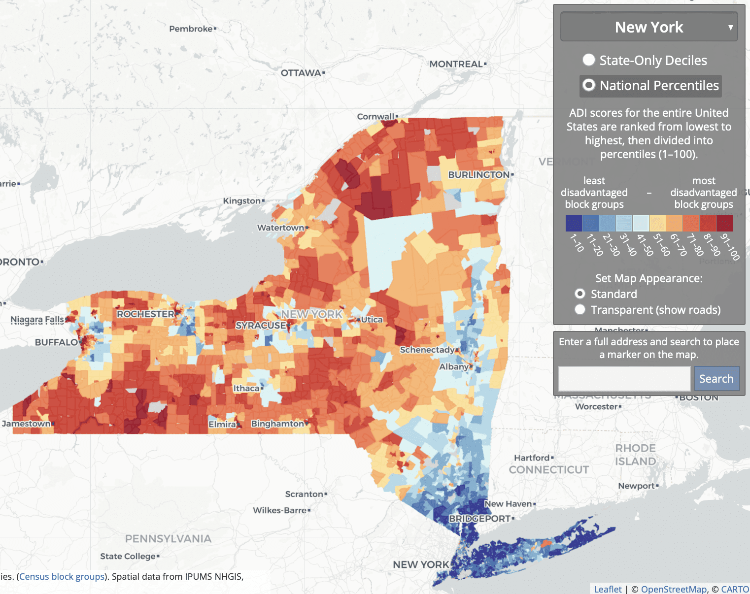
So what they’re doing is comparing some rich areas of NYC and its suburbs; to some low- and middle-income parts of the city, suburbs, and upstate; to some low-income rural and inner-city areas upstate.

Association Between Residential Neighborhood Social Conditions and Health Care Utilization and Costs:

Retrospective cohort study. Medicare claims data from 2013 to 2014 linked with neighborhood social conditions at the US census block group level of 2013 for 93,429 Medicare fee-for-service and dually eligible patients. . . . Disadvantaged neighborhood conditions are associated with lower total annual Medicare costs but higher potentially preventable costs after controlling for demographic, medical, and other patient characteristics. . . . We restricted our sample to patients with 9-digit residential zip codes available in New York or New Jersey . . .

I don’t see the relevance of these correlations to the criticisms of the ADI.

To return to our main thread, the rebuttal summarizes:

The ADI is currently the most validated scientific tool for US neighborhood level disadvantage. This does not mean that other measures may not eventually also meet this high bar.

My problem here is with the term “most validated.” I’m not sure how to take this, given that all this validation didn’t seem to have shown that problem with the South Bronx etc. But, sure, I get their general point: When doing research, better to go with the devil you know, etc.

The rebuttal authors add:

CMS should continue to investigate all options, beware of conflicts of interest, and maintain the practice of vetting scientific validated, evidence-based criteria when selecting a tool to be used in a federal program.

I think we can all agree on that.

Beyond general defenses of the ADI on the grounds that many people use it, the rebuttal authors make an interesting point about the use of neighborhood-level measures more generally:

Neighborhood-level socioeconomic disadvantage is just as (and is sometimes more) important than individual SES. . . . These factors do not always overlap, one may be high, the other low or vice versa. Both are critically important in equity-focused intervention and policy design. In their HEBA, as aligned with scientific practice, CMS has included one of each—the ADI captures neighborhood-level factors, and dual Medicare and Medicaid eligibility represents an individual-level factor. Yet groups have mistakenly conflated individual-level and neighborhood-level factors, wrongly suggesting that neighborhood-level factors are only used because additional individual factors are not readily available.

They link to a review article. I didn’t see the reference there to groups claiming that neighborhood-level factors are only used because additional individual factors are not readily available, but I only looked at that linked article quickly so I probably missed the relevant citation.

The above are all general points about the importance of using some neighborhood-level measure of disadvantage.

But what about the specific concerns raised with the ADI, such as the labeling most of the South Bronx as being low disadvantage (in the 10th to 30th percentile nationally)? Here’s what I could find in the rebuttal:

These assertions rely on what’s been described as “the weakest of all possible arguments”: face validity—defined as the appearance of whether or not something is a correct measurement. This is in contrast to empirically-driven tests for construct validity. Validation experts universally discredit face validity arguments, classifying them as not legitimate, and more aligned with “marketing to a constituency or the politics of assessment than with rigorous scientific validity evidence.” Face validity arguments on their own are simply not sufficient in any rigorous scientific argument and are fraught with potential for bias and conflict of interest. . . .

Re-weighting recommendations run the risk of undermining the strength and scientific rigor of the ADI, as any altered ADI version no longer aligns with the highly-validated original Neighborhood Atlas ADI methodology . . .

Some have suggested that neighborhood-level disadvantage metrics be adjusted to specific needs and areas. We consider this type of change—re-ranking ADI into smaller, custom geographies or adding local adjustments to the ADI itself—to be a type of gerrymandering. . . . A decision to customize the HEBA formula in certain geographies or parts of certain types of locations will benefit some areas and disservice others . . .

I disagree with the claim that face validity is “the weakest of all possible arguments.” For example, saying that a method is good because it’s been cited thousands of times, or saying that local estimates are fine because the national or state-level correlations look right, those are weaker arguments! And if validation experts universally discredit face validity arguments . . . ummmm, I’m not sure who are the validation experts out there, and in any case I’d like to see the evidence of this purportedly universal view. Do validation experts universally think that North Korea has moderate electoral integrity?

The criticism

Here’s what the critical article lists as limitations of the ADI:

Using national ADI benchmarks may mask disparities and may not effectively capture the need that exists in some of the higher cost-of-living geographic areas across the country. The ADI is a relative measure for which included variables are: median family income; percent below the federal poverty level (not adjusted geographically); median home value; median gross rent; and median monthly mortgage. In some geographies, the ADI serves as a reasonable proxy for identifying communities with poorer health outcomes. For example, many rural communities and lower-cost urban areas with low life expectancy are also identified as disadvantaged on the national ADI scale. However, for parts of the country that have high property values and high cost of living, using national ADI benchmarks may mask the inequities and poor health outcomes that exist in these communities. . . .

They recommend “adjusting the ADI for variations in cost of living,” “recalibrating the ADI to a more local level,” or “making use of an absolute measure such as life expectancy rather than a relative measure such as the ADI.”

There seem to be two different things going on here. The first is that ADI is a socioeconomic measure, and it could also make sense to include a measure of health outcomes. The second is that, as a socioeconomic measure, ADI seems to have difficulty in areas that are low income but with high housing costs.

My summary

1. I agree with my correspondent’s email that led off this post. The criticisms of the ADI seem legit—indeed, they remind me a bit of the Human Development Index, which a similar problem of giving unreasonable summaries that can be attributed to someone constructing a reasonable-seeming index and then not looking into the details; see here for more. There was also the horrible, horrible Electoral Integrity Index, which had similar issues of face validity that could be traced back to fundamental issues of measurements.

2. I also agree with my correspondent that the rebuttal article is bad for several reasons. The rebuttal:
– does not ever address the substantive objections;
– doesn’t seem to recognize that, just because a measure gives reasonable national correlations, that doesn’t mean that it can’t have serious local problems;
– leans on an argument-from-the-literature that I don’t buy, in part out of general distrust of the literature and in part because none of the cited literature appears to address the concerns on the table;
– presents a ridiculous argument against the concept of face validity.

Face validity—what does that mean?

Let me elaborate upon that last point. When a method produces a result that seems “on its face” to be wrong, that does not necessarily tell us that the method is flawed. If something contradicts face validity, that tells us that it contradicts our expectations. It’s a surprise. One possibility is that our expectations were wrong! Another possibility is that there is a problem with the measure, in which case the contradiction with our expectations can help us understand what went wrong. That’s how things went with the political science survey that claimed that North Korea was a moderately democratic country, and that’s how things seem to be going with the Area Deprivation Index. Even if it has thousands of citations, it can still have flaws. And in this case, the critics seem to have gone in and found where some of the flaws are.

In this particular example, the authors of the rebuttal have a few options.

They could accept the criticisms of their method and try to do better.

Or they could make the affirmative case that all these parts of the South Bronx, southeast D.C., etc., are not actually socioeconomically deprived. Instead they kind of question that these areas are deprived (“New York State in general is a very well-resourced state”) but without quite making that claim. I think one reason they’re stuck in the middle is politics. Public health is in general coming from the left side of the political spectrum and, from the left, if an area is poor and has low life expectancy, you’d call it deprived. From the right, you could argue that these poor areas already get tons of government support and that all this welfare dependence just compounds the problem. From a conservative perspective, you might argue that these sorts of poor neighborhoods are not “deprived” but rather are already oversaturated with government support. But I don’t think we’d be seeing much of that argument in the health-disparities space.

Or they could make a content-low response without addressing the problem. Unfortunately, that’s the option they chose.

I have no reason to think they’ve chosen to respond poorly here. My guess is that they’re soooo comfortable with their measure, soooooo sure it’s right, that they just dismissed the criticism without ever thinking about it. Which is too bad. But now they have this post! Not too late for them to do better. Tomorrow’s another day, hey!

P.S. My correspondent adds:

The original article criticizing the ADI measure has some map graphic sins that any editor should have removed before publication. Here are some cleaner comparisons of the city data. The SDI measure in those plots is the Social Deprivation Index from Robert Graham Center.

Washington, D.C.:

New York City:

Boston:

San Francisco area:

Do Ultra-Processed Data Cause Excess Publication and Publicity Gain?

Ethan Ludwin-Peery writes:

I was reading this paper today, Ultra-Processed Diets Cause Excess Calorie Intake and Weight Gain (here, PDF attached), and the numbers they reported immediately struck me as very suspicious.

I went over it with a collaborator, and we noticed a number of things that we found concerning. In the weight gain group, people gained 0.9 ± 0.3 kg (p = 0.009), and in the weight loss group, people lost 0.9 ± 0.3 kg (p = 0.007). These numbers are identical, which is especially suspicious since the sample size is only 20, which is small enough that we should really expect more noise. What are the chances that there would be identical average weight loss in the two conditions and identical variance? We also think that 0.3 kg is a suspiciously low standard error for weight fluctuation.

They also report that weight changes were highly correlated with energy intake (r = 0.8, p < 0.0001). This correlation coefficient seems suspiciously high to us. For comparison, the BMI of identical twins is correlated at about r = 0.8, and about r = 0.9 for height. Their data is publicly available here, so we took a look and found more to be concerned about. They report participant weight to two decimal places in kilograms for every participant on every day. Kilograms to two decimal places should be pretty sensitive (an ounce of water is about 0.02 kg), but we noticed that there were many cases where the exact same weight appeared for a participant two or even three times in a row. For example participant 21 was listed as having a weight of exactly 59.32 kg on days 12, 13, and 14, participant 13 was listed as having a weight of exactly 96.43 kg on days 10, 11, and 12, and participant 6 was listed as having a weight of exactly 49.54 kg on days 23, 24, and 25.

In fact this last case is particularly egregious, as 49.54 kg is exactly one kilogram less, to two decimal places, than the baseline for this participant’s weight when they started, 50.54 kg. Participant 6 only ever seems to lose or gain weight in increments of 0.10 kilograms. Similar patterns can also be seen in the data of other participants.

We haven’t looked any deeper yet because we think this is already cause for serious concern. It looks a lot like heavily altered or even fabricated data, and we suspect that as we look closer, we will find more red flags. Normally we wouldn’t bother but given that this is from the NIH, it seemed like it was worth looking into.

What do you think? Does this look equally suspicious to you?

He and his sister Sarah followed up with a post, also there are posts by Nick Brown (“Some apparent problems in a high-profile study of ultra-processed vs unprocessed diets”) and Ivan Oransky (“NIH researcher responds as sleuths scrutinize high-profile study of ultra-processed foods and weight gain”).

I don’t really have anything to add on this one. Statistics is hard, data analysis is hard, and when research is done on an important topic, it’s good to have outsiders look at it carefully. So good all around, whatever happens with this particular story.

Before reading this post, take a cold shower: A Stanford professor says it’s “great training for the mind”!

Matt Bogard writes:

I don’t have full access to this article to know the full details and can’t seem to access the data link but with n = 49 split into treatment and control groups for these outcomes (also making gender subgroup comparisons) this seems to scream, That which does not kill my statistical significance only makes it stronger.

From the abstract:

Results: Theoretical and practical training in cold immersion in the winter did not induce anxiety. Regular cold exposure led to a significant (p=0.045) increase of 6.2% in self-perceived sexual satisfaction compared with the pre-exposure measurements. Furthermore, considerable increase (6.3% compared with the pre-exposure period) was observed in self-perceived health satisfaction; the change was borderline significant (p=0.052). In men, there was a reduction in waist circumference (1.3%, p=0.029) and abdominal fat (5.5%, p=0.042). Systematic exposure to cold significantly lowered perceived anxiety in the entire test group (p=0.032).

Conclusions: Cold water exposure can be recommended as an addition to routine military training regimens. Regular exposure positively impacts mental status and physical composition, which may contribute to the higher psychological resilience. Additionally, cold exposure as a part of military training is most likely to reduce anxiety among soldiers.

I’m not planning to pay 42 euros to read the whole article (see image above), but, yeah, based on the abstract it looks like any effects here are too variable to be discovered in this way. This one hits a few of our themes:

1. Lots of p-values around 0.05. Greg Francis has written about this.

2. Forking paths: lots and lots of different ways of slicing the data.

3. Small sample size. N = 49 isn’t a lot even before getting into the subgroups and interactions.

4. Implausibly large effect-size estimates. An average reduction of 5.5% of abdominal fat, that sounds like a lot, no? This problem comes for free when variability is high.

5. Noisy measurements that don’t quite align with questions of interest. I can’t be sure about this one, but I’m not quite sure that the life satisfaction and sexual satisfaction surveys are really measuring what’s important here.

6. Story time. Even setting aside the statistical problems, do you notice how they move from “sexual satisfaction,” “health satisfaction,” “waist circumference,” and “abdominal fat” in the Results, to “mental status and physical composition” in the conclusion? I guess “getting skinny and having good sex” wouldn’t sound so good.

7. Between-person comparisons. There’s no need for this study to be done in this way—some people get treatment, some get control. It should be easy enough to do both treatments on each person, but it seems that they didn’t do so. Why? I guess because between-person comparisons are standard practice. They’re easier to analyze and at first glance look cleaner than within-person comparisons. But that apparent cleanliness is an illusion.

8. Coherence with folk theories. Cold showers! Sounds paleo, huh? I’m not saying that cold showers can’t have benefits, just that this is a noisy study with the sort of conclusion that a lot of people will be happy to hear.

What’s going on?

I don’t know what’s going on. Here’s my guess: These researchers took some measurements that vary a lot from person to person, maybe some of these measurements vary a bit within person too. They applied a treatment which will have variable effects: maybe very close to zero in some cases, positive for some people, negative for others. Given this mix, we can expect the average effects to be small. Small average effects, indirect measurements, high variation . . . it’ll be hard to find any signal amid all this noise. Then this gets piped through forking paths and the statistical-significance filter and, boom!, results come out, ready to be published and publicized. I’m not saying the authors of the paper did anything dishonest, but that doesn’t stop them from pulling comparisons out of noise.

It’s the usual story of junk science, the push of thousands of journals seeking publications and millions of people doing research, combined with the pull of “the aching desire for an answer” (as Tukey put it) to unlimited numbers of research questions, mixed in with the horrible ability of statistical methods to convince people there’s strong evidence even when it isn’t there.

The article in question was from an obscure journal and I figured I’d never hear about it again.

Part 2

But then I checked my email, and two days earlier I’d received this message from Scott McCain:

Some friends and family are into the idea of cold showers. I’ve seen some work on it before. Recently, Stanford professor Andrew Huberman has covered this study supporting that cold exposure can have a whole host of benefits (including self-perceived sexual satisfaction and reduced waist circumference). I felt that this was interesting but a bit surprising.

I don’t have access to this study, so I downloaded the raw data—which is great that they published it! It seems like they’ve measured a whole bunch of things. I’ve tried communicating to friends and family that this study (however I haven’t analyzed their data myself, besides a cursory look) seems likely underpowered and maybe has been at risk of a garden of forking paths.

Indeed. Again, I’m not saying that cold or hot showering has no effect; I just don’t think this sort of push-button model of scientific inquiry will be useful in figuring it out. But, just to be clear, I’m not trying to talk your friends and family out of taking cold showers. They should go for it, why not?

Part 3

And then I received another email, this one from Joshua Brooks, pointing to a series of twitter post from Gideon Meyerowitz-Katz slamming the above-discussed study. It seems that the cold-shower paper became widely discussed on the internet after it was promoted by Andrew Huberman, a neurobiology professor at Stanford who has a podcast and a “once-a-month newsletter with science and science-based tools for everyday life.”

We’ll get back to Huberman in a moment, but first let me discuss the posts by Meyerowitz-Katz, who writes that the paper in question “shows precisely the opposite” of what it claims. I wouldn’t put it that way; rather I’d just say the paper provides no strong evidence of anything. It’s a noisy study. Noisy and not statistically significantly different from zero is not the same thing as saying that the effect is not there or even that the effect is not important; it’s just that the study is too weak to find anything useful. Also, Meyerowitz-Katz is annoyed that the paper focuses on before-after comparisons. But before-after comparisons can be fine! You learn a lot by comparing to “before” data. And in any case you can compare the before-after differences in the treatment and control groups. On the other hand, Meyerowitz-Katz comes to the same conclusion that I do, which is that the study appears to be consistent with null effects so its conclusions should not be taken seriously.

OK, one more thing. Meyerowitz-Katz writes:

To sum up – this is a completely worthless study that has no value whatsoever scientifically. It is quite surprising that it got published in its current form, and even more surprising that anyone would try to use it as evidence.

I wouldn’t quite put it that way. First, who’s to say it’s “completely worthless”? It has some measurements and maybe they’ll be useful to someone. They posted their raw data! Second, I’m fine with saying that it’s too bad that the paper got published or that anyone would try to use it as evidence. But to call this quite surprising?? Bad or pointless research papers get published all the time, in all sorts of journals, and then they get taken as evidence by all sorts of people, renowned professors and otherwise. So I’m surprised Meyerowitz-Katz is surprised. His surprisal suggests to me that he puts too much faith in journal articles!

Anyway, after looking this all over, I responded to Brooks:

I guess “BMJ Military Health” is a pretty obscure journal . . . but, sure, lots of bad stuff gets published! I’ve never heard of this Huberman guy. I guess if this thing of hyping crap science works for Gladwell, NPR, and Ted, it makes sense that people with less elevated perches in the media will try it too.

I’m not trying to be cynical here—I don’t think that hyping crap science is a good thing—I’m just trying to be realistic. There are lots of journals out there, and if you fish around through enough of them, you can find superficially-plausible articles that will support just about any position.

Brooks followed up with further background on Huberman:

On the cold showers, he points to a meta-analysis.

I don’t know, actually, that he bases his view to any significant extent on that one paper.

The cold immersion claim is just one of the rather remarkable claims he makes on a whole range of effects…

They mostly come off as credible at first glance to me. For all, he claims an “evidence base” in the literature. Personally, I don’t necessarily dismiss everything he says per se, but when i string together the sheer number of absolutely certain claims he makes about such large effects, I have to conclude there’s a fundamental flaw.

Also, apparently he hawks supplements, plus, I’ve also hear him hawking such things as mattresses customized to fit individual consumers by responses to an online questionnaire, that result in improved sleep.

I’m currently listening to a podcast where he’s talking to a scientist about the genetics of “inherited experience.” Right now they’re describing experiments showning a differential effect to worms who are fed other worms who were exposed to an experimental condition (electric shock) then put into a blender.

It’s actually pretty interesting – and some of the research they’re talking about supposedly has been replicated.

But it all feels kinda like the ESP research.

It’s hard to think about these things because there could be real effects! As discussed above, to the extent that cold showers have meaningful effects on people, we should expect these effects to vary a lot from person to person.

I went to Huberman’s webpage on the cold showers to see the meta-analysis that Brooks mentions, but the only meta-analysis I found there was “Impact of Cold-Water Immersion Compared with Passive Recovery Following a Single Bout of Strenuous Exercise on Athletic Performance in Physically Active Participants: A Systematic Review with Meta-analysis and Meta-regression.” Cold-water immersion for athletic performance seems to have zero overlap with cold showers for mood and general health. Nothing wrong with talking about this study but it doesn’t really seem relevant for the discussion of cold showers.

Also Huberman has this:

Building Resilience & Grit

By forcing yourself to embrace the stress of cold exposure as a meaningful self-directed challenge (i.e., stressor), you exert what is called ‘top-down control’ over deeper brain centers that regulate reflexive states. This top-down control process involves your prefrontal cortex – an area of your brain involved in planning and suppressing impulsivity. That ‘top-down’ control is the basis of what people refer to when they talk about “resilience and grit.” Importantly, it is a skill that carries over to situations outside of the deliberate cold environment, allowing you to cope better and maintain a calm, clear mind when confronted with real-world stressors. In other words, deliberate cold exposure is great training for the mind. [Boldface in the original.]

“Grit,” huh? C’mon dude, get real.

P.S. Here’s the supplement he’s advertising:

Looks a little bit iffy, but, hey, what do I know? I’m never studied human performance. I kinda wonder if Huberman takes these himself. I could imagine a few options:

1. Of course he takes them; he’s a true believer.

2. Of course he doesn’t take them; the sponsorship thing is all about the money.

3. He believes they work, but he doesn’t think he personally needs them, so he doesn’t take them.

4. He doubts they do anything, but he figures they won’t hurt, so why not, and he takes them.

Maybe there’s some other option I haven’t thought of.

The causal revolution in econometrics has gone too far.

Kevin Lewis points us to this recent paper, “Can invasive species lead to sedentary behavior? The time use and obesity impacts of a forest-attacking pest,” published in Elsevier’s Journal of Environmental Economics and Management, which has the following abstract:

Invasive species can significantly disrupt environmental quality and flows of ecosystem services and we are still learning about their multidimensional impacts to economic outcomes of interest. In this work, I use quasi-random US county detections of the invasive emerald ash borer (EAB), a forest-attacking pest, to investigate how invasive-induced deforestation can impact obesity rates and time spent on physical activity. Results suggest that EAB is associated with 1–4 percentage points (pp) (mean = 37.0%) annual losses of deciduous forest cover in infested counties. After EAB detection, obesity rates are higher by 2.5pp (mean = 24.7%) and daily minutes spent on physical activity are lower by 4.9 min (mean = 51.7 min), on average. I show that less time spent on outdoor sports and exercise is one possible, but not exclusive, mechanism. Nationwide, EAB is associated with $3.0 billion in annual obesity-related healthcare costs over 2002–2012, equivalent to approximately 1.2% of total annual US medical costs related to obesity. Results are supported by many robustness and falsification tests and an alternative IV specification. This work has policy implications for invasive species management and expands our understanding of invasive species impacts on additional economic outcomes of interest.

Seeing this sort of thing makes me feel that causal revolution in econometrics has gone too far. The first part of the analysis involves invasive species and loss of forest cover. That part is ok, I guess. I don’t know anything about invasive species, but it sure sounds like loss of forest cover is the kind of thing the could cause. The problem I have is with the second part of the analysis, on obesity and time spent on outdoor sports and exercise. It just seems too much of a stretch, especially given that the whole analysis is on a county level.

To put it another way: there are lots and lots of things that could affect obesity and time spent on exercise, and invasive species reducing forest cover seems like the least of it.

From the other direction: the places where invasive species are spreading is not a random selection of U.S. counties. Places with more or less invasive species will differ in all sorts of ways, some of which might happen to be correlated with time spent on exercise, obesity, all sorts of things.

In short, I see no reason to believe the causal claims made in the article. On the other hand, it says:

A multitude of fixed effects and controls for socioeconomic and demographic confounders are used in order to isolate the EAB effect. I also estimate a suggestive first-stage model showing EAB’s impact to county-level deciduous forest cover, in order to preliminarily investigate the suspected mechanism by which EAB spread may translate into biological effects on obesity and physical activity.

The causal interpretation of my findings is supported by several checks, including: (i) an event study plot showing increasing marginal impacts of EAB over time, consistent with the biologically delayed timing of EAB-induced deforestation; (ii) falsification tests showing no impact of EAB on being underweight, no impact of EAB in the years prior to actual detection, and no impact of EAB on non-ash coniferous forest canopy; (iii) a robustness check that accounts for spatial autocorrelation in EAB detection using a Spatial Durbin Model; (iv) an investigation of biological mechanisms using daily time use diary data from the American Time Use Survey (ATUS); (v) results showing that changes in economic activity are likely not driving my findings, and; (vi) an IV specification that uses EAB detections as an instrument for deciduous forest cover to validate a suspected deforestation pathway of effect.

Sorry, but all the multitudes and Durbins and specifications and pathways don’t do it for me. Again, the pattern of invasive species is non-random, and it can vary with just about anything. So, no, I don’t agree with the claim that “This work contributes to the literature on the economics of invasive species by broadening our understanding of invasives’ true indirect costs to society.”

What’s going on here?

Remember that quote from Tukey, “The combination of some data and an aching desire for an answer does not ensure that a reasonable answer can be extracted from a given body of data”?

Another way to put it is that the story they’re trying to tell in this paper, starting with invasive species and forest cover and ending up with obesity and physical activity, is just too attenuated to be able to estimated from available data.

As I see it, there’s a misplaced empiricism going on here, an idea that by using proper econometric or statistical techniques you can obtain a “reduced-form” estimate. The trouble, as usual, is that:
1. Realistic effect sizes will be impossible to detect in the context of natural variation,
2. Forking paths allow researchers to satisfy that “aching desire” for a conclusive finding,
3. P-values, robustness tests, etc. help researchers convince themselves that the patterns they see in these data provide strong evidence for the stories they want to tell.
4. Given an existing academic tradition, researchers don’t notice 1, 2, and 3 above. They’re like the proverbial fish not seeing the water they’re swimming in.

Criticism as a collaboration between authors and audience

At this point it’s time for someone to pipe up that we’re shouldn’t be criticizing a paper we haven’t read, that we’re being mean to the author who we should’ve contacted first, who’s either a working stiff who does not deserved to be criticized by a bigshot, or else a bigshot himself who should be able ignore the pinpricks of the haters, etc etc etc.

To these (hypothetical criticisms), I reply that, no, I don’t think we should be required to spend $24.95 in order to criticize published work:

More generally, publishing a work makes it public. If you don’t want work to be doubted in public, there’s no need to publish it. Just to be clear, I’m not saying the author of the above-discussed paper is bothered by this criticism. I’m speaking more generically here.

Also, I’m fine with people publishing in paywalled journals. I do it too! Publication is a pain in the ass, and we’ll usually go with whatever journal will take our paper. It’s a weird thing because we’re providing the content and doing all the effort, and they’re then taking possession of it, but that’s how things go, and we’re typically too busy with the next project to want to buck the system on this on.

So, to continue, I hope we can see this criticism as a collaborative effort between authors and audience. The authors do the service of publishing their work rather than merely spreading it on the whisper network, and the critics do the service of posting their criticisms publicly rather than keeping it on the Q.T. and contacting the authors in secret.

Doing this in public allows everyone to be involved—including any third parties who’d like to argue that my criticisms are misplaced and we should believe the claims in the above-discussed article. Those of you who disagree with me—you should be able to see what I have to say too, not just have this locked in an email to the authors which you’ll never see.

As to my comments being critical: Yeah, I don’t think the published analysis is saying what is claimed. That’s too bad. It’s nothing personal. There are some dead-end paradigms in scientific research. It happens. We have to be looking at the big picture. We’re not doing researchers any favors by politely accepting claims that aren’t supported by the data. Indeed, take enough such claims and you can put them together and you end up with an entire junk literature which can be meta-analyzed into junk claims.

What, then, to do?

The final question is what would I recommend authors of this sort of paper to do? If I don’t believe their claims—if, indeed, I think the connection between invasive species and obesity is too tenuous for such an analysis to “work” in the sense of telling us something about the effects of invasive species on obesity, as opposed to turning up some correlations in observational data—then, given that they’re interested in this topic and they have access to these data, what should they do?

I’m not sure—maybe there’s nothing useful they can do at all here!—but, to if there is something to be gained here, my suggestion is to frame the problem observationally. These are the places with more invasive species, what’s been happening in these places, how do these places differ from otherwise-similar areas that did not have an invasive-species problem, etc. I’d say just drop the county-level obesity data entirely, but if you want to study it, look at the usual factors such as urban-rural, age, ethnic composition, etc. Learn what you can learn, forget about the big claims.

Should every correlation be published during the COVID-19 pandemic?

Nans Florens, Gideon Meyerowitz-Katz, Jérôme Barriere, Eric Billy, Fabrice Frank, Véronique Saada, Alexander Samuel, Barbara Seitz-Polski, Kyle Sheldrick, and Lonni Besançon write an article with the above title that begins as follows:

There is a strong correlation between deaths by swimming pool drowning in the USA and Nicholas Cage’s apparition in movies per year. While not establishing causal relationships, this finding raises concerns regarding Nicholas Cage-induced drownings and should call for a halt to the actor’s film career. If you think this paragraph is goofy, then you should be concerned by your interpretation of the too-quickly published correlations during the COVID-19 pandemic. Recently, Sun et al. published an article in Scientific Reports entitled: “Increased emergency cardiovascular events among under-40 population in Israel during vaccine rollout and third COVID-19 wave.” In this paper, the authors highlighted correlations between the Israeli vaccine campaign and an increased number of severe cardiovascular event calls to Emergency Management Services in the under-40 population. Even if the correlation seemed statistically significant, it is, to our opinion, clinically irrelevant.

During the COVID-19 pandemic, rapid publication efforts were made by authors and publishers to improve our knowledge and care toward greater safety and efficiency of the management of this disease. Simultaneously, many publications have been rushed potentially without rigorous peer-review and there has been a non-negligible increase in the duplication and waste of scientific efforts. In 2012, Frank Messerli highlighted in the New England Journal of Medicine, a strong correlation between chocolate consumption by country and the number of Nobel laureates. This study was published to warn scientists about over-interpreting their correlation data. Despite this notorious demonstration of what may be a spurious correlation, many scientists and editors continue to publish articles with correlations that have little clinical relevance. Sun et al.’s article, in our opinion, is the perfect demonstration of this phenomenon.

Some of the conclusions of this article are questionable from a clinical perspective. . . . First, the absolute number of calls for cardiac arrests is low in the under-40 population, peaking at approximately 10 during the vaccine rollout. . . . Second, regarding acute coronary syndrome (ACS), despite a statistically significant correlation, this association suffers from interpretation biases that are too large to be properly supported. . . . Third, the first signals regarding the occurrence of cardiac events in young patients vaccinated with mRNA-containing vaccines date from April 2021 and quickly led to the adaptation of vaccine recommendations in many countries . . . Furthermore, the authors did not consider seasonal or yearly trends in their analysis. . . . Finally, the main criticism of the dataset presented in the manuscript is the absence of confirmation of either the vaccination status, COVID-19 status, or underlying comorbidities among included patients. . . .

There are several additional issues with the statistical analysis as presented in the document which substantially undermine its conclusions and indicate a lack of rigor in the manuscript. . . . While the authors have described their analysis as “not establishing causal relationships,” they have in fact not even established useful correlations.

This last point is an example of my dictum that Correlation does not even imply correlation.

Regarding the question in the title of this post, yes, let’s publish everything. It’s gonna happen in any case. To put it another way, the problem of publishing the vaccine-and-cardiac-arrest correlation isn’t that they published the correlation, it’s that they only published that one correlation and then they overinterpreted it. Publish everything.

To put it another way, when I say “publish,” I mean, “make public.” I don’t mean, “give the seal of approval to” or “claim that something has scientific or policy relevance.” In that sense, the problem is coming not from the publication (in the sense that I use the term) but in the attitude that, because something is published, we should believe it.

Also, I’m saying we should publish every correlation, not that we should publish every foolish claim.