In judo, before you learn the cool moves, you first have to learn how to fall. Maybe we should be training researchers the same way: first learn how things can go wrong, and only when you get that lesson down do you learn the fancy stuff.

I want to follow up on a suggestion from a few years ago:

In judo, before you learn the cool moves, you first have to learn how to fall. Maybe we should be training researchers, journalists, and public relations professionals the same way. First learn about Judith Miller and Thomas Friedman, and only when you get that lesson down do you get to learn about Woodward and Bernstein.

Martha in comments modified my idea:

Yes! But I’m not convinced that “First learn about Judith Miller and Thomas Friedman, and only when you get that lesson down do you get to learn about Woodward and Bernstein” or otherwise learning about people is the way to go. What is needed is teaching that involves lots of critiquing (especially by other students), with the teacher providing guidance (e.g., criticize the work or the action, not the person; no name calling; etc.) so students learn to give and accept criticism as a normal part of learning and working.

I responded:

Yes, learning in school involves lots of failure, getting stuck on homeworks, getting the wrong answer on tests, or (in grad school) having your advisor gently tone down some of your wild research ideas. Or, in journalism school, I assume that students get lots of practice in calling people and getting hung up on.

So, yes, students get the experience of failure over and over. But the message we send, I think, is that once you’re a professional it’s just a series of successes.

Another commenter pointed to this inspiring story from psychology researchers Brian Nosek, Jeffrey Spies, and Matt Motyl, who ran an experiment, thought they had an exciting result, but, just to be sure, they tried a replication and found no effect. This is a great example of how to work and explore as a scientist.

Background

Scientific research is all about discovery of the unexpected: to do research, you need to be open to new possibilities, to design experiments to force anomalies, and to learn from them. The sweet spot for any researcher is at Cantor’s corner.

Buuuut . . . researchers are also notorious for being stubborn. In particular, here’s a pattern we see a lot:
– Research team publishes surprising result A based on some “p less than .05” empirical results.
– This publication gets positive attention and the researchers and others in their subfield follow up with open-ended “conceptual replications”: related studies that also attain the “p less than .05” threshold.
– Given the surprising nature of result A, it’s unsurprising that other researchers are skeptical of A. The more theoretically-minded skeptics, or agnostics, demonstrate statistical reasons why these seemingly statistically-significant results can’t be trusted. The more empirically-minded skeptics, or agnostics, run preregistered replications studies, which fail to replicate the original claim.
– At this point, the original researchers do not apply the time-reversal heuristic and conclude that their original study was flawed (forking paths and all that). Instead they double down, insist their original findings are correct, and they come up with lots of little explanations for why the replications aren’t relevant to evaluating their original claims. And they typically just ignore or brush aside the statistical reasons why their original study was too noisy to ever show what they thought they were finding.

I’ve conjectured that one reason scientists often handle criticism in such scientifically-unproductive ways is . . . the peer-review process, which goes like this:

As scientists, we put a lot of effort into writing articles, typically with collaborators: we work hard on each article, try to get everything right, then we submit to a journal.

What happens next? Sometimes the article is rejected outright, but, if not, we’ll get back some review reports which can have some sharp criticisms: What about X? Have you considered Y? Could Z be biasing your results? Did you consider papers U, V, and W?

The next step is to respond to the review reports, and typically this takes the form of, We considered X, and the result remained significant. Or, We added Y to the model, and the result was in the same direction, marginally significant, so the claim still holds. Or, We adjusted for Z and everything changed . . . hmmmm . . . we then also though about factors P, Q, and R. After including these, as well as Z, our finding still holds. And so on.

The point is: each of the remarks from the reviewers is potentially a sign that our paper is completely wrong, that everything we thought we found is just an artifact of the analysis, that maybe the effect even goes in the opposite direction! But that’s typically not how we take these remarks. Instead, almost invariably, we think of the reviewers’ comments as a set of hoops to jump through: We need to address all the criticisms in order to get the paper published. We think of the reviewers as our opponents, not our allies (except in the case of those reports that only make mild suggestions that don’t threaten our hypotheses).

When I think of the hundreds of papers I’ve published and the, I dunno, thousand or so review reports I’ve had to address in writing revisions, how often have I read a report and said, Hey, I was all wrong? Not very often. Never, maybe?

Where we’re at now

As scientists, we see serious criticism on a regular basis, and we’re trained to deal with it in a certain way: to respond while making minimal, ideally zero, changes to our scientific claims.

That’s what we do for a living; that’s what we’re trained to do. We think of every critical review report as a pain in the ass that we have to deal with, not as a potential sign that we screwed up.

So, given that training, it’s perhaps little surprise that when our work is scrutinized in post-publication review, we have the same attitude: the expectation that the critic is nitpicking, that we don’t have to change our fundamental claims at all, that if necessary we can do a few supplemental analyses and demonstrate the robustness of our findings to those carping critics.

How to get to a better place?

How can this situation be improved? I’m not sure. In some ways, things are getting better: the replication crisis has happened, and students and practitioners are generally aware that high-profile, well-accepted findings often do not replicate. In other ways, though, I fear we’re headed in the wrong direction: students are now expected to publish peer-reviewed papers throughout grad school, so right away they’re getting on the minimal-responses-to-criticism treadmill.

It’s not clear to me how to best teach people how to fall before they learn fancy judo moves in science.
Statistical Practice as Scientific Exploration (my talk on 4 Mar 2024 at the Royal Society conference on the promises and pitfalls of preregistration)

Here’s the conference announcement:

Discussion meeting organised by Dr Tom Hardwicke, Professor Marcus Munafò, Dr Sophia Crüwell, Professor Dorothy Bishop FRS FMedSci, Professor Eric-Jan Wagenmakers.

Serious concerns about research quality have provoked debate across scientific disciplines about the merits of preregistration — publicly declaring study plans before collecting or analysing data. This meeting will initiate an interdisciplinary dialogue exploring the epistemological and pragmatic dimensions of preregistration, identifying potential limits of application, and developing a practical agenda to guide future research and optimise implementation.

And here’s the title and abstract of my talk, which is scheduled for 14h10 on Mon 4 Mar 2024:

Statistical Practice as Scientific Exploration

Much has been written on the philosophy of statistics: How can noisy data, mediated by probabilistic models, inform our understanding of the world? Researchers when using and developing statistical methods can be seen to be acting as scientists, forming, evaluating, and elaborating provisional theories about the data and processes they are modelling. This perspective has the conceptual value of pointing toward ways that statistical theory can be expanded to incorporate aspects of workflow that were formerly tacit or informal aspects of good practice, and the practical value of motivating tools for improved statistical workflow.

I won’t really be talking about preregistration, in part because I’ve already said so much on that topic here on this blog; see for example here and various links at that post. Instead I’ll be talking about the statistical workflow, which is typically presented as a set of procedures applied to data but which I think is more like a process of scientific exploration and discovery. I addressed some of these ideas in this talk from a couple years ago. But, don’t worry, I’m sure I’ll have lots of new material. Not to mention all the other speakers at the conference.

Book on Stan, R, and Python by Kentaro Matsuura

A new book on Stan using CmdStanR and CmdStanPy by Kentaro Matsuura has landed. And I mean that literally as you can see from the envelope (thanks, Kentaro!). Even the packaging from Japan is beautiful—it fit the book perfectly. You may also notice my Pentel Pointliner pen (they’re the best, but there’s a lot of competition) and my Mnemosyne pad (they’re the best, full stop), both from Japan.

If you click through to Amazon using the above link, the “Read Sample” button takes you to a list where you can read a sample, which includes the table of contents and a brief intro to notation.

Yes, it comes with source code

There’s a very neatly structured GitHub package, Bayesian statistical modeling with Stan R and Python, with all of the data and source code for the book.

The book just arrived, but from thumbing through it, I really like the way it’s organized. It uses practical simulation code and realistic data to illustrate points of workflow and show users how to get unstuck from common problems. This is a lot like the way Andrew teaches this material. Unlike how Andrew teaches, it starts from the basics, like what is a probability distribution. Luckily for the reader, rather than a dry survey trying to cover everything, it hits a few insightful highlights with examples—this is the way to go if you don’t want to just introduce distributions as you go.

The book is also generous with its workflow advice and tips on dealing with problems like non-identifiability or challenges like using discrete parameters. There’s even an advanced section at the end that works up to Gaussian processes and the application of Thompson sampling (not to reinforce Andrew’s impression that I love Thompson sampling—I just don’t have a better method for sequential decision making in “bandit” problems [scare quotes also for Andrew]).

CmdStanR and CmdStanPy interfaces

This is Kentaro’s second book on Stan. The first is in Japanese and it came out before CmdStanR and CmdStanPy. I’d recommend both this book and using CmdStanR or CmdStanPy—they are our go-to recommendations for using Stan these days (along with BridgeStan if you want transforms, log densities, and gradients). After moving to Flatiron Institute, I’ve switched from R to Python and now pretty much exclusively use Python with CmdStanPy, NumPy/SciPy (basic math and stats functions), plotnine (ggplot2 clone), and pandas (R data frame clone).

Random comment on form

In another nod to Andrew, I’ll make an observation about a minor point of form. If you’re going to use code in a book set in LaTeX, use sourcecodepro. It’s a Lucida Console-like font that’s much easier to read than courier. I’d just go with mathpazo for text and math in Palatino, but I can see why people like Times because it’s so narrow. Somehow Matsuura managed to solve the dreaded twiddle problem in his displayed Courier code so the twiddles look natural and not like superscripts—I’d love to know the trick to that. Overall, though, the graphics are abundant, clear, and consistently formatted, though Andrew might not like some of the ggplot2 defaults.

Comments from the peanut gallery

Brian Ward, who’s leading Stan language development these days and also one of the core devs for CmdStanPy and BridgeStan, said that he was a bit unsettled seeing API choices he’s made set down in print. Welcome to the club :-). This is why we’re so obsessive about backward compatibility.

Here are the most important parts of statistics:

Statistics is associated with random numbers: normal distributions, probability distributions more generally, random sampling, randomized experimentation.

But I don’t think these are the most important parts of statistics.

I thought about this when rereading this post that I wrote awhile ago but happened to appear yesterday. Here’s the relevant bit:

In his self-experimentation, Seth lived the contradiction between the two tenets of evidence-based medicine: (1) Try everything, measure everything, record everything; and (2) Make general recommendations based on statistical evidence rather than anecdotes.

Seth’s ideas were extremely evidence-based in that they were based on data that he gathered himself or that people personally sent in to him, and he did use the statistical evidence of his self-measurements, but he did not put in much effort to reduce, control, or adjust for biases in his measurements, nor did he systematically gather data on multiple people.

I think that these are the most important parts of statistics:
(a) to reduce, control, or adjust for biases and variation in measurement, and
(b) to systematically gather data on multiple cases.
This all should be obvious, but I don’t think it comes out clearly in textbooks, including my own. We get distracted by the shiny mathematical objects.

And, yes, random sampling and randomized experimentation are important, as is statistical inference in all its mathematical glory—our BDA book is full of math—, but you want those sweet, sweet measurements as your starting point.

Hey, check this out! Here’s how to read and then rewrite the title and abstract of a paper.

In our statistical communication class today, we were talking about writing. At some point a student asked why it was that journal articles are all written in the same way. I said, No, actually there are many different ways to write a scientific journal article. Superficially these articles all look the same: title, abstract, introduction, methods, results, discussion, or some version of that, but if you look in detail you’ll see that you have lots of flexibility in how to do this (with the exception of papers in medical journals such as JAMA which indeed have a pretty rigid format).

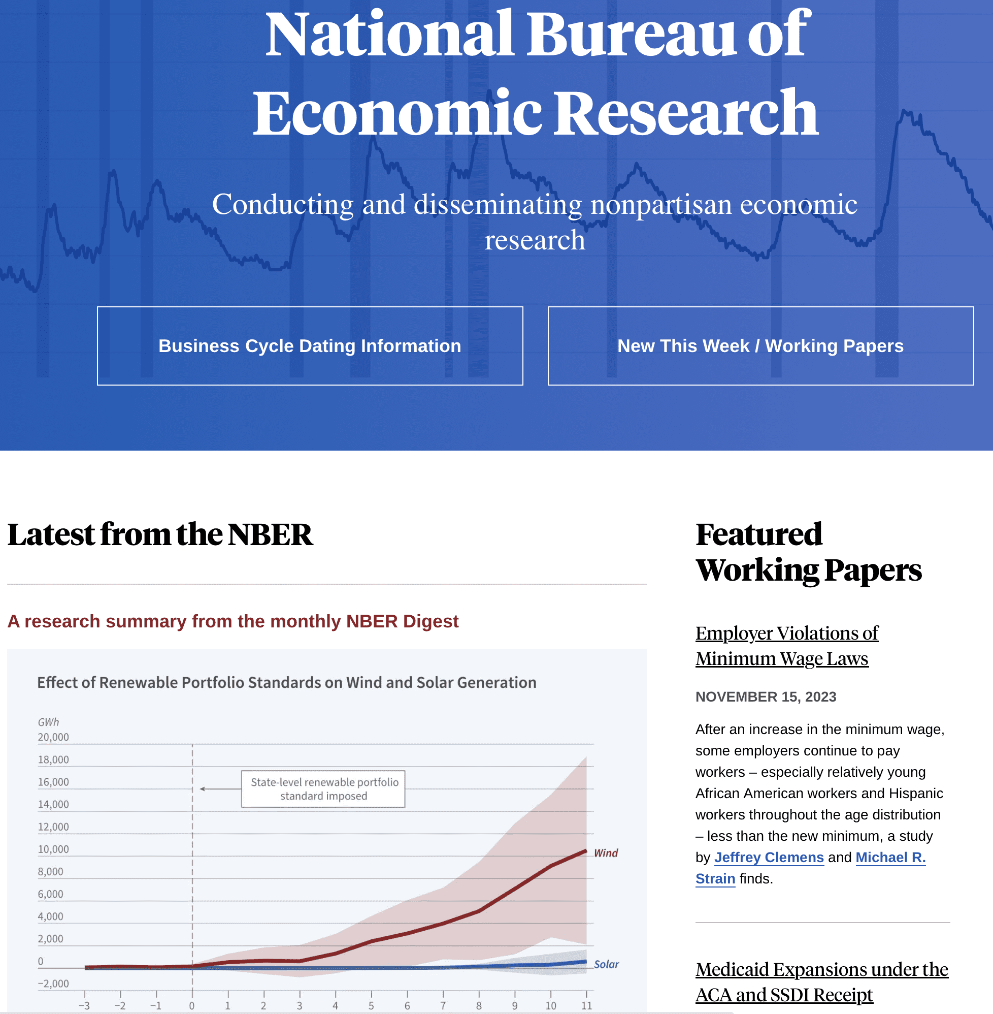
The next step was to demonstrate the point by going to a recent scientific article. I asked the students to pick a journal. Someone suggested NBER. So I googled NBER and went to its home page:

I then clicked on the most recent research paper, which was listed on the main page as “Employer Violations of Minimum Wage Laws.” Click on the link and you get this more dramatically-titled article:

Does Wage Theft Vary by Demographic Group? Evidence from Minimum Wage Increases

with this abstract:

Using Current Population Survey data, we assess whether and to what extent the burden of wage theft — wage payments below the statutory minimum wage — falls disproportionately on various demographic groups following minimum wage increases. For most racial and ethnic groups at most ages we find that underpayment rises similarly as a fraction of realized wage gains in the wake of minimum wage increases. We also present evidence that the burden of underpayment falls disproportionately on relatively young African American workers and that underpayment increases more for Hispanic workers among the full working-age population.

We actually never got to the full article (but feel free to click on the link and read it yourself). There was enough in the title and abstract to sustain a class discussion.

Before going on . . .

In class we discussed the title and abstract of the above article and considered how it could be improved. This does not mean we think the article, or its title, or its abstract, is bad. Just about everything can be improved! Criticism is an important step in the process of improvement.

The title

“Does Wage Theft Vary by Demographic Group? Evidence from Minimum Wage Increases” . . . that’s not bad! “Wage Theft” in the first sentence is dramatic—it grabs our attention right away. And the second sentence is good too: it foregrounds “Evidence” and it also tells you where the identification is coming from. So, good job. We’ll talk later about how we might be able to do even better, but I like what they’ve got so far.

Just two things.

First, the answer to the question, “Does X vary with Y?”, is always Yes. At least, in social science it’s always Yes. There are no true zeroes. So it would be better to change that first sentence to something like, “How Does Wage Theft Vary by Demographic Group?”

The second thing is the term “wage theft.” I took that as a left-wing signifier, the same way in which the use of a loaded term such as “pro-choice” or “pro-life” conveys the speaker’s position on abortion. So I took the use of that phrase in the title as a signal that the article is taking a position on the political/economic left. But then I googled the first author, and . . . he’s an “Adjunct Senior Fellow at the Hoover Institution.” Not that everyone at Hoover is right-wing, but it’s not a place I associate with the left, either. So I’ll move on and not worry about this issue.

The point here is not that I’m trying to monitor the ideology of economics papers. This is a post on how to write a scholarly paper! My point is that the title conveys information, both directly and indirectly. The term “wage theft” in the title conveys that the topic of the paper will be morally serious—they’re talking about “theft,” not just some technical violations of a law—; also it has this political connotation. When titling your papers, be aware of the direct and indirect messages you’re conveying.

The abstract

As I said, I liked the title of the paper—it’s punchy and clear. The abstract is another story. I read it and then realized I hadn’t absorbed any of its content, so I read it again, and it was still confusing. It’s not “word salad”—there’s content in that abstract—; it’s just put together in a way that I found hard to follow. The students in the class had the same impression, and indeed they were kinda relieved that I too found it confusing.

How to rewrite? The best approach would be to go into the main paper, maybe start with our tactic of forming an abstract by taking the first sentence of each of the first five paragraphs. But here we’ll keep it simple and just go with the information right there in the current abstract. Our goal is to rewrite in a way that makes it less exhausting to read.

Our strategy: First take the abstract apart, then put it back together.

I went to the blackboard and listed the information that was in the abstract:
– CPS data
– Definition of wage theft
– What happens after minimum wage increase
– Working-age population
– African American, Hispanic, White

Now, how to put this all together? My first thought was to just start with the definition of wage theft, but then I checked online and learned that the phrase used in the abstract, “wage payments below the statutory minimum wage,” is not the definition of wage theft; it’s actually just one of several kinds of wage theft. So that wasn’t going to work. Then there’s the bit from the abstract, “falls disproportionately on various demographic groups”—that’s pretty useless, as what we want to know is where this disproportionate burden falls, and by how much.

Putting it all together

We discussed some more—it took surprisingly long, maybe 20 minutes of class time to work through all these issues—and then I came up with this new title/abstract:

Wage theft! Evidence from minimum wage increases

Using Current Population Survey data from [years] in periods following minimum wage increase, we look at the proportion of workers being paid less than the statutory minimum, comparing different age groups and ethnic groups. This proportion was highest in ** age and ** ethnic groups.

OK, how is this different from the original?

1. The three key points of the paper are “wage theft,” “evidence,” and “minimum wage increases,” so that’s now what’s in the title.

2. It’s good to know that the data came from the Current Population Survey. We also want to know when this was all happening, so we added the years to the abstract. Also we made the correction of changing the tense in the abstract from the present to the past, because the study is all based on past data.

3. The killer phrase, “wage theft,” is already in the title, so we don’t need it in the abstract. That helps, because then we can use the authors’ clear and descriptive phrase, “the proportion of workers being paid less than the statutory minimum,” without having to misleadingly imply that this is the definition of wage theft, and without having to lugubriously state that it’s a kind of wage theft. That was so easy!

4. We just say we’re comparing different age and ethnic groups and then report the results. This to me is much cleaner than the original abstract which shared this information in three long sentences, with quite a bit of repetition.

5. We have the ** in the last sentence because I’m not quite clear from the abstract what are the take-home points. The version we created is short enough that we could add more numbers to that last sentence, or break it up into two crisp sentences, for example, one sentence about age groups and one about ethnic groups.

In any case, I think this new version is much more readable. It’s a structure much better suited to conveying, not just the general vibe of the paper (wage theft, inequality, minority groups) but the specific findings.

Lessons for rewriters

Just about every writer is a rewriter. So these lessons are important.

We were able to improve the title and abstract, but it wasn’t easy, nor was it algorithmic—that is, there was no simple set of steps to follow. We gave ourselves the relatively simple task of rewriting without the burden of subject-matter knowledge, and it still took a half hour of work.

After looking over some writing advice, it’s tempting to think that rewriting is mostly a matter of a few clean steps: replacing the passive with the active voice, removing empty words and phrases such as “quite” and “Note that,” checking for grammar, keeping sentences short, etc. In this case, no. In this case, we needed to dig in a bit and gain some conceptual understanding to figure out what to say.

The outcome, though, is positive. You can do this too, for your own papers!

“You need 16 times the sample size to estimate an interaction than to estimate a main effect,” explained

This has come up before here, and it’s also in Section 16.4 of Regression and Other Stories (chapter 16: “Design and sample size decisions,” Section 16.4: “Interactions are harder to estimate than main effects”). But there was still some confusion about the point so I thought I’d try explaining it in a different way.

The basic reasoning

The “16” comes from the following four statements:

1. When estimating a main effect and an interaction from balanced data using simple averages (which is equivalent to least squares regression), the estimate of the interaction has twice the standard error as the estimate of a main effect.

2. It’s reasonable to suppose that an interaction will have half the magnitude of a main effect.

3. From 1 and 2 above, we can suppose that the true effect size divided by the standard error is 4 times higher for the interaction than for the main effect.

4. To achieve any desired level of statistical power for the interaction, you will need 4^2 = 16 times the sample size that you would need to attain that level of power for the main effect.

Statements 3 and 4 are unobjectionable. They somewhat limit the implications of the “16” statement, which does not in general apply to Bayesian or regularized estimates, not does it consider goals other than statistical power (equivalently, the goal of estimating an effect to a desired relative precision). I don’t consider these limitations a problem; rather, I interpret the “16” statement as relevant to that particular set of questions, in the way that the application of any mathematical statement is conditional on the relevance of the framework under which they can be proved.

Statements 1 and 2 are a bit more subtle. Statement 1 depends on what is considered a “main effect,” and statement 2 is very clearly an assumption regarding the applied context of the problem being studied.

First, statement 1. Here’s the math for why the estimate of the interaction has twice the standard error of the estimate of the main effect. The scenario is an experiment with N people, of which half get treatment 1 and half get treatment 0, so that the estimated main effect is ybar_1 – ybar_0, comparing average under treatment and control. We further suppose the population is equally divided between two sorts of people, a and b, and half the people in each group get each treatment. Then the estimated interaction is (ybar_1a – ybar_0a) – (ybar_1b – ybar_0b).

The estimate of the main effect, ybar_1 – ybar_0, has standard error sqrt(sigma^2/(N/2) + sigma^2/(N/2)) = 2*sigma/sqrt(N); for simplicity I’m assuming a constant variance within groups, which will typically be a good approximation for binary data, for example. The estimate of the interaction, (ybar_1a – ybar_0a) – (ybar_1b – ybar_0b), has standard error sqrt(sigma^2/(N/4) + sigma^2/(N/4) + sigma^2/(N/4) + sigma^2/(N/4)) = 4*sigma/sqrt(N). I’m assuming that the within-cell standard deviation does not change after we’ve divided the population into 4 cells rather than 2; this is not exactly correct—to the extent that the effects are nonzero, we should expect the within-cell standard deviations to get smaller as we subdivide—; again, however, it is common in applications for the within-cell standard deviation to be essentially unchanged after adding the interaction. This is equivalent to saying that you can add a important predictor without the R-squared going up much, and it’s the usual story in research areas such as psychology, public opinion, and medicine where individual outcomes are highly variable and so we look for effects among averaging.

The biggest challenge with the reasoning in the above two paragraphs is not the bit about sigma being smaller when the cells are subdivided—this is typically a minor concern, and it’s easy enough to account for if necessary—, nor is it the definition of interaction. Rather, the challenge comes, perhaps surprisingly, from the definition of main effect.

Above I define the “main effect” as the average treatment effect in the population, which seems reasonable enough. There is an alternative, though. You could also define the main effect as the average treatment effect in the baseline category. In the notation above, the main effect would then be defined ybar_1a – ybar_0a. In that case, the standard error of the estimated main effect is only sqrt(2) times the standard error of the estimate of the interaction.

Typically I’ll frame the main effect as the average effect in the population, but there are some settings where I’d frame it as the average effect in the baseline category. It depends on how you’re planning to extrapolate the inferences from your model. The important thing is to be clear in your definition.

Now on to statement 2. I’m supposing an interaction that is half the magnitude of the main effect. For example, if the main effect is 20 and the interaction is 10, that corresponds to an effect of 25 in group a and 15 in group b. To me, that’s a reasonable baseline: the treatment effect is not constant but it’s pretty stable, which is kinda what I think about when I hear “main effect.”

But there are other possibilities. Suppose that the effect is 30 in group a and 10 in group b, so the effect is consistently positive effect, but now it varies by a factor of 3 rather under the two conditions. In this case, the main effect is 20 and the interaction is 20. The main effect and the interaction are of equal size, and so you only need 4 times the sample size to estimate the main effect as to estimate the interaction.

Or suppose the effect is 40 in group a and 0 in group b. Then the main effect is 20 and the interaction is 40, and in that case you need the same sample size to estimate the main effect as to estimate the interaction. This can happen! In such a scenario, I don’t know that I’d be particularly interested in the “main effect”—I think I’d frame the problem in terms of effect in group a and effect in group b, without any particular desire to average over them. It will depend on context.

Why this is important

Before going on, let me copy something from my our earlier post explaining the importance of this result: From the statement of the problem, we’ve assumed the interaction is half the size of the main effect. If the main effect is 2.8 on some scale with a standard error of 1 (and thus can be estimated with 80% power; see for example page 295 of Regression and Other Stories, where we explain why, for 80% power, the true value of the parameter must be 2.8 standard errors away from
the comparison point), and the interaction is 1.4 with a standard error of 2, then the z-score of the interaction has a mean of 0.7 and a sd of 1, and the probability of seeing a statistically significant effect difference is pnorm(0.7, 1.96, 1) = 0.10. That’s right: if you have 80% power to estimate the main effect, you have 10% power to estimate the interaction.

And 10% power is really bad. It’s worse than it looks. 10% power kinda looks like it might be OK; after all, it still represents a 10% chance of a win. But that’s not right at all: if you do get “statistical significance” in that case, your estimate is a huge overestimate:

> raw <- rnorm(1e6, .7, 1)
> significant <- raw > 1.96
> mean(raw[significant])
[1] 2.4

So, the 10% of results which do appear to be statistically significant give an estimate of 2.4, on average, which is over 3 times higher than the true effect.

So, yeah, you don’t want to be doing studies with 10% power, which implies that when you’re estimating that interaction, you have to forget about statistical significance; you need to just accept the uncertainty.

Explaining using a 2 x 2 table

Now to return to the main-effects-and-interactions thing:

One way to look at all this is by framing the population as a 2 x 2 table, showing the averages among control and treated conditions within groups a and b:

           Control  Treated  
Group a:  
Group b:  

For example, here’s an example where the treatment has a main effect of 20 and an interaction of 10:

           Control  Treated  
Group a:     100      115
Group b:     150      175

In this case, there’s a big “group effect,” not necessarily causal (I had vaguely in mind a setting where “Group” is an observational factor and “Treatment” is an experimental factor), but still a “main effect” in the sense of a linear model. Here, the main effect of group is 55. For the issues we’re discussing here, the group effect doesn’t really matter, but we need to specify something here in order to fill in the table.

If you’d prefer, you can set up a “null” setting where the two groups are identical, on average, under the control condition:

           Control  Treated  
Group a:     100      115
Group b:     100      125

Again, each of the numbers in these tables represents the population average within the four cells, and “effects” and “interactions” correspond to various averages and differences of the four numbers. We’re further assuming a balanced design with equal sample sizes and equal variances within each cell.

What would it look like if the interaction were twice the size of the main effect, for example a main effect of 20 and an interaction of 40? Here’s one possibility of the averages within each cell:

           Control  Treated  
Group a:     100      100
Group b:     100      140

If that’s what the world is like, then indeed you need exactly the same sample size (that is, the total sample size in the four cells) to estimate the interaction as to estimate the main effect.

When using regression with interactions

To reproduce the above results using linear regression, you’ll want to code the Group and Treatment variables on a {-0.5, 0.5} scale. That is, Group = -0.5 for a and +0.5 for b, and Treatment = -0.5 for control and +0.5 for treatment. That way, the main effect of each variable corresponds to the other variable equaling zero (thus, the average of a balanced population), and the interaction corresponds to the difference of treatment effects, comparing the two groups.

Alternatively we could code each variable on a {-1, 1} scale, in which case the main effects are divided by 2 and the interaction is divided by 4, but the standard errors are also divided in the same way, so the z-scores don’t change, and you still need the same X times the sample size to estimate the interaction as to estimate the man effect.

Or we could code each variable as {0, 1}, in which case, as discussed above, the main effect for each predictor is then defined as the effect of that predictor when the other predictor equals 0.

Why do I make the default assumptions that I do in the above analyses?

The scenario I have in mind is studies in psychology or medicine where a and b are two groups of the population, for example women and men, or young and old people, and researchers start with a general idea, a “main effect,” but there is also interest in how this effects vary, that is, “interactions.” In my scenario, neither a or b is a baseline, and so it makes sense to think of the main effect as some sort of average (which, as discussed here, can take many forms).

In the world of junk science, interactions represent a way out, a set of forking paths that allow researchers to declare a win in settings where their main effect does not pan out. Three examples we’ve discussed to death in this space are the claim of an effect of fat arms on men’s political attitudes (after interacting with parental SES), an effect of monthly cycle on women’s political attitudes (after interacting with partnership status), and an effect of monthly status on women’s clothing choices (after interacting with weather). In all these examples, the main effect was the big story and the interaction was the escape valve. The point of “You need 16 times the sample size to estimate an interaction than to estimate a main effect” is not to say that researchers shouldn’t look for interactions or that they should assume interactions are zero; rather, the point is that they should not be looking for statistically-significant interactions, given that their studies are, at best, barely powered to estimate main effects. Thinking about interactions is all about uncertainty.

In more solid science, interactions also come up: there are good reasons to think that certain treatments will be more effective on some people and in some scenarios. Again, though, in a setting where you’re thinking of interactions as variations on a theme of the main effect, your inferences for interactions will be highly uncertain, and the “16” advice should be helpful both in design and analysis.

Summary

In a balanced experiment, when the treatment effect is 15 in Group a and 25 in Group b (that is, the main effect is twice the size of the interaction), the estimate of the interaction will have twice the standard error as the estimate of the main effect, and so you’d need a sample size of 16*N to estimate the interaction at the same relative precision as you can estimate the main effect from the same design but with a sample size of N.

With other scenarios of effect sizes, the result is different. If the treatment effect is 10 in Group a and 30 in Group b, you’d need 4 times the sample size to estimate the interaction as to estimate the main effect. If the treatment effect is 0 in group a and 40 in Group b, you’d need equal sample sizes.

Teaching materials now available for Llaudet and Imai’s Data Analysis for Social Science!

Last year we discussed the exciting new introductory social-science statistics textbook by Elena Llaudet and Kosuke Imai.

Since then, Llaudet has created a website with tons of materials for instructors.

This is the book that I plan to teach from, next time I teach introductory statistics. As it is, I recommend it as a reference for students in more advanced classes such as Applied Regression and Causal Inference, if they want a clean refresher from first principles.

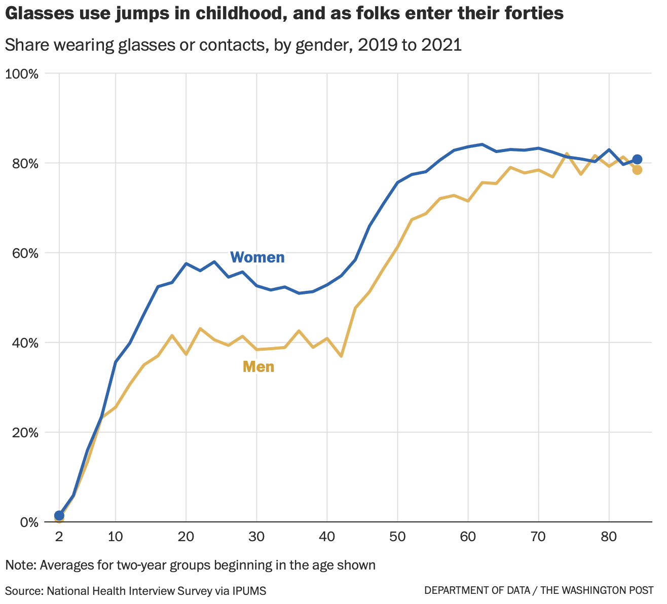
“Wait, is everybody wearing glasses nowadays?”

Paul Alper points to this fun news article by Andrew Van Dam, who runs the “Department of Data” column for the Washington Post. Van Dam writes:

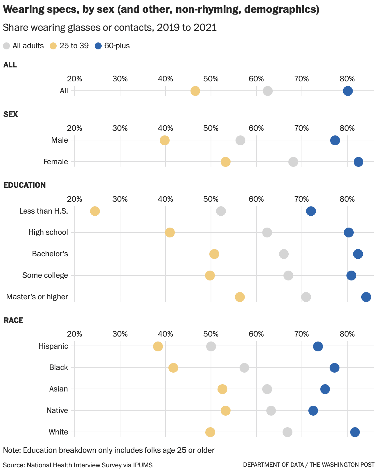
According to our analysis of more than 110,000 responses to the National Health Interview Survey conducted by the Census Bureau on behalf of the National Center for Health Statistics, 62 percent of respondents said they donned some form of corrective eyewear in a recent three year-period. . . .

The ubiquity of eyeglasses in your personal universe will change depending on whether you’re hanging out with young legal workers (ages 25 to 39) or your friends who work in agriculture or construction. That’s because the legal workers are more than twice as likely to wear glasses.

What’s actually going on here? If good vision is hereditary, as we assume, how could your occupation determine your need for vision correction? . . . we called eye-data expert Bonnielin Swenor, director of the Johns Hopkins Disability Health Research Center. Swenor pointed us to her friend and colleague, Johns Hopkins Wilmer Eye Institute pediatric ophthalmologist and researcher Megan Collins, who appears to know everything about eyeballs. . . .

It turns out that, yes, myopia [nearsightedness] is on the march. In a 2009 JAMA Ophthalmology publication, National Institutes of Health ophthalmologists found that the prevalence of myopia had increased from 25 percent of the population age 12 to 54 in 1971 and 1972 to 42 percent of people in that age range in 1999 to 2004. The study was based on thousands of physical exams conducted for the National Health and Nutrition Examination Survey. . . .

Swenor and Collins explain that while kids may not have changed, the world around them sure has. And key changes in the way kids grow up — many associated with urban living and consumer technology — have been hard on the eyes. . . . According to a review of myopia research, spending time outdoors is one of the best things a kid can do for healthy eye growth. . . . Outdoor light may help your eyes grow, and being outside gives your eyeballs more opportunities to flex their muscles by focusing on distant objects. While data is surprisingly scarce, available evidence suggests kids may spend less time outdoors than they did a generation or two ago. . . .

Myopia has risen even more rapidly in East Asia, where countries have attempted sweeping remedies. A program in Taiwan, for example, encouraged students to participate in two hours of outdoor activity every day. After it began in 2010, researchers found in the journal Ophthalmology, Taiwan’s long rise in myopia went into reverse.

People also are more educated today, and many studies find that the more education you have, the more likely you are to be myopic. That correlation, of course, is probably related to the first two factors: To get a diploma or degree, you’ll probably spend more time indoors studying. . . . Education gaps often accompany much of the difference in myopia — and thus the glasses gap — among groups: Women are more likely to wear glasses than men. High earners are more likely to wear glasses than low earners. And Asian and White Americans are more likely to wear glasses than their Black and Hispanic compatriots.

Of course, myopia is not the only reason a more-educated person might be more likely to wear glasses. “There are a number of other factors that may be at play too,” Collins said, “including cost of eyeglasses, access to vision care, health literacy, or trust in the health-care system.” More educated Americans are also more likely to be doing jobs that require near work, such as typing or reading, and thus more likely to don reading glasses to compensate for the slow advance of presbyopia.

While myopia is an easily corrected annoyance for many of us, Swenor says its rising prevalence is also a bona fide public health issue. When the eyeball elongates, the stretching can damage the wall of your retina and cause permanent, non-correctible vision loss such as myopic macular degeneration. . . .

This is just great, an exemplar of newspaper science writing. Let me count the ways:

1. Lots of data graphics

2. Quotes with outside experts

3. This: “While data is surprisingly scarce, available evidence suggests . . .” I looooove this recognition of uncertainty.

This was so great that I added Van Dam’s column to our Blogs We Read page.

Ritogel: Bandar Togel Online Terpercaya untuk Pengalaman Bertaruh yang Aman dan Menyenangkan

Dalam dunia perjudian online, kepercayaan dan keamanan merupakan dua aspek penting yang selalu dicari oleh para pemain. Ritogel, sebagai bandar togel online terpercaya, hadir untuk menjawab kebutuhan tersebut. Dengan komitmen untuk menyediakan lingkungan bertaruh yang aman dan adil, Ritogel telah menjadi destinasi utama bagi para penggemar togel di seluruh dunia.

How to teach certain tricky things such as the difference between standard deviation and standard error

The students in my class on applied regression and causal inference are required to contribute to a shared online document. Before each class, every student needs to enter something in the document, either a question on the reading/homework or a response to some other student’s question. Then in class we discuss some of the questions that came up.

This can work really well! For example, from today’s class:

Student #1: I am a bit confused on the formula from figure 6.4. The initial equation is y = 30 + 0.54x, but I am a bit confused on how we derive to the equivalent equation y = 63.9 + 0.54(x − 62.5)

Student #2: If you multiply it out: y = 63.9 + 0.54(x − 62.5) = 63.9 + 0.54x − 33.75 ≈ 30 + 0.54x. So you have the same equation in the end. But it’s transformed because an intercept where x = 0 doesn’t make a lot of practical sense in some cases (like height, where no one can be 0 inches tall). So we write that equation instead, centering it around the mean, to give more meaning to the intercept.

Sometimes lots of students ask the same or similar questions, and we definitely want to discuss live. For example:

Student #3: How exactly is the residual standard deviation calculated, and what does it mean conceptually? How can we understand it in comparison to standard error and standard deviation?

Student #4: I also had a question about this. I find the terms “standard error,” “standard deviation,” “standard deviation of the residual,” and “standard error of the true parameter values” to at times be used interchangeably, which can be very confusing. For instance, when I read the instructions for problem 1a., I assumed we were being asked to take the standard error, meaning the standard deviation divided by the square of n. Yet, in the book it makes clear we should use the sigma score produced by the stan_glm model. Is there a way for us to remember which concept is being invoked and when going forward, or is this something we just have to discern through context and our intuition?

Student #5: Yeah, I have the same questions here. It seems that the residual standard deviation is to describe the standard deviation of the error terms in the function.

Student #6: I also have this question : is uncertainty and standard error the same thing? And is MD_SD equal to the standard error that is sd/squared(n)? And using lm, is the uncertainty printed the standard deviation or error?

So I talked about standard deviation and standard error in class. It didn’t go well. I said how the standard error is the estimated standard deviation of a parameter estimate, I wrote some notation on the board, and I did some explaining. Nothing I said was wrong, but I don’t think it helped.

And, no kidding it didn’t help! Of course my explanation didn’t help. This was a topic that the students were already confused about. More talkety talk from me is not gonna solve that problem.

Here’s what I think I should’ve done. Instead of giving this definition and explanation, I should’ve just said that the definition and explanation are in the book, and I should’ve used the class time to go over an example. For example, just a few minutes earlier we’d discussed in class this fitted model predicting the incumbent candidate for president’s two-party vote share given percentage growth in per capita income in the year preceding the election, using all the elections after World War 2:

1948-2020:

            Median MAD_SD
(Intercept) 46.7    1.4
growth       2.8    0.6
Auxiliary parameter(s):
      Median MAD_SD
sigma 3.7 0.7

So I could’ve just gone through each of the sd’s in the display, along with sigma, and asked the students in pairs to explain to each other the meaning of each of these. Then the next thing would be to ask what would happen to these numbers if N were multiplied by 2, or by 4.

At this point, if students wanted to ask their questions on standard deviation and standard error, we could do it in the context of this example that they’ve just been talking about. We could also loop back to their homework assignment.

My mistake was to “explain” rather than to demonstrate. Explanation is a dead end. Demonstration is forward-looking and allows students to participate, which is absolutely necessary if you want them to learn something.

And if we want to follow up, we can go through the other fitted models we discussed, breaking the data into two parts:

1948-1988:

            Median MAD_SD
(Intercept) 44.8    2.7
growth       3.5    1.0
Auxiliary parameter(s):
      Median MAD_SD
sigma 4.5 1.2
1992-2020:

            Median MAD_SD
(Intercept) 48.4    1.5
growth       1.6    1.1
Auxiliary parameter(s):
      Median MAD_SD
sigma 2.8 0.8

I think this alternative way of teaching, using examples rather than explanation, would’ve worked better for three reasons:

1. The explanation’s still there in the book for students to read when they’re ready.

2. It should be easier to follow the idea in the context of a familiar example than in abstract framing in terms of estimates and sampling distributions.

3. Even if they still don’t fully understand the concept, in the meantime they may have learned a useful related skill which will move them forward.

How many hours should students spend in class each week (compared to doing homework)?

We had a fun discussion the other day after my talk in London on statistics teaching.

One question that arose was how our classes should change in reaction to the new chatbots that can write essays and answer homework questions.

My first reaction is that the chatbots will be helpful, not so much for doing homework or checking answers, as there are lots of examples where the chatbot gives the worst of both worlds: a wrong answer but with a superficially convincing explanation, but rather for helping with coding. Students are always telling me they got stuck for hours and hours trying to figure out the code to make some graph or do some analysis, and indeed, even routine tasks such as graphing a scatterplot with fitted regression line or poststratification accounting for uncertainty can be tricky to code in R or Python or whatever, so if the chatbot can help with that, great! The point is not for the chatbot to give the answer but rather to think of it as a sort of super-google that will help you find the answers to frequently asked questions on the internet.

So, yeah, a chatbot, if used well, can help with your homework, especially if the problem is to make some graph or do some statistical analysis and you have to figure out what commands to use on the computer. On the downside, it can get in the way of doing homework if you use it as a replacement for thinking, for example by entering your homework problem to the chat window, getting a solution as output, and then editing that slightly before turning it in. Editing a chatbot response isn’t nothing—it’s a real skill to take something that might be wrong and rewrite it as necessary to make sense, indeed this is a skill that recipients of the Founders Award from the American Statistical Association seem to struggle with, and indeed it could be useful in life—but it’s not really what we want to be teaching in a statistics class, either. It’s a skill, it’s just not statistics.

So, how does the existence and ready availability of powerful chatbots change our statistics teaching? To start, we can’t really give take-home essay assignments. But I wasn’t giving take-home essay assignments, or take-home final exam problems, anyway. I’ll still give regular homework assignments, but I can’t assume that students will do them. One option is to require the solutions be hand-written (except for those that require code and computer-made graphs); even if all you do is copy over something that came off the computer, that itself could be a way to help learn.

The big thing, though, is to rethink the balance between students’ time spent in class and time spent at home. Traditionally in university classes, classroom time is for following along the lecture and for asking questions, and home time is for reading the book and doing homework. Now, I think students need to spending most of classroom time working on problems, as we can’t assume they’ll be doing that at home. From this perspective, home is the time for students to prepare for class (by reading the book and doing practice problems) and for them to review the material after.

That works for me—it’s pretty much how I’ve been trying to teach anyway in recent years—but I wonder if the balance of hours needs to change too. Currently I’m assuming students will spend 10 hours a week on a course: that’s 3 hours in the classroom (2 weekly classes of 1.5 hours each; I’d prefer 3 classes a week, each an hour long, but unfortunately it seems that this will never again be happening at Columbia—something to do with its U.S. News ranking strategy, perhaps?), 1 hour in a help session with the teaching assistant if that is available, and 6 hours at home, which perhaps is 2 hours going through the textbook and 4 hours on homework.

Anyway, I’m just wondering: if students learn by doing, and if they’re going to be doing the doing in class and not at home, then maybe we should have more classroom hours? For each course, 4 or 5 hours per week instead of just 3? I know this is a non-starter too: in recent years, classes have started moving from two 1.5-hour meetings per week to one 2-hour meeting. Students and teachers alike find it so much more convenient to have fewer classroom hours to schedule. But I’m really thinking that more live hours would be better. Not 4 or 5 hours of lecture; 4 or 5 hours of supervised problem solving. That’s where I think we should go, even if I have no idea how to get there.

The Freaky Friday that never happened

Speaking of teaching . . . I wanted to share this story of something that happened today.

I was all fired up with energy, having just taught my Communicating Data and Statistics class, taking notes off the blackboard to remember what we’d been talking about so I could write about it later, and students were walking in for the next class. I asked them what it was, and they said Shakespeare. How wonderful to take a class on Shakespeare at Columbia University, I said. The students agreed. They love their teacher—he’s great.

This gave me an idea . . . maybe this instructor and I could switch classes some day, a sort of academic Freaky Friday. He could show up at 8:30 and teach my statistics students about Shakespeare’s modes of communication (with his contemporaries and with later generations including us, and also how Shakespeare made use of earlier materials), and I could come at 10am to teach his students how we communicate using numbers and graphs. Lots of fun all around, no? I’d love to hear the Shakespeare dude talk to a new audience, and I think my interactions with his group would be interesting too.

I waited in the classroom for awhile so I could ask the instructor when he came into the room, during the shuffling-around period before class officially starts at 10:10. Then 10:10 came and I stood outside to wait as the students continued to trickle in. A couple minutes later I saw a guy approaching, about my age, I ask if he teaches the Shakespeare class. Yes, he is. I introduce myself: I teach the class right before, on communicating data and statistics, maybe we could do a switch one day, could be fun? He says no, I don’t think so, and goes into the classroom.

That’s all fine, he has no obligation to do such a thing, also I came at him unexpectedly at a time when he was already in a hurry, coming to class late (I came to class late this morning too. Mondays!). His No response was completely reasonable.

Still . . . it was a lost opportunity! I’ll have to brainstorm with people about other ways to get this sort of interdisciplinary opportunity on campus. We could just have an interdiscplinary lecture series (Communication of Shakespeare, Communication in Statistics, Communication in Computer Science, Communication in Medicine, Communication in Visual Art, etc.), but it would be a bit of work to set up such a thing, also I’m guessing it wouldn’t reach so many people. I like the idea of doing it using existing classes, because (a) then the audience is already there, and (b) it would take close to zero additional effort: you’re teaching your class somewhere else, but then someone else is teaching your class so you get a break that day. And all the students are exposed to something new. Win-win.

The closest thing I can think of here is an interdisciplinary course I organized many years ago on quantitative social science, for our QMSS graduate program. The course had 3 weeks each of history, political science, economics, sociology, and psychology. It was not a statistics course or a methods course; rather, each segment discussed some set of quantitative ideas in the field. The course was wonderful, and Jeronimo Cortina and I turned it into a book, A Quantitative Tour of the Social Sciences, which I really like. I think the course went well, but I don’t think QMSS offers it anymore; I’m guessing it was just too difficult to organize a course with instructors from five different departments.

P.S. I read Freaky Friday and its sequel, A Billion for Boris, when I was a kid. Just noticed them on the library shelves. The library wasn’t so big; I must have read half the books in the children’s section at the time. Lots of fond memories.

“Creating Community in a Data Science Classroom”

David Kane sends along this article he just wrote with the above title and the following abstract:

A community is a collection of people who know and care about each other. The vast majority of college courses are not communities. This is especially true of statistics and data science courses, both because our classes are larger and because we are more likely to lecture. However, it is possible to create a community in your classroom. This article offers an idiosyncratic set of practices for creating community. I have used these techniques successfully in first and second semester statistics courses with enrollments ranging from 40 to 120. The key steps are knowing names, cold calling, classroom seating, a shallow learning curve, Study Halls, Recitations and rotating-one-on-one final project presentations.

There’s some overlap with the ideas in chapters 1 and 2 of my forthcoming book with Aki, “Active Statistics: Stories, Games, Problems, and Hands-on Demonstrations for Applied Regression and Causal Inference,” but Kane has a bunch of ideas that are different from (but complementary) to ours. I recommend our book (along with Rohan Alexander’s Telling Stories with Data, Elena Llaudet and Kosuke Imai’s Data Analysis for Social Science, our own, Regression and Other Stories); I also recommend Kane’s article. Kane, like Aki and me in our new book, focus on ways to get students actively involved in class. I hadn’t thought about this in terms of “community,” but that seems like a good way to frame it.

I’m sure there’s lots more out there; the above list of resource is focused on modern introductions to applied statistics and active ways to learn and teach this material.

Advice on writing a discussion of a published paper

A colleague asked for my thoughts on a draft of a discussion of a published paper, and I responded:

My main suggestion is this: Yes, your short article is a discussion of another article, and that will be clear when it is published. But I think you should write it to be read on its own, which means that you should focus on the points you want to make, and only then talk about the target article and other discussions.

So I’d do like this:

paragraph 1: Your main point. The one takeaway you want the reader to get.

the next few paragraphs: Your other points. Everything you want to say.

a few paragraphs more: How this relates to the articles you are discussing. Where you agree with them and where you disagree. If there are things in the target article you like, say so. Readers will in part use the discussion to make their judgment on the main article, so if your discussion reads as purely negative, that will take its toll. Which is fine, if that’s what you want to do.

final paragraph: Summary and pointers to future work.

I hope this is helpful. This advice might sound kinda generic but I actually wrote it specifically with your article in mind!

Awhile ago I gave some advice on writing research articles. This is the first time I recall specifically giving advice on writing a discussion.

My two courses this fall: “Applied Regression and Causal Inference” and “Communicating Data and Statistics”

POLS 4720, Applied Regression and Causal Inference:

This is a fast-paced one-semester course on applied regression and casual inference based on our book, Regression and Other Stories. The course has an applied and conceptual focus that’s different from other available statistics courses.
Topics covered in POLS 4720 include:
• Applied regression: measurement, data visualization, modeling and inference, transformations, linear regression, and logistic regression.
• Simulation, model fitting, and programming in R.
• Causal inference using regression.
• Key statistical problems include adjusting for differences between sample and population, adjusting for differences between treatment and control groups, extrapolating from past to future, and using observed data to learn about latent constructs of interest.
• We focus on social science applications, including but not limited to: public opinion and voting, economic and social behavior, and policy analysis.
The course is set up using the principles of active learning, with class time devoted to student-participation activities, computer demonstrations, and discussion problems.

The primary audience for this course is Poli Sci Ph.D. students, and it should also be ideal for statistics-using graduate students or advanced undergraduates in other departments and schools, as well as students in fields such as computer science and statistics who’d like to get an understanding of how regression and causal inference work in the real world!

STAT 6106, Communicating Data and Statistics:

This is a one-semester course on communicating data and statistics, covering the following modes of communication:
• Writing (including storytelling, writing technical articles, and writing for general audiences)
• Statistical graphics (including communicating variation and uncertainty)
• Oral communication (including teaching, collaboration, and giving presentations).
The course is set up using the principles of active learning, with class time devoted to discussions, collaborative work, practicing and evaluation of communication skills, and conversations with expert visitors.

The primary audience for this course is Statistics Ph.D. students, and it should also be ideal for Ph.D. students who do quantitative work in other departments and schools. Communication is sometimes thought of as a soft skill, but it is essential to statistics and scientific research more generally!

See you there:

Both courses have lots of space available, so check them out! In-person attendance is required, as class participation is crucial for both. POLS 4720 is offered Tu/Th 8:30-10am; STAT 6106 will be M/W 8:30-10:am. These are serious classes, with lots of homework. Enjoy.

How well do engineers understand probability? (question from an aeronautical engineer)

Zach del Rosario writes:

I recently published work investigating longstanding probability errors in aircraft design. I’m actually a bit sad that I had to write this paper, as the error is as simple as

f(quantile(X)) ==not necessarily equal to== quantile(f(X))

with X a random variable and f an arbitrary function. Despite the simplicity of this error, this tacit assumption has been in use in aircraft design for at least the past 60 years (based on the revision history of the Code of Federal Regulations).

Since completing this work, I’ve begun a research pivot to try to understand how university training could lead to so many engineers missing such a simple issue related to probability / uncertainty. I’m particularly curious to hear the experiences of your other readers. At this stage in my career I’m looking for inspiration on how to frame what is ultimately an education / social science question: How widespread are these kinds of issues in engineering, and what can we do from an education perspective to address them?

I have no idea! It’s my general impression that probability is intuitive to only a small minority of people. Math is hard, and probability is even harder! On the other hand, there’s research by Gigerenzer et al. that suggests that people understand probabilistic concepts much better when they are framed in terms of frequencies. So maybe instead of asking about the quantile of a distribution, you could say, “Imagine you have 1000 airplanes. How many would have . . .”, or whatever, and get better intuition that way. I’m just guessing, though; maybe some readers have better ideas.

“Whom to leave behind”

OK, this one is hilarious.

The story starts with a comment from Jordan Anaya, pointing to the story of Michael Eisen, a biologist who, as editor of the academic journal eLife, changed its policy to a public review system. It seems that this policy was controversial, much more so than I would’ve thought. I followed the link Anaya gave to Eisen’s twitter feed, scrolled through, and came across the above item.

There are so many bizarre things about this, it’s hard to know where to start:

– The complicated framing. Instead of just putting them in a lifeboat or something, there’s this complicated story about a spaceship with Earth doomed for destruction.

– It says that these people have been “selected” as passengers. All the worthy people in the world, and they’re picking these guys. “An Accountant with a substance abuse problem”? “A racist police officer”? Who’s doing the selection, exactly? This is the best that humanity has to offer??

– That “Eight (8)” thing. What’s the audience for this: people who don’t know what the word “Eight” means?

– All the partial information, which reminds me of those old-fashioned logic puzzles (“Mr. White lives next door to the teacher, who is not the person who likes to play soccer,” etc.) We hear about the athlete being gay and a vegetarian, but what about the novelist or the international student? Are they gay? What do they eat?

– I love that “militant African American medical student.” I could see some conflict here with the “60-year old Jewish university administrator.” Maybe best not to put both on the same spaceship . . .

– Finally, the funniest part is the dude on twitter who calls this “demonic.” Demonic’s a bad thing, right?

Anyway, I was curious where this all came from so I googled *Whom to Leave Behind* and found lots of fun things. A series of links led to this 2018 news article from News5 Cleveland:

In an assignment given out at Roberts Middle School in Cuyahoga Falls, students had to choose who they felt were “most deserving” to be saved from a doomed Earth from a list based on race, religion, sexual orientation and other qualifications. . . .

In a Facebook post, Councilman Adam Miller said he spoke with the teacher who gave the assignment. He said the teacher intended to promote diversity. Miller told News 5 the teacher apologized for the assignment that has caused such controversy.

The Facebook link takes us here:

Hey—they’re taking the wife but leaving the accountant behind. How horrible!

The comments to the post suggest this activity has been around for awhile:

And one of the commenters points to this variant:

I’m not sure exactly why, but I find this one a lot less disturbing than the version with the militant student, the racist cop, and the Jew.

There are a bunch of online links to that 2018 story. Even though the general lifeboat problem is not new, it seems like it only hit the news that one time.

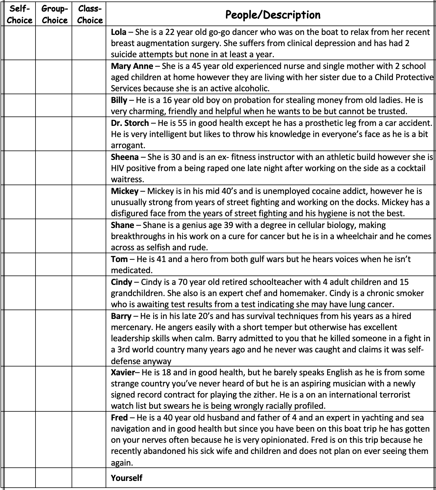
But . . . further googling turns up lots of variants. Particularly charming was this version with ridiculously elaborate descriptions:

I love how they give each person a complex story. For example, sure, Shane is curing cancer, “but he is in a wheelchair.” I assume they wouldn’t have to take the chair onto the boat, though!

Also they illustrate the story with this quote:

“It’s not hard to make decisions when you know what your values are” – Roy Disney

This is weird, given that the whole point of the exercise is that it is hard to make decisions.

Anyway, the original lifeboat activity seems innocuous enough, a reasonable icebreaker for class discussion. But, yeah, adding all the ethnic stuff just seems like you’re asking for trouble.

It’s more fun than the trolley problem, though, I’ll give it that.

DSGE and GPT3

Pedro Franco sends in two items.

The first relates to dynamic stochastic general equilibrium (DSGE) models in economics. Franco writes:

Daniel McDonald and Cosma Shalizi take a standard DSGE (short-run, macro models) and subject them to some fairly simple and clear tests (run the model and see how well it can estimate with centuries of data; take data and shuffle it around so inflation is GDP, GDP is interest rates, etc) and… the results are not great.

Noah Smith, who interviewed you a while ago, ended up beating me to the punch with an extensive article about the basics of what happened.

There were further developments afterwards that I haven’t seen summarized anywhere. In short, a bunch of macroeconomists on Twitter were surprised with what had been found in the paper and tried to replicate the results unsuccessfully. As far as I can tell (I’d need to check carefully), the authors of the paper haven’t yet replied to this, so it’s been an interesting example of “open science” overall, where the criticism is presented, counter-argued and things continue.

I don’t have anything to say about this one. I know next to nothing about macroeconomics. Shalizi is a reasonable guy but there’s just too much going on here for me to follow without having to learn a lot of stuff first. So I’ll just share it here as an example of scientific discussion.

Franco’s second item is about the performance of chatbots on standardized tests. He writes:

The latest iteration of GPT4 was presented together with the results of it going through a series of standardized exams (see here and here for the paper), something that got a lot of attention due to the impressive results it achieved. When I first saw this, I was equally impressed (and still am), but I think there’s a question to be had here that I haven’t seen so far (caveat, I’m not a researcher in the area, so I could easily have missed it) about a couple of things related to this.

There’s a smaller issue that I’ll go through first, which is with the way they test for contamination in their sample, that being when they check if the questions they use to test Chat’s capacity may have been a part of their training data. They basically test to see if 3 substrings of 50 characters of each question they use in each test was part of the training data and consider it a contaminated question if any of the substrings is present; it’s unclear if they manually check once the method detects a positive.

Having worked with language processing before, I understand that they’re probably doing this (instead of something more complex/thorough) for computational/manpower reasons, but it does mean there’s a chance that a much larger portion of their exam questions is contaminated than they realize/claim; I wish they had shown some sort of validation for their method, which I don’t think would have been hard to do. I’m specially worried given that the types of tests they’re using (GRE, SAT, etc) are heavily discussed on the internet and it would not be hard for small variations to exist with appropriate answers.

That said, what I think is the really interesting question is what exactly do we learn/measure with these tests? I.e., how do we interpret a LLM like ChatGPT doing well in standardized testing, as opposed to something that isn’t? Let me elaborate a little bit.

For humans, (at least one reason) we use these tests as we’re hoping/expecting that being able to do well in these types of questions means those humans will do well with novel questions and situations too, when it comes to applying their knowledge and reasoning. But is this sort of generalization reasonable for a LLM? The issue is that, as far as I understand things, the nature of standardized tests (with limited variation) means that answers to them are likely to be much more predictable to a LLM than to a human. With it’s massive training set, that sort of predictability seems to make it relatively easier for LLMs to deal with.

Essentially, we see the machine doing well in a task that we, humans, find hard, but hopefully measures our capacity to apply what we understood in other contexts/situations, and I think that we may end up anthropomorphising the LLM a bit too much and believing that the same tests are as useful in testing their abilities. To get back to initial question, I’m curious as to what exactly are we measuring when we do this, a recurrent question on your blog.

My reply: I’d separate this into two questions. First, what can the chatbot do; second, what are we asking from humans. For the first question: Yes, the chatbot seems to be able to construct strings of words that correspond closely to correct answers on the test. For the second question: This sort of pattern-matching is often what students learn how to do! We can look at this in a couple ways:

(a) For most students, the best way to learn how to give correct answers on this sort of test is to understand the material—in practice, actually learning the underlying topic is a more effective strategy than trying to pattern-match the answers without understanding.

(b) A student who is really confused can sometimes still get an OK grade by carefully studying practice problems and figuring out how to solve each kind of problem, without ever really understanding what is going on. But this can still be a good thing, because once you learn how to solve all these individual problems, you can start to figure out the big picture, similar to how if you know enough vocabulary and you immerse yourself in a foreign language, eventually it can start to make sense.

For computers, it’s different. Statement (a) won’t be the case with a computer, at least not with modern chatbots. As for statement (b), I don’t know what to say. I don’t see pattern-matching as leading to understanding, but maybe that could change in the future.

So I guess I’m agreeing with Franco, at least for now.

He’s looking for student-participation activities for a survey sampling class

Art Owen writes:

It is my turn to teach our sampling course again. Last time I did that, the highlight was that students could design and conduct their own online survey using Google consumer surveys. Today I learned that Google has discontinued that platform and I don’t see any successor product.

Do you know anybody offering something similar that could be used in a classroom?

Traditional sampling theory is pretty dated now and not often useful for sampling opinions. I compress the best parts of it into the first half or so of the class. Then I talk about sampling from databases, sampling from wildlife populations, and online sampling. I’ve been tempted to add something about how every time you interact with certain businesses (hotels, ride share …. ) you get nagged for a survey response either on the 5 point scale or the net-promoter 10 point scale about recommending the product. Mainly I find those things annoying, though I should probably add something about how they are or should be used.

My reply: For several years I taught a sampling class at Columbia. In the class I’d always have to spend some time discussing basic statistics and regression modeling . . . and this always was the part of the class that students found the most interesting! So I eventually just started teaching statistics and regression modeling, which led to our Regression and Other Stories book.

Also our new book, Active Statistics: Stories, Games, Problems, and Hands-on Demonstrations for Applied Regression and Causal Inference, has lots of fun material on sampling, including many in-class activities.

Regarding surveys that students could do, I like your idea of sampling from databases, biological sampling, etc. You can point out to students that a “blood sample” is indeed a sample!

Owen responded:

Your blood example reminds me that there is a whole field (now very old) on bulk sampling. People sample from production runs, from cotton samples, from coal samples and so on. Widgets might get sampled from the beginning, middle and end of the run. David Cox wrote some papers on sampling to find the quality of cotton as measured by fiber length. The process is to draw a blue line across the sample and see the length of fibers that intersect the line. This gives you a length-biased sample that you can nicely de-bias. There’s also an interesting out there about tree sampling, literally on a tree, where branches get sampled at random and fruit is counted. I’m not sure if it’s practical.

Last time I found an interesting example where people would sample ocean tracts to see if there was a whale. If they saw one, they would then sample more intensely in the neighboring tracts. Then the trick was to correct for the bias that brings. It’s in the Sampling book by S. K. Thompson. There are also good mark-recapture examples for wildlife.

I hesitate to put a lot of regression in a sampling class; It is all too easy for every class to start looking like a regression/prediction/machine learning class. We need room for the ideas about where and how data arises and it’s too easy to crowd those out by dwelling on the modeling ideas.

I’ll probably toss in some space-filling sampling plans and other ways to down size data sets as well.

The old style, from the classic book by Cochran, was: get an estimator, show it is unbiased, find an expression for its variance, find an estimate of that variance, show this estimate is unbiased and maybe even find and compare variances of several competing variance estimates. I get why he did it but it can get dry. I include some of that but I don’t let it dominate the course. Choices you can make and their costs are more interesting.

I understand the appeal of a sampling class that focuses on measurement, data collection, and inference issues specific to sampling. The challenge I’ve seen is getting enough students interested in taking such a class.

Devereaux on ChatGPT in the classroom

Palko points to this post by historian Bret Devereaux:

Generally when people want an essay, they don’t actually want the essay; the essay they are reading is instead a container for what they actually want which is the analysis and evidence. An essay in this sense is a word-box that we put thoughts in so that we can give those thoughts to someone else. . . .

In a very real sense then, ChatGPT cannot write an essay. It can imitate an essay, but because it is incapable of the tasks which give an essay its actual use value (original thought and analysis), it can only produce inferior copies of other writing. . . .

That leaves the role of ChatGPT in the classroom. And here some of the previous objections do indeed break down. A classroom essay, after all, isn’t meant to be original; the instructor is often assigning an entire class to write essays on the same topic, producing a kaleidoscope of quite similar essays using similar sources. Moreover classroom essays are far more likely to be about the kind of ‘Wikipedia-famous’ people and works which have enough of a presence in ChatGPT’s training materials for the program to be able to cobble together a workable response (by quietly taking a bunch of other such essays, putting them into the blender and handing out the result, a process which in the absence of citation we probably ought to understand as plagiarism). In short, many students are often asked to write an essay that many hundreds of students have already written before them.

And so there were quite a few pronouncements that ChatGPT had ‘killed’ the college essay. . . . This both misunderstands what the college essay is for as well as the role of disruption in the classroom. . . .

In practice there are three things that I am aiming for an essay assignment to accomplish in a classroom. The first and probably least important is to get students to think about a specific historical topic or idea, since they (in theory) must do this in order to write about it. . . . The second goal and middle in importance is training the student in how to write essays. . . . Thus the last and most important thing I am trying to train is not the form of the essay nor its content, but the basic skills of having a thought and putting it in a box that we outlined earlier. Even if your job or hobbies do not involve formal writing, chances are (especially if your job requires a college degree) you are still expected to observe something real, make conclusions about it and then present those conclusions to someone else (boss, subordinates, co-workers, customers, etc.) in a clear way, supported by convincing evidence if challenged. What we are practicing then is how to have good thoughts, put them in good boxes and then effectively hand that box to someone else. . . .

Crucially – and somehow this point seems to be missed by many of ChatGPT’s boosters I encountered on social media – at no point in this process do I actually want the essays. Yes, they have to be turned in to me and graded and commented because that feedback in turn is meant to both motivate students to improve but also to signal where they need to improve. But I did not assign the project because I wanted the essays. To indulge in an analogy, I am not asking my students to forge some nails because I want a whole bunch of nails – the nails they forge on early attempts will be quite bad anyway. I am asking them to forge nails so that they learn how to forge nails (which is why I inspect the nails and explain their defects each time) and by extension also learn how to forge other things that are akin to nails. . . .

What one can immediately see is that a student who simply uses ChatGPT to write their essay for them has simply cheated themselves out of the opportunity to learn (and also wasted my time in providing comments and grades).

It’s as if you’re coaching kids on the football team and you want them to build up their strength by lifting weights. It wouldn’t help the students to do it using a forklift.

Regarding chatbots in the classroom, I see a few issues:

1. It makes cheating a lot easier. Already you can google something like *high school essay on seven years war* and get lots of examples, but the most accessible ones you have to pay for, and you just get the essays one at a time, you can’t easily modify them. I’ve never actually used the GPT chatbot but I’m guessing there you can just type it in and get the essay right away.

Even for students who don’t want to cheat, I could see them typing in the essay topic just to get started, and then taking the chatbot output as a starting point . . . and that’s cheating, or it can be. More to the point, it can be destructive of the learning process relative to the ultimate goal: As Devereaux discusses, this sort of chatbot result won’t be at all useful for future writing that’s actually intended to convey information.

2. It will change the sorts of assignments that teachers give to students. Instead of the take-home essay assignment, the in-class assignment.

3. Even for the in-class assignment, the chatbot can be useful for preparing. Here I can see pluses and minuses. The plus is that it can give the student a lot of practice. The minus is that it’s practicing an empty form of writing (that horrible “five-paragraph essay” thing, ending, “In conclusion . . .”) and also it can be used to cheat: a student has a sense of what the question will be can prepare by having the chatbot write some plausible answers.

Again, the problem with cheating is that it’s a replacement for learning the relevant skills, in the same way that lifting weights with the forklift is a replacement for actually building your muscle strength.

4. On the plus side, it does seem that if used carefully the chatbot can create useful practice problems for studying. Whether the topic is writing anything else, it can be helpful to have lots of practice.

Some questions on regression

Brett Cooper writes:

I read your book Regression and Other Stories. As a beginner and community college student, I wonder if I may be able to ask you a couple of simple and clarifying questions.

1. Multiple Regression and Collinearity

I created 2 linear regression models using variables from a simple dataset. The first model is a simple linear regression model with a regressor X1 and a specific response variable Y. The other model is a multiple linear regression model which includes X1, X2, X3 and Y. The statistical summary for the simple linear regression model assigns a positive and statistically significant coefficient beta1 to X1 indicating a positive linear association between X1 and Y. However, the statistical summary for the multiple regression model shows that the coefficient beta1 for X1 has changed sign, changed magnitude and is not statistically significant anymore.
Did that happen because of the undesirable but often unavoidable effect of collinearity between X1 and one or both of the other two predictors X2 and X3?

Based on my understanding, it is to be expected that, even with zero multicollinearity, the regression coefficient associated with certain predictor X change, in magnitude or even sign, when the predictors X are considered together in a multiple linear regression model instead of separately in relation to the response variable Y. Is that correct?
However, is it “normal” for the coefficients’ sign and for the p-value for the same predictor X to change when switching to a different model? A change of coefficient sign for X would indicate an opposite behavior between X and Y in going from a simple to a multiple regression model…

— As a rule of thumb, before creating a multiple regression model involving Y,X1,X2,X3, would it recommended and useful to first create the simple regression models, i.e. Y =beta1*X1+beta0, Y =beta2*X2+beta0, Y=beta3*X3+beta0, and compute their regression coefficients? Or should we jump straight to the multivariate model Y= beta1*X1+beta2*X2+beta3*X3 and evaluate the regression coefficients at that point?

2. Multicollinearity

— Multicollinearity affects the interpretability (impacts the accuracy of the regression coefficients) of our model but not its predictive power. Multicollinearity can have different sources: it can originate from the data itself but also from the structure of the model. For example, model Y = beta1*X1 + beta2* X1^2 + beta3 * (X1*X2) has interdependent terms. Surprisingly, multicollinearity would NOT be present between X1 and the term X1^2 even if they are quadratically dependent…Is that correct? What about the interaction term (X1*X3) and the term X1? Or would multicollinearity be present and only be reduced if we mean center the variables X1, X2, X3?

— Correlation means linear dependence. Is multicollinearity only caused by the presence of linear dependence or do other types of dependence (curvilinear, etc.) between predictors also cause collinearity in the model?

3. Variable Transformation (feature scaling)

–Certain statistical models require their input predictors to be scaled before they can be used to build the model itself so the variables can all be on equal footing.
Some models, like decision trees, don’t require scaling at all. Scaling variables (linear or nonlinear scaling) is generally useful when the involved variables, the Xs and the Y, have very different ranges. My understanding is that predictor variables with large ranges would automatically receive large regression coefficients even if their relative importance is lower in comparison to other predictors. Is that correct and true for most models?

— In some cases, scaling seems optional and only improves the interpretability of the association between Y and the Xs (computed correlation may be tiny only and we can increase it by scaling the variables). That said, is the scaling of the predictors X and/or response variable Y necessary and critical for the creation of an accurate and correct simple or multiple linear regression model? Or does scaling only help with the interpretability of the regression coefficients?

My reply:

1a. When you add predictors to a model, you can expect the coefficients of the original predictors to change. Once they can change, yes, they can change sign: there’s nothing special about zero. As for statistical significance and p-values: sure, they can change too. One way to see this is to imagine N = 1 million: then even small changes in the coefficients will correspond to huge changes in p-values.

1b. Yes, when you fit a big model, I recommend fitting a series of little models to build up to it, and you can look at how the predictions of interest change as the model builds up.

2. I’m not completely sure about your questions on multicollinearity. To put it another way: the answers to these questions are not obvious to me, and I recommend figuring these out by just simulating them in R.

3. I think that scaling is important for the interpretation of parameters (see here) and if you’re going to use Bayesian priors (see here). There’s also nonlinear scaling (logs, etc.) or combining predictors, which will change your model entirely.