When your regression model has interactions, do you need to include all the corresponding main effects?

Jeff Gill writes:

For some reason the misinterpretations about interactions in regression models just won’t go away. I teach the point that mathematically and statistically one doesn’t have to include the main effects along with the multiplicative component, but if you leave them out it should be because you have a strong theory supporting this decision (i.e. GDP = Price * Quantity, in rough terms). Yet I got this email from a grad student yesterday:

As I was reading the book, “Introduction to Statistical Learning,” I came across the following passage. This book is used in some of our machine learning courses, so perhaps this is where the idea of leaving the main effects in the model originates. Maybe you can send these academics a heartfelt note of disagreement.

“The hierarchical principle states that if we include an interaction in a model, we should also include the main effects, even if the p-values associated with their coefficients are not significant. In other words, if the interaction between X1 and X2 seems important, then we should include both X1 and X2 in the model even if their coefficient estimates have large p-values. The rationale for this principle is that if X1 × X2 is related to the response, then whether or not the coefficients of X1 or X2 are exactly zero is of little interest. Also X1 × X2 is typically correlated with X1 and X2, and so leaving them out tends to alter the meaning of the interaction.”

(Bousquet, O., Boucheron, S. and Lugosi, G., 2004. Introduction to statistical learning theory. Advanced Lectures on Machine Learning: ML Summer Schools 2003, Canberra, Australia, February 2-14, 2003, Tübingen, Germany, August 4-16, 2003, Revised Lectures, pp.169-207.)

There are actually two errors here. It turns out that the most cited article in the history of the journal Political Analysis was about interpreting interactions in regression models, and there are seemingly many other articles across various disciplines. I still routinely hear the “rule of thumb” in the quote above.

To put it another way, suppose you start with the model with all the main effects and interactions, and then you consider the model including the interactions but excluding one or more main effects. You can think of this smaller model in two ways:

1. You could consider it as the full model with certain coefficients set to zero, which in a Bayesian sense could be considered as very strong priors on these main effects, or in a frequentist sense could be considered as a way to lower variance and get more stable inferences by not trying to estimate certain parameters.

2. You could consider it as a different model of the world. This relates to Jeff’s reference to having a strong theory. A familiar example is a model of the form, y = a + b*t + error, with a randomly assigned treatment z that occurs right after time 0. A natural model is then, y = a + b*t + c*z*t + error. You’d not want to fit the model, y = a + b*t + c*z * d*z*t + error—except maybe as some sort of diagnostic test—because, by design, the treatment cannot effect y at time 0.

I have three problems with the above-quoted passage. The first is the “even if the p-values” bit. There’s no good reason, theoretically or practically, that p-values should determine what is in your model. So it seems weird to refer to them in this context. My second problem is where they say, “whether or not the coefficients of X1 or X2 are exactly zero is of little interest.” In all my decades of experience, whether or not certain coefficients are exactly zero is never of interest! I think the problem here is that they’re trying to turn an estimation problem (fitting a model with interactions) into a hypothesis testing problem, and I think this happened because they’re working within an old-fashioned-but-still-dominant framework in theoretical statistics in which null hypothesis significance testing is fundamental. Finally, calling it a “hierarchical principle” seems to be going too far. “Hierarchical heuristic,” perhaps?

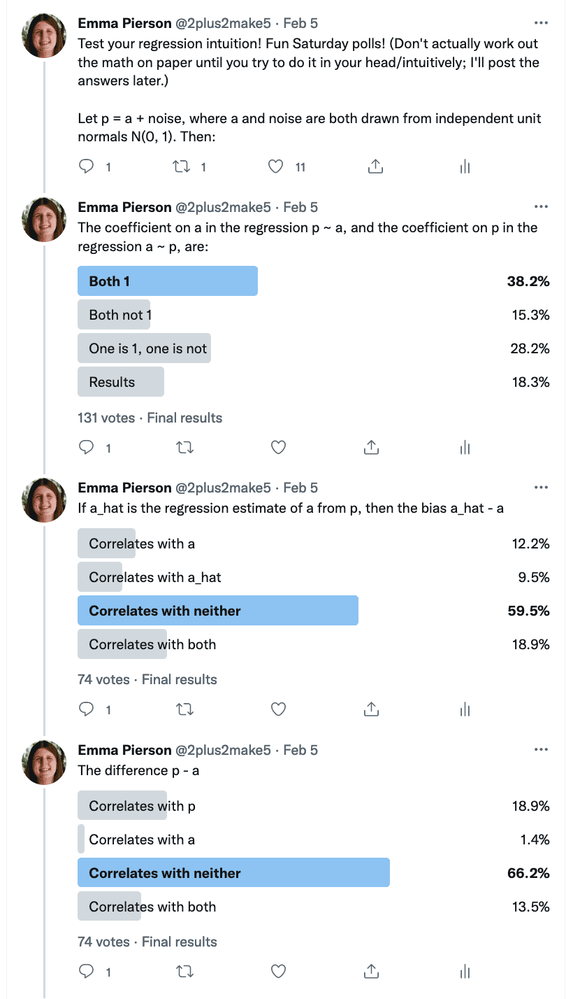
That all said, usually I agree with the advice that, if you include an interaction in your model, you should include the corresponding main effects too. Hmmm . . . let’s see what we say in Regression and Other Stories . . . section 10.3 is called Interactions, and here’s what we’ve got . . .

We introduce the concept of interactions in the context of a linear model with a continuous predictor and a subgroup indicator:

Figure 10.3 suggests that the slopes differ substantially. A remedy for this is to include an interaction . . . that is, a new predictor defined as the product of these two variables. . . . Care must be taken in interpreting the coefficients in this model. We derive meaning from the fitted model by examining average or predicted test scores within and across specific subgroups. Some coefficients are interpretable only for certain subgroups. . . .

An equivalent way to understand the model is to look at the separate regression lines for [the two subgroups] . . .

Interactions can be important, and the first place we typically look for them is with predictors that have large coefficients when not interacted. For a familiar example, smoking is strongly associated with cancer. In epidemiological studies of other carcinogens, it is crucial to adjust for smoking both as an uninteracted predictor and as an interaction, because the strength of association between other risk factors and cancer can depend on whether the individual is a smoker. . . . Including interactions is a way to allow a model to be fit differently to different subsets of data. . . . Models with interactions can often be more easily interpreted if we preprocess the data by centering each input variable about its mean or some other convenient reference point.

We never actually get around to giving the advice that, if you include the interaction, you should usually be including the main effects, unless you have a good theoretical reason not to. I guess we don’t say that because we present interactions as flowing from the main effects, so it’s kind of implied that the main effects are already there. And we don’t have much in Regression and Other Stories about theoretically-motivated models. I guess that’s a weakness of our book!

“The Role of Doubt in Conceiving Research.” The capacity to be upset, to recognize anomalies for what they are, and to track them down and figure out what in our understanding is lacking:

Stanley Presser sends along this article, “The Role of Doubt in Conceiving Research.” Presser has taught for many years at the University of Maryland but not when I was a student there, also he teaches sociology and I’ve never taken a sociology class.

Presser’s article has lots of interesting discussion and quotes about learning from failure, the problem of researchers believing things that are false, the challenge of recognizing what is an interesting research question, along with some specific issues that arise with survey research.

I’m reminded of the principle that an important characteristic of a good scientist is the capacity to be upset, to recognize anomalies for what they are, and to track them down and figure out what in our understanding is lacking. This sort of unsettled-ness–aan unwillingness to sweep concerns under the rug, a scrupulousness about acknowledging one’s uncertainty—is, I would argue, particularly important for a statistician.

P.S. That last link is from 2016, to a post that begins as follows:

I’ve given many remote talks but this is the first time I’ve spoken at an all-electronic conference. It will be a challenge. In a live talk, everyone’s just sitting in the room staring at you, but in an electronic conference everyone will be reading their email and surfing the web. . . . At the very least, I have to be more lively than my own writing, or people will just tune me out and start reading old blog entries.

Funny to see this, seven years later, now that electronic conferences are the standard. And I think they really are worse than the in-person variety. It’s hard for a speaker to be more interesting than whatever is in everybody’s inbox, not to mention the world that is accessible from google.

Instructors are trying their best but they are busy and often don’t themselves understand statistics so well. How can they avoid using bad examples, or does this even matter?

Asher Meir writes:

I haven’t cried on your shoulder for a long time, but I know statistics education is one of your passions and I couldn’t resist.

My niece is studying political science at a university in Holland. She has a required course in data analysis/statistical methods. Everyone so often she asks me for help with her homework and every time I see black. Here is the latest example. The students are given a data set of 193 countries (all of them, according to the assignment), with regime type and education expenditure level for each one. Here are a few of the questions:

· Compute the proportion of democracies in the data set and calculate the 95% confidence interval.

· According to an earlier measurement, out of 185 countries 90 were democratic in 2000. Use the confidence interval method (i.e. compare the two confidence intervals) to decide whether the proportion of democracies significantly differs between now and then.

· According to an earlier measurement, the average education expenditure of democracies was 4,695 in 2000. Compare the mean education expenditure of democracies in 2000 and today (2019). Formulate appropriate hypotheses and investigate whether there is a statistically significant difference between the expenditure on education now and then.

The data set doesn’t have a subsample, it has all 193 countries in the world. Ergo, there is no confidence interval; if there are exactly 100 democracies then the confidence interval is [100,100]. If 90 were democratic in 2000, then the number of democracies is different at the 100% confidence level, and this would be true even if the number in 2000 was 99, compared to 100 in the new data set. The same for education expenditures. There is no sample and no indication of measurement error. If there is even a one-Euro (or dollar or whatever) difference in the expenditure, then that difference is significant at the 100% level.

Is that correct?

On the previous problem set I told my niece the questions were carelessly written, but “this is what they really want you to do.” But this one is so egregious I really don’t know what to tell her. I just told her that there is no relevance for a confidence interval if you have data for the whole population.

The problem set also has a lot of gratuitous left wing propaganda, I imagine that there is some kind of correlation between being ignorant of how to draw conclusions and taking certain conclusions for granted even when they have no empirical basis.

(Evidently what the instructor has in mind is a test which measures the following: Suppose each country observation is a random draw from a Bernoulli distribution with probability P of being a democracy/heads. We find that in a sample of 193 tosses, 100 are heads. What is the 95% confidence interval for P? But that’s not how regimes are decided, at least not in the short run.)

I have a few things to say about this story:

1. Is it really true that “there is no relevance for a confidence interval if you have data for the whole population”?

2. What about the particular example of the 193 countries?

3. What’s an instructor to do?

1. Is it really true that “there is no relevance for a confidence interval if you have data for the whole population”?

No, I disagree with that strong statement. The statement would be true if sampling were the only theoretical basis for confidence intervals, but sampling is not the only form of randomness. We discussed this back in 2011 in our post, How do you interpret standard errors from a regression fit to the entire population?. Short answer is that even if you have the whole population right now, you’re still gonna want to use your model for prediction to new cases.

2. What about the particular example of the 193 countries?

Here I agree with my correspondent that his niece’s homework assignment doesn’t make sense, as the question isn’t asking about the prevalence of democracy or the relation between democracy and some other variable; it’s just flat-out asking for a 95% interval for “the proportion of democracies.” I can’t see how to wriggle out of that one and define a population.

Just by comparison, several years ago I was fitting a model to estimate the cancer death rate by county using ten years of data. Assuming the data give all the cancer deaths, the results are the results. But if a county has, say, a population of 1000 with 1 kidney cancer death, I’m comfortable saying that 0.001 is the observed kidney cancer death rate but there’s an underlying kidney cancer death rate in the county that I don’t know, for which I can perform inference. That underlying rate is just a mathematical construct but it makes sense to me to think about it. In the democracy example, I don’t see a corresponding underlying-parameter model that makes sense.

3. What’s an instructor to do?

As the above examples illustrate, these problems are subtle. Where does this leave the teacher in such a course, who needs to teach the basics (for example, how to construct and interpret a confidence interval from a binomial proportion) but would like to avoid bad examples such as the democracy problem above where the model doesn’t really apply?

The instructor then has two choices.

The cleanest option is to step back and only use models from pure math, so instead of countries that are democratic or not, all the problems involve sampling balls from a very large urn, or rolling a die with an unknown bias, or drawing cards from a well-shuffled deck. Even here you can run into trouble (for example, you can’t really find a coin where, when you flip it, it has probability p of landing heads, unless p = 0.5, 0, or 1), but if you stick to urns you should be ok.

When I teach this material, my go-to example is basketball shots, where I state the probability of success and also explicitly assume the outcomes are independent. Assuming known probability and independence of outcomes of basketball shots is no more unreasonable than assuming these properties for draws of balls from an urn, and I think the hoops example is easier to visualize, also you can easily talk about players with different abilities or the probability changing as you move closer or farther from the basket. All this is easier for me to think about than, say, comparing the unknown probabilities of black and white balls in an urn. The point is that the basketball example, the way I set it up, is pure probability—it’s really a math example, just like the urn.

The other approach when teaching confidence intervals from binomial proportions is to use real data. There are many available examples from sports (for example, basketball free-throw data), but for a social science class the go-to example will be public opinion surveys. I talk about these in my classes all the time!

When using real data I think it’s important to talk about the assumptions and their failures. For a sample survey, it’s easy: the basic assumption is that we have a simple random sample of accurate measurements from the population of interest, and these assumptions can go wrong because it’s not a random sample, the measurements have error (for example, respondents aren’t always telling the truth), and undercoverage (you’re not fully accessing the population of interest). For the countries-with-democracy example, the assumptions aren’t so clear, which should already be a signal that something’s going wrong.

Here’s an example, kinda like the democracy example but which fits better into the binomial modeling setting: “Suppose you say that an attempted coup d’etat has probability p of succeeding, and you have data on 185 attempted coups, of which 90 succeeded. Give an estimate and 95% confidence interval for the probability that an attempted coup succeeds.” Here the assumption is that coups are independent, each with ex-ante probability p of success. These assumps are clearly wrong—outcomes aren’t independent, and the success probabilities have to vary a lot—but so are the assumps of a political poll. The point is that the binomial model makes sense on its own terms here.

So my advice to instructors when creating such problems is to be explicit about the assumptions that make the math work, be clear about how these assumptions translate to real life, and, if you can’t figure out how to state the assumptions, don’t use the example.

Stating the assumptions and how they can go wrong, that takes work. But I think it’s worth it.

Summer School on Advanced Bayesian Methods in Belgium

(this post is by Charles)

This September, the Interuniversity Institute for Biostatistics and statistical Bioinformatics is holding its 5th Summer School on Advanced Bayesian Methods. The event is set to take place in Leuven, Belgium. From their webpage:

As before, the focus is on novel Bayesian methods relevant to the applied statistician. In the fifth edition of the summer school, the following two courses will be organized in Leuven from 11 to 15 September 2023:

The target audience of the summer school are statisticians and/or epidemiologists with a sound background in statistics, but also with a background in Bayesian methodology. In both courses, practical sessions are organized, so participants are asked to bring along their laptop with the appropriate software (to be announced) pre-installed.

I’m happy to do a three-day workshop on Stan: we’ll have ample time to dig into a lot of interesting topics and students will have a chance to do plenty of coding.

I’m also looking forward to the course on spatial modeling. I’ve worked quite a bit on the integrated Laplace approximation (notably its implementation in autodiff systems such as Stan), but I’ve never used the INLA package itself (or one of its wrappers), nor am I very familiar with applications in ecology. I expect this will be a very enriching experience.

The registration deadline is July 31st.

Rosenthal’s textbook: A First Look at Rigorous Probability Theory

I’ve never taken a stats class. I was a math major, but dropped stats after I got appendicitis because I didn’t want to drop abstract algebra or computability theory. So here I am 40 years later trying to write up some more formal notes on probability theory and Markov chain Monte Carlo methods (MCMC) and finding myself in need of a gentle intro to probability theory that defines things rigorously. Jeffrey S. Rosenthal’s 2006 book A First Look at Rigorous Probability Theory is just what I needed. Despite not being very good at continuous math as an undergrad, I would have loved this book as it’s largely algebraic, topological, and set-theoretic in approach rather than relying on in-depth knowledge of real analysis or matrix algebra. Even the examples are chosen to be simple rather than being designed for Ph.D.s in math, and even include a lot of basic analysis results like constructing uncountable, unmeasurable sets.

This is not the final book you’ll need on your way to becoming a measure theorist. For example, it never discusses Radon-Nikodym derivatives to unify the theory of pdfs. It doesn’t really get into stochastic processes beyond a high-level discussion of Brownian motion. It does cover the basic theory of general state space, time-homogeneous Markov chains in a few pages (why I was reading it), but that’s just scratching the surface of Rosenthal and Roberts’ general state-space MCMC paper which is dozens of pages long in much finer print.

One of the best features of the book is that it’s both short and packed with meaningful examples. Rosenthal was quite selective in eliminating unnecessary fluff and sticking to the through line of introducing the main ideas. Most of the texts in this area just can’t resist all kinds of side excursions, examples which bring in all sorts of Ph.D. level math. That can be good if you need breadth and depth, but Rosenthal’s approach is superior for a first, broad introduction to the field.

In summary: 5/5 stars.

Stan class at NYR Conference in July (in person and virtual)

I (Jonah) am excited to be teaching a 2-day Stan workshop preceding the NYR Conference in July. The workshop will be July 11-12 and the conference July 13-14.  The focus of the workshop will be to introduce the basics of applied Bayesian data analysis, the Stan modeling language, and how to interface with Stan from R. Over the course of two full days, participants will learn to write models in the Stan language, run them in R, and use a variety of R packages to work with the results.

There are both in-person and remote spots available, so if you can’t make it to NYC you can still participate. For tickets to the workshop and/or conference head to https://rstats.ai/nyr.

P.S. In my original post I forgot to mention that you can use the discount code STAN20 to get 20% off tickets for the workshop and conference!


Before data analysis: Additional recommendations for designing experiments to learn about the world

Statisticians talk a lot about what to do with your data. We can go further by considering what comes before data analysis: design of experiments and data collection. Here are some recommendations for design and data collection:

Recommendation 1. Consider measurements that address the underlying construct of interest.

The concepts of validity and reliability of measurement are well known in psychology but are often forgotten in experimental design and analysis. Often we see exposure or treatment measures and outcome measures that connect only indirectly to substantive research goals. This can be seen in the frequent disconnect between the title and abstract of a research paper, on one hand, and the actual experiment, on the other. A notorious example in psychology is a paper that referred in its title to a “long-term experimental study” that in fact was conducted for only three days.

Our recommendation goes in two directions. First, set up your design and data collection to measure what you want to learn about. If you are interested in long-term effects, conduct a long-term study if possible. Second, to the extent that it is not possible to take measurements that align with your inferential goals, be open about this gap and explicit about the theoretical assumptions or external information that you are using to support your more general conclusions.

Recommendation 2. When designing an experiment, consider realistic effect sizes.

There is a tendency to overestimate effect sizes when designing a study. Part of this is optimism and availability bias: it is natural for researchers who have thought hard about a particular effect to think that it will be important, to envision scenarios where the treatment will have large effects and not to think so much about cases where it will have no effect or where it will be overwhelmed by other possible influences on the outcome. In addition, past results will be much more likely to be published if they have reached a significance threshold, and this results in literature reviews that vastly overestimate effect sizes.

Overestimation of effect sizes leads to overconfidence in design, with researchers being satisfied by small sample size and sloppy measurements in a mistaken belief that the underlying effect is so large that it can be detected even with a very crude inference. And this causes three problems. First, it is a waste of resources to conduct an experiment that is so noisy that there is essentially no chance of learning anything useful, and this sort of work can crowd out the more careful sorts of studies that would be needed to detect realistic effect sizes. Second, a false expectation of high power creates a cycle of hype and disappointment that can discredit a field of research. Third, the process of overestimation can be self-perpetuating, with a noisy experiment being analyzed until apparently statistically-significant results appear, leading to another overestimate to add to the literature. These problems arise not just in statistical power analysis (where the goal is to design an experiment with a high probability of yielding a statistically significant result) but also applies to more general design analyses where inferences will be summarized by estimates and uncertainties.

Recommendation 3. Simulate your data collection and analysis on the computer first.

In the past, we have designed experiments and gathered data on the hope that the results would lead to insight and possible publication—but then the actual data would end up too noisy, and we would realize in retrospect that our study never really had a chance of answering the questions we wanted to ask. Such an experience is not a complete waste— we learn from our mistakes and can use them to design future studies—but we can often do better by preceding any data collection with a computer simulation.

Simulating a study can be more challenging than conducting a traditional power analysis. The simulation does not require any mathematical calculations; the challenge is the need to specify all aspects of the new study. For example, if the analysis will use regression on pre-treatment predictors, these must be simulated too, and the simulated model for the outcome should include the possibility of interactions.

Beyond the obvious benefit of revealing designs that look to be too noisy to detect main effects or interactions of interest, the construction of the simulation focuses our ideas by forcing us to make hard choices in assuming the structure and sizes of effects. In the simulation we can make assumptions about variation in measurement and in treatment effects, which can facilitate the first two recommendations above.

Recommendation 4. Design in light of analysis.

In his book, The Chess Mysteries of Sherlock Holmes, logician Raymond Smullyan (1979) wrote, “To know the past, one must first know the future.” The application of this principle to statistics is that design and data collection should be aligned with how you plan to analyze your data. As Lee Sechest put it, “The central issue is the validity of the inferences about the construct rather than the validity of the measure per se.”

One place this arises is in the collection of pre-treatment variables. If there is concern about imbalance between treatment and control groups in an observational study or an experiment with dropout, it is a good idea to think about such problems ahead of time and gather information on the participants to use in post-data adjustments. Along similar lines, it can make sense to recruit a broad range of participants and record information on them to facilitate generalizations from the data to larger populations of interest. A model to address problems of representativeness should include treatment interactions so that effects can vary by characteristics of the person and scenario.

In summary, we can most effectively learn from experiment if we think plan the design and data collection ahead of time, which involves: (1) using measurement that relates well to underlying constructs of interest, (2) considering realistic effect sizes and variation, (3) simulating experiments on the computer before collecting any data, and (4) keeping analysis plans in mind in the design stage.

The background on this short paper was that I was asked by Joel Huber from the Journal of Consumer Psychology to comment on an article by Michel Wedel and David Gal, Beyond statistical significance: Five principles for the new era of data analysis and reporting. Their recommendations were: (1) summarize evidence in a continuous way, (2) recognize that rejection of statistical model A should not be taken as evidence in favor of preferred alternative B, (3) use substantive theory to generalize from experimental data to the real world, (4) report all the data rather than choosing a single summary, (5) report all steps of data collection and analysis. (That’s my rephrasing; you can go to the Wedel and Gal article to see their full version.)

Lots of confusion around probability. It’s a jungle out there.

Emma Pierson sends along this statistics quiz (screen-shotted below—you can see the answers people gave to each question in the bar graphs):

Pierson writes:

In spite of the simplicity and ubiquity of the setup, people were very bad at this quiz—on every question, the majority answer was incorrect, and on the last two questions, performance was worse than random guessing. Of course, Twitter is a weird sample, but I also spoke to a number of genuine experts—professors of statistics, computer science, and economics at top universities—who found these questions unintuitive as well. I thought this might be of interest to your blog because you might be able to provide some useful intuition or diagnose why people’s intuitions lead them astray here.

I responded: I don’t quite understand your questions. From question 1, it look like “a”, “noise”, and “p” are vectors; I’m picturing length 100 because that’s what I typically do in simulation experiments for class.. But then in question 2, it looks like “a” is a scalar, but then the bias would be E(a_hat – a), not a_hat – a. And then the correlation you’re discussing is across multiple studies. In question 3, it again seems like “a” and “p” are vectors. I guess I understand questions 1 and 3 but not question 2. I agree that it’s disturbing that so many people get this wrong. I wonder whether the ambiguous specification is part of the problem. Or maybe I’m missing something?

Pierson responded:

Here’s a simulation of the setup I had in mind (hopefully a correct simulation—I don’t really use R these days, but I think you do):

a = rnorm(500000)
noise = rnorm(500000)
p = a + noise
d = data.frame(a, p)

# question 1
print(lm(a ~ p, data=d))
print(lm(p ~ a, data=d))

# question 2
a_hat = predict(lm(a ~ p, data=d), d)
print(cor(a_hat - a, a))
print(cor(a_hat - a, a_hat))

# question 3
print(cor(p - a, a))
print(cor(p - a, p))

Always hard to know what people on Twitter are thinking, but I don’t think (based on my conversations with people) that misunderstandings explain the wrong answers? People seemed to understand the setup pretty clearly, and I also didn’t get any confused questions about it on Twitter.

To which I replied: Oh, you were defining a_hat as the point prediction: I didn’t get that part. I agree that these things confuse people. It reminds me of that other false intuition people have, that if a is correlated with b, and b is correlated with c, then a must be correlated with c. People also seem to have the intuition that a can be correlated with b, even while b is uncorrelated with a. And then there’s a whole literature in cognitive psychology on super-additive probabilities (Pr(A) + Pr(not-A) seems to be greater than 1) or sub-additive probabilities (Pr(A) + Pr(not-A) seems to be less than 1). Lots of confusion around probability. It’s a jungle out there.

This is one of the motivations for the work of Gigerenzer etc. on reframing problems in terms of natural frequencies so as to avoid the confusingness of probability.

Physics educators do great work with innovative teaching. They should do better in evaluating evidence of effectiveness and be more open to criticism.

Michael Weissman pointed me to a frustrating exchange he had with the editor of, Physical Review Physics Education Research. Weissman submitted an article criticizing an article that the journal had published, and the editor refused to publish his article. That’s fine—it’s the journal’s decision to decide what to publish!—but I agree with Weissman that some of the reasons they gave for not publishing were bad reasons, for example, “in your abstract, you describe the methods used by the researchers as ‘incorrect’ which seems inaccurate, SEM or imputation are not ‘incorrect’ but can be applied, each time they are applied, it involves choices (which are often imperfect). But making these choices explicit, consistent, and coherent in the application of the methods is important and valuable. However, it is not charitable to characterize the work as incorrect. Challenges are important, but PER has been and continues to be a place where people tend to see the positive in others.”

I would not have the patience to go even 5 minutes into these models with the coefficients and arrows, as I think they’re close to hopeless even in the best of settings and beyond hopeless for observational data, nor do I want to think too hard about terms such as “two-way correlation,” a phrase which I hope never to see again!

I agree with Weissman on these points:

1. It is good for journals to publish critiques, and I don’t think that critiques should be held to higher standards than the publications they are critiquing.

2. I think that journals are too focused on “novel contributions” and not enough on learning from mistakes.

3. Being charitable toward others is fine, all else equal, but not so fine if this is used as a reason for researchers, or an entire field, to avoid confronting the mistakes they have made or the mistakes they have endorsed. Here’s something I wrote in praise of negativity.

4. Often these disputes are presented as if the most important parties are authors of the original paper, the journal editor, and the author of the letter or correction note. But that’s too narrow a perspective. The most important parties are not involved in the discussion at all: these are the readers of the articles—those who will takes its claims and apply them to policy or to further researchers—and all the future students who may be affected by these policies. Often it seems that the goal is to minimize any negative career impact on the authors of the original paper and to minimize any inconvenience to the journal editors. I think that’s the wrong utility function, and to ignore the future impacts of uncorrected mistakes is implicitly an insult to the entire field. If the journal editors think the work they publish has value—not just in providing chits that help scholars get promotions and publicity, but in the world outside the authors of these articles—then correcting errors and learning from mistakes should be a central part of their mission.

I hope Weissman’s efforts in this area have some effect in the physics education community.

As a statistics educator, I’ve been very impressed by the innovation shown by physics educators (for example, the ideas of peer instruction and just-in-time teaching, which I use in my classes), so I hope they can do better in this dimension of evaluating evidence of effectiveness.

These corruption statistics are literally incredible! (Every political science student should read this article.)

Matthew Stephenson sends along this paper on the reliability of quantitative estimates of the magnitude and impact of global corruption and writes:

There’s no fancy statistical work here, and nothing about causal inference – my coauthor Cecilie Wathne and I were just trying to figure out where some of these oft-cited numbers come from… and we found that they’re often either completely made up, or based on what can be most generous described as gut feelings expressed in quantitative form.

From the paper:

We analysed ten global corruption statistics, attempting to trace each back to its origin and to assess its credibility and reliability. These statistics concern the amount of bribes paid worldwide, the amount of public funds stolen/embezzled, the costs of corruption to the global economy, and the percentage of development aid lost to corruption, among other things. Of the ten statistics we assessed, none could be classified as credible, and only two came close to credibility. Six of the ten statistics are problematic, and the other four appear to be entirely unfounded. . . .

First, using a combination of keyword searches and snowballing, we identified 71 potentially relevant quantitative statistics from a range of sources. . . . we narrowed our original list of 71 statistics to the following ten, which are the focus of our analysis:
1. Approximately US$1 trillion in bribes is paid worldwide every year.
2. Approximately US$2.6 trillion in public funds is stolen/embezzled every year.
3. Corruption costs the global economy approximately US$2.6 trillion, or 5% of global
GDP, each year.
4. Corruption, together with tax evasion and illicit financial flows, costs developing
countries approximately US$1.26 trillion each year.
5. Approximately 10%–25% of government procurement spending is lost to corruption
each year.
6. Approximately 10%–30% of the value of publicly funded infrastructure is lost to
corruption each year.
7. Approximately 20%–40% of spending in the water sector is lost to corruption each
year.
8. Up to 30% of development aid is lost to fraud and corruption each year.
9. Customs-related corruption costs World Customs Organization members at least
US$2 billion per year.
10. Approximately 1.6% of annual deaths of children under 5 years of age (over
140,000 deaths per year) are due in part to corruption.
We attempted to trace each of these statistics back to its original source. . . .

This is amazing. The corruption literature seems to have “Sleep Diplomat”-level problems.

This makes me think it could be useful to have an article collecting a bunch of these made-up or bogus statistics. So far we’ve got:

The claim that North Korea is more democratic than North Carolina

– The Human Development Index

– The supposed “smallish town” where 75 people a week were supposedly dying because of the lack of information flow between the hospital’s emergency room and the nearby mental health clinic

– The above corrupt corruption statistics.

We could collect a bunch more, no?

Here I’m restricting ourselves to simple numbers, not even getting into bad statistical analyses, causal confusions, selection bias, etc.

P.S. Following up on Stephenson’s above-linked report, Ray Fisman and I wrote an article with him for The Atlantic which conveyed the general point. That article was fun to write, and I hope it reached some readers who otherwise wouldn’t have thought about the issue, but I’d still like to compile a broader list, as discussed in the above post.

When did the use of stylized data examples become standard practice in statistical research and teaching?

In our discussion of the statistician Carl Morris, Phil pointed to an interview of Morris by Jim Albert from 2014 which contained this passage:

In the spring of 1970, some years after our Stanford graduations, we talked one evening outside the statistics department at Stanford and decided to write a paper together. What should it be about? Brad [Efron] suggested, “Let’s work on Stein’s estimator.” Because so few understood it back then, and because we both admired Charles Stein so much for his genius and his humanity, we chose this topic, hoping we could honor him by showing that his estimator could work well with real data.

Stein already had proved remarkable theorems about the dominance of his shrinkage estimators over the sample mean vector, but there also needed to be a really convincing applied example. For that, we chose baseball batting average data because we not only could use the batting averages of the players early in the season, but because we also later could observe how those batters fared for the season’s remainder—a much longer period of time.

What struck me about this quote was that there was such a long delay between the theoretical work and “a really convincing applied example.” Also, the “applied example” was only kind of applied. Yeah, sure, it was a real data, and it addressed a real problem—assessing performance based on noisy information—but it was what might best be called a stylized data example.

Don’t get me wrong; I think stylized data examples are great. Here are some other instances of stylized data examples in statistics:
– The 8 schools
– The Minnesota radon survey
– The Bangladesh arsenic survey
– Forecasting the 1992 presidential election
– The speed-of-light measurements.

What do these and many other examples have in common, beside that my colleagues and I used them to demonstrate methods in our books?

They are all real data, they are all related to real applied problems (in education research, environmental hazards, political science, and physics) and real statistical problems (estimating causal effects, small-area estimation, decision making under uncertainty, hierarchical forecasting, model checking), and they’re all kind of artificial, typically using only a small amount of the relevant information for the problem at hand.

Still, I’ve found stylized data examples to be very helpful, perhaps for similar reasons as Efron and Morris:

1. The realness of the problem helps sustain our intuition and also to give a sense of real progress being made by new methods, in a way that is more understandable and convincing than, say, a reduction in mean squared error.

2. The data are real and so we can be surprised sometimes! This is related to the idea of good stories being immutable.

Indeed, sometimes researchers demonstrate their methods with stylized data examples and the result is not convincing. Here’s an example from a few years ago, where a colleague and I expressed skepticism about a certain method that had been demonstrated on two social-science examples. I was bothered by both examples, and indeed my problems with these examples gave me more understanding as to why I didn’t like the method. So the stylized data examples were useful here too, even if not the way the original author intended.

In section 2 of this article from 2014 I discussed different “ways of knowing” in statistics:

How do we decide to believe in the e↵ectiveness of a statistical method? Here are a few potential sources of evidence (I leave the list unnumbered so as not to imply any order of priority):

• Mathematical theory (e.g., coherence of inference or convergence)
• Computer simulations (e.g., demonstrating approximate coverage of interval estimates under some range of deviations from an assumed model)
• Solutions to toy problems (e.g., comparing the partial pooling estimate for the eight schools to the no pooling or complete pooling estimates)
• Improved performance on benchmark problems (e.g., getting better predictions for the Boston Housing Data)
• Cross-validation and external validation of predictions
• Success as recognized in a field of application (e.g., our estimates of the incumbency advantage in congressional elections)
• Success in the marketplace (under the theory that if people are willing to pay for something, it is likely to have something to offer)

None of these is enough on its own. Theory and simulations are only as good as their assumptions; results from toy problems and benchmarks don’t necessarily generalize to applications of interest; cross-validation and external validation can work for some sorts of predictions but not others; and subject-matter experts and paying customers can be fooled.

The very imperfections of each of these sorts of evidence gives a clue as to why it makes sense to care about all of them. We can’t know for sure so it makes sense to have many ways of knowing. . . .

For more thoughts on this topic, see this follow-up paper with Keith O’Rourke.

In the above list of bullet points I described the 8 schools as a “toy problem,” but now I’m more inclined to call it a stylized data example. “Toy” isn’t quite right; these are data from real students in real schools!

Let me also distinguish stylized data examples from numerical illustrations of a method that happen to use real data. Introductory statistics books are full of examples like that. You’re at the chapter on the t test or whatever and they demonstrate it with data from some experiment in the literature. “Real data,” yes, but not really a “real example” in that there’s no engagement with the applied context; the data are just there to show how the method works. In contrast, the intro stat book by Llaudet and Imai uses what I’d call real examples. Still with the edges smoothed, but what I’d call legit stylized data examples.

It’s my impression that the use of stylized data examples has been standard in statistics research and education for awhile. Not always, but often, enough so that it’s not a surprise to see them. The remark by Carl Morris in that interview makes me think that this represents a change, that things were different 50 years ago and before.

And I guess that’s right—there really has been a change. When I think of the first statistics course I took in college, the data were all either completely fake or they were numerical illustrations. And even Tukey’s classic EDA book from 1977 is full of who-cares examples like the monthly temperature series in Yuma, Arizona. At that point, Tukey had decades of experience with real problems and real data in all sorts of application areas—yet when writing one of his most enduring works, he went with the fake? Why? I think because that’s how it was done back then. You have your theory, you have your methods, and the point of the methods research article or book is to show how to do it, full stop. In the tradition of Snedecor and Cochran’s classic book on statistical methods. Different methods but the same general approach. But something changed, and maybe the 1970s was the pivotal period. Maybe the Steve Stiglers of the future can figure this one out.

Why it doesn’t make sense to say, “X people are dying every year from Y.” Use life-years instead.

Nadav Shnerb writes:

I’m a Israeli physicist and an occasional reader of your blog. Recently I have noticed what appears to me as an essential failure in the way statistical facts are presented to the public, and I would be happy to learn about your opinion on that issue.

Here in Israel (and I’m sure also in the US) many facts regarding health hazards are presented in the media as “X Israelis are dying every year from Y”. For example, it is commonly stated that 8000 Israelis die every year from smoking. I’ve noticed that this number is, roughly speaking, simply the number of smokers that die every year (In Israel there are about 40000 death events yearly, and the percentage of smokers is 0.2).

This led me to realize that the statement “X Israelis are dying every year from Y” allows for two different interpretations and that the way the data is presented to the public right now is (I believe) almost completely meaningless.

Let us consider a country with 10 million people, 8 million non-smokers, and 2 million smokers. The population has no age structure, all non-smokers die at 80 and all smokers die at 70. The situation is thus clear: 20% of the citizens lose 10 years of their life due to smoking. No doubt. But what is the answer to the question “how many individuals are dying yearly because of smoking”?

What I believed to be the right answer is about 3600, which is THE DECREASE IN THE YEARLY DEATH TOLL ONE EXPECTS IF THERE WERE NO SMOKERS AT ALL. [Hey, no need to shout! — ed.] Without smokers we will have 1/80 of the population die every year, so for 10M citizens, it will be 125000. With smokers, we have to add 1/80 out of 8M (100000) to 1/70 out of 2M (~28600), so, as said, the answer is about 3600.

However, what I have gathered from the statistics literature I’ve read is that the answer presented in the media is the answer to a different question. They present the answer to “How many people who died this year would not have died (this year) if they had not smoked?”, and the answer to THIS [hey, chill out, dude! — ed.] question is simply 28600, because ALL the smokers that died this year would have stayed alive had they been non-smokers.

To me, this looks like a quite misleading statement. The answer to the second question delivers almost no information! Suppose the smokers die at 79 instead of at 70. The answer to the first question I have posed will change from 3600 to about 320, reflecting the fact that the damage due to smoking is ten times smaller. The answer to the second question, though, will stay almost the same (it will go down from 28600 to 25320). Isn’t that ridiculous?

Moreover, the answer to the second question depends very much on the segmentation of time. Suppose smoking shortens one’s lifetime only by one month, then the answer to the second question will by 1/12 of the number of dead smokers (only those that will survive this specific year), but if you count things monthly, then again all the dead smokers will be in the game.

I would have guessed that these issues are already known and discussed in the literature, but I did not find an appropriate source. Are you familiar with such work? Can you see any justification for that style of coverage of health hazards used in the media?

I agree this is a good example. I think the original sin here, as it were, is to speak of lives rather than life-years. We’re all gonna die, but we’d usually like to delay that time of reckoning. So, yeah, I recommend speaking of life-years or qalys.

Shnerb adds:

Additionally, I think any measure of the impact of smoking on mortality should be scalable. For example, if smoking is estimated to cause 12,000 deaths per year, it should also be estimated to cause approximately 1,000 deaths per month. On the contrary, if smoking is estimated to reduce life expectancy by precisely one month, say, then the answer to “How many people would have survived the YEAR if they had not smoked” and to “How many people would have survived a given MONTH if they had not smoked” are almost the same.

Consider the analogy of learning statistics to learning a new language.

From Active Statistics: Stories, Games, Problems, and Hands-on Demonstrations for Applied Regression and Causal Inference:

Consider the analogy of learning statistics to learning a new language. We tell our students that the class is particularly difficult because they’re learning two foreign languages—statistics and R—both of which can be challenging if you do not have a strong background in math and programming.

The challenge is to learn how to engage in and understand conversations, not merely memorize stock phrases and rules of grammar.

Replacing the “zoo of named tests” by linear models

Gregory Gilderman writes:

The semi-viral tweet thread by Jonas Lindeløv linked below advocates abandoning the “zoo of named tests” for Stats 101 in favor of mathematically equivalent (I believe this is the argument) varieties of linear regression:

As an adult learner of statistics, perhaps only slightly beyond the 101 level, and an R user, I have wondered what the utility of some of these tests are when regression seems to get the same job done.

I believe this is of wider interest than my own curiosity and would love to hear your thoughts on your blog.

My reply: I don’t agree with everything in Lindeløv’s post—in particular, he doesn’t get into the connection between analysis of variance and multilevel models, and sometimes he’s a bit too casual with the causal language—but I like the general flow, the idea of trying to use a modeling framework and to demystify the zoo of tests. Lindeløv doesn’t mention Regression and Other Stories, but I think he’d like it, as it follows the general principle of working through linear models rather than presenting all these tests as if they are separate things.

Also, I agree 100% with Lindeløv that things like the Wilcoxon test are best understood as linear models applied to rank-transformed data. This is a point we made in the first edition of BDA way back in 1995, and we’ve also blogged it on occasion, for example here. So, yeah, I’m glad to see Lindeløv’s post and I hope that people continue to read it.

Someone has a plea to teach real-world math and statistics instead of “derivatives, quadratic equations, and the interior angles of rhombuses”

Robert Thornett writes:

What if, for example, instead of spending months learning about derivatives, quadratic equations, and the interior angles of rhombuses, students learned how to interpret financial and medical reports and climate, demographic, and electoral statistics? They would graduate far better equipped to understand math in the real world and to use math to make important life decisions later on.

I agree. I mean, I can’t be sure; he’s making a causal claim for which there is no direct evidence. But it makes sense to me.

Just one thing. The “interior angles of rhombuses” thing is indeed kinda silly, but I think it would be awesome to have a geometry class where students learn to solve problems like: Here’s the size of a room, here’s the location of the doorway opening and the width of the hallway, here are the dimensions of a couch, now how do you manipulate the couch to get it from the hall through the door into the room, or give a proof that it can’t be done. That would be cool, and I guess it would motivate some geometrical understanding.

In real life, though, yeah, learning standard high school and college math is all about turning yourself into an algorithm for solving exam problems. If the problem looks like A, do X. If it looks like B, to Y, etc.

Lots of basic statistics teaching looks like that too, I’m afraid. But statistics has the advantage of being one step closer to application, which should help a bit.

Also, yeah, I think we can all agree that “derivatives, quadratic equations, and the interior angles of rhombuses” are important too. The argument is not that these should not be taught, just that these should not be the first things that are taught. Learn “how to interpret financial and medical reports and climate, demographic, and electoral statistics” first, then if you need further math courses, go on to the derivatives and quadratic equations.

Tidyverse examples for Regression and Other Stories

Bill Behrman writes:

I commend you for providing the code used in Regression and Other Stories. In the class I’ve co-taught here at Stanford with Hadley Wickham, we’ve found that students greatly benefit from worked examples.

We’ve also found that students with no prior R or programming experience can, in a relatively short time, achieve considerable skill in manipulating data and creating data visualizations with the Tidyverse. I don’t think the students would be able to achieve the same level of proficiency if we used base R.

For this reason, as I read the book, I created a Tidyverse version of the examples.

For these examples, I tried to write model code suitable for learning how to manipulate data and create data visualizations using the Tidyverse.

For readers seeking the code for a given section of the book, I’ve provided a table of contents at the top of each example with links from book sections to the corresponding code.

I notice that the book’s website has a link to an effort to create a Python version of the examples. Perhaps the examples I’ve create can serve a resource for those seeking to learn the Tidyverse tools for R.

This is a great resource! It’s good to see this overlap of modeling and exploratory data analysis (EDA) attitudes in statistics. Traditionally the modelers don’t take graphics and communication seriously, and the EDA people disparage models. For example, the Venables and Ripley book, excellent though it was, had a flaw in that it did not seem to take modeling seriously. I appreciate the efforts of Behrman, Wickham, and others on this, and I’m sure it will help lots of students and practitioners as well.

Behrman adds:

I couldn’t agree more on the complementary roles of EDA and modeling.

For some of the tidyverse ROS examples, I added an EDA section at the top, both to illustrate how to understand the basics of a dataset and to orient readers to the data before turning to the modeling.

We’ve found that with ggplot2, students with no prior R or programing experience can become quite proficient at data visualization. When we give them increasing difficult EDA challenges, they actually enjoy becoming data detectives. Our alums doing data work in industry tell us that EDA is one of their most useful data tools.

Since ours is an introductory class, what we teach in “workflow” has modest aims, primarily to help students better organize their work. We created a function dcl::create_data_project() to automatically create a directory with subdirectories useful in almost all data projects. With two more commands, students can make this a GitHub repo.

We stress the importance of reproducibility and having all data transformations done by scripts. And to help their future selves, we show students how to use the Unix utility make to automate certain tasks.

P.S. We put their code, along with others, on the webpage for Regression and Other Stories:

And here’s their style guide and other material they use in their data science course.

Bayes del Sur conference in Argentina

Osvaldo Martin writes:

Bayes del Sur

We aim to bring together specialists and apprentices who explore the potential of the Bayesian approach in academia, industry, state, and social organizations. We hope this congress will help build and strengthen the Southern cone Bayesian community, but the conference is open to people worldwide. This will be an opportunity to discuss a wide range of topics, from data analysis to decision-making, with something interesting for everyone.

As part of the activities, we will have short talks (15 minutes), posters/laptop sessions, a hackathon, and also time to relax and chat with each other. On top of that, we will have two tutorials. One by Jose Storopoli supported by the Stan governing body, and another by Oriol Abril-Pla supported by ArviZ-devs.

The congress will be on August 4 and 5, 2023 in Santiago del Estero, Argentina. And it is free!

You can register and submit proposals for talks and posters by filling out this form. The CFP deadline is March 31, 2023.

Sounds great!

“Not within spitting distance”: Challenges in measuring ovulation, as an example of the general issue of the importance of measurement in statistics

Ruben Arslan writes:

I don’t know how interested you still are in what’s going on in ovulation research, but I hoped you might find the attached piece interesting. Basically, after the brouhaha following Harris et al. 2013 observation that the same research groups used very heterogeneous definitions of the fertile window, the field moved towards salivary steroid immunoassays as a hormonal index of cycle phase.

Turns out that this may not have improved matters, as these assays do not actually index cycle phase very well at all, as we show. In fact, these “measures” are probably outperformed by imputation from cycle phase measures based on LH surges or counting from the next menstrual onset.

I think the preregistration revolution helped, because without researcher flexibility to save the day a poor measure is a bigger liability. But it still took too long to realize given how poor the measures seem to be. You wouldn’t be able to “predict” menstruation with these assays with much accuracy, let alone ovulation.

The models were estimated in Stan via brms. I’d be interested to hear what you or your commenters have to say about some of the more involved steps I took to guesstimate the unmeasured correlation between salivary and serum steroids.

I think the field is changing for the better — almost everyone I approached shared their data for this project (much of it was public already) and though the conclusions are hard to accept, most did.

The preprint is here.

This is a good example of the challenges and importance of measurement in a statistical study. Earlier we’ve discussed the general issue and various special cases such as the claim that North Korea is more democratic than North Carolina.

My hypothesis on all this is that when students are taught research methods, they’re taught about statistical analysis and a bit about random sampling. Then when they do research, they’re super-aware of statistical issues such as how to calculate a standard error and also aware of issues regarding sampling, experimentation, and random assignment—but they don’t usually think of measurement as a statistical/methods/research challenge. They just take some measurement and run with it, without reflecting on whether it makes sense, let alone studying its properties of reliability and validity. Then if they get statistical significance, they think they’ve made a discovery, and that’s a win, so game over.

I don’t really know where to start to help fix this problem. But gathering some examples is a start. Maybe we need to write a paper with a title such as Measurement Matters, including a bunch of these examples. Publish it as an editorial in Science or Nature and maybe it will have some effect?

Arslan adds:

The paper is now published after three rounds of reviews. One interesting bit that peer review added: a reviewer didn’t quite trust my LOO-R estimates of the imputation accuracy and wanted me to say they were unvalidated and would probably be lower in independent data. So, I added a sanity check with independent data. The correlations were within ±0.01 of the LOO-R estimates. Pretty impressive job, LOO and team.

Leave-one-out cross validation FTW!

“Erroneous Statistics in Physical Review Physics Education Research . . . causal conclusions that are unsupported by evidence and sometimes (e.g. on use of GREs) flatly contradicted by the evidence”

Michael Weissman writes:

I would like to invite you to my upcoming talk titled Erroneous Statistics in Physical Review Physics Education Research taking place on 2023-02-28 (yyyy-mm-dd) at 16:00 UTC [that’s 10 am CST] as a part of the Speakers’ Corner seminar series of the Virtual Science Forum.
To see the talk abstract and register please go to VSF Speakers’ corner website or register directly using this link.

Here’s the abstract:

The American Physical Society publication Physical Review Physics Education Research focuses on questions that are essentially social science. Unfortunately, it routinely publishes and promotes papers that make egregious errors in statistical reasoning, particularly in causal inference. As a result policy recommendations based on PRPER papers can rest on causal conclusions that are unsupported by evidence and sometimes (e.g. on use of GREs) flatly contradicted by the evidence. I will describe just one typical erroneous paper to illustrate the technical issues, while providing references for critiques of many others. The PRPER editorial team has an express policy of resisting the type of error correction traditionally employed by Physical Review.