This is Jessica. In a previous post I mentioned methodological problems with studies of AI-assisted decision-making, such as are used to evaluate different model explanation strategies. The typical study set-up gives people some decision task (e.g., Given the features of this defendant, decide whether to convict or release), has them make their decision, then gives them access to a model’s prediction, and observes if they change their mind. Studying this kind of AI-assisted decision task is of interest as organizations deploy predictive models to assist human decision-making in domains like medicine and criminal justice. Ideally, the human is able to use the model to improve the performance they’d get on their own or if the model was deployed without a human in the loop (referred to as complementarity).
The most frequently used definition of appropriate reliance is that if the person goes with the model prediction but it’s wrong, this is overreliance. If they don’t go with the model prediction but it’s right, this is labeled underreliance. Otherwise it is labeled appropriate reliance.
This definition is problematic for several reasons. One is that the AI might have a higher probability than the human of selecting the right action, but still end up being wrong. It doesn’t make sense to say the human made the wrong choice by following it in such cases. Because it’s based on post-hoc correctness, this approach confounds two sources of non-optimal human behavior: not accurately estimating the probability that the AI is correct versus not making the right choice of whether to go with the AI or not given one’s beliefs.
By scoring decisions in action space, it also equally penalizes not choosing the right action (which prediction to go with) in a scenario where the human and the AI have very similar probabilities of being correct and one where either the AI or human has a much higher probability of being correct. Nevertheless, there are many papers doing it this way, some with hundreds of citations.
In A Statistical Framework for Measuring AI Reliance, Ziyang Guo, Yifan Wu, Jason Hartline and I write:
Humans frequently make decisions with the aid of artificially intelligent (AI) systems. A common pattern is for the AI to recommend an action to the human who retains control over the final decision. Researchers have identified ensuring that a human has appropriate reliance on an AI as a critical component of achieving complementary performance. We argue that the current definition of appropriate reliance used in such research lacks formal statistical grounding and can lead to contradictions. We propose a formal definition of reliance, based on statistical decision theory, which separates the concepts of reliance as the probability the decision-maker follows the AI’s prediction from challenges a human may face in differentiating the signals and forming accurate beliefs about the situation. Our definition gives rise to a framework that can be used to guide the design and interpretation of studies on human-AI complementarity and reliance. Using recent AI-advised decision making studies from literature, we demonstrate how our framework can be used to separate the loss due to mis-reliance from the loss due to not accurately differentiating the signals. We evaluate these losses by comparing to a baseline and a benchmark for complementary performance defined by the expected payoff achieved by a rational agent facing the same decision task as the behavioral agents.
It’s a similar approach to our rational agent framework for data visualization, but here we assume a setup in which the decision-maker receives a signal consisting of the feature values for some instance, the AI’s prediction, the human’s prediction, and optionally some explanation of the AI decision. The decision-maker chooses which prediction to go with.
We can compute the upper bound or best attainable performance in such a study (rational benchmark) as the expected score of a rational decision-maker on a randomly drawn decision task. The rational decision-maker has prior knowledge of the data generating model (the joint distribution over the signal and ground truth state). Seeing the instance in a decision trial, they accurately perceive the signal, arrive at Bayesian posterior beliefs about the distribution of the payoff-relevant state, then choose the action that maximizes their expected utility over the posterior. We calculate this in payoff space as defined by the scoring rule, such that the cost of an error can vary in magnitude.
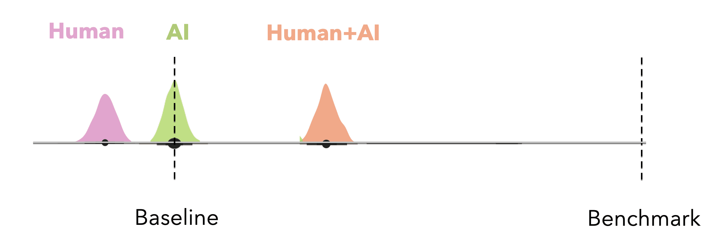
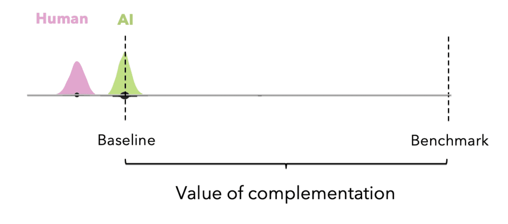
We can define the “value of rational complementation” for the decision-problem at hand by also defining the rational agent baseline: the expected performance of the rational decision-maker without access to the signal on a randomly chosen decision task from the experiment. Because it represents the score the rational agent would get if they could rely only on their prior beliefs about the data-generating model, the baseline is the expected score of a fixed strategy that always chooses the better of the human alone or the AI alone.
If designing or interpreting an experiment on AI reliance, the first thing we might want to do is look at how close to the benchmark the baseline is. We want to see a decent amount of room for the human-AI team to improve performance over the baseline, as in the image above. If the baseline is very close to the benchmark, it’s probably not worth adding the human.
Once we have run an experiment and observed how well people make these decisions, we can treat the value of complementation as a comparative unit for interpreting how much value adding the human contributes over making the decision with the baseline. We do this by normalizing the observed score within the range where the rational agent baseline is 0 and the rational agent benchmark is 1 and looking at where the observed human+AI performance lies. This also provides a useful sense of effect size when we are comparing different settings. For example, if we have two model explanation strategies A and B we compared in an experiment, we can calculate expected human performance on a randomly drawn decision trial under A and under B and measure the improvement by calculating (score_A − score_B)/value of complementation.

We can also decompose sources of error in study participants’ performance. To do this, we define a “mis-reliant” rational decision-maker benchmark, which is the expected score of a rational agent constrained to the reliance level that we observe in study participants. Hence this is the best score a decision-maker who relies on the AI the same overall proportion of the time could attain had they perfectly perceived the probability that the AI is correct relative to the probability that the human is correct on every decision task. Since the mis-reliant benchmark and the study participants have the same reliance level (i.e., they both accept the AI’s prediction the same percentage of the time), the difference in their decisions lies entirely in accepting the AI predictions at different instances. The mis-reliant rational decision-maker always accepts the top X% AI predictions ranked by performance advantage over human predictions, but study participants may not.
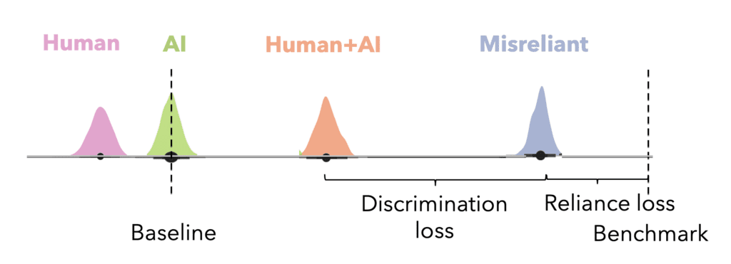
By calculating the mis-reliant rational benchmark for the observed reliance level of study participants, we can distinguish between reliance loss, the loss from over- or under-relying on the AI (defined as the difference between the rational benchmark and mis-reliant benchmark divided by the value of rational complementation), and discrimination loss, the loss from not accurately differentiating the instances where the AI is better than the human from the ones where the human is better than the AI (defined as the difference between the mis-reliant benchmark and the expected score of participants divided by the value of rational complementation).
We apply this approach to some well-known studies on AI reliance and can extend the original interpretations to varying degrees, ranging from observing a lack of potential to see complementarity in the study given how much better the AI was going in than the human, to the original interpretation missing that participants’ reliance levels were pretty close to rational and they just couldn’t distinguish which signals they should go with AI on. We also observe researchers making comparisons across conditions for which the upper and lower bounds on performance differ without accounting for the difference.
There’s more in the paper – for example, we discuss how the rational benchmark, our upper bound representing the expected score of a rational decision-maker on a randomly chosen decision task, may be overfit to the empirical data. This occurs when the signal space is very large (e.g., the instance is a text document) such that we observe very few human predictions per signal. We describe how the rational agent could determine the best response on the optimal coarsening of the empirical distribution, such that the true rational benchmark is bounded by this and the overfit upper bound.
While we focused on showing how to improve research on human-AI teams, I’m excited about the potential for this framework to help organizations as they consider whether deploying an AI is likely to improve some human decision process. We are currently thinking about what sorts of practical questions (beyond Could pairing a human and AI be effective here?) we can answer using such a framework.