Prediction isn’t everything, but everything is prediction

Image

This is Leo.

Explanation or explanatory modeling can be considered to be the use of statistical models for testing causal hypotheses or associations, e.g. between a set of covariates and a response variable. Prediction or predictive modeling, (supposedly) on the other hand, is the act of using a model—or device, algorithm—to produce values of new, existing, or future observations. A lot has been written about the similarities and differences between explanation and prediction, for example Breiman (2001), Shmueli (2010), Billheimer (2019), and many more.

These are often thought to be separate dimensions of statistics, but Jonah and I have been discussing for a long time that in some sense there may actually be no such thing as explanation without prediction. Basically, although prediction itself is not the only goal of inferential statistics, everything—every objective—in inferential statistics can be reframed through the lense of prediction.

Hypothesis testing, ability estimation, hierarchical modeling, treatment effect estimation, causal inference problems, etc., can all be described in our opinion from a (inferential) predictive perspective. So far we have not found an example for which there is no way to reframe it as prediction problem. So I ask you: is there any inferential statistical ambition that cannot be described in predictive terms?

P.S. Like Billheimer (2019) and others, we think that inferential statistics should be considered as inherently predictive and be focused primarily on probabilistic predictions of observable events and quantities, rather than focusing on statistical estimates of unobersvable parameters that do not exist outside of our highly contrived models. Similarly, we also feel that the goal of Bayesian modeling should not be taught to students as finding the posterior distribution of unobservables, but rather as finding the posterior predictive distribution of the observables (with finding the posterior as an intermediate step); even when we don’t only care about predictive accuracy and we still care about understanding how a model works (model checking, GoF measures), we think the predictive modeling interpretation is generally more intuitive and effective.

The appeal of New York Times columnist David Brooks . . . Yeah, I know this all sounds like a nutty “it’s wheels within wheels, man” sort of argument, but I’m serious here!

Over the years, we’ve written a bit about David Brooks on this blog, originally because he had interesting things to say about a topic I care about (Red State Blue State) and later because people pointed out to me various places where he made errors and then refused to correct them, something that bothered me for its own sake (correctable errors in the paper of record!) and as part of a larger phenomenon which I described as Never back down: The culture of poverty and the culture of journalism. At an intellectual level, I understand why pundits are motivated to not ever admit error, also I can see how they can get into the habit of shunting criticism aside because they get so much of it; still, I get annoyed.

Another question arises, though, which is how is it that Brooks has kept his job for so long? I had a recent discussion with Palko on this point.

The direct answer to why Brooks stays employed is that he’s a good writer, regularly turns in his columns on time, continues to write on relevant topics, and often has interesting ideas. Sure, he makes occasional mistakes, but (a) everyone makes mistakes, and when they appear in a newspaper with a circulation of millions, people will catch these mistakes, and (b) newspapers in general, and the Times in particular, are notorious for only very rarely running corrections, so Brooks making big mistakes and not correcting himself is not any kind of disqualification.

In addition, Palko wrote:

For the target audience [of the Times, Brooks offers] a nearly ideal message. It perfectly balances liberal guilt with a sense of class superiority.

I replied with skepticism of Palko’s argument that Brooks’s continued employment comes from his appeal to liberals.

I suspect that more of it is the opposite, that Brooks is popular among conservatives because he’s a conservative who conservatives think can appeal to liberals.

Kinda like the appeal of Michael Moore to liberals: Moore’s the sort of liberal who liberals think can appeal to conservatives.

I like this particular analogy partly because I imagine that it would piss off both Brooks and Moore (not that either of them will ever see this post).

Palko responded:

But it’s not conservatives who keep hiring him.

Brooks’ breakthrough was in the Atlantic, the primary foundation of his career is his long-time day job is with the NYT, his largest audience probably comes from PBS News Hour.

To which I replied as follows:

First off, I don’t know whether the people who are hiring Brooks are liberal, conservative, or somewhere in between. In any case, if they’re conservative, I’m pretty sure they’re only moderately so: I say this because I don’t think the NYT op-ed page has any columnists who supported the Jan 6 insurrection or who claim that Trump actually won the 2020 election etc.

It’s my impression that one reason Brooks was hired, in addition to his ability to turn in readable columns on time, was (a) he’s had some good ideas that have received a lot of attention (for example, the whole bobo stuff, his red-state, blue-state stuff), and (b) most of their op-ed columnists have been liberal or centrist, and they want some conservatives for balance.

Regarding (a), yes, he’s said a lot of dumb things, but I’d say he still has had some good ideas. He’s kinda like Gladwell in that he speculates with an inappropriate air of authority, but his confidence can sometimes get him to interesting places that a more careful writer might never reach.

Regarding (b), it’s relevant that many conservatives are fans of Brooks (for example here, here, and here). If the NYT is going to hire a conservative writer for balance, they’ll want to hire a conservative writer who conservatives like. Were they to hire a writer who conservatives hate, they wouldn’t be doing a good job of satisfying their goal of balance.

So, whoever is in charge of hiring Brooks and wherever his largest audience is, I think that a key to his continued employment is that he is popular among conservatives because he’s a conservative who conservatives think can appeal to liberals.

Yeah, I know this all sounds like a nutty “it’s wheels within wheels, man” sort of argument, but I’m serious here!

This post is political science

The point of posting this is not to talk more about Brooks—if you’re interested in him, you can read his column every week—but rather to consider some of these indirect relationships here, the idea that a publication with liberal columnists will hire a conservative who is then chosen in large part because conservatives see him as the sort of conservative who will appeal to liberals. I don’t think this happens so much in the opposite direction, because if a publication has lots of conservative columnists, that’s probably because it’s an explicitly conservative publication so they wouldn’t want to employ any liberals at all. There must be some counterexamples to that, though.

And I do think there’s some political science content here, related to this discussion I wrote with Gross and Shalizi, but I’ve struggled with how to address the topic more systematically.

God is in every leaf of every tree—comic book movies edition.

Mark Evanier writes:

Martin Scorsese has directed some of the best movies ever made and most of them convey some powerful message with skill and depth. So it’s odd that when he complains about “comic book movies” and says they’re a danger to the whole concept of cinema, I have no idea what the f-word he’s saying. . . .

Mr. Scorsese is acting like “comic book movies” are some new thing. Just to take a some-time-ago decade at random, the highest grossing movie of 1980 was Star Wars: Episode V — The Empire Strikes Back. The highest-grossing movie of 1981 was Superman II. The highest of 1982 was E.T. the Extra-Terrestrial and the highest-grossing movies of the following years were Star Wars: Episode VI — Return of the Jedi, Ghostbusters, Back to the Future, Top Gun, Beverly Hills Cop II, Who Framed Roger Rabbit and Batman.

I dunno about you but I’d call most of those “comic book movies.” And now here we have Scorsese saying of the current flock, “The danger there is what it’s doing to our culture…because there are going to be generations now that think movies are only those — that’s what movies are.” . . .

This seems like a statistical problem, and I imagine some people have studied this more carefully. Evanier seems to be arguing that comic book movies are no bigger of a thing now than they were forty years ago. There must be some systematic analysis of movie genres over time that could address this question.

Discover Instagram Stories with These Tools

Explore Instagram stories differently with these services:

Instagram Story Viewer – Dive into a vibrant world with Mollygram’s unique interface.
Insta Stories – Enhance your experience with innovative tools and captivating content.
Stories IG – Your gateway to a plethora of Instagram stories and trends.

What’s up with spring blooming?


This post is by Lizzie.

Here’s another media hit I missed; I was asked to discuss why daffodils are blooming now in January. If I could have replied I would have said something like:

(1) Vancouver is a weird mix of cool and mild for a temperate place — so we think plants accumulate their chilling (cool-ish winter temperatures needed before plants can respond to warm temperatures, but just cool — like 2-6 C is a supposed sweet spot) quickly and then a warm snap means they get that warmth they need and they start growing.

This is especially true for plants from other places that likely are not evolved for Vancouver’s climate, like daffodils.

(2) It’s been pretty warm! I bet they flowered because it has been so warm.

Deep insights, I know …. They missed me but luckily they got my colleague Doug Justice to speak and he hit my points. Doug knows plants more than I do. He also calls our cherry timing for our …

International Cherry Prediction Competition

Which is happening again this year!

You should compete! Why? You can win money, and you can help us build better models, because here’s what I would not say on TV:

We all talk about ‘chilling’ and ‘forcing’ in plants, and what we don’t tell you is that we never actually measure the physiological transition between chilling and forcing because… we aren’t sure what it is! Almost all chilling-forcing models are built on scant data where some peaches (mostly) did not bloom when they were planted in warm places 50+ years ago. We need your help!


Bayesians are frequentists.

We wrote about this a few years ago, but it’s a point of confusion that keeps coming up, so I’m posting it again:

Bayesians are frequentists. The Bayesian prior distribution corresponds to the frequentist sample space: it’s the set of problems for which a particular statistical model or procedure will be applied.

Bayesian and frequentist inference are both about averaging over possible problems to which a method might be applied. Just as there are many different Bayesian approaches (corresponding to different sorts of models, that is, different sorts of assumptions about the set of problems over which to average), there are many different frequentist approaches (again, corresponding to different sorts of assumptions about the set of problems over which to average).

I see a direct mapping between the frequentist reference set and the Bayesian prior distribution. Another way to put it is that a frequentist probability, defined as relative frequency in repeated trials, requires some definition of what is a repeated trial. We discuss this, from various angles, in chapter 1 of BDA.

I agree that different groups of statisticians, who are labeled “Bayesians” and “frequentists,” can approach problems in different ways. I just don’t think the differences are so fundamental, because I think that any Bayesian interpretation of probability has to have some frequentist underpinning to be useful. And, conversely, any frequentist sample space corresponds to some set of problems to be averaged over.

For example, consider the statement, “Brazil had a 0.25 probability of winning the 2018 World Cup.” To the extent that this statement is the result of a Bayesian analysis (and not simply a wild guess), it would be embedded in web of data and assumptions regarding other teams, other World Cups, other soccer games, etc. And, to me, this network of reference sets is closely related to the choice in frequentist statistics of what outcomes to average over.

Self-declared frequentists do have a way of handling one-off events: they call them “predictions.” In the classical frequentist world, you’re not allowed to make probabilistic inferences about parameters, but you are allowed to make probabilistic inferences about predictions. Indeed, in that classical framework, the difference between parameters and predictions or missing data is precisely that parameters are unmodeled, whereas predictions and missing data are modeled.

The comments are worth reading too. In particular, Ben Goodrich makes good points in disagreeing with me, and the late Keith O’Rourke and others add some useful perspective too.

This all came to mind because Erik van Zwet pointed me to some online discussion of our recent post. The commenter wrote:

In a recent blog, Andrew Gelman writes “Bayesians moving from defense to offense: I really think it’s kind of irresponsible now not to use the information from all those thousands of medical trials that came before. Is that very radical?”

Here is what is perplexing me.

It looks to me that ‘those thousands of medical trials’ are akin to long run experiments. So isn’t this a characteristic of Frequentism? So if bayesians want to use information from long run experiments, isn’t this a win for Frequentists?

What is going offensive really mean here?

Some of the participants in that thread did seem to get the point, but nobody knew about our saying, “Bayesians are frequentists,” so I added it to the lexicon.

So, just to say it again, yes, good Bayesian inference and good frequentist inference are both about having a modeled population (also called a prior distribution, or frequency distribution, or reference set) that is a good match to the applied question being asked.

A prior that corresponds to a relevant frequency distribution is a win for frequentists and for Bayesians too! Remember Hal Stern’s principle that the most important aspect of a statistical analysis is not what you do with the data, it’s what data you use.

And, regarding what I meant by “Bayesians moving from defense to offense,” see our followup here.

The immediate victims of the con would rather act as if the con never happened. Instead, they’re mad at the outsiders who showed them that they were being fooled.

Dorothy Bishop has the story about “a chemistry lab in CNRS-Université Sorbonne Paris Nord”:

More than 20 scientific articles from the lab of one principal investigator have been shown to contain recycled and doctored graphs and electron microscopy images. That is, results from different experiments that should have distinctive results are illustrated by identical figures, with changes made to the axis legends by copying and pasting numbers on top of previous numbers. . . . the problematic data are well-documented in a number of PubPeer comments on the articles (see links in Appendix 1 of this document).

The response by CNRS [Centre National de la Recherche Scientifique] to this case . . . was to request correction rather than retraction of what were described as “shortcomings and errors”, to accept the scientist’s account that there was no intentionality, despite clear evidence of a remarkable amount of manipulation and reuse of figures; a disciplinary sanction of exclusion from duties was imposed for just one month.

I’m not surprised. The sorts of people who will cheat on their research are likely to be the same sorts of people who will instigate lawsuits, start media campaigns, and attack in other ways. These are researchers who’ve already shown a lack of scruple and a willingness to risk their careers; in short, they’re loose cannons, scary people, so it can seem like the safest strategy to not try to upset them too much, not trap them into a corner where they’ll fight like trapped rats. I’m not speaking specifically of this CNRS researcher—I know nothing of the facts of this case beyond what’s reported in Bishop’s post—I’m just speaking to the mindset of the academic administrators who would just like the problem to go away so they can get on with their regular jobs.

But Bishop and her colleagues were annoyed. If even blatant examples of scientific misconduct cannot be handled straightforwardly, what does this say about the academic and scientific process more generally? Is science just a form of social media, where people can make any sort of claim and evidence doesn’t matter?

They write:

So what should happen when fraud is suspected? We propose that there should be a prompt investigation, with all results transparently reported. Where there are serious errors in the scientific record, then the research articles should immediately be retracted, any research funding used for fraudulent research should be returned to the funder, and the person responsible for the fraud should not be allowed to run a research lab or supervise students. The whistleblower should be protected from repercussions.

In practice, this seldom happens. Instead, we typically see, as in this case, prolonged and secret investigations by institutions, journals and/or funders. There is a strong bias to minimize the severity of malpractice, and to recommend that published work be “corrected” rather than retracted.

Bishop and her colleagues continue:

One can see why this happens. First, all of those concerned are reluctant to believe that researchers are dishonest, and are more willing to assume that the concerns have been exaggerated. It is easy to dismiss whistleblowers as deluded, overzealous or jealous of another’s success. Second, there are concerns about reputational risk to an institution if accounts of fraudulent research are publicised. And third, there is a genuine risk of litigation from those who are accused of data manipulation. So in practice, research misconduct tends to be played down.

But:

This failure to act effectively has serious consequences:

1. It gives credibility to fictitious results, slowing down the progress of science by encouraging others to pursue false leads. . . . [and] erroneous data pollutes the databases on which we depend.

2. Where the research has potential for clinical or commercial application, there can be direct damage to patients or businesses.

3. It allows those who are prepared to cheat to compete with other scientists to gain positions of influence, and so perpetuate further misconduct, while damaging the prospects of honest scientists who obtain less striking results.

4. It is particularly destructive when data manipulation involves the Principal Investigator of a lab. . . . CNRS has a mission to support research training: it is hard to see how this can be achieved if trainees are placed in a lab where misconduct occurs.

5. It wastes public money from research grants.

6. It damages public trust in science and trust between scientists.

7. It damages the reputation of the institutions, funders, journals and publishers associated with the fraudulent work.

8. Whistleblowers, who should be praised by their institution for doing the right thing, are often made to feel that they are somehow letting the side down by drawing attention to something unpleasant. . . .

What happened next?

It’s the usual bad stuff. They receive a series of stuffy bureaucratic responses, none of which address any of items 1 through 8 above, let alone the problem of the data which apparently have obviously been faked. Just disgusting.

But I’m not surprised. We’ve seen it many times before:

– The University of California’s unresponsive response when informed of research misconduct by their star sleep expert.

– The American Political Science Association refusing to retract an award given to an author for a book with plagiarized material, or even to retroactively have the award shared with the people whose material was copied without acknowledgment.

– The London Times never acknowledging the blatant and repeated plagiarism by its celebrity chess columnist.

– The American Statistical Association refusing to retract an award given to a professor who plagiarized multiple times, including from wikipedia (in an amusing case where he created negative value by introducing an error into the material he’d copied, so damn lazy that he couldn’t even be bothered to proofread his pasted material).

– Cornell University . . . ok they finally canned the pizzagate dude, but only after emitting some platitudes. Kind of amazing that they actually moved on that one.

– The Association for Psychological Science: this one’s personal for me, as they ran an article that flat-out lied about me and then refused to correct it just because, hey, they didn’t want to.

– Lots and lots of examples of people finding errors or fraud in published papers and journals refusing to run retractions or corrections or even to publish letters pointing out what went wrong.

Anyway, this is one more story.

What gets my goat

What really annoys me in these situations is how the institutions show loyalty to the people who did research misconduct. When researcher X works at or publishes with institution Y, and it turns out that X did something wrong, why does Y so often try to bury the problem and attack the messenger? Y should be mad at X; after all, it’s X who has leveraged the reputation of Y for his personal gain. I’d think that the leaders of Y would be really angry at X, even angrier than people from the outside. But it doesn’t happen that way. The immediate victims of the con would rather act as if the con never happened. Instead, they’re mad at the outsiders who showed them that they were being fooled. I’m sure that Dan Davies would have something to say about all this.

Ben Shneiderman’s Golden Rules of Interface Design

The legendary computer science and graphics researcher writes:

1. Strive for consistency.

Consistent sequences of actions should be required in similar situations; identical terminology should be used in prompts, menus, and help screens; and consistent color, layout, capitalization, fonts, and so on, should be employed throughout. Exceptions, such as required confirmation of the delete command or no echoing of passwords, should be comprehensible and limited in number.

2. Seek universal usability.

Recognize the needs of diverse users and design for plasticity, facilitating transformation of content. Novice to expert differences, age ranges, disabilities, international variations, and technological diversity each enrich the spectrum of requirements that guides design. Adding features for novices, such as explanations, and features for experts, such as shortcuts and faster pacing, enriches the interface design and improves perceived quality.

3. Offer informative feedback.

For every user action, there should be an interface feedback. For frequent and minor actions, the response can be modest, whereas for infrequent and major actions, the response should be more substantial. Visual presentation of the objects of interest provides a convenient environment for showing changes explicitly.

4. Design dialogs to yield closure.

Sequences of actions should be organized into groups with a beginning, middle, and end. Informative feedback at the completion of a group of actions gives users the satisfaction of accomplishment, a sense of relief, a signal to drop contingency plans from their minds, and an indicator to prepare for the next group of actions. For example, e-commerce websites move users from selecting products to the checkout, ending with a clear confirmation page that completes the transaction.

5. Prevent errors.

As much as possible, design the interface so that users cannot make serious errors; for example, gray out menu items that are not appropriate and do not allow alphabetic characters in numeric entry fields. If users make an error, the interface should offer simple, constructive, and specific instructions for recovery. For example, users should not have to retype an entire name-address form if they enter an invalid zip code but rather should be guided to repair only the faulty part. Erroneous actions should leave the interface state unchanged, or the interface should give instructions about restoring the state.

6. Permit easy reversal of actions.

As much as possible, actions should be reversible. This feature relieves anxiety, since users know that errors can be undone, and encourages exploration of unfamiliar options. The units of reversibility may be a single action, a data-entry task, or a complete group of actions, such as entry of a name-address block.

7. Keep users in control.

Experienced users strongly desire the sense that they are in charge of the interface and that the interface responds to their actions. They don’t want surprises or changes in familiar behavior, and they are annoyed by tedious data-entry sequences, difficulty in obtaining necessary information, and inability to produce their desired result.

8. Reduce short-term memory load.

Humans’ limited capacity for information processing in short-term memory (the rule of thumb is that people can remember “seven plus or minus two chunks” of information) requires that designers avoid interfaces in which users must remember information from one display and then use that information on another display. It means that cellphones should not require reentry of phone numbers, website locations should remain visible, and lengthy forms should be compacted to fit a single display.

Wonderful, wonderful stuff. When coming across this, I saw that Shneiderman taught at the University of Maryland . . . checking his CV, it turns out that he taught there back when I was a student. I could’ve taken his course!

It would be interesting to come up with similar sets of principles for statistical software, statistical graphics, etc. We do have 10 quick tips to improve your regression modeling, so that’s a start.

Since Jeffrey Epstein is in the news again . . .

I came across this from a bit more than a year ago which is also relevant to today’s earlier post on “The Simple Nudge That Raised Median Donations by 80%.” Here it is:

Nudge meets Edge: A Boxing Day Story

I happened to come across this post from 2011 about an article from one of the Nudgelords promoting the ridiculous “traditional” idea of modeling risk aversion as “a primitive; each person had a parameter, gamma, that measured her degree of risk aversion.” That was before I had a full sense of how silly/dangerous the whole nudge thing was (see also here) . . . but, also, it featured a link to the notorious Edge foundation, home of Jeffrey Epstein and his pals. All those Great Men; there’s hardly enough room at NPR and Ted to hold all of them.

Again, why am I picking on these guys? The Edge foundation: are these not the deadest of dead horses? But remember what they say about beating a dead horse. The larger issue—a smug pseudo-humanistic contempt for scientific measurement, along with an attitude that money + fame = truth—that’s still out there.

What to trust in the newspaper? Example of “The Simple Nudge That Raised Median Donations by 80%”

Greg Mayer points to this news article, “The Simple Nudge That Raised Median Donations by 80%,” which states:

A start-up used the Hebrew word “chai” and its numerical match, 18, to bump up giving amounts. . . . It’s a common donation amount among Jews — $18, $180, $1,800 or even $36 and other multiples.

So Daffy lowered its minimum gift to $18 and then went further, prompting any donor giving to any Jewish charity to bump gifts up by some related amount. Within a year, median gifts had risen to $180 from $100. . . .

I see several warning signs here:

1. “Within a year, median gifts had risen to $180 from $100.” This is a before/after change, not a direct comparison of outcomes.

2. No report, just a quoted number which could easily have been made up. Yes, the numbers in a report can be fabricated too, but that takes more work and is more risk. Making up numbers when talking with a reporter, that’s easy.

3. The people who report the number are motivated to claim success; the reporter is motivated to report a success. The article is filled with promotion for this company. It’s a short article that mentions “Daffy” 6 times in the short article, for example this bit which reads like a straight-up ad:

If you have children, grandchildren, nieces or nephews, there’s another possibility. Daffy has a family plan that allows children to prompt their adult relatives to support a cause the children choose. Why not put the app on their iPhones or iPads so they can make suggestions and let, for example, a 12-year-old make $12 donations to 12 nonprofits each year?

Why not, indeed? Even better, why not have them make their donations directly to Daffy and cut out the middleman?? Look, I’m not saying that the people behind Daffy are doing anything wrong; it’s just that this is public relations, not journalism.

4. Use of the word “nudge” in the headline is consistent with business-press hype. Recall that “nudge” is a subfield whose proponents are well connected in the media and routinely make exaggerated claims.

So, yeah, an observational comparison with no documentation, in an article that’s more like an advertisement, that’s kinda sus. Not that the claim is definitely wrong, there’s just no good reason for us to take it seriously.

In some cases academic misconduct doesn’t deserve a public apology

This is Jessica. As many of you probably saw, Claudine Gay resigned as president of Harvard this week. Her tenure as president is apparently the shortest on record, and accusations of plagiarism involving some of her published papers and her dissertation seem to be a major contributor that pushed this decision, after the initial backlash against Gay’s response alongside MIT and Penn presidents Kornbluth and Magill to questions from Republican congresswoman Stefanik about blatantly anti-semitic remarks on their campuses in the wake of Oct. 7.

The plagiarism counts are embarrassing for Gay and for Harvard, for sure, as were the very legalistic reactions of all three presidents when asked about anti-semitism on their campuses. In terms of plagiarism as a phenomena that crops up in academia, I agree with Andrew that it tells us something about the author’s lack of ability or effort to take the time to understand the material. I suspect it happens a lot under the radar, and I see it as a professor (more often with ChatGPT in the mix and no, it does not always lead to explicit punishment, to comment on what some are saying online about double standards for faculty and students). What I don’t understand is how in Gay’s case this is misconduct at the level that warrants a number of headline stories in major mainstream news media and the resignation of an administrator who has put aside her research career anyway. 

On the one hand, I can see how it is temptingly easy to rationalize why the president of what is probably the most revered university on earth cannot be associated with any academic misconduct without somehow bringing shame on the institution. She’s the president of Harvard, how can it not be shocking?! is one narrative I suppose. But, this kind of response to this situation is exactly what bothers me in the wake of her resignation. I will try to explain.

Regarding the specifics, I saw a few of the plagarized passages early on, and I didn’t see much reason to invest my time in digging further, if this was the best that could be produced by those who were obviously upset about it (I agree with Phil here that they seem like a  “weak” form of plagiarism). What makes me uncomfortable about this situation was how so many people, under the guise of being “objective,” did feel the need to invest their time in the name of establishing some kind of truth in the situation. This is the moment of decision that I wish to call attention to. It’s as though in the name of being “neutral” and “evidence based” we are absolved from having to consider why we feel so compelled in certain cases to get to the bottom of it, but not so much in other cases.  

It’s the same thing that makes so much research bad: the inability to break frame, to turn on the premise rather than the minor details. To ask, how did we get here? Why are we all taking for granted that this is the thing to be concerned with? 

Situations like what happened to Gay bring a strong sense of deja vu for me. I’m not sure how much my personal reaction is related to being female in a still largely male-dominated field myself, but I suspect it contributes. There’s a scenario that plays out from time to time where someone who is not in the majority in some academic enterprise is found to have messed up. At first glance, it seems fairly minor, somewhat relatable at least, no worse than what many others have done. But, somehow, it can’t be forgotten in some cases. Everyone suddenly exerts effort they would normally have trouble producing for a situation that doesn’t concern them that much personally to pore over the details with a fine-tooth comb to establish that there really was some fatal flaw here. The discussion goes on and becomes hard to shut out, because here is always someone else who is somehow personally offended by it. And the more it gets discussed, the more it seems like overwhelmingly a real thing to be dealt with, to be decided. It becomes an example for the sake of being principled. Once this palpable sense that ‘this is important’, ‘this is a message about our principles,’ sets in, then the details cannot be overlooked. How else can we be sure we are being rational and objective? We have to treat it like evidence and bring to bear everything we know about scrutinizing evidence. 

What is hard for me to get over is that these stories that stick around and capture so much attention are far more often stories about some member of the racial or gender non-majority who ended up in a high place. It’s like the resentment that a person from the outside has gotten in sets in without the resenter even becoming aware of it, and suddenly a situation that seems like it should have been cooperative gets much more complicated. This is not to say that people who are in the majority in a field don’t get called out or targetted sometimes, they do. Just that there’s a certain dynamic that seems to set in more readily when someone perceived as not belonging to begin with messes up. As Jamelle Watson-Daniels writes on X/Twitter of the Gay situation: “the legacy and tradition of orchestrated attacks against the credibility of Black scholars all in the name of haunting down and exposing them as… the ultimate imposters.” This is the undertone I’m talking about here.

I’ve been a professor for about 10 years, and I’ve seen this sort of hyper-attention turned on women and/or others in the non-majority who violated some minor code repeatedly in that time. In many instances, it creates a situation that divides those who are confused by the apparent level of detail orientedness given the crime and those who can’t see how there is any other way than to make the incident into an example. Gay is just the most recent reminder. 

What makes this challenging for me to write about personally is that I am a big believer in public critique, and admitting one’s mistakes. I have advocated for both on this blog. To take an example that comes up from time to time, I don’t think that because of uneven power dynamics, public critique of papers with lead student authors should be shut down, or that we owe authors extensive private communications before we openly criticize. That goes against the sort of open discussion of research flaws that we are already often incentivized to avoid. For the same reason, I don’t think that critiques made by people with ulterior motives should be dismissed. I think there were undoubtedly ulterior motives here, and I am not arguing that the information about accounts of plagiarism here should not have been shared at all. 

I also think making decisions driven by social values (which often comes up under the guise of DEI) is very complex. At least in academic computer science, we seem to be experiencing a moment of heightened sensitivity to what is perceived “moral” and “ethical”, and that often these things are defined very simplistically and tolerance for disagreement low. 

And I also think that there are situations where a transgression may seem minor but it is valuable to mind all the details and use it as an example! I was surprised for example at how little interest there seemed to be in the recent Nature Human Behavior paper which claimed to present all confirmatory analyses but couldn’t produce the evidence that the premise of the paper suggests should be readily available. This seemed to me like an important teachable moment given what the paper was advocating to begin with.  

So anyway, lots of reasons why this is hard to write about, and lots of fodder for calling me a hypocrite if you want. But I’m writing this post because the plagiarism is clearly not be the complete story here. I don’t know the full details of the Gay investigation (and admit I haven’t spent too much time researching this: I’ve seen a bunch of the plagiarism examples, but I don’t have a lot of context on her entire career). So it’s possible I’m wrong and she did some things that were truly more awful than the average Harvard president. But I haven’t heard about them yet. And either way my point still stands: there are situations with similar dynamics to this where my dedication to scientific integrity and public critique and getting to the bottom of technical details do not disappear, but are put on the backburner to question a bigger power dynamic that seems off. 

And so, while I normally I think everyone caught doing academic misconduct should acknowledge it, for the reasons above, at least at the moment, it doesn’t bother me that Gay’s resignation letter doesn’t mention the plagiarism. I think not acknowledging it was the right thing to do. 

Progress in 2023

Published:

Unpublished:

Enjoy.

“It’s About Time” (my talk for the upcoming NY R conference)

I speak at Jared’s NYR conference every year (see here for some past talks). It’s always fun. Here’s the title/abstract for the talk I’ll be giving this year.

It’s About Time

Statistical processes occur in time, but this is often not accounted for in the methods we use and the models we fit. Examples include imbalance in causal inference, generalization from A/B tests even when there is balance, sequential analysis, adjustment for pre-treatment measurements, poll aggregation, spatial and network models, chess ratings, sports analytics, and the replication crisis in science. The point of this talk is to motivate you to include time as a factor in your statistical analyses. This may change how you think about many applied problems!

Clarke’s Law, and who’s to blame for bad science reporting

Lizzie blamed the news media for a horrible bit of news reporting on the ridiculous claim that “the climate crisis is causing certain grapes, used in almost all champagne, to be on the brink of extinction.” The press got conned by a press release from a sleazy company, which in this case was “a Silicon Valley startup” but in other settings could be a pollster or a car company or a university public relations office or an advocacy group or some other institution that has a quasi-official role in our society.

Lizzie was rightly ticked off by the media organizations that were happily playing the “sucker” role in this drama, with CNN straight-up going with the press release, along with a fawning treatment of the company that was pushing the story, and NPR going with a mildly skeptical amused tone, interviewing an actual outside expert but still making the mistake of taking the story seriously rather than framing it as a marketing exercise.

We’ve seen this sort of credulous reporting before, perhaps most notably with Theranos and the hyperloop. It’s not just that the news media are suckers, it’s that being a sucker—being credulous—is in many cases a positive for a journalist. A skeptical reporter will run fewer stories, right? Malcolm Gladwell and the Freakonomics team are superstars, in part because they’re willing to routinely turn off whatever b.s. detectors they might have, in order to tell good stories. They get rewarded for their practice of promoting unfounded claims. If we were to imagine an agent-based model of the news media, these are the agents that flow to the top. One could suppose a different model, in which mistakes tank your reputation, but that doesn’t seem to be the world in which we operate.

So, yeah, let’s get mad at the media, first for this bogus champagne story and second for using this as an excuse to promote a bogus company.

Also . . .

Let’s get mad at the institutions of academic science, which for years have been unapologetically promoting crap like himmicanes, air rage, ages ending in 9, nudges, and, let’s never forget, the lucky golf ball.

In terms of wasting money and resources, I don’t think any of those are as consequential as business scams such as Theranos or hyperloop; rather, they bother me because they’re coming from academic science, which might traditionally be considered a more trustworthy source.

And this brings us to Clarke’s law, which you may recall is the principle that any sufficiently crappy research is indistinguishable from fraud.

How does that apply here? I can only assume that the researchers behind the studies of himmicanes, air rage, ages ending in 9, nudges, the lucky golf ball, and all the rest, are sincere and really believe that their claims are supported by their data. But there have been lots of failed replications, along with methodological and statistical explanations of what went wrong in those studies. At some point, to continue to promote them is, in my opinion, on the border of fraud: it requires willfully looking away from contrary evidence and, at the extreme, leads to puffed-up-rooster claims such as, “The replication rate in psychology is quite high—indeed, it is statistically indistinguishable from 100%.”

In short, the corruption involved in the promotion of academic science has poisoned the well and facilitated the continuing corruption of the news media by business hype.

I’m not saying that business hype and media failure are the fault of academic scientists. Companies would be promoting themselves, and these lazy news organizations would be running glorified press releases, no matter what we were to do in academia. Nor, for that matter, are academics responsible for credulity on stories such as UFO space aliens. The elite news media seems to be able to do this all on its own.

I just don’t think that academic science hype is helping with the situation. Academic science hype helps to set up the credulous atmosphere.

Michael Joyner made a similar point a few years ago:

Why was the Theranos pitch so believable in the first place? . . .

Who can forget when James Watson. . . . co-discoverer of the DNA double helix, made a prediction in 1998 to the New York Times that so-called VEGF inhibitors would cure cancer in “two years”?

At the announcement of the White House Human Genome Project in June 2000, both President Bill Clinton and biotechnologist Craig Venter predicted that cancer would be vanquished in a generation or two. . . .

That was followed in 2005 by the head of the National Cancer Institute, Andrew von Eschenbach, predicting the end of “suffering and death” from cancer by 2015, based on a buzzword bingo combination of genomics, informatics, and targeted therapy.

Verily, the life sciences arm of Google, generated a promotional video that has, shall we say, some interesting parallels to the 2014 TedMed talk given by Elizabeth Holmes. And just a few days ago, a report in the New York Times on the continuing medical records mess in the U.S. suggested that with better data mining of more coherent medical records, new “cures” for cancer would emerge. . . .

So, why was the story of Theranos so believable in the first place? In addition to the specific mix of greed, bad corporate governance, and too much “next” Steve Jobs, Theranos thrived in a biomedical innovation world that has become prisoner to a seemingly endless supply of hype.

Joyner also noted that science hype was following patterns of tech hype. For example, this from Dr. Eric Topol, director of the Scripps Translational Science Institute:

When Theranos tells the story about what the technology is, that will be a welcome thing in the medical community. . . . I tend to believe that Theranos is a threat.

The Scripps Translational Science Institute is an academic, or at least quasi-academic, institution! But they’re using tech hype disrupter terminology by calling scam company Theranos a “threat” to the existing order. I have no reason to think that the director of the Scripps Translational Science Institute himself committing fraud? I have no reason to think so. What I do think is that he wants to have it both ways. When Theranos was riding high, he hyped it and called it a “threat” (again, that’s a positive adjective in this context). Later, after the house of cards fell, he wrote, “I met Holmes twice and conducted a video interview with her in 2013. . . . Like so many others, I had confirmation bias, wanting this young, ambitious woman with a great idea to succeed. The following year, in an interview with The New Yorker, I expressed my deep concern about the lack of any Theranos transparency or peer-reviewed research.” Actually, though, here’s what he said to the New Yorker: “I tend to believe that Theranos is a threat. But if I saw data in a journal, head to head, I would feel a lot more comfortable.” Sounds to me less like deep concern and more like hedging his bets.

Caught like a deer in the headlights between skepticism and fomo.

Extinct Champagne grapes? I can be even more disappointed in the news media

Happy New Year. This post is by Lizzie.

Over the end-of-year holiday period, I always get the distinct impression that most journalists are on holiday too. I felt this more acutely when I found an “urgent” media request in my inbox when I returned to it after a few days away. Someone at a major reputable news outlet wrote:

We are doing a short story on how the climate crisis is causing certain grapes, used in almost all champagne, to be on the brink of extinction. We were hoping to do a quick interview with you on the topic….Our deadline is asap, as we plan to run this story on New Years.

It was late on 30 December so I had missed helping them but still had to reply that I hoped that found some better information because ‘the climate crisis is causing certain grapes, used in almost all champagne, to be on the brink of extinction’ was not good information in my not-so-entirely-humble opinion as I study this and can think of zero-zilch-nada evidence to support this.

This sounded like insane news I would expect from more insane media outlets. I tracked down what I assume was the lead they were following (see here), and found it seems to relate to some AI start-up I will not do the service of mentioning that is just looking for more press. They seem to put out splashy sounding agricultural press releases often — and so they must have put out one about Champagne grapes being on the brink of extinction to go with New Year’s.

I am on a bad roll with AI just now, or — more exactly — the intersection of human standards and AI. There’s no good science that “the climate crisis is causing certain grapes, used in almost all champagne, to be on the brink of extinction.” The whole idea of this is offensive to me when human actions are actually driving species extinct. And it ignores tons of science on winegrapes and the reality that they’re pretty easy to grow (growing excellent ones? Harder). So, poor form on the part of the zero-standards-for-our-science AI startup. But I am more horrified by the media outlets that cannot see through this. I am sure they’re inundated with lots of crazy bogus stories every day, but I thought that their job was to report on ones that matter and they hopefully have some evidence are true.

What did they do instead of that? They gave a platform to a “a highly adaptable marketing manager and content creator” to talk about some bogus “study” and a few soundbites to a colleague of mine who actually knew the science (Ben Cook from NASA).

Here’s a sad post for you to start the new year. The Onion (ok, an Onion-affiliate site) is plagiarizing. For reals.

How horrible. I remember when The Onion started. They were so funny and on point. And now . . . What’s the point of even having The Onion if it’s running plagiarized material? I mean, yeah, sure, everybody’s gotta bring home money to put food on the table. But, really, what’s the goddam point of it all?

Jonathan Bailey has the story:

Back in June, G/O Media, the company that owns A.V. Club, Gizmodo, Quarts and The Onion, announced that they would be experimenting with AI tools as a way to supplement the work of human reporters and editors.

However, just a week later, it was clear that the move wasn’t going smoothly. . . . several months later, it doesn’t appear that things have improved. If anything, they might have gotten worse.

The reason is highlighted in a report by Frank Landymore and Jon Christian at Futurism. They compared the output of A.V. Club’s AI “reporter” against the source material, namely IMDB. What they found were examples of verbatim and near-verbatim copying of that material, without any indication that the text was copied. . . .

The articles in question have a note that reads as follows: “This article is based on data from IMDb. Text was compiled by an AI engine that was then reviewed and edited by the editorial staff.”

However, as noted by the Futurism report, that text does not indicate that any text is copied. Only that “data” is used. The text is supposed to be “compiled” by the AI and then “reviewed and edited” by humans. . . .

In both A.V. Club lists, there is no additional text or framing beyond the movies and the descriptions, which are all based on IMDb descriptions and, as seen in this case, sometimes copied directly or nearly directly from them.

There’s not much doubt that this is plagiarism. Though A.V. Club acknowledges that the “data” came from IMDb, it doesn’t indicate that the language does. There are no quotation marks, no blockquotes, nothing to indicate that portions are copied verbatim or near-verbatim. . . .

Bailey continues:

None of this is a secret. All of this is well known, well-understood and backed up with both hard data and mountains of anecdotal evidence. . . . But we’ve seen this before. Benny Johnson, for example, is an irredeemably unethical reporter with a history of plagiarism, fabrication and other ethical issues that resulted in him being fired from multiple publications.

Yet, he’s never been left wanting for a job. Publications know that, because of his name, he will draw clicks and engagement. . . . From a business perspective, AI is not very different from Benny Johnson. Though the flaws and integrity issues are well known, the allure of a free reporter who can generate countless articles at the push of a button is simply too great to ignore.

Then comes the economic argument:

But in there lies the problem, if you want AI to function like an actual reporter, it has to be edited, fact checked and plagiarism checked just like a real human.

However, when one does those checks, the errors quickly become apparent and fixing them often takes more time and resources than just starting with a human author.

In short, using an AI in a way that helps a company earn/save money means accepting that the factual errors and plagiarism are just part of the deal. It means completely forgoing journalism ethics, just like hiring a reporter like Benny Johnson.

Right now, for a publication, there is no ethical use of AI that is not either unprofitable or extremely limited. These “experiments” in AI are not about testing what the bots can do, but about seeing how much they can still lower their ethical and quality standards and still find an audience.

Ouch.

Very sad to see an Onion-affiliated site doing this.

Here’s how Bailey concludes:

The arc of history has been pulling publications toward larger quantities of lower quality content for some time. AI is just the latest escalation in that trend, and one that publishers are unlikely to ignore.

Even if it destroys their credibility.

No kidding. What next, mathematics professors who copy stories unacknowledged, introduce errors, and then deny they ever did it? Award-winning statistics professors who copy stuff from wikipedia, introducing stupid-ass errors in the process? University presidents? OK, none of those cases were shocking, they’re just sad. But to see The Onion involved . . . that truly is a step further into the abyss.

The continuing challenge of poststratification when we don’t have full joint data on the population.

Torleif Halkjelsvik at the Norwegian Institute of Public Health writes:

Norway has very good register data (education/income/health/drugs/welfare/etc.) but it is difficult to obtain complete tables at the population level. It is however easy to get independent tables from different registries (e.g., age by gender by education as one data source and gender by age by welfare benefits as another). What if I first run a multilevel model to regularize predictions for a vast set of variables, but in the second step, instead of a full table, use a raking approach based on several independent post-stratification tables? Would that be a valid approach? And have you seen examples of this?

My reply: I think the right way to frame this is as a poststratification problem where you don’t have the full poststratification table, you only have some margins. The raking idea you propose could work, but to me it seems awkward in that it’s mixing different parts of the problem together. Instead I’d recommend first imputing a full poststrat table and then using this to do your poststratification. But then the question is how to do this. One approach is iterative proportional fitting (Deming and Stephan, 1940). I don’t know any clean examples of this sort of thing in the recent literature, but there might be something out there.

Halkjelsvik responded:

It is an interesting idea to impute a full poststrat table, but I wonder whether it is actually better than directly calculating weights using the proportions in the data itself. Cells that should be empty in the population (e.g., women, 80-90 years old, high education, sativa spray prescription) may not be empty in the imputed table when using iterative proportional fitting (IPF), and these “extreme” cells may have quite high or low predicted values. By using the data itself, such cells will be empty, and they will not “steal” any of the marginal proportions when using IPF. This is of course a problem in itself if the data is limited (if there are empty cells in the data that are not empty in the population).

Me: If you have information that certain cells are empty or nearly so, that’s information that you should include in the poststrat table. I think the IPF approach will be similar to the weighting; it is just more model-based. So if you think the IPF will give some wrong answers, that suggests you have additional information. I recommend you try to write down all the additional information you have and use all of it in constructing the poststratification table. This should allow you to do better than with any procedure that does not use this info.

Halkjelsvik:

After playing with a few scenarios (on a piece of paper, no simulation) I see that my suggested raking/weighting approach (which also would involve iterative proportional fitting) directly on the sample data is not a good idea in contexts where MRP is most relevant. That is, if the sample cell sizes are small and regularization matters, then the subgroups of interest (e.g. geographical regions) will likely have too little data on rare demographic combinations. The approach you suggested (full population table imputation based on margins) appears more reasonable, and the addition of “extra information” is obviously a good idea. But how about a hybrid: Instead of manually accounting for “extra information” (e.g., non-existing demographic combinations) this extra information can be derived directly from the proportions of the sample itself (across subgroups of interest) and can be used as “seed” values (i.e., before accounting for margins at the local level). Using information from the sample to create the initial (seed) values for the IPF may be a good way to avoid imputing positive values in cells that are structural zeros, given that the sample is sufficiently large to avoid too many “sample zeros” that are not true “structural zeros”.

So the following could be an approach for my problem?

1. Obtain regularized predictions from sample.

2. Produce full postrat seed table directly from “global” cell values in the sample (or from other available “global” data, e.g. if available only at national level). That is, regions start with identical seed structures.

3. Adjust the poststrat table by iterative proportional fitting based on local margins (but I have read that there may be convergence problems when there are many zeros in seed cells).

Me: I’m not sure! I really want to have a fully worked-out example, a case study of MRP where the population joint distribution (the poststratification table) is not known and it needs to be estimated from data. We’re always so sloppy in those settings. I’d like to do it with a full Bayesian model in Stan and then compare various approximations.

“How not to be fooled by viral charts”

Good post with the above title from economics journalist Noah Smith.

Just for you, I’ll share a few more from some of our old blog posts:

Suspiciously vague graph purporting to show “percentage of slaves or serfs in the world”:

slaves-serfs

Debunking the so-called Human Development Index of U.S. states:

hdi0.png

(Worst) graph of the year:

The worst graph every made?:

skillswise.png

And, ok, this isn’t a “viral chart” at all, but it’s the absolute worst ever:

You can go through the blog archives to find other fun items.

Hey wassup Detroit Pistons? What’s gonna happen for the rest of the season? Let’s get (kinda) Bayesian. With graphs and code (but not a lot of data; sorry):

Paul Campos points us to this discussion of the record of the Detroit professional basketball team:

The Detroit Pistons broke the NBA record for most consecutive losses in a season last night, with their 27th loss in a row. . . . A team’s record is, roughly speaking, a function of two factors:

(1) The team’s quality. By “quality” I mean everything about the team”s performance that isn’t an outcome of random factors, aka luck — the ability of the players, individually and collectively, the quality of the coaching, and the quality of the team’s management, for example.

(2) Random factors, aka luck.

The relative importance of luck and skill?

The above-linked post continues:

How do we disentangle the relative importance of these two factors when evaluating a team’s performance to some point in the season? . . . The best predictor ex ante of team performance is the evaluation of people who gamble on that performance. I realize that occasionally gambling odds include significant inefficiencies, in the form of the betting public making sentimental rather than coldly rational wagers, but this is very much the exception rather than the rule. . . . the even money over/under for Detroit’s eventual winning percentage this season was, before the first game was played, a winning percentage of .340. To this point, a little more than third of the way through the season, Detroit’s winning percentage has been .0666. . . .

To the extent that the team has had unusually bad luck, then one would expect the team’s final record to be better. But how much better? Here we can again turn to the savants of Las Vegas et. al., who currently set the even money odds of the team’s final record on the basis of the assumption that it will have a .170 winning percentage in its remaining games.

Campos shares a purported Bayesian analysis and summarizes, “if we have just two pieces of information — a prior assumption of a .340 team, and the subsequent information of a .066 performance through thirty games — the combination of these two pieces of information yields a posterior prediction of a .170 winning percentage going forward, which remarkably enough is exactly what the current gambling odds predict! . . . it appears that the estimate being made by professional gamblers is that about two-thirds of Detroit’s worse than expected record is a product of an ex ante overestimate of the team’s quality, while the other third is assumed to be accounted for by bad luck.”

I think that last statement is coming from the fact that (1/3)*0.340 + (2/3)*0.067 is approximately 0.170.

I don’t quite follow his Bayesian logic. But never mind about that for now.

As I said, I didn’t quite follow the Bayesian logic shared by Campos. Here’s my problem. He posts this graph:

I think I understand the “No_Prior_Info” curve in the graph: that’s the y ~ binomial(n, p) likelihood for p, given the data n=30, y=2. But I don’t understand where the “Prior” and “Posterior” curves come from. I guess the Prior distribution has a mean of 0.340 and the Posterior distribution has a mean of 0.170, but where are the widths of these curves coming from?

Part of the confusion here is that we’re dealing with inference for p (the team’s “quality,” as summarized by the probability that they’d win against a randomly-chosen opponent on a random day) and also with predictions of outcomes. For the posterior mean, there’s no difference: under the basic model, the posterior expected proportion of future games won is equal to the posterior mean of p. It gets trickier when we talk about uncertainty in p.

How, then, could we take the beginning-of-season and current betting lines–which we will, for the purposes of our discussion here, identify as the prior and posterior means of p, ignoring systematic biases of bettors–and extract implied prior and posterior distributions? There’s surely enough information here to do this, if we use information from all 30 teams and calibrate properly.

Exploratory analysis

I started by going to the internet, finding various sources on betting odds, team records, and score differentials, and entering the data into this file. The latest Vegas odds I could find on season records were from 19 Dec; everything else came from 27 Dec.

Next step was to make some graphs. First, I looked at point differential and team records so far:

nba <- read.table("nba2023.txt", header=TRUE, skip=1)
nba$ppg <- nba$avg_points
nba$ppg_a <- nba$avg_points_opponent
nba$ppg_diff <- nba$ppg - nba$ppg_a
nba$record <- nba$win_fraction
nba$start_odds <- nba$over_under_beginning/82
nba$dec_odds <- nba$over_under_as_of_dec/82
nba$sched <- - (nba$schedule_strength - mean(nba$schedule_strength)) # signed so that positive value implies a more difficult schedule so far in season
nba$future_odds <- (82*nba$dec_odds - 30*nba$record)/52

pdf("nba2023_1.pdf", height=3.5, width=10)
par(mfrow=c(1,2), oma=c(0,0,2,0))
par(mar=c(3,3,1,1), mgp=c(1.5,.5,0), tck=-.01)
#
par(pty="s")
rng <- range(nba$ppg_a, nba$ppg)
plot(rng, rng, xlab="Points per game allowed", ylab="Points per game scored", bty="l", type="n")
abline(0, 1, lwd=.5, col="gray")
text(nba$ppg_a, nba$ppg, nba$team, col="blue")
#
par(pty="m")
plot(nba$ppg_diff, nba$record, xlab="Point differential", ylab="Won/lost record so far", bty="l", type="n")
text(nba$ppg_diff, nba$record, nba$team, col="blue")
#
mtext("Points per game and won-lost record as of 27 Dec", line=.5, side=3, outer=TRUE)
dev.off()

Here's a question you should always ask yourself: What do you expect to see?

Before performing any statistical analysis it's good practice to anticipate the results. So what do you think these graphs will look like?
- Ppg scored vs. ppg allowed. What do you expect to see? Before making the graph, I could have imagined it going either way: you might expect a negative correlation, with some teams doing the run-and-gun and others the physical game, or you might expect a positive correlation, because some teams are just much better than others. My impression is that team styles don't vary as much as they used to, so I was guessing a positive correlation.
- Won/lost record vs. point differential. What do you expect to see? Before making the graph, I was expecting a high correlation. Indeed, if I could only use one of these two metrics to estimate a team's ability, I'd be inclined to use point differential.

Aaaand, here's what we found:

Hey, my intuition worked on these! It would be interesting to see data from other years to see if I just got lucky with that first one.

Which is a better predictor of won-loss record: ppg scored or ppg allowed?

OK, this is a slight distraction from Campos's question, but now I'm wondering, which is a better predictor of won-loss record: ppg scored or ppg allowed? From basic principles I'm guessing they're about equally good.

Let's do a couple of graphs:

pdf("nba2023_2.pdf", height=3.5, width=10)
par(mfrow=c(1,3), oma=c(0,0,2,0))
par(mar=c(3,3,1,1), mgp=c(1.5,.5,0), tck=-.01)
#
par(pty="m")
rng <- range(nba$ppg_a, nba$ppg)
plot(rng, range(nba$record), xlab="Points per game scored", ylab="Won/lost record so far", bty="l", type="n")
abline(0, 1, lwd=.5, col="gray")
text(nba$ppg, nba$record, nba$team, col="blue")
#
par(pty="m")
plot(rng, range(nba$record), xlab="Points per game allowed", ylab="Won/lost record so far", bty="l", type="n")
abline(0, 1, lwd=.5, col="gray")
text(nba$ppg_a, nba$record, nba$team, col="blue")
#
par(pty="m")
plot(range(nba$ppg_diff), range(nba$record), xlab="Avg score differential", ylab="Won/lost record so far", bty="l", type="n")
abline(0, 1, lwd=.5, col="gray")
text(nba$ppg_diff, nba$record, nba$team, col="blue")
#
mtext("Predicting won-loss record from ppg, ppg allowed, and differential", line=.5, side=3, outer=TRUE)
dev.off()

Which yields:

So, about what we expected. To round it out, let's try some regressions:

library("rstanarm")
print(stan_glm(record ~ ppg, data=nba, refresh=0), digits=3)
print(stan_glm(record ~ ppg_a, data=nba, refresh=0), digits=3)
print(stan_glm(record ~ ppg + ppg_a, data=nba, refresh=0), digits=3)

The results:

            Median MAD_SD
(Intercept) -1.848  0.727
ppg          0.020  0.006

Auxiliary parameter(s):
      Median MAD_SD
sigma 0.162  0.021 
------
            Median MAD_SD
(Intercept)  3.192  0.597
ppg_a       -0.023  0.005

Auxiliary parameter(s):
      Median MAD_SD
sigma 0.146  0.019 
------
            Median MAD_SD
(Intercept)  0.691  0.335
ppg          0.029  0.002
ppg_a       -0.030  0.002

Auxiliary parameter(s):
      Median MAD_SD
sigma 0.061  0.008

So, yeah, points scored and points allowed are about equal as predictors of won-loss record. Given that, it makes sense to recode as ppg differential and total points:

print(stan_glm(record ~ ppg_diff + I(ppg + ppg_a), data=nba, refresh=0), digits=3)

Here's what we get:

               Median MAD_SD
(Intercept)     0.695  0.346
ppg_diff        0.029  0.002
I(ppg + ppg_a) -0.001  0.001

Auxiliary parameter(s):
      Median MAD_SD
sigma 0.062  0.009

Check. Once we include ppg_diff as a predictor, the average total points doesn't do much of anything. Again, it would be good to check with data from other seasons, as 30 games per team does not supply much of a sample.

Now on to the betting lines

Let's now include the Vegas over-unders in our analysis. First, some graphs:

pdf("nba2023_3.pdf", height=3.5, width=10)
par(mfrow=c(1,3), oma=c(0,0,2,0))
par(mar=c(3,3,1,1), mgp=c(1.5,.5,0), tck=-.01)
#
par(pty="s")
rng <- range(nba$start_odds, nba$record)
plot(rng, rng, xlab="Betting line at start", ylab="Won/lost record so far", bty="l", type="n")
abline(0, 1, lwd=.5, col="gray")
text(nba$start_odds, nba$record, nba$team, col="blue")
#
par(pty="s")
rng <- range(nba$record, nba$dec_odds)
plot(rng, rng, xlab="Won/lost record so far", ylab="Betting line in Dec", bty="l", type="n")
abline(0, 1, lwd=.5, col="gray")
text(nba$record, nba$dec_odds, nba$team, col="blue")
#
par(pty="s")
rng <- range(nba$start_odds, nba$dec_odds)
plot(rng, rng, xlab="Betting line at start", ylab="Betting line in Dec", bty="l", type="n")
abline(0, 1, lwd=.5, col="gray")
text(nba$start_odds, nba$dec_odds, nba$team, col="blue")
#
mtext("Won-lost record and over-under at start and in Dec", line=.5, side=3, outer=TRUE)
dev.off()

Which yields:

Oops--I forgot to make some predictions before looking. In any case, the first graph is kinda surprising. You'd expect to see an approximate pattern of E(y|x) = x, and we do see that--but not at the low end. The teams that were predicted to do the worst this year are doing even worse than expected. It would be interesting to see the corresponding graph for earlier years. My guess is that this year is special, not only in the worst teams doing so bad, but in them underperforming their low expectations.

The second graph is as one might anticipate: Betters are predicting some regression toward the mean. Not much, though! And the third graph doesn't tell us much beyond the first graph.

Upon reflection, I'm finding the second graph difficult to interpret. The trouble is that "Betting line in Dec" is the forecast win percentage for the year, but 30/82 of that is the existing win percentage. (OK, not every team has played exactly 30 games, but close enough.) What I want to do is just look at the forecast for their win percentage for the rest of the season:

pdf("nba2023_4.pdf", height=3.5, width=10)
par(mfrow=c(1,3), oma=c(0,0,2,0))
par(mar=c(3,3,1,1), mgp=c(1.5,.5,0), tck=-.01)
#
par(pty="s")
rng <- range(nba$record, nba$dec_odds)
plot(rng, rng, xlab="Won/lost record so far", ylab="Betting line of record for rest of season", bty="l", type="n")
abline(0, 1, lwd=.5, col="gray")
fit <- coef(stan_glm(future_odds ~ record, data=nba, refresh=0))
print(fit)
abline(fit, lwd=.5, col="blue")
text(nba$record, nba$future_odds, nba$team, col="blue")
#
dev.off()

Here's the graph:

The fitted regression line has a slope of 0.66:

            Median MAD_SD
(Intercept) 0.17   0.03  
record      0.66   0.05  

Auxiliary parameter(s):
      Median MAD_SD
sigma 0.05   0.01 

Next step is to predict the Vegas prediction for the rest of the season given the initial prediction and the team's record so far:

print(stan_glm(future_odds ~ start_odds + record, data=nba, refresh=0), digits=2)

            Median MAD_SD
(Intercept) -0.02   0.03 
start_odds   0.66   0.10 
record       0.37   0.06 

Auxiliary parameter(s):
      Median MAD_SD
sigma 0.03   0.00  

It's funny--everywhere we look, we see this 0.66. And 30 games is 37% of the season!

Now let's add into the regression the points-per-game differential, as this should include additional information beyond what was in the won-loss so far:

print(stan_glm(future_odds ~ start_odds + record + ppg_diff, data=nba, refresh=0), digits=2)

            Median MAD_SD
(Intercept) 0.06   0.06  
start_odds  0.67   0.09  
record      0.20   0.11  
ppg_diff    0.01   0.00  

Auxiliary parameter(s):
      Median MAD_SD
sigma 0.03   0.00 

Hard to interpret this one, as ppg_diff is on a different scale from the rest. Let's quickly standardize it to be on the same scale as the won-lost record so far:

nba$ppg_diff_std <- nba$ppg_diff * sd(nba$ppg_record) / sd(nba$ppg_diff)
print(stan_glm(future_odds ~ start_odds + record + ppg_diff_std, data=nba, refresh=0), digits=2)

             Median MAD_SD
(Intercept)  0.06   0.06  
start_odds   0.67   0.09  
record       0.20   0.11  
ppg_diff_std 0.17   0.10  

Auxiliary parameter(s):
      Median MAD_SD
sigma 0.03   0.00  

OK, not enough data to cleanly disentangle won-lost record and point differential as predictors here. My intuition would be that, once you have point differential, the won-lost record tells you very little about what will happen in the future, and the above fitted model is consistent with that intuition, but it's also consistent with the two predictors being equally important, indeed it's consistent with point differential being irrelevant conditional on won-lost record.

What we'd want to do here--and I know I'm repeating myself--is to repeat the analysis using data from previous years.

Interpreting the implied Vegas prediction for the rest of the season as an approximate weighted average of the preseason prediction and the current won-lost record

In any case, the weighting seems clear: approx two-thirds from starting odds and one-third from the record so far, which at least on a naive level seems reasonable, given that the season is about one-third over.

Just for laffs, we can also throw in difficulty of schedule, as that could alter our interpretation of the teams' records so far.

nba$sched_std <- nba$sched * sd(nba$record) / sd(nba$sched)
print(stan_glm(future_odds ~ start_odds + record + ppg_diff_std + sched_std, data=nba, refresh=0), digits=2)

             Median MAD_SD
(Intercept)  0.06   0.06  
start_odds   0.68   0.09  
record       0.21   0.11  
ppg_diff_std 0.17   0.10  
sched_std    0.04   0.03 

So, strength of schedule does not supply much information. This makes sense, given that 30 games is enough for the teams' schedules to mostly average out.

The residuals

Now that I've fit the regression, I'm curious about the residuals. Let's look:

fit_5 <- stan_glm(future_odds ~ start_odds + record + ppg_diff_std + sched_std, data=nba, refresh=0)
fitted_5 <- fitted(fit_5)
resid_5 <- resid(fit_5)
#
pdf("nba2023_5.pdf", height=5, width=8)
par(mar=c(3,3,1,1), mgp=c(1.5,.5,0), tck=-.01)
#
par(pty="m")
plot(fitted_5, resid_5, xlab="Vegas prediction of rest-of-season record", ylab="Residual from fitted model", bty="l", type="n")
abline(0, 0, lwd=.5, col="gray")
text(fitted_5, resid_5, nba$team, col="blue")
#
dev.off()

And here's the graph:

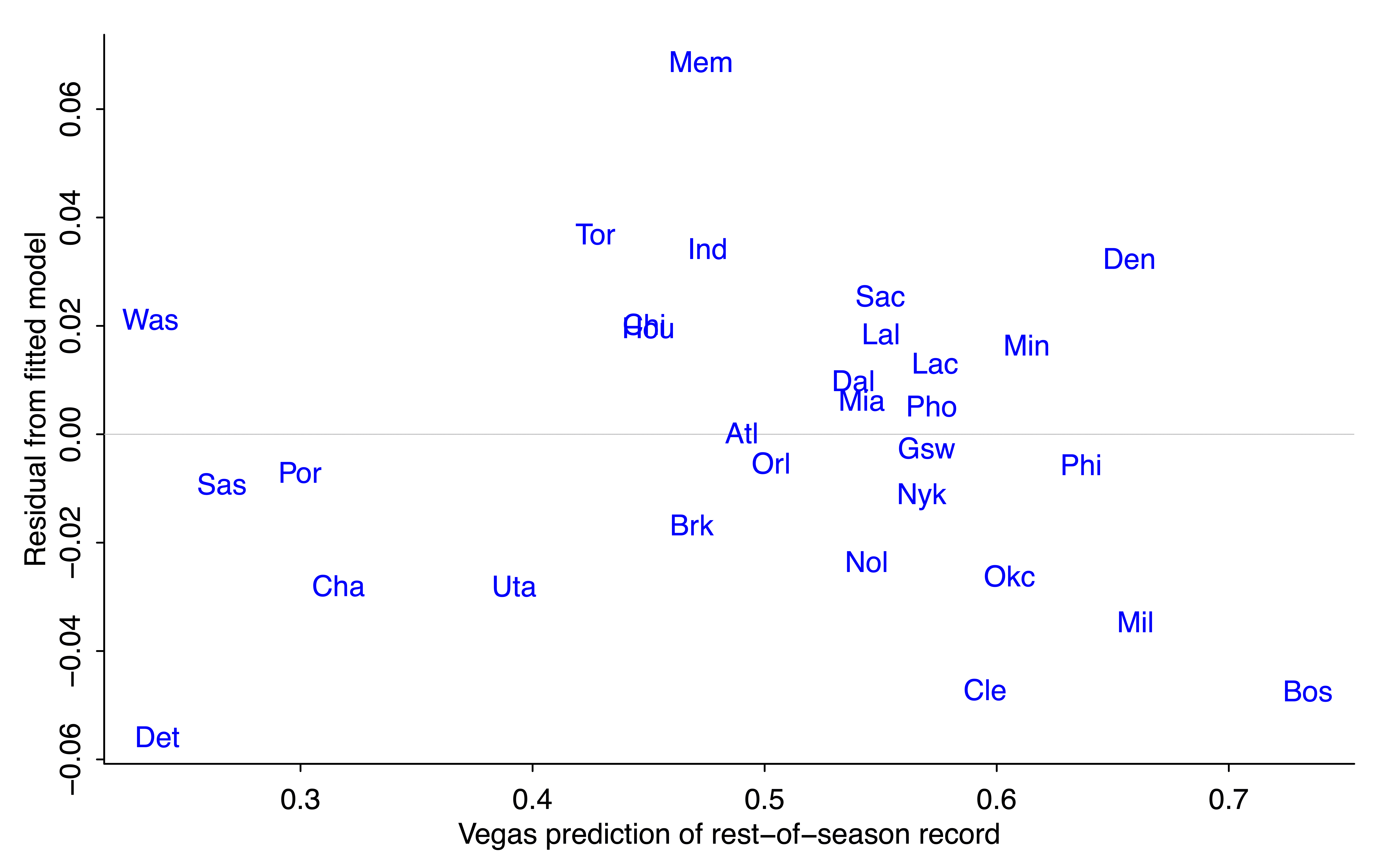
The residual for Detroit is negative (-0.05*52 = -2.6, so the Pistons are expected to win about 3 games less than their regression prediction based on prior odds and outcome of first 30 games). Cleveland and Boston are also expected to do a bit worse than the model would predict. On the other direction, Vegas is predicting that Memphis will win about 4 games more than predicted from the regression model.

I have no idea whassup with Memphis. The quick generic answer is that the regression model is crude, and bettors have other information not included in the regression.

Reverse engineering an implicit Bayesian prior

OK, now for the Bayesian analysis. As noted above, we aren't given a prior for team j's average win probability, p_j; we're just given a prior point estimate of each p_j.

But we can use the empirical prior-to-posterior transformation, along with the known likelihood function, under the simplifying assumption the 30 win-loss outcomes for each team j are independent with constant probability p_j for team j. This assumption that is obviously wrong, given that teams are playing each other, but let's just go with it here, recognizing that with full data it would be straightforward to extend to an item-response model with an ability parameter for each team (as here).

To continue, the above regression models show that the Vegas "posterior Bayesian" prediction of p_j after 30 games is approximately a weighted average of 0.65*(prior prediction) + 0.35*(data won-loss record). From basic Bayesian algebra (see, for example, chapter 2 of BDA), this tells us that the prior has about 65/35 as much information as data from 30 games. So, informationally, the prior is equivalent to the information from (65/35)*30 = 56 games, about two-thirds of a season worth of information.

Hey--what happened??

But, wait! That approximate 2/3 weighting for the prior and 1/3 weighting of the data from 30 games is the opposite of what Campos reported, which was a 1/3 weighting of the prior and 2/3 of the data. Recall: prior estimated win probability of 0.340, data win rate of 0.067, take (1/3)*0.340 + (2/3)*0.067 and you get 0.158, which isn't far from the implied posterior estimate of 0.170.

What happened here is that the Pistons are an unusual case, partly because the Vegas over-under for their season win record is a few percentage points lower than the linear model predicted, and partly because when the probability is low, a small percentage-point change in the probability corresponds to a big change in the implicit weights.

Again, it would be good to check all this with data from other years.

Skill and luck

There's one more loose end, and that's Campos taking the weights assigned to data and prior and characterizing them as "skill" and "luck" in prediction errors. I didn't follow that part of the reasoning at all so I'll just let it go for now. Part of the problem here is in one place Campos seems to be talking about skill and luck as contributors to the team's record, and in another place he seems to considering them as contributors to the difference between preseason predictions and actual outcomes.

One way to think about skill and luck in a way that makes sense to me is within an item-response-style model in which the game outcome is a stochastic function of team abilities and predictable factors. For example, in the model,

score differential = ability of home team - ability of away team + home-field advantage + error,

the team abilities are in the "skill" category and the error is in the "luck" category, and, ummm, I guess home-field advantage counts as "skill" too? OK, it's not so clear that the error in the model should all be called "luck." If a team plays better against a specific opponent by devising a specific offensive/defensive plan, that's skill, but it would pop up in the error term above.

In any case, once we've defined what is skill and what is luck, we can partition the variance of the total to assign percentages to each.

Another way of looking at this is to consider the extreme case of pure luck. If outcomes determined only by luck, then each game is a coin flip, and we'd see this in the data because the team win proportions after 30 games would follow a binomial distribution with n=30 and p=0.5. The actual team win proportions have mean 0.5 (of course) and sd 0.18, as compared to the theoretical mean of 0.5 and sd of 0.5/sqrt(30) = 0.09. That simple calculation suggests that skill is (0.18/0.09)^2 = 4 times as important as luck when determining the outcome of 30 games.

And maybe I'm getting just getting this all tangled myself. The first shot at any statistical analysis often will have some mix of errors in data, modeling, computing, and general understanding, with that last bit corresponding to the challenge of mapping from substantive concepts to mathematical and statistical models. Some mixture of skill and luck, I guess.

Summary

1. Data are king. In the immortal words of Hal Stern, the most important aspect of a statistical analysis is not what you do with the data, it’s what data you use. I could do more than Campos did, not so much because of my knowledge of Bayesian statistics but because I was using data from all 30 teams.

2. To continue with that point, you can do lots better than me by including data from other years.

3. Transparency is good. All my data and code are above. I might well have made some mistakes in my analyses, and, in any case, many loose ends remain.

4. Basketball isn't so important (hot hand aside). The idea of backing out an effective prior by looking at information updating, that's a more general idea worth studying further. This little example is a good entry point into the potential challenge of such studies.

5. Models can be useful, not just for prediction but also for understanding, as we saw for the problem of partitioning outcomes into skill and luck.

P.S. Last week, when the Pistons were 2-25 or something like that, I was taking with someone who's a big sports fan but not into analytics, the kind of person who Bill James talked about when he said that people interpret statistics as words that describe a situation rather than as numbers that can be added, subtracted, multiplied, and divided. The person I was talking with predicted that the Pistons would win no more than 6 games this year. I gave the statistical argument why this was unlikely: (a) historically there's been regression to the mean, with an improving record among the teams that have been doing the worst and an average decline among the teams at the top of the standings, (b) if a team does unexpectedly poorly, you can attribute some of that to luck. Also, 2/30 = 0.067, and 5/82 = 0.061, so if you bet that the Pistons will win no more than 6 games this season, you're actually predicting they might do worse in the rest of the season. All they need to do is get lucky in 5 of the remaining games. He said, yeah, sure, but they don't look like they can do it. Also, now all the other teams are trying extra hard because nobody wants to be the team that loses to the Pistons. OK, maybe. . . .

Following Campos, I'll just go with the current Vegas odds and give a point prediction the Pistons will end the season with about 11 wins.

P.P.S. Also related is a post from a few years back, “The Warriors suck”: A Bayesian exploration.

P.P.P.S. Unrelatedly, except for the Michigan connection, I recommend these two posts from a couple years ago:

What is fame? The perspective from Niles, Michigan. Including an irrelevant anecdote about “the man who invented hedging”

and

Not only did this guy not hold the world record in the 100 meter or 110-yard dash for 35 years, he didn’t even run the 110-yard dash in 10.8 seconds, nor did he see a million patients, nor was he on the Michigan football and track teams, nor did Michigan even have a track team when he attended the university. It seems likely that he did know Jack Dempsey, though.

Enjoy.

Judgments versus decisions

This is Jessica. A paper called “Decoupling Judgment and Decision Making: A Tale of Two Tails” by Oral, Dragicevic, Telea, and Dimara showed up in my feed the other day. The premise of the paper is that when people interact with some data visualization, their accuracy in making judgments might conflict with their accuracy in making decisions from the visualization. Given that the authors appear to be basing the premise in part on results from a prior paper on decision making from uncertainty visualizations I did with Alex Kale and Matt Kay, I took a look. Here’s the abstract:

Is it true that if citizens understand hurricane probabilities, they will make more rational decisions for evacuation? Finding answers to such questions is not straightforward in the literature because the terms “judgment” and “decision making” are often used interchangeably. This terminology conflation leads to a lack of clarity on whether people make suboptimal decisions because of inaccurate judgments of information conveyed in visualizations or because they use alternative yet currently unknown heuristics. To decouple judgment from decision making, we review relevant concepts from the literature and present two preregistered experiments (N=601) to investigate if the task (judgment vs. decision making), the scenario (sports vs. humanitarian), and the visualization (quantile dotplots, density plots, probability bars) affect accuracy. While experiment 1 was inconclusive, we found evidence for a difference in experiment 2. Contrary to our expectations and previous research, which found decisions less accurate than their direct-equivalent judgments, our results pointed in the opposite direction. Our findings further revealed that decisions were less vulnerable to status-quo bias, suggesting decision makers may disfavor responses associated with inaction. We also found that both scenario and visualization types can influence people’s judgments and decisions. Although effect sizes are not large and results should be interpreted carefully, we conclude that judgments cannot be safely used as proxy tasks for decision making, and discuss implications for visualization research and beyond. Materials and preregistrations are available at https://osf.io/ufzp5/?view only=adc0f78a23804c31bf7fdd9385cb264f. 

There’s a lot being said here, but they seem to be getting at a difference between forming accurate beliefs from some information and making a good (e.g., utility optimal) decision. I would agree there are slightly different processes. But they are also claiming to have a way of directly comparing judgment accuracy to decision accuracy. While I appreciate the attempt to clarify terms that are often overloaded, I’m skeptical that we can meaningfully separate and compare judgments from decisions in an experiment. 

Some background

Let’s start with what we found in our 2020 paper, since Oral et al base some of their questions and their own study setup on it. In that experiment we’d had people make incentivized decisions from displays that varied only how they visualized the decision-relevant probability distributions. Each one showed a distribution of expected scores in a fantasy sports game for a team with and without the addition of a new player. Participants had to decide whether to pay for the new player or not in light of the cost of adding the player, the expected score improvement, and the amount of additional monetary award they won when they scored above a certain number of points. We also elicited a (controversial) probability of superiority judgment: What do you think is the probability your team will score more points with the new player than without? In designing the experiment we held various aspects of the decision problem constant so that only the ground truth probability of superiority was varying between trials. So we talked about the probability judgment as corresponding to the decision task.

However, after modeling the results we found that depending on whether we analyzed results from the probability response question or the incentivized decision, the ranking of visualizations changed. At the time we didn’t have a good explanation for this disparity between what was helpful for doing the probability judgment versus the decision, other than maybe it was due to the probability judgment not being directly incentivized like the decision response was. But in a follow-up analysis that applied a rational agent analysis framework to this same study, allowing us to separate different sources of performance loss by calibrating the participants’ responses for the probability task, we saw that people were getting most of the decision-relevant information regardless of which question they were responding to; they just struggled to report it for the probability question. So we concluded that the most likely reason for the disparity between judgment and decision results was probably that the probability of superiority judgment was not the most intuitive judgment to be eliciting – if we really wanted to elicit the beliefs directly corresponding to the incentivized decision task, we should have asked them for the difference in the probability of scoring enough points to win the award with and without the new player. But this is still just speculation, since we still wouldn’t be able to say in such a setup how much the results were impacted by only one of the responses being incentivized. 

Oral et al. gloss over this nuance, interpreting our results as finding “decisions less accurate than their direct-equivalent judgments,” and then using this as motivation to argue that “the fact that the best visualization for judgment did not necessarily lead to better decisions reveals the need to decouple these two tasks.” 

Let’s consider for a moment by what means we could try to eliminate ambiguity in comparing probability judgments to the associated decisions. For instance, if only incentivizing one of the two responses confounds things, we might try incentivizing the probability judgment with its own payoff function, and compare the results to the incentivized decision results. Would this allow us to directly study the difference between judgments and decision-making? 

I argue no. For one, we would need to use different scoring rules for the two different types of response, and things might rank differently depending on the rule (not to mention one rule might be easier to optimize under). But on top of this, I would argue that once you provide a scoring rule for the judgment question, it becomes hard to distinguish that response from a decision by any reasonable definition. In other words, you can’t eliminate confounds that could explain a difference between “judgment” and “decision” without turning the judgment into something indistinguishable from a decision. 

What is a decision? 

The paper by Oral et al. describes abundant confusion in the literature about the difference between judgment and decision-making, proposing that “One barrier to studying decision making effectively is that judgments and decisions are terms not well-defined and separated.“ They criticize various studies on visualizations for claiming to study decisions when they actually study judgments. Ultimately they describe their view as:

In summary, while decision making shares similarities with judgment, it embodies four distinguishing features: (I) it requires a choice among alternatives, implying a loss of the remaining alternatives, (II) it is future-oriented, (III) it is accompanied with overt or covert actions, and (IV) it carries a personal stake and responsibility for outcomes. The more of these features a judgment has, the more “decision-like” it becomes. When a judgment has all four features, it no longer remains a judgment and becomes a decision. This operationalization offers a fuzzy demarcation between judgment and decision making, in the sense that it does not draw a sharp line between the two concepts, but instead specifies the attributes essential to determine the extent to which a cognitive process is a judgment, a decision, or somewhere in-between [58], [59].

This captures components of other definitions of decision I’ve seen in research related to evaluating interfaces, e.g., as a decision as “a choice between alternatives,” typically involving “high stakes.” However, like these other definitions, I don’t think Oral et al.’s definition very clearly differentiates a decision from other forms of judgment. 

Take the “personal stake and responsibility for outcomes” part. How do we interpret this given that we are talking about subjects in an experiment, not decisions people are making in some more naturalistic context?    

In the context of an experiment, we control the stakes and one’s responsibility for their action via a scoring rule. We could instead ask people to imagine making some life or death decision in our study and call it high stakes, as many researchers do. But they are in an experiment, and they know it. In the real world people have goals, but in an experiment you have to endow them

So we should incentivize the question to ensure participants have some sense of the consequences associated with what they decide. We can ask them to separately report their beliefs, e.g., what they perceive some decision-relevant probability to be as we did in the 2020 study. But if we want to eliminate confounds between the decision and the judgment, we should incentivize the belief question too, ideally with a proper scoring rule so that it’s in their best interest to tell me the truth. Now both our decision task and our judgment task, from the standpoint of the experiment subject, would both seem to have some personal stake. So we can’t distinguish the decision easily based on its personal stakes.

Oral et al. might argue that the judgment question is still not a decision, because there are three other criteria for a decision according to their definition. Considering (I), will asking for a person’s belief require them to make a choice between alternatives? Yes, it will. Because any format we elicit their response in will naturally constrain it. Even if we just provide a text box to type in a number between 0 and 1, we’re going to get values rounded at some decimal place. So it’s hard to use “a choice among alternatives” as a distinguishing criteria in any actual experiment. 

What about (II), being future-oriented? Well, if I’m incentivizing the question then it will be just as future-oriented as my decision is, in that my payoff depends on my response and the ground truth, which is unknown to me until after I respond.

When it comes to (III), overt or covert actions, as in (I), in any actual experiment, my action space will be some form of constrained response space. It’s just that now my action is my choice of which beliefs to report. The action space might be larger, but again there is no qualitative difference between choosing what beliefs to report and choosing what action to report in some more constrained decision problem.

To summarize, by trying to put judgments and decisions on equal footing by scoring both, I’ve created something that seems to achieve Oral et al.’s definition of decision. While I do think there is a difference between a belief and a decision, I don’t think it’s so easy to measure these things without leaving open various other explanations for why the responses differ.

In their paper, Oral et al. sidestep incentivizing participants directly, assuming they will be intrinsically motivated. They report on two experiments where they used a task inspired by our 2020 paper (showing visualizations of expected score distributions and asking, Do you want the team with or without the new player, where the participant’s goal is to win a monetary award that requires scoring a certain number of points). Instead of incentivizing the decision by using the scoring rule to incentivize participants, they told them to try to be accurate. And instead of eliciting the corresponding probabilistic beliefs for the decision, they asked them two questions: Which option (team) is better?, and Which of the teams do you choose? They interpret the first answer as the judgment and the second as the decision. 

I can sort of see what they are trying to do here, but this seems like essentially the same task to me. Especially if you assume people are intrinsically motivated to be accurate and plan to evaluate responses using the same scoring rule, as they do. Why would we expect a difference between these two responses? To use a different example that came up in a discussion I was having with Jason Hartline, if you imagine a judge who cares only about doing the right thing (convicting the guilty and acquitting the innocent), who must decide whether to acquit or convict a defendant, why would you expect a difference (in accuracy) when you ask them ‘Is he guilty’ versus ‘Will you acquit or convict?’ 

In their first experiment using this simple wording, Oral et al. find no difference between responses to the two questions. In a second experiment they slightly changed the wording of the questions to emphasize that one was “your judgment” and one was “your decision.” This leads to what they say is suggestive evidence that people’s decisions are more accurate than their judgments. I’m not so sure.

The takeway

It’s natural to conceive of judgments or beliefs as being distinct from decisions. If we subscribe to a Bayesian formulation of learning from data, we expect the rational person to form beliefs about the state of the world and then choose the utility maximizing action given those beliefs. However, it is not so natural to try to directly compare judgments and decisions on equal footing in an experiment. 

More generally, when it comes to evaluating human decision-making (what we generally want to do in research related to interfaces) we gain little by preferring colloquial verbal definitions over the formalisms of statistical decision theory, which provide tools designed to evaluate people’s decisions ex-ante. It’s much easier to talk about judgment and decision-making when we have a formal way of representing a decision problem (i.e., state space, action space, data-generating model, scoring rule), and a shared understanding of what the normative process of learning from data to make a decision is (i.e., start with prior beliefs, update them given some signal, choose the action that maximizes your expected score under the data-generating model). In this case, we could get some insight into how judgments and decisions can differ simply by considering the process implied by expected utility theory. 

Uh oh Barnard . . .

Paul Campos tells a story that starts just fine:

In fiscal year 2013, the [University of Florida law] school was pulling in about $36.6 in tuition revenue (2022 dollars). Other revenue, almost all of which consisted of endowment income, pushed the school’s total self-generated revenue to around $39 million in constant dollars.

At the time, the law school had 62 full time faculty members, which meant it was generating around $645,000 per full-time faculty member. The school’s total payroll, including benefits, totaled about 64% of its self-generated income. This was, from a budgetary perspective, a pretty healthy situation. . . .

And then it turns ugly:

Shortly afterwards, a proactive synergistic visionary named Laura Rosenbury became dean, and things started to change . . . a lot.

Rosenbury was obsessed with improving the law school’s ranking in the idiotic US News tables. Central to this vision was raising the LSAT and GPA scores of the law school’s entering students. In recent years, prospective law students have learned they can drive a hard bargain with schools like Florida, which were desperate to buy high LSAT scores in particular, because of the weight these numbers are given in the US News rankings formula. In order to improve these metrics Rosenbury had to convince the central administration to radically slash the effective tuition UF’s law students were paying . . .

The result was that, by fiscal year 2022, tuition revenue at the law school had fallen from $36.6 million to $8.3 million, in constant dollars — an astonishing 77% decline.

Rosenbury also increased the size of the full time faculty from 62 to 84, while slashing the size of the student body, with the result being that revenue per full time faculty member fell from around $645,000 to about $178,000. This meant that the school’s revenue was now not much more than half of its payroll, let alone the rest of its expenses.

Although Rosenbury managed to raise some money from donors while shilling her “vision” of a highly ranked law school. the net result was that, by the end of her deanship, the law school’s total self-generated revenue was covering just 40% of its operating costs, approximately.

By gaming the rankings in countless and in some instances ethically dubious ways — for example, she claimed that the school’s part time faculty expanded from 30 to 259 — the latter figure should be completely impossible under the ABA’s definitions of who can be counted as part time faculty — she did manage to raise the law school’s ranking quite a bit. This has not resulted in better job outcomes for Florida’s graduates relative to its local competitor schools, whose rankings didn’t improve, but it has allowed central administrators to advertise to their regents and legislators that UF now has a “top 25” law school . . .

And, now, the kicker. Campos quotes the New York Times:

Barnard College of Columbia University, one of the most prominent women’s colleges in the United States, announced on Thursday that it had chosen Laura A. Rosenbury, the dean of the University of Florida Levin College of Law, to serve as its next president.

Ms. Rosenbury became the first woman to serve as dean of Levin College of Law, in Gainesville, Fla., in 2015. She also taught classes in feminist legal theory, employment discrimination and family law. . . .

Columbia University hiring an administrator who supplied dubious data to raise a college’s U.S. News rankings . . . there’s some precedent for that!

Campos is only supplying one perspective, though. To learn more I took a look at the above-linked NYT article, which supplies the following information about the recent administrative accouplishments of Prof. Rosenbury, the new president of Barnard:

Ms. Rosenbury oversaw a period of growth at the University of Florida, raising more than $100 million in donations, hiring 39 new faculty members and increasing the number of applicants by roughly 200 percent, Barnard said. . . .

“I have been able to continue to do my work while also moving the law school forward in really exciting ways with the support of the state,” [Rosenbury] said. “The state has really invested in higher education in Florida including in the law school, and that is how we have been able to raise our national profile.”

What’s interesting here is that these paragraphs, while phrased in a positive way, are completely consistent with Campos’s points:

1. “More than $100 million in donations”: A ton of money, but not enough to make up for the huge drop in revenue.

2. “Hiring 39 new faculty members”: An odd thing to do if you’re gonna reduce the number of students.

3. “Increasing the number of applicants by roughly 200 percent”: Not really a plus to have more applicants for fewer slots. I mean, sure, if more prospective students want to apply, go for it, but if the way you get there is by offering huge discounts, it’s not an amazing accomplishment.

4. “The state has really invested in higher education in Florida including in the law school”: If you go from a profit center to a money pit, and then the state needs to bail you out, then, yeah, the state is “investing” . . . kind of.

On the plus side, if Columbia has really been ejected from U.S. News, the new Barnard president won’t have any particular motivation to game the rankings. I do worry, though, that she’ll find a way to raise costs while reducing revenues.

Also, to be fair, budgets aren’t the only thing that a university president does. Perhaps Prof. Rosenbury’s intellectual contributions are important enough to be worth the financial hit. I have no idea and make no claim on this, one way or the other.