Mark Liberman posted some interesting summaries of telephone speech records from the Linguistic Data Consortium. He writes:
I [Mark Liberman] took a quick look at demographic variation in the frequency of the filled pauses conventionally written as “uh” and “um”. For technical reasons that I won’t go into here, I used the frequency of the definite article “the” as the basis for comparison. Thus I selected a group of speakers (e.g. men aged 60-69), counted how often they were transcribed as saying “uh”, and to normalize that count (since the number of people in each category was different) I divided by the number of times the same speakers were transcribed as saying “the”.

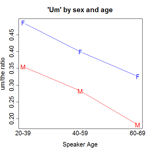
He also did “Um”:
My comments
And now, some contentless comments about graphical presentation:
1. I like the clear axis labels and titles, and even more importantly, that the lines are labeled directly (rather than using different dotted lines and a key). Good labeling is important–I do it even for the little graphs I’m making in my own research when exploring data or model fits.
2. I would’ve used blue for boys and pink for girls–easier to remember–although perhaps Mark was purposely trying to be non-stereotypical.
3. My biggest change would have been to (a) put the 2 graphs on a common scale, and (b) make them smaller, and put them next to each other. Smaller graphs allow us to see more at once, and see patterns that can be more obscure when we are forced to scroll back and forth between mutiple plots. In R, I do par(mfrow=c(2,2)) as a default.
4. I would have the bottom of each graph go to 0, since that’s a natural baseline (the zero-uh and zero-um level that we might all like to try to reach!). There’s been some debate about the “start-at-zero rule” but I usually favor it in a situation such as this, where it doesn’t require much extension of the axis.
Anyway, Mark’s blog entry has much more on this interesting data source.
P.S.
Caroline says “emmm” instead of “ummm.” Is this standard among native Spanish speakers?
P.P.S.
Prof. Gelman has some good comments on "profile charts" often used with ANOVA / regression type models to depict the effects of factors on a response variable. These have got to start from zero, and for percentages, I'd also use the end-at-1 rule.
I'd add these observations:
(1) the 3rd age group (60-69) is smaller than the other two, covering 10 rather than 20 years, so it is a bit misleading to treat them equally on the x-axis;
(2) it appears that the effect of gender on the um/uh ratios is constant across the age groups (technically, this is saying that the "interaction" effect of gender*age is zero; or, that the gender and age effects are addictive): I'm not sure if this reflects a model assumption or the data.
Hmmm.
(I was going to end my comment there, but maybe I'll continue).
We can sorta kinda the uh/um ratio, which appears to increase with age.
I wonder how much of this is a cohort effect rather than an age effect.
Interesting. Would it be possible to see if there are effects on the rate by the audience, i.e. in speaking to older men, younger women say "hmm" less?
I also assume people tend to use the same phrase in a long conversation after an initial "coordinating" phase.
I think the biggest problem with the graphs is that we don't have any idea about the variability of the measurements. Ideally, it would be nice to see the data, but if that is too messy some kind of model based estimate of the standard error.
I'm also unsure about the naturalness of including 0 in the y-axis in this case – I don't think um's and uh's are something we consciously speak (or hear) most of the time.
To answer your question about native speakers of Spanish: I have noticed that a lot of native Spanish speakers, when speaking English, tend to say "emmmm". I think it is because the Spanish translation of "ummm" is "este", usually drawn out to sound like "esteeeeeeeee".
Thanks for all the comments. In response to Hadley:
(1) I assume the sample size is huge. The real issue to me is not standard error as much as variation among persons–for example, do all men have a 38% uh/the ratio, or is it 0% for some men and 60% for others?
(2) Zero is a relevant baseline even if it's never attained. For example, an uh/the ratio of 44% is 2 times an uh/the ratio of 22%. This is visually immediate in a start-at-zero plot.
John: Thanks. The funny thing is, the first time I heard "Emmm," it sounded wrong to me. Then I realized how silly it was for me to think there's a correct way to say "Ummm"!
Another "Ummm" variant I've heard in Spanish is "Vaya." No direct English analogue to this, as far as I can tell. Maybe the closest is "yeah" or "hmmm" (with the distinction being that vaya, yeah, and hmmm represent assent with the other person's speech, whereas ummm is something we're more likely to say in the midst of our own speech.
OK, enough amateur linguistics for now…
Hmm, I think what I really wanted was some description of the distribution of the values at each point, and (very related) some way to judge whether the differences were "significant". There are plenty of graphical tools that could help us here – box plots, box-percentile plots, jittered raw values etc…
Are we interested in comparing ratios or relative differences? In both the graphs the relative differences appear constant – isn't that what we should be focussing our attention on?
Interesting study though there is a scope for your research. You may apply further statistical methods, one like ANOVA, to test your hypothesis.