The Venn Diagram Challenge which started with this entry has spurred exciting discussions at Junk Charts, EagerEyes.org, and at Perceptual edge. So I thought I will do my best to put them together in one piece.
Outcomes people created can be divided into 2 classes, first group dealt with the problem of expressing the “3-way Venn diagram of percentage with different base frequency”. Second group went a little deeper to figure out the better way to express what the paper is trying to express in a graphical way. Our ultimate goal is the second one, however, first problem is it’s self a interesting challenge and thus I will deal with them separately. ( Second group will be dealt with in the Venn Diagram Challenge Summary 2 which should come shortly after this article. )
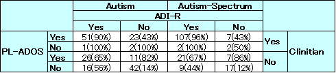
Venn diagram converted into a table:
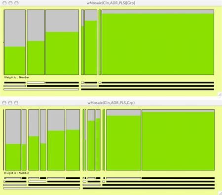
(For background you can look at the previous posts original entry, on Antony Unwin’s Mosaic chart, and Stack Lee’s bar chart.)
How to express 3-way Venn diagram of percentage with different base frequency better
Here are 4 graphs that I am aware of that falls in this category:
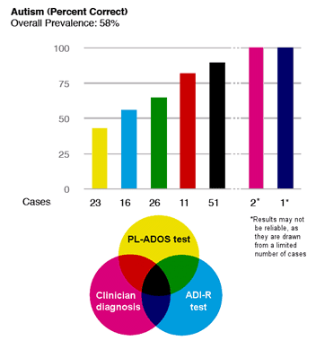
Stack Lee

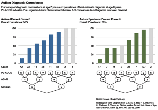
Robert Kosara
Patrick Murphy
Antony Unwin
It is always amazing to see how people make cool graphics out of same data.
There were 4 things ( percentage, base frequency, structure, possible trend, and maybe more) or maybe more, from the Venn diagram that could have been expressed graphically. When we dissect the above graphs by the 4 things noted above, result is the following:
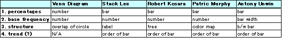
So the biggest differences between the graphs are the way in which the structure is expressed. Another point to note is how the different graphs addressed the issue of the base frequency. It’s hard to say which one’s the best because they all have points which I like. For example, to express percentage Antony’s Mosaic chart seems the most suitable since it is clear that it is showing a proportion by having gray area with the green area on the bar. To express base frequency, again I like Antony’s Mosaic chart since it gives heavy weight on the ones with more samples, which are the results that we should focus more on. As for expressing structure, it is tough call between Patrick and Robert, I personally like them both in a different way. Stack’s bar chart seems very good at comparing between Autism and Autism Spectrum which I should have put in the chart.
What we did:
We made 2 graphs
Figure 1: line graph of prevalence of best-estimate diagnosis at age 9 years conditioned on clinician (clinician was chosen arbitrarily)
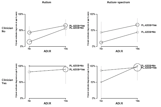
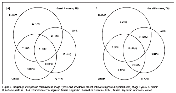
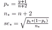
Figure 1. Prevalence of best-estimate diagnosis at age 9 years with frequency of diagnostic combinations at age 2 years expressed as area of circle. Vertical line show plus minus 2 standard error bounds based on the implicit binomial distribution with Bayesian correction (*1). Upper graph represents the case where clinician is yes and bottom is for clinician no. PL-ADOS stands for Pre-Linguistic Autism Diagnostic Observation Schedule; ADI-R stands for Autism Diagnostic Interview–Revised.
Figure 2: line graph of prevalence of best-estimate diagnosis at age 9 years by combination of tests

Figure 2. Prevalence of best-estimate diagnosis at age 9 years with frequency of diagnostic combinations at age 2 years expressed as area of circle. Autism. Blue line represents the Pre-Linguistic Autism Diagnostic Observation Schedule (PL-ADOS); Green line represents Autism Diagnostic Interview–Revised (ADI-R); and Red line represents Clinician.
If we do the same analysis we get this:

For figure 1 you can see the trend easily, with the cost of loosing the overall structure. Alternatively figure 2 keeps the structure, but it comes with the cost of visual complexity. Area of circle is not my favorite way to express the base frequency, but it does a good job of showing which points are more important without interfering with the trend line. Also this figure is generalizable to more complex Venn Diagrams.
What do you think? We appreciate your constructive comments!
( If you have charts that was not mentioned in this article and would like to be acknowledged give us a comment. Also those who tacked the issue of sensitivity and specificity, I didn’t forget you. You will be mentioned in Venn Diagram Challenge Summary 2. …to be continued…)
(*1) Calculation of standard error with Bayesian correction is done as:
Just a note to give proper credit. I submitted 4 charts to the "Gelman challenge". You picked my fourth one, which was a minor modification I made to Robert Kosara's vertical bar graph. I had found the tree map under his bars hard to understand (at first), so I color-coded his bars and used a Venn diagram as the key. The Venn is not a data-analysis tool, just a graphic legend to visually depict the relationships between the three tests alone and in combination.
In contrast, Robert's tree map legend is also a data-analysis tool. It indicates which factors are the most important (those with the most "Y"s on the right hand side).
My personal favorite was Derek's stacked tornado chart. It is at http://i146.photobucket.com/albums/r264/del_c/inf…
Derek looked at four factors for each test combination: % correct positive diagnosis (autism found at age 2 and 9), % incorrect positive diagnosis (autism found at age 2 but not at 9), % correct negative diagnosis (no autism found at 2 or 9), and % incorrect negative diagnosis (autism not found at 2 but found at 9).
A single bar encoded all four factors. The longer the dark part of the bar (correct diagnosis), and the shorter the light part of the bar (incorrect diagnosis), the more accurate and useful the test combination.
I felt Derek's chart "said it in a glance". Robert's was also good, and had some additional advantages in the tree maps.
The two new charts (Figs. 1 and 2) to me are hiding data and rely too much on repeated scales etc. I have worked with the data but cannot figure out what is going on in these charts, even with some effort. (My two cents!)
Thanks for your efforts in summarizing the "Gelman challenge".
Thanks to Patrick for the kind words. My last and preferred version was this one.
Patrick:
I noticed you've worked a lot on this and had many charts. The one I mentioned seemed to be your last work so I chose that one. I should have mentioned your other charts
1, 2, and 3.
Also, thanks for pointing out Derek's work. I have plan to refer to his works in the 2nd part of the summary.
There have been lots of interesting suggestions for displaying these data. I am just not sure they are presenting the information that was actually collected. Like everyone else (?), I didn't realise initially that the same children have been diagnosed as having Autism and/or Autism spectrum. The diagnosis Autism spectrum includes the Autism cases. (For those who are interested in pursuing this I have included my summary of the data structure reported in the original article at the foot of this entry.)
For the data structure we have assumed, Andrew's table with the four things that might be shown is very helpful. Mosaic plots seem to me to be the only form which successfully allows direct comparisons of percentages and includes the group sizes. The labelling could be better, perhaps adapting Robert Kosara's idea. Just stating the number in each group seems insufficient and is non-graphical. Andrew's circles are a step in the right direction, though they suffer from the overprinting in Fig 2 and from the excessive labelling in Fig 1. At the end of the day, graphics are subjective and a lot depends on prior experience and education. This is why it is important to state what you think people should be able to see from your graphic. Too often graphics are used as decoration in publications, with little intent of conveying information.
Summary of data structure reported in Lord's article
1) 214 children were all tested in three ways at age 2 (not exactly 2, the standard deviations are fairly large, cf. Table 1). The article concentrates on the 172 children who were also diagnosed at age 9.
(2) Each test at 2 gave rise to one of three diagnoses:
Autism
ASD
Non-spectrum
In reporting ASD, the figures in the article are always for Autism + ASD
(3) A "best diagnosis" at age 2 was constructed (cf. foot of second column p696 and the same position on p697). This is NOT the same as being positive on all three tests.
(4) The children were diagnosed again at age 9.
(5) Each test results in a score of some kind, which is transformed to a diagnosis. On p696 the clinical rating uses
1-2 definitely non-spectrum
3-7 ASD including PDD-NOS,
8-10 definite autism.
This means that more children will be rated ASD or definitely autistic than rated definitely autistic by this test. That is why there are more cases of (+,+,+) (i.e. positive diagnosis in all threee tests) and fewer of (-,-,-) (i.e. negative diagnosis in all threee tests) in the righthand plot. It also means that you cannot compare any of the groups, because they involve different children.
e.g. Supposing all three tests use the 1-10 scale above. A child with scores of (5,2,8) would be in (-,-,+) for autism (left plot) and in (+,-,+) for ASD (right plot).
(6) A full diagnosis dataset would have 172 cases of five categorical variables, each with the categories Autism, PDD-NOS, Non-spectrum: one variable for each of the three tests, one for the best diagnosis at 2 and one for the diagnosis at 9. Many of the 243 combinations would, of course, be empty and a single plot is likely to be unhelpful. A plot of the 32 combinations for autism/not autism or for Spectrum/Non-spectrum could be very helpful.
It is possible from Figures 1 and 2 to construct two aggregated datasets of four categorical variables (the three tests and "best" at two years old or the three tests and diagnosis at 9 years old).