I sometimes play with Google Analytics to see the number of daily visitors on our blog and where they are coming from. The charts of daily visits look a bit like this:
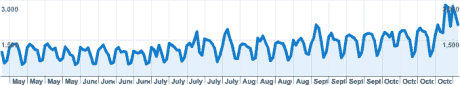
Clearly, there is an upwards trend, but the influence of the day of the week messes everything up. I exported the data into a text file, and typed a line into R:
plot(stl(ts(read.table(‘visitors’),frequency=7),s.window=”periodic”))
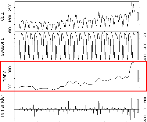
The trend component shows what I am really interested in: the trough of summer, followed by a relatively consistent rising trend. Every now and then another site will refer to our blog, temporarily increasing the traffic, and Andrew’s cool voting plots are responsible for the latest spike.
Setting the stl function’s t.window parameter to 14, 21 or more will smooth the trend a bit more. The model is imperfect because new visitors do come in bursts, but leave more slowly. Perhaps we should do a better Bayesian model for time series decomposition, unless someone else has already done this.