Steve Buyske points me to this:
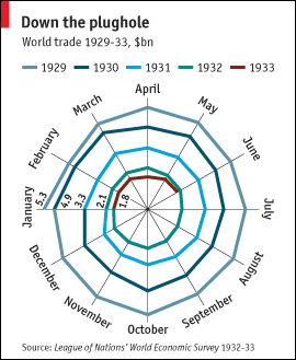
Boy do I hate this. A straight time series would do so much better. They should also follow the general principle of extending the series, going back before 1929 and after 1933. But my main feeling is that this spiderweb action is just horrible.
Ugly, yes.
On the plus side, it is a striking depiction of a "going down the drain" metaphor, and does highlight that each month showed a year-on-year drop (so cursory visual inspections handles some seasonal adjustment questions one might have). At least the origin is zero.
Why would a straight time series be so much better? You seem to be saying this has a big flaw that outweighs its pluses but it isn't obvious to me what that is. My big complaint is that the axis isn't logarithmic; you probably have a different big complaint.
As Brent says, this adjusts for month effects; a straight time series doesn't.
Brent: Yes, the zero origin is good and it gives the graph much of its power. But I hate that gratuitous spiderweb pattern.
Seth: I'm too lazy to get the month-by-month data and make a time plot, but I think such a plot would be much clearer. To start with, a time plot would itself show any seasonal variation, which I doubt is huge in any case. I just want to see what was happening, and the graph makes it harder to see that. Also makes it harder for them to show more years and thus convey important contextual information.
The main thing to be shown here is that each year is smaller than the last. The main confound in a simple graph is seasonality (although not necessarily a problem here).
I'd show this as a line graph with 5 lines, one for each year. X axis would be Jan, Feb…Dec.
With the spiderweb graph, one is tempted to interpret the area of the circle as the size of trade for that year. But the size of trade as shown in the graph is proportional to the radius; the area of the circle is proportional to radius^2.
Trade in 1929 (5.3, just taking the only number given) is about 3x trade in 1933 (1.8). But 5.3^2 is 8.7x 1.8^2.
I actually like it. It effectively gives you the idea that each year trade is consistently smaller than the previous. To the extent that it is meant to underline the titled metaphor (down the plughole) and given that I don't have any information about the broader context in which the data is meant to be used, I think it is effective and fun. And why shouldn't we allow data to be fun?
Better would be to plot it on the surface of a cylinder. But neither my monitor nor my eyeballs handle that real well. =)
This was so ugly I had to make a proper chart of it:
Spiraling Down the Drain
To address a couple of specific points in the comments:
The down the drain spiral metaphor was taken way too far, at the expense of conveying any useful information.
A time series shows the year-over-year trends, as well as month-to-month effects. To show seasonal variations, you could plot separate year data on the same Jan-Dec scale.
The spiral chart was not effective at showing monthly variations. In this case, there was hardly any seasonal effect, other than perhaps a peak in October the first two years, and the spider chart showed neither the general lack of seasonality nor the October bumps.
Isn't this a copy of one of the more famous graphs of the 20th century? I wish I could remember the reference, but it is up there with the famous depiction of the diminishing size of Napolean's army. I recall the spiderweb graph from a high school history course. I liked it then and now; how better to communicate the downward spiral of economic activity to a lay audience?
Mike: As Ed Tufte might say, if you want to have a graph and have fun, I'd prefer an informative graph plus an ice cream cone.
Jon: Your chart is excellent. I agree entirely.
Chris: I think the "spiral" metaphor is being overworked here. But I don't think this is the worst graph ever, or anything close to it.