The Organisation for Economic Co-operation and Development reports that the following project from Krisztina Szucs and Mate Cziner has won their visualization challenge, “launched in September 2012 to solicit visualisations based on the OECD’s data-rich Education at a Glance report”:
(The graph is interactive. Click on the above image and click again to see the full version.)
From the press release:
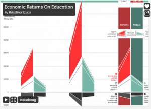
Entries from around the world focused on data related to the economic costs and return on investment in education . . . [The winning entry] takes a detailed look at public vs. private and men vs. women for selected countries . . .
The judges were particularly impressed by the angled slope format of the visualisation, which encourages comparison between the upper-secondary and tertiary benefits of education. Szucs and Cziner were also lauded for their striking visual design, which draws users into exploring their piece [emphasis added].
I used boldface to highlight a point that Antony Unwin and I have been making recently, which is that the obscurity and difficulty of certain infographs can, paradoxically, make them appealing and powerful by first sucking you (the reader) in and then giving you a puzzle to chew on: what exactly do those numbers mean? Once you’ve figured that out, you’re deep inside the subject.
To be frank, I don’t think many people will actually learn much at all about education or education statistics from playing with the Szucs and Cziner visualization, but it does a good job of selling the topic in the sense of making the numbers look potentially interesting and surprising.
More here from Patrick Love at the OECD, who writes:
They chose Krisztina and Maté’s graph from over 30 entries because it “does a great job of breaking down the complex interplay between costs and returns into a form that is easy to compare”. And also because “instead of the many-country approach used by most entries, the project takes a detailed look at public vs. private and men vs. women for three selected countries (which you can change)”.
Huh—only three selected countries??? That I can’t see the benefit of, given that the graph is interactive.
Is this some kind of joke?
After puzzling over the graph for a minute, I decided it wasn’t worth my time to figure out what is going on. What does the sloped bar mean, anyway?
Familiarity breeds contempt?
Off topic, but I just noticed that one of the sponsors of the blog is “National Security Agency”. What does Andrew do for the NSA? Or would you have to kill me if you told me? :)
Rahul:
They gave me a research grant to work on weakly informative priors.
Did I wander onto Kaiser’s “Junk Charts” blog?
This is a horror. Change from “men” to “women” and the countries change. Maybe they just change every so often anyway.
Zbicyclist:
Agreed, but it won an award, so I think it’s worth thinking about what that graph had that appealed to people.
Maybe the appeal was the fact they couldn’t understand it so it had to be deep.
I have spent the time to understand it. This is just horrible. Maybe this blog should run a contest to come up with a better way to display the same numbers. Or perhaps it would be more entertaining, and more challenging, to come up with a worse way.
The best foil would be to develop a MIT-Scigen analog that has a lot of colors, animations, widgets, sliders, buttons an also looks sleek but has just junk numbers in it.
I too was puzzled by the viz. If you deeply understand the underlying data (as the OECD judges do), then perhaps the multiple dimensions in the viz make more sense.
It may have helped to provide a short video with narration (ala Hans Rosling). Casual viewers would get something out of just watching, and those more interested would have a better starting point to explore.
It’s somewhat weak for the judges to say, “comparative analysis can reveal trends and insights crucial to shaping policy and improving well-being through education.” and to then not provide an example. A cynic might assume they’re still exploring the vizualization.
I was totally puzzled — the “help” and “about” sections referred to bigger and smaller slopes meaning something, but I couldn’t figure out what positive and negative slopes refer to. What’s on the X axis? Is there anything on the x axis?
For each country, the plots show four columns of numbers. From left to right, they are: public costs on upper secondary education, public costs on tertiary education, private costs on tertiary education, and private costs on upper secondary education. So the “x axis” within a country just takes you from one of these to the next; they could have used four columns of bars per country instead, but then it wouldn’t have had that angular look, which presumably they think is cool.
Thanks Phil — Any thoughts on what a “good” education system would look like (at least in terms of this graph)?
You see how much better it works out when I say nice things and let the commenters get nasty? (Although I did write, “I don’t think many people will actually learn much at all about education or education statistics from playing with the Szucs and Cziner visualization.”)
This principle reminds me of Chris Ware’s comics, however, Ware has earned a license to do this kind of thing as an artist:
http://www.metabunker.dk/rackham/anmeldelse/billeder/Ware/quimbyback.jpg
For most people, it’s probably just as ill-advised as trying to write papers in the style of james joyce.