Yair points us to this page full of wonderful graphs from the Stephen Wolfram blog. Here are a few:

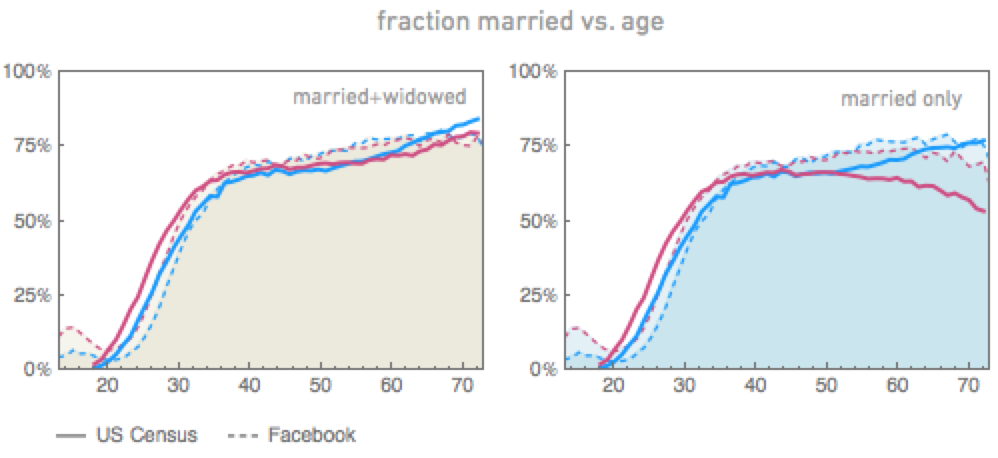
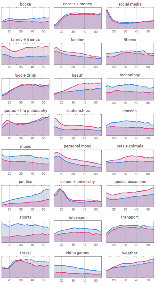
And some words:
People talk less about video games as they get older, and more about politics and the weather. Men typically talk more about sports and technology than women—and, somewhat surprisingly to me, they also talk more about movies, television and music. Women talk more about pets+animals, family+friends, relationships—and, at least after they reach child-bearing years, health. . . . Some of this is rather depressingly stereotypical. And most of it isn’t terribly surprising to anyone who’s known a reasonable diversity of people of different ages. But what to me is remarkable is how we can see everything laid out in such quantitative detail in the pictures above—kind of a signature of people’s thinking as they go through life.
Of course, the pictures above are all based on aggregate data, carefully anonymized. But if we start looking at individuals, we’ll see all sorts of other interesting things. . . .
Good stuff, and I like the flexible, open attitude. And great graphs. That’s why I’m posting this, in order to spread the word, to inspire others to do this sort of statistical exploration. Follow the link for lots more.
By the way . . .
I wonder who did the analysis, who made the graphs, and who wrote the text. No authors are listed. It’s posted on the Stephen Wolfram Blog, but Wolfram is known for contracting out his research. It’s certainly possible that he did all the statistical analysis, computing, graphics, and writing himself, I just have no idea. It’s funny: in academia, allocation of credit and attribution of authorship is huge. In industry, not so much. As an academic, I’d like to give credit to whoever made these pretty graphs, but perhaps from Wolfram’s perspective, whoever made the graphs is just doing a job, just like whoever sweeps the floors in the lab or whoever cleans the erasers in the classroom. In any case, I give Wolfram credit, no joke. Even if he didn’t do any of the work on this, it takes skill to hire the right people to do the job.
On the credit issue, see the following link for an extended discussion with a person who made many of the graphs and did much of the analysis: https://news.ycombinator.com/item?id=5603679
While visiting Facebook during the summer of 2011, I ran a broad range of analyses on the Facebook social graph — together with Brian Karrer, Lars Backstrom, and Cameron Marlow — that was posted to the arxiv: [ http://arxiv.org/abs/1111.4503 ]. Our analysis was based on the full graph, and includes observations about age-age assortativity, a quantification of the friendship paradox, and quite a bit more. It was part of an internal effort to provide the research community with descriptive statistics about the Facebook graph.
As Michael points out, it appears that much of the Wolfram analysis was led by Taliesin Beynon, who references our work in the HackerNews discussion. The lack of citation in the Wolfram blog post is understandable — it’s part of a corporate blogging effort trying to advertise Wolfram Alpha and Mathematica for “data science”. If the post was an academic exercise then there are many works they should be citing before ours — Feld on the friendship paradox, the algorithms they use for community detection (note that the Mathematica documentation does not give these) — but none of the links in the blog post leave the Wolfram domain. Such is marketing. But overall the Wolfram post is stunning work with beautiful graphics, bravo to them!
Agreed.
Even though they have, as you say, “pretty graphs,” the statistical analysis itself is amateur at best. On the popularity per age graphs, they do not even have confidence intervals, yet make claims on this self-selected dataset which most surely has some bias, despite its size. I’m quite surprised you have provided no statistical critique on this “statistical models, casual inference, and social science” blog.
Karissa:
Big sample size implies essentially zero standard errors. There are systematic differences between the facebook population and the U.S. population (and these are discussed in the post I link to), but the usual sort of confidence intervals wouldn’t make much sense here.
On your second question, I don’t see the need for a statistical critique. The linked post is clear on what it has to offer. Lots of interesting patterns from big data, they don’t really claim more than that. I think it would be great if researchers fit statistical models to such data.
I don’t see the analysis at that site as amateur. It is limited in its goals, but within those goals, it seems state-of-the-art. But, sure, there’s lots of room for more.
I think academics gloat a bit too much about their system of assigning out credit. The authors and citations of a paper are often as much a reflection of politics, quid pro quo and strategic flattery as of the merit of the work itself.
My pet rant is how computational support staff (I was one) gets often zero credit for days of hard work. And no, I’m not talking about the fellows that run backups or install Windows. I’m talking about parallalising programs on clusters, debuggging broken legacy codes, optimizing compiled programs, gluing together scripting and pre-processing, etc.
Rahul:
I’ve never heard an academic gloat about their system of assigning out credit. I’ve heard lots of complaining, zero gloating. You must hang out with a different sort of academics than I do.
In any case, I agree that programming deserves more credit than it does. I fight for that within the field of statistics.
The whole bit about who gets co-authorship seems very arbitrary and full of political undertones.
Yes, I agree. That’s why academics complain about the subject! I just haven’t ever seen anyone gloat about the problem, quite the contrary. Whenever I’ve seen academics talk about authorship, they seem to be talking about all the problems involved with it.
Tufte in VDoQI wrote that graphs should be landscape-format rectangles of 1.4-1.6 aspect ratio, but I don’t agree. I think that age-age graph would have worked better as a square.
“Some of this is rather depressingly stereotypical.”
Personally, I take great glee in documenting the statistical validity of stereotypes.
One thing to keep in mind, which they seem to have not, is that this is not a longitudal population so claims like ‘People talk less about video games as they get older’ are less true than ‘more about politics and the weather’ since it is less likely older people have had the same degree of exposure to video games as both groups have been exposed to politics/weather.
Patrick:
I think they did allude to this problem, noting that given the short time frame of these data, it is impossible to separate age and cohort effects.
Ah, thanks Andrew. I need to be a more thorough reader then and follow the links.
Naturally you have made it again however there other articles on statistics.
I thought the article about the mormon was your best though.
hopefully you will get more readers from OZ!
As someone in industry, my experience is that citation and references are invaluable. This data out on the Wolfram site will age and become useless at an unknown rate. Anyone who wants or needs to update the analysis or take a second look at the data is simply out of luck. This probably won’t be a problem in this case, but it can be a huge problem when your products age, markets shift, and you need to access old data rather than just a few static graphs. The academic practice of citation enables this sort of re-examination of old data (though it admittedly doesn’t always work), while the industrial practice of just publishing (and therefore only preserving) a few analysis results is hugely detrimental and, in the long run, highly inefficient.
At least one category is missing: Among my latin-american facebook friends, the most popular topic (after family, math &stat) is — Jesus!
Maybe they are only looking at US data?
You may find it interesting that in Australia our Copyright Act (PART IX) http://www.austlii.edu.au/au/legis/cth/consol_act/ca1968133/ specifically gives legals backing to the notion that it is morally correct to attibute authorship.