I recently posted on the sister blog regarding a paper by Jon Zelner, James Trostle, Jason Goldstick, William Cevallos, James House, and Joseph Eisenberg, “Social Connectedness and Disease Transmission: Social Organization, Cohesion, Village Context, and Infection Risk in Rural Ecuador.”
Zelner follows up:
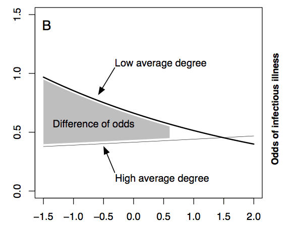
This made me think of my favorite figure from this paper, which showed the impact of relative network position within villages on risk. Basically, less-connected households in low average-degree villages were at higher risk than more-connected households in those villages, but in high average-degree places there was no meaningful relative degree effect.
Here it is:
What’s the X axis?
Never mind… I’m assuming it is social connections of the individual family, while the lines stratify by average social connection of the village.
Difference (in standard deviations) of household degree from village average degree
From the link in Zelner follow-up quote.
Now as soon as I find out what a village average degree is …
I’m not sure why Andrew loved this figure. I’m lost. What a cryptic figure.
Err, exactly. The plot must mean something, but what? At the moment it looks like an economist’s graph!
Note I am not a fan of simple=-minded economic graphs.
It is addictive. I keep coming back & staring at it hoping I will have an Eureka moment & all will be clear. :)
Where’s the raw data?