In July 2015 I was spectacularly wrong

See here.

Also interesting was this question that I just shrugged aside:

If a candidate succeeds in winning a nomination and goes on to win the election and reside in the White House do they have to give up their business interests as these would be seen as a conflict of interest? Can a US president serve in office and still have massive commercial business interests abroad?

Hey, Taiwan experts! Here’s a polling question for you:

Lee-Yen Wang writes:

I have a question about comparing polls in presidential elections in Taiwan.

The four candidates are:

– Mr. A: Hou Yu-ih, mayor of New Taipei City, from Taiwan’s main opposition Kuomintang (KMT) party.

– Mr. B: Dr. Ko Wen-je, ex-mayor of Taipei, Chairman of the People’s Party (TPP), a much smaller opposition party than the KMT.

– Mr. C: Lai Ching-te, Vice President and the Chairman of the Democratic Progressive Party (DPP), the ruling party.

– Ms. D: Hsiao Bi-khim, former envoy to the United States and a member of the DPP.

My question concers the best method for comparing polls to determine the optimal candidate pairing for president and vice president.

The scenario involves two competing candidates, Mr. A and Mr. B, who want to decide who should be the presidential candidate and who should be the vice presidential candidate, while facing a decided pair, CD.

Polls are conducted for both AB vs. CD and BA vs. CD. Different combinations of AB and BA may have varying strengths against CD. The poll comparisons are listed below, with only the title row representing the comparison shown:

AB CD AB-CD BA CD BA-CD (AB-CD) -(BA-CD)

My question is: which approach is more reasonable for determining which pair of combinations, AB or BA, is stronger against CD?

A and B campaigned heavily for the presidential nomination, with the loser in the polls becoming the vice presidential candidate. However, AB-CD elicits a different response in the polls than BA-CD.

This can be simulated: AB vs. CD is 48% to 46%, while BA vs. CD is 41% to 32%. In the case of AB vs. BA, AB beats BA by 7%. However, if we use the difference of the difference, we get 2% vs. 9%, and the difference of the difference is 7%, favoring BA. These two approaches yield inconsistent results. In a high-stakes election where both candidates campaign intensely, which approach do you suggest is theoretically sound for comparison?

The aforementioned scenario played out vividly in the recent presidential election in Taiwan in January. The controversy over resolving the tie ultimately led to the split of candidates A and B just before the official candidate registration deadline.

They each quickly chose their own vice presidential candidates to run against the CD pair.

The key question is how best to compare the poll results. There are several options:
– Should we simply compare AB vs. BA using the margin of error and ignore the situation to compare the difference of the difference?
– Should we use the margin of error as a metric and apply it to compare the difference of the difference?
– Should we instead use the ratio of estimation and normalize the probability of AB and BA?
– Should we employ the ratio method of estimation and compare the difference of the difference, where we normalize p = (AB – CD)/((AB – CD) + (BA – CD)) and q = 1-p? The question is whether this operation makes sense.

Are there other effective methods for comparing surveys that could solve this dilemma?

I have no idea what’s going on in this story. No idea at all. But I thought some Taiwan experts might be interested, so I’m posting here.

Why I continue to support the science reform movement despite its flaws

I was having a discussion with someone about problems with the science reform movement (as discussed here by Jessica), and he shared his opinion that “Scientific reform in some corners has elements of millenarian cults. In their view, science is not making progress because of individual failings (bias, fraud, qrps) and that if we follow a set of rituals (power analysis, preregistration) devised by the leaders than we can usher in a new era where the truth is revealed (high replicability).”

My quick reaction was that this reminded me of an annoying thing where people use “religion” as a term of insult. When this came up before, I wrote that maybe it’s time to retire use of the term “religion” to mean “uncritical belief in something I disagree with.”

But then I was thinking about this all from another direction, and I think there’s something there there. Not the “millenarian cults” thing, which I think was an overreaction on my correspondent’s part.

Rather, I see a paradox. From his perspective, my correspondent sees the science reform movement as having a narrow perspective, an enforced conformity that leads it into unforced errors such as publishing a high-profile paper promoting preregistration without actually itself following preregistered analysis plans. OK, he doesn’t see all of the science reform movement as being so narrow—for one thing, I’m part of the science reform movement and I wasn’t part of that project!—but he seems some core of the movement being stuck in narrow rituals and leader-worship.

But I think it’s kind of the opposite. From my perspective, the core of the science reform movement (the Open Science Framework, etc.) has had to make all sorts of compromises with conservative forces in the science establishment, especially within academic psychology, in order to keep them on board. To get funding, institutional support, buy-in from key players, . . . that takes a lot of political maneuvering.

I don’t say this lightly, and I’m not using “political” as a put-down. I’m a political scientist, but personally I’m not very good at politics. Politics takes hard work, requiring lots of patience and negotiation. I’m impatient and I hate negotiation; I’d much rather just put all my cards face-up on the table. For some activities, such as blogging and collaborative science, these traits are helpful. I can’t collaborate with everybody, but when the connection’s there, it can really work.

But there’s more to the world than this sort of small-group work. Building and maintaining larger institutions, that’s important too.

So here’s my point: Some core problems with the open-science movement are not a product of cult-like groupthink. Rather, it’s the opposite: this core has been structured out of a compromise with some groups within psychology who are tied to old-fashioned thinking, and this politically-necessary (perhaps) compromise has led to some incoherence, in particular the attitude or hope that, by just including some preregistration here and getting rid of some questionable research practices there, everyone could pretty much continue with business as usual.

Summary

The open-science movement has always had a tension between burn-it-all-down and here’s-one-quick-trick. Put them together and it kinda sounds like a cult that can’t see outward, but I see it as more the opposite, as an awkward coalition representing fundamentally incoherent views. But both sides of the coalition need each other: the reformers need the old institutional powers to make a real difference in practice, and the oldsters need the reformers because outsiders are losing confidence in the system.

The good news

The good news for me is that both groups within this coalition should be able to appreciate frank criticism from the outside (they can listen to me scream and get something out of it, even if they don’t agree with all my claims) and should also be able to appreciate research methods: once you accept the basic tenets of the science reform movement, there are clear benefits to better measurement, better design, and better analysis. In the old world of p-hacking, there was no real reason to do your studies well, as you could get statistical significance and publication with any old random numbers, along with a few framing tricks. In the new world of science reform—even imperfect science reform, this sort of noise mining isn’t so effective, and traditional statistical ideas of measurement, design, and analysis become relevant again.

So that’s one reason I’m cool with the science reform movement. I think it’s in the right direction: its dot product with the ideal direction is positive. But I’m not so good at politics so I can’t resist criticizing it too. It’s all good.

Reactions

I sent the above to my correspondent, who wrote:

I don’t think it is a literal cult in the sense that carries the normative judgments and pejorative connotations we usually ascribe to cults and religions. The analogy was more of a shorthand to highlight a common dynamic that emerges when you have a shared sense of crisis, ritualistic/procedural solutions, and a hope that merely performing these activities will get past the crisis and bring about a brighter future. This is a spot where group-think can, and at times possibly should, kick in. People don’t have time to each individually and critically evaluate the solutions, and often the claim is that they need to be implemented broadly to work. Sometimes these dynamics reflect a real problem with real solutions, sometimes they’re totally off the rails. All this is not to say I’m opposed to scientific reform; I’m very much for it in the general sense. There’s no shortage of room for improvement in how we turn observations into understanding, from improving statistical literacy and theory development to transparency and fostering healthier incentives. I am, however, wary of the uncritical belief that the crisis is simply one of failed replications and that the performance of “open science rituals” is sufficient for reform, across the breadth of things we consider science. As a minor point, I don’t think many of the vast majority of prominent figures in open science intend for these dynamics to occur, but I do think they all should be wary of them.

There does seem to be a problem that many researchers are too committed to the “estimate the effect” paradigm and don’t fully grapple with the consequences of high variability. This is particularly disturbing in psychology, given that just about all psychology experiments study interactions, not main effects. Thus, a claim that effect sizes don’t vary much is a claim that effect sizes vary a lot in the dimension being studied, but have very little variation in other dimensions. Which doesn’t make a lot of sense to me.

Getting back to the open-science movement, I want to emphasize the level of effort it takes to conduct and coordinate these big group efforts, along with the effort required to keep together that the coalition of skeptics (who see preregistration as a tool for shooting down false claims) and true believers (who see preregistration as a way to defuse skepticism about their claims) and get these papers published in top journals. I’d also say it takes a lot of effort for them to get funding, but that would be kind of a cheap shot, given that I too put in a lot of effort to get funding!

Anyway, to continue, I think that some of the problems with the science reform movement are that it effectively promises different things to different people. And another problem is with these massive projects that inevitably include things that not all the authors will agree with.

So, yeah, I have a problem with simplistic science reform prescriptions, for example recommendations to increase sample size without any nod toward effect size and measurement. But much much worse, in my opinion, are the claims of success we’ve seen from researchers and advocates who are outside the science-reform movement. I’m thinking here about ridiculous statements such as the unfounded claim of 17 replications of power pose, or the endless stream of hype from the nudgelords, or the “sleep is your superpower” guy, or my personal favorite, the unfounded claim from Harvard that “the replication rate in psychology is quite high—indeed, it is statistically indistinguishable from 100%.”

It’s almost enough to stop here with the remark that the scientific reform movement has been lucky in its enemies.

But I also want to say that I appreciate that the “left wing” of the science reform movement—the researchers who envision replication and preregistration and the threat of replication and preregistration as a tool to shoot down bad studies—have indeed faced real resistance within academia and the news media to their efforts, as lots of people will hate the bearers of bad news. And I also appreciate that the “right wing” of the science reform movement—the researchers who envision replication and preregistration as a way to validate their studies and refute the critics—in that they’re willing to put their ideas to the test. Not always perfectly, but you have to start somewhere.

While I remain annoyed at certain aspects of the mainstream science reform movement, especially when it manifests itself in mass-authored articles such as the notorious recent non-preregistered paper on the effects of preregistration, or that “Redefine statistical significance” article, or various p-value hardliners we’ve encountered over the decades, I also respect the political challenges of coalition-building that are evident in that movement.

So my plan remains to appreciate the movement while continuing to criticize its statements that seem wrong or do not make sense.

I sent the above to Jessica Hullman, who wrote:

I can relate to being surprised by the reactions of open science enthusiasts to certain lines of questioning. In my view, how to fix science is as about a complicated question as we will encounter. The certainty/level of comfortableness with making bold claims that many advocates of open science seem to have is hard for me to understand. Maybe that is just the way the world works, or at least the way it works if you want to get your ideas published in venues like PNAS or Nature. But the sensitivity to what gets said in public venues against certain open science practices or people reminds me very much of established academics trying to hush talk about problems in psychology, as though questioning certain things is off limits. I’ve been surprised on the blog for example when I think aloud about something like preregistration being imperfect and some commenters seem to have a visceral negative reaction to see something like that written. To me that’s the opposite of how we should be thinking.

As an aside, someone I’m collaborating with recently described to me his understanding of the strategy for getting published in PNAS. It was 1. Say something timely/interesting, 2. Don’t be wrong. He explained that ‘Don’t be wrong’ could be accomplished by preregistering and large sample size. Naturally I was surprised to hear #2 described as if it’s really that easy. Silly me for spending all this time thinking so hard about other aspects of methods!

The idea of necessary politics is interesting; not what I would have thought of but probably some truth to it. For me many of the challenges of trying to reform science boil down to people being heuristic-needing agents. We accept that many problems arise from ritualistic behavior, but we have trouble overcoming that, perhaps because no matter how thoughtful/nuanced some may prefer to be, there’s always a larger group who want simple fixes / aren’t incentivized to go there. It’s hard to have broad appeal without being reductionist I guess.

“Guns, Race, and Stats: The Three Deadliest Weapons in America”

Geoff Holtzman writes:

In April 2021, The Guardian published an article titled “Gun Ownership among Black Americans is Up 58.2%.” In June 2022, Newsweek claimed that “Gun ownership rose by 58 percent in 2020 alone.” The Philadelphia Inquirer first reported on this story in August 2020, and covered it again as recently as March 2023 in a piece titled “The Growing Ranks of Gun Owners.” In between, more than two dozen major media outlets reported this same statistic. Despite inconsistencies in their reporting, all outlets (directly or indirectly) cite as their source a survey-based infographic conducted by a firearm industry trade association.

Last week, I shared my thoughts on the social, political, and ethical dimensions of these stories in an article published in The American Prospect. Here, I address whether and to what extent their key statistical claim is true. And an examination of the infographic—produced by the National Shooting Sports Foundation (NSSF)—reveals that it is not. Below, I describe six key facts about the infographic that undermine the media narrative. After removing all false, misleading, or meaningless words from the Guardian’s headline and Newsweek’s claim, the only words remaining are “Among” “Is,” “In,” and “By.”

(1) 58.2% only refers to the first six months of 2020

To understand demographic changes in firearms purchases or ownership in 2020, one needs to ascertain firearm sales or ownership demographics from before 2020 and after 2020. The best way to do this is with a longitudinal panel, which is how Pew found no change in Black gun ownership rates among Americans from 2017 (24%) to 2021 (24%). Longitudinal research in The Annals of Internal Medicine, also found no change in gun ownership among Black Americans from 2019 (21%) through 2020/2021 (21%).

By contrast, the NSSF conducted a one-time survey of its own member retailers. In July 2020, the NSSF asked these retailers to estimate demographics in the first six months of 2020 to demographics in the first six months of 2019. A full critique of this approach and its drawbacks would require a lengthy discussion of the scientific literature on recency bias, telescoping effects, and so on. To keep this brief, I’d just like to point out that by July 2020, many of us could barely remember what the world was like back in 2019.

Ironically, the media couldn’t even remember when the survey took place. In September 2020, NPR reported—correctly—that “according to AOL News,” the survey concerned “the first six months of 2020.”  But in October of 2020, CNN said it reflected gun sales “through September.” And by June 2021, CNN revised its timeline to be even less accurate, claiming the statistic was “gun buyers in 2020 compared to 2019.”

Strangely, it seems that AOL News may have been one of the few media outlets that actually looked at the infographic it reported. The timing of the survey—along with other critical but collectively forgotten information on its methods are printed at the top of the infographic. The entire top quarter of the NSSF-produced image is devoted to these details:  “FIREARM & AMMUNITION SALES DURING 1ST HALF OF 2020, Online Survey Fielded July 2020 to NSSF Members.”

But as I discuss in my article in The American Prospect, a survey about the first half of 2020 doesn’t really support a narrative about Black Americans’ response to “protests throughout the summer” of 2020 or to that November’s “contested election.” This is a great example of a formal fallacy (post hoc reasoning), memory bias (more than one may have been at work here), and motivated reasoning all rolled into one. To facilitate these cognitive errors, the phrase “in 2020” is used ambiguously in the stories, referring at times to its first six months of 2020 and at times specific days or periods during the last seven months. This part of the headlines and stories is not false, but it does conflate two distinct time periods.

The results of the NSSF survey cannot possibly reflect the events of the Summer and Fall of 2020. Rather, the survey’s methods and materials were reimagined, glossed over, or ignored to serve news stories about those events.

(2) 58.2% describes only a tiny, esoteric fraction of Americans

To generalize about gun owner demographics in the U.S., one has to survey a representative, random sample of Americans. But the NSSF survey was not sent to a representative sample of Americans—it was only sent to NSSF members. Furthermore, it doesn’t appear to have been sent to a random sample of NSSF members—we have almost no information on how the sample of fewer than 200 participants were drawn from the NSSF’s membership of nearly 10,000. Most problematically—and bizarrely—the survey is supposed to tell us something about gun buyers, yet the NSSF chose to send the survey exclusively to its gun sellers.

The word “Americans” in these headlines is being used as shorthand for “gun store customers as remembered by American retailers up to 18 months later.” In my experience, literally no one assumes I mean the latter when I say the former. The latter is not representative of the former, so this part of the headlines and news stories is misleading.

(3) 58.2% refers to some abstract, reconstructed memory of Blackness

The NSSF doesn’t provide demographic information for the retailers it surveyed. Demographics can provide crucial descriptive information for interpreting and weighting data from any survey, but their omission is especially glaring for a survey that asked people to estimate demographics. But there’s a much bigger problem here.

We don’t have reliable information about the races of these retailers’ customers, which is what the word “Black” is supposed to refer to in news coverage of the survey. This is not an attack on firearms retailers; it is a well-established statistical tendency in third-party racial identification. As I’ve discussed in The American Journal of Bioethics, a comparison of CDC mortality data to Census records shows that funeral directors are not particularly accurate in reporting the race of one (perfectly still) person at a time. Since that’s a simpler task than searching one’s memory and making statistical comparisons of all customers from January through June of two different years, it’s safe to assume that the latter tends to produce even less accurate reports.

The word “Black” in these stories really means “undifferentiated masses of people from two non-consecutive six-month periods recalled as Black.” Again, the construct picked out by “Black” in the news coverage is a far cry from the construct actually measured by the survey.

(4) 58.2% appears to be about something other than guns

The infographic doesn’t provide the full wording of survey items, or even make clear how many items there were. Of the six figures on the infographic, two are about “sales of firearms,” two are about “sales of ammunition,” and one is about “overall demographic makeup of your customers.” But the sixth and final figure—the source of that famous 58.2%—does not appear to be about anything at all. In its entirety, that text on the infographic reads: “For any demographic that you had an increase, please specify the percent increase.”

Percent increase in what? Firearms sales? Ammunition sales? Firearms and/or ammunition sales? Overall customers? My best guess would be that the item asked about customers, since guns and ammo are not typically assigned a race. But the sixth figure is uninterpretable—and the 58.2% statistic meaningless—in the absence of answers.

(5) 58.2% is about something other than ownership

I would not guess that the 58.2% statistic was about ownership, unless this were a multiple choice test and I was asked to guess which answer was a trap.

The infographic might initially appear to be about ownership, especially to someone primed by the initial press release. It’s notoriously difficult for people to grasp distinctions like those between purchases by customers and ownership in a broader population. I happen to think that the heuristics, biases, and fallacies associated with that difficulty—reverse inference, base rate neglect, affirming the consequent, etc.—are fascinating, but I won’t dwell on them here. In the end, ammunition is not a gun, a behavior (purchasing) is not a state (ownership), and customers are none of the above.

To understand how these concepts differ, suppose that 80% of people who walk into a given gun store in a given year own a gun. The following year, the store could experience a 58% increase in customers, or a 58% increase in purchases, but not observe a 58% increase in ownership. Why? Because even the best salesperson can’t get 126% of customers to own guns. So the infographic neither states nor implies anything specific about changes in gun ownership.

(6) 58.2% was calculated deceptively

I can’t tell if the data were censored (e.g., by dropping some responses before analysis) or if the respondents were essentially censored (e.g., via survey skip logic), but 58.2% is the average guess only of retailers who reported an increase in Black customers. Retailers who reported no increase in Black customers were not counted toward the average. Consequently, the infographic can’t provide a sample size for this bar chart. Instead, it presents a range of sample sizes for individual bars: “n=19-104.”

Presenting means from four distinct, artificially constructed, partly overlapping samples as a single bar chart without specifying the size of any sample renders that 58.2% number uninterpretable. It is quite possible that only 19 of 104 retailers reported an increase in Black customers, and that all 104 reported an increase in White customers—for whom the infographic (but not the news) reported a 51.9% increase. Suppose 85 retailers did not report an increase in Black customers, and instead reported no change for that group (i.e., a change of 0%). Then if we actually calculated the average change in demographics reported by all survey respondents, we would find just a 10.6% increase in Black customers (19/104 x 58.2%), as compared to a 51.9% increase in white customers (104/104 x 51.9%).

A proper analysis of the full survey data could actually undermine the narrative of a surge in gun sales driven by Black Americans. In fact, a proper calculation may even have found a decrease, not an increase, for this group. The first two bar charts on the infographic report percentages of retailers who thought overall sales of firearms and of ammunition were “up,” “down,” or the “same.” We don’t know if the same response options were given for the demographic items, but if they were, a recount of all votes might have found a decrease in Black customers. We’ll never know.

The 58.2% number is meaningless without additional but unavailable information. Or, to use more technical language, it is a ceilingestimate, as opposed to a real number. In my less-technical write-up, I simply call it a fake number.

This is kind of in the style of our recent article in the Atlantic, The Statistics That Come Out of Nowhere, but with lot more detail. Or, for a simpler example, a claim from a few years ago about political attitudes of the super-rich, which came from a purported survey about which no details were given. As with some of those other claims, the reported number of 58% was implausible on its face, but that didn’t stop media organizations from credulously repeating it.

On the plus side, a few years back a top journal (yeah, you guessed it, it was Lancet, that fount of politically-motivated headline-bait) published a ridiculous study on gun control and, to their credit, various experts expressed their immediate skepticism.

To their discredit, the news media reports on that 58% thing did not even bother running it by any experts, skeptical or otherwise. Here’s another example (from NBC), here’s another (from Axios), here’s CNN . . . you get the picture.

I guess this story is just too good to check, it fits into existing political narratives, etc.

What happens when someone you know goes off the political deep end?

Speaking of political polarization . . .

Around this time every year we get these news articles of the form, “I’m dreading going home to Thanksgiving this year because of my uncle, who used to be a normal guy who spent his time playing with his kids, mowing the lawn, and watching sports on TV, but has become a Fox News zombie, muttering about baby drag shows and saying that Alex Jones was right about those school shootings being false-flag operations.”

This all sounds horrible but, hey, that’s just other people, right? OK, actually I did have an uncle who started out normal and got weirder and weirder, starting in the late 1970s with those buy-gold-because-the-world-is-coming-to-an-end newsletters and then getting worse from there, with different aspects of his life falling apart as his beliefs got more and more extreme. Back in 1999 he was convinced that the year 2K bug (remember that?) would destroy society. After January 1 came and nothing happened, we asked him if he wanted to reassess. His reply: the year 2K bug would indeed take civilization down, but it would be gradual, over a period of months. And, yeah, he’d always had issues, but it did get worse and worse.

Anyway, reading about poll results is one thing; having it happen to people you know is another. Recently a friend told me about another friend, someone I hadn’t seen in awhile. Last I spoke with that guy, a few years back, he was pushing JFK conspiracy theories. I don’t believe any of these JFK conspiracy theories (please don’t get into that in the comments here; just read this book instead), but lots of people believe JFK conspiracy theories, indeed they’re not as wacky as the ever-popular UFOs-as-space-aliens thing. I didn’t think much about it; he was otherwise a normal guy. Anyway, the news was that in the meantime he’d become a full-bore, all-in vaccine denier.

What happened? I have no idea, as I never knew this guy that well. He was a friend, or I guess in recent years an acquaintance. I don’t really have a take on whether he was always unhinged, or maybe the JFK thing started him on a path that spiraled out of control, or maybe he just spent too much time on the internet.

I was kinda curious how he’d justify his positions, though, so I sent him an email:

I hope all is well with you. I saw about your political activities online. I was surprised to see you endorse the statement that the covid vaccine is “the biggest crime ever committed on humanity.” Can you explain how you think that a vaccine that’s saved hundreds of thousands of lives is more of a crime committed on humanity than, say, Hitler and Stalin starting WW2?

I had no idea how he’d respond to this, maybe he’d send me a bunch of Qanon links, the electronic equivalent of a manila folder full of mimeographed screeds. It’s not like I was expecting to have any useful discussion with him—once you start with the position that a vaccine is a worse crime than invading countries and starting a world war, there’s really no place to turn. He did not respond to me, which I guess is fine. What was striking to me was how he didn’t just take a provocative view that was not supported by the evidence (JFK conspiracy theories, election denial, O.J. is innocent, etc.); instead he staked out a position that was well beyond the edge of sanity, almost as if the commitment to extremism was part of the appeal. Kind of like the people who go with Alex Jones on the school shootings.

Anyway, this sort of thing is always sad, but especially when it happens to someone you know, and then it doesn’t help that there are lots of unscrupulous operators out there who will do their best to further unmoor these people from reality and take their money.

From a political science perspective, the natural questions are: (1) How does this all happen?, and (2) Is this all worse than before, or do modern modes of communication just make us more aware of these extreme attitudes? After all, back in the 1960s there were many prominent Americans with ridiculous extreme-right and extreme-left views, and they had a lot of followers too. The polarization of American institutions has allowed some of these extreme views to get more political prominence, so that the likes of Alex Jones and Al Sharpton can get treated with respect by the leaders of the major political parties. Political leaders always would accept the support of extremists—a vote’s a vote, after all—but I have the feeling that in the past they were more at arms length.

This post is not meant to be a careful study of these questions, indeed I’m sure there’s a big literature on the topic. What happened is that my friend told me about our other friend going off the deep end, and that all got me thinking, in the way that a personal connection can make a statistical phenomenon feel so much more real.

P.S. Related is this post from last year on Seth Roberts and political polarization. Unlike my friend discussed above, Seth never got sucked into conspiracy theories, but he had this dangerous mix of over-skepticism and over-credulity, and I could well imagine that he could’ve ended up in some delusional spaces.

Generically partisan: Polarization in political communication

Gustavo Novoa, Margaret Echelbarger, et al. write:

American political parties continue to grow more polarized, but the extent of ideological polarization among the public is much less than the extent of perceived polarization (what the ideological gap is believed to be). Perceived polarization is concerning because of its link to interparty hostility, but it remains unclear what drives this phenomenon.

We propose that a tendency for individuals to form broad generalizations about groups on the basis of inconsistent evidence may be partly responsible.

We study this tendency by measuring the interpretation, endorsement, and recall of category-referring statements, also known as generics (e.g., “Democrats favor affirmative action”). In study 1 (n = 417), perceived polarization was substantially greater than actual polarization. Further, participants endorsed generics as long as they were true more often of the target party (e.g., Democrats favor affirmative action) than of the opposing party (e.g., Republicans favor affirmative action), even when they believed such statements to be true for well below 50% of the relevant party. Study 2 (n = 928) found that upon receiving information from political elites, people tended to recall these statements as generic, regardless of whether the original statement was generic or not. Study 3 (n = 422) found that generic statements regarding new political information led to polarized judgments and did so more than nongeneric statements.

Altogether, the data indicate a tendency toward holding mental representations of political claims that exaggerate party differences. These findings suggest that the use of generic language, common in everyday speech, enables inferential errors that exacerbate perceived polarization.

Nice graphs. I guess PNAS publishes good stuff from time to time.

Multilevel models for taxonomic data structures

mandelbrot2.png

This post from John Cook about the hierarchy of U.S. census divisions (nation, region, division, state, county, census tract, block group, census block, household, family, person) reminded me of something that I’ve discussed before but have never really worked out, which is the construction of families of hierarchical models for taxonomic data structures.

A few ideas come into play here:

1. Taxonomic structures come up a lot in social science. Cook gives the example of geography. Two other examples are occupation and religion, each of which can be categorized in many layers. Check out the Census Bureau’s industry and occupation classifications or the many categories of religion, religious denomination, etc.

2. Hierarchical modeling. If you have a national survey of, say, 2000 people classified by county, you won’t want to just do a simple “8 schools“-style hierarchical model, because if you do that you’ll pool the small counties pretty much all the way to the national average. You’ll want to include county-level predictors. One way of doing this is to include indicators for state, division, and region: that is, a hierarchical model over the taxonomy. This would be a simple example of the “unfolding flower” structure that expands to include more model structure as more data come in, thus avoiding the problem that the usual forms of weak priors are very strong as the dimensionality of the model increases while the data remain fixed (see Section 3 of my Bayesian model-building by pure thought paper from 1996).

I think there’s a connection here to quantum mechanics, in the way that, when a system is heated, new energy levels appear.

3. Taxonomies tend to have fractal structure. Some nodes have lots of branches and lots of depth, others just stop. For example, in the taxonomy of religious denominations, Christians can be divided into Catholics, Protestant, and others, then Protestants can be divided into mainline and evangelical, each which can be further subdivided, whereas some of the others, such as Mormons, might not be divided at all. Similarly, some index entries in a book will have lots of sub-entries and can go on for multiple columns, within which some sub-entries have many sub-sub-entries, etc., and then other entries are just one line. You get the sort of long-tailed distribution that’s characteristic of self-similar processes. Mandelbrot wrote about this back in 1955! This might be his first publication of any kind about fractals, a topic that he productively chewed on for several decades more.

My colleagues and I have worked with some taxonomic models for voting based on geography:
– Section 5 of our 2002 article on the mathematics and statistics of voting power,
– Our recent unpublished paper, How democracies polarize: A multilevel perspective.
These are sort of like spatial models or network models, but structured specifically based on a hierarchical taxonomy. Both papers have some fun math.

I think there are general principles here, or at least something more to be said on the topic.

You can tell that this Bret guy never tried driving on the George Washington Bridge on rush hour

From the local paper:

“Pragmatic, competent . . . most definitely not a hater,” huh? OK, whatever you say, Bret. If that whole presidential run thing fails, maybe Christie has a shot at Secretary of Transportation.

In all seriousness, I guess the game in the takes industry nowadays is to hold the most ridiculous position possible and then just watch the clicks roll in. So maybe the columnist made that asinine statement just to get some notice. All publicity is good publicity, right? In which case, I played right into his hands . . .

P.S. Just to clarify, my objection to the above quote is that it’s ridiculous to refer to Christie as “Pragmatic, competent . . . most definitely not a hater,” given that he has a clear rep of being a non-pragmatic, incompetent, hater. I’m not saying you can’t make the argument that Christie is “pragmatic, competent . . . most definitely not a hater”; Chrstie’s done a lot of things, and I’m sure you can put together some occasions where he’s been pragmatic, some times he’s been competent, and some times when he’s not been a hater. But referring to Christie as “pragmatic, competent . . . most definitely not a hater” is at the very least a hot take, and so if you’re going to describe him that way, you’d want to supply some evidence for such a counterintuitive claim.

Also, I don’t really think that Bret was trolling for clicks when he gave the above quote. My best guess of what happened—a guess I base not on any knowledge of Bret but rather on my general impression of newspaper columnists—is that he writes what sounds good, not what’s factual. He started by wanting to say something nice about Christie, and he came up with “Pragmatic, competent . . . most definitely not a hater.” That sounds nice, so mission accomplished. Who cares if it makes any sense? It’s not like anyone’s reading these things for content.

Blue Rose Research is hiring (yet again) !

Blue Rose Research has a few roles that we’re actively hiring for as we gear up to elect more Democrats in 2024, and advance progressive causes!

A bit about our work:

  • For the 2022 US election, we used engineering and statistics to advise major progressive organizations on directing hundreds of millions of dollars to the right ads and states.
  • We tested thousands of ads and talking points in the 2022 election cycle and partnered with orgs across the space to ensure that the most effective messages were deployed from the state legislative level all the way up to Senate and Gubernatorial races and spanning the issue advocacy space as well.
  • We were more accurate than public polling in identifying which races were close across the Senate, House, and Gubernatorial maps.
  • And we’ve built up a technical stack that enables us to continue to build on innovative machine learning, statistical, and engineering solutions.

Now as we are looking ahead to 2024, we are hiring for the following positions:

All positions are remote, with optional office time with the team in New York City.

Please don’t hesitate to reach out with any questions ([email protected]).

Experts and the politics of disaster prevention

Martin Gilens, Tali Mendelberg, and Nicholas Short write:

Despite the importance of effective disaster policy, governments typically fail to produce it. The main explanation offered by political scientists is that voters strongly support post-disaster relief but not policies that seek to prevent or prepare for disaster. This study challenges that view. We develop novel measures of preferences for disaster prevention and post-disaster relief. We find strong support for prevention policies and candidates who pursue them, even among subgroups least likely to do so. Support for prevention has the hallmarks of “real” attitudes: consistency across wordings and response formats, including open ended probes; steadfastness in the face of arguments; and willingness to make trade-offs against disaster relief, increased taxes, and reduced spending on other programs. Neither cognitive biases for the here and now nor partisan polarization prevent robust majority support for disaster prevention. We validate these survey findings with election results.

This is from a paper, “The Politics of Disaster Prevention,” being presented next week in the political science department; here’s a link to an earlier presentation. I’m just sharing the abstract because I’m not sure if they want the full article to be available yet.

In any case, the results are interesting. Lots to chew on regarding political implications. And it reminded me of something that something comes up in policy discussions.

Disaster preparedness is an area where experts play an important intermediary role between government, citizens, media, and activists. And, unlike, say, medical or defense policy, where there are recognized categories of experts (doctors and retired military officers), there’s not really such a thing as a credentialed expert on disaster prevention.

I’m not saying that we should always trust doctors or retired military officers (or, for that matter, political science professors), just that there’s some generally-recognized path to recognition of expertise.

In contrast, when it comes to disaster preparedness, we might hear from former government officials and various entrepreneurial academics such as Dan Ariely and Cass Sunstein who have a demonstrated willingness to write about just about anything (ok, I have such willingness too, but for better or worse I’m not an unofficially NPR-certified authority).

We might also hear from researchers who are focused on judgement under uncertainty—but they can also have problems with probability themselves. The problem here might be that academics tend to think in theoretical terms—even when we’re working on an applied problem, we’re typically thinking about how it slots into our larger research program—and, as a result, we can botch the details, which is a problem when the topic is disaster preparedness.

I offer no solutions here; I’m just trying to add one small bit to the framework of Gilens, Mendelberg, and Short regarding the politics of disaster preparedness. They talk about voters and politicians, and to some extent about media and activists; somehow the fact that there are no generally recognized experts in the area seems relevant too.

I sent the above to the authors, and Mendelberg replied:

Prevention policy experts do exist. FEMA may be best known. Less known is that disaster response and preparedness is a profession, with its own journals, training certification, and even a Bureau of Labor Statistics classification (Emergency Management Director, numbering about 12,000 jobs, mostly in local and state government). Btw, Columbia has a center for disaster preparedness, and they offer training certifications.

Do these experts have influence? One comparison point is the role of experts in opinion about climate policy. That role has become fraught, as that policy domain has become politically polarized. People skeptical of climate change are turned off by climate scientists asserting their scientific expertise to advocate for policy. By contrast, according to out findings, disaster prevention is not very polarized. So prevention experts could shape public opinion on prevention policy. Whether they shape disaster policy is a separate question. Anecdotally, I’ve heard they wish they had more policy influence. Are they hamstrung because politicians under-estimate public support? An interesting question.

Wow, indeed Columbia appears to be home to the National Center for Disaster Preparedness. I hope some of its staffers come to Mendelberg’s talk.

What is “public opinion”?

Gur Huberman writes:

The following questions crossed my mind as I read this news article.

1. Is there an observable corresponding to the term “public opinion?”

2 From the article,

Polls in Russia, or any other authoritarian country, are an imprecise measure of opinion because respondents will often tell pollsters what they think the government wants to hear. Pollsters often ask questions indirectly to try to elicit more honest responses, but they remain difficult to accurately gauge.

What is the information conveyed by the adjective “authoritarian?”

My reply: Yeah, there’s a Heisenberg uncertainty thing going on, where the act of measurement (here, asking the survey question) affects the response. In rough analogy to physical quantum uncertainty, you can try to ask the question in a very non-invasive way and then get a very noisy response, or you can ask the question more invasively, in which case you can get a stable response but it can be far from the respondent’s initial state.

To put it another way: yes, it can be hard to get an accurate survey response if respondents are afraid of saying the wrong thing; also, there’s not always an underlying opinion to be measured. It depends on the item: sometimes there’s a clearly defined true answer or well-defined opinion, sometimes not.

In this case, the news article reports on a company that “tries to address this shortcoming by constantly gathering data from small local internet forums, social media companies and messaging apps to determine public sentiment.” I’m not sure how “public sentiment” is defined here; they seem to be measuring something, but I’m not quite sure what it is.

This happens a lot in social science, and science in general. We have something of importance that we’d like to measure but is not clearly defined, we then measure something related to it, and then we have to think about what we’ve learned. Another example is legislative redistricting, where researchers have come up with various computational procedures to simulate randomly drawn districts, but without there being any underlying model for such a distribution. And I guess lots of examples in biomedicine where researchers work with some measure of general health, without the latent concept ever being defined.

“His continued strength in the party is mostly the result of Republican elites’ reluctance to challenge him, which is a mixture of genuine support and exaggerated ideas about his strength among Republican voters.”

David Weakliem, who should have a regular column at the New York Times (David Brooks and Paul Krugman could use the occasional break, no?), writes:

A couple of months ago, some people were saying that Donald Trump’s favorability ratings rose every time he was indicted. . . . Closer examination has shown that this isn’t true, that his favorability ratings actually declined slightly after the indictments. But at the time, it occurred to me that the degree of favorability might be more subject to change—shifting from “strongly favorable” to “somewhat favorable” is easier than shifting from favorable to unfavorable—and that the degree of favorability will matter in the race for the nomination. On searching, I [Weakliem] found there aren’t many questions that ask for degree of favorability, and that breakdowns by party weren’t available for most of them. However, the search wasn’t useless, because it reminded me of the American National Election Studies “feeling thermometers” for presidential candidates, which ask people to rate the candidates on a scale of zero to 100. Here is the percent rating the major party candidates at zero:

With the exception of George McGovern in 1972, everyone was below 10% until 2004, when 13% rated GW Bush at zero. In 2008, things were back to normal, with both Obama and McCain at around 7%, but starting in 2012, zero ratings increased sharply.

The next figure shows the percent rating each candidate at 100.

There is a lot of variation from one election to the next, but no trend. In 2016, 6.4% rated Trump at 100, which is a little lower than average (and the same as Hillary Clinton). He rose to 15.4% in 2020, which is the second highest ever, just behind Richard Nixon in 1972. But several others have been close, most recently Obama in 2012 and Bush in 2004, and it’s not unusual for presidents to have a large increase in their first term (GW Bush, Clinton, and Reagan had similar gains).

Weakliem concludes:

That is, Trump doesn’t seem to have an exceptionally large number of enthusiastic supporters among the public . . . I think his continued strength in the party is mostly the result of Republican elites’ reluctance to challenge him, which is a mixture of genuine support and exaggerated ideas about his strength among Republican voters.

This is interesting in that it goes against the usual story which is that Republican elites keep trying to get rid of Trump, but Republican voters won’t let them. I think the resolution here is that many Republican elites presumably can’t stand Trump and are trying to get rid of him behind the scenes, but publicly they continue to offer him strong support. Without the support of Republican elites, I think that Trump would have a lot less support among Republican voters. But even a Trump with less support could still do a lot of damage to the party, a point that Palko made back in 2015. This has been the political dynamic for years, all the way since the beginning of Trump’s presidency: He needed, and needs, the support of the Republican elites to have a chance of being competitive in any two-party election or to do anything at all as president; the Republican elites needed, and need, Trump to stay on their side. The implicit bargain was, and is, that the Republican elites support Trump electorally and he support Republican elites on policies that are important to them. The January 6 insurrection fell into the electoral-support category.

Thinking about this from a political science perspective, what’s relevant is that, even though we’re talking about elections and public opinion, you can’t fully understand the situation by only looking at elections and public opinion. You also have to consider some basic game theory or internal politics.

Weakliem also links to a post from 2016 where he asks, “does Trump have an unusually enthusiastic ‘base’?” and, after looking at some poll data, concludes that no, he doesn’t. Rather, Weakliem writes, “what is rising is not enthusiastic support for one’s own side, but strong dislike or fear of the other side.”

This seems consistent with what we know about partisan polarization in this country. The desire for a strong leader comes with the idea that this is what is necessary to stop the other side.

Academia corner: New candidate for American Statistical Association’s Founders Award, Enduring Contribution Award from the American Political Science Association, and Edge Foundation just dropped

Bethan Staton and Chris Cook write:

A Cambridge university professor who copied parts of an undergraduate’s essays and published them as his own work will remain in his job, despite an investigation upholding a complaint that he had committed plagiarism. 

Dr William O’Reilly, an associate professor in early modern history, submitted a paper that was published in the Journal of Austrian-American History in 2018. However, large sections of the work had been copied from essays by one of his undergraduate students.

The decision to leave O’Reilly in post casts doubt on the internal disciplinary processes of Cambridge, which rely on academics judging their peers.

Dude’s not a statistician, but I think this alone should be enough to make him a strong candidate for the American Statistical Association’s Founders Award.

And, early modern history is not quite the same thing as political science, but the copying thing should definitely make him eligible for the Aaron Wildavsky Enduring Contribution Award from the American Political Science Association. Long after all our research has been forgotten, the robots of the 21st century will be able to sift through the internet archive and find this guy’s story.

Or . . . what about the Edge Foundation? Plagiarism isn’t quite the same thing as misrepresenting your data, but it’s close enough that I think this guy would have a shot at joining that elite club. I’ve heard they no longer give out flights to private Caribbean islands, but I’m sure there are some lesser perks available.

According to the news article:

Documents seen by the Financial Times, including two essays submitted by the third-year student, show nearly half of the pages of O’Reilly’s published article — entitled “Fredrick Jackson Turner’s Frontier Thesis, Orientalism, and the Austrian Militärgrenze” — had been plagiarised.

Jeez, some people are so picky! Only half the pages were plagiarized, right? Or maybe not? Maybe this prof did a “Quentin Rowan” and constructed his entire article based on unacknowledged copying from other sources. As Rowan said:

It felt very much like putting an elaborate puzzle together. Every new passage added has its own peculiar set of edges that had to find a way in.

I guess that’s how it felt when they were making maps of the Habsburg empire.

On the plus side, reading about this story motivated me to take a look at the Journal of Austrian-American History, and there I found this cool article by Thomas Riegler, “The Spy Story Behind The Third Man.” That’s one of my favorite movies! I don’t know how watchable it would be to a modern audience—the story might seem a bit too simplistic—but I loved it.

P.S. I laugh but only because that’s more pleasant than crying. Just to be clear: the upsetting thing is not that some sleazeball managed to climb halfway up the greasy pole of academia by cheating. Lots of students cheat, some of these students become professors, etc. The upsetting thing is that the organization closed ranks to defend him. We’ve seen this sort of thing before, over and over—for example, Columbia never seemed to make any effort whatsoever to track down whoever was faking its U.S. News numbers—, so this behavior by Cambridge University doesn’t surprise me, but it still makes me sad. I’m guessing it’s some combination of (a) the perp is plugged in, the people who make the decisions are his personal friends, (b) a decision that the negative publicity for letting this guy stay on at his job is not as bad as the negative publicity for firing him.

Can you imagine what it would be like to work in the same department as this guy?? Fun conversations at the water cooler, I guess. “Whassup with the Austrian Militärgrenze, dude?”

Meanwhile . . .

There are people who actually do their own research, and they’re probably good teachers too, but they didn’t get that Cambridge job. It’s hard to compete with an academic cheater, if the institution he’s working for seems to act as if cheating is just fine, and if professional societies such as the American Statistical Association and the American Political Science Association don’t seem to care either.

Getting the first stage wrong

Sometimes when you conduct (or read) a study you learn you’re wrong in interesting ways. Other times, maybe you’re wrong for less interesting reasons.

Being wrong about the “first stage” can be an example of the latter. Maybe you thought you had a neat natural experiment. Or you tried a randomized encouragement to an endogenous behavior of interest, but things didn’t go as you expected. I think there are some simple, uncontroversial cases here of being wrong in uninteresting ways, but also some trickier ones.

Not enough compliers

Perhaps the standard way to be wrong about the first stage is to think there is one when there more or less isn’t — when the thing that’s supposed to produce some random or as-good-as-random variation in a “treatment” (considered broadly) doesn’t actually do much of that.

Here’s an example from my own work. Some collaborators and I were interested in how setting fitness goals might affect physical activity and perhaps interact with other factors (e.g., social influence). We were working with a fitness tracker app, and we ran a randomized experiment where we sent new notifications to randomly assigned existing users’ phones encouraging them to set a goal. If you tapped the notification, it would take you to the flow for creating a goal.

One problem: Not many people interacted with the notifications and so there weren’t many “compliers” — people who created a goal when they wouldn’t have otherwise. So we were going to have a hopelessly weak first stage. (Note that this wasn’t necessarily weak in the sense of the “weak instruments” literature, which is generally concerned about a high-variance first stage producing bias and resulting inference problems. Rather, even if we knew exactly who the compliers were — compliers are a latent stratum, it was a small enough set of people that we’d have very low power for any of the plausible second-stage effects.)

So we dropped this project direction. Maybe there would have been a better way to encourage people to set goals, but we didn’t readily have one. Now this “file drawer” might mislead people about how much you can get people to act on push notifications, or the total effect of push notifications on our planned outcomes (e.g., fitness activities logged). But it isn’t really so misleading about the effect of goal setting on our planned outcomes. We just quit because we’d been wrong about the first stage — which, to a large extent, was a nuisance parameter here, and perhaps of interests to a smaller (or at least different, less academic) set of people.

We were wrong in a not-super-interesting way. Here’s another example from James Druckman:

A collaborator and I hoped to causally assess whether animus toward the other party affects issue opinions; we sought to do so by manipulating participants’ levels of contempt for the other party (e.g., making Democrats dislike Republicans more) to see if increased contempt led partisans to follow party cues more on issues. We piloted nine treatments we thought could prime out-party animus and every one failed (perhaps due to a ceiling effect). We concluded an experiment would not work for this test and instead kept searching for other possibilities…

Similarly, here the idea is that the randomized treatments weren’t themselves of primary interest, but were necessary for the experiment to be informative.

Now, I should note that, at least with a single instrument and a single endogenous variable, pre-testing for instrument strength in the same sample that would be used for estimation introduces bias. But it is also hard to imagine how empirical researchers are supposed to allocate their efforts if they don’t give up when there’s really not much of a first stage. (And some of these cases here are cases where the pre-testing is happening on a separate pilot sample. And, again, the relevant pre-testing here is not necessarily a test for bias due to “weak instruments”.)

Forecasting reduced form results vs. effect ratios

This summer I tried to forecast the results of the newly published randomized experiments conducted on Facebook and Instagram during the 2020 elections. One of these interventions, which I’ll focus on here, replaced the status quo ranking of content in users’ feeds with chronological ranking. I stated my forecasts for a kind of “reduced form” or intent-to-treat analysis. For example, I guessed what the effect of this ranking change would be on a survey measure of news knowledge. I said the effect would be to reduce Facebook respondents’ news knowledge by 0.02 standard deviations. The experiment ended up yielding a 95% CI of [-0.061, -0.008] SDs. Good for me.

On the other hand, I also predicted that dropping the optimized feed for a chronological one would substantially reduce Facebook use. I guessed it would reduce time spent by 8%. Here I was wrong, the reduction was more than double that, with what I roughly calculate to be a [-23%, -19%] CI.

OK, so you win some you lose some, right? I could even self-servingly say, hey, the more important questions here were about news knowledge, polarization etc., not exactly how much time people spend on Facebook.

It is a bit more complex than that because these two predictions were linked in my head: one was a kind of “first stage” for the other, and it was the first stage I got wrong.

Part of how I made that prediction for news knowledge was by reasoning that we have some existing evidence that using Facebook increases people’s news knowledge. For example, Allcott, Braghieri, Eichmeyer & Gentzkow (2020) paid people to deactivate Facebook for four weeks before the 2018 midterms. They estimate a somewhat noisy local average treatment effect of -0.12 SDs (SE: 0.05) on news knowledge. Then I figured my predicted 8% reduction probably especially “consumption” time (rather than time posting and interacting around one’s own posts), would translate into a much smaller 0.02 SD effect. I made some various informal adjustments, such as a bit of “Bayesian-ish” shrinkage towards zero.

So while maybe I got the ITT right, perhaps this is partially because I seemingly got something else wrong: the effect ratio of news knowledge over time spent (some people might call this an elasticity or semi-elasticity). Now I think it turns out here that the CI for news knowledge is pretty wide (especially if one adjusts for multiple comparisons), so even if, given the “first stage” effect, I should have predicted an effect over twice as large, the CI includes that too.

Effect ratios, without all the IV assumptions

Over a decade ago, Andrew wrote about “how to think about instrumental variables when you get confused”. I think there is some wisdom here. One of the key ideas is to focus on the first stage (FS) and what sometimes is called the reduced form or the ITT: the regression of the outcome on the instrument. This sidelines the ratio of the two, ITT/FS — the ratio that is the most basic IV estimator (i.e. the Wald estimator).

So why am I suggesting thinking about the effect ratio, aka the IV estimand? And I’m suggesting thinking about it in a setting where the exclusion restriction (i.e. complete mediation, whereby the randomized intervention only affects the outcome via the endogenous variable) is pretty implausible. In the example above, it is implausible that the only affect of changing feed ranking is to reduce time spent on Facebook, as if that was a homogenous bundle. Other results show that the switch to a chronological feed increased, for example, the fraction of subjects’ feeds that was political content, political news, and untrustworthy sources:

Figure 2 of Guess et al. showing effects on feed composition

Without those assumptions, this ratio can’t be interpreted as the effect of the endogenous exposure (assuming homogeneous effects) or a local average treatment effect. It’s just a ratio of two different effects of the random assignment. Sometimes in the causal inference literature there is discussion of this more agnostic parameter, labeled an “effect ratio” as I have done.

Does it make sense to focus on the effect ratio even when the exclusion restriction isn’t true?

Well in the case above, perhaps it makes sense because I used something like this ratio to produce my predictions. (But maybe this was or was not a sensible way to make predictions.)

Second, even if the exclusion restriction isn’t true, it can be that the effect ratio is more stable across the relevant interventions. It might be that the types of interventions being tried work via two intermediate exposures (A and B). If the interventions often affect them to somewhat similar degrees (perhaps we think about the differences among interventions being described by a first principal component that is approximately “strength”), then the ratio of the effect on the outcome and the effect on A can still be much more stable across interventions than the total effect on Y (which should vary a lot with that first principal component). A related idea is explored in the work on invariant prediction and anchor regression by Peter Bühlmann, Nicolai Meinshausen, Jonas Peters, and Dominik Rothenhäusler. That work encourages us to think about the goal of predicting outcomes under interventions somewhat like those we already have data on. This can be a reason to look at these effect ratios, even when we don’t believe we have complete mediation.

[This post is by Dean Eckles. Because this post touches on research on social media, I want to note that I have previously worked for Facebook and Twitter and received funding for research on COVID-19 and misinformation from Facebook/Meta. See my full disclosures here.]

Partisan assortativity in media consumption: Aggregation

How much do people consume news media that is mainly consumed by their co-partisans? And how do new media, including social media and their “dangerous algorithms“, contribute to this?

One way of measuring the degree of this partisan co-consumption of news is a measure used in the literature on segregation and, more recently, in media economics. Gentzkow & Shapiro (2011) used this isolation index to measure “ideological segregation”:
definition of ideological segregation
where j indexes what’s being consumed (e.g., Fox News, a particular new article) and m indexes the medium, for comparing, e.g., TV and radio. The second term in each summation (cons_j / visits_j) is the fraction of the visits of item j made by conservatives, or conservative share. Then you can think about what the average conservative share is for an individual, or for a group, such as all liberals or conservatives. This isolation index (which, with my network science glasses on I might call a measure of partisan assortativity) then measures the difference in the average conservative share between conservatives and liberals.

Using this measure and domain-level definitions of what is being consumed (e.g., nytimes.com), Gentzkow & Shapiro (2011) wrote that:

We find that ideological segregation of online news consumption is low in absolute terms, higher than the segregation of most offline news consumption, and significantly lower than the segregation of face-to-face interactions with neighbors, co-workers, or family members. We find no evidence that the Internet is becoming more segregated over time.

Aggregation questions

With this and many similar studies of news consumption, we might worry that partisans consume content from common outlets, but consume different content there. Wealthy NYC conservatives might read the New York Times for Bret Stephens and regional news, while liberals read it for different articles. And particularly when the same domain hosts a wide range of content that is not really under the same editorial banner, it might be hard to find a scalable, consistent way to choose what that “j” index should designate. Gentzkow & Shapiro already recognized some version of this problem, which led them to remove, e.g., blogspot.com (remember Blogger?) from their analysis.

This summer there were four new papers from large teams of academics and Meta researchers. I briefly discussed the three with randomized interventions, but neglected the fourth, “Asymmetric ideological segregation in exposure to political news on Facebook”. This paper presents new estimates of the isolation index above — and looks at how this index varies as you consider different kinds of relationships individuals could have to the news. What’s the isolation index for news users could see on Facebook given who they’re friends with and what groups they’ve joined? What’s the isolation index for news users see in their feeds? And what’s the isolation index for what they actually interact with? This follows the waterfall in Bakshy, Messing & Adamic (2015). This new paper concludes that “ideological segregation [on Facebook] is high and increases as we shift from potential exposure to actual exposure to engagement”, consistent with a what has sometimes been called a “filter bubble”.

In a letter to Science, Solomon Messing has some helpful comments on this new work, which prompted me to think about the aggregation issue I mention above, and which is perhaps one of the more common, persistent problems in social science. (We even just had a post about micro vs. macro quantities last week.) In a longer blog post, Solomon writes:

The issue is that while domain-level analysis suggests feed-ranking increases ideological segregation, URL-level analysis shows no difference in ideological segregation before and after feed-ranking. And we should strongly prefer their URL-level analysis. Domain-level analysis effectively mislabels highly partisan content as “moderate/mixed,” especially on websites like YouTube, Reddit, and Twitter.

This is pretty much all present in Figure 2. We can see (in panel A) how absolute levels of the isolation (segregation) index are much higher for URLs than domains. Then when we step through the funnel of what content people could see, do see, and interact with, there are big, qualitative differences between doing this at the level of domains (panel B) or URLs (panel C):

Figure 2A-C from González-Bailón et al. (2023) showing the segregation (or isolation) index.

Figure 2A-C from González-Bailón et al. (2023). There is a large difference in the isolation (segregation) index when measured at the level of individual articles/videos/etc. (URLs) vs. domains (panel A). This also seems to matter a lot for the differences among potential, exposed, and engaged audiences (compare panels B and C).

In his letter and associated longer blog post, Sol digs into the details a bit more, including highlighting some of the nice further analyses available in the large, information-rich appendices of the paper. That post and the reply by two of the authors (Sandra González-Bailón and David Lazer) both highlight additional heterogeneity in the gap between the “potential” and “exposed” segregation indices for different types of content and users:

Messing acknowledges that there is evidence of increased algorithmic segregation in content shared by users … Messing describes the size of these effects as “trace,” but the differences are substantively and statistically significant, as the confidence intervals around the time trends (based on a local polynomial regression) suggest. Messing states that there is no evidence of algorithmically driven increased segregation for Facebook groups, but the evidence suggests that algorithmic curation actually drives a very large and statistically significant reduction, rather than an increase, in segregation levels (figure S14C).

That is, depending on whether we are taking about URLs that could appear in users’ feeds because they were broadcast by users or pages (such as those representing businesses and publishers) or posted by users into groups (which can, e.g., be topically or regionally focused) — the differences in this isolation index between potential and exposed changes sign:

Figure S14 of Gonzáles-Bailón et al.

Figure S14 of Gonzáles-Bailón et al. (2023). These plots reproduce the analysis of Figure 2C above for content shared in different ways. Note that the ordering of potential and exposed reverses between A and B vs. C.

So the small differences in the segregation index between potential and exposed in the main analysis apparently mask larger differences in opposite directions.

González-Bailón and Lazer also argue we should attend to other measures of segregation in the original paper:

[Messing] overlooks Figure 2F. This panel shows that polarization (i.e., the extent to which the distribution of ideology scores is bimodal and far away from zero) goes up after algorithmic curation. In particular, the size of the homogeneous “bubble” on the ideological right grows when shifting from potential to exposed audiences. This is true both for URL- and domain- level analyses (Figure 2, E and F).

Gonzáles-Bailón et al. Figure 2F

Figure 2F from Gonzáles-Bailón et al. (2023). The distribution of the favorability scores of URLs for potential, exposed, and engaged audiences. The favorability score for a URL is (C-L)/(C+L) where C and L are the counts of conservatives and liberals in the audience.

There do seem to be some substantial differences in these distributions, which are presumably quite precisely estimated. I have a hard time telling what the differences in cumulative distributions might look like here. And it isn’t obvious to me what summaries of this distribution — capturing it being “bimodal and far away from zero” — are most relevant. This is one reason motivation for using preregistered quantities like the isolation index.

Is less aggregated better in every way?

More generally, I think it is relevant to ask whether we should always prefer the disaggregated analyses.

There are perhaps two separate questions here. First, ignoring estimation error, is what we want to know the “fully” (whatever exactly that means) disaggregated quantity? Second, in practice, working with finite data, when should we aggregate a bit to perhaps get better estimates?

Let’s take the estimation case first. Imagine we aren’t working with the view of things Meta has. We might observe a small sample of people. Then if we try to keep track of what fraction of the viewers of each article are liberals or conservatives, we are going to get a lot of 0s and 1s. So just a lot of noise. This is not classical measurement error and could add substantial bias. This might suggest aggregating a bit. (Of course, one “nice” thing about this bias is that perhaps we can readily characterize it analytically and correct for it, unlike the problems with ecological inference.) Maybe there is even a nice solution here involving a multilevel model, with, e.g., URLs nested within domains, with domain specific means and variances.

OK, now ignoring estimation with finite data: what quantity do we want to know in the first place? We can think of how partisans may consume different parts of the same content: Democrats and Republicans might read or watch different bits of the same State of the Union address. We could even pick this up in some data. For example, some consumer panels could allow us to measure exactly which parts of a YouTube video someone watches. (And, URLs can even point to specific parts of the same video — or, I’d assume more commonly, to a different YouTube video that is a clip of the same longer video.) One reason to chose to keep doing analysis at the video/URL level would be that perhaps many other relevant things are happening at the level of videos or above: Ads may be quite homogeneously targeted within sections of the same video, and the revenue is similarly shared (or not) with the channel owner. Thus, one motivation for choosing some more aggregated analysis would be addressing questions about economics of journalism, competition in Internet services and media, etc.

In this setting, I find the URL-level analysis more compelling for addressing questions about “filter bubbles” etc. — though there are still threats to relevance or validity here too. But with less data or more concern about media economics, we might want to attend to more aggregated analyses.

[This post is by Dean Eckles. I want to note that I was an employee or contractor of Facebook (now Meta) from 2010 through 2017. I have received funding for other research from Meta, Meta has sponsored a conference I organize, and I have coauthored with Meta employees as recently as this summer. I was also recently a consultant to Twitter, ending shortly after the Musk acquisition. You can find all my disclosures here.]


Debate over effect of reduced prosecutions on urban homicides; also larger questions about synthetic control methods in causal inference.

Andy Wheeler writes:

I think this back and forth may be of interest to you and your readers.

There was a published paper attributing very large increases in homicides in Philadelphia to the policies by progressive prosecutor Larry Krasner (+70 homicides a year!). A group of researchers then published a thorough critique, going through different potential variants of data and models, showing that quite a few reasonable variants estimate reduced homicides (with standard errors often covering 0):

Hogan original paper,
Kaplan et al critique
Hogan response
my writeup

I know those posts are a lot of weeds to dig into, but they touch on quite a few topics that are recurring themes for your blog—many researcher degrees of freedom in synthetic control designs, published papers getting more deference (the Kaplan critique was rejected by the same journal), a researcher not sharing data/code and using that obfuscation as a shield in response to critics (e.g. your replication data is bad so your critique is invalid).

I took a look, and . . . I think this use of synthetic control analysis is not good. I pretty much agree with Wheeler, except that I’d go further than he does in my criticism. He says the synthetic control analysis in the study in question has data issues and problems with forking paths; I’d say that even without any issues of data and forking paths (for example, had the analysis been preregistered), I still would not like it.

Overview

Before getting to the statistical details, let’s review the substantive context. From the original article by Hogan:

De-prosecution is a policy not to prosecute certain criminal offenses, regardless of whether the crimes were committed. The research question here is whether the application of a de-prosecution policy has an effect on the number of homicides for large cities in the United States. Philadelphia presents a natural experiment to examine this question. During 2010–2014, the Philadelphia District Attorney’s Office maintained a consistent and robust number of prosecutions and sentencings. During 2015–2019, the office engaged in a systematic policy of de-prosecution for both felony and misdemeanor cases. . . . Philadelphia experienced a concurrent and historically large increase in homicides.

I would phrase this slightly differently. Rather than saying, “Here’s a general research question, and we have a natural experiment to learn about it,” I’d prefer the formulation, “Here’s something interesting that happened, and let’s try to understand it.”

It’s tricky. On one hand, yes, one of the major reasons for arguing about the effect of Philadelphia’s policy on Philadelphia is to get a sense of the effect of similar policies there and elsewhere in the future. On the other hand, Hogan’s paper is very much focused on Philadelphia between 2015 and 2019. It’s not constructed as an observational study of any general question about policies. Yes, he pulls out some other cities that he characterizes as having different general policies, but there’s no attempt to fully involve those other cities in the analysis; they’re just used as comparisons to Philadelphia. So ultimately it’s an N=1 analysis—a quantitative case study—and I think the title of the paper should respect that.

Following our “Why ask why” framework, the Philadelphia story is an interesting data point motivating a more systematic study of the effect of prosecution policies and crime. For now we have this comparison of the treatment case of Philadelphia to the control of 100 other U.S. cities.

Here are some of the data. From Wheeler (2023), here’s a comparison of trends in homicide rates in Philadelphia to three other cities:

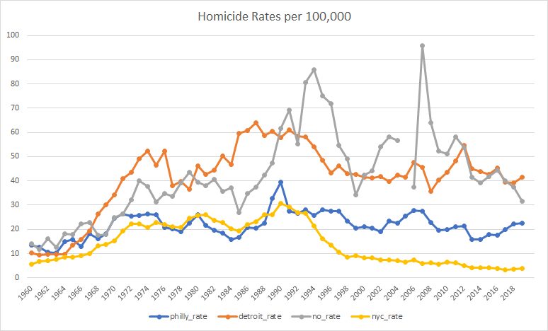
Wheeler chooses these particular three comparison cities because they were the ones that were picked by the algorithm used by Hogan (2022). Hogan’s analysis compares Philadelphia from 2015-2019 to a weighted average of Detroit, New Orleans, and New York during those years, with those cities chosen because their weighted average lined up to that of Philadelphia during the years 2010-2014. From Hogan:

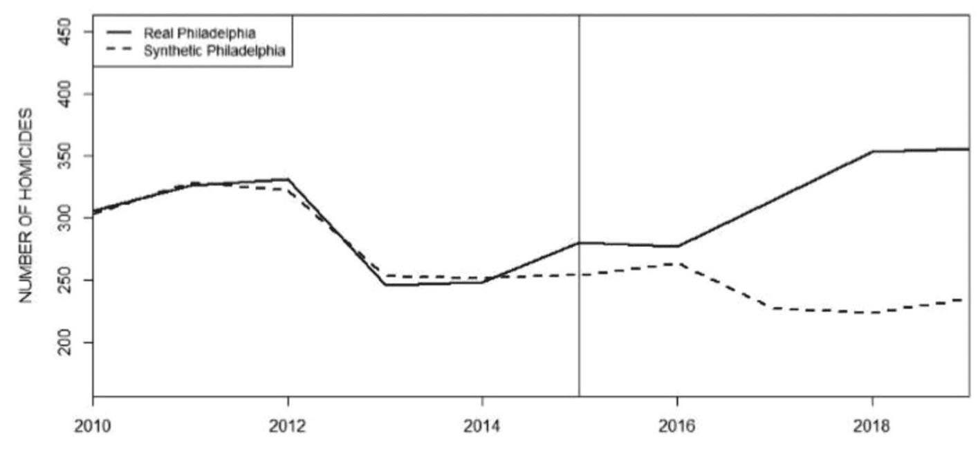
As Wheeler says, it’s kinda goofy for Hogan to line these up using homicide count rather than homicide rates . . . I’ll have more to say in a bit regarding this use of synthetic control analysis. For now, let me just note that the general pattern in Wheeler’s longer time series graph is consistent with Hogan’s story: Philadelphia’s homicide rate moved up and down over the decades, in vaguely similar ways to the other cities (increasing throughout the 1960s, slightly declining in the mid-1970s, rising again in the late-1980s, then gradually declining since 1990), but then steadily increasing from 2014 onward. I’d like to see more cities on this graph (natural comparisons to Philadelphia would be other Rust Belt cities such as Baltimore and Cleveland. Also, hey, why not show a mix of other large cities such as LA, Chicago, Houston, Miami, etc.) but this is what I’ve got here. Also it’s annoying that the above graphs stop in 2019. Hogan does have this graph just for Philadelphia that goes to 2021, though:

As you can see, the increase in homicides in Philadelphia continued, which is again consistent with Hogan’s story. Why only use data up to 2019 in the analyses? Hogan writes:

The years 2020–2021 have been intentionally excluded from the analysis for two reasons. First, the AOPC and Sentencing Commission data for 2020 and 2021 were not yet available as of the writing of this article. Second, the 2020–2021 data may be viewed as aberrational because of the coronavirus pandemic and civil unrest related to the murder of George Floyd in Minnesota.

I’d still like to see the analysis including 2020 and 2021. The main analysis is the comparison of time series of homicide rates, and, for that, the AOPC and Sentencing Commission data would not be needed, right?

In any case, based on the graphs above, my overview is that, yeah, homicides went up a lot in Philadelphia since 2014, an increase that coincided with reduced prosecutions and which didn’t seem to be happening in other cities during this period. At least, so I think. I’d like to see the time series for the rates in the other 96 cities in the data as well, going from, say, 2000, all the way to 2021 (or to 2022 if homicide data from that year are now available).

I don’t have those 96 cities, but I did find this graph going up to 2000 from a different Wheeler post:

Ignore the shaded intervals; what I care about here is the data. (And, yeah, the graph should include zero, since it’s in the neighborhood.) There has been a national increase in homicides since 2014. Unfortunately, from this national trend line alone I can’t separate out Philadelphia and any other cities that might have instituted a de-prosecution strategy during this period.

So, my summary, based on reading all the articles and discussions linked above, is . . . I just can’t say! Philadelphia’s homicide rate went up since 2014 during the same period that it decreased prosecutions, and this was part of a national trend of increased homicides—but there’s no easy way given the directly available information to compare to other cities with and without that policy. This is not to say that Hogan is wrong about the policy impacts, just that I don’t see any clear comparisons here.

The synthetic controls analysis

Hogan and the others make comparisons, but the comparisons they make are to that weighted average of Detroit, New Orleans, and New York. The trouble is . . . that’s just 3 cities, and homicide rates can vary a lot from city to city. It just doesn’t make sense to throw away the other 96 cities in your data. The implied counterfactual is that if Philadelphia had continued post-2014 with its earlier sentencing policy, that its homicide rates would look like this weighted average of Detroit, New Orleans, and New York—but there’s no reason to expect that, as this averaging is chosen by lining up the homicide rates from 2010-2014 (actually the counts and populations, not the rates, but that doesn’t affect my general point so I’ll just talk about rates right now, as that’s what makes more sense).

And here’s the point: There’s no good reason to think that an average of three cities that give you numbers comparable to Philadelphia’s for the homicide rates in the five previous years will give you a reasonable counterfactual for trends in the next five years. To think there’s no mathematical reason we should expect the time series to work that way, nor do I see any substantive reason based on sociology or criminology or whatever to expect anything special from a weighted average of cities that is constructed to line up with Philadelphia’s numbers for those three years.

The other thing is that this weighted-average thing is not what I’d imagined when I first heard that this was a synthetic controls analysis.

My understanding of a synthetic controls analysis went like this. You want to compare Philadelphia to other cities, but there are no other cities that are just like Philadelphia, so you break up the city into neighborhoods and find comparable neighborhoods in other cities . . . and when you’re done you’ve created this composite “city,” using pieces of other cities, that functions as a pseudo-Philadelphia. In creating this composite, you use lots of neighborhood characteristics, not just matching on a single outcome variable. And then you do all of this with other cities in your treatment group (cities that followed a de-prosecution strategy).

The synthetic controls analysis here differed from what I was expecting in three ways:

1. It did not break up Philadelphia and the other cities into pieces, jigsaw-style. Instead, it formed a pseudo-Philadelphia by taking a weighted average of other cities. This is a much more limited approach, using much less information, and I don’t see it as creating a pseudo-Philadelphia in the full synthetic-controls sense.

2. It only used that one variable to match the cities, leading to concerns about comparability that Wheeler discusses.

3. It was only done for Philadelphia; that’s the N=1 problem.

Researcher degrees of freedom, forking paths, and how to think about them here

Wheeler points out many forking paths in Hogan’s analysis, lots of data-dependent decision rules in the coding and analysis. (One thing that’s come up before in other settings: At this point, you might ask how do we know that Hogan’s decisions were data-dependent, as this is a counterfactual statement involving the analyses he would’ve had done had the data been different. And my answer, as in previous cases, is that, given that the analysis was not pre-registered, we can only assume it is data-dependent. I say this partly because every non-preregistered analysis I’ve ever done has been in the context of the data, also because if all the data coding and analysis decisions had been made ahead of time (which is what been required for these decisions to not be data-dependent), then why not preregister? Finally let me emphasize that researcher degrees of freedom and forking paths do not represent criticisms of flaws of a study; they’re just a description of what was done, and in general I don’t think they’re a bad thing at all; indeed, almost all the papers I’ve ever published include many many data-dependent coding and decision rules.)

Given all the forking paths, we should not take Hogan’s claims of statistical significance at face value, and indeed the critics find that various alternative analyses can change the results.

In their criticism, Kaplan et al. say that reasonable alternative specifications can lead to null or even opposite results compared to what Hogan reported. I don’t know if I completely buy this—given that Philadelphia’s homicide rate increased so much since 2014, it seems hard for me to see how a reasonable estimate would find that its policy rate reduced the homicide rate.

To me, the real concern is with comparing Philadelphia to just three other cities. Forking paths are real, but I’d have this concern even if the analysis were identical and it had been preregistered. Preregister it, whatever, you’re still only comparing to three cities, and I’d like to see more.

Not junk science, just difficult science

As Wheeler implicitly says in his discussion, Hogan’s paper is not junk science—it’s not like those papers on beauty and sex ratio, or ovulation and voting, or air rage, himmicanes, ages ending in 9, or the rest of our gallery of wasted effort. Hogan and the others are studying real issues. The problem is that the data are observational, the data are sparse and highly variable; that is, the problem is hard. And it doesn’t help when researchers are under the impression that these real difficulties can be easily resolved using canned statistical identification techniques. In that aspect, we can draw an analogy to the notorious air-pollution-in-China paper. But this one’s even harder, in the following sense: The air-pollution-in-China paper included a graph with two screaming problems: an estimated life expectancy of 91 and an out-of-control nonlinear fitted curve. In contrast, the graphs in the Philadelphia-analysis paper all look reasonable enough. There’s nothing obviously wrong with the analysis, and the problem is a more subtle issue of the analysis not fully accounting for variation in the data.

Donald Trump’s and Joe Biden’s ages and conditional probabilities of their dementia risk

The prior

Paul Campos posted something on the ages of the expected major-party candidates for next year’s presidential election:

Joe Biden is old. Donald Trump is also old. A legitimate concern about old people in important positions is that they are or may become cognitively impaired (For example, the prevalence of dementia doubles every five years from age 65 onward, which means that on average an 80-year-old is is eight times more likely to have dementia than a 65 year old).

Those are the baseline probabilities, which is one reason that Nate Silver wrote:

Of course Biden’s age is a legitimate voter concern. So is Trump’s, but an extra four years makes a difference . . . The 3.6-year age difference between Biden and Trump is potentially meaningful, at least based on broad population-level statistics. . . . The late 70s and early 80s are a period when medical problems often get much worse for the typical American man.

Silver also addressed public opinion:

An AP-NORC poll published last week found that 77 percent of American adults think President Biden is “too old to be effective for four more years”; 51 percent of respondents said the same of Donald Trump. . . . the differences can’t entirely be chalked up to partisanship — 74 percent of independents also said that Biden was too old, while just 48 percent said that of Trump.

The likelihood

OK, those are the base rates. What about the specifics of this case? Nate compares to other politicians but doesn’t offer anything about Biden or Trump specifically.

Campos writes:

Recently, Trump has been saying things that suggest he’s becoming deeply confused about some very basic and simple facts. For example, this weekend he gave a speech in which he seemed to be under the impression that Jeb Bush had as president launched the second Iraq war . . . In a speech on Friday, Trump claimed he defeated Barack Obama in the 2016 presidential election. . . . Trump also has a family history of dementia, which is a significant risk factor in terms of developing it himself.

Campos notes that Biden’s made his own slip-ups (“for example he claimed recently that he was at the 9/11 Twin Towers site the day after the attack, when in fact it was nine days later”) and summarizes:

I think it’s silly to deny that Biden’s age isn’t a legitimate concern in the abstract. Yet based on the currently available evidence, Trump’s age is, given his recent ramblings, a bigger concern.

It’s hard to know. A quick google turned up this:

On July 21, 2021, during a CNN town hall, President Joe Biden was asked when children under 12 would be able to get COVID-19 vaccinations. Here’s the start of his answer to anchor Don Lemon: “That’s under way just like the other question that’s illogical, and I’ve heard you speak about it because y’all, I’m not being solicitous, but you’re always straight up about what you’re doing. And the question is whether or not we should be in a position where you uh um, are why can’t the, the, the experts say we know that this virus is in fact uh um uh is, is going to be, excuse me.”

On June 18, after Biden repeatedly confused Libya and Syria in a news conference, The Washington Post ran a long story about 14 GOP lawmakers who asked Biden to take a cognitive test. The story did not note any of the examples of Biden’s incoherence and focused on, yes, Democrats’ concerns about Trump’s mental health.

And then there’s this, from a different news article:

Biden has also had to deal with some misinformation, including the false claim that he fell asleep during a memorial for the Maui wildfire victims. Conservatives — including Fox News host Sean Hannity — circulated a low-quality video on social media to push the claim, even though a clearer version of the moment showed that the president simply looked down for about 10 seconds.

There’s a lot out there on the internet. One of the difficulties with thinking about Trump’s cognitive capacities is that he’s been saying crazy things for years, so when he responds to a question about the Russia-Ukraine war by talking about windmills, that’s compared not to a normal politician but with various false and irrelevant things he’s been saying for years.

I’m not going to try to assess or summarize the evidence regarding Biden’s or Trump’s cognitive abilities—it’s just too difficult given that all we have is anecdotal evidence. Both often seem disconnected from the moment, compared to previous presidents. And, yes, continually being in the public eye can expose weaknesses. And Trump’s statements have been disconnected from reality for so long, that this seems separate from dementia even if it could have similar effects from a policy perspective.

Combining the prior and the likelihood

When comparing Biden and Trump regarding cognitive decline, we have three pieces of information:

1. Age. This is what I’m calling the base rate, or prior. Based on the numbers above, someone of Biden’s age is about 1.6 times more likely to get dementia than someone of Trump’s age.

2. Medical and family history. This seems less clear, but from the above information it seems that someone with Trump’s history is more at risk of dementia than someone with Biden’s.

3. Direct observation. Just so hard to compare. That’s why there are expert evaluations, but it’s not like a bunch of experts are gonna be given access to evaluate the president and his challenger.

This seems like a case where data source 3 should have much more evidence than 1 and 2. (It’s hard for me to evaluate 1 vs. 2; my quick guess would be that they are roughly equally relevant.) But it’s hard to know what to do with 3, given that no systematic data have been collected.

This raises an interesting statistical point, which is how to combine the different sources of information. Nate Silver looks at item 1 and pretty much sets aside items 2 and 3. In contrast, Paul Campos says that 1 and 2 pretty much cancel and that the evidence from item 3 is strong.

I’m not sure what’s the right way to look at this problem. I respect Silver’s decision not to touch item 3 (“As of what to make of Biden and Trump in particular — look, I have my judgments and you have yours. Cognitively, they both seem considerably less sharp to me than they did in their primes”); on the other hand, there seems to be so much direct evidence, that I’d think it would overwhelm a base rate odds of 1.6.

News media reporting

The other issue is news media coverage. Silver argues that the news media should be spending more time discussing the statistical probability of dementia or death as a function of age, in the context of Biden and Trump, and one of his arguments is that voters are correct to be more concerned about the health of the older man.

Campos offers a different take:

Nevertheless, Biden’s age is harped on ceaselessly by the media, while Trump apparently needs to pull a lampshade over his head and start talking about how people used to wear onions on their belts before the same media will even begin to talk about the exact same issue in regard to him, and one that, given his recent behavior, seems much more salient as a practical matter.

From Campos’s perspective, voters’ impressions are a product of news media coverage.

But on the internet you can always find another take, such as this from Roll Call magazine, which quotes a retired Democratic political consultant as saying, “the mainstream media has performed a skillful dance around the issue of President Biden’s age. . . . So far, it is kid gloves coverage for President Biden.” On the other hand, the article also says, “Then there’s Trump, who this week continued his eyebrow-raising diatribes on his social media platform after recently appearing unable, at times, to communicate complete thoughts during a Fox News interview.”

News coverage in 2020

I recall that age was discussed a lot in the news media during the 2020 primaries, where Biden and Sanders were running against several much younger opponents. It didn’t come up so much in the 2020 general election because (a) Trump is almost as old as Biden, and (b) Trump had acted so erratically as president that it was hard to line up his actual statements and behaviors with a more theoretical, actuarial-based risk based on Biden’s age.

Statistical summary

Comparing Biden and Trump, it’s not clear what to do with the masses of anecdotal data; on the other hand, it doesn’t seem quite right to toss all that out and just go with the relatively weak information from the base rates.

I guess this happens a lot in decision problems. You have some highly relevant information that is hard to quantify, along with some weaker, but quantifiable statistics. In their work on cognitive illusions, Tversky and Kahneman noted the fallacy of people ignoring base rates, but there can be the opposite problem of holding on to base rates too tightly, what we’ve called slowness to update. In general, we seem to have difficulty balancing multiple pieces of information.

P.S. Some discussion in comments about links between age and dementia, or diminished mental capacities, also some discussion about evidence for Trump’s and Biden’s problems. The challenge remains of how to put these two pieces of information together. I find it very difficult to think about this sort of question where the available data are clearly relevant yet have such huge problems with selection. There’s a temptation to fall back on base rates but that doesn’t seem right to me either.

P.P.S. I emailed Campos and Silver regarding this post. Campos followed up here. I didn’t hear back from Silver, but I might not have his current email, so if anyone has that, could you please send it to me? Thanks.

“We live in a time of mad kings, megalomaniacal sociopaths granted dangerous power through wealth and/or political position, prone to wild schemes of empire and grandeur”

After quoting Jamal Khashoggi from 2017:

Let’s talk about something other than women driving. The NEOM project, the futuristic city that he (the crown prince) plans to invest half a trillion dollars in. What if it goes wrong? It could bankrupt the country.

Palko writes:

“My name is Ozymandias, king of kings: Look on my works, ye Mighty, and despair!” — Neom was just the beginning for MBS

As mentioned before, we live in a time of mad kings, megalomaniacal sociopaths granted dangerous power through wealth and/or political position, prone to wild schemes of empire and grandeur. Even in this crowded field, the ruler of Saudi Arabia manages to stand out, particularly with his willingness to burn through even the impressive coffers of his country building futuristic boondoggles.

He’s like a self-funding Elon Musk.

He then quotes Nadeen Ebrahim and Dalya Al Masri:

At the heart of the project is the “Mukaab,” a 400-meter (1,312-foot) high, 400-meter wide and 400-meter-long cube that is big enough to fit 20 Empire State buildings. . . . due to be completed in 2030.


“Back in the day, you would have negative discussions about Saudi Arabia affiliated to human rights abuses,” said Andreas Krieg, research fellow at the King’s College London Institute of Middle Eastern Studies. “But now they’re trying to push new narratives of being a country of development and one that can build futuristic cities.”


But some have questioned whether the project will even come to fruition. Saudi Arabia has announced similar mega projects in the past, work on which has been slow.

In 2021, MBS announced his $500 billion futuristic Neom city in the northwest of the country, with promises of robot maids, flying taxis, and a giant artificial moon. And last year, he unveiled a giant linear city, the Line, which aimed to stretch over 106 miles and house 9 million people.

“The more absurd and futuristic these projects get, the more I can’t help but imagine how much more dystopian everything surrounding them will be,” wrote Dana Ahmed, a Gulf researcher at Amnesty International, on Twitter.

Saudi officials have insisted that work on the projects is going ahead as planned.

It’s hard to know how to think about this. Is the ruler of Saudi Arabia as clueless as the Axios journalists who wrote, “Tesla CEO Elon Musk has unveiled a video of his Boring Company’s underground tunnel that will soon offer Los Angeles commuters an alternative mode of transportation.” That was “soon” in 2018!

OK, no reason to think the authors of that linked article were clueless. They could well have been crazy like a fox, aiming for a lucrative job in public relations. Putting out an article with such a stupid claim, that’s a commitment device demonstrating a real willingness to continue to write and publish ridiculous things in the future.

Anyway, yeah, they “have insisted that work on the projects is going ahead as planned.” If you take that statement literally, it doesn’t actually say it will be completed in 2030. Yes, it’s “due to be completed in 2030,” but that doesn’t mean that is their plan. The actual plan could well be for the project to be overdue: a much smaller thing to be completed many years later.

Kind of like that dude who owes Defector $500,000. I mean, sure, he said he “would back them with $500,000,” but people say all sorts of things, right?

There’s nothing special about rich people here. All of us make plans that we ultimately can’t carry out. I have lots of ideas for books that, realistically, I’ll never get around to writing. With rich people, the plans can just be bigger, also it’s worth journalists’ while to promote rich people’s ideas, in the hope that some of the money will splash off onto them, or just through some sort of generalized worship of money and success. Bankrupting a country, though, that seems more serious than just circulating stupid graphs.

Stupid legal arguments: a moral hazard?

I’ve published two theorems; one was true and one turned out to be false. We would say the total number of theorems I’ve proved is 1, not 2 or 0. The false theorem doesn’t count as a theorem, not does it knock out the true theorem.

This also seems to be the way that aggregation works in legal reasoning: if a lawyer gives 10 arguments and 9 are wrong, that’s ok; only the valid argument counts.

I was thinking about this after seeing two recent examples:

1. Law professor Larry Lessig released a series of extreme arguments defending three discredited celebrities: Supreme Court judge Clarence Thomas, financier Jeffrey Epstein, and economist Francesca Gino. When looking into this, I was kinda surprised that Lessig, who is such a prominent law professor, was offering such weak arguments—but maybe I wasn’t accounting for the asymmetrical way in which legal arguments are received: you spray out lots of arguments, and the misses don’t count; all that matters is how many times you get a hit.

I remember this from being a volunteer judge at middle-school debate: you get a point for any argument you land that the opposing side doesn’t bother to refute. This creates an incentive to emit a flow of arguments, as memorably dramatized by Ben Lerner in one of his books. Anyway, the point is that from Lessig’s perspective, maybe it’s ok that he spewed out some weak arguments; that’s just the rules of the game.

2. A group suing the U.S. Military Academy to abandon affirmative action claimed in its suit that “For most of its history, West Point has evaluated cadets based on merit and achievement,” a ludicrous claim, considering that the military academy graduated only three African-American cadets during its first 133 years.

If I were the judge, I’d be inclined to toss out the entire lawsuit based on this one statement, as it indicates a fatal lack of seriousness on the part of the plaintiffs.

On the other hand, I get it: all that matters is that the suit has at least one valid argument. The invalid arguments shouldn’t matter. This reasoning can be seen more clearly, perhaps, if we consider a person unjustly sentenced to prison for a crime he didn’t commit. If, in his defense, he offers ten arguments, of which nine are false, but the tenth unambiguously exonerates him, then he should get off. The fact that he, in his desperation, offered some specious arguments does not make him guilty of the crime.

The thing that bugs me about this West Point lawsuit and, to a lesser extent, Lessig’s posts, is that this freedom to make bad arguments without consequences creates what economists call a “moral hazard,” by which there’s an incentive to spew out low-quality arguments as a way to “flood the zone” and overwhelm the system.

I was talking with a friend about this and he said that the incentives here are not so simple, as people pay a reputational cost when they promote bad arguments. It’s true that whatever respect I had for Lessig or the affirmative-action-lawsuit people has diminished, in the same way that Slate magazine has lost some of its hard-earned reputation for skepticism after running a credulous piece on UFOs. But . . . Lessig and the affirmative-action crew don’t care about what people like me think about them, right? They’re playing the legal game. I’m not sure what, if anything, should be done about all this; it just bothers me that there seem to be such strong incentives for lawyers (and others) to present bad arguments.

I’m sure that legal scholars have written a lot about this one, so I’m not claiming any originality here.

P.S. However these sorts of lawsuits are treated in the legal system, I think that it would be appropriate for their stupidity to be pointed out when they get media coverage. Instead, there seems to be a tendency to take ridiculous claims at face value, as long as they are mentioned in a lawsuit. For example, here’s NPR on the West Point lawsuit: “In its lawsuit filed Tuesday, it asserts that in recent decades West Point has abandoned its tradition of merit-based admissions”—with no mention of how completely stupid it is to claim that they had a “tradition of merit-based admissions” in their 133 years with only 4 black graduates. Or the New York Times, which again quotes the stupid claim without pointing out it’s earth-is-flat nature. AP and Reuters did a little better in that they didn’t quote the ridiculous claim; on the other hand, that serves to make the lawsuit seem more reasonable than it is.