Earlier today I discussed a paper by Anne Case and Angus Deaton in which they noted an increase in mortality rates among non-Hispanic white Americans from 1989 to 2013, a pattern that stood in sharp contrast to a decrease in several other rich countries and among U.S. Hispanics as well:
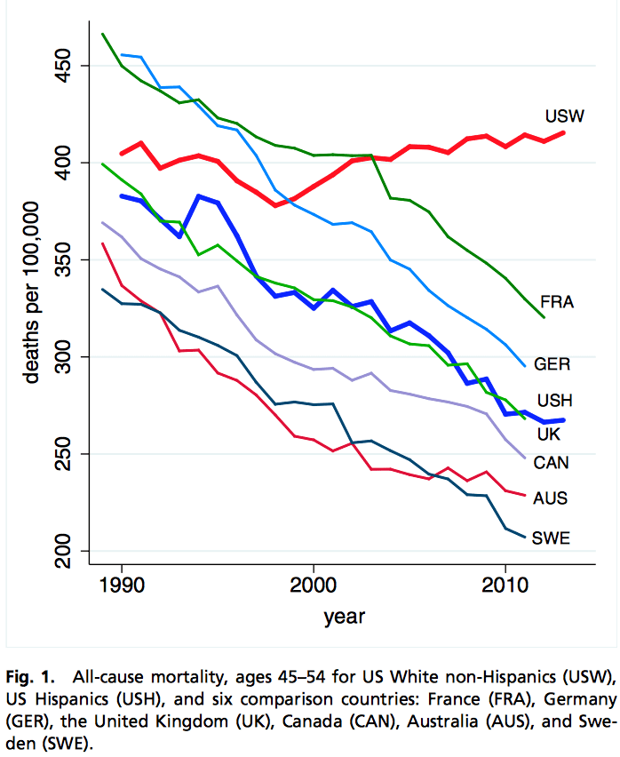
Interpretation of this graph is tricky though, because the “45-54” age group was, on average, younger at the beginning of this time series than at the end, what with the big fat baby boomer generation passing through (see image at top of page). Average age increased from 49.1 in 1989 to 49.7 in 2013. Not a huge increase, but not trivial either given the steady increase in mortality rate as a function of age (approximately 8% per year) among the middle-aged.
I did a quick calculation to estimate what we might expect to happen to the mortality rate in the 45-54 age group, just from the changing age distribution, and here’s what I found:
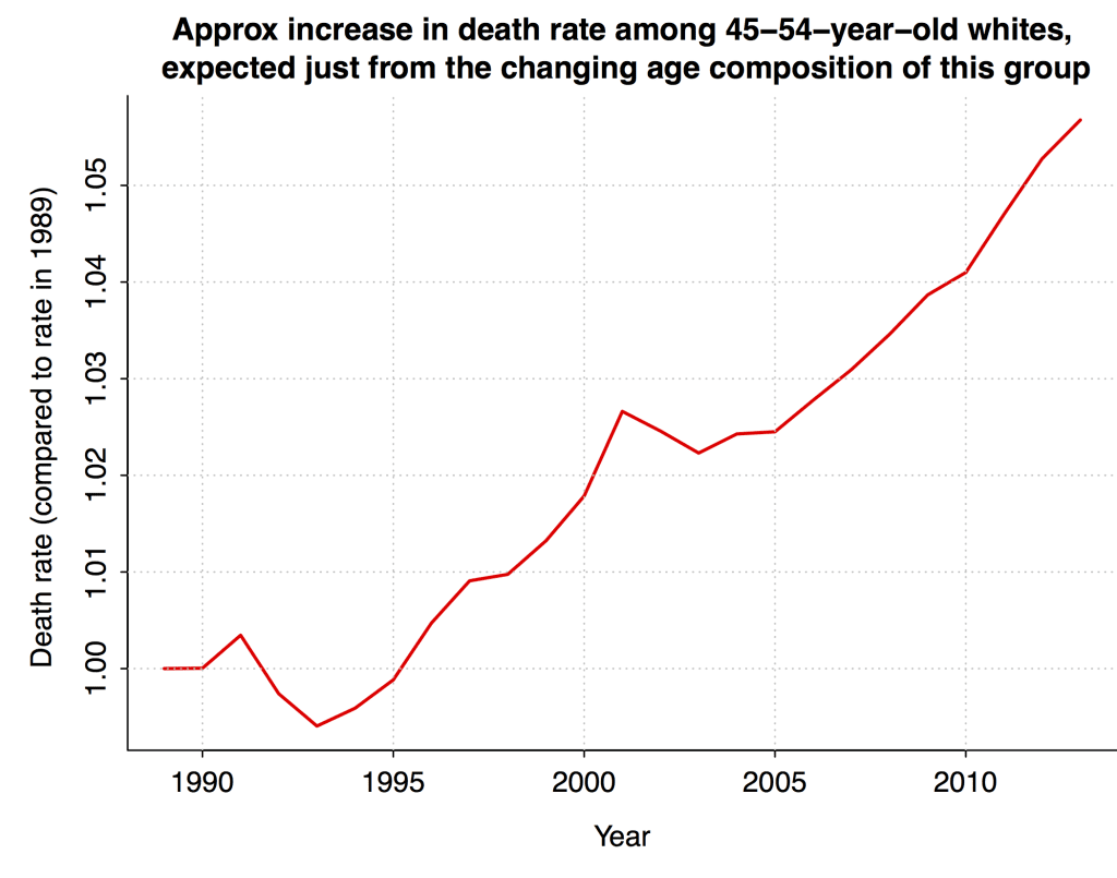
Based on this analysis, the entire increase in mortality among non-Hispanic white Americans aged 55 in the Case-Deaton graph can be explained by changing age composition. Sociologist Philip Cohen sliced the data in a somewhat different way and estimated that the change in age composition could explain about half of the increase.
As I wrote in my earlier post, the Case-Deaton result is still interesting because of the comparison to other countries (and to Hispanics within the U.S.): these other groups show declines in mortality rates of around 30%, which is much more than could be explained by any age-aggregation artifacts.
Deaton replies
I asked a colleague to point this post to Deaton, and he (Deaton) replied with the following data from the CDC showing deaths per 100,000 among white non-Hispanics in 1999 (not 1989, which was the beginning of the series shown above, but 1999; apparently the pre-1999 data are harder to grab) and 2013:
Age   1999    2013  Change
45   262.3   260.7    -1.6
46   292.9   289.8    -3.1
47   305.9   323.5    17.6
48   337.2   342.9     5.7
49   359.0   384.5    25.5
50   376.7   422.2    45.5
51   429.0   466.1    37.1
52   444.8   481.2    36.4
53   545.1   526.7   -18.4
54   555.3   572.7    17.4
Deaton pointed out that the mortality rate increased among most age groups. And, indeed, the average increase is about 4%.
Deaton also sent this analysis to the New York Times, where David Leonhardt reports:
Breaking down the 45-to-54 age group into single years of age, which should avoid Mr. Gelman’s concern, still shows the same pattern.
“If we want to be more precise about the age range involved, we could say that for all single years of age from 47 to 52, mortality rates are increasing,” wrote Mr. Deaton, the most recent winner of the Nobel Prize in economics. “So the overall increase in mortality is not due to failure to age adjust.” . . .
“We stick by our results,” he said.
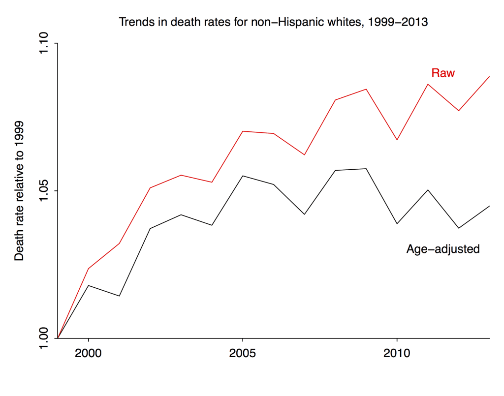
According to the table above, mortality rates among non-Hispanic whites aged 45-54 increased by an average of about 4% after controlling for age. But if you go to Case and Deaton’s graph above, you’ll find an increase of about 12% 9% in the raw mortality rate for that group from 1999 (again, not 1989 for this comparison) and 2013.
So according to these calculations, if you correct for the age-composition bias, about 2/3 half of the observed change from 1999 to 2013 goes away. If you look at the top graph above, 1999 appears to be an unusual year so it might not be the best to use as a baseline.
Here, then, is a quick summary of our estimates of the bias from age composition in estimating the recent changes in death rate for non-Hispanic white Americans aged 45-54:
After controlling for age, there was a decline in the death rate from 1989 to 1999, then an increase from 1999 to 2005, then it’s been steady since then. See graphs here.
In my post, I estimated no change because I was considering the entire range, 1989-2013, as presented in the original Case and Deaton paper. In his reply Deaton estimated an increase because he was just looking from 1999-2013. Actually, though, all that increase occurred between 1999 and 2005.
Summary
So there appears to have been no aggregate increase in age-adjusted mortality in this group in the 1989-2013 period.
Is it then appropriate to say “We stick by our results”?
In this case I say yes, that Case and Deaton’s main results seem to stand up just fine.
As noted above (and in my earlier post), their key claim was that death rates among middle-aged non-Hispanic whites in the U.S. slightly increased, even while corresponding death rates in other countries declined by about 30%. Even after you apply a bias correction and find that death rates among middle-aged non-Hispanic whites in the U.S. were actually flat (or maybe even decreased slightly), the key comparison to other countries is barely affected. A bias of 5% is small compared to an observed difference of 30%.
And this is why I emphasized throughout that this statistical bias did not invalidate the Case and Deaton study. As a statistician, I am of course interested in such biases, and it wasn’t clear to me ahead of time how large the correction would be. It turned out that the bias explained the observed increase among 45-54-year-old non-Hispanic whites, and that’s interesting, but the cross-national comparison is still there, and that seems to be the most important thing.
P.S. Deaton also asked why I estimated the bias using the age distribution rather than single-year mortality rates. The answer to this question is that I just used the data I found. I have no great familiarity with demographic data and I did not know that the data by ethnicity and year of age were easily available. I agree that the natural thing to do would be to analyze death rates by year of age. If someone can point me to such a dataset, I’d be glad to fit a model to it, indeed this would be an excellent project.
P.P.S. The mortality rates by year of age from 1999 to 2003 are at CDC Wonder, so that’s a start. If anyone knows where the 1989-1998 data are, please let me know.
I agree with Case and Deaton on the main point, for sure: if indeed there was a decrease from 1989 to 1999, and an increase from 1999 to 2005, and no change after that, this is largely consistent with their story of there being a reversal, or at least a stalling of improvement, after decades of progress. And, in any case, the change compared to other countries and groups is huge. Which is a point that I emphasized in all my posts. The existence of a bias does not imply that there is no underlying effect. Indeed, that’s why I wanted to quantify the bias, to get a sense of how it changes one’s conclusions.
P.P.P.S. More graphs here, including this:
If average age is increasing within a 10-year group, I assume it’s also increasing within any one-year group inside that 10-year group. I would if that explains an appreciable part of the remainder. (One wouldn’t think it would make much difference, but then again there’s only 1/3-ish of the original gap remaining.)
Jeremy:
No, I don’t think so. The gradient within any year will be only something like 1/10 the gradient within the 10-year period, so I don’t think that final adjustment will do much. That said, it shouldn’t be hard to make such an adjustment using a trapezoidal kind of thing.
>“If we want to be more precise about the age range involved, we could say that for all single years of age from 47 to 52, mortality rates are increasing”
Sorry, not true. Here’s the data:
http://pastebin.com/AdMqviA5
Source (at the form page, you have to scroll down to select single year ages):
http://wonder.cdc.gov/ucd-icd10.html
I don’t really get whats going on with this paper, so I must be missing something. But I predict this will go from ages 45-54 (original) to 47-52 (current) to 49-52 + maybe 53/54 (next) and finally age 51 (what the data shows). Just because 2013 rates are higher than 1999 does not mean they are increasing.
The lack of a decrease still stands out anyway… There is something going on here that is interesting and probably important, so it is good people are looking at it.
Anon:
Yes, exactly: “The lack of a decrease still stands out anyway… There is something going on here that is interesting and probably important, so it is good people are looking at it.”
Correct … I read this paper perhaps a bit differently, which is the first figure shows the US looking different than the other countries selected in not having a decline, but that the meat of the paper is showing that this lack of decline is largely due to suicide and poisoning (drug overdose) deaths among white people with less than college education. But of course those of us who are white middle aged people and went to college are especially focused on the “isn’t this interesting?” figure.
Isn’t this why you age-standardize !?
Jose:
Yes, once you have data by single year of age, the natural thing is to age-standardize by using some common age distribution (maybe even a uniform in this particular range since total deaths are so low). I’m guessing that this wasn’t done because much of the data are only available in binned age ranges. And, if you do want to analyze binned age ranges, it makes sense to estimate the bias. Hence my post!
Sorry I wasn’t clear- my comment wasn’t a critique of your analysis, but genuine surprise that reviewers at PNAS didn’t require reporting of standardized rates. Even with uncertainties in the binning, it wouldn’t be too hard to data augment for a sensitivity analysis. Next time I review for PNAS (cough cough)….
Jose:
I’m guessing that nobody thought of this because it’s so standard to report ages in these bins. Similarly, Case and Deaton reported comparisons conditional on education categories. These sorts of analysis are so usual, that it can be hard to step out of the box and think of this particular bias. Also, people perhaps do not realize that mortality rates more than double from 45 to 54, so even a shift in mean of just half a year makes a difference. Finally, there’s the age-period-cohort problem. By analyzing by age in this way, it can be hard to catch cohort effects. Which is one reason it’s helpful to graph the time series rather than just comparing 1999 to 2013.
+1
The way you do it in demography is always a bit more complicated than what you do in other analyses e.g. they don’t assume uniformity of risk within the bins.
Very well done.
(I feel like the NYT’s reporting should be better though… maybe they should show your proposed curve vs Case-Deaton’s vs those of all the other comparable countries and the conclusion would just jump out at the reader. I didn’t think their bar chart was all that useful. Oh well.)
I thought it was strange that the data Deaton sent to Gelman was for all genders but the data in the paper was for men. Anoneuoid’s source allows you to restrict data to men and also has data for Hispanic/Latino.
I did this quick and can’t make any promises about potential copy and paste errors. But death rates by age and Hispanic/Latino status in 1999 and 2013 for men should be here:
https://docs.google.com/spreadsheets/d/1qvMABxDZzJZRbh43qgCkXFJCt6-BQ3R0s5f4mw7wJu0/edit?usp=sharing
Assuming no errors, there’s a 1% average increase among white, non-Hispanic/Latino men and a 23% decrease among Hispanic/Latino men.
While this very high level statistical discussion is quite interesting (but beyond my statistical abilities despite being a reader of Snedecor) I have to ask: What does it really mean? When compared with other countries and races within our own country, more whites are dying of some form of suicide. As you note, Andrew, it doesn’t change the fact that something quite ‘terrible’ is going on.
I would hypothesize that the root cause is the disappearance of middle class jobs that a non-high, high school or even Community College grad can do. There just aren’t enough of them. The demands of the current workplace are simply outpacing the rate of resilient change that most of those folks can handle without significant support and help.
One form might be a monthly payment at the $15/hr rate or other minimum wage conditioned on entering into education or trades that will eventually support them. The education and trades costs should also be reimbursed. Not to mention counseling for drugs and alcohol abuse, which I maintain are used to deaden the psychic pain of becoming “useless”. I don’t see any social discussion on this issue.
Paul
PS: Forgot to mention two resources. “The New Inequality–creating solutions for poor America” by Richard B. Freeman and “Unequal Childhoods” by Annette LaRue. Get the second edition of Annette’s book to see Table D of the 10-year follow up on the subjects. In Freeman’s case, the tome is only 83 pages but has some very interesting ideas on what we have done in our distant past and what we might figure out to do now.
Paul
Related to Cohen’s dramatic graph about age structure and my earlier comment on the original post, I think they would have been better off excluding the last year of data since that is so dramatically distorted by including the then 54 year old members of the peak birth year (1946) cohort, which really is dramatically higher than every nearby year. Just the fact that this group is a very large cohort traveling through institutions (including schools and hospitals) not designed for so many people all of the same age has its own impacts that are possibly confounding the analysis beyond even age structure.
Interesting point.
+1
And in addition, the 1946 birth cohort may have experienced other confounding “environmental” factors that could influence health. Examples:
Diets changed considerably right after the war — from shortages (especially of unhealthy foods) to more abundance.
Stresses during the war conceivably (no pun intended) could have affected quality of germ cells in parents of these children.
And there are the additional effects that some of us have mentioned of having large numbers in this cohort serving in the Vietnam war.
All in all, lots of reasons to consider this cohort atypical.
Wouldn’t the change in age distribution be roughly the same for all the comparanda, so that the gap stays the same? Or rather, since falling mortality rates mean that life expectancy is increasing more in all other groups, correcting for bias across the board might even increase the gap.
That’s the theme of the whole comments section on the other post. Oh, well.
Gelman ==> The whole system of reporting causes of death was changed from ICD9 to ICD10, which had an entirely (almost) new set of codes and a different method of coding.
I did a brief fact-checking (12 hours) on this — the start date for the shift is nominally 1999 — but different states and counties all get onboard with the new system sporadically….coroners are getting used to the new system, etc.
It is possible that a lot of the “increase” is simply in the *coding* of deaths….
The old ICD9 codes were clearly marked “accidental”. The new ICD10 codes X40-49 are “accidental” but all the Y codes which Case includes are “unknown intent”.
This may be a nothing…but my gut tells me that part/much of what we see in these rather obscure stats is a new system being implemented in such a way as to create or inflate some effect that is not quite really there.
ICD9 codes do not translate directly to ICD10 codes — comparing pre-1998 and post-1999 stats can lead to trouble.
I would suggest talking directly to a few big city and small county coroners….about their experience instituting the new codes. Have they had trouble training staff? Are they simply using more codes for the same old things? Have they been calling “accidental” more often….avoiding suicide rulings? Trying to resist the pressure to rule accidental instead of suicide? Ruling medical mistakes “accidental” or “suicide”? In other words, are they aware of shifting some types of deaths from some category to another in a way that would produce these results? ….shifting some types of deaths from past inappropriate categories to the new categories of ICD10 in a way that would produce these results? It doesn’t take a big change in reporting to make the “apparent” big change we see at the National level.
There is something in this whole matter that has do do with the change in coding systems.
The start date is way too much of a coincidence — the shift in white-male stats occurs *precisely* when the codes begin to change.
Would codes make a difference for the raw total age specific mortality rate?
Reply to Elin ==> The State of Missouri tool is a bit blunt for our purposes. Some results are given only as NUMBER, some as NUMBER and DEATH RATE. It doesn’t separate genders.
What we know is Missouri shifted from ICD9 to ICD10 codes starting in 1999.
Case and Deaton shows anomalies appearing starting precisely in 1999.
A quick down-and-dirty check of the Missouri stats shows suicides ticking up sharply (in total numbers) at the same time…
Coding Cause of Death (and changing the codes) is a big deal. See http://www.cdc.gov/nchs/data/nvsr/nvsr49/nvsr49_02.pdf
What I have done here is just “thread pulling”….
Mentally, like this…
Hmmmm…that Death Rate thing *is* odd…Oh, what’s this? Huge sharp upticks in three things general categories of death all starting exactly the sme time in 1999? … why do I remember that year? 1999? Hey, wasn’t that the year the NEW Cause of Death ICD10 codes started being used? Yes, it was…boy — I wonder about the coincidence here….
There may have been changes to the way in which Race and Ethnicity is being reported as well : see http://www.doh.wa.gov/portals/1/documents/…/deathstatisticaldatanotes.docx
which is a timeline of race/Ethnicity reporting changes, indicating that in 1997 and 2000 there are changes that affect the coding of White/Non-hispanic.
I I refers to the CDC WONDER online database tool — used by Case and Deaton. I am suspicious that the report is not so much about a real world change as about a way deaths are reported and sliced-and-diced by dB categories.
The 1997 and 2000 changes affecting coding of White/Non-hispanic sound like they could have possible effects here.
Such an interesting story, and I wonder about the extent to which there are regional differences in speed of adoption that might explain the regional patterns. But on the other hand there has definitely always been a regional dimension to gun violence including suicide.
According to the publication by Deaton and Case the mortality rates for whites have increased since the 1990’s for ages 45-54. What is less-known however, is that according to data gathered from http://wonder.cdc.gov/mcd-icd10.html the same increase in mortality rates could be observed for age groups 25-34 and 35-44 (non-Hispanic whites), between 1999 and 2013. In fact the data for the age group 25-34 was particularly striking, with mortality rates increasing from 91.3 in 1999 to 110.5 in 2013, representing a relative increase of more than 20%. For other groups like Hispanics, non-Hispanic blacks, and Asian or Pacific Islanders, the mortality rates continued to decrease from 1999 to 2013 for the age groups 25-34 and 35-44.
This suggests that the increase in mortality rate happened not only in the age group 45-54 for non-Hispanic whites, but also in the age groups 25-34 and 35-44. The source for the data, CDC WONDER, is also used by Deaton and Case in their publication (this is stated in the paper).
I don’t understand why they didn’t include that in their paper, would have made the news a lot more significant.
Note to I I => Read my comments, one above and one below. I am getting a real strong sense that this whole thing is a result of how, and how quickly, the new ICD10 codes are being implemented, over the last decade or so, by coroners and their staffs.
more….
Use this State of Missouri site: http://health.mo.gov/data/mica/mica/death.php
Select:
Deaths: Residents of Missouri
Race: = White
Sex: = Male
Ethnicity: = Non Hispanic
Age: = 45 to 64
Suicide
All Years
You’ll see the sudden change, a ramp up, right at 2000/2001.
Got to be in the new coding…it is too pat.
The ‘poisonings’ category in Fig 2 the PNAS paper really jumped out on my first reading- it’s just too strange.
The ICD10 for poisoning covers everything under the sun including things like *underdosing for diabetes or cardiac conditions*:
http://www.icd10data.com/ICD10CM/Codes/S00-T88/T36-T50
and only to set of subclasses specifically deals with illegal drugs/alcohol:
http://www.icd10data.com/ICD10CM/Codes/F01-F99/F10-F19
So depending on which subclasses were captured and how they were aggregated, this could be contributing as well. Not clear why there would be any differential in these codes between ethnicity, however.
Older data but important differences in prescription drug usage by ethnicity:
http://www.ncbi.nlm.nih.gov/pmc/articles/PMC3538828/
Earlier report on excess opioid-related mortality 1999-2011; age classes are mostly all increasing (but whites with the majority):
http://www.cdc.gov/nchs/data/databriefs/db166.htm
I know where you can get the earlier years, if you are still looking. The National Center for Health Statistics has detailed mortality data. I don’t know how far back it goes, but I obtained 1989 – 1993 for an unrelated project.
I applied to get the data through NAPHSIS (http://www.naphsis.org/). If they say no, then you can go to a Census Data Research Center with an application. It’s a bit of a pain to get.
The documentation for the data is here:
http://www.cdc.gov/nchs/nvss/mortality_public_use_data.htm
http://www.cdc.gov/nchs/data/dvs/dt89icd9.pdf
Also http://mortality.org
Looking at the Missouri data, I am puzzled why the “all causes” would also increase over that time frame – if it were due to coding of causes of death. Coding could explain why particular types increase, but should not account for an increase in the overall mortality rate.
Possibly a new code for zombies?
On a more realistic note, I’d have to agree the classifications may shift but one would expect the total to be the same.
Reply to Dale ==> For Missouri, All Death by All Causes for the entire population is in the mid-1900s in the early 1990s and drops to around 800 by 2010.
If you check these settings:
Deaths: Residents of Missouri
Race: = White
Ethnicity: = Non Hispanic
Age: = 45 to 64
Cause of Death: = All Causes
the table reports only NUMBER and not DEATH RATE which is what we are interested in. Numbers increase with increasing population….exactly as expected. (no idea why, if you select instead All Races and Non-Hispanic, it returns Number and Rate).
Suicides are reported in raw numbers as well, but the step-change there is abrupt, coincident with the date of ICD change., looking a lot like the Case and Deaton graphs.
this is not meant to be a smoking gun, just an indicator that even on the State level, we see a coincident uptick with ICD change, in suicides (one of the Case and Deaton causes).
Unfortunately, the Missouri online tool doesn’t allow us to select Poisonings.
Thanks for the clarification – the site appears to say it gives rates and numbers. In any case, I looked up the population in that age group (45-64) for the state of Missouri and compared it to the absolute number of deaths from all causes in that age group. In 2000 it was 575 deaths per 100,000 and in 2013 it was 590 per 100,000. I guess this may support your idea since the overall rate did not change much but the types of causes did change more significantly.
To make the international comparison, wouldn’t you have to do the age adjustment for all countries, not just the US?
This seems important. The core baby boom hit in different years in different countries, which might contribute to this. Some of these countries probably didn’t experience a boom (e.g., neutral Sweden) but I’m not entirely sure, while the German dynamic would be totally different given its postwar fate.