David Backus writes:
Check esp fig 2 here.
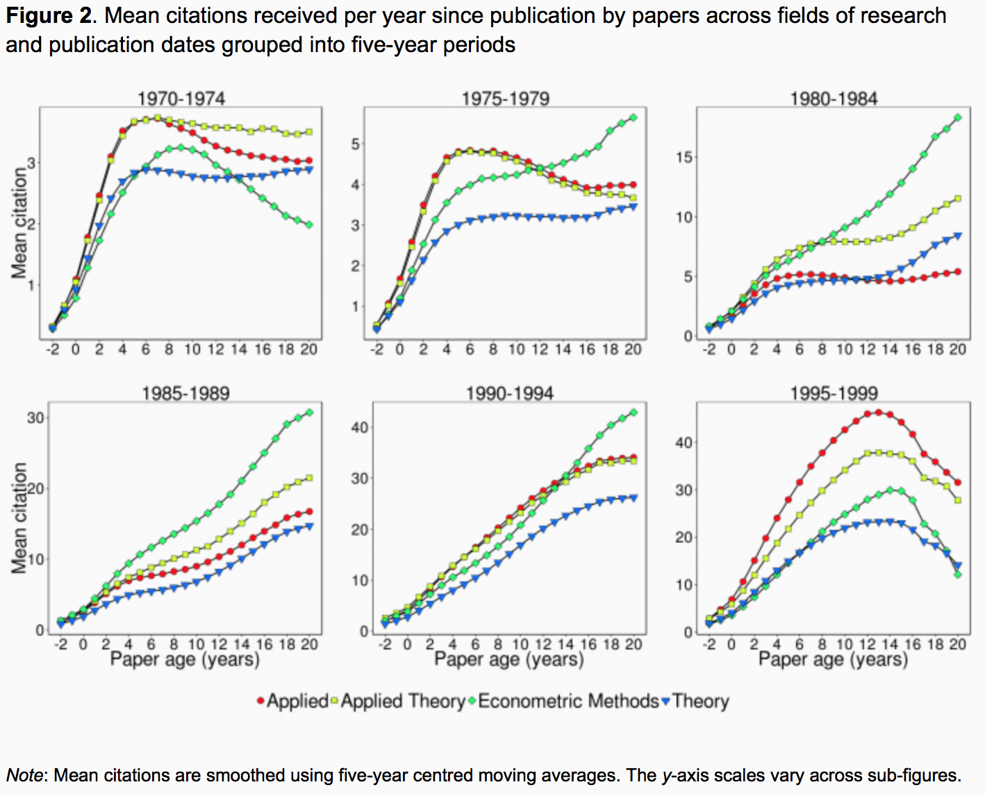
He was pointing me to a post by Sebastian Galiani, Ramiro Galvez, and Maria Victoria Anauati called The lifecycle of scholarly articles across fields of economic research.
And here’s fig 2:
And, as usual, I duck all the interesting questions and move toward triviality:
This should be a grid of 4 x 6 plots. The color code just makes the graphs unreadable!
P.S. Also, y-axes should be on log scale, and then all the graphs could have a common y-axis.
It probably doesn’t help that the colors used would be horrible to distinguish for individuals with color sight impairments. Varying the scales of the y axes also doesn’t help with interpretation along with visualizing the number of papers that people cited two years before they were published.
It’s unclear if for the last batch (1995-1999) the average calculation takes into account that only some of the papers published in that period are old enough to get cited 18 or 20 years later. That could explain, at least in part, the generalised decline.
While I agree that the plots are hard to read, I think the correct layout depends on what the point of the paper is. If the relative emphasis on different subfields of economics at different times is the point, then you need to put all the subfields on one chart so that they can be visually compared. I don’t think the econometrics boom of the 1980s would jump out at you in a 4×6 grid.
Bill wrote: “It probably doesn’t help that the colors used would be horrible to distinguish for individuals with color sight impairments. ”
Actually, these plots aren’t too bad on this score. I’m one of those color-impaired persons – partially red-green color blind – and I’ve put a lot of thought into how to distinguish plot lines. You can also think back to the days of monochrome-only printers, where you had similar problems.
Most color-impaired people have a bad pair of colors – usually red-green but some, fewer, yellow-blue. So don’t include both colors from one pair. Most of us can tell black and gray from the impaired colors. A few can’t distinguish any colors, but they are much rarer. So instead of red and green, mix up the complementary pairs: choose say red and blue instead. Yellow of course doesn’t work well on a white background. My own preferred color selection is black-blue-light cyan-medium gray-red, in that order. That gives me five color/saturation combinations I can reliably distinguish.
Other distinguishing cues are line width, symbols, line style (e.g., dashed vs solid), and saturation.
In these particular plots, the colors are not ideal and the lines are a little too thin for me to get all the colors well, but they aren’t too bad. I can barely tell two of the colors apart (don’t ask me what they are – I can sort of tell them apart but not what their colors are!), but they use different symbols.
Thanks for remarking on this problem!
However much fun analyzing economic citation data is for economists, it’s like venture capitalists who say “we’re investing in an app that recommends restaurants” or physicists who say “the universe is a simulation” or psychologists studying the effects of wobbly pillows on relationships.
It’s a way to announce to the world you’ve given up and just need to make a living somehow.
P.S. their charts were easy to read.
+1 to all your examples.
Next up: “studying the effect of ‘studying the effect of age on citations’ on citations”
Sort of agree, but sort of feel like the field of Empirical Epistemology (how “truth” is determined and used, and how knowledge disseminates in the real world) should exist and doesn’t.
Very few 20 year old applied papers actually provide the best parameter estimates available, and yet they are cited. Why and How? Understanding the propagation of “knowledge” over time is a worthwhile activity, no? At least more worthwhile than another N=40 study showing that Psychologists can trick people into doing stuff.
That said – it is also pretty much exactly the kind of narcissistic mirror-gazing economists like to do and that quickly goes from sorta-useful to massive-waste-of-time. Rankings too (journals, schools, etc.), although at least sometimes those papers are really intended as methods papers developing a new ranking algorithm which may or may not be useful in other contexts).
(to re-disclose: I am an economist)
It’s not just economists btw. Lots of narcissism in physics, engineering, medicine, etc.
There is a certain force that pushes people in this direction, the story goes like this:
“I thought up a great applied study with real-world consequences and wrote a great grant. It didn’t even get discussed and was rejected in favor of LATEST BUZZWORD, so now I’m wondering how well does this system of allocating resources really work… so I wrote a paper about how resources are allocated to MY FIELD. Then, after that paper panned the way things are done, I could never get another grant approved, so I wrote a paper about how studying resource allocation affects MY FIELD…”
in fact, I think 50% of the decision about what grants are funded should be the output of a cryptographic RNG: http://models.street-artists.org/2015/10/19/a-much-better-grant-evaluation-algorithm/
which would avoid a fair amount of the in-group vs out-group effects that slowly strangle whole fields of research.
“As can be seen, economic research articles effectively have a lifecycle. For almost every estimated curve, they begin their life with a low number of citations per year. That number then rises over a given period of time until it reaches a peak. Thereafter, papers begin to decline in importance as measured by yearly citation counts.”
Not necessarily true. This is similar to what was discussed on this blog earlier:
http://statmodeling.stat.columbia.edu/2015/10/05/cognitive-skills-rising-and-falling/
tl/dr: Averaging curves like this (or multiple different groups of similar curves) can give rise to an artificial peak: http://s23.postimg.org/ave87x7fd/perform.png
Those plots seem pretty easy-to-read to me. Unless you’re colour blind.
Bobo:
The difficulty of the graph is that you have to go back and forth between the plots and the labels to figure out which line is which. The graph is fine as a look-up table, but the difficult labeling makes it difficult to see all the comparisons at once. With a 6×4 grid, all would be clearer.
The data itself is quite interesting. My first reaction is that it look like citation inflation. Either economics articles are getting better (note the increasing citation rate over time) or the prevalence of citations is increasing. It is important to note that the data is restricted to the top 5 economics journals, so these are “high quality” and difficult to publish in. It would be interesting to look at data on the average number of articles cited – the length of the citation section. If the number of references is increasing, then I think it is largely citation inflation. If the number is not increasing, then it might reflect increasing quality of the articles (“might” since there are still other explanations). But if it is citation inflation, then it raises other interesting questions, such as, to get published in these top journals do you need to make sure you cite an increasing number of established scholars in the field – a reflection of the refereeing process? [call me a skeptic]
While I understand (I think) how using five-year centered moving averages results in negative numbers on the y-axis, it just seems odd to have a non-zero number of citations at a paper age of -1 years.
x-axis, needless to say!
Epipete:
I’ve had papers cited before they were published. It happens because the publication process for some journals is so slow, and in the meantime people cite the preprint.
>”P.S. Also, y-axes should be on log scale, and then all the graphs could have a common y-axis.”
I understand the reason for this, but almost always lack the intuition to interpret a chart with log axes and need to do both to understand what is happening. Is this normal, or did I just miss something somewhere along the line? Is there some mental trick you use to convert back and forth mentally?
Anon:
You can do log-scale axes and put labels at 0.1, 0.3, 1, 3, 10, 30.