Jonathan Auerbach and I wrote up some of the age-adjustment stuff we discussed on this blog a couple months ago. Here’s our article, a shorter version of which will appear as a letter in PPNAS.
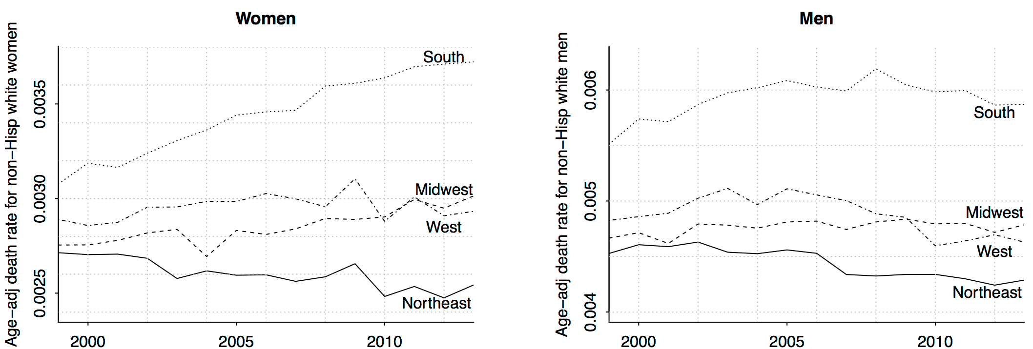
Wow!! Remember that increasing death rate among middle-aged non-Hispanic whites? It’s all about women in the south (and, to a lesser extent, women in the midwest). Amazing what can be learned just by slicing data.
I don’t have any explanations for this. As I told a reporter the other day, I believe in the division of labor: I try to figure out what’s happening, and I’ll let other people explain why.
I’m sure you can come up with lots of stories on your own, though. When performing your reverse causal inference, remember that people move, and, as we’ve discussed before, the cohorts are changing. 45-54-year-olds in 1999 aren’t the same people as 45-54-year-olds in 2013. We adjust for changing age distributions (ya gotta do that) but we’re still talking about different cohorts.
Here’s how our paper begins:
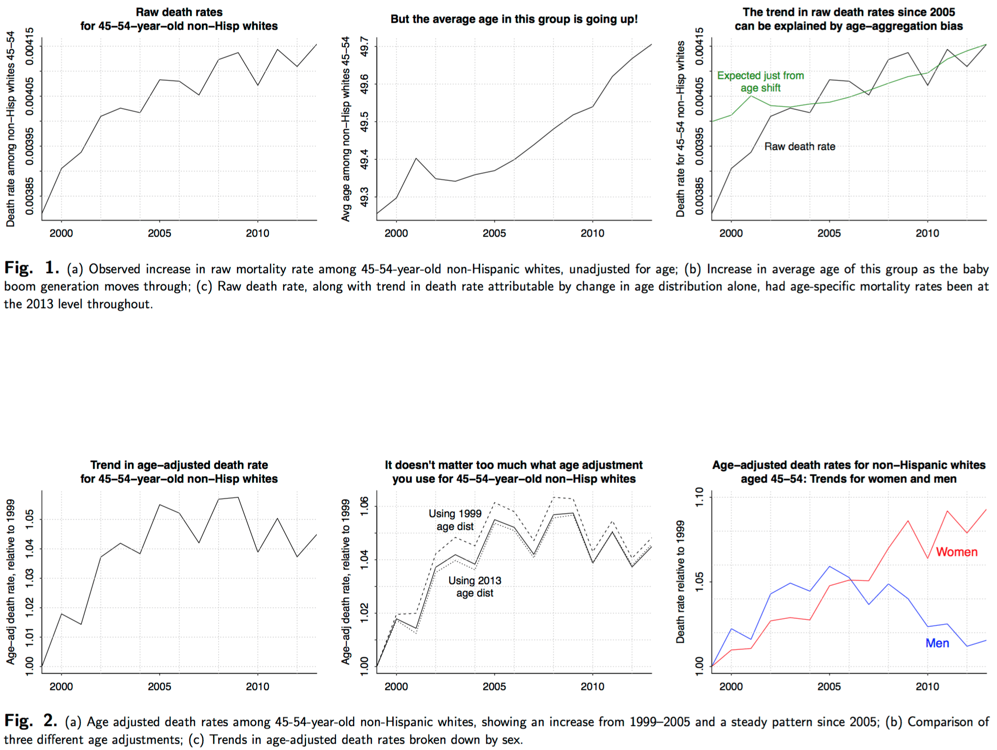
In a recent article in PNAS, Case and Deaton show a figure illustrating “a marked increase in the all-cause mortality of middle-aged white non-Hispanic men and women in the United States between 1999 and 2013.” The authors state that their numbers “are not age-adjusted within the 10-y 45-54 age group.” They calculated the mortality rate each year by dividing the total number of deaths for the age group by the population of the age group.
We suspected an aggregation bias and examined whether much of the increase in aggregate mortality rates for this age group could be due to the changing composition of the 45–54 year old age group over the 1990 to 2013 time period. If this were the case, the change in the group mortality rate over time may not reflect a change in age-specific mortality rates. Adjusting for age confirmed this suspicion. Contrary to Case and Deaton’s figure, we find there is no longer a steady increase in mortality rates for this age group. Instead there is an increasing trend from 1999–2005 and a constant trend thereafter. Moreover, stratifying age-adjusted mortality rates by sex shows a marked increase only for women and not men, contrary to the article’s headline.
And here’s the age-adjustment story in pictures:
For some reason, the NYT ran a story on this the other day and didn’t age adjust, which was a mistake. Nor did they break down the data by region of the country. Too bad. Lots more people read the NYT than read this blog or even PPNAS.
Maybe it has something to do with the figure titled ‘Trend, USA’ a third of the way down on the following page: http://www.tobaccoatlas.org/topic/smoking-among-women/
If you look through the comments in the previous threads, the increase in death rates appeared to be due to “poisoning” from painkillers and blood pressure meds along with suicide. I’d say more likely this is some issue with how they guessed race for each mortality, which was determined by the local demographics and how death certificate ID numbers are assigned. There were a bunch of threads on this and I couldn’t find it at the moment.
Rather than region of the country, have you thought of disaggregating by county, specifically by its level of urbanicity (see Goodall, Kafadar & Tukey’s May 98 American Statistician paper)? As they point out, Nevada is rural in aggregate, but some 85 percent of its population is in Clark (LV) and Washoe (Reno) counties. I’ve found it to be a useful indicator.
Pedantic quibble, but what’s with not aligning the dashed background grid with the tick marks? Makes it hard to estimate values from data points.
They look aligned to me. But I’d argue that in the first graph raw death rate is on the wrong scale, deaths/1000 people would be better (3.85, 3.95 etc) the pointless 0.00 doesn’t help interpretation or reading of the graph.
Better yet, all cause death rate as a fraction of 1999 death rate from heart disease. Put the baseline heart disease rate on the graph somewhere so people can rescale it themselves. Since heart disease is a big killer, let’s use its rate as a yardstick.
Another point that tripped me was that every individual graph there has a different scale. Isn’t that a no-no when you present a matrix of graphs for comparison?
e.g. The increase in female mortality seems highly exaggerated. Almost 2x with respect to the male mortality.
Rahul:
Yes, we thought about some of these issues. We did a lot of graphs on a common scale starting at a baseline of 1, but we also thought it would be helpful to look at overall levels. No single set of graphs will do it all, and I’m sure you’re right that we could’ve improved ours in various ways. Actually, I think just adding color would help—putting the lines for women in red and the lines for men in blue. I’m such an oldster that I still think of color as a costly feature to add, rather than a tool that can make just about any graph easier to read.
Today, one problem arises in trying to cater simultaneously to a web audience & a print audience.
You can use a lot more color (and other tricks if you have the time) for a graph that will be posted on the web. Print graphs need a different approach.
The NYT was going to do a nice article about a web tool Andrew and I had put together some years ago, illustrated by a big color graphic, and then a couple of days before the article ran there was a huge tsunami that killed many thousands of people, so, understandably, we got pushed off the front page of the science section…onto a later page that didn’t use color. The black-and-white map was not nearly as compelling as color would have been.
@Phil
Out of curiosity, what is this web tool? Does it still live somewhere?
I remember seeing a link to this story on declining life expectancy for rural white women on Jenny Davidson’s blog in 2013: http://prospect.org/article/whats-killing-poor-white-women
I always assumed that you, Case/Deaton, et al. were familiar with this story but I’m relinking on the off-chance I was wrong.
I was not aware of this paper, but it seems highly relevant. It looks at life expectancy rather than mortality rates, but you would think that it merits one of the 39 references listed in the Case/Deaton paper. But it is not referenced there at all. This seems to raise yet another dimension of the myriad research issues discussed on this blog.
It is not reasonable to expect authors to have read everything relevant to their research. The paper Sarang links is in a well known journal and has been extensively cited, but it still seems reasonable that even knowledgeable and capable researchers might not be aware of it. However, it is a sad state of affairs that multiple researchers still conduct research on the same issues in relative ignorance of what others are doing. Part of this is endemic to research but part is not. As publication outlets proliferate the ability to stay on top of things becomes more and more difficult (note that we somehow expect referees to avoid this problem), even for well intentioned researchers. One consequence is that people over-specialize since it is only possible to stay on top of a very narrow field of expertise.
The sad (and disturbing to me) thing is that these problems appear to be getting worse, despite all the technological tools that are available to combat them. Sharing of knowledge at all stages of research is potentially much easier than in the past – yet we see research conducted in silos. I think there are many causes for this, but we should start with saying that this is unacceptable and an important issue to address. I am not faulting Case/Deaton (nor myself) but I think that far too little emphasis is put on sharing of knowledge relative to increasing one’s resume.
Dale:
That paper doesn’t count because its authors aren’t economists.
So true! Social scientists operate in silos. This is a feature not a bug of the cartel system.
I have written in the past to researchers to make them aware of similar research in other disciplines. Typically, the response I get is: “I am writing for people in so I am only focusing on literature in “.
Go figure.
Economists don’t read or cite outside economics, even when they are “discovering” topics or social facts that other social sciences have been studying and known for years. The other social sciences cite each other, and they cite economists. Sometimes, they even read economists before citing them.
Andrew briefly blogged about the 2012 paper by Olshansky et al in Health Affairs discussed in the article: http://statmodeling.stat.columbia.edu/2012/10/25/health-disparities-are-associated-with-low-life-expectancy/
Naive question: In Fig. 1 (c ) why doesn’t the green line (“Expected death rate just from age shift”) start from where the “Raw Death Rate” series starts (black line)?
Is that offset at year 2000 to be expected? Why? When we say “age shift” isn’t year 2000 the reference point?
So I’m curious, how does the location-dis-aggregated graph look for women / men *only* in the 45-54 cohort? The original argument was about that specific age cohort, right?
Does the southern-women trend exist for all age cohorts or only specific ones?
Rahul:
The graphs shown above, including the graphs by region, are all for the 45-54 cohort.
Ah! Thanks. It was confusing since every other graph explicitly mentions 45-54 except the first two.
Rahul:
What really bums me out is that PPNAS has strict space limits for letters and so those final graphs, with the regional patterns, will not appear in the published letter. They exist only on my webpage, on our Arxiv paper, and on this blog.
PPNAS’s loss. For all I know more people will read them on your blog & arxiv than via PPNAS.
Andrew: “Remember that people move”
I am not sure how location is informative here. For all I know this simply captures the migration south of retirees.
IMHO there is no evading the causal question. Ideally you want to dissect the data by potential causes. The alternative is to cut it a million ways and go down a speculative rabbit hole.
Fernando:
I don’t think there are so many retirees in the 45-54 age group. Also the numbers are age adjusted so there’s no reason to expect that retirees would have higher death rates than other people of the same age.
Ha! I read it too fast.
But here is another take: People who are sick and in 45-54 age range migrate south searching for better climate.
the general point is whether there is something associated with the South that is causing higher death rates, or are people experiencing higher death rates moving South.
Fernando:
Yes, I agree with your general point, that you ultimately can’t avoid causal reasoning when thinking about these things.
Andrew:
I guess an interesting exercise would be to cut the data by location. Then cut it by profession, and so on for all variables in your data set. For each cut plot a graph. Then select all plots that have a curve that stands out like the one in your first chart. Presumably you can run this in a loop.
Yes, it sounds like something that already exists, there’s some literature on automated data discovery? What’s stunning about this example was that I only tried 3 things on the data—age adjustment, decomposition by sex, and decomposition by region—and each made a big difference. This suggests that it would worth looking at more.
But doesn’t this all sound like multiple hypothesis testing. What would be surprising is if all these decompositions made no difference at all (says the devil’s advocate in me). (In fact, your cancer example in BDA and how it is so high in MidWest due to low prevalence / measurement issues is a case in point.)
PS the age adjustment I think is justified as addressing a measurement issue, not an analytical angle.
Fernando:
Sample sizes are large here, if we had p-values they’d be .0000001 or whatever. In any case we have internal replication from the multiple years. Random patterns would not look like clean trends.
Andrew:
– With large sample sizes everything is significant, which is one point I am making.
– The multiple replications over years story depends on the degree of intra-cluster correlation by panel no? Be it from true state dependendence, unobserved time-invariant heterogeneity, or serial correlation.
I’d argue it makes good sense to start to think about a variety of actual models for what’s going on. Look at different causes of mortality, and try to explain those in terms of causal effects, for example smoking on lung cancer and heart disease, or changes in medical treatment recommendations for certain cancers and how those changes are available differentially to different groups… etc etc.
automatic data mining can help you focus on what variables are of interest, but you’ll get farther at actually understanding causes if you can turn it into a comparison of various causal models.
+1. Smoking is typically the elephant in the room in this sort of study.
Yes. My understanding is that women now smoke more than men, and specially women of lower income. The latter might explain south part (lower income) but are women smoking at higher rates over time? Maybe? Or, more sinister, are cigarettes becoming more deadly?
Smoking is unlikely to be a strong mortality factor in this age group.
Give smoking another 15 to 20 years to work its deadly magic, then you’d be on to something. I’d focus my hypotheses on access to health care for a strong all-cause explanatory risk factor. You know, no mental health care= suicide/drug abuse, breast cancers diagnosed too late, obesity and poorly treated diabetes, and throw in some infectious disease, too.
I mean, not to sound all Strangelovian, but if you wished to make more people die at a younger age, getting them hooked on tobacco is probably the least efficient way to go about it. Emphysema is their big killer and it comes very late.
I forgot to mention -> Besides, as a region, the South has got to be a leader in health care inequality simply because we are so concentrated, state-wise, in right wing derp. Although the underlying motivation of the inequality is as a punitive racial instrument, it has bystander effects.
Look at the age distribution of opioid drug overdose deaths…
http://www.cdc.gov/drugoverdose/data/overdose.html
So when you do something like this how does one tell apart a real, robust trend from artifacts of data?
i.e. If one dis-aggregated any dataset automatically for long enough isn’t one going to find, at some level of decomposition, a trend somewhere?
Rahul:
There are different ways to think about it, here are two:
1. Predictive. Can you make a prediction for next year’s mortality rate? If a model can help you make a better prediction, it’s not noise.
2. Causal. Can you predict the effect of some intervention?
I would like to know how many of them had abortions and multiple abortions. How old were they when Roe v. Wade went into effect?
Which is the relevant factor: “womanhood” or “in the south”? That is, are non-Hispanic Southern black women also seeing an increase in death rate (relative to non-Hispanic black women in other areas of the country)?
I think the term “the South” is a little misleading in that some of the worst areas for growth in overdose deaths tend to be on the fringes of the South, such as West Virginia-Kentucky and Oklahoma. I wouldn’t be surprised if Scots-Irish ethnicity is a factor in some fashion. Reporter Sam Quinones’s “Dreamland” focuses on southern Ohio, which is technically not the South but shares a lot of culture with the coal-mining regions of the Southern Fringe.
But why only women?
A very good question.
The big trouble in white male death rates was in the early 2000s, while with white women it’s set in worse in more recent years.
But why?
I am no statistician – but what if there’s a vulnerable cohort in this generation aging its way through the curve? Women generally live longer. Could the men in that cohort have died off first, and now it’s the women’s turn?
There may be an age lag between men and women based on older husbands/younger wives, such as married at 27M/22F or similar. For consideration, what about wives ‘catching up’ with dead husbands after years of similar dysfunction. Their vices operated on a younger host, so took a little longer to kill them.
This could be a small factor, but per capita vehicle deaths are much worse in the South, for example more people die in vehicle crashes in Mississippi than in New Jersey.
Just glancing at the data you can see in most cases its 3 or 4 times more deadly in the South versus the Northeast.
http://www.iihs.org/iihs/topics/t/general-statistics/fatalityfacts/state-by-state-overview
Olshansky, S. Jay, et al. “Differences in life expectancy due to race and educational differences are widening, and many may not catch up.” Health Affairs 31.8 (2012): 1803-1813.
Has 191 Google cites, including:
Dowd, Jennifer B., and Amar Hamoudi. “Is life expectancy really falling for groups of low socio-economic status? Lagged selection bias and artefactual trends in mortality.” International journal of epidemiology 43.4 (2014): 983-988.
Montez, Jennifer Karas, and Lisa F. Berkman. “Trends in the educational gradient of mortality among US adults aged 45 to 84 years: Bringing regional context into the explanation.” American journal of public health 104.1 (2014): e82-e90.
About ¼ are from economists, including:
Bosworth, Barry and Burke, Kathleen, Differential Mortality and Retirement Benefits in the Health and Retirement Study (May 2014). Available at SSRN: http://ssrn.com/abstract=2440826 or http://dx.doi.org/10.2139/ssrn.2440826
Goldman, Dana P., and Peter R. Orszag. “The Growing Gap in Life Expectancy: Using the Future Elderly Model to Estimate Implications for Social Security and Medicare.” The American Economic Review 104.5 (2014): 230-233.
Have you tried looking at older time series? e.g. Is the trend seen in 1990-2000 data too?
Also, what about other age cohorts? Are *only* 45-54 aged southern white women dying more?
Has anyone looked at the actuarial literature or trade publications on this?
If anyone ought to spot a new spike in mortality of a specific cohort, I’d think the insurance industry ought to be it. Although I can imagine they’d be quite secretive about some of this data too. Might be a source of competitive advantage.
What do we know about cause of death?
I have some further thoughts, but I think the question is far more important than any of my half-assed answers, so I’ll post them separately.
Reading this story, there seem to be a few implicit potential explanations (with empirical evidence from this statistical study in parentheses):
-smoking (Probably significant. The study suggests this explains less than 1/3 of the variation but that could be bad data.)
-obesity/diabetes (the study suggests this is 6%, and the study is underestimating things by less than a factor of 3, so probably this is not too big a factor)
-meth/alcohol/prescription painkillers (not really covered in the study, but probably not insignificant; the pre-disaggregation stories on this have definitely raised this as a possibility)
-unemployment (study suggests this is a big one, but there are various possible mechanisms)
-lack of social network
-loneliness
-direct stress
-substance abuse
-alarm bells aren’t ringing when they should
-economic factors
-lack of insurance/underinsurance
Meh, the last stuff was supposed to be in outline format, but the initial spaces got stripped.
Yet another valuable and pertinent study – not referenced by Case/Deaton. As Andrew has said, though, this was not written by economists – worse yet, it was sociology! My wife, a physician, tells me that the overuse of painkillers (particularly in middle aged white women) is not news in the medical community. So, the more I read, the more irritated I become about the original Case/Deaton study. While it was nicely written by two more than competent researchers (with reputations that I will never match), their work appears sloppy in a number of dimensions and appears to be written in a relative vacuum. They claim to have discovered overlooked important story. Now, that story appears to be somewhat less than robust, not new, and unclear as to what exactly it contributes to our understanding of trends in mortality.
I thought I was about as skeptical as possible (having grown up in NYC) but it just keeps getting worse.
+1 for the link to Potts’ story. I’ve seen a few references to it in the context of Case/Deaton but don’t recall it getting much press when it came out (which, admittedly, might just be lousy memory on my part).
http://www.nber.org/papers/w21809.pdf
Historical Origins of a Major Killer: Cardiovascular Disease in the American South
This recent NBER paper tries to explain outsize cardiovascular disease mortality in the South.
Long term effects of oral birth control pills.
Exclusively in the South?
I had wondered about the effects of oral contraception — but got there by first thinking about whether the increasing middle aged death rates might actually be influenced by lower death rates at lower ages. Increased use of oral contraception came to mind as something that might have lowered death rates (from childbirth) in the cohort at a younger age – – then it occurred to me that the pills could also have long term effects (e.g. blood clots) increasing middle aged death. But why might this show up just in the South? One plausible reason might be poorer health care in the South; that could lead to over-reliance on birth control pills, but also less monitoring for negative side effects.
So it’s somewhat plausible, but I wouldn’t bet on it.
Another thought was that the standard regions aren’t necessarily the important ones. I think someone else (Steve Sailer?) mentioned that. E.g., Appalachia extends thorough parts of several states, but the region tends to have circumstances that might make it have different life trajectories than other parts of the country.
Ideally, analysis by smaller units (e.g, counties) would be best (a “smooth” or “heat map” of the US would be interesting.) But I doubt that the data would be available at that level.
“the standard regions aren’t necessarily the important ones.”
Yeah. It is just a convenient cut of the data, like 45-54 year-olds, like all cuts of all data. But it is an important point to make, so thanks for making me think about it. And it makes me think about different meanings of “causality”.
It isn’t that, conditional on who you are and how you live, being in that age range somewhere in the South magically makes you more likely to die. It is just that those characteristics are correlated with various factors and exposures and inputs and whatever that lead to increasing death rates. There is only a kind of “proximate” causality at work in these kinds of comparisons (like region or age-group or socioeconomic status), not a “direct” causality.
Incidentally, this is basically Daniel Lakeland’s disagreement with all my statistical intuition: I tend to (try to) estimate proximate causes of things using the simplest, cleanest comparisons I can; he wants to model the underlying direct causes (usually biological or physical) and estimate a model with thousands of parameters and many, many variables (quickly! in Stan! apparently). In this case you can see how both are useful: Thinking hard about the world so that you can find the important ways to cut up and interpret the data to demonstrate an important empirical fact (Case/Deaton’s and Andrew’s contribution here); and then coming up with ways of trying to model which more direct causes are most responsible for the increased mortality (see forthcoming literature over the next 3 years, possibly by Daniel Lakeland, if he’s bored).
The measurements available make it more tractable to deal with proximate causes than direct ones?
“relatively more is the South” would suffice?
I’m a 53 yo male and have been single and dating for 10 years. For reasons known and unknown the first 7-8 years I dated woman around 35 exclusively. The last 2-3 years I’ve made an effort to date women closer to my age. One thing that I’ve noticed that has shocked me is the use of meds. I understand its a small pool but from my experience I can say with pretty good anecdotal confidence that of the pool of single women 40-55 that I could potentially date 85-90 percent will be on some fairly hardcore regimen of prescription drugs for anxiety and/or depression. I don’t know what they would be like without the meds and I’m not a doctor but they don’t appear to be in good health to me.
I would go with the meds hypotheseis
Those “fairly hardcore regimens” you speak of are most likely just good old-fashioned vitamin P. The use of tricyclics has been waning for years in favor of prozac and related SSRI’s. If someone told me they were on an antidepressant I’d take Vit P and whatever odds they would be stupid enough to give me.
This drug class has very few side effects and none of them are deadly. Whether Vit P increases suicide risk at all has been studied quite a bit. The so-called disinhibition hypothesis. If it does, and it probably doesn’t, the effect size is very very small.
I mean, the meds hypothesis wouldn’t explain this trend.
Are there data on mortality by occupation? And how do you develop the “nose for databases” to quickly find the best data for answering the question you have, that or find that the data don’t yet exist? Sometimes I fear mine has anosmia.
Possibly helpful: Introducing Kaggle Datasets
https://medium.com/@benhamner/introducing-kaggle-datasets-a935f9f76f5#.62myaoubc
How would you get the data to find if they were disproportionately using a particular health care provider, or pharmacy, or medication?
http://www.theguardian.com/us-news/2016/feb/07/suicide-rates-rise-butte-montana-princeton-study:
“A study released late last year by two Princeton academics, Anne Case and Angus Deaton, who won the 2014 Nobel prize for economics, revealed that the death rate for white Americans aged 45 to 54 has risen sharply since 1999 after declining for decades. The increase, by 20% over the 14 years to 2013, represents about half a million lives cut short.”
You’d hope that The Guardian would notice the problems with the paper, eventually.
Roger:
It doesn’t help that when Case and Deaton were asked about the age bias problem, they bobbed and weaved instead of just accepting the correction.
Have you looked at whether more middle white women in the South suffer the sandwich generation problem: expected to provide care for both children and aging parents? If black Southern women have children on average earlier more of them may escape this problem.
I’m originally from a rural Georgia town. Self-destructive behaviors like smoking, drug addiction in an environment with little to no mental health resources, much less affordable mental health resources, and a continued stigma around it. Depression is more prevalent in women than men.