Last year there was much discussion here and elsewhere about a paper by Anne Case and Angus Deaton, who noticed that death rates for non-Hispanic white Americans aged 45-54 had been roughly flat since 1999, even while the death rates for this age category had been declining steadily in other countries and among nonwhite Americans.
Here’s the quick summary of what was happening in the U.S. for non-Hispanic white Americans aged 45-54:
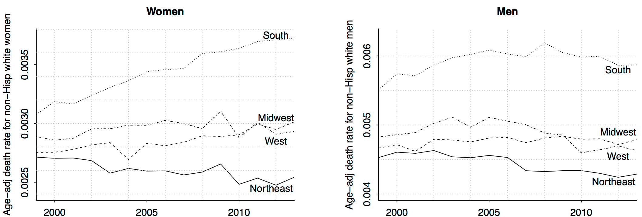
Different things are happening in different regions—in particular, things have been getting worse for women in the south and midwest, whereas the death rate of men in this age group have been declining during the past few years—but overall there has been little change since 1999. In contrast, other countries and U.S. nonwhites have seen large declines in death rates, something like 20%.
The above graph (from this paper with Jonathan Auerbach) is not quite what Case and Deaton showed. They didn’t break things down by sex or region, and they didn’t age adjust, which was a mistake because during the 1999-2013 period, the baby boom moved through the 45-54 age group, so that this group increased in average age, leading to an increase in raw death rates simply because the people in this age category are older. (The instantaneous probability of dying increases at a rate of about 8% per year; that is, each year in this age range your chance of dying during the next year is multiplied by approximately a factor of 1.08; thus, when looking at relatively small changes of death rate you really have to be careful about age composition.)
Anyway, that’s all been hashed out a million times and now we understand it.
Today I want to talk about something different: trends in death rate by education. Much of the discussion in the news media has centered on the idea that the trend is particularly bad for lower-educated whites. But, as I wrote in my first post on the topic:
I’m not quite sure how to interpret Case and Deaton’s comparisons across education categories (no college; some college; college degree), partly because I’m not clear on why they used this particular binning but also because the composition of the categories have changed during the period under study. The group of 45-54-year-olds in 1999 with no college degree is different from the corresponding group in 2013, so it’s not exactly clear to me what is learned by comparing these groups. I’m not saying the comparison is meaningless, just that the interpretation is not so clear.
I was just raising a question, but it turns out that some people have studied it, and there’s a paper from 2015 in the journal Health Affairs.
Here it is: Measuring Recent Apparent Declines In Longevity: The Role Of Increasing Educational Attainment, by John Bound, Arline Geronimus, Javier Rodriguez, and Timothy Waidmann, who write:
Independent researchers have reported an alarming decline in life expectancy after 1990 among US non-Hispanic whites with less than a high school education. However, US educational attainment rose dramatically during the twentieth century; thus, focusing on changes in mortality rates of those not completing high school means looking at a different, shrinking, and increasingly vulnerable segment of the population in each year.
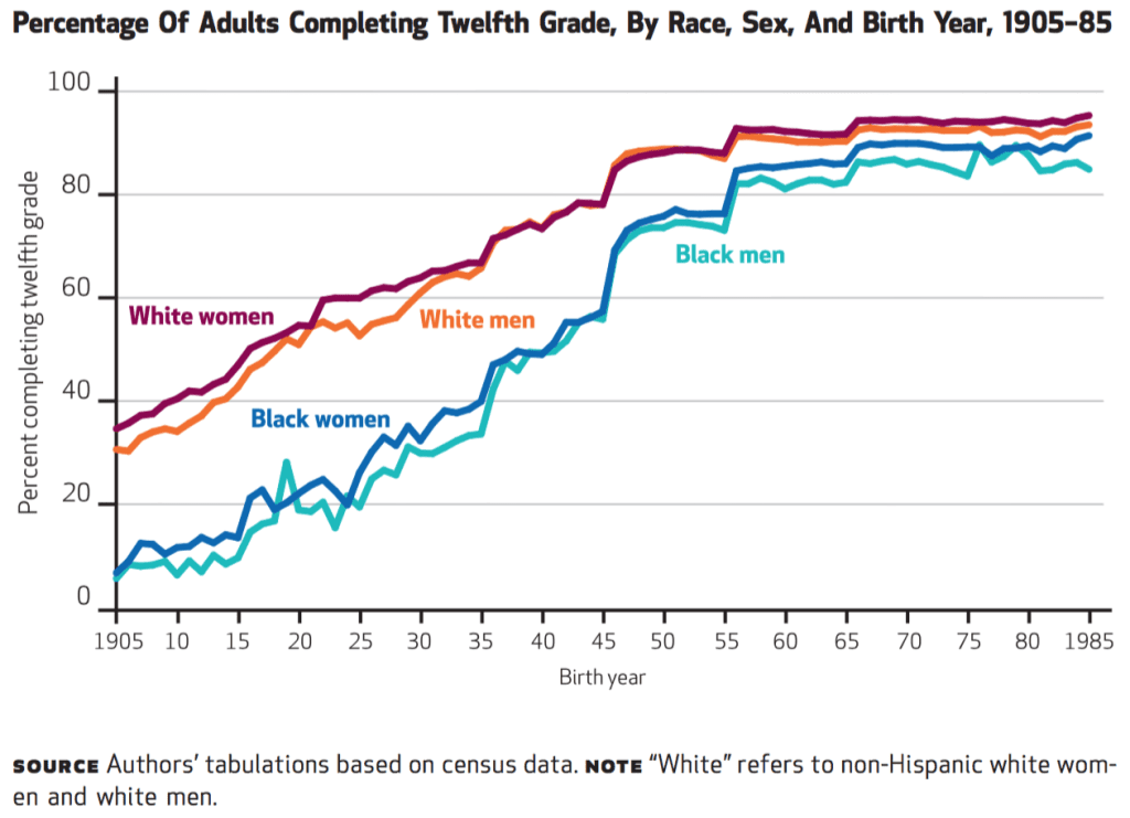
Yes, this was the question I raised earlier, and Bound et al. back it up with a graph, which I reproduced at the top of this post. (John Bullock argues in a comment that the above graph is wrong because high school completion rates aren’t so high, but this does not affect the general point made by Bound et al.)
Then they take the next step:
We analyzed US data to examine the robustness of earlier findings categorizing education in terms of relative rank in the overall distribution of each birth cohort, instead of by credentials such as high school graduation.
That makes sense. By using relative rank, they’re making an apples-to-apples comparison. And here’s what they find:
Estimating trends in mortality for the bottom quartile, we found little evidence that survival probabilities declined dramatically.
Interesting! They conclude:
Widely publicized estimates of worsening mortality rates among non-Hispanic whites with low socioeconomic position are highly sensitive to how educational attainment is classified. However, non-Hispanic whites with low socioeconomic position, especially women, are not sharing in improving life expectancy, and disparities between US blacks and whites are entrenched.
“(The instantaneous probability of dying increases at a rate of about 8% per year; that is, each year in this age range your chance of dying during the next year is multiplied by approximately a factor of 1.8; thus, when looking at relatively small changes of death rate you really have to be careful about age composition.)”
Should that be 1.08?
I agree. Has to be a typo.
Cody:
Thanks; typo fixed.
We age fast: mortality rates do increase at about 8-10% per _year_.
From the Human Mortality Database, U.S. combined sex death rate at age 45 is about 0.0025. By age 54, it is 0.0057. The rate of increase log(57/25)/10 = 8% per year.
Andrew’s 1.80, as he makes clear, is approximation of what happens over a decade of age from age 45 to 54.
It would seem that these analyses would be prone to the kind of problems discussed in “Statistically Controlling for Confounding Constructs Is Harder than You Think” by Westfall and Yarkoni, which was referenced recently on this blog:
http://journals.plos.org/plosone/article?id=10.1371/journal.pone.0152719
It would seam that essentially all social science is prone to this kind of problem!
Side note: the figure that appears at the top of this post is misleading. None of the cohorts described in that figure had twelfth-grade completion rates of 80%, much less above 80%. Russell Rumberger’s Dropping Out is excellent on this point, and on the way that true twelfth-grade completion rates were stagnant in America for 40 years, starting in the 1970s. (See also this Washington Post article about the graduation rate topping 80% in 2012 for the first time ever.)
The authors were probably conflating completion of twelfth grade with receipt of a GED. But as Heckman and co-authors have shown in a variety of papers, that’s a bad move. On average, GED recipients look more like dropouts than high school graduates with respect to income and a variety of personal characteristics.
John,
There is a difference between the graduation rate published in the report you cite and the measure reported in Bound et al. In the cited report, the graduation rate is for a given school year whereas the measure Bound et al. are using is the percentage of adults completing 12th grade at age 25. Thus, the graph at the top is accurate.
OnlyStats, that’s not quite right.
It’s true that Bound et al. are examining one quantity, and that the Post article to which I referred reports a different quantity. But the Bound et al. figure remains misleading because it conflates twelfth-grade completion with receipt of a GED.
Bound et al. don’t say, in their article, that they are conflating categories in this way. But they are relying on decennial Census data, which don’t distinguish between ordinary high school graduation and receipt of a GED. (To see this, examine the “educ” variable for any pre-2010 decennial Census.)
This conflation is relevant because a large and generally rising percentage of all “high school credentials” awarded in a given year are GEDs. As of 2008, about 1 in 8 people receiving “high school credentials” in a given year were really receiving a GED. (The data are in Figure 1 of this paper by Heckman, Humphries, and Mader.)
In short: if Bound et al. were really reporting the “percentage of adults completing twelfth grade,” instead of the percentage who have either completed twelfth grade or received a GED, I think that the figure at the top of this post would look different. Unless I’ve missed my mark, all four lines in the figure would be shifted down in a substantial way.
I don’t think that any of this impeaches the larger argument that Bound et al. are making. I’m just concerned about widespread overestimation of high school graduation rates.
John,
Yes, I now understand what you say. Thank you! Given the census data, however, I don’t see a clear way to disentangle the issue that you raise (given the format of educational attainment in mortality data). Your point is well taken, nevertheless.
Deaton still keeps making his claims, he just did it in his last debate in this years ASSA meting.
John:
It’s frustrating how people just refuse to admit their mistakes.
As far as Case and Deaton’s paper continues to be used by the media as evidence for an “epidemic” and gives them high ratings, some scientists jump on that omnibus to gain salience. Case and Deaton’s paper shows 179 citations in Google Scholar as of today whereas better-elaborated papers like Bound et al.’s show a mere 4 citations. Why? Because non-epidemics are less “sexy” than national-level epidemics?
Two of my Pacific colleagues have both talked about visiting the USA and being mistaken by Hispanic people for being Hispanic – they were both spoken to in Mexican and people got grumpy when they didn’t understand. So, I still have huge reservations about whether people’s ethnicities are correctly identified at death compared to the census when people can self-report.
I can imagine that in the absence of information people (coroners/first-responders) would default to “white” because of how an error would be perceived, especially in places where there is more stigma to being non-white or Hispanic.
I would expect to see it more markedly 1) in young adults – people living a long way from family (another country, perhaps) who haven’t established a family of their own to share those kinds of details with and 2) in the very old, where there is no living family or close family to know/report those kinds of details.
I suspect the *vast majority* of death certificates are filled out by the family or by asking the family questions. Certainly, there will be a few elderly people with no living relatives or tourists who were robbed and killed and had their papers stolen, and other “John/Jane Does” but they’re by far the minority.
Every death certificate filled out in the US is available from the CDC in microdata form (note at this level of detail they don’t identify the location of death): https://www.cdc.gov/nchs/nvss/deaths.htm
You have go to be of two minds on this. The scholar in you is frustrated, but it’s half the ammunition for your blog.
I found Bound et al.’s methodological appendix quite thorough and detailed on some methodological intricacies not discussed in the paper. The most prominent related to matching educational levels across the different sets of data. To the contrary, I found some of Case and Deaton’s methodological decisions quite unexpected; for example, I still don’t understand why they put together men and women in the same group.
Only:
I too don’t understand why Case and Deaton pooled the two sexes. I think it might just be econ thinking: economists often seem to like to pool their data and come up with averages. Local average treatment effect, Consumer price index, you name it: they have a tradition of boiling everything down to a single number.
Talking about boiling things down, Bound et al. show one more important thing in this paper in addition to what we are discussing here: Mortality inequality on the basis of education is increasing.
I have more of a glass-half-full perspective: If Case and Deaton’s paper hadn’t come out immediately after Deaton won his quasi-Nobel, the country still wouldn’t be paying attention to the White Death. So, I appreciate their work, even if it could have been more polished.
Steve:
I think Case and Deaton did a service with their paper, and indeed it may be that their naivety was a key component of their success. Lots of demographers knew about these trends but their understanding was too sophisticated and they didn’t have a clean way of making their point. Case and Deaton, by misreading their data, ended up with a dramatic claim (the increasing death rate) which wasn’t quite true, but was close enough to a larger truth (the comparison to other countries) which they also pointed out in their paper and which withstood the reanalysis.
At a scholarly and a personal level, I remain annoyed that Case and Deaton have showed little interest in correcting their errors and moving forward, but I agree with you that their paper was a net contribution. I hope that journalists, researchers, and policymakers who are interested in this topic will now go to the real experts. Not Case, not Deaton, not me, but people like the authors of the paper discussed in the above post.
Yeah, but it’s a really serious problem for the longterm credibility of science with the public. Academics know there’s no downside to going on a media publicity blitz with overhyped research that doesn’t hold up (like Andy Reynolds and the Electoral Integrity Project, who I was sorry to see resurface in The Monkey Cage today.) Lots of fields are going to end up like the nutritionists – their credibility with the public has been completely shot because everyone has become so jaded to seeing contradictory headlines proclaiming that [everyday food] causes/cures cancer.
What makes this even more frustrating is that there is a new study that just came out using cohort measures:
http://www.sciencedirect.com/science/article/pii/S0140673617301873
With the NIH press release here:
https://www.nih.gov/news-events/news-releases/study-finds-premature-death-rates-diverge-united-states-race-ethnicity
It feels as though we are simply being bombarded with studies on mortality at this point without any clear indication as to which is believable or not. Note that the above study only cites Case and Deaton and not your note with Auerbach.